Chapter 3
Getting to Know jQuery UI
IN THIS CHAPTER
 Introducing jQuery UI
Creating a custom version of jQuery UI
Including the jQuery UI code in your page
Trying out a few jQuery UI widgets
Playing around with jQuery UI interactions and effects
Because jQuery UI runs on top of jQuery, the syntax used to initialize, configure, and manipulate the different components is in the same comfortable, easy-to-use, and short-hand style that we’ve all come to know and love through using jQuery. Therefore, getting used to it is incredibly easy.
— DAN WELLMAN
In Chapters 1 and 2 of this minibook, I go through the basics of jQuery and showed how easy jQuery makes it to select elements, manipulate tags, CSS properties, and HTML attributes, and build interactive and fun pages with events and animations. jQuery’s ease and power make it an indispensable tool in the modern web developer’s workshop, but as powerful as it is, jQuery can’t do everything. In particular, jQuery doesn’t offer much — okay, anything — in the way of tools to help ease the chore of building user interface components such as menus, dialog boxes, and tabs. Sure, jQuery gives you the technology to build these things, but the coding is still often time-consuming and laborious.
But it doesn’t have to be. That’s because the jQuery Foundation — the same group that brings you jQuery — is also behind a sister project called jQuery UI (jQuery User Interface), which offers an impressive set of pre-fab user interface components. In this chapter, you explore what jQuery UI has to offer and investigate a number of the most useful and powerful jQuery UI components.
What’s the Deal with jQuery UI?
Have you ever seen one of those homemade Little Free Libraries that people put up on their properties and allow anyone to take (and, ideally, add) books? The jQuery library is a bit like that because it allows third-party developers to create extensions to jQuery called plug-ins. These are small bits of code that piggyback on jQuery’s syntax, making them intuitive to learn and use. For example, if a plug-in extended jQuery with a method named doohickey(), you'd run the plug-in on an element, like so:
$(element).doohickey();
There are hundreds of available plug-ins (check out http://plugins.jquery.com to see the complete list). However, one plug-in in particular is the most popular: jQuery UI, which offers a set of components related to building a web page user interface. jQuery UI itself breaks down its components into ten categories, but for purposes in this chapter, there are three main categories that you explore:
- Widgets: Ready-to-use user interface components such as menus, dialog boxes, tabs, and sliders
- Effects: Animations that go well beyond built-in jQuery effects, such as
hide()andfadeIn() - Interactions: Mouse-centric tools that enable you to configure web page elements to be resizable, draggable, sortable, and more
jQuery UI has a Download Builder tool that enables you to select just the components you want, a ThemeRoller tool that lets you customize the look of the components you download, and a consistent set of class names that you can access via CSS rules or your jQuery code.
Getting Started with jQuery UI
Getting up and running with jQuery UI involves the following steps:
-
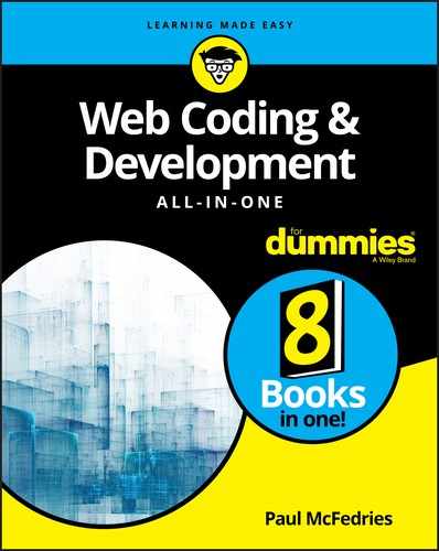
Surf to the jQuery UI's Download Builder page, at
https://jqueryui.com/download.Figure 3-1 shows the top part of the Download Builder page.
- Leave the Version option with the most recent version selected.
-
Use the check boxes to choose which jQuery UI components you want to use.
If you don’t yet know which components you want to use, leave them all selected for now. The resulting file will be quite big (over 250KB), but you can always come back and select just the components you want to use when you’re more familiar with what jQuery UI has to offer.
-
Near the bottom of the page, use the Theme list to select a CSS theme for your components.
If you want to roll your own theme, click Design a Custom Theme to open the ThemeRoller, shown in Figure 3-2. Use the ThemeRoller widget on the left to customize your fonts, colors, and more. Then click Download Theme to return to the Download Builder with
Custom Themenow showing in the Theme list. -
Click Download.
jQuery UI gathers your files into a ZIP archive and downloads the file to your computer.
- Double-click the downloaded file to unzip it.
-
Copy the jQuery UI CSS file to the folder where you keep your web page CSS files.
At a minimum, you need to copy the
jquery-ui.cssfile and theimagessubfolder. You might also want to copy the minified version of the CSS —jquery-ui.min.css— to use with your production code. -
Copy the jQuery UI JavaScript file to the folder where you keep your web page JavaScript files.
You need to copy the
jquery-ui.jsfile. You might also want to copy the minified version —jquery-ui.min.js— to use with your production code. -
Incorporate the jQuery UI code into your web page.
For the CSS file, set up a
<link>tag (adjusting the path to the file as needed for your own folder structure):<link rel="stylesheet" href="/css/jquery-ui.css">For the JavaScript file, set up a
<script>tag and place it after the<script>tag you use for jQuery (again, be sure to adjust the path to the file as needed):<script src="https://ajax.googleapis.com/ajax/libs/jquery/3.3.1/jquery.min.js"></script><script src="/js/jquery-ui.js">
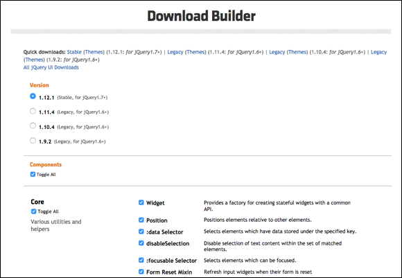
FIGURE 3-1: Use the jQuery UI Download Builder page to create your custom jQuery UI download.
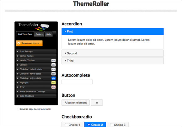
FIGURE 3-2: Use the jQuery UI ThemeRoller on the left to create a custom CSS theme for your components. The sample components on the right (such as Accordion, Autocomplete, and Button, shown here) give you a preview of your theme.
Working with the jQuery UI Widgets
A jQuery UI widget is a ready-to-use web page user interface component. jQuery UI offers 15 or so of these widgets, most of which are related to forms, so I won't cover them in this chapter. (See Book 6, Chapter 2 to get the details on forms and form controls.) However, that still leaves you with a fistful of remarkably useful widgets — tabs, menus, dialog boxes, and accordions — that you can put to good use right away to make your web pages stand out from the herd.
Dividing content into tabs
In a web browser, the tabs that run across the window just above the content area each contain a web page, and you switch between the pages by clicking the tabs.
You can offer that same convenience in your web pages by implementing jQuery UI’s tabs widget, which displays a series of two or more tabs, each of which is loaded with content. The user switches between the content by clicking the tabs. When you have a lot of content to display, but not a lot of room to display it, tabs are your best choice.
A good example of the tabs widget in action is on jQuery UI’s ThemeRoller page (http://jqueryui.com/themeroller), where the ThemeRoller tool offers three tabs: Roll Your Own, Gallery, and Help, as pointed out in Figure 3-3.

FIGURE 3-3: jQuery UI’s ThemeRoller tool makes good use of jQuery UI’s tabs widget.
To create tabs on your page, you need to set up your HTML using the following steps:
-
Add a block-level element to use as the parent for the entire tab structure, and include an
idvalue.You can use a semantic element such as
<article>or<aside>, if it fits your content, or a generic<div>container:<div id="my-tabs"></div> - The tabs themselves are enclosed in a list (which can be unordered or ordered), where the text for each list item is the text that appears on each tab.
<div id="my-tabs"><ul><li>This</li><li>That</li><li>The Other</li></ul></div> -
For each tab, add a block-level element to hold the tab's content, and include a unique
idvalue.Again, you can use a semantic element such as
<section>or<p>, if that works for you, or a generic<div>:<div id="my-tabs"><ul><li>This</li><li>That</li><li>The Other</li></ul><div id="my-tab-1">This is the first tab's content.</div><div id="my-tab-2">This is the second tab's content.</div><div id="my-tab-3">Yep, this is the third tab's content.</div></div> -
Return to your list of items and convert each item's text into a link that points to the
idvalue of the tab’s content block.Be sure to precede each
idwith a hash symbol (#). Here's the final HTML code:<div id="my-tabs"><ul><li><a href="#my-tab-1">This</a></li><li><a href="#my-tab-2">That</a></li><li><a href="#my-tab-3">The Other</a></li></ul><div id="my-tab-1">This is the first tab's content.</div><div id="my-tab-2">This is the second tab's content.</div><div id="my-tab-3">Yep, this is the third tab's content.</div></div>
With your HTML set up, you turn it into tabs by applying jQuery UI’s tabs() method to the parent container:
$('#my-tabs').tabs();
Figure 3-4 shows the result.
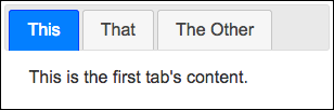
FIGURE 3-4: Some tabs created using jQuery UI’s tabs widget.
 You can style the tabs widget by overriding the rules that come with jQuery UI’s CSS. There are four main classes you can use to style the tabs widget:
ui-tabs: The parent container. For example, I styled the tabs widget shown in Figure 3-4 to have a width of300pxas follows:.ui-tabs {width: 300px;}ui-tabs-nav: The list container (the<ul>or<ol>element).ui-tabs-tab: Each<li>item in the list (that is, each tab).ui-tabs-panel: The content container for each tab.
Creating a navigation menu
If your page navigation includes quite a few links — especially if those links can be divided into categories — you can tidy things up and make your navigation easier and more comprehensible for page visitors by converting your links into a drop-down menu with submenus.
Creating a menu normally requires quite a bit of coding, but jQuery UI's menu widget simplifies things considerably. Here are the steps to follow to build a menu widget for your page:
-
Create a parent element to hold the menu widget structure, and include an
idvalue.You can use any block-level element, but most developers use an unordered list (
<ul>):<ul id="my-menu"></ul> -
For each menu item, add a list item element (
<li>), where the item text is your menu item text surrounded by a block-level element, such as<div>.To add a menu separator (a horizontal line across the menu), use a dash as the menu item text:
<ul id="my-menu"><li><div>Menu Item #1</div></li><li><div>Menu Item #2</div></li><li><div>-</div></li><li><div>Menu Item #3</div></li></ul> -
To create a submenu within an existing menu item, insert a new unordered list between the menu item's
<li>and</li>tags, after the menu item text element.Note that the submenu's
<ul>tag doesn’t need anidvalue. Here's the final HTML code:<ul id="my-menu"><li><div>Menu Item #1</div></li><li><div>Menu Item #2</div><ul><li><div>Submenu Item #2-A</div></li><li><div>Submenu Item #2-B</div></li></ul></li><li><div>-</div></li><li><div>Menu Item #3</div></li></ul>
Now you turn your HTML tags into a menu by applying jQuery UI’s menu() method to the parent container:
$('#my-menu).menu();
Figure 3-5 shows the finished menu.
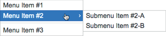
FIGURE 3-5: A drop-down menu with a submenu, created using jQuery UI’s menu widget.
You can style the menu widget by overriding the rules that come with jQuery UI’s CSS. There are three main classes you can use to style the menu widget:
ui-menu: The parent container (the<ul>element). For example, I styled the menu widget shown in Figure 3-5 to have a width of200px, as follows:.ui-menu {width: 200px;}ui-menu-item: Each<li>item in the list (that is, each menu item).ui-menu-wrapper: The content container for each menu item (the<div>elements in my example).
Displaying a message in a dialog
In Book 3, Chapter 6, I talk about JavaScript's alert() method, which you can use to display a message to the user. As long as you don’t overdo it, displaying messages is a handy trick to have up your web development sleeve. The problem, however, is that JavaScript’s alert() boxes are plain to a fault and aren't customizable. If you’re going to subject your page visitors to the occasional message, then why not make the message at least look nice?
You can get a better-looking message by foregoing JavaScript’s alert() method in favor of jQuery UI’s dialog widget. The dialog widget creates a floating window that offers a title bar, a content area for the message, and a button that closes the window.
To set up the dialog widget, create a <div> element that uses the following format:
<div id="dialog-id" title="dialog-title">
Dialog message
</div>
dialog-id: A uniqueidvalue for the dialog widgetdialog-title: The text you want to appear in the dialog widget's title bar- Dialog message: The message you want to display in the dialog widget’s content area
Once that’s done, you turn your HTML into a dialog widget by applying jQuery UI’s dialog() method to the <div>:
$('#dialog-id').dialog({
autoOpen: false
});
Notice that I've included the object literal {autoOpen: false}, which tells jQuery UI not to display the dialog automatically when you first run the dialog() method. To open the dialog (say, in response to a button click), run the dialog() method with the string open as the parameter:
$('#dialog-id').dialog('open');
Here's an example, and Figure 3-6 shows the dialog that appears when the button is clicked:
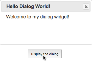
FIGURE 3-6: The jQuery UI dialog widget that appears when you click the button.
HTML:
<div id="my-dialog" title="Hello Dialog World!">
Welcome to my dialog widget!
</div>
<button id="my-button">
Display the dialog
</button>
jQuery:
// Initialize the dialog widget
$('#my-dialog').dialog({
autoOpen: false}
);
// Display the dialog when the button is clicked
$('#my-button').click(function() {
$('#my-dialog').dialog('open');
});
You can style the dialog widget by overriding the rules that come with jQuery UI’s CSS. There are four main classes you can use to style the menu widget:
ui-dialog: The parent container (the<div>element)ui-dialog-titlebar: The dialog widget's title barui-dialog-title: The dialog widget’s title textui-dialog-container: The dialog widget's content area
Hiding and showing content with an accordion
An accordion is a series of headings, each with an associated chunk of content, where only one heading/content combo is shown at a time. Accordions are a great way to display multiple items without overwhelming the reader with all the content at once.
I talk about how to use jQuery to build a simple accordion in Book 4, Chapter 2, but jQuery UI offers a more sophisticated accordion widget. To create an accordion, you first need to set up some HTML tags as follows:
-
Add a block-level element to use as the parent for the entire accordion structure, and include an
idvalue.You can use a semantic element such as
<main>or<article>, if it fits your content, or a generic<div>container:<div id="my-accordion"></div> -
Add a header.
You can use any element you want, but a heading tag makes sense semantically:
<div id="my-accordion"><h6>Header A</h6></div> -
Add the content that goes with the header from Step 2.
Again, you can use a semantic element such as
<section>or<p>, if that works for you, or any element you want, such as a<div>:<div id="my-accordion"><h6>Header A</h6><div>This is the content panel for Header A</div></div> -
Repeat Steps 2 and 3 for each header/content pair you want to include in your accordion.
Here's the final HTML code for my example:
<div id="my-accordion"><h6>Header A</h6><div>This is the content panel for Header A</div><h6>Header B</h6><div>This is the content panel for Header B</div><h6>Header C</h6><div>This is the content panel for Header C</div></div>
With your HTML ready to go, you turn that code into an accordion by applying jQuery UI’s accordion() method to the parent container:
$('#my-accordion').accordion();
Figure 3-7 shows the result.
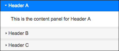
FIGURE 3-7: An accordion created using jQuery UI’s accordion widget.
Note that with jQuery UI’s accordion, one content panel is always visible. If you’d prefer that the accordion allow all the content panels to be hidden, initialize the accordion() method with an object literal that sets the collapsible property to true:
$('#my-accordion').accordion({
collapsible: true
});
You can style the accordion widget by overriding the rules that come with jQuery UI's CSS. There are three main classes you can use to style the accordion widget:
ui-accordion: The parent container. For example, I styled the accordion widget shown in Figure 3-7 to have a width of400px, as follows:.ui-accordion {width: 400px;}ui-accordion-header: The accordion headers.ui-accordion-content: The accordion content panels.
Introducing jQuery UI Effects
As I go on and on about in Book 4, Chapter 2, jQuery offers half a dozen animation effects: hide(), show(), fadeOut(), fadeIn(), slideUp(), and slideDown(), as well as their toggle versions: toggle(), fadeToggle(), and slideToggle(). That's a decent palette to work with, but apparently it wasn’t good enough for the jQuery UI team, who’ve stuffed no less than 14 extra animations into the Effects category.
 Do you need all those effects? No, you don’t. As with all things related to animation, too little is always better than too much, so let moderation be your watchword. That said, there are some fun and interesting effects in the jQuery UI library, so perhaps there’s one (or, at most, two) that is just right for your project.
Applying an effect
Before I describe the available animations, let’s see how you apply them to an element. The most straightforward way is to use jQuery UI’s effect() method. Here’s the syntax:
$(selector).effect(effect, options, duration, function() {
Code to run when the effect is done
});
selector: A jQuery selector that specifies the web page element you want to work with.effect: A string that specifies the name of the jQuery UI effect you want to apply to the element.options: An object literal that includes one or more property-value pairs that specify the effect options you want to use. These options vary with the effect, but the most common property iseasing, which sets the easing function. jQuery UI offers more than 30 easings; seehttps://api.jqueryui.com/easingsfor the complete list and to try out each one.duration: The length of the effect, in milliseconds. You can also use the keywordsslow(equivalent to 600ms) orfast(equivalent to 200ms). The default duration is 400ms.function(): A callback function that jQuery UI executes after the effect ends.
For example, the following statement applies jQuery UI's bounce effect with a slow duration to the element that has an id value of my-div:
$('#my-div').effect('bounce', 'slow');
The effect() method works best with effects that perform some action on an element, while leaving that element in place (such as bouncing the element). If you want to hide or show an element, then you're better off working with jQuery UI’s extensions to jQuery’s hide(), show(), and toggle() methods. These use the same syntax as the effect() method:
$(selector).hide(effect, options, duration, function() {
Code to run when the effect is done
});
$(selector).show(effect, options, duration, function() {
Code to run when the effect is done
});
$(selector).toggle(effect, options, duration, function() {
Code to run when the effect is done
});
Checking out the effects
Here's a quick look at the available effects offered by jQuery UI:
blind: Hides or shows an element as though the element was a window blind that you pull up or down. As an option, you can set thedirectionproperty toup,down,left,right,vertical, orhorizontal.$('#my-div').toggle('blind',{direction: 'left'});bounce: Bounces an element up and down. As options, you can use thedistanceproperty to set the maximum bounce height (in pixels), and thetimesproperty to set the number of bounces.$('#my-div').effect('bounce',{distance: 200,times: 10},1500);clip: Hides or shows an element by shrinking the element vertically from the top and bottom. Set thedirectionproperty tohorizontalto clip the element horizontally.$('#my-div').toggle('clip');drop: Hides or shows an element by fading the element out or in while simultaneously sliding the element left or right. As an option, you can set thedirectionproperty toup,down,left, orright.$('#my-div').toggle('drop',{direction: 'up'});explode: Hides an element by exploding it into pieces that fly off in all directions; shows an element by restoring the exploded pieces to their original configuration. You can set thepiecesproperty to the number of pieces to explode; the value should be a square, such as16or25(the default is9).$('#my-div').toggle('explode',{pieces: 16});fade: Hides or shows an element by fading the element out or in.$('#my-div').toggle('fade', 'slow');fold: Hides an element by first shrinking it vertically to a 15-pixel height (the first “fold”), and then shrinking it horizontally until it disappears (the second “fold”); shows an element by reversing the folding procedure. For options, you can use thesizeproperty to set the height, in pixels, after the first fold (the default is15); you can set thehorizFirstproperty totrueto make the first fold horizontal rather than vertical.$('#my-div').toggle('fold',{size: 50});highlight: Highlights the background of an element. Use thecolorproperty to specify the highlight color as an RGB triplet (the default is#ffff99).$('#my-div').effect('highlight',{color: 'ffd700'});puff: Hides or shows an element by scaling the element larger or smaller while simultaneously fading the element out or in. Add the percent property to set the maximum scale percentage (the default is150).$('#my-div').toggle('puff',{percent: 200});pulsate: Pulsates an element by quickly oscillating its opacity between0and1. Use thetimesproperty to set the number of oscillations (the default is5).$('#my-div').effect('pulsate',{times: 10});scale: Grows or shrinks an element. For options, you can set thedirectionproperty tohorizontal,vertical, orboth(the default); you can use theoriginproperty to set the vanishing point as an array of the form['h','v'], wherehistop,middle, orbottom, andvisleft,center, orright(the default is['middle','center']); you can use thepercentproperty to set the scale factor; and you can set thescaleproperty tobox,content, orboth(the default).$('#my-div').effect('scale',{percent: 25, origin: ['top','left']});shake: Shakes an element horizontally or vertically. As options, you can set thedirectionproperty to eitherleft(the default) orrightfor a horizontal shake, or toupordownfor a vertical shake; you can use thedistanceproperty to set the shake displacement, in pixels (the default is20); and you can set thetimesproperty to set the number of shakes (the default is3).$('#my-div').effect('shake',{distance: 10,times: 10},1000);size: Changes the dimensions of an element to a specified width and height. You set the new dimensions by adding thetoproperty as an option and setting it to an object literal that specifies thewidthandheight, in pixels. You can also use theoriginproperty to set the resize fixed point as an array of the form['h','v'], wherehistop,middle, orbottom, andvisleft,center, orright(the default is['top','left']); and you can set thescaleproperty tobox,content, orboth(the default).$('#my-div').effect('size',{to: {width: 200, height: 100}});slide: Hides or shows an element by sliding it out of or into the viewport. For options, you can use thedirectionproperty to set the direction of the slide toleft(the default),right,up, ordown; you can use thedistanceproperty to set the length of the slide, in pixels (the default is the width of the element ifdirectionisleftorright, or the height of the element ifdirectionisupordown).$('#my-div').toggle('slide',{direction: 'up'});
Taking a Look at jQuery UI Interactions
To round out this look at the main jQuery UI components, I spend the rest of this chapter looking at the jQuery UI interactions category. An interaction is a widget that enables page visitors to use a mouse (or trackpad or touchscreen) to control, modify, or in some other way mess with a web page element. For example, on my Web Design Playground site (see webdesignplayground.io), I use one of the jQuery UI interactions to enable coders to use a mouse to resize the width and height of the editors and other windows.
Applying an interaction
Before I describe the available interactions, take a look at the general syntax you use to apply one to an element:
$(selector).interaction(options|events);
selector: A jQuery selector that specifies the web page element you want to work with.interaction: A string that specifies the name of the jQuery UI interaction you want to apply to the element.options|events: An object literal that includes one or more property-value pairs that specify the interaction options you want to use, and one or more interaction events you want to handle. Both the available options and the available events vary depending on the interaction.
For example, the following statement applies jQuery UI's resizable widget with two options that specify the element’s minimum width and minimum height, as well as a handler for the widget’s resize event, which fires when the element gets resized:
$('#my-div').resizable(
{
minWidth: 40,
minHeight: 50,
resize: function(event, ui) {
console.log(ui.size.width);
}
}
);
In the event handler, the event argument refers to the event itself, whereas the ui argument refers to user interface object that the page visitor is interacting with. Most of the interaction widgets offer both start and stop events, which fire when the interaction begins and ends, respectively.
Trying out the interactions
Here's a quick look at the available interactions offered by jQuery UI:
draggable: Enables the user to move an element using a mouse. You can constrain the dragging to a particular direction by setting theaxisproperty to eitherx(horizontal dragging only) ory(vertical dragging only). You can also set the transparency of the element while it's being dragged by setting theopacityproperty to a number between0(invisible) and1(fully visible). To run code while the element is dragged, create a handler for thedragevent.$('#my-div').draggable({axis: 'x',opacity: .5,drag: function(event, ui) {console.log(ui.position.left);}});droppable: Sets up an element as the target of a drag-and-drop operation. That is, if you apply thedraggablewidget to element A and thedroppablewidget to element B, the user can drag element A and drop it on element B. You can specify how much of the draggable element must overlap the droppable element before it is considered “dropped” by using thetoleranceproperty set to one of the following:fit(complete overlap is required; this is the default);intersect(50 percent overlap required);pointer(the mouse pointer must be inside the droppable; ortouch(any overlap will do). To run code when the element is dropped, create a handler for thedropevent.$('#my-div').droppable({tolerance: 'intersect',drop: function(event, ui) {console.log('Dropped it!');}});resizable: Enables the user to resize an element using a mouse. You can specify which directions the user can resize the element by adding thehandlesproperty, which is a comma-separated string consisting of one or more of the following directions:n,e,s,w,ne,se,sw,nw, andall. You can set limits on the element's dimensions (in pixels) by using themaxHeight,minHeight,maxWidth, andminWidthproperties. To run code while the element is resized, create a handler for theresizeevent.$('#my-div').resizable({handles: 'e, se, s',minWidth: 50,minHeight: 25,resize: function(event, ui) {console.log(ui.size.width + ' ' ui.size.height);}});selectable: Enables the user to select elements using a mouse. The user can either “lasso” the elements by using the mouse to drag a box around them, or the user can hold down either Ctrl (Windows) or ⌘ (Mac) and then click each element. You can specify how much of the lasso must overlap an element before it is considered “selected” by using thetoleranceproperty set to either of the following:fit(complete overlap is required; this is the default), ortouch(any overlap will do). To run code after each element is selected, create a handler for theselectingevent.$('#my-div').selectable({tolerance: 'touch',selecting: function(event, ui) {console.log(ui.selecting.innerText);}});sortable: Enables the user to change the order of elements using a mouse. You can constrain the sort movement to a particular direction by setting theaxisproperty to eitherx(horizontal sorting only) ory(vertical sorting only). You can also set the transparency of the element while it's being sorted by setting theopacityproperty to a number between0(invisible) and1(fully visible). To run code while an element is being sorted, create a handler for thesortevent.$('#my-div').sortable({axis: 'y',opacity: .5,sort: function(event, ui) {console.log(ui.item[0].innerText);}});