
For sure, you will need most of the form elements that Xamarin Studio provides. Form elements will give you a very easy and quick way to get a request and retrieve data from users—as we have done several times with the TextView elements.
- CheckBox:
A checkbox is either checked or not, and it contains an associated label describing the choice that the user is about to make:
CheckBox cb = FindViewById<CheckBox> (Resource.Id.checkBox1);
- Obviously, checkboxes support the method in order to know whether it's checked or not and to change the associated text. Respectively, these methods are as follows:
cb.Text = "My Describing Text";
Boolean isMyCheckBoxChecked = cb.Checked;
As other elements contain text, checkboxes also come with a set of methods regarding the size, color, and event—
TextChanged,TextColor, andTextChanged, respectively. - ProgressBar:
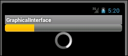
There are two types of ProgressBar; the horizontal one that progresses classically until it reaches 100%, and the circular one that keeps turning around until you cut it. The following figure shows both types on top of each other. The horizontal one is at the top and the declaring code is exposed by the following code sample:
ProgressBar pb = FindViewById<ProgressBar> (Resource.Id.progressBar1);
- The code for creating a reference to ProgressBars is the same for both types of this particular form element. How can the Android platform display it differently? If you look inside the
.axmlfile corresponding to our activity on "source mode", you will see the following lines:<ProgressBar style="?android:attr/progressBarStyleHorizontal" android:layout_width="fill_parent" android:layout_height="wrap_content" android:id="@+id/progressBar1" />
- As you will have certainly noticed, there is a style property that can be filled by four different values:
?android:attr/progressBarStyleHorizontal
?android:attr/textAppearanceLarge
?android:attr/textAppearanceNormal
?android:attr/textAppearanceSmall
The first one corresponds to the horizontal one, whereas the last three define the different sizes of the circular one. Finally, you can set the value of a progress bar using the
.Progress()method, as shown in the following code sample:pb.Progress = 25;
- RadioButton and Groups:
RadioButton is basically the same as Checkbox, expects that, as same as for HTML, only on radio button of a group can be selected at once. We can create groups of RadioButtons, also known as RadioGroups, where we can pick only one option. Every single RadioButton, as for CheckBox, owns a method to know whether it's checked. Moreover, the RadioGroup also provides a method that returns the ID of the checked RadioButton. The four methods create a reference to RadioButton and RadioGroups and retrieve the checked values, as exposed here:
//RADIO BUTTON
RadioButton rb = FindViewById (Resource.Id.radioButton1);
Boolean isChecked = rb.Checked;
//RADIOGROUP
RadioGroup rg = FindViewById (Resource.Id.radioGroup1);
int selectedId = rg.CheckedRadioButtonId;
Once again, the trick behind the RadioGroup cannot be seen in the classical and graphical view. If we take a look at the XML behind the scenes, we will be able to see that the RadioGroup is just another form of markup containing a set of RadioButtons.
- RatingBars:
With RatingBars, we have a very curious and useful component. It's simply a form element composed of stars that customers use to rate whatever you have for them to rate:

As we can logically expect, RatingBar has a method to obtain the number of stars that have been checked:
RatingBar rb = FindViewById (Resource.Id.ratingBar1);
int nbStrars = rb.NumStars;
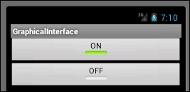
- ToggleButton:
A ToggleButton is similar to an interrupter. It has only two possible values: on or off. While the outcomes of the
.Checked()method will always betrueorfalse, the text, however, can be modified to fit your needs using theTextOn()andTextOff()methods:ToggleButton tb = FindViewById<ToggleButton> (Resource.Id.toggleButton1); Boolean isCheked = tb.Checked; //Modify the text tb.TextOn = "Some Option:On"; tb.TextOff = "Some Option:Off";
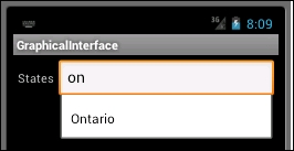
- AutoCompleteTextView:
There is one particular element that comes in handy for selecting states or countries. Indeed, this component is parametrizable to display preset values according to the user entries. In the following example, we will create
AutoCompleteTextView, which provides an autocomplete on Canadian states.- Drag and drop an AutoComplete element onto your GUI.
- Instantiate a static array of strings in the
MainActivie.csfile, shown as follows:static string[] CANADIANS_STATES = new string[] { "British Columbia", "Alberta", "Saskatchewan", "Manitoba", "Ontario", "Quebec", "New Brunswick", "Prince Edward Island","Nova Scotia", "Newfoundland and Labrador", "Yukon", "Northwest Territories",Nunavut"}; - Create a
states_list.xmlfile under theResources/Layoutfolder:<TextView xmlns:android="http://schemas.android.com/apk/res/android" android:layout_width="fill_parent" android:layout_height="fill_parent" android:padding="10dp" android:textSize="16sp" android:textColor="#000"> </TextView>
- Declare an ArrayAdapter:
An ArrayAdapter will be used to associate the string in the
CANADIANS_STATESparameter to user entries in order to propose his/her matching cases:AutoCompleteTextView actv = FindViewById<AutoCompleteTextView> (Resource.Id.autoCompleteTextView1); var adapter = new ArrayAdapter<String> (this, Resource.Layout.states_list, CANADIANS_STATES); actv.Adapter = adapter;
- Build and deploy your code. You should have the following:
There is not much to understand about form elements. Basically, we will always use the same method; to get a reference. We will always get a reference to the form element of interest by using the FindViewById generic method and after this, by using the specific methods of each element:
RadioGroup rg = FindViewById<RadioGroup> (Resource.Id.radioGroup1);
As we already saw, we will pass buttons and TextView through other common form elements, such as CheckBox, ProgressBar, RadioButton and Group, RatingBar, ToggleButton, and finally the AutoCompleteTextView. For each of these form elements, we will give the code used to create the reference and some insight on a few useful methods associated with this element.