
The splash screen of your application is, without a doubt, one of the images you should work hard on. The splash screen will appear every time your application is launched and will be displayed while your application is loading in the background. Usually, starting a full-fledged application takes a couple of seconds and you would want to inform your users that the application is starting by displaying a good-looking splash screen instead of a black screen. By definition, splash screens cover the entire screen and welcome your customers.
In order to follow this recipe, you must have Xamarin Studio or Visual Studio with the Xamarin Studio up and running. Then, create a new project named UsingRessources for experiencing the recipes in this chapter.
In order to display the splash screen, we will have to create an activity and a theme that we will apply to it. This can be done by following these steps:
- Create a
mySplashScreen.Themeinstance in a file namedStyle.xmlunder theRessources/Valuesfolder. - The following code presents the content of the
Style.xmlfile. As you can see, we have given a unique name to our style and defined two distinct items:windowsBackroundandWindowsNoTitle. These two items specify the picture we want to display and an option to not display the activity title, respectively:<?xml version="1.0" encoding="UTF-8" ?> <resources> <style name="mySplashScreen.Theme" parent="android:Theme"> <item name="android:windowBackground">@drawable/mySplashPicture</item> <item name="android:windowNoTitle">true</item> </style> </resources>Add your splash screen image under the
Resources/drawablefolder.We will use the following image, which is a work by SinhalaTik (http://www.sinhalatik.blogspot.ca) as our splash screen:

- Finally, the third and last step consists of creating the SplashScreen activity, which has a reference to our theme:
[Activity(Theme = "@style/mySplashScreen.Theme", MainLauncher = true, NoHistory = true)]
  public class SplashActivity : Activity {
    protected override void OnCreate (Bundle bundle) {
      base.OnCreate (bundle);
      // Some heavy business logic.
      StartActivity(typeof(MainActivity));
    }
  }
The MainLauncher=true option means that the current activity is the entry point of our application. Beside the MainLaucher instance, there are two new options: Theme and NoHistory. Obviously, the Theme parameter refers to the theme we just created for specifying the image that must be displayed as a splash screen. However, the NoHistory parameter deserves some explanation. An Android user can, using the back button, browse their activity history in the same way as the previous button on your Internet browser. Specifying NoHistory = true will prevent this activity from appearing in the history. Therefore, when users press the back button, they will not be able to see the splash screen again.
The following activity orchestration should appear:
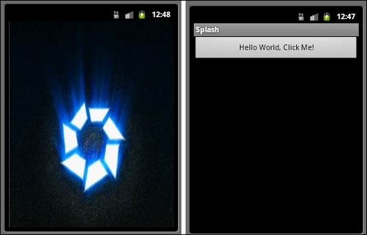
As you can see in the screenshot, the splash screen activity appears first without the activity title. Then, when the business logic is completed, the second activity appears.
Displaying a splash screen involves new kinds of object that are assignable to an activity: Android theme and style. We require these new concepts because we want the splash screen to be displayed even before the application starts loading. Indeed, there is no reason to use a splash screen if it only appears when the application is fully loaded. Using Android themes and styles will allow the Android engine to display whatever we define inside them, let's say a welcoming picture serving as a splash screen as soon as the user clicks on the application. Concretely, a style is a set of properties specifying the look and feel of a graphical element, such as TextView, and a theme refers to a style applied to an entire activity instead of a specific element.
Let's see what the style looks like and how to create and use styles. First, using a style will allow you to reuse the layout that you have defined in XML. For example, consider the following TextView layout from Chapter 3, Building a GUI:
<TextView
  android:text= "row1"
  android:textSize= "15pt"
  android:layout_width= "fill_parent"
  android:layout_height= "wrap_content"
  android:layout_weight= "1"
  android:text= "@string/row1"/>
This could be reduced to the following code snippet:
<TextView
  android:style= "@style/myStyle"
  android:text= "@string/row1"/>
This allows you to use only one style to set the look and feel of TextViews.
The concrete style file is another XML file which has to be created under the Ressources/values folder of your Android application. This file must have a <resource> XML root, which contains a set of <item> tags defining graphical properties. The following code shows the style file corresponding to the TextView element for Chapter 3, Building a GUI:.
<?xml version="1.0" encoding="UTF-8" ?>
<resources>
  <style name="myStyle" parent="@android:style/TextAppearance.Medium">
    <item name="android:textSize">15pt</item>
    <item name="android:layout_width">fill_parent</item>
    <item name="android:layout_height">wrap_content</item>
    <item name="android:layout_weight">1</item>
  </style>
</resources>
As you can see, the style markup has a name attribute that must be unique and will identify this style. We will refer to this unique name to apply this style to an element with @style/myStyle, as shown earlier. Also, style can have a parent, meaning that style still supports inheritance in the same way as objects do. Here, the parent is a platform style named TextAppearance.Medium, but it also could be another style that you have previously defined. As for inheritance in object programming, the child style will have all the properties defined by the parent file, and we can refine them.
The theme concept isn't physical as it is just referring to a style applied to the whole application or to an activity. Applying it is not rocket science. Indeed, you just have to specify it in the AndroidManifest.xml file by inserting the following tag for the whole application:
<application android:theme="@style/myStyle">
In case you only want the theme to be applied to one activity, the activity definition does have a Theme attribute, as shown by the following code:
[Activity (Theme = "@style/myStyle", Label = "Ressources", MainLauncher = true)]
Although Android performs extremely well resizing and scaling your images, you definitively should provide different image resolutions in order to adapt your applications to the screens they are displayed on. Several parameters should be taken into account. Some of them include the screen density, orientation, resolution, and Density-Independent Pixel (DP). While the orientation and resolution should sound familiar to you, the density and the density-independent pixel are trickier. The screen density refers to the number of pixels inside a given area. It also called DPI (Dots Per Inch). Using the Android platform, you have access to four different groups of density: low, medium, high, and extra high. The density-independent pixel is another concept that allows you to express a layout position or dimension in a density-independent manner. Therefore, you should use the density-independent pixels to build your layouts. The formula to convert from dp to pixel is px= dp x (dpi / 160). Hence, in a 580 dpi screen, 1 dp equals 3 physical pixels. Once again, the screens are divided into four different categories: xlarge (960dp x 720xp), large (640dp x 480dp), normal (470dp x 320dp), and small (426dp x 320 dp). All of these values are on at least basis.
To take advantage of the screen categories proposed by the Android platform, you just have to create a different layout folder according to the categories you want to support. The folder must be named as follows:
Resources/layout/main_activity.xml widthResources/layout-sw600dp/main_activityResources/layout-sw720dp/main_activity.xml
In the preceding example, we have three different layouts. The first one will be picked for a screen smaller than 600 dp, the second one for screens ranging from 600 dp to 720 dp, and the last one for anything bigger than 720 dp. The sw attribute stands for smallest width. Instead of the sw attribute, you can use w for available width or h for available height.
Refer to the complete Google guide to support multiscreen applications at http://developer.android.com/guide/practices/screens_support.html for more information about good practices.