
There are four different and preprogrammed layouts that you can use in Xamarin Studio. Layout means a special ordering of elements inside the activity. These layouts are Relative, Linear, Table, and Tabbed Layouts. In this section, we will learn how to take advantage of each of them.
- LinearLayout:
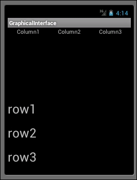
Let's now look at how to add new elements in it to see how it looks. The next code sample shows three linear layouts in order to display three columns followed by three lines. The first linear layout contains the two other ones. It's the default one. After this, the second one owns
android: orientation="horizontal"while the second one has the same argument, but is set tovertical, allowing us to create the following spatial organizations:<?xml version="1.0" encoding="utf-8"?> <LinearLayout xmlns:android="http://schemas.android.com/apk/res/android" android:orientation="vertical" android:layout_width="fill_parent" android:layout_height="fill_parent" android:minWidth="25px" android:minHeight="25px"> <LinearLayout android:orientation="horizontal" android:layout_width="fill_parent" android:layout_height="fill_parent" android:layout_weight="1"> <TextView android:text="Column1" android:gravity="center_horizontal" android:layout_width="wrap_content" android:layout_height="fill_parent" android:layout_weight="1"/> <TextView android:text="Column2" android:gravity="center_horizontal" android:layout_width="wrap_content" android:layout_height="fill_parent" android:layout_weight="1"/> <TextView android:text="Column3" android:gravity="center_horizontal" android:layout_width="wrap_content" android:layout_height="fill_parent" android:layout_weight="1"/> </LinearLayout> <LinearLayout android:orientation="vertical" android:layout_width="fill_parent" android:layout_height="fill_parent" android:layout_weight="1"> <TextView android:text="row1" android:textSize="15pt" android:layout_width="fill_parent" android:layout_height="wrap_content" android:layout_weight="1"/> <TextView android:text="row2" android:textSize="15pt" android:layout_width="fill_parent" android:layout_height="wrap_content" android:layout_weight="1"/> <TextView android:text="row3" android:textSize="15pt" android:layout_width="fill_parent" android:layout_height="wrap_content" android:layout_weight="1"/> </LinearLayout> </LinearLayout>The following screenshot shows the results of an activity displayed with the code that we just saw:
- RelativeLayout:
RelativeLayout, as its name suggests, ordinates elements in relative positions, meaning that for each element, you choose the alignment that they should take. For example, if we use
LinearLayoutcontainingTextView, followed by a button, the button will automatically get aligned to the left-hand side border of the screen. UsingRelativeLayout, we can align the button to the right-hand side part of the element at the top of it:<?xml version="1.0" encoding="utf-8"?> <RelativeLayout xmlns:android="http://schemas.android.com/apk/res/android" android:layout_width="fill_parent" android:layout_height="fill_parent"> <TextView android:id="@+id/textview1" android:layout_width="fill_parent" android:layout_height="wrap_content" android:text="What's your name ?"/> <EditText android:id="@+id/editText1" android:layout_width="fill_parent" android:layout_height="wrap_content" android:background="@android:drawable/editbox_background"android:layout_below="@id/textview1"/><Button android:id="@+id/button1" android:layout_width="wrap_content" android:layout_height="wrap_content"android:layout_below="@id/editText1"android:layout_alignParentRight="true"android:layout_marginLeft="10dip" android:text="GO" /> </RelativeLayout>The highlighted lines of the code show the
tdonateentattributes that we can use to ordinate the element. We can useandroid:layout_below=to specify which element must be below which other one using the latter's ID. Moreover, we can useandroid: layout_alignParentRight="true"orandroid: layout_alignParentLeft ="true"to set up the alignment. The following screenshot shows how the activity is displayed: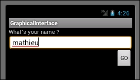
- TableLayout:
This layout is heavily used by Android programmers. Indeed, it separates the activity displayed into a table row of a table just as the HTML table does. In fact, the skin of the separation is a clean separator for anything you have to differentiate in your graphical interface. Finally, inside a table row, elements own
android: layout_column, allowing them to select in which column the element belongs. This creates a graphical interface as shown in the following screenshot, which has three different columns and five rows:
In addition to the
android: layout_columnattribute, we can see that an element without it will automatically be placed at the right-hand side if declared after an element owning this attribute. However, if it does not have the column attribute and is the first to be declared on the column row, then it will take its place in the first column.In the following code sample, we can also see the markup named
<View>, containing a height and color. These elements are the white lines separating the first two lines from the others:<?xml version="1.0" encoding="utf-8"?> <TableLayout xmlns:android="http://schemas.android.com/apk/res/android" android:layout_width="fill_parent" android:layout_height="fill_parent" android:stretchColumns="1"> <TableRow> <TextView android:layout_column="1" android:text="New Pic" android:padding="3dip" /> <TextView android:text="Swap-left" android:gravity="right" android:padding="3dip" /> </TableRow> <TableRow> <TextView android:layout_column="1" android:text="Love This One ?" android:padding="3dip" /> <TextView android:text="Swap-Right" android:gravity="right" android:padding="3dip" /> </TableRow> <View android:layout_height="2dip" android:background="#FF909090" /> <TableRow> <TextView android:layout_column="1" android:text="Share ?" android:padding="3dip" /> <TextView android:text="Swap-Top" android:gravity="right" android:padding="3dip" /> </TableRow> <View android:layout_height="2dip" android:background="#FF909090" /> <TableRow> <TextView android:text="X" android:padding="3dip" /> <TextView android:text="Some Other Thing" android:padding="3dip" /> </TableRow> <View android:layout_height="2dip" android:background="#FF909090" /> <TableRow> <TextView android:layout_column="1" android:text="Quit" android:padding="3dip" /> <TextView android:text="Swap-Done" android:gravity="right" android:padding="3dip" /> </TableRow> </TableLayout>The preceding code sample shows the entire table layout code.
- TabbedLayout:
The last layout that we want you to keep in mind is the most complicated one, but it is also one of the most used. It's a layout enabling you to have a tab in your application. TabbedLayout is not as intuitive as the three other layouts we have seen so far. Indeed, the declaration of this layout is made by a
<TabHost>markup, defining your activity as Tab capable. Then, you will have a LinearLayout containing two mandatory elements:TabWidgetandFrameLayout. At last, your code will contain the markups of the following code sample. Also, the ID ofTabHost,TabWidget, andFrameLayoutmust have the values of@android:id/tabhost,@android:id/tabs, and@android:id/tabcontent, respectively:<?xml version="1.0" encoding="utf-8"?> <TabHost xmlns:android="http://schemas.android.com/apk/res/android" android:id="@android:id/tabhost"> <LinearLayout> <TabWidget android:id="@android:id/tabs"/> <FrameLayout android:id="@android:id/tabcontent"/> </LinearLayout> </TabHost> - If you deploy this activity on your emulator, you will be pretty disappointed, as it does nothing except display a black screen. Indeed, since we just defined the possibility of using tabs, we will now have to implement them. The first thing is to modify the declaration of your
MainActivityclass inside theMainActivity.csfile, as shown in the following code sample, where theMainActivityclass is now a subtype ofTabActivityinstead ofActivity:-[Activity (Label = "Layout", MainLauncher = true)] - public class MainActivity : Activity +[Activity (Label = "Layout", MainLauncher = true)] + public class MainActivity : TabActivity
- Each tab is a separate activity in reality. Therefore, we have to create as many new activities as the desired amount of tabs. Moreover, the tabs are identified by a logo with some text, and we have to specify the logo we want to use. We will create a two-tabbed layout with a megaphone and mic.
- Since each tab is a separate activity, we have to create them. Create two activities—a mic and megaphone that contains the following code:
protected override void OnCreate (Bundle bundle) { TextView textview = new TextView (this); textview.Text = "Mic tab"; SetContentView (textview); } - The corresponding
.axmlfiles,mic.axmlandmegaphone.axml, contain the reference to the icon. Note that icons must be placed under thedrawablefolder and referred to without the extension (.png,.jpg,…):<?xml version="1.0" encoding="utf-8"?> <selector xmlns:android="http://schemas.android.com/apk/res/android"> <item android:drawable="@drawable/micOn" android:state_selected="true"/> <item android:drawable="@drawable/micOff"/> </selector> - Finally, you can programmatically create these tabs in the
MainActivityclass using the following code sample. It first creates an Intent using the type of the Mic Activity, just as we did earlier between activities in this chapter. Then, it asks for a new Tab and fills this tab with appropriate properties, such as the layout or title. You will also have to do this for the second tab—the megaphone:var intent = new Intent(this, typeof(Mic)); intent.AddFlags(ActivityFlags.NewTask); var spec = TabHost.NewTabSpec("mic"); var drawable = Resources.GetDrawable(Resource.Layout.Mic); spec.SetIndicator("Mic Tab", drawable); spec.SetContent(intent); TabHost.AddTab(spec); - It's done! To summarize the TabbedLayout, you have to make your activity implements
TabActivityinstead ofActivity, and then create as many activities as you need—one for each tab. Then, for each activity, specify a layout. Finally, instantiate these tabs in the main activity. The following screenshot shows the TabbedLayout in action: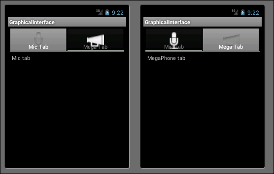
Layouts provide a special environment to work in. When you select a layout, your elements will be put on the screen according to the layout that you pick. Therefore, you have to know the advantages of each of them to make a sound choice. Despite their importance, it's fairly simple to understand what they do, and how to implement them. Indeed, to declare a specific layout for our applications, we use, as usual, the .axml file related to the targeted activity.
In order to identify which layout is currently used for your activity, you can open the source view of the .axml file, and check the second line. The following code shows the code for the LinearLayout, which is the default one:
<LinearLayout xmlns:android="http://schemas.android.com/apk/res/android"
  android:orientation="vertical"
  android:layout_width="fill_parent"
  android:layout_height="fill_parent"
  android:minWidth="25px"
  android:minHeight="25px">
</LinearLayout>
If you create your elements manually, place them inside the Layout markup. Also, we can create many layouts in the same activity.