
According to Google's Our Mobile Planet data (http://services.google.com/fh/files/blogs/our_mobile_planet_us_en.pdf), an average Android downloads 26 applications in addition to the already-installed ones. So, we can easily assume that your application will be hidden somewhere in the other 40-50 applications of your users. How can we catch the eyes on both the Android market and the applications' menus? This can be done using a recognizable icon. This recipe will show you how to change the default icon on Android.
Using the following steps, we will see how to use an icon in our application:
- Find or create a logo representing your application/company.
We will use the following icon:

- Place your logo under the
Resources/drawablefolder. - Modify your
AndroidManifest.xmlfile underPropertiesfolder as follows:<?xml version="1.0" encoding="utf-8"?> <manifest xmlns:android="http://schemas.android.com/apk/res/android" android:versionCode="1" android:versionName="1.0" package="Splash.Splash"> <uses-sdk/> <application android:icon="@drawable/icon_name" android:label="Splash"></application> </manifest>
All attributes but
android:iconshould already be in the file. - Deploy your application on the emulator again.
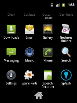
The application will start as usual, however, if you browse back by pressing the Home button or the Back button, you will be able to access the application menu and see the new logo, as shown in the following screenshot:
There is not much to understand about icons. Icons are images with a 48 x 48 pixel size. The default icon of your application will look like this:

This image is stored under the Resources/drawable/Icon.png folder. This picture is used both for the Android Play Store and the application menu on the phone.
Here is some additional information recommended by Google.
The required size of Google Play Store icons—the ones that the users will see while browsing through the market—is 512x512 px, due to the ability of users to browse through the market using a laptop and not only a phone. This logo will be demanded by Google while submitting your application to the market.
Keeping this in mind, I encourage you to design your icons using vectors capable software, such as Abobe PhotoShop.
In order to get a bigger visual impact, your icons should be a distinct three-dimensional silhouette. Also, your icons should have a little perspective, as if viewed from above. This way, users will be able to see depth in your icons and therefore, they will be highlighted compared to the background and other icons around.
Iconography is a wide domain, you can find more on this at http://developer.android.com/design/style/iconography.html.