Chapter 1
ZBrush as a Character Design Tool
In the past few years ZBrush has gained an enormous amount of ground among professional concept designers as a fast way to develop organic ideas for character design. This process has many advantages over traditional clay or painting techniques. For example, ZBrush allows you to implement real-time edits while sitting in front of a director, taking feedback as you work. With this approach, quick variations can be created and compared so you can be sure the best solution is arrived at as soon as possible. This work flow has gained significant popularity as it can greatly enhance and speed up the design process.
Another advantage of this approach over conceptualizing designs in clay is that there is far less of a wait for sculptural changes to be made. In most cases, massive design alterations can be implemented in a matter of seconds! In addition, with the ZBrush layers tool variations on the sculpture, texture or color can be stored on a single model and compared to each other. You can even use the ZBrush timeline tools to examine how the character may move or change shape. This kind of digital work flow offers huge advantages for everyone from the designer to the director and the artists in the production pipeline who will eventually bring the design to life.
With all these advantages, one of the strongest benefits to using ZBrush as a character concept tool is the ZTool itself. Once a character design is approved, there is a 3-D model already in existence. This ZTool can be passed on to the artists in the models and textures departments. There will be no need to remodel the concept design. The artists will be free to create animation-ready models of the design for further development. It is often in this stage that more changes are made to a character. I feel that the design process is not done until the final shot is on screen. The process is evolutionary, and there are many artists involved in the journey.
In the recent ZBrush update, Pixologic has created new tools that allow the same level of gestural intuitive design to be applied to mechanical and hard surface forms as well. We will look at using these tools to create mechanical elements for our biomech design.
One unique application of the digital assets created in ZBrush is the 3-D printer or mill. Anything created in ZBrush may be printed as a digital maquette for reference to other departments. There are several low-cost companies offering this service to the public, and the prices will only continue to drop while print quality improves. We will look at how to prepare a model for exporting and 3-D printing to create a physical design maquette. Figure 1-1 shows an actual design maquette created in ZBrush and printed on a 3-D printer. There are even situations where I have created full-sized props by sculpting in ZBrush and having the data milled into foam and further finished by sculptors and other artists. The possibilities for this tool really are endless, and new avenues continue to open up.
Figure 1-1: This digital sculpture was printed on a 3-D printer from a ZBrush file to create the central figure in this maquette. This is a design for a monumental public sculpture created at Weta Workshop, courtesy of the Wellington City Council.
First Things First: Some Notes on Conceptualization
Before we jump into the examples and lessons of this book, let’s take a look at some useful guideliness to help you make design decisions. The following are a selection of guidelines and helpful considerations I try to keep in mind as I work. The idea is to familiarize yourself with thinking in these terms so these questions and approaches come naturally when you try to solve a design problem.
Realism and Expectations
One of the things I always try to do when creating a character is to anchor as much as possible in reality. This usually manifests as basing creature anatomy on real-world animal or human anatomy. When working on a creature, I will often try to draw elements from real world sources to ground the design in a sense of reality. Figure 1-2, for example, is a design by Paul Komoda that pulls elements from a variety of real-world seal life to create an intimidating new design. The same approach holds true for biped physiology as well. This helps make the creature more believable to the viewer. We recognize what an actual body looks like, and when confronted with a distorted form, it makes the character seem all the more compelling if there are elements we recognize from ourselves. Figure 1-3 shows a biomech with physiology based on the human shoulder girdle. You can see that there are recognizable shoulder muscles such as the pecs and deltoids as well as the mechanical forms molded into the shapes of collar bones and a rib cage.
Figure 1-2: This creature carries many elements pulled from various natural sources to help ground the design in reality; the parts are unified by being arranged into a strong overall design or silhouette. (Krishnu by Paul Komoda)

Figure 1-3: The shoulder structure of this biomechanical character is based on human anatomy.
Breaking Expectations
Try to break from the viewer’s expectations as much as possible. There have been thousands of creatures and characters made for film in the past 100 years. If you want to be a successful designer, you must not only capture the audience’s attention, you also must show them something that is appealing and looks new. This is best accomplished by deciding what the expectations are and what the clichés are, and then finding ways to break those expectations. The triangle of the face is one example we use in the book as well as stretching the space between the facial features to subtly play on audience expectations. One of my favorite examples of breaking expectations is The mouth of Sauron from The Lord of the Rings (Figure 1-4). This character breaks the audience expectation about the size and placement of the mouth and removes any other facial features that would allow us to relate to the character.
Figure 1-4: Here the mouth of Sauron shows how expectations in the proportions and placement of features can be broken to great effect. Image courtesy of Weta Workshop

Creature vs. Character
When working on a design, it is often important to ask yourself whether this is a creature or a character. Is this an animal with emotions we can relate to, and does it have an internal life to which the audience is privy? If it does, it is a character with drives and emotions. A creature is more of a monster or an animal the viewer cannot relate to. These tend to be motivated by basic needs such as food, hunting, power, or the desire to simply be left in peace. A peaceful beast of burden and a ferocious hunting beast are both examples of creatures, whereas an alien who wants to communicate with our race, for good or bad ends, is a character. This is important because it helps us understand what we need to communicate with the design. A character (good or bad) needs some way for the audience to connect and empathize. This usually occurs in the eyes. A creature only needs to appear to be a viable life-form that is suited to the task it is portrayed to undertake. A beast of burden needs to appear to be bred to carry packs across the land, while a ferocious hunter beast needs to look like a powerful, fast, and dangerous predator. When finding a point of reference for the viewer, we have already said how familiar anatomical details can create a sense of veracity, but this won’t help us relate. I find the key to relating to a character is in the eyes (Figure 1-5). If you give your character deep eyes with a sense of emotion or inner dialog, the audience will be drawn in and, hopefully, interested in what’s happening in the mind of the character. Consider creatures like E.T., Gollum, and the Na’vi: they all have eyes that communicate. Creatures like those in Alien, Predator, and Jaws have eyes that are impossible to relate to—they lack humanity and are therefore even more terrifying as a force of nature you cannot reason with! We will take special care to look at techniques to paint realistic eyes on our characters that communicate emotion.
Figure 1-5: The eyes will be a natural focal point for the viewer. Eyes that communicate humanity will inspire empathy, while eyes that veer away from human traits will inspire distrust or fear.
Visual Development in Thumbnails and Quicksketch
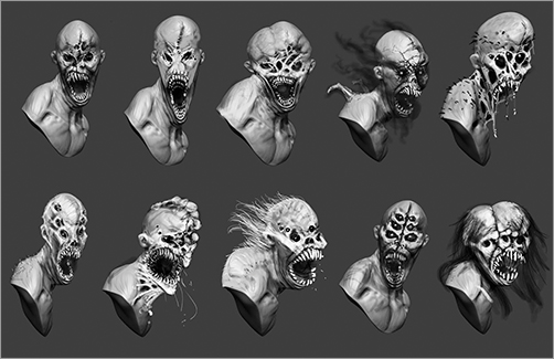
As you start working up ideas, try to avoid jumping right into the final sculpture. Allow yourself the time and space to explore thumbnails and see where the design journey may lead. You will find your best ideas come not in the first 10 or even 20 attempts. You may hit on ideas of great originality 30 or 40 ideas in. You cannot do 40 finished ZBrush sculptings in a day so you must explore in thumbnails. This can be accomplished as quick sketches in ZBrush, as we will do in Chapter 2, “The Character Portrait: Sculpting the Alien Mystic” (see Figure 1-6). Thumbnails don’t need to be finished drawings; they can be messy little sketches for your own use only. The point is to get ideas and shapes done so you can evaluate them against each other. You may also do this in pencil on paper or even with a small ball of clay. The important point here is to not jump into your first idea—explore and take a design journey to the best solution to the problem. Figure 1-7 shows a series of design explorations by Bryan Wynia. Bryan uses grayscale values to paint over a ZBrush sculpture and create several striking character options quickly.
Figure 1-6: Silhouette thumbnails created in ZBrush
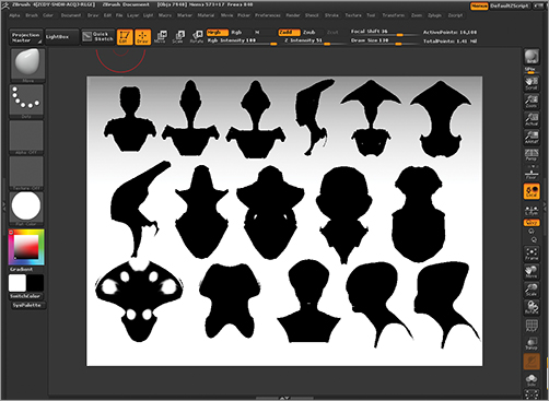
Figure 1-7: A series of character concept options by Bryan Wynia. Bryan paints in grayscale over a ZBrush sculpture to generate multiple characters quickly.
In this section we will look at some of the major design considerations that we will revisit over the course of this book. These are just a few of the important lessons we can use to inform our choices as we work on a design. I hope reading over these tenets will help you understand why I make some of the choices I do as we work through the lessons. I will often refer back to these concepts, and when I work, I try to keep them in the back of my mind as a set of guidelines to help steer the artistic decision-making process.
These tenets represent concepts drawn from the varied disciplines of graphic design, sculpture, and painting, and each of which will come up as we work through the projects in this book. Ultimately these all apply across multiple media because the rules of good art are consistent whether you are using clay, pixels, Pixols, or paint. That’s why we have so much to gain by looking back at the art instruction of painters, sculptors, and photographers. Just because we are using a computer doesn’t mean those lessons are invalid. Rather, it’s even more important now to understand how artists arrive at pleasing images. When I approach a design, I try to keep these tenets in mind at each stage of the sculpture or painting. They represent some fundamental concepts in art and design, and you will benefit from trying to remember them as you work on your own designs.
Sculptural Considerations
ZBrush is the primary tool used in this book. In almost all of these lessons we finish the design illustration in Photoshop, but the primary toolset remains sculptural. For this reason, I think it is important to revisit some of the sculptural lessons we discussed in my other books. These concepts apply even when you are painting because the same rules for making good art apply across all media.
In my previous two books we discussed the three tenets of sculpture: gesture, form, and proportion. These are so important that I want to reiterate them here. When working up a sculpture (or any image for that matter), you want to ensure that the figure retains a clear and compelling gesture. Second to gesture is form, and last is proportion. Before we explore other key sculptural concepts, let’s review these three.
Gesture
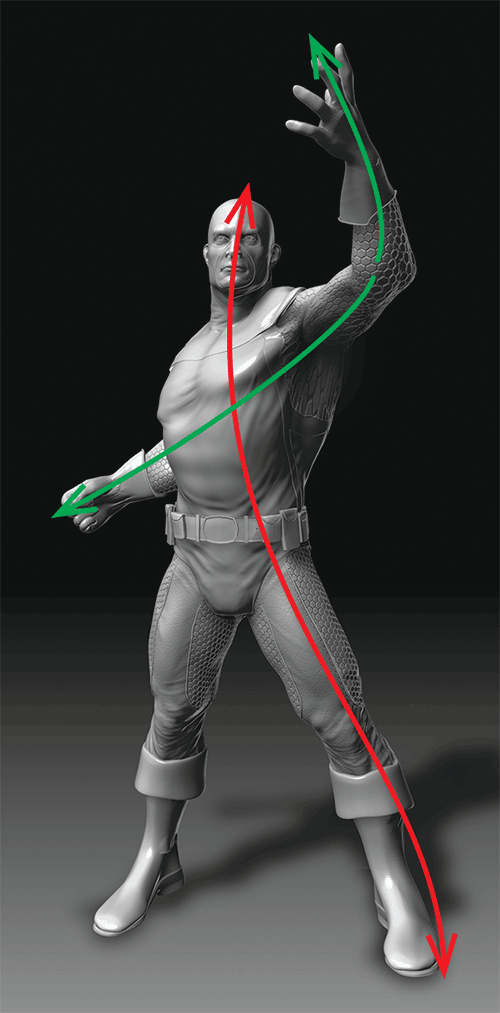
Gesture represents the life or motion inherent in a figure. It can be expressed in the action line drawn through a figure that communicates the thrust of its pose. When working on a figure, instill a sense of life in the pose by maintaining a strong gesture. Figure 1-8 shows a neutrally posed figure with a good gesture sketched in. Many of you may be familiar with the concept of gesture drawing. This is an invaluable exercise where you try to capture the figure with a series of action lines rather than the outlines of the figure. It’s very effective for training yourself to see the life in a pose (Figure 1-9). By practicing life drawing as much as possible from both humans and live animals, you will develop a keen eye for the short pose. This means you will be able to quickly recognize and capture the lines of action in a figure. Sensitivity like this helps designers keep life in their work.
Figure 1-8: A neutrally posed figure with gesture lines drawn in shows that even a figure at rest should have some gesture in the pose.

Figure 1-9: Be aware of the gesture or lines of action in the figure.
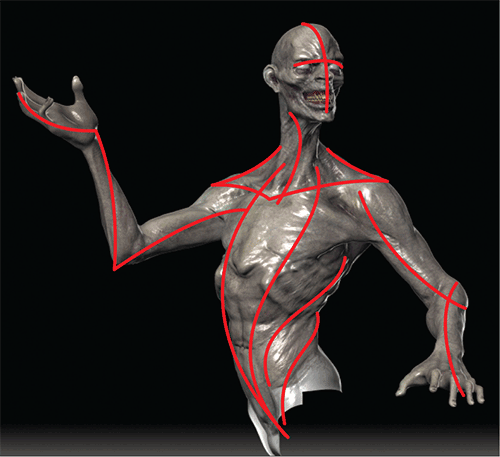
Gesture is important because it instills a figure with a sense of spring or life. It can mean the difference between what looks like a lifeless, stiff 3-D model and a living character. Gesture is especially important when posing figures. By being aware of the direction or thrust of the pose, you can effectively set up a dynamic composition for your final image (Figure 1-10 and Figure 1-11). Figure 1-12 shows a character that has been posed in a dynamic position with special attention paid to maintaining exciting lines of action throughout the body.
Figure 1-10: Gesture lines drawn over a sculpture to illustrate the action in the pose

Figure 1-11: This figure drawing was created by first trying to capture the gesture of the pose.
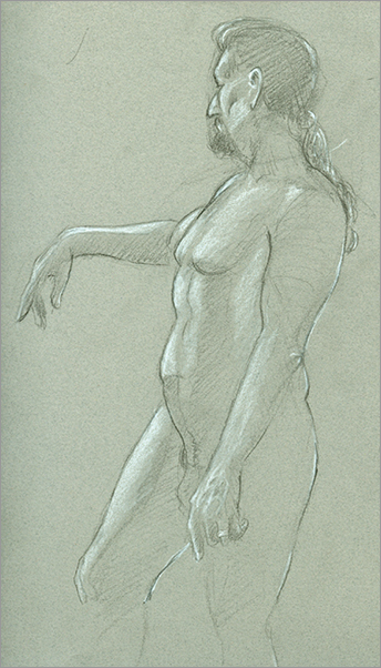
Figure 1-12: A character in a dynamic pose
Form
Form represents the shape of a thing as defined by light and shadow playing across the surface. In Figure 1-13 you can see how removing all light and shadow reduces the sculpture to just the silhouette. When working on a character, you want to define form as fully as possible, making sure it is resolved before you must move on to the next stages. Form is the difference between a soft-looking character and one that feels like it has structure and anatomy. One example of how well-resolved form is important is when you need to represent the contrast between bony, hard shapes under skin and soft, fleshy ones (Figure 1-14).
Figure 1-13: Form is defined by light and shadow.

Figure 1-14: In this detail, you can see how the soft, fleshy forms of the cheek and eye contrast against the hard, angled forms of the cheekbone.

There are often cases when you are working under an extremely tight timeline, and you must finish the sculpture and have it painted in a matter of hours. If you skip any step in the process, do not skip refining the form. Given the choice between form and detail, sacrifice the details, as they do little to sell the realism or beauty of the sculpture, while the form is part of what makes it come to life. A colleague of mine from the Gnomon School of Visual Effects, John Brown, one of the best figurative sculpture professors I have ever met, has a wonderful method of breaking down the hierarchy of form. I will try to do it justice here but I highly recommend his DVD series, available from www.figuresandfocus.com, which has some of the best sculpting educational material on the market! John considers form in three classes: primary, secondary, and tertiary. Primary forms are the biggest shapes of the character—the skull, nose, and ears for example. Primary forms are those most basic shapes that make a recognizable head. Secondary forms are things like folds of flesh and fat rolls (Figure 1-15). These are details that add character to the face. Tertiary forms are the fine details, such as pores and wrinkles.
Figure 1-15: Primary, secondary, and tertiary forms examined

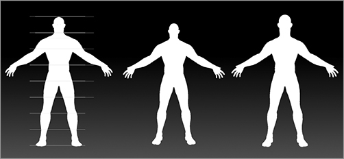
Proportion
Proportion is the relative size between the parts of a figure. Proportion can help define how we perceive a figure. Notice how the figure with a larger head naturally appears shorter in silhouette (Figure 1-16). Proportion plays an important role in character design in that the same rules that apply to a human also apply to creatures. That means that a large head on a body tends to make that creature look shorter or younger, while a smaller head makes the body look massive and more imposing. You can subtly influence how the character is perceived by being cognizant of the rules of proportions and deliberately manipulating them.
Figure 1-16: In silhouette it becomes clear that altering the head size changes the perception of the relative size of the figure.
Shape Considerations
In this section we will look at how to intelligently use shapes and their interactions as a tool in design. By being aware of how shapes interplay through rhythm, balance, contrast, and other aspects of shape language, we can be sensitive to the overall appearance of our characters. In this section we will learn how the silhouette or overall shape of the character is the most important element in the design. By learning how to look at and manipulate shapes, we will have more control over creating compelling creatures and characters.
Silhouette: The Overall Shape Outline
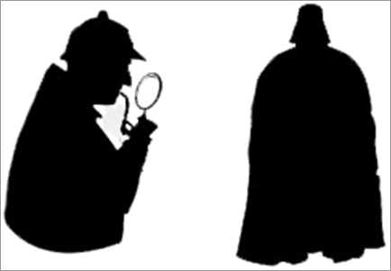
One of the most important aspects of the overall character design is the silhouette. This is the outline of the character, the overall shape. Some designers call this “the first read” because it is the first impression the viewer gets of the character or object when looking at the image. The eye registers the outline first, then fills in the internal details. For this reason it is important to create an iconic silhouette. By “iconic silhouette” I mean a graphic outline that is bold and memorable enough to become iconic. Picture the shape of Darth Vader’s helmet or Gandalf’s hat. The images spring easily to your mind because those are iconic shapes. Figure 1-17 shows several characters in silhouette. Notice how each has a character and interesting form, which is communicated even in this black-and-white shape.
The silhouette must be strong to create a sense of the iconic. Iconic silhouettes lead to memorable characters. If the silhouette is plain or uninspired, the character may not leave a strong impression. Take, for example, the silhouettes in Figure 1-18. There is no question as to who the illustrated characters are. This is why iconic silhouettes are so important. They allow you to identify a character at a glance, and they imprint on the consciousness. It’s the same principle in logo design and graphic design. As a matter of fact, some of the best designers I know have extensive experience in graphic design. This attention to big graphic shapes informs their design work, enabling them to create strong iconic designs.
Figure 1-17: A selection of character designs in silhouette

Figure 1-18: Because of the iconic nature of their designs, these silhouettes should remind you of other characters.
Shape Language
When I talk about shape language I am referring to how the shapes of a character relate when broken down into their simplest forms. It can also be called shape relationships. Most characters can be resolved to spheres, ovoids, boxes, or cylinders. Look at these shapes and observe how they are stacked in space. Are the proportions between them appealing? Do the relative sizes change or are they consistent? It is usually best to try for variation (Figure 1-19).
The concept of shape language is often found in graphic design. By “shape language” I mean the type of shapes you use and how they relate to one another. For example, are you using predominately ovoid shapes and are they contrasted with a more rectangular shape? This represents a use of contrast in your shape language. Alternately, you could compose a creature of predominantly a single kind of shape. The image in Figure 1-20, for example, represents an alien head composed entirely of ovoid forms. This approach can be a bit dull because there is no sense of contrast or tension beyond the variation in size and rotation of the ovoid shapes. Adding contrasting angled shapes creates a different and interesting shape relationship. You have contrast between the ovoid forms and the angular forms (Figure 1-21). You can see this in practice in Figure 1-22.
Figure 1-19: Basic shape relationships and interlocking of forms in a character
Figure 1-20: A head in silhouette composed of all ovoids

Figure 1-21: Here we see contrast with ovoid shapes by the introduction of angular shapes.

Figure 1-22: Here you can see this kind of contrast applied in the combination of soft, spherical and hard, angular forms in this character.
The concept of shape language extends to more than just the silhouette of the figure. I will often try to visualize the character as being composed of basic forms. Then I will examine how those basic shapes interact. Figure 1-23 shows a character broken into simple volumes, while Figure 1-24 shows the same for a human figure. Understanding how to recognize and manipulate the graphic shapes in your characters is an important step to being able to control how you communicate with your designs.
The following are some things I keep in the back of my mind while I work on the shapes and forms of a character. These don’t need to be conscious considerations on a checklist as you work. It’s best to read this section and be aware of how these structures manifest. Look for them in other work, and they will inevitably creep into your own design language.
Figure 1-23: A character broken into simple volumes to examine the shape relationships

Figure 1-24: A human figure broken into simple volumes and planes

You may also seek inspiration from nature. Collect as many photos of plant, animal, fungus, and landscape formations. Nature has devised every combination of shape and color at some point, and you can do no better than to reference and evaluate from this resource. I keep a very large folder of photo references divided by subject. This is in addition to the reference library of books and magazines that I often page through for general inspiration.
Organizing Shapes
Shapes can be organized in different ways to different effects. Here we will look at how shapes are organized into configurations of rythym, balance, and contrast, and how shapes can take on visual weight.
Rhythm
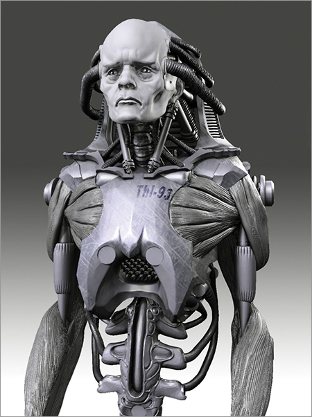
When working with a character, I will sometimes look for interesting rhythms within the placement of the shapes. Rhythms create a sense of structure and balance through repetition. Figure 1-25 shows an abstract design created by the rhythmic repetition of elements. For a practical look at this in action, Figure 1-26 shows a character with a repetition of shapes throughout the design. Notice how the large curved forms echo throughout the bust. This creates an appealing visual motif that repeats through the form and unifies it into a single visual composition. It is not a coincidence that rhythm is a musical term in most minds. When used effectively, it creates the same sense of underlying structure that a solid drumbeat maintains in a song.
Figure 1-25: Shape rhythm explained with basic shapes
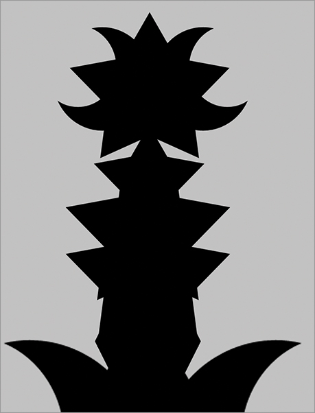
Figure 1-26: A character with a rhythmic repetition of shapes
Designer John Mahoney suggests a great tip for using music while you work. Pick a specific piece of music that fits the character and keep it playing while you sculpt and paint. This helps keep your mind “in character” and focused on the mood and attitude of the character you are designing.
Balance
Balance is the equal distribution of elements (Figure 1-27). You may also find that some designs require a sense of balance. Balance works well in some situations, but too much balance can be very boring. In nature nothing is ever symmetrical: there are always subtle variations. There are situations where symmetry and balance may be desired to communicate something cold, brutal, or immobile such as a robot or biomech perhaps (Figure 1-28). Balance can also imply strength and stability.
Figure 1-27: The principle of balance illustrated with simple geometric shapes
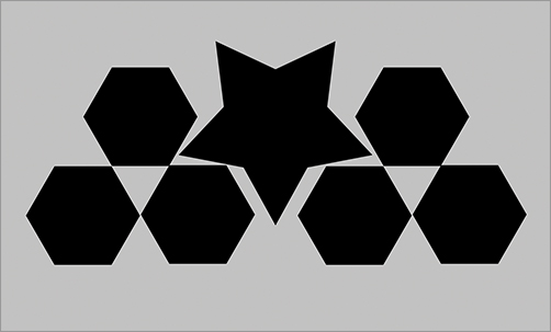
Figure 1-28: Balance was used to add a sense of industrial coldness and strength to this biomechanical design.
Contrast
You can get interesting effects if you break from balance by introducing the principle of contrast. Depending on the effect you want, you can either balance or contrast your forms. I find it’s best to contrast and try to avoid perfect balance in most cases. The degree of contrast will, of course, impact the effect you get. Balance is rarely interesting, as it does not create any sense of tension. Figure 1-29 shows contrast and tension by clustering the shapes in an asymmetrical manner. One practical example of where contrast is useful is when experimenting with proportional variations in a character. Interesting effects can be achieved by contrasting a large upper body with a smaller lower body, for example (Figure 1-30). This represents a contrast of forms.
Figure 1-29: Contrast in basic forms

Figure 1-30: Contrast between body forms is seen here with the large torso and small legs.

Visual Weight
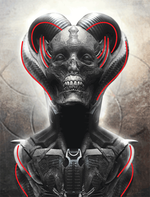
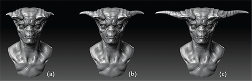
Visual weight is a very important consideration. The relative size and placement of a shape can give it more visual weight than others on the screen (Figure 1-31). This can accentuate a design element for good or bad effect. For example, the shapes of these horns in Figure 1-32 carry more visual weight the larger they get. When the horns are smallest, as they are in image A, they serve no real purpose on the design; they add little to the overall effect. In image B they carry a little visual weight but not enough to make the overall effect feel special. They read as just decoration. When the horns are at their largest, as in image C, they become a design statement. This is a bolder approach to the horns that creates an interesting character bust because there is a dynamic tension between the character’s head and the massive sweeping horns.
Figure 1-31: The concept of visual weight illustrated with basic geometric shapes

Figure 1-32: Visual weight applied to the horns of a character
Many of the best designers I know have a graphic design background. They have a solid and thorough understanding of how basic 2-D shapes interact and create compelling combinations. They use this information to inform their designs of creatures, characters, and costumes. These basic lessons of art and design apply to everything from the simplest shape to the most complex creature design. In the end, we are always just moving shapes and color to influence the perceptions and feelings of the viewer. Collect examples of strong, easily read graphic design to add to your reference folder. Just the act of learning to recognize good abstract design is valuable. It’s even better to analyze why you respond to some designs over others. This helps you determine what makes a particular layout appealing.
Design Statements and Features
A design statement is an element of the design that can be considered key, or part of what makes that particular design unique. The term is sometimes interchangeable with design feature. You want to make sure every design has at least one statement. You can have multiple statements, but if you get too many, you end up with elements fighting each other. Determine the design statement in your favorite characters. Frankenstein’s monster’s flat head is a statement; Predator’s mandibles and dreadlocks are statements. By these examples you can see how it is important to pick out elements and make them features that will make the design special rather than just decorate it.
Anatomical Considerations
When working up a creature, I consider the physiology and biology in terms of its natural world counterparts. A powerful carnivore, for example, will tend to have large, crushing masseter muscles in the jaw. Figure 1-33 shows the substantial surface area given over to the jaw muscles of a carnivore.
This physiological detail is important because we subconsciously pick up on those shapes and cues. By creating a character with large, powerful jaw muscles, we tell the viewer that the character or creature is strong and potentially dangerous. This is because we are cued into those kinds of subtle details when we observe other animals, including people.
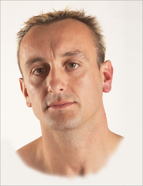
Look at the highly developed masseter muscles on a muscular male (Figure 1-34). These are a result of intensive training of the neck and shoulders as well as low body fat. Typically, a strong jawline is partially created by pronounced masseter muscles: this tends to denote strength.
Figure 1-33: This skull shows the large surface area given over to the jaw muscles of a carnivore.

Figure 1-34: The masseters on this muscular male are pronounced, which add to his strong jawline and appearance of strength.
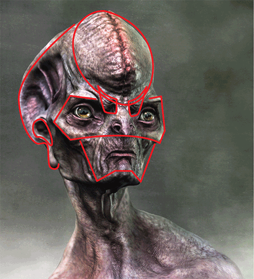
Strong effects can be achieved by breaking the norms of the proportions of the face or body. For example, eye spacing has been used to great effect in several recent character designs to break with norms (see Figure 1-35).
Figure 1-35: This figure shows the uncanny effect created by breaking the normal proportions of the face.
Culture and Lifestyle Considerations
Lastly, it is equally important to get an idea of how your character lives. What is his world like? How does he prepare food? Does he hunt or farm? Is he peaceful or warlike? As many details as you can gather or invent will inform the decisions you make with a design.
Figure 1-36 is an illustration by designer Paul Tobin. Notice how the design is filled with small, unique details that communicate a sense of culture and place. From the tattoos to the choice of weaponry, the character looks like he comes from a specific culture with a specific level of technology. Visual cues like these are important to consider and include whenever possible. These same considerations can be extended to the manner in which a creature interacts with its environment. A quadrupedal alien with opposable thumbs on all four limbs will interact differently with his world from a biped with two hands.
Figure 1-36: This character design by Paul Tobin features many details that portray the character’s culture and backstory.
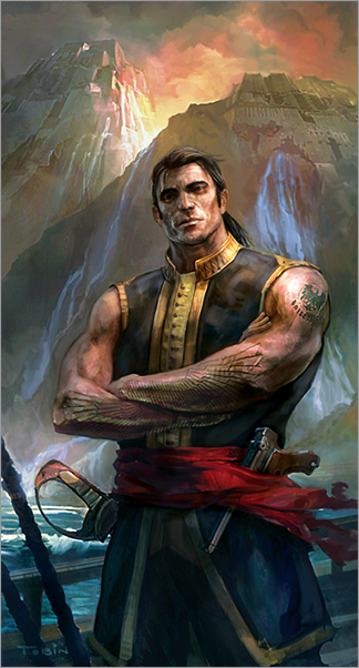
Even if the viewer is not aware of the backstory, consistent details like this inspire a sense of cohesion and reality to the design. The viewer will pick up on these details, and nothing will feel contrived or out of place. These kinds of considerations help to sell the character and make it feel real.
About Color
In the course of many of the lessons we will be painting color on the character. Color will come into play when we make skin markings as well as when we light and place the figure in an environment. Don’t panic at the thought of color theory. It may seem complex, but there are a few simple concepts we will be using here. When gathering reference materials for your personal library, don’t neglect books and magazines such as National Geographic. Anthropologists who study the development of human cultures often document beautiful and expressive color languages that are unique to different cultures across the planet. Tasteful color designs can be created by sampling from the existing palettes in use by any number of peoples. For creature design you may also sample color directly from an existing skin texture. Aquatic animals have vibrant and interesting skin colorations that lend themselves to use in alien life.
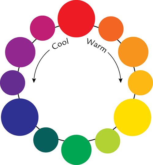
The Color Wheel
The color wheel is the basic tool for using and understanding color (Figure 1-37). The wheel is read by finding the primary colors red, yellow, and blue (Figure 1-38). These colors cannot be mixed from other sources; they are pure primary colors. The secondary colors, green, violet, and orange, are created by mixing primaries (Figure 1-39).
Tertiary color is created by mixing two secondary colors together (Figure 1-40).
Figure 1-37: The color wheel
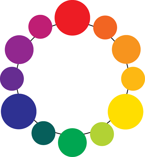
Figure 1-38: The primary colors

Figure 1-39: The secondary colors
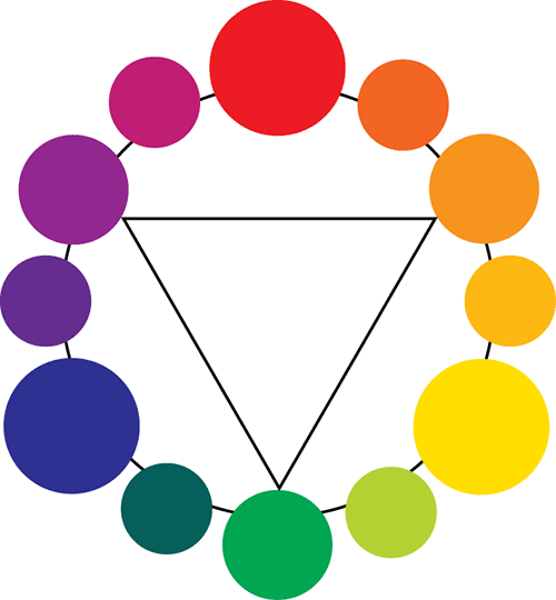
Figure 1-40: The tertiary colors
You will rarely have to “mix” color on your computer screen. You will merely select it from the color picker. It is important to understand the color wheel because it shows us what colors are complements to each other, meaning what color is directly opposite on the color wheel. These complements create color contrasts that can be useful when trying to create visual interest. Mixing a complementary color into a composition can create a focal point and draw the eye or simply help make a very dull paint scheme more vibrant. One of my favorite complements is violet and green. If you add the complement to a color you will desaturate it. We will talk more about saturation below.
Temperature
Temperature refers to the relative warmth or coolness of a color. Figure 1-41 shows the color wheel broken into warm and cool. Notice, though, that even when dealing with a “warm” color such as red, you can move toward a cool or warm hue depending on the side of the wheel you move toward. Remember that color temperature is relative. You can have warm and cool reds or cool and warm blues.
Figure 1-41: Reading temperature on the color wheel. Moving toward red is warm and moving toward blue is cool.
Temperature is most valuable in that warm colors tend to look like they are advancing toward the viewer while cool colors recede (Figure 1-42). I use this tenet when working on the background of the design. I try to keep my backgrounds cool and my figures warm or vice versa. That way there is a temperature contrast that helps separate the character from the backdrop (Figure 1-43). This concept can also help when defining rim light on a character. In Figure 1-44 you can see the key light or main light on the figure is warm while the rim light is a cooler blue hue. This helps create visual interest though contrast, and it also uses the rim light to help carve out the figure from the background. Always avoid broad flat lighting with no temperature contrast or rim lights, as it creates a very bland image with little depth.
Figure 1-42: Warm and cool advance and recede with basic shapes.

Figure 1-43: Using temperature contrast to pull the character from the background
Figure 1-44: Cool rim light example by Bryan Wynia
Saturation
In the course of the book, we will often be altering the saturation of a color. Saturation is the relative vibrancy or purity of a hue. Figure 1-45 shows a color through various stages of desaturation. Desaturating the colors of a design has a calming effect on the eye: it can make the image easier to look at by reducing the vibrant nature of the digital color and provides the same slightly neutralized look of a traditional paint palette. Remember that mixing the complement into a color will desaturate it. Many painters will slightly neutralize their colors to get this effect.
Color saturation is also a function of perspective. A color will lose saturation the further it gets from the eye. This is useful when trying to separate a figure from the background to create a sense of depth in the image. Parts of a character that are receding from the viewer can be desaturated further to make them recede from view. (Figure 1-46). This also means that areas closer to the viewer will have a higher color saturation and therefore be a natural focal point for the eye, drawing the viewer’s attention. By being aware of this aspect of color saturation, you can hold the viewer’s gaze in certain areas of the image based on where the color is most saturated.
Figure 1-45: Here you can see red at full saturation at the top of the strip. As you move down, the color desaturates.

Figure 1-46: An example of receding areas losing color saturation. The top image is fully saturated while the bottom has a gradual falloff in saturation as the figure recedes from the viewer.

Composition
In this section, we will touch on some considerations for how to compose the image in the picture plane. We will look at focal points and how to arrange them in an image. This is a brief introduction to these concepts. We will be looking at composition in far more depth in the lessons themselves.
Focal points
Once you are ready to light and render your character to take it into Photoshop for the final painting passes, it’s time to consider how the character will be experienced by the viewer. When creating the final image of your character, you should consider the moment when the viewer first encounters the subject in the image. Seek to create a dramatic and exciting moment in time. You will need a focal point for the image. This is arguably the most important placement in the image—the first point the viewer should look when they see the image. I often keep the character’s eyes as a focal point by their placement in the picture plane. Some of the methods to draw the viewer’s attention to a focal point are with light, placement, color contrast, or the placement of details. You can call the viewer’s attention to a spot in the image by simply making it the brightest point.
In Figure 1-47 I have the center of the key light as the focal point. Notice how attention naturally is pulled to this area away from the darker areas. You can use this technique to paint less of the image if you allow some areas to fall into shadow and silhouette (Figure 1-48). This can save valuable time by allowing you to illustrate just enough of a character to get the idea across, freeing you to move on to create other options. Often your success depends on how quickly you can work and how many different designs you can execute in a day. Lastly you can guide the eye by placing the character in a certain way on the screen. We will look at this in more detail in the next section, composition.
Figure 1-47: Guiding the eye with light
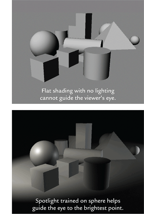
Figure 1-48: Guiding the eye with detail and lost edges

Composition and the Rule of Thirds
When composing the final image, we take some considerations to mind: the aspect ratio of the final image and the placement of the figure on the plane. One of the easiest ways to place the figure is to use the rule of thirds, seen here in Figure 1-49.
The eye naturally tends to be drawn to a horizon line two-thirds above the base of the image. By placing points of interest at the intersection of any of these lines, you keep the focal point away from the center of the image and make a more interesting composition. Remember how balance does not create tension. By placing the focus at the center of the image, you create a symmetrical, balanced image, which tends to be less exciting than one with tension. We will look more closely at the rule of thirds as well as the mysterious and highly useful Golden Rectangle in Chapter 9, “Painting the Forest Spirit.”
Figure 1-49: Divide the picture pane into nine frames.

Demonstrating Composition:The White Fox vs Sherlock Holmes
Thanks to Paul Tobin for contributing this section! Paul is a senior concept designer at Weta Workshop whose credits include The Hobbit, King Kong, Chronicles of Narnia, District 9, and Avatar.
No matter how beautifully rendered or detailed, a picture with a poor or confused use of composition will undermine all later work. So putting that extra time into getting your composition right is time well spent.
When I first start to explore an idea for a picture, I begin with roughs and these initial forays often evolve at an intuitive level. In these early roughs, I want to identify the various pieces of my picture and how they relate to each other. By assigning focal points and a hierarchy to your pieces, you can then start to build a composition that supports your concept and communicates it efficiently. It’s not unlike completing a jigsaw puzzle: the first step is to just concentrate on finding your edges and the rest will follow. Start simple with clearly identifiable shapes and then build depth and detail later.
This illustration, titled The White Fox vs. Sherlock Holmes, appeared in Coilhouse Magazine Issue 5 and illustrated a story about Chinese pulp fiction at the turn of the century. In some of these stories, China actually appropriated the Victorian Sherlock Holmes and integrated him into Chinese folklore, with one of his chief adversaries being the mystical White Fox. After working through a number of roughs, the central idea unfolded, which was that the White Fox and the protagonist Sherlock Holmes would be literally on a stage, not unlike actors in a Chinese Opera. In terms of compositional pieces there were primarily just the three, the two characters and the stage. In terms of hierarchy it’s the White Fox, followed by Sherlock Holmes, and finally the stage itself, which is intentionally a sparse and simple backdrop for the drama to unfold upon. I always imagined that this picture caught that moment when the curtain raises and the characters are revealed for the first time in dramatic poses: the beautiful White Fox with her sword and fan, defiant and deadly, and Holmes, intent upon the clues, his pose a play upon the iconic depiction found in the classic illustrated books of the period. Figure 1-50 shows my compositional breakdown of this image.
If I had placed White Fox in the middle of the picture, it would have forced Holmes uncomfortably off to one side. As I had to overlap these figures, it was important to find a solution that allowed the partially obscured Holmes to still be a strong secondary element. By using the rule of thirds (the blue grid), I tweaked my initial rough to make sure that the White Fox was on the left one-third line and Holmes’s face and hand on the right one-third line. This was done by eye without literally putting down a grid, but with an understanding of how the rule of thirds can be applied.
Figure 1-50: Compositional breakdown: The White Fox vs Sherlock Holmes
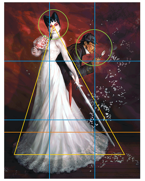
The second compositional device I employed was the triangle (in yellow). I wanted the White Fox to be a dominant and formidable character, so by splaying her dress and positioning the arms, I created a triangle composition that gives a sense of physical strength and stability. It also serves the purpose of leading the eye to the primary focal point of the picture, the White Fox’s face.
I also made sure that the horizon line (in orange) was perfectly horizontal to emphasize this stability, and by adding in receding floorboards, I was able to build a sense of depth into the picture.
The last main device I employed was the use of diagonals, often offset to one another to build a degree of dynamism into what was becoming a very static picture. These diagonals would also help lead the viewer’s eye to my focal points. The line of the sword and arm combined with the inward tilt on the fan all help lead to the White Fox’s face. The same is also true of my hair design for this character. Not only do the two main points symbolize fox ears, but they also angle toward the face.
In the case of Holmes, having him bent forward dramatically angles him away from the body of the White Fox. His arm matches the angle of his back to really sell this thrusting, intent pose, and the long line of his opium pipe leads to his face, which is the secondary point of focus for the picture. A late addition to the painting was the drifting cherry blossoms, which are also angled to create more energy to the picture, rather than just having them drift vertically from above. Once all these elements were in place I slowly started to work up the detailing and used color and lighting to build upon the compositional effects.
ZBrush to Photoshop Design Process
In this book we will use a variety of tools and techniques. ZBrush will be the core program used in all the tutorials. In many lessons, we will take our models to Photoshop for a final painting pass to help “sell” the character. Oftentimes you will want to work out the overall shape of a character in 3-D from all angles, then pick a dramatic angle to render in Photoshop with color and atmosphere. This allows you to show a director or art director the character both as a sculpture and as a dramatic living being as they may look on film. Figure 1-51 shows a character in both grayscale and a painted presentation.
This is standard practice in concept design for many artists today. The benefit of using ZBrush to generate a base on which to Photoshop paint is that you have a consistent base model that can be further edited in real time for the director. New views are easy to generate, and most importantly, when the design is approved, the 3-D model already exists and can be passed on to departments and then fed into a production pipeline.
Figure 1-51: Character as grayscale and painted
We will also look at other techniques, such as designing for 3-D printing. Many times a design is printed on a 3-D printer to generate a physical maquette that can be held and experienced (Figure 1-52). This is a common practice as well, and it is quite rewarding to see your work in the real world. Luckily the price of 3-D printing is dropping substantially, so it is accessible to most consumers now.
Figure 1-52: This digital sculpture by Bryan Wynia was printed on a 3-D printer to create the physical maquette in image B.

Another powerful aspect of this process is that your underlying model is reusable. It has never been easier to grow and create variations on a character than now with ZBrush. In a matter of minutes, multiple versions of a character can be worked up and put before a director for evaluation. This kind of immediate feedback allows artists to get the character exactly as the director wishes faster than even before (Figure 1-53). It also allows far more possibilities to be explored in less time.
Figure 1-53: Variations on a character can be created quickly.

We have taken an in-depth look at the various tenets of design I try to keep in mind as I work. We will refer back to many of the concepts in this chapter throughout the rest of the tutorials in this book. The lessons in this chapter will serve you well as you develop ideas for creature and character concepts. Let’s move on now and put these lessons into practice.
In the next chapter I will illustrate the process of designing an alien character bust. Throughout the process, we will refer back to many concepts from this chapter such as gesture, shape language, and rhythm. Let’s get started!