Chapter 4
Posing the Interdimensional Traveler
In this chapter we will take the design from Chapter 3, “The Interdimensional Traveler: A Full Body Character Design,” and begin to render it in a compelling final image. We will learn how to use Transpose to pose the figure, how to use the Layers menu to store pose data, and how to use the TimeLine to store views. We will also look at the concept of the golden rectangle to help us plan the composition and find the best image dimension for the final presentation. In Chapter 5, “Painting the Interdimensional Traveler,” we will look at how to composite ZBrush renders in Photoshop, using painting tools to add the final touches to the image.
We will begin by looking at how to pose the figure from Chapter 3. The design as it stands is in a neutral pose. We will add some character and personality to the figure before we start the illustration. This is our chance to act with the figure. We will determine the character and his motivations and then communicate these in the way the character holds his body.
You will recall that this character should have a regal, imposing bearing. With that in mind, we can further hone the design. Jamie Beswarick, one of the most talented designers I have ever met, told me that a design maquette, or image, should represent your first encounter with a character. It should represent a moment that sums up the character’s attitude and motivations. I try to remember this when I plan my illustrations. How might the first scene where the character is introduced look? What will he be doing? How will this figure be perceived by other characters?
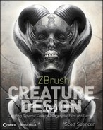
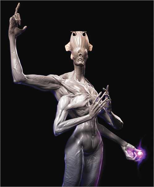
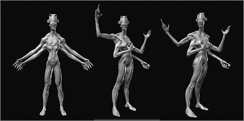
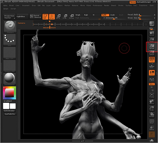
In this case, I have chosen to maintain the regal grace we already explored in Chapter 3. I also chose to place the viewer below the figure to give him a more imposing air. When posing the figure, I maintained a sense of grace by continuing to exploit the S-curves, bending the joints and keeping a sweeping flow between the limbs (Figure 4-1).
Figure 4-1: In this pose you can see the sweeping curves implied by the limbs.
Lines of Action
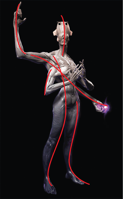
As we create the pose, we need to remain aware of the lines of action, or gesture lines, in the pose. As you will recall from previous chapters, this is a fundamental consideration you want to keep in mind throughout the process of sculpting, posing, and establishing the final composition. It is important that the action lines of the pose flow in a pleasing way throughout the figure because they guide the eye into and around the image itself. Once you decide on a final pose and angle of view, you want to be sure those lines flow naturally and appealingly through the picture plane. Figure 4-2 shows a few examples of poses with the lines drawn in.
Figure 4-2: Here we see some pose options with the gesture lines overlaid.
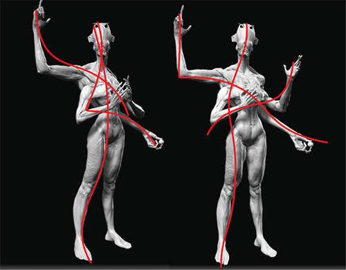
Figure 4-3 shows a good example of something to avoid. While posing the arm I found I had created a right angle at the elbow. This introduced a hard edge in the pose and broke the rhythms I had established. You can see how I correct the right angle to give a more fluid gesture to the arm. Little subtleties like this can make a big difference in how the image reads to the viewer. An appealing design posed and presented in an unappealing way will undermine all your hard work and give it far less impact. A director or other creative decision maker will often only give your work a few seconds of attention. In these few moments, you need to make an impression.
Figure 4-3: Always try to avoid right angles as seen in the arm of the figure on the left. These tend to be static and uninteresting.
Tangents
Tangents are another consideration when composing the figure for the final illustration. Tangents are points where the figure crosses over itself or another object in the scene. You will recall from Chapter 2, “The Character Portrait: Sculpting the Alien Mystic,” how important silhouette is in defining the character. Silhouette is also important in defining the character’s pose. You want the pose to be clean in silhouette view. If it isn’t, the viewers will have to stop and untangle the figure in their minds to understand what they are looking at. This will detract from the powerful initial read the viewer gets from the design. The first reaction will not be awe, but frustration and confusion.
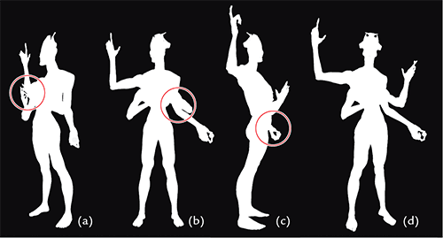
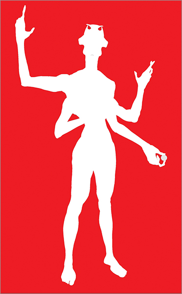
Figure 4-4 shows a few poses in silhouette. Note the tangents of the figure’s arms in some of the poses. You want to avoid areas where the arms intersect with the body and make the pose unclear. The circled areas represent areas of tangency. Pose D is the clearest because it shows the physiological structure of the creature without confusing the eye.
Figure 4-4: Here you can evaluate some poses in silhouette.
Before you pose the figure, you need a general idea of the angle of view you want for the final image. At this stage, we are ready to position the figure and prepare to render final images. I prefer to show the character in a three-quarter view. I find it best to avoid a straight on, front or side view, as these tend to be less dynamic and do not show the form of the figure particularly well.
In the following steps we will use the Transpose tools to pose the figure. For more in-depth looks at these tools see ZBrush Character Creation and ZBrush Digital Sculpting Human Anatomy or the video on the DVD or download files that come with this book.
1. I know I want to offset the limbs so that each pair is performing a clear action. I will begin by posing the upper right arm. I step down a couple subdivision levels so there is less geometry to work with. Posing at the higher subdivision levels makes it more difficult to control the Transpose tools.
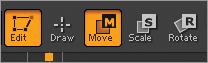
2. I want to isolate the right arm by masking the rest of the body. The easiest way to do this is to use a Transpose mask. Press the W key to enter Transpose Move. The Move icon will now be lit at the top of the screen (Figure 4-5).
Figure 4-5: The Transpose Move icon
3. Hold the Ctrl key and then click drag down the arm. The mesh will mask the arm based on the underlying topology. You may need to further clean up the mask using the mask brushes.
Brush Selection for Precision Masking
For precision masking you can use the Mask Pen or Lasso brushes. These brushes are selected from the Brush menu but are only accessible when pressing the Ctrl key. For example, you can select the Mask Pen brush to sculpt with any of the normal brushes, but when you press the Ctrl key, the brush will change to the mask pen. ZBrush has many brushes that are mapped to function keys. The smooth brushes, for example, are mapped to the Shift key, the masking brushes to Ctrl, and the visibility brushes to Ctrl + Shift. This means that you can be sculpting with any brush and then hold Shift to switch to your selected smooth brush, then hold Ctrl for your masking brush selection, and then hold Ctrl + Shift for the visibility or clipping brushes.
Select the masking brush you prefer from the Brush menu. To use this brush you will need to press and hold the Ctrl key while sculpting. The brush will convert to the masking brush you selected from the menu. When in masking mode, the cursor will become yellow. Press Ctrl to mask. Press Ctrl + Alt to erase your mask. Ctrl click on the masked area to soften the mask edges or Ctrl + Alt click on the mask to sharpen it.
4. When the arm is unmasked, make sure you are in Transpose Move mode (press W) and click drag to draw a transpose line from the shoulder to the wrist (Figure 4-6). Make sure the start of the line is at the center of the rotation of the shoulder and that the end of the line falls at the wrist. You can reposition the ends of the line by clicking and dragging on, not in, the endpoint circles or the line itself. Rotate the arm up as seen in Figure 4-7.
Figure 4-6: The Transpose line is drawn from the shoulder to the wrist.
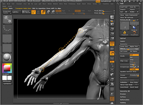
Figure 4-7: The arm is rotated up with the Transpose Rotate brush.
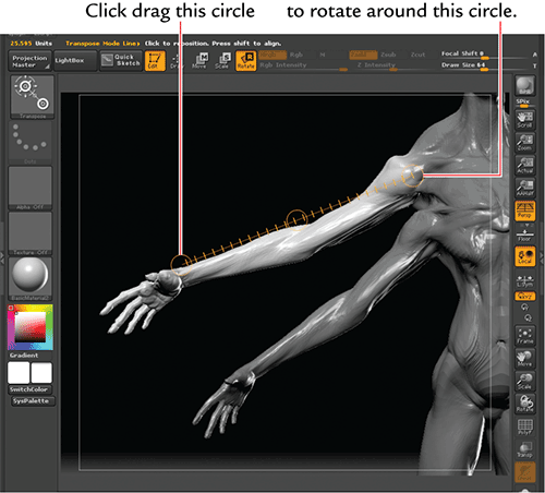
5. Now we will rotate the elbow in a different manner. Click and drag from the shoulder to the elbow. For the elbow, we will bend the arm using bone posing. This is a built in skinning algorithm in Transpose that allows you to bend joints such as knees and elbows without causing the mesh to collapse. Hold Alt and click drag in the circle at the elbow to bend the joint. Notice that one side of the joint stretches while the other contracts. This prevents the mesh from collapsing and losing its volume (Figure 4-8).
Figure 4-8: Alt click in the elbow circle to bend the elbow using bone posing.

6. The wrist can be posed using the same bone posing method that we used on the elbow. This ensures that the wrist maintains its volume while bending (Figure 4-9).
7. When working on the opposing arm, I decided to angle it down for contrast. Having both arms raised would create an equilibrium that is not what I am trying to achieve in posing this figure (Figure 4-10).
8. In Figure 4-11, we see the fingers being posed. I decided to place a small object, in this case a sphere, into one of the hands. This allows the character to interact with an object and opens new posing possibilities to those fingers. The fingers are posed using bone posing for the most part. Be sure to rotate often as you move the fingers and use masks as you work.
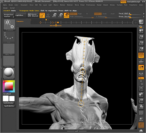
9. Isolate the head from the body with a mask to rotate the neck (Figure 4-12). Draw a transpose line from the head to the center of the shoulders. Click and drag in the center circle to rotate the head around its Y axis. The process of posing the head requires a few variations of masking and Transpose. To see the process in detail, refer to the video of posing this character on the DVD or download files.
Figure 4-9: Posing the wrist
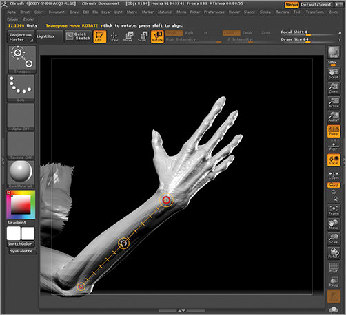
Figure 4-10: Posing the opposite arm
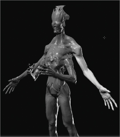
Figure 4-11: Here the fingers are posed to lend an appealing gesture to the hand.

Figure 4-12: Posing the neck
Posing the Secondary Limbs
The secondary limbs are posed in much the same way as the primary. The main difference is that I choose to group these in separate polygroups. This makes is easier to isolate one arm from the body and the other arm while I work. This is particularly important for the lower limbs because I will want them to cross over and interlock the fingers in some poses (Figure 4-13). To cross limbs over the centerline of the body and pose them in close proximity to one another I need a way to isolate the arms quickly and clearly from the rest of the body. See the video on the DVD or download files for the entire posing process in action.
At this stage the pose is ready for us to move on to compose the figure into a final image. We will make further adjustments to best serve the angle of view once the figure is placed on the image plane.
Figure 4-13: Here the arms cross the centerline of the body and the fingers intertwine.
Setting Up the ZBrush Document
Now we will set up our document and render image passes to composite and paint over in Photoshop. We will begin by creating a pleasing proportion for the overall document size by exploiting the golden rectangle. Then we will position the figure and use the TimeLine tools to store variations in angle to help pick the best view. As we position the figure on the picture plane, we will continue to consider how the lines flow through the pose and adjust the position as needed to get the best possible result.
The Golden Rectangle: Ancient Secret, Timeless Tool
Before we position the figure on the canvas, we need to determine the proportion and resolution of that canvas. I avoid using the default ZBrush document because the resolution is too low for the best results and the overall proportion is not as pleasing as possible. We will resize the document to be a higher resolution and a more pleasing proportion and create a pleasing base document using a golden rectangle.
The golden rectangle has gone by many names: you will find it called golden section or golden ratio. The golden spiral is derived from its shape. It is one of the fundamental ratios of measurement in nature and has been a secret of designers, builders, and artists since the dawn of civilization. It is a powerful and often misunderstood tool. I hope to give you some insights in this section on how it can be applied to your work as a designer. While the golden rectangle is referenced often in graphic design, I rarely find examples of how it can be practically applied to other kinds of design—especially sculpture and figure studies. I hope to offer some examples here of how the rectangle can be used to help us proportion a figure and place it pleasingly on the image plane of an illustration.
In a nutshell, the golden rectangle is a rectangle that can be divided into a square and a smaller rectangle. The smaller rectangle has the same aspect ratio as the original larger rectangle. Figure 4-14 illustrates this. Here we see that the length of the smaller rectangle divided by its width is equal to the length of the larger rectangle divided by its width, a ÷ b = (a + b) ÷ a. The ratio of the larger to the smaller side of each rectangle is known as the golden ratio. This rectangular ratio is found in nature as well as in art and design. A 35mm film frame is very close to a golden rectangle.
The importance of this rectangle is that it provides an extremely visually pleasing ratio. This shape has been exploited by artists and designers for centuries as an internal measure for the relationship between parts of a figure or image as well as a basis for the proportion of the image plane itself. By composing inside a golden rectangle, many artists feel they are starting off with a proportionally beautiful window through which the viewer is asked to look.
It may seem like a strange thing to consider a simple ratio “beautiful.” Keep in mind this proportional relationship is found throughout nature and was adopted by artists in the ancient world. They believed that perfect beauty was found in balance and harmony and that nature expressed the highest manifestations of this. By bringing the rules of proportion from the natural world into their work, these artists hoped to imbue their art with a touch of the same perfection they found in nature.
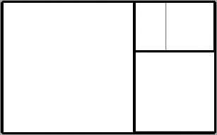
Remember that within any golden rectangle is a smaller golden rectangle, and within that rectangle is another, and so on (Figure 4-15). The smaller rectangle can be divided over and over to create an infinite nest of golden rectangles (Figure 4-16).
Figure 4-14: A golden rectangle in its simplest form

Figure 4-15: Notice how the golden rectangle contains another golden rectangle within itself.
Figure 4-16: Furthermore, this second rectangle contains another copy of the golden rectangle.
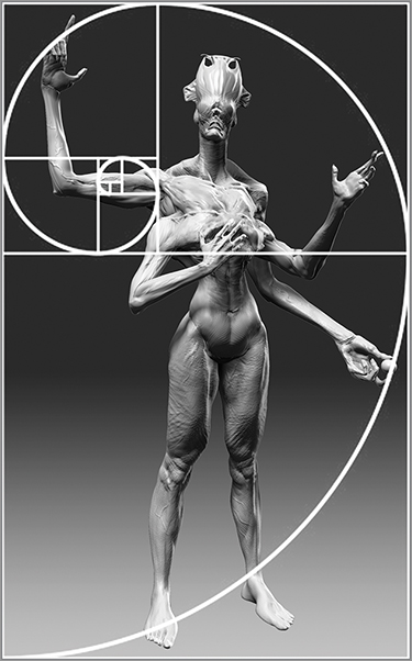
This nesting effect is what gives us the golden spiral found in conch shells (Figure 4-17) and elsewhere in nature. This logarithmic spiral is called the spira mirabilis (Figure 4-18). This spiral can also be used as a tool to guide the placement and layout of elements in the picture plane. Figure 4-19 shows the arms laid out to fall within the spiral arm.
Figure 4-17: A golden spiral in nature

Figure 4-18: A golden rectangle with a nested rectangle and spiral in red
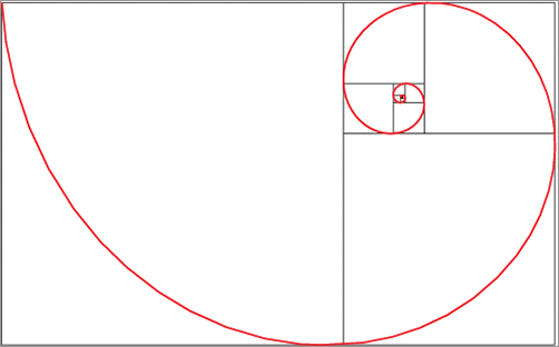
Figure 4-19: The arms fall within the spiral.
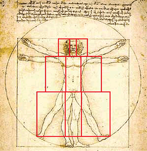
The most famous application of the golden rectangle to design is Leonardo da Vinci’s Vitruvian Man. This famous image shows Leonardo applying the golden rectangle to the proportions of the human body (Figure 4-20). Here we see the height of the person was divided into two segments at the navel. By dividing the distance from the bottom of the feet to the navel by the distance from the navel to the top of the head, we get the golden mean. Renaissance artists sometimes called this number the divine proportion because of its presence throughout nature and close association with the depiction of beauty and proportional harmony.
Figure 4-20: Leonardo’s Vitruvian Man illustrates the proportions of the golden rectangle found in the human body.
The golden rectangle is found in the individual parts of the body as well. Figure 4-21 shows the ratio of measurement between the fingers of the hand. This is a 3:2 ratio. The 3:2 ratio is extremely close to the golden rectangle. I have overlaid the golden rectangle over a model of the human hand bones to illustrate this. Note how the smaller finger bone falls within the smaller proportion of the rectangle while the larger bone falls within the larger division. This ratio repeats up the bones of the hand. Try finding other instances of the golden rectangle in the human body.
The golden rectangle was originated by the Greek mathematician and philosopher Pythagoras in the sixth century BC. Since that time it has been seen in the work of various artists and architects throughout the ages. It seems that you can find applications of the golden ratio in just about any aesthetically pleasing layout, from the Parthenon (Figure 4-22) to the structure of faces in classical art (Figure 4-23).
All this begs the question, is this is a conscious decision on the part of the designer or is an intuitively created and successful design always going to follow the golden ratio? I don’t think the answer actually matters. Some artists may well have an instinctual eye for pleasing proportions. Others (such as myself) need to learn from the masters and apply the techniques that appeared to guide their work. By being aware that the golden rectangle exists and represents a powerful design tool, we can exploit it in our own work.
Figure 4-21: The same nested scale of proportion is found in the parts of the body. Here you see it in the ratio of the fingers to the hands.

Figure 4-22: The golden rectangle is represented in the façade of the Parthenon.

Image free from Gutenberg project http://www.gutenberg.org/files/16990/16990-h/16990-h.htm
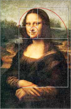
Figure 4-23: The face of the Mona Lisa is a contained within a perfect golden rectangle.
Using the Golden Ratio in a Creature Design
So how do we apply this to our character? The most direct way to exploit the information we now have about the golden rectangle is to see whether our character’s body can conform to this proportion. Figure 4-24 shows how the head fits perfectly into a golden rectangle, which is why the ratio between the facial mass and the head crest is appealing. Note how it is less successful when the proportion is changed so that the ratio between the face and crest is close to 1:1. You can check the body proportions and adjust as needed. Figure 4-25 shows the body of the character with golden proportions measured out.
Figure 4-24: Here the golden rectangle is applied to the character’s head. Notice how the effect is much better when the ratio of the head parts fall within a golden rectangle.

Figure 4-25: The body with the golden rectangle overlaid
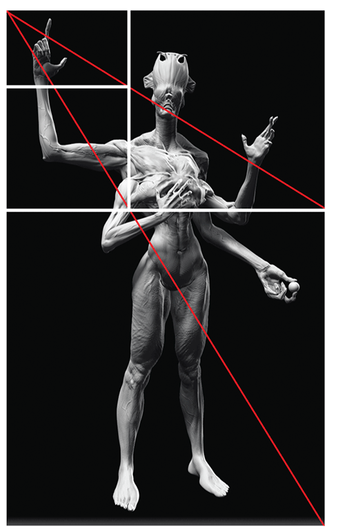
Rule of Thirds and Golden Rectangle
A common compositional tool for creating a pleasing layout is known as the rule of thirds. The rule of thirds is derived from the idea of the golden rectangle, but it is not a golden rectangle itself. It is a quick way to create a pleasing proportion in most aspect ratios. The rule of thirds is often used in illustration and photography. This rule divides the picture plane into nine equal parts as shown in Figure 4-26.
Figure 4-26: Using the rule of thirds, the picture plane is divided into nine sections to help place points of interest.

When composing the image, make an effort to place objects of interest on the intersections of these lines. These intersections represent focal points for the image. This helps you avoid placing focal points in the center. We want to keep areas of interest outside the center for reasons already discussed in Chapter 1, “ZBrush as a Character Design Tool.” Perfect symmetry and balance tend to be boring. The idea is that images composed in this manner will carry more dynamic tension than a perfectly centered composition.
Figure 4-27 shows the rule of thirds applied to an image. While the rule of thirds is not exactly the golden rectangle and will not result in the same composition, it is a close and quick approximation that is very helpful to many artists seeking a way to organize their image planes into dynamic compositions.
Figure 4-27: Applying the rule of thirds to a composition shows how the elements are arranged (image by Paul Tobin).

I hope this section has adequately explained the meaning and use of the golden rectangle. I have always been fascinated by this phenomenon in art and equally mystified by its application. Hopefully this section has helped to clarify how we can use this ratio in our work.
These are guidelines to help create better images. The idea is to understand and use them to your benefit—not to be shackled by them. As you compose your own images, you will sometimes have to adjust your approach based on multiple variables. For example, in my composition I needed to place the figure torso down the center of the picture plane. This was because of the highly complex multiple limbs and potential for unappealing tangents. I balanced the pros and cons of each problem and decided that bringing the figure toward the center was acceptable because it allowed a more aesthetically pleasing arrangement of the limbs. I also feel the contrast between the multiple arms offsets any sense of balance created by a centered placement.
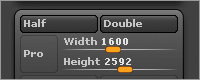
Adjusting the Document Size
Using the golden rectangle to define our document size is a very simple process. We will create a golden mean document by changing the proportions to a ratio that represents a golden ratio. Follow these steps to create this document:
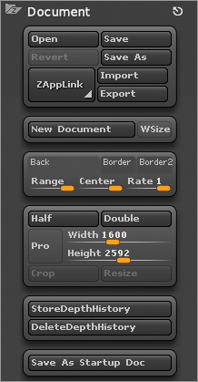
1. Go to Document and turn off Pro: this is the constrain proportions button. Set the document to 1600 × 2592 resolution. This is a rectangle in the golden proportion. I think you will find this allows you to create a very pleasing composition with a standing figure (Figure 4-28).
Figure 4-28: Turn off constrain proportion.
2. Disable the WSize button. This prevents ZBrush from resizing the document when you load the project again (Figure 4-29). Position the figure on the canvas and Save the project. You can upsize and downsize this document by clicking the Double and Half buttons under the Document menu (Figure 4-30).
Figure 4-29: Disable WSize.
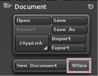
Figure 4-30: Double and Half buttons
Placing the Character on the Picture Plane
Now we will look at some of the considerations when placing the character for your final illustration. This is a very important step because the position and pose you choose here will serve to either show off your hard work or hide it. You can ruin a good design with a poorly thought out composition.
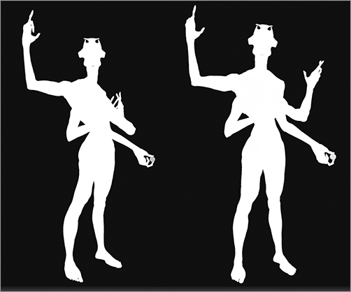
Remember to be aware of the silhouette and tangents as you place the figure. Figure 4-31 shows several poses in grayscale and in silhouette. The pose must be clearly readable in silhouette to be successful. These poses are unsuccessful because the areas of tangency confuse the figure. It is difficult to read how the limbs are related to the body and the pose. Figure 4-32 shows the two most successful configurations. There is tangency between the arms and the body in both options, but enough information is given from the elbow to the forearm to make these poses read easier to the eye. The rest of the limbs are extended from the body and have a clear action in silhouette.
Figure 4-31: Areas of tangency have been circled here.
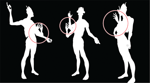
Figure 4-32: A clear pose reads well, even in silhouette. Here we see two pose options that are the most successful.
This concept of the first read has been revisiting us since the very early design. It is such an important aspect of design theory that it carries all the way through to animation. Animators will always evaluate the pose and position of the character I silhouette to make sure it reads clearly.
As you pose the figure, look for negative spaces and how they interrelate. In Figure 4-33, for example, you can see the triangular negative space created by the inside of the lower arm. This negative space shows the arm is bent and the elbow is away from the body. If I shifted the figure and lost this space, the pose would be less clear. These shapes will register to the viewer. It is part of the artist’s job to be aware of them and in control of their presentation.
The area around the figure counts as negative space as well. Be sure to consider the overall outline space of the figure. In Figure 4-34 you can see how the negative space is just as important in defining the figure as the silhouette or positive space.
Figure 4-33: Here you can clearly see the negative spaces around the shape of the arm.
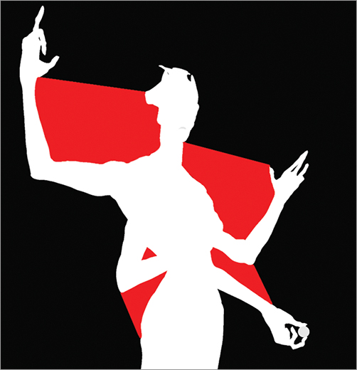
Figure 4-34: The negative space around the figure
While composing the image, be sure to keep the implied lines in mind. These are similar to the gesture lines of the figure. Figure 4-35, for example, shows the arm at a right angle. This creates an unnatural break in an otherwise organic form. Bend the arm out slightly to create an implied line that flows down the figure.
Figure 4-35: Note how the arm is improved by breaking the 90-degree angle and introducing more of a curve.

Also try to avoid parallel lines. Remember that symmetry can be boring as well as repetition of strictly vertical and horizontal lines (Figure 4-36). Try to keep lines on a bias to keep the work interesting (Figure 4-37).
Figure 4-36: Notice how the straight lines here are repetitive and boring.
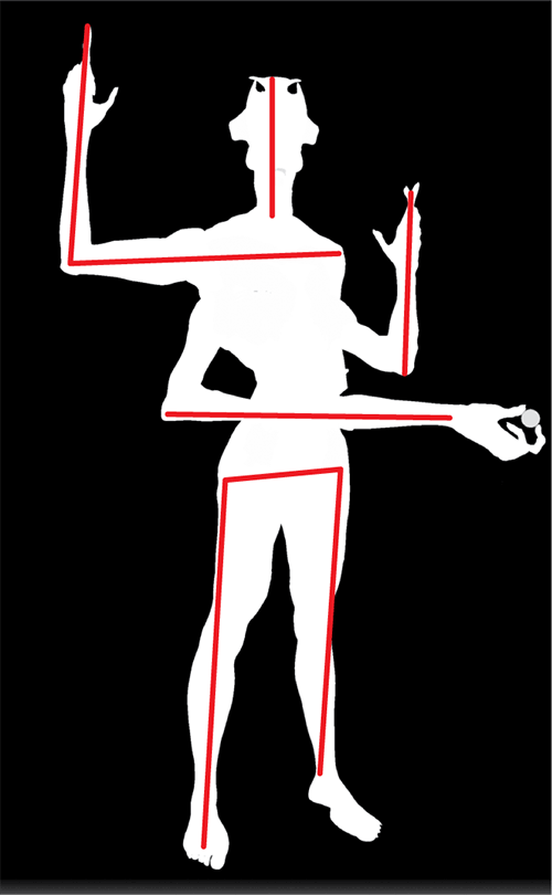
Figure 4-37: Improve the pose by breaking the repetition of verticals and horizontals.

Using TimeLine to Store Options
We will use TimeLine to store variant positions. This helps us quickly evaluate a series of options to pick the best one. You may also choose to store vastly different positions and poses using TimeLine and Layers combined. This allows you to create an entire series showing off your character and store them all in one project file. To use TimeLine to store positions follow these steps:
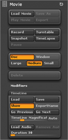
1. Open TimeLine by going to Movie, then TimeLine, and click Show (Figure 4-38).
Figure 4-38: Click here to show the TimeLine.
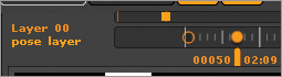
2. With your figure in position, click on the timeline itself to add a dot. You can now change the figure position and click farther down the timeline to create another dot. These are camera keyframes, and they will store the figure position on the canvas (Figure 4-39).
3. Continue to add new position options as needed. If you need to change the pose, create a new layer and Save the changes there. You can then keyframe the layer opacity to move the figure itself for different views (Figure 4-40).
Figure 4-39: The TimeLine with two dots. Dots serve as keyframes on the timeline.
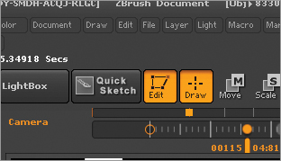
Figure 4-40: This layer contains changes to the figure position.
4. Once you have your options stored, you can quickly move between them using the arrow keys. This allows you to quickly evaluate which compositions appear the strongest.
You can also use TimeLine to store changes in the pose. This is helpful in allowing you to have multiple body positions stored as well as camera positions. This makes it easier to render out multiple image options to Photoshop to paint over later. To add poses to a layer follow these steps. (Be sure to see the DVD or download files for a video illustrating the process of storing poses in layers with TimeLine.)
1. Create a new layer while at the highest subdivision level.
2. Use Transpose to make changes to the figure pose. Changes will be stored on the newly created layer. Rename this layer “pose variant” by clicking the Name button (Figure 4-41).
Figure 4-41: Create a new layer and name it Pose Variant.
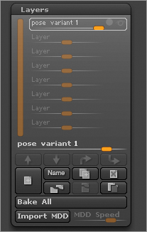
3. You may turn visibility on or off on the pose variant layer to render the character in the original or modified position. You may store as many poses as you wish in separate layers with this method. Figure 4-42 shows a series of pose variations stored in layers. This gives you maximum freedom when going to Photoshop to pick the strongest presentation image.
Figure 4-42: These various pose options are stored in layers.
Setting up Lighting and Camera Settings
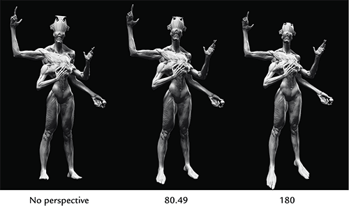
The last step before you render is setting up lighting and camera settings. Camera settings are controlled by the Focal Angle slider under the Draw menu (Figure 4-43). This is set by default based on object scale, but you can control the perspective distortion by adjusting this slider. Figure 4-44 shows the effect of a few different settings. Experiment on your own figures though, as the FocalAngle setting will always appear different depending on the original scale of the object in the document window. Remember that the focal angle is specific to the ZBrush camera and will not correspond to camera settings in other software packages or the real world.
Figure 4-43: The FocalAngle slider adjusts the camera perspective.
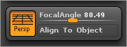
Figure 4-44: The effect of altering the perspective settings
Lighting is adjusted under the Light menu. Follow the next few steps to create a key and rim light lighting setup. The key light is the main light that casts the dramatic shadows on the figure. The rim light will shine from the rear and create a bright rim of light around the edge of the forms. This will both define the shapes and bring the figure forward from the background.
1. Open the Light menu and dock it to the side of the screen.
2. Click and drag the orange light icon to adjust the key light placement (Figure 4-45).
3. Turn on the next light by clicking the light bulb icon. Turn the Intensity all the way up and move to the center of the sphere (Figure 4-46).
4. Click on the orange placement icon to put the light behind the object. You will see the light change in the document window to appear to be lighting the object from behind (Figure 4-47). Move the light to the edge to get a nice rim light. This light setup will save by default with the ZBrush project.
Figure 4-45: Adjusting key light placement
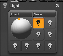
Figure 4-46: The light settings
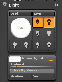
Figure 4-47: Here you can see the dramatic effect of rim light on the figure. Rim light adds depth by carving the figure away from the background to better define its shape.

Creating Render Passes
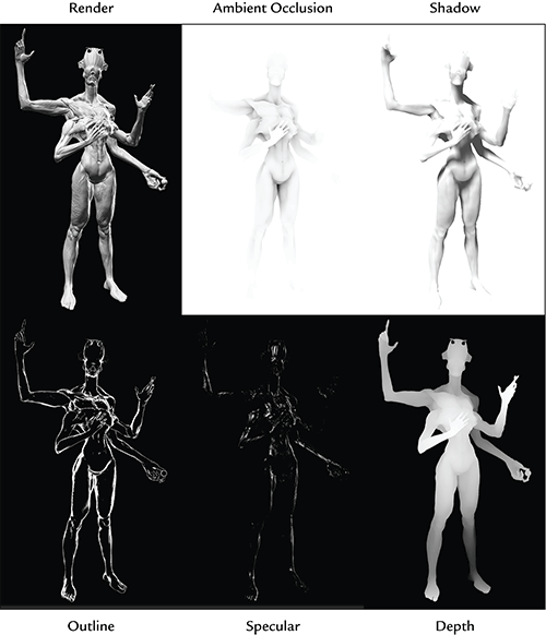
At this stage, the figure is posed and placed on the picture plane in a composition you find appealing. Make sure you pick the pose you like best from any stored on layers. We are now ready to render some passes out of ZBrush to take into Photoshop for painting. We want to export separate passes of light, shadow, special highlight, and matte to give us the most freedom in creating our final illustration (Figure 4-48). We will render these passes using the ZBrush BPR, or Best Preview Renderer.
Figure 4-48: A composite of the various render passes exported from ZBrush
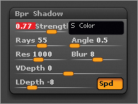
1. Begin by setting up the shadow settings. Under the Render and Bpr Shadow settings menu, set Strength to 0.77 and Rays to 55. This will give you a strong shadow with a soft edge. Set LDepth to –8 to cast more dramatic shadows (Figure 4-49).
Figure 4-49: The Bpr Shadow settings
2. Make sure ambient occlusion is enabled under the Render menu by pressing the AOcclusion button (Figure 4-50). This ensures the ambient occlusion pass will render.
Figure 4-50: The AOcclusion button under the Render menu
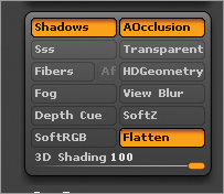
3. Next enable the render pass option under the Render menu by pressing Create Maps (Figure 4-51). This will cause the renderer to automatically generate the image, depth pass, ambient occlusion, shadow, and matte renders.
Figure 4-51: Click the Create Maps button to generate render passes automatically.

4. Make sure you selected Material BasicMaterial2 or Basic Material and pressed the BPR button to render these passes (Figure 4-52). The maps will appear in the slots under the Render menu. Click each icon and specify a file name and location to export them (Figure 4-53). When rendering the document, make sure the Actual button on the right side of the screen is pressed (Figure 4-54). This renders the document at actual size or full document resolution. The anti-aliasing quality of BPR renders is good enough so that the rendered image does not need to be resized when you export from ZBrush. If you do need to improve the quality, increase the SPix slider on the right of the canvas before rendering.
Figure 4-52: The BPR button will execute a Best Preview Render.

Figure 4-53: Exporting the render passes
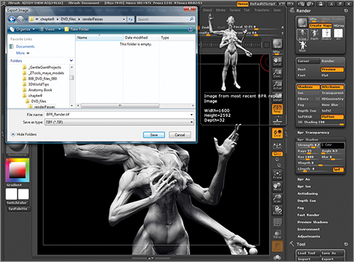
Figure 4-54: The Actual button renders and exports the document at actual size.
Creating Rim Light and Specular Passes
Some useful passes are not created by default in ZBrush. You will want to manually create a pass for specular shine so that you can control the highlights on the figure. You will also want to make an outline pass to accentuate the rim lighting. Follow these steps to make these passes:
1. Make sure RGB is on at the top of the screen. Select black as the active color (Figure 4-55). Go to Color and FillObject to fill the model with black (Figure 4-56).
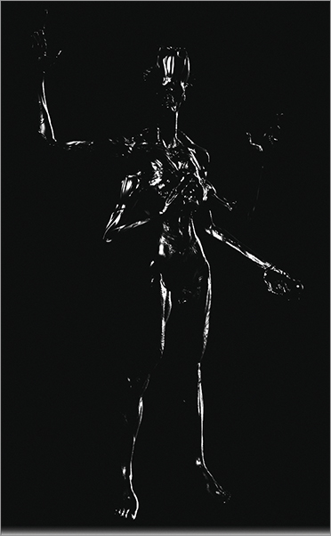
2. Click the Best button under the Render menu to enable Best Renderer mode (Figure 4-57). Best Renderer is the older ZBrush rendering method. We are using it for these passes because we don’t need the highly realistic shadows of BPR mode. Press Render to render the document. With the black color on, the only thing that renders is the specular shine. We can composite this into our image in Photoshop to control the shininess of various parts (Figure 4-58).
Figure 4-55: Here the active color is black.
Figure 4-56: Here the figure has been filled with the color black.
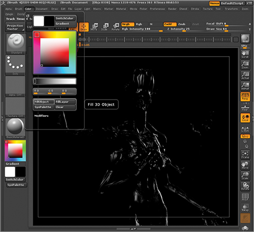
Figure 4-57: The Best button under the Render menu

Figure 4-58: After rendering the figure, you will have an image that only contains the shiny highlights. This can be added as a layer in Photoshop with screen blending mode to add specular highlights.
3. Export the map by going to Document and Export, and Save as specular.psd. Make sure the document is set to actual size by pressing the Actual button on the right of the screen; otherwise this render pass will be a different size than the previous ones.
Next we will make a rim light pass. Follow these steps:
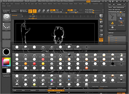
1. Open the Material palette on the left side of the screen (Figure 4-59).
Figure 4-59: The Material palette open
2. Select the Outline shader (Figure 4-60). This will be useful for creating relight effects in Photoshop. Make sure Mrbg is on at the top of the screen (Figure 4-61). Make white the active color again and press the Color and FillObject button. Export this image as outline.psd.
Figure 4-60: The outline shader is useful to create rim lights in Photoshop.
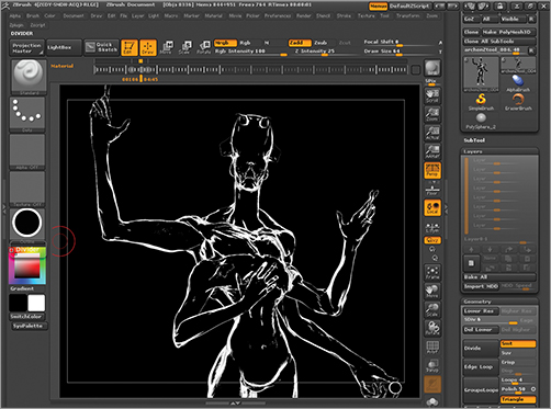
Figure 4-61: The Mrgb button

This concludes the process of preparing render passes to composite in Photoshop. In the next chapter we will bring all these parts together into a single file and look at how to add the final touches of light and color to create our creature illustration.