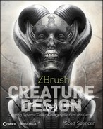
Chapter 9
Painting the Forest Spirit
In this chapter we will pose and paint the Forest Spirit character we created in Chapter 8, “Sculpting the Forest Spirit.” We will look at some of the considerations I used when posing the figure. We will also look at how to render base images outside of ZBrush. This requires touching on the ZBrush plug-in Decimation Master, which we cover in depth in Chapter 11, “ZBrush for Digital 3-D Printing.” We will then take our model to Maya, where we will create a scene file, lighting, and render passes using Maya render layers. These layers will be composited in Photoshop. Once in Photoshop, we will look at how to create an interesting character illustration using a limited palette.
We will keep the color unsaturated and monochromatic. This is often desirable when you want to communicate a design without addressing questions of color. Some directors can be quite sensitive to color choices and as a result of this it can sometimes be beneficial to address a design in a more desaturated color space to help the viewer see and evaluate the character independent of any color choices. This allows the sculpture and form to be evaluated before the extra element of color is added to the mix. I have seen designs dismissed because the color choice was not suitable. Often you have only a few moments in the first viewing to capture attention and appeal. The Forest Spirit lends itself to this approach since unsaturated earth tones suit an earthy character like this. While we are in Photoshop, we will look at how I paint hair and fur on a character as well as an extremely fast technique for painting eyes.
The Brief: Forest Spirit in Color
The brief for this chapter is to execute a character illustration from the Forest Spirit model. We want to give this character a desaturated, muted color language. Try to avoid any overpowering color choices so the viewer can concentrate on the formal elements of the design. We will look at how to create a moody image with dynamic presence while minimizing the amount of painting required. We will give this character a hirsute quality by painting in thickets of coarse hair.
Before we can render our images outside of ZBrush, there are some things we need to think about and establish. Firstly, we will need to pose the figure. In the Interdimensional Traveler character, we opted for an evenly balanced pose. This time we will experiment with offsetting the weight of the character in what is called contrapposto. We will also need to look at how to get the detailed figure outside of ZBrush for rendering. To accomplish this we will learn about Decimation Master, a plug-in for ZBrush.
Posing the Figure
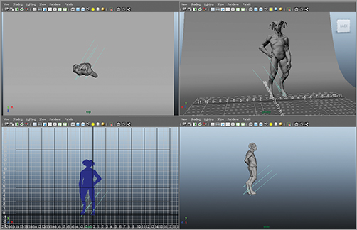
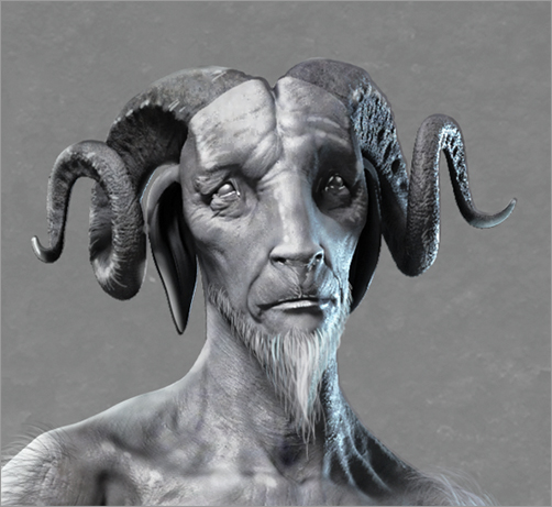
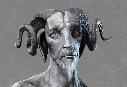
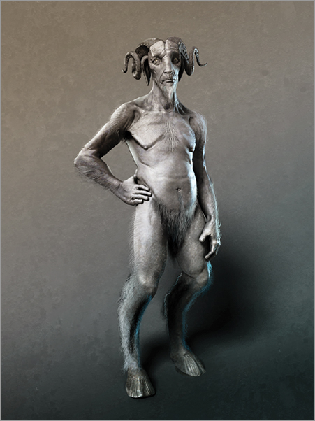
As we have seen in other projects so far, the model has been posed in a manner that helps communicate the character and disposition. This helps create a far more dynamic presentation than a mere neutral pose that communicates very little about a character’s attitude. Since I had considered this particular character to possess a softer, more gentle personality, I attempted to give him a more introspective pose. I accomplished this by giving a slight tilt to the head and raising his eye line rather than making direct eye contact. With this I intended to give him a thoughtful presence rather than a direct engagement with the viewer (Figure 9-1).
Figure 9-1: The posed figure
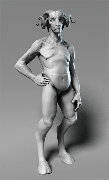
Contrapposto
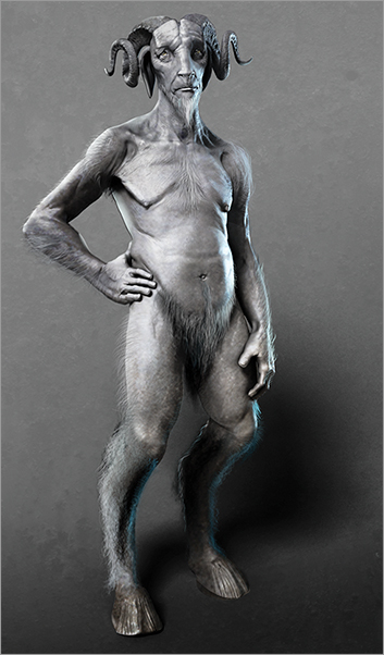
When posing this figure, I have used the technique of creating a contrapposto pose to make the figure feel more dynamic, interesting, and alive. Contrapposto is an Italian word meaning counter pose. It describes a figure where the weight is shifted to one leg or the other and not held equally distributed between the legs. This causes a rhythmic offsetting of the masses in the body expressed by contrasting angles between the knees, hips, and shoulders. Contrapposto was very common in Renaissance art—it is seen most famously in the figure of David by Michelangelo. In Figure 9-2, I have illustrated contrapposto in the figure of a giant sculpted by Jim McPherson.
For the Interdimensional Traveler, we allowed the weight to remain between the feet. The dynamics of the pose were achieved by offsetting the figure in a spiral composition. For the Forest Spirit, we will keep the figure facing forward but we will offset the weight between the hips and shoulders to create a more interesting effect (Figure 9-3).
Figure 9-2: This giant sculpture demonstrates the concept of contrapposto and offsetting masses.
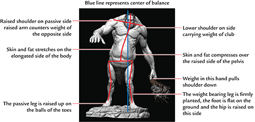
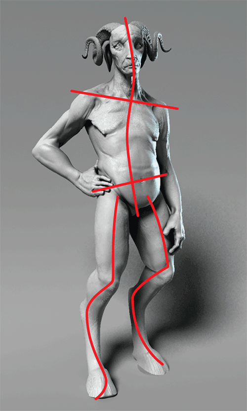
Figure 9-3: The Forest Spirit pose with lines overlaid on the angles
Exporting from ZBrush
Before we can render this figure outside of ZBrush, we would need to either generate displacement or normal maps with a low-res model or export high-resolution decimated models, which can be rendered outside ZBrush. Normal and displacement mapping is a complicated process which is absolutely necessary if you want to export your figure to a rendering and animation pipeline. Since we will be rendering still images, we can take a much simpler route and decimate the figure. To do this we will use a ZBrush plug-in called Decimation Master. We cover Decimation Master in much more detail in Chapter 11 but I will give you the basic steps for its use here.
Decimating the Figure
Decimation Master is used to reduce the overall poly count of the figure while retaining the details. The posed Forest Spirit model, exported at full resolution would be far too heavy to open and manipulate in Maya successfully. The system would be unstable and memory would likely crash. By reducing the poly count with Decimation Master, you reduce the file size. The original ZTool is 275 megabytes and several million polygons. After Decimation Master the resulting model is 38.1 megabytes and 999,000 faces. This polygon count and file size is perfectly suited for rendering in Maya. By decimating the model you will retain all your detail without having to resort to complex shader networks to render normal maps or displacements in mental ray.
If you want to know more about rendering displacement and normal maps, I have included some bonus videos on the DVD or download files that deal with this.
Follow the steps below to export the decimated figure.
1. Load the ZProject file goatman_posed.ZPR containing the posed figure from the DVD or the download files into ZBrush.
2. Make sure the body SubTool is currently selected under Tool SubTools (Figure 9-4). You also want to be sure you are at the highest subdivision level so all of the model’s detail is visible. Open the ZPlugin menu from the top of the screen and click the radial icon to dock it to the side of the interface. From the ZPlugin menu open the Decimation Master submenu (Figure 9-5).
Figure 9-4: The body is the active SubTool selected in this screenshot.

Figure 9-5: The Decimation Master submenu

3. Under the Decimation Master menu click the Pre-process All button. This will cause ZBrush to run the initial computations on the mesh for each SubTool and allow us to decimate in the next step. This stage of pre-processing may take a few minutes depending on your computer’s speed. ZBrush is writing a cache file to disk for each SubTool, which will allow it to perform the mesh reductions required for decimation.
4. Once the mesh is preprocessed, we will set the level of decimation. Set the k Polys slider to 999. This value specifies a mesh with 999,000 polygons. Maya tends to work best for me with meshes of 1 million polys or less. This varies from system to system depending on your hardware specs. For this section, we will decimate the figure to 999,000 polygons. This level will give us good detail while creating a model which can be easily loaded into Maya without crashing the system.
5. Press the Decimate Current button and ZBrush will start the decimation process (Figure 9-6). This stage may take a few moments but most of the heavy computation was completed in the Pre-process mesh step. When the model is decimated you will be able to zoom in and examine the details. Turn on Polyframe mode with Shift + F to see the level of decimation (Figure 9-7).
6. Now that the mesh is decimated you can export the OBJ file. Under the Tool menu, click the export button and save the mesh as body.obj. We will need to repeat the process for the horns.
7. Select the horn SubTool and be sure you are at the highest subdivision level. Open the ZPlugin Decimation Master menu. We don’t need to preprocess the horns at this stage because we clicked Pre-process All before, which wrote a cache file for each SubTool. Set the k Polys slider to 200. This will decimate the horns to 200,000 faces.
8. Export the horns as horns.obj. You will also want to manually export the eyes and teeth respectively. These are not detailed ZTools so the objs can be exported without decimation.
Figure 9-6: The k Polys slider sets the target polygon count of the final mesh in thousands of polygons.
Figure 9-7: Here you can see a decimated mesh in gray shade as well as frame mode. In frame mode, the selective triangulation performed by Decimation Master is apparent.

Now that the decimated meshes are exported to disk as OBJ files, we are ready to move to Maya. In the next steps, we will import these models, create a lit environment, and render passes for compositing in Photoshop.
Loading the Models to Maya
At this stage, we are ready to load our decimated meshes into Maya. This will allow us to render passes of the character, taking advantage of Maya’s light and camera settings as well as the indirect lighting options available in Mental Ray for Maya. We will use Maya’s render layers to help organize the scene and create the required render passes for compositing. Follow the steps to prepare a Maya scene.
1. With Maya open, go to File Import ![]() and from the File type drop-down select OBJ (Figure 9-8). At the bottom of this window, in the File Type Specific Options section, make sure the radial button next to Single Object is selected.
and from the File type drop-down select OBJ (Figure 9-8). At the bottom of this window, in the File Type Specific Options section, make sure the radial button next to Single Object is selected.
Figure 9-8: The Import Options menu

2. Click the Import button and browse the the body.obj file. Import this into Maya (Figure 9-9). The geometry will likely come in upside down. Do not move or scale it yet. We need to import the other SubTools.
3. From the same Import menu, bring in the eyes and horns SubTools. The teeth can be left out since the character’s mouth is not open. When all the objects are imported, they will align in the correct space. Click and drag a selection marquee around the models to select them all. Press the Ctrl + G hot key to group them together.
4. We now want to center the pivot of the group to make manipulating the size and placement of the figure easier. Click Modify Center pivot. (Figure 9-10).
5. Press the E key to enter rotate mode while the group is still selected. If you accidently deselect the group, select any object that is a member then press the up arrow on the keyboard. This will select the group again. Rotate while holding down the J key to snap the rotation to degree increments. This helps you rotate the model exactly. Figure 9-11 shows the model rotated to the correct world space.
6. Press the W key to switch to Move from Rotate. Move the model up in Y so the figure is standing on the ground grid.
Figure 9-9: The mesh imported into Maya
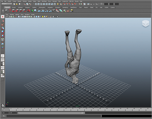
Figure 9-10: Centering the pivot point
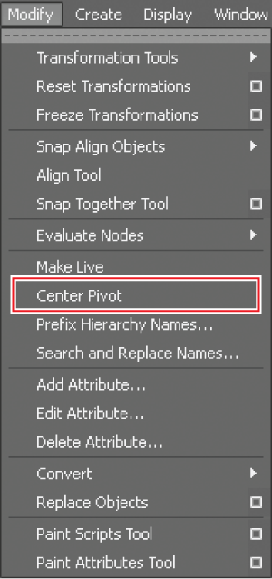
Figure 9-11: The model rotated into correct orientation

Preparing the Scene, Lighting, and Background in Maya
We have now imported the meshes themselves and oriented them in the scene. The next step is to create an environment for the figure to be lit. Since the purpose of this image is to showcase the character, we will chose a simple photo studio setup. This allows us to focus entirely on the figure and his silhouette.
Creating the Backdrop
In the steps below, we will create the studio backdrop as well as the basic lighting setup.
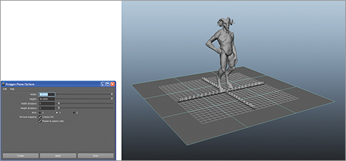
1. From the main menu at the top of the screen click Create Polygon Primitives Plane ![]() . Reset the settings by going to Edit Reset settings on the window. Set the height and width to 35 and the width and height divisions to 3 (Figure 9-12).
. Reset the settings by going to Edit Reset settings on the window. Set the height and width to 35 and the width and height divisions to 3 (Figure 9-12).
Figure 9-12: The create Polygon Plane options are shown on the left of the screen here. The polygon plane moved to the level of the feet to serve as a ground plane.
2. With the plane selected, press the F9 key to enter into the vertex selection mask. Select the back row of vertices as shown in Figure 9-13.
3. Press W to enter move mode and drag those vertices up in the Y direction. Invert the selected vertices by going to Edit Invert selection. Now the other control vertices will be ready to move. Shift these back in Z until the backdrop looks like Figure 9-14.
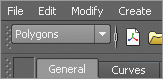
4. Press the F8 key to return to Object Select mode from Vertex mode. Make sure the selection mask in Maya is set to Polygons (Figure 9-15). If this part of the UI is not visible, go to Display UI Elements Show All UI Elements (Figure 9-16). Alternatively, you can open the hotbox by holding the spacebar and then click in the left region to bring up menu masks. Select polygons from there to switch the main menu to polygon model (Figure 9-17). Now the main menu at the top of the screen will display the polygon modeling options.
Figure 9-13: The back row of vertices selected
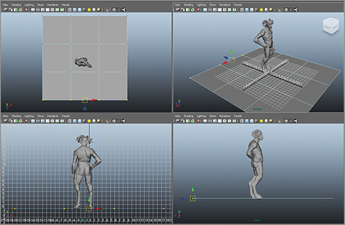
Figure 9-14: On the left you can see the vertices moved up in the Y direction. On the right the vertices are moved back in Z.

Figure 9-15: The polygons menu mask
5. With the backdrop geometry selected, go to Mesh Smooth ![]() . Reset the settings. Set divisions to 2 and then uncheck Geometry Borders under the Preserve section. Click Smooth and the backdrop will smooth (Figure 9-18).
. Reset the settings. Set divisions to 2 and then uncheck Geometry Borders under the Preserve section. Click Smooth and the backdrop will smooth (Figure 9-18).
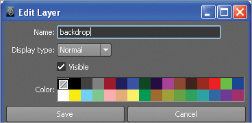
6. The backdrop is now finished. We can add this to a layer and set it to reference to keep it from being selectable while we work. To do this, click the new layer icon at the right side of the screen as seen in Figure 9-19. Double click the layer name to bring up the Edit Layer box. Here you can rename the layer to backdrop (Figure 9-20).
Figure 9-16: The display all UI elements menu
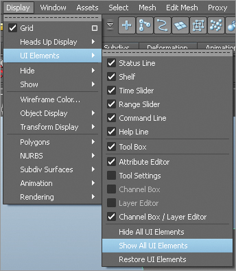
Figure 9-17: Selecting the polygon menu mask from the hotbox
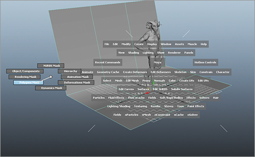
Figure 9-18: The backdrop geometry smoothed
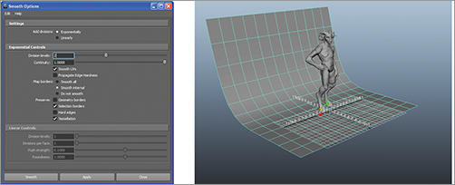
Figure 9-19: Create a new layer by pressing the new layer icon shown here
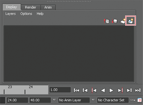
Figure 9-20: Double clicking the layer name will open this dialogue box and allow you to rename the layer.
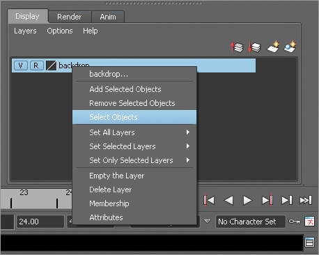
7. Select the backdrop geometry and right click the layer name. From the popup menu select add selected objects (Figure 9-21). With the layer selected, click the Layers menu item. Set selected layer Reference to set the layer to reference mode. This means you cannot select the backdrop accidently while you work. To easily select the backdrop again simply right click on the layer name and select objects to select the backdrop (Figure 9-22).
Figure 9-21: Add Selected Objects to layer
Figure 9-22: Use the Select Objects menu to select the contents of a layer set to reference mode.
Setting Up Lighting
With the backdrop in place, we are now ready to create the lights for our scene. Follow these steps to create a key and backlight using Maya’s directional lights.
1. Create a directional light by clicking create lightsDirectional. Press E to enter Rotate mode. Press the number 7 at the top of the keyboard to display lighting in the viewport and rotate the light at an angle similar to what’s seen in Figure 9-23.
Figure 9-23: The light angle menu
2. Press Ctrl to open the Attribute Editor. Open the shadows options. Set the angle to 10 and the rays to 50. A lower angle setting creates a sharper shadow and more rays reduce the graininess but will also increase the overall render time (Figure 9-24).
3. Duplicate this light by pressing Ctrl + D and rotate the second light to point at the figure’s back—this will be the rim light (Figure 9-25). The Attribute Editor should still be open. If not, press Ctrl + A while the light is selected.
Figure 9-24: Altering the shadow settings
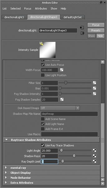
Figure 9-25: Setting up the rim light
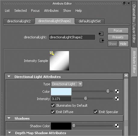
4. Pressing Ctrl + A will open the Attribute Editor for the rim light. Set the light intensity to 3.71 (Figure 9-26). We want to give the rim light a cooler hue. To do this, we will assign a color to the light. Click the color box in the Attribute Editor and set the color to a pale blue (RGB 0.687 0.844 0.922). This will help differentiate the rim light from the key. The cooler light will help make these areas recede but the impact of the rim light will help define the character from the background.
Figure 9-26: Setting the light color
Setting Up Materials
Now we will set up materials on the body, eyes, and horns. These will be fairly standard blinn shaders with slight modifications. We are most concerned with getting a variation in specular quality between the skin, eyes, and horns since these are three distinct materials.
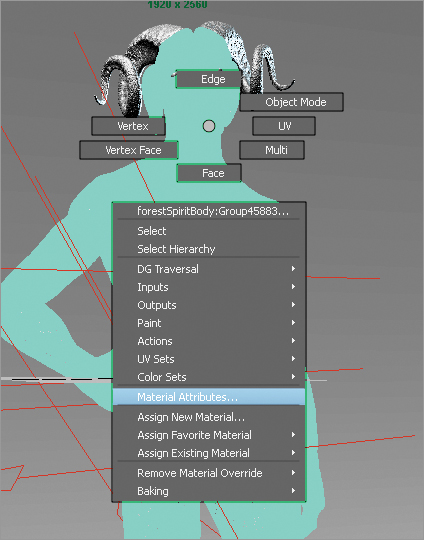
1. Select the body mesh. Click and hold the right mouse button and select Assign Favorite Material Blinn. This will assign a blinn shader to the body, and if the Attribute Editor is still on, the settings will be visible (Figure 9-27). If the Attribute Editor is not open, right click and hold and select material attributes from the Marking menu (Figure 9-28).
2. We want to adjust the specular shading settings. To allow us to see the change on the model, click the Select button at the bottom of the Attribute Editor window. This will allow you to keep the material node selected while deselecting the geometry in the viewport. That way, changes made to the shader are visible in the window (Figure 9-29).
Figure 9-27: Assign favorite material
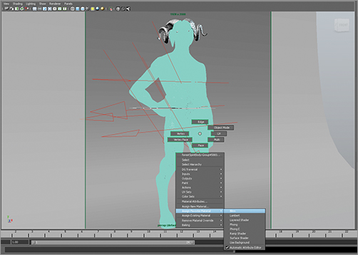
Figure 9-28: The material attributes menu
3. Click in the color swatch and set the RGB value to 0.500 0.500 0.500. You may need to set the color drop-down box to RGB on the lower right corner of the window (Figure 9-30).
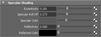
4. In the Specular Shading Settings, adjust the Eccentricity setting to 0.281, Specular Roll Off to 0.273, Specular Color to RGB value 0.248 0.248 0.248, and Reflectivity to 0. These settings can be seen in Figure 9-31. This will give the skin a general shine with no sharp, refined specular highlights. This is more suitable for a skin like this that should not appear particularly moist or shiny. The eyes and horns will have a much stronger specular highlight by contrast.
Figure 9-29: The select button allows you to select and alter the material node while seeing the material change on the model in the viewport.

Figure 9-30: Setting the color value of the light in the color history menu
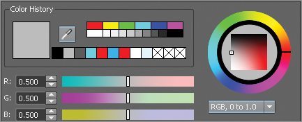
Figure 9-31: The specular settings for the material node
5. Select the horn geometry. Right click and hold, and from the Marking menu, select Assign Favorite Material Blinn. Click the color swatch and set the RGB value to a darker gray than the skin, in this case RGB 0.317 0.317 0.317.
6. Under the Specular Shading settings, set Eccentricity to 0.260, Specular Roll Off to 0.756, Specular Color to RGB 0.309 0.309 0.309, and Reflectivity to 0 (Figure 9-32). This will create a nice color and specular contrast between the horns and the head (Figure 9-33).
7. Select each eyeball. While the main menu is in polygon mode, click Mesh Combine, to combine the two spheres into a single object (Figure 9-34). Click and hold the RMB and assign a blinn shader as before.
8. Set the color of the blinn to 0.600 0.600 0.600 to give the eyes a lighter gray than the skin and horns. Under the Specular Shading section set Eccentricity to 0.209, Specular Roll Off to 1, Specular Color to RGB 0.683 0.683 0.683 and Reflectivity to 0.
Figure 9-32: Set the specular color for the horns to help control the level of shine
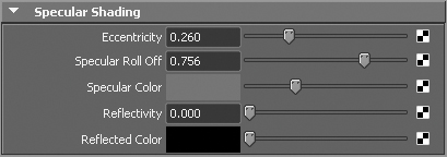
Figure 9-33: The horns and skin have varied levels of shininess due to their different specular settings
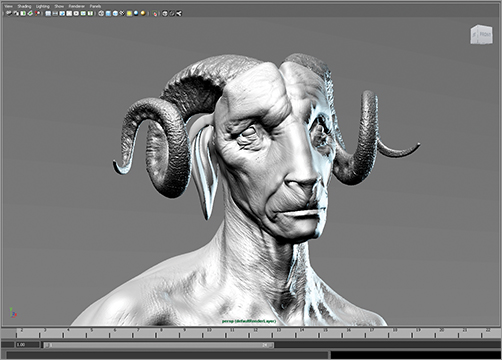
Figure 9-34: Combine the eye meshes

9. Lastly we will assign a Lambert shader to the backdrop. We assign a Lambert shader to the backdrop so there are no specular reflections/highlights on the background itself. The Lambert shader is flat shading, only with no shine. Click the Channel box tab at the right side of the screen or press Ctrl + A to switch from the Attribute Editor to the channel box. Under the Layer menu at the lower right corner of the screen right click and hold on the backdrop layer and, from the popup menu, select Objects.
10. The backdrop is now selected. Remember we cannot directly click on the backdrop geometry to select it at this time because the layer is set to reference. Right click and hold on the backdrop in the viewport menu. From the popup menu, select Assign Favorite Material Lambert. The shader will appear in the Attribute Editor on the right side of the screen. Set the color to RGB 0.453 0.453 0.453.
That completes the shader assignments. We are now ready to create render passes to ensure that we get the images from Maya we need for export.
Setting Up Render Pass Layers
Maya allows you to create various render layers that control the type of image output by the renderer. We will use these render layers to create a normal base render, an ambient occlusion pass, and a matter pass for our render.
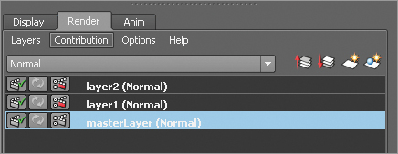
1. Press Ctrl + A to exit the Attribute Editor and show the Channel box. Alternatively, you can click the Channel box tab at the right side of the screen. In the Layers menu at the bottom, click the Render tab. This is where we will create and edit render layers (Figure 9-35).
Figure 9-35: Create render layers.

2. By default, you have a master layer that renders the basic scene with lighting. We will create another render layer that is set to generate an ambient occlusion pass. Ambient occlusion helps define the shadows on the figure and is very useful in Photoshop for giving more depth and intensity to the lighting. Select the figure, pressing the up arrow on the keyboard so the whole group is selected. Holding down Shift, drag a marquee around the lights to select them as well.
3. With this selection, click the Create New Layer and Assign Selected Objects button, shown in Figure 9-36. This will create a new layer called layer1 (Normal) and assign the figure and lights to it. Double click the layer name and rename it Occlusion.
Figure 9-36: Create new layer and assign the geometry and lights.
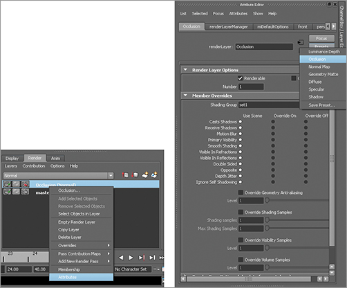
4. Right click on the layer name and from the popup window, select Attributes. This will open the render layer attributed in the Attribute editor. Click and hold the right mouse button over the Presets button in the Attribute editor. Here you will find several layer types listed. Select Occlusion, and Maya will automatically set up the render layer to generate an ambient occlusion render (Figure 9-37).
Figure 9-37: Selecting the attributes for the Occlusion render layer
5. Now we will create a matte layer for the figure. Select the figure again. Press the up arrow so the whole group is selected. This time you will not select the lights. Again, press the Create New Layer button to generate a layer and add the selected geometry. Double click this layer and name it “Matte.”
6. Right click the menu name “Matte” and from the popup menu, select Attributes again. In the Attribute Editor, click Presets and select Geometry Matte. This will create a matte render layer. Note that the figure will appear blacked out on the screen now; select the master layer and your regular shading and lighting will reappear (Figure 9-38).
Figure 9-38: The figure will appear in silhouette when in the geometry matte render layer, as we see on the left. When you select the master layer, the regular lighting will reappear, as shown on the right.

Setting Up Camera and Render
Now we are ready to set up our camera view for rendering. In this section, we will look at how to enable the rendering camera and set up all our render options so we get the images we need from Mental Ray.
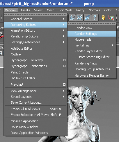
1. From the top of the screen, press the Render Settings button (Figure 9-39). Alternatively, you can access the render settings by clicking Window Rendering Editors Render Settings (Figure 9-40).
Figure 9-39: The Render Settings button
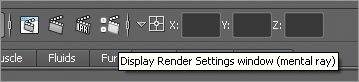
Figure 9-40: The Render Settings menu
2. In the render settings window, set Mental Ray in the Render, using the drop-down box. This selects Mental Ray as the renderer (Figure 9-41).
3. Under the Common Settings tab, open the File Output menu (Figure 9-42). Set the image format drop-down box to tiff. Under Renderable Cameras, select Perspective (Figure 9-43). This will set the perspective camera as the rendering camera and the file type output will be tiff.
4. Next we will set the resolution. I chose a high-resolution final render in a portrait proportion, that has a longer height than width. Uncheck Maintain width/height ratio and set the image to 1920 × 2650. Set Resolution to 300, so the image is suitable for print (Figure 9-44). Figure 9-45 shows the render window as a whole.
Figure 9-41: Set Mental Ray as the renderer
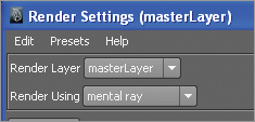
Figure 9-42: File output

Figure 9-43: Setting the Renderable Cameras to perspective
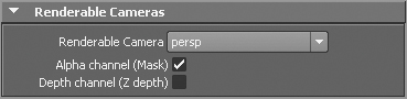
Figure 9-44: Image Size settings
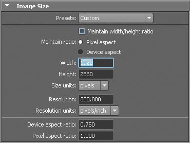
Figure 9-45: The render window

Some Special Settings for Rendering Multiple Views
If you choose to keyframe multiple camera positions or model positions with the intention of rendering multiple options from Maya, you will need to set a couple extra render global settings. Under the File Output section, set Frame/animation ext to name.number.ext. This ensures that each individual frame is rendered and named with its own number in the filename. Set the frame padding slider to 2. Under the Frame Range submenu, you will need to set Start and End frame. If you set keyframes at 1–5, you want to set your Start to 1 and End to 5. With these settings in place, Maya will render a pass for each frame, number the image accordingly, and store it in the appropriate folder, as we see in the next section.
5. Next we will set up the anti-aliasing settings to give the best image quality. Go to the Quality menu tab in the Render Settings and choose the “Production” preset. This allows the anti-aliasing settings to be automatically created. You must be sure to do this before turning on Final Gathering in the next step.
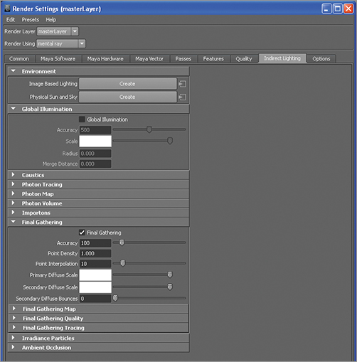
6. Next we will enable Final Gathering. This will give a very nice, soft lighting and shadow effect on the final image. Click the Indirect Lighting tab at the top of the Render settings window (Figure 9-46). Open the Final Gathering submenu and click the Final Gathering checkbox. Set accuracy to 100, Point Density to 1, and Point Interpolation to 10. You can increase Accuracy to 200 for a higher-quality result, but the render will take longer. Remember we will be using this as a basis for painting in Photoshop, so you can afford to reduce some quality for speed.
Figure 9-46: The indirect lighting options
Click the Close button at the bottom of the menu. Your render settings now are stored. Now we will enable the necessary camera settings so we can frame the image for composition.
1. Select the perspective camera by clicking the camera icon in the toolbar along the top of the perspective viewport window (Figure 9-47).
Figure 9-47: The select camera icon
2. We will now want to display the resolution of the image the camera is set to render. This is called the resolution gate, and it is enabled by clicking the View menu in the perspective viewer toolbar, under View select Camera Settings Resolution Gate (Figure 9-48). A rectangle will appear in the viewport now—this rectangle is determined by the image dimensions set in the render global.
Figure 9-48: The Resolution Gate shows a rectangle representing the image resolution set in the render globals.

3. If the borders are offscreen, with the camera selected, open the Attribute Editor. Under the Display Options settings, raise the overscan value until the resolution gate is visible in the viewport. This helps to accurately frame your render (Figure 9-49).
4. Orient the camera to the figure to get the best possible composition. You may choose to keyframe several camera positions. You can also rotate the group node containing the figure to get various angles. These rotations can be keyframed as well. Check the sample scene file on the DVD or download files for an example of how keyframes have been set for the camera as well as the figure group.
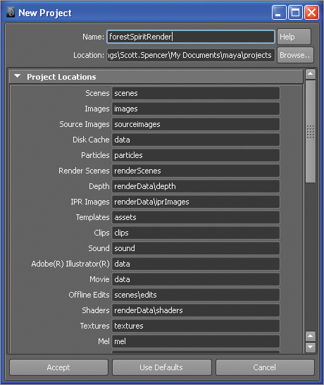
5. Save your scene file before moving on to the next steps. Create a new project by going to File Project New. Name the project “forestSpiritRender.” Note the fact that there are no spaces in the project name. In the new project window, click the Use Defaults button, to fill in the directories (Figure 9-50).
6. Click Accept and then save your file as “render.mb.” Take notice of where your project folder is located. Your final renders will store here in the image subfolder. We will need to get them for the Photoshop stage.
Figure 9-49: The overscan value can adjust the visibility of the resolution gate.
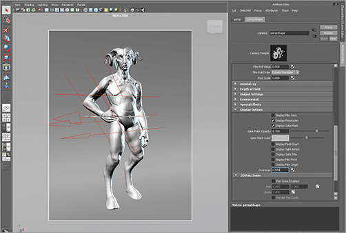
Figure 9-50: Create a new project.
Rendering the Image Passes
We are now ready to render images from Maya. Follow these steps to create separate render passes on disk.
1. Under the Render Layers menu, make sure all layers are set to render. The first little icon on the layer should have a green checkmark (Figure 9-51).
2. Change to the Rendering Menu Mask at the top left of the screen (Figure 9-52).
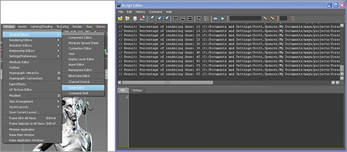
3. From the top menu bar, click Render Batch render. This will start the rendering of your three layers. You can watch the render in progress by opening the Script Editor, clicking the icon in Figure 9-53 or going to Window General Editors Script Editor.
4. Change to the Rendering Menu Mask at the top left of the screen (Figure 9-54).
Figure 9-51: Set to render

Figure 9-52: Rendering menu mask
Figure 9-53: Script editor button
Figure 9-54: Script Editor menu
When the render is complete, you will find the passes stored in the Maya project directory, in the Images folder, in subfolders named for each layer. If you rendered multiple frames, each folder will have an image numbered for each frame. This will help you identify and composite the associated layers in Photoshop.
Compositing and Painting in Photoshop
Now that we have completed the technical stages to render out images, we are ready to start painting in Photoshop. This section is where we pull out the tips and tricks to really make this image come alive. With just a few simple techniques, I will show you how to give these renders a textured, illustrative feel as well as how to add light and life to the eyes with just a few passes of light and shadow.
Make sure your brush set that came with this book is loaded into Photoshop. This can be appended to your favorite brushes or replace them entirely. We will be using soft round brushes for most of the work in this chapter with the exception of some specific hair brushes. We will discuss the hair brushes as they come up later. If you rendered multiple keyframes in the previous example, pick one of them to follow these steps or use the render passes supplied on the DVD or download files.
Composite Layers in Photoshop
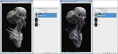
To composite the layers, we will use the same script as seen in Chapter 5, “Painting the Interdimensional Traveler.” In Photoshop, open the menu item File Scripts Load Files Into Stack.
1. From the Load Layers menu, click Browse and locate the render passes. Maya stored them in the Images Subfolder of your project folder. The renders will be stored in folders called MasterLayer, Occlusion, and Matte. If you rendered multiple keyframes, each folder will have a file named with a number that corresponds to the keyframe it represents. For the first frame you want to only load the passes numbered 01.
2. Browse and load the masterLayer, occlusion, and master images for frame 001 (Figure 9-55). When this is done, click OK on the Load Layers dialog box, and Photoshop will create a new layered document from the files selected.
3. Arrange the masterLayer image on the bottom of the layer stack with Occlusion and Matte above it. Rename the layers “figure,” “occlusion,” and “matte” for clarity later, as we need to work with specific layers (Figure 9-56).
4. Select the occlusion layer. Set the layer blending mode to multiply (Figure 9-57).
5. Use the magic wand to select the body on the matte layer. Make sure layer visibility is on and click on the character’s body with the magic wand tool. You will get marching ants around the figure silhouette (Figure 9-58).
Figure 9-55: The render passes selected in Load-Layers
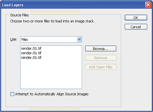
Figure 9-56: Arrange the renamed layers as seen here with Occlusion and Matte above the figure layer
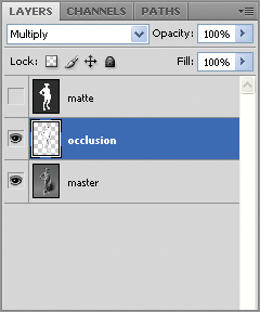
Figure 9-57: The image on the left is the figure without the occlusion layer. On the right is the figure with the occlusion layer set to multiply.

Figure 9-58: Selecting the figure with the matte

6. Since we have the figure matte selected now, we can separate it from the background. This will make it easier to generate a selection later. All you will need to do is Ctrl+Click on the layer and it will automatically select just the pixels of the figure. Press Ctrl + J to jump the selection up into a new layer. Name this new layer “figureMatte” (Figure 9-59). You can turn off visibility on both the matte and figure matte layers now. This will make isolating the figure from the background much easier. All you need to do is Ctrl+Click on the layer itself to select the figure. The layer need not be active or visible for this to work.
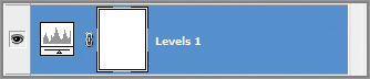
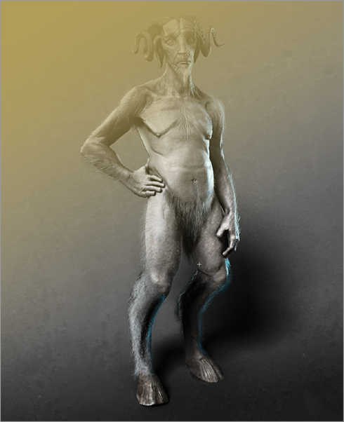
7. Create a new layer by going to Layer New Adjustment Layer Levels. This creates a levels adjustment layer at the top of the stack (Figure 9-60). When the layer is created, the Levels control window will appear in the Photoshop interface, allowing you to adjust the levels of the image (Figure 9-61). This allows you to apply changes to the lightness and darkness of the layers beneath this adjustment layer. Darken the image using the layers control sliders. At this stage, the entire image is darkened by the levels control (Figure 9-62).
Figure 9-59: The figure layer

Figure 9-60: Create an adjustment layer for level control.
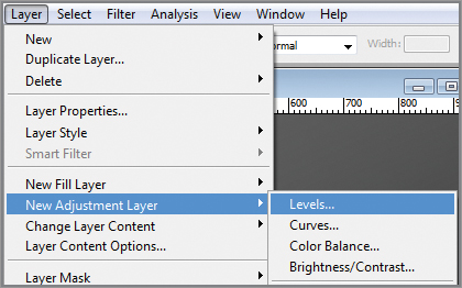
Figure 9-61: Adjust the histogram to darken the image as seen here.
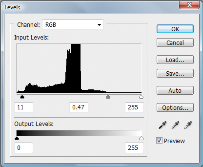
Figure 9-62: The entire image is darkened by the levels adjustment layer.

8. We now want to create a falloff, so the darkening effect appears to increase toward the bottom of the image. This will help create the impression of a key light falling off toward shadow and increase the contrast and atmosphere of the image. The adjustment layer comes with a layer mask by default (Figure 9-63).
Figure 9-63: The adjustment layer comes with a layer mask attached as seen here. Click in the white rectangle to select it and make it editable.
9. Click in the mask so it is active. From the tools, select the Gradient tool. The Gradient is located under the paint bucket so if you do not see the gradient icon, click and hold on the paint bucket to select it (Figure 9-64).
Figure 9-64: Select the Gradient tool.

10. With the Gradient tool selected, click and drag from the upper left to lower right corners of the image. This will add a gradient to the mask layer causing the lighting effect to grow in intensity toward the feet, giving the impression of light falling off to shadow. If you see the actual gradient in your image, you are not currently painting into the layer mask. To fix this, undo with Ctrl + Z, make sure you click on the mask in the layer menu, and draw the gradient again (Figure 9-65).
Figure 9-65: Create an adjustment layer to control the levels and selectively darken parts of the image

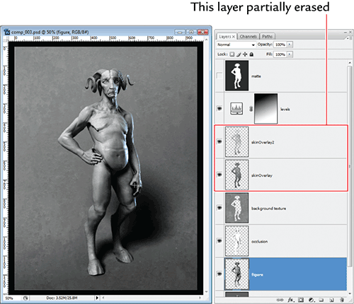
Adding Noise Layers for Skin Variation
We will now add a layer of visual noise to the figure itself. This will break up the perfectly gray surface and help to suggest irregularities and texture in the skin.
1. From the DVD or download files, load the image noise.tif. We will add this as a noise layer over the whole image. We will add this as an Overlay layer to introduce skin texture variation (Figure 9-66).
2. Select the image with Ctrl + A, then press Ctrl + C to copy it into memory. Return to the character image and paste the noise image in by pressing Ctrl + V. It will paste as a new layer. Rename the layer to “skinOverlay” and arrange the layer so it is above the MasterLayer. Set the skinOverlay blending mode to Overlay (Figure 9-67). You may want to reduce the layer opacity if the effect is too strong.
Figure 9-66: The noise image
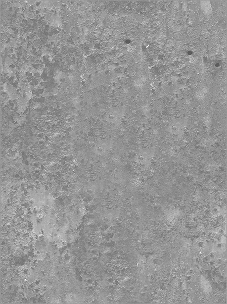
Figure 9-67: The skin with the noise overlay applied—notice the broken up texture patterns

3. We want to remove the overlay image in the areas that overlap the background. We want to concentrate this noise pattern on the figure itself. Ctrl+Click on the figureMatte layer to select the figure pixels. Do this while the skinOverlay layer is still selected.
4. Press Ctrl + I to invert the selection and press the delete key to remove the noise that falls outside the figure (Figure 9-68). Clear the selection by pressing Ctrl + A.
5. At this point, I select the eraser with a soft round brush. Enlarge the brush size and set the opacity to 50%. Erase sections of the figure texture. While on the skinOverlay layer, press Ctrl + A and then Ctrl + J to copy and jump the layer up (Figure 9-69). This will cause the texture effect to be stronger, as it effectively doubles the noise effect. Continue to erase areas to create variation (Figure 9-70).
Figure 9-68: Background noise removed
Figure 9-69: Duplicated layer of noise
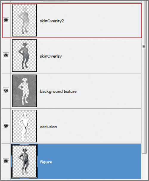
Figure 9-70: Effect of duplicating and erasing out the layer
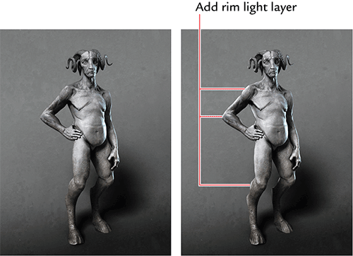
6. Press Ctrl + Alt + Shift + N to create a new layer. Name this layer “highlights.”
7. Ctrl+Click on the figureMatte layer, to create a selection from the body. You can hide the marching ants while keeping the selection active by pressing Ctrl + H.
8. Select a soft round brush and from the color picker, select a cool white (RGB 236 245 246).
9. Set the opacity to 20% and paint along the edge of the figure. Build up a rim light along one side (Figure 9-71).
Figure 9-71: Painting rim light
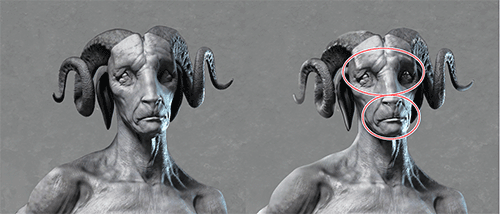
10. Pick out areas of highlight along the eyes and horn with a harder round brush. White highlights with a sharper edge give the impression of shiny harder material. Softer edges on highlights create the impression of softer, less wet, or polished materials. Suggest the eye that’s hidden in shadow by painting in some highlights along the lower eyelid. This brings some interest to what would otherwise be a dead space of dark in the image (Figure 9-72).
Figure 9-72: Picking out highlights in the face
Painting Hair
We will now paint in hair on the character. While we want to give him a hairy appearance, it is not necessary to paint every hair on his body—doing so would create a noisy or unappealing character. In this section, I will show you a painterly approach to the character’s hair, using some special brushes in the brush set supplied on the DVD or download files.
Painting the Beard
We will start by painting a goatee on the character. I had always envisioned his face with a long, pointed goatee. You will see how the addition of this form will further complete the shape language of the character’s head bringing the angles of his face to a much more acute point (Figure 9-73).
Figure 9-73: Notice how the addition of the long pointed beard alters the angles of the face. It tends to lengthen the long triangle of the face and changes the overall appearance of the character

1. Create a new layer and name it “goatee.” In the Brush menu, click the arrow in the upper right of the menu to open the options.
2. Sketch in the general shape of the center long hairs with the same brush (Figure 9-74). Select the brush hard round 1 #2. With this brush we will sketch in single strands of hair. Dial back the opacity of the brush to 50% and sketch in stray hairs (Figure 9-74). You may also want to sketch hairs along the jaw line as well (Figure 9-75).
3. Select Large List to see the full brush names. Select the brush called streaks from the brush presets (Figure 9-76). Dial back the opacity to 65% and select a light gray color. You can hold the Alt key to invoke the color sampler and actually sample a light value from the image itself.
4. Lower the brush diameter. We want to start to suggest short choppy stubble along the jaw line but the brush is at the wrong angle. Open the Brush menu by clicking the icon here or clicking Window Brushes (F3 hot key) (Figure 9-77). Click the Brush Tip Shape menu and you will be able to adjust the brush tip angle by clicking and rotating the crosshair. Rotate the brush to an angle congruent with the jaw line (Figure 9-78). With shirt strokes suggest choppy hairs along the jaw line.
Figure 9-74: Sketching in the center of the goatee
Figure 9-75: Adding hairs to the jaw line
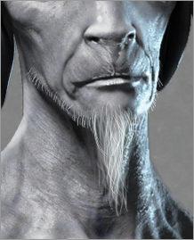
Figure 9-76: Here the Large List option is enabled in the Brush menu. Select the brush named streaks
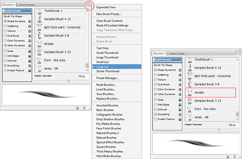
Figure 9-77: Open the Brush Tip Shape menu here.
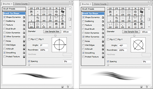
Figure 9-78: Choppy hairs on jaw line created with rotated brush—sketch in center of goatee with long strokes.

5. From the Brush menu, flip the brush angle so it follows the other side of the jaw. Press and hold Alt and select a very light color from the rim light side of the figure’s face (Figure 9-79). We want the hair on this side to be brightly lit like the face itself. This will make it have less detail but you will still be able to see the ragged edge of the hairs (Figure 9-80).
6. We want to add some contrast. Duplicate the goatee layer by pressing Ctrl + J. This copies the layer above itself into a new layer. The effect will brighten the beard considerably. Set the blending mode to Multiply and name the layer “goatee multiply” (Figure 9-81). You will see that this now darkens the beard and adds contrast.
7. Dial back the layer opacity to 65%. Select the eraser with a soft round brush. Set the eraser opacity to 10% and erase areas that are too strong. The purpose of this Multiply layer is to add contrast to the beard.
Figure 9-79: Paint in highlights with brighter white.
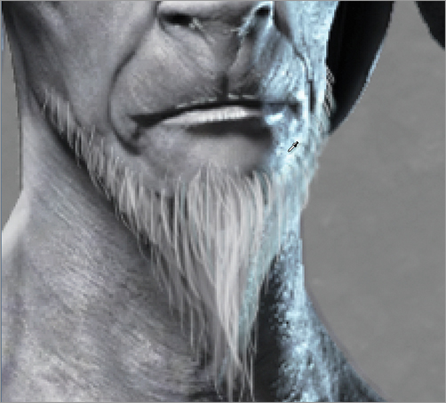
Figure 9-80: Sample light color from the rim light side.
Figure 9-81: Add layer as multiply.
8. Select the goatee layer again and select the Blur brush. Set the opacity to 15% and blur the edges of the hairs. Do not overdo this—you just want to add a sense of fuzziness to the hair so they are not all like crisp strands of spaghetti (Figure 9-82).
9. Group the layers of the goatee together and call this group “beard” (Figure 9-83).
That completes the goatee (Figure 9-84). We will now look at using some more specialized brushes to create body hair on other areas of the character.
Figure 9-82: Use the Blur brush on the hair.
Figure 9-83: The beard layers grouped. The group folder is closed in this image. Click the arrow next to the folder to expand it and view the contained layers.

Figure 9-84: Final goatee
Painting the body hair
1. In the Brush menu, select Replace brushes and browse to the hairbrushes.abr brush set, supplied on the DVD or download files. This will replace the current brush set with the hair brushes we will use for this section. Make sure you have your current brush set saved and easily accessible to reload later (Figure 9-85).
Figure 9-85: The specialty hair set hairbrushes.abr

2. Select the brush Hair 06. Using this brush, sketch in the mass of hair at the midsection. Try to keep in mind a growth pattern that trails up to the navel. When painting hair, I try to sample color directly from the image by pressing the Alt key while in the brush tool. This invokes the color picker. Select light gray values for the hair and then shade with darker values (Figure 9-86).
3. The shape of the groin hair is a large inverted triangle. It is intended to help mirror the shape of the head and facial hair, continuing the repetition of triangles down into the body.
4. Sample a lighter value and paint in highlights to the groin hair. Use the round brush with a low diameter setting and manually sketch in each hair. Blur the edges of the hair with the Blur brush (Figure 9-87).
5. Use the soft round brush, turn down the diameter until it is a very fine brush, and sketch in small hairs along the far edge of the belly (Figure 9-88).
6. For the leg hair, use the Fuzz brush. Select a light gray value and with the brush sketch in the woolly leg hairs. Be sure to sample both light and dark values to give contrast to the hair (Figure 9-89).
Figure 9-86: Painting midsection hair. Use the brush hair_6 to sketch in the hair at the midsection
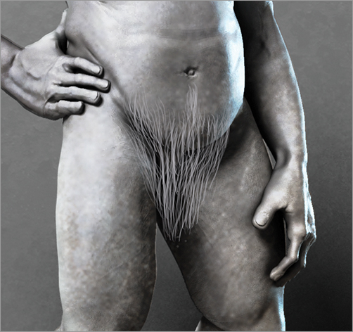
Figure 9-87: Highlighting groin hair
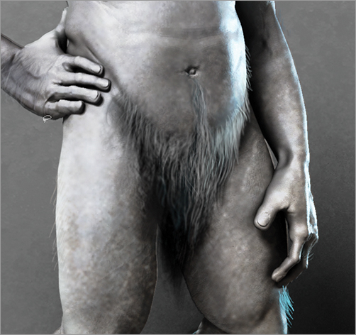
Figure 9-88: Painting hairs on the edge of the bell

7. Sample the blue rim light and paint along the edge of the leg hair. This gives the impression the light hits the hair as well, creating a cool fringe of light. This helps marry the hair to the image and combat the impression of strokes painted on top of the image that do not incorporate the lighting (Figure 9-90).
8. Using the same Fuzz 1 brush in conjunction with Hair 06, paint in forearm hair and underarm hair. Just suggest the hairs here—try to avoid making too many detailed strands, as these would be distracting and unpleasant. By breaking up the edges of the figure with hair fringes, you can suggest the hairiness without being too specific (Figure 9-91).
9. Figure 9-92 shows the final hair. Be sure to see the video on the DVD or download files for more tips and tricks to painting the body hair.
Figure 9-89: Painting hair fringe on legs

Figure 9-90: Detailing hair fringe on legs

Figure 9-91: Body hair
Figure 9-92: The final hair
A Quick Approach to Painting Eyes
Now I would like to share a very quick way you can paint a realistic eye in the fewest possible steps. This approach has served me very well when I needed to show a quick gray render but I needed to introduce some life to the character beforehand. With only minutes before a presentation, little touches like this can really help push an idea to the forefront because a character with “light” in the eyes will always be more appealing than one with smooth gray spheres for eyeballs!
See the DVD or download files for a video demonstrating this process on the image here as well as a separate video tutorial on painting eyes on a close-up render of this Forest Spirit character.
1. Create a new layer with the Ctrl + Shift + N hot key. Name this “layer eyes.”
2. Select the brush hard round 9 #3. Set the diameter to be the size of the iris for the eye. Don’t worry if the iris overlaps the upper and lower lids, just get the right diameter. Set the brush hardness slider to about 70%.
3. Select a dark color like RGB 0.14 0.14 0.14 and create a circle for the iris with the brush (Figure 9-93). Select the eraser and erase any parts that overlapped the eyelids (Figure 9-93).
4. Create a new layer with Ctrl + Shift + N and name this one “iris color.” Select a lighter amber color like RGB 142 121 59. Use the same brush but dial back the hardness to 50%. Ctrl+Click on the iris layer to select the pixels of the iris. The irises will be highlighted by the marching ants marquee. You can hide this selection with Ctrl + H. This will constrain the brush strokes on this layer to just the area covered by the iris.
5. Stroke along the bottom of the iris selection. This will concentrate the brightest values at the bottom of the eye. Based on the angle of the light, this is where the light would be hitting the iris directly. The upper iris is shaded by the brow ridge and eyelid (Figure 9-94). Once this light is painted in, it should look like a crescent of light in the eye.
Figure 9-93: Creating a black circle for the base of the iris

Figure 9-94: Concentrating lightest color at bottom of eye
6. Create a new layer and name this layer “pupil.” Dial back the draw size and create a pupil. Make sure the pupils are consistent and do not look walleyed or cross-eyed (Figure 9-95).
7. Create a new layer named “highlight.” Dial back you brush diameter and select white. Pick out a highlight in the areas shown in Figure 9-96. Make sure the highlight overlaps the dark of the pupil.
8. You may also choose to tint the inner corner of the eye. This pinkish area is called the tear duct, or more properly, the caruncle. You can color the edge of the eye with the same brush. Create a new layer and name it “eye tint.” Dial back the opacity slightly and keep your edges hard for wet shiny highlights. Select a rose color like RGB 161 66 66. Set the blending mode to Overlay. At this stage, we have several layers built up to create the look of the eye. For clarity, the layer stack is shown in Figure 9-97. You may also choose to tint the lips and nostrils as well. Here you can see the final effect (Figure 9-98).
This is a very simplified, quick approach to the eye. It is extremely effective and you can even change the color by doing a hue saturation adjustment on the iris layer.
Figure 9-95: Use a hard round brush with a dark value and add the pupil.

Figure 9-96: Create highlights here.

Figure 9-97: The eye layer stack
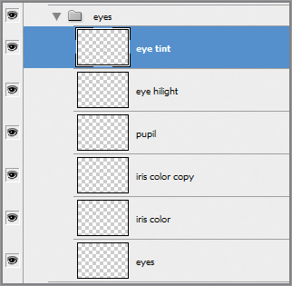
Figure 9-98: Tinting the eyes

Adding Atmospherics
In this section, we will add the final pass of atmosphere to the character. We will create a key and fill light effect where a warm and cool light are both shining from different sides of the image. This is the same process we used to light the Interdimensional Traveler in Chapter 5. I will touch on the steps here. Please see Chapter 5 for a more in-depth approach or, alternatively, view the video for this chapter. We will create a depth-of-field effect in this demonstration in a slightly different manner. While we used a depth pass render in Chapter 5, here we will use a Gaussian Blur filter and selective erasing to create a similar effect.
1. Create a new layer and call this layer “key warm.”
2. From the Tool menu, select the Gradient tool. If you do not see the Gradient tool, click and hold the left mouse button on the paint bucket and the gradient will appear. Set the gradient type in the Gradient Editor to “Foreground to Transparent” (Figure 9-99).
3. From the Color menu, select a warm color like RGB 138 120 62. Draw the gradient from the upper left to lower right, as seen in Figure 9-100.
Figure 9-99: Set gradient to “Foreground to Transparent”

Figure 9-100: Gradient drawn in normal blending mode
4. Set the blending mode to overlay and your image will look like Figure 9-101. You may want to dial back the layer opacity. If you want to further adjust the color, use the Hue Saturation controls by pressing the Ctrl + U hot key.
5. Create a new layer and call this “fill cool.” Select a cool color from the Color menu, like RGB 100 142 142. Repeat the process and draw a gradient from the lower right to upper left of the screen. Dial back the layer opacity and set the blending mode to overlay. Your image will now look like Figure 9-102.
Figure 9-101: Gradient layer changed to Overlay blending mode
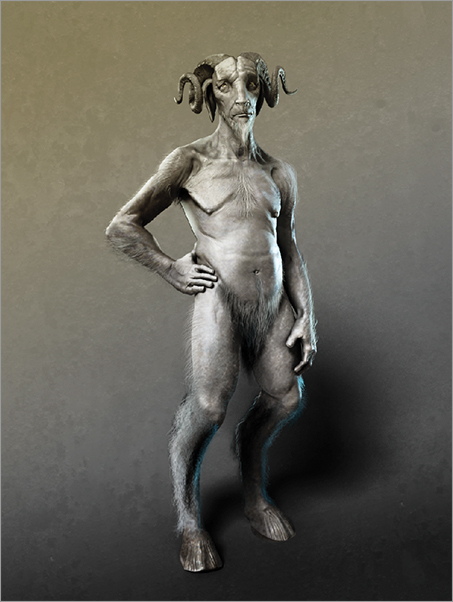
Figure 9-102: Both warm and cool light gradients help create a temperature contrast in the image, adding to visual interest.
Creating Lens Blur with Gaussian Blur
Now we will create a lens blur effect similar to what we did in Chapter 5. In Chapter 5, we used a depth pass rendered from ZBrush to calculate accurate lens blur using the Lens Blur Photoshop filter. While this is a highly accurate and effective way of creating atmospheric perspective and depth of field, we will now look at a fast way to mimic the same effect. In this lesson, we will use the Gaussian blur filter to selectively soften areas of the image while keeping the center of interest in sharper focus. While not as accurate as the Lens Blur filter, this technique is fast and effective for creating a soft-focus, painterly style.
If you prefer to use a ZDepth pass for this effect, as we did in Chapter 5, simply render depth from Maya. A ZDepth pass can be enabled by clicking the checkbox Depth channel (Z Depth) under the Renderable Cameras section in the Common tab of the Render Settings window.

1. We will now collapse all the layers into a new layer copy. This essentially flattens the document to a new layer while keeping all the previous layers beneath in the stack. Press Ctrl + Alt + Shift + E. You now have a new layer. Name it “flattened.”
2. Duplicate a new copy of the layer by selecting all with Ctrl + A and jumping up with Ctrl + J. This creates a copy of the layer above the original. Add a blur to this layer by going to Filter Blur Gaussian Blur. Set the blur to approximately .9 (Figure 9-103).
3. Use a soft eraser brush set to 20% opacity to erase the areas you want to remain in focus. This is a kind of depth-of-field cheat that also helps focus viewer attention. Figure 9-104 shows how I have brought portions of the image into sharper focus while letting others fall slightly into blur. Figure 9-105 shows the final image.
Figure 9-103: The blurred layer
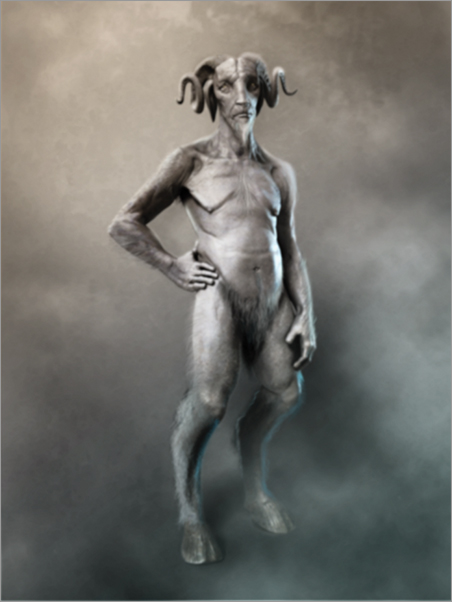
Figure 9-104: Image with DOF
Figure 9-105: The final image
That completes this lesson in painting the Forest Spirit. We have learned how to render base images from Maya for use as Photoshop layers. We have also looked at how to create an unsaturated character design illustration, how to paint realistic eyes quickly, as well as how to approach painting hair and fur.
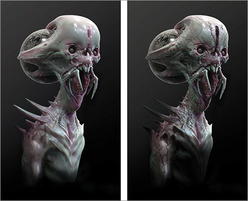
Before we move on to the next chapter, I’d like to share this space with a good friend and artist I greatly admire. Jerad Marantz has designed on some of the biggest films in the past few years and his art is always inspiring (see Figure 9-106 for a great example). Follow along as he shows some of his process for the Space Ghoul image.
Figure 9-106: A sample from Jerad’s portfolio of work. I’m sure you will find his creatures as amazing and inspiring as I do!
Designing the Space Ghoul with Jerad Marantz
Thanks to Jerad Marantz for contributing to this section! Marantz is a freelance concept artist and teacher based in Sherman Oaks, CA. He has designed for several practical FX houses, visual FX studios, and video game companies, and is currently the lead artist at the Aaron Sims Company.
This concept started as a loose sketch. I wanted to design something wacky that was also disturbing. I played around with the proportions and the idea of an orb somehow tethered to the back of a creature’s head. As a concept artist, I spend a lot of time in Photoshop and ZBrush, but I always try to keep up my drawing skills. I find that out of every tool I’ve adopted for my pipeline, drawing is the first thing that suffers if I don’t practice, so I do it every day.
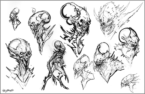
Before going into ZBrush, it is essential that you have 60% of your design resolved. This is important because you need set up the geometry according to where you will need your detail. A good sketch is a solid foundation (Figure 9-107).
Figure 9-107: Sketches
Sculpting the Space Ghoul
I started from scratch and built the sculpt in ZSpheres. At this point, I’m setting up my geometry and determining where I’ll need the mesh to be the densest. For the eyes, I added ZSpheres and inverted them to accommodate the edge loops for the eye sockets. I constantly preview the adaptive skin to make sure the geometry is doing what I want it to do by hitting the A key. During this stage, I realized that I could get more resolution out of the model if I sculpted the mandibles separately as independent SubTools. I appended a new ZSphere and quickly set up the mesh for the mandibles. Once everything was in place, I created the adaptive skin and started sculpting (Figure 9-108).
Figure 9-108: The base subdivision level of the mesh

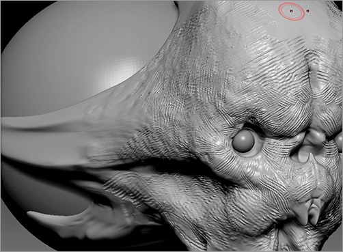
When sculpting in ZBrush, I use these brushes primarily: the Move brush, Clay Tubes, Dam Standard, Standard, Clay, Trim Dynamic, and the Rake brush. For the first step, while the mesh is at subdivision 2, I use the Move brush to pull out my main forms: the forehead, cranium, jaw, muscle, and cheek bones. Then I push in the eye sockets, mouth, and nasal cavities. By working at this level, I am taking advantage of the low geometry and am able to define the sculpt in simple planes. I always try to take the model as far as I can before using any of the other brushes or sculpting on high subdivisions. One of the biggest issues I’ve noticed in beginners’ models is that their sculpts tend to feel “baggy.” The anatomy seems to hang loose and there is a lack of structure. This is often caused by starting the sculpt in the higher subdivisions.
At subdivision 4, I then start to lay more complex anatomy with the Clay Tubes brush. Clay Tubes has a wonderful edge to it as it builds up the forms and allows you to maintain structure (Figure 9-109).
Once I’ve gotten the sculpt where I want it with Clay Tubes, I use the Rake brush to refine the sculpt. I use this brush in additive and subtractive ways. Rakes in traditional sculpting are used to remove excess clay by averaging out the surface and refining the sculpture. The Rake brush in ZBrush can work the same way, but it pushes and pulls the mesh instead of actually carving into it like clay. I use the Rake to refine the model and add more detail to the forms. I always start to use the Rake at a large diameter, and as I’m refining the sculpt I shrink the diameter down and focus on resolving more of the complex forms (Figure 9-110).
Once I’ve reached a certain point with the Rake brush where I’m happy, I start to smooth out areas by hitting Shift. I then use my Trim Dynamic brush to find edges that I may have lost, especially in the cheek bones and other under planes. Then I move on to the Standard and Dam Standard brushes. Dam Standard is phenomenal for carving in details like fine wrinkles and delicate areas, whereas Standard helps you to build up your tertiary detail.
Once the sculpt has reached a level at which I’m content, I then bring the entire model to a low subdivision and pose it, masking off areas and moving or rotating them. In the case of this sculpt; I just turned the head slightly. It’s amazing how a subtle pose will bring a character to life. Once I’m done posing my model, depending on the model’s resolution, I will decimate it if I intend to render outside of ZBrush. I accomplish this with the Decimation Master plug-in. My favorite thing about Decimation Master is that before you decimate your model, you can mask out the areas that you want to retain the most detail and Decimation Master will leave those areas at a higher resolution (Figure 9-111).
Figure 9-109: Clay Tubes brush in use

Figure 9-110: Rakes in use
I created these render passes outside of ZBrush using the same techniques Scott discussed earlier in this chapter. I used a very simple skin shader for one of my passes. Pretty much any rendering engine will have some kind of skin shader these days. If you choose to use ZBrush for your render passes, check in Chapter 10, “Rendering the Enforcer,” for a demonstration of how to render skin materials in ZBrush. When I’m rendering my character, I always make sure that the lighting is dramatic. Dramatic lighting guarantees a dynamic image. I rendered several material passes. I first selected a translucent skin material and went into the material’s properties to change the color to a green hue (Figure 9-112).
Figure 9-111: Posed head
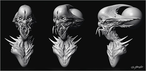
Figure 9-112: Base render

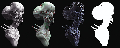
Then I did pass of a matte material that really showed me all of the detail in the sculpt. I also took a pass of a very black and shiny material that I used for the creature’s black pattern on the mandibles, chest, and spikes. Finally, I render a flat material pass that is a solid white silhouette. This is a pass that I’ll use as a mask when I start to bring the design into Photoshop (Figure 9-113).
Figure 9-113: Materials matte black and flat mat
Finishing in Photoshop
I bring the material renders into Photoshop and stack them one on top of the other in the same document, making sure that they are all lined up. I then experiment and see how the materials work with each other. I turned the translucent skin pass into a Soft Light layer and put that on top of the matte material layer. This became my base for the painting. Then I placed my shiny black material on the top layer and used a mask to paint the patterns on the chest, mandibles, and spikes (Figure 9-114).
Figure 9-114: Using the shiny black material
In Photoshop, I can continue to design. If I want to significantly alter the model, I can liquefy it or I can paint directly over the image. I do tend to paint over my 3-D renders quite a bit, using a soft brush to maintain the illusion and consistency of the image. You’ll notice that I didn’t take the time to sculpt the creature’s eyelids in the model. When I brought the renders into Photoshop, I decided to paint them in, giving the creature a slight sympathetic quality (Figure 9-115).
To break up the color of the face, I lightly painted some pinks around the eyes, nose, and mouth on a soft light layer (Figure 9-116). I wanted the creature to be really fleshy and translucent, so I spent time panting in veins. To accomplish the effect in the forehead, I used a photograph of a human brain on another Soft Light layer. The translucency of a soft light layer works really well in creating something that looks like it’s under the skin (Figure 9-117).
Figure 9-115: Eyelid detail
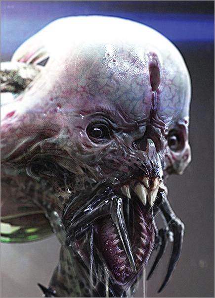
Figure 9-116: Pinks around face
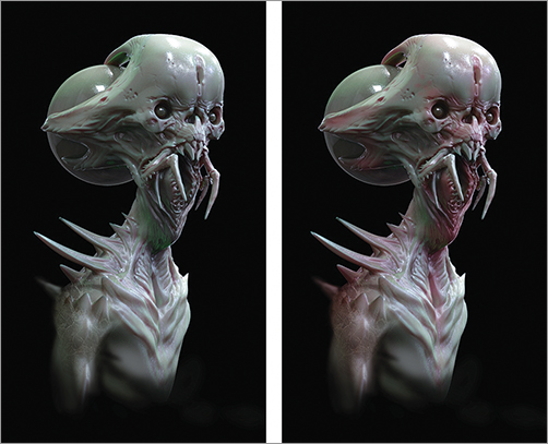
Figure 9-117: Soft light veins before and after
With Photoshop you can easily adjust and change the color of your material renders by using Color Balance and Hue Saturation. You are not limited by the color of the original renders.
Finally, I added atmosphere to the design using a soft brush on a normal layer and painted in the lighting effects to indicate a vague environment, just to place him somewhere (Figure 9-118). These were placed on a Linear Dodge (Add) blending mode to create a blown-out lighting effect. Figure 9-119 shows the final image.
Figure 9-118: Light effects layers
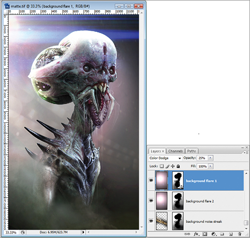
Figure 9-119: The final image
