Chapter 5
Painting the Interdimensional Traveler
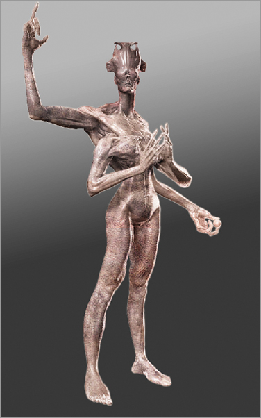
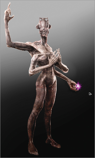
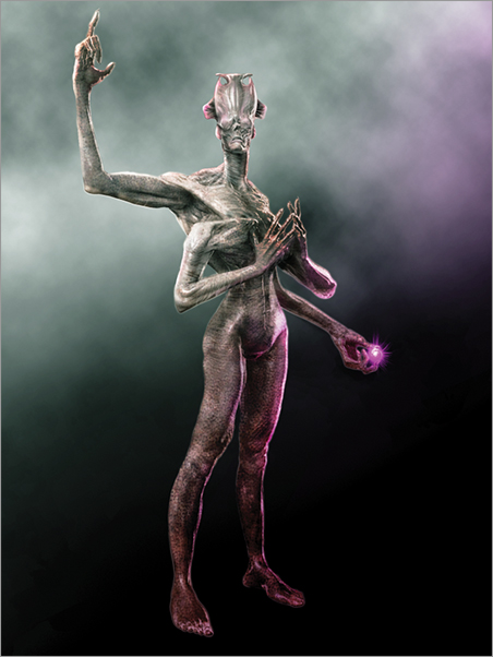
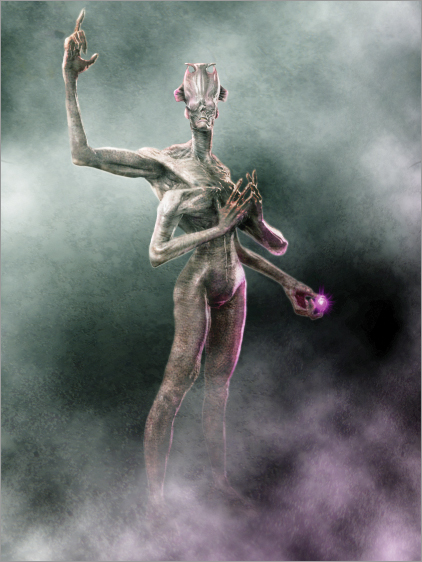
In Chapter 4, “Posing the Interdimensional Traveler,” we looked at how to infuse our character with personality and purpose by posing its body. Now, it’s time to enhance and finalize our conceptualization with with the use of Photoshop Painting tools. We will introduce color and texture, and further explore the concepts of light, shadow, depth of field, and other details to create a compelling final illustration. At the end of this chapter, you will have a finished Photoshop painting created using your ZBrush sculpture as the basis of the image (Figure 5-1).
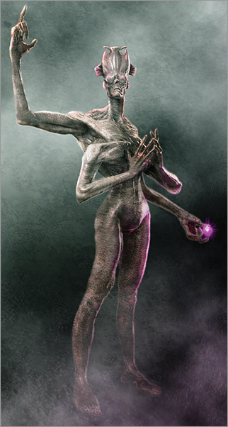
Figure 5-1: In this chapter, we will create this final image of the Interdimensional Traveler.
Adding Color and Texture with Photoshop Paintover
We are now ready to import the images into Photoshop, composite them together, and start painting color and texture over the base design. This is where all our work comes together and we create a compelling final-presentation image. In this section, we will be using Photoshop in conjunction with some special hot keys. I highly recommend learning and using the Photoshop hot keys, as it will increase your speed. Being able to access tools via hot keys allows you to focus more on the work and less on the process of using the software and hunting down tools. Also, be sure to check the DVD or the download files for a fully narrated video of this chapter project. You can follow along the chapter steps in real time as I work on this image.
While I do most of my work in this chapter with basic round brushes, varying their harness, you may want to use some of the specialty brush presets available on the DVD or download files. See the video on loading custom brush sets.
Preparing Images for Composite
Before we can composite the images together, they all need to be the same format. This facilitates using the “load files into stack” Photoshop script. All the image files need to be RGB 8 bit images. The shadow and depth passes are rendered from ZBrush as Grayscale multichannel images. These cannot be processed by the Photoshop script and therefore they need to be converted to 8 bit RGB. Follow these steps to prepare the images for composite.
1. Open the Shadow, Ambient Occlusion, Depth, and Matte passes in Photoshop.
2. For each image go to Image mode and convert to RGB. If an image is Multichannel, convert to grayscale first and then convert to RGB. Next convert each image to 8 bit under the Image mode menu (Figure 5-2).
Figure 5-2: Convert to 8 bit RGB

4. Save the images.
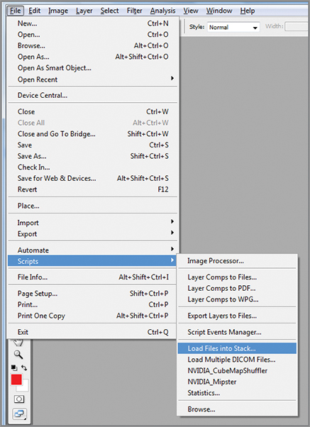
5. The images are now ready to composite into a single document. Since they are all the same format now, the easiest way is to go to File Scripts Load Files into Stack (Figure 5-3).
Figure 5-3: Load files into stack
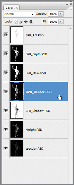
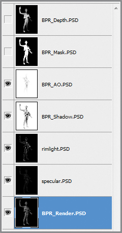
6. Click the browse button and select all the image layer passes. Select the BRP_Render, BPR_AO, BPR_Shadow, BPR_Mask, BPR_Depth, specular, and rim light files. Click OK (Figure 5-4). The files are now loaded into a single Photoshop document. Each layer is named descriptively, based on the filename (Figure 5-5).
Figure 5-4: The Load Files into Stack script UI in Photoshop

Figure 5-5: Layer stack
Arranging the Layers
We are now ready to arrange the passes we imported into ZBrush. In this section we will be looking at Photoshop blending modes and the layer menu. We will also be using some Photoshop hot keys from here on. Table 5-1 shows some of the ones I use most often. Remember you can define your own Photoshop hot keys with the Keyboard Shortcuts menu under the Edit menu. You can also define what Photoshop menus are visible and what tools are accessible under the Menu tab of the same window (Figure 5-6).
Figure 5-6: The Keyboard Shortcuts and Menus screen in Photoshop allows you to customize hot keys as well as menu layouts. This screen is accessible under the Edit Keyboard Shortcuts menu
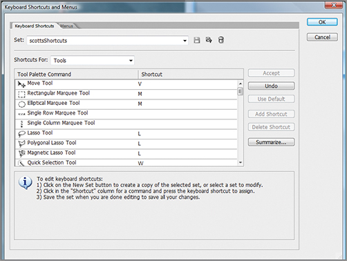
Table 5-1: Common Photoshop Hot keys
| Photoshop function | Hot key |
| Collapse layer Down | Ctrl + D |
| Collapse all layers into a copy | Ctrl + Alt + Shift + E |
| Show/Hide Selection Marquee | Ctrl + H |
| Jump selection up as a layer | Ctrl + J |
| Cut and jump up new layer | Ctrl + Shift + J |
| Group layers | Ctrl + G |
| Zoom | Ctrl + or Ctrl – |
| Color balance | Ctrl + B |
| Hue Saturation | Ctrl + U |
| Levels | Ctrl + L |
| New layer | Ctrl + Shift + N |
| New document | Ctrl + N |
| Create clipping mask | Ctrl + Shift + G |
| Select all | Ctrl + A |
| Fill with foreground color | Alt + Delete |
| Invert selection | Ctrl + Shift + I |
| Brush size control | [ and ] |
ZBrush artist and author Eric Keller has a very useful technique for recalling hot keys. Eric recommends making an image that charts your hot keys and then setting it as the desktop background image on your computer. Whenever you need a quick reminder of the hot keys, simply minimize all windows (on Windows computers, press the Windows key + D to minimize all windows) and your hot key cheat sheet will be visible. See the DVD or download files for a hot key cheat sheet image of the table below. There are many more useful hot keys—see the Photoshop menu items to find the relevant hot keys or define your own in the Edit Keyboard shortcuts menu.
Blending Modes
Before we move on, we need to fully understand the layer menu and blending modes. Figure 5-7 shows the layer menu and many of its options highlighted. Most of your time in Photoshop will be spent between the Brush menus and the Layer menus. The Layer menu functions as a stack. The topmost image in the layer stack displays above those layers below it. Changes made to the top layers usually obscure the layers below when the blending mode is set to normal. If you alter the blending mode, it changes the way the layers blend, in many cases allowing the bottom layers to show through, modified by the pixels of the upper layers.
Figure 5-7: The Layer menu contains many options for controlling layer appearance and how each layer interacts with those below it. This image calls out many of those options for your reference
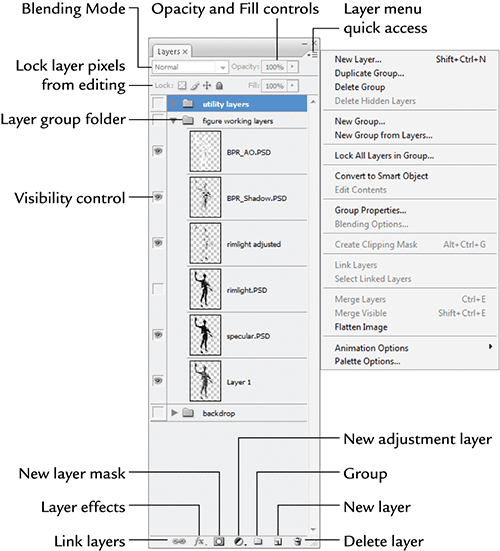
Table 5-2 shows some of the most common blending modes and their function. These are the blending modes I use on a regular basis. The verbal description of blending modes can be tricky to grasp. I recommend checking the example images as well as experimenting on your own. Blending modes are powerful in their ability to help you create “happy accidents” in your work. Their impact will always be a little different depending on the contents of the layers you are working with. This element of randomness and unpredictability makes experimenting with layers a lot of fun. While understanding the various modes will give you a technical understanding of what each one can accomplish, I often find I get surprises that lead my painting into new directions as I experiment with blending modes in my painting. Also, don’t be afraid to hue shift or change the values of your layers to alter the way the blending mode affects them. Experimentation will bring interesting results. See the video for this chapter to see several instances where blending modes Overlay and Soft Light are used to influence the impact of a texture on the image (Figure 5-8).
Table 5-2: Common Blending Modes
| Blending mode | Function |
| Normal | The default blending mode—the two layers do not interact and the top layer will overlap the lower ones |
| Multiply | Darken the lower layers based on the relative value of the selected layer. White will be transparent while darker values will darken the layers below. |
| Lighten | Lighten evaluates the pixels of both the selected layer and the one beneath and uses the lighter pixels value between the two. |
| Linear Dodge (Add) | Lightens the lower layers based on the lightness values of the pixels in the selected layer. |
| Overlay | This blending mode multiplies the light colors and screens the dark colors. |
| Soft Light | Soft Light is the reverse of Overlay—it will multiply the dark colors and screen the light ones. Its effect tends to appear subtler. |
| Screen | Screen brightens lower layers based on the lightness of the selected layer. |
Figure 5-8: Here we see the same texture overlay applied with different blending modes.

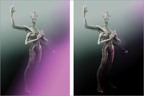
Blending modes can have a powerful effect on an image. One very common use is adding noise to an image. Noise is a random pattern of color or value that can be used to break up the perfect digital look of the illustration and create a sense of dirt or randomness. Noise manifests in the real world as dust on a lens, grain in the film stock, or scratches and dirt on an image or screen. The world is full of visual imperfections, so it’s important that we introduce these kinds of low-fidelity details to our digital images. We are trying to create atmospheric illustrative images of our characters—not crystal-clear 3-D renders where every detail is in perfect focus. Adding noise and losing detail is an important part of creating that painterly look. Figure 5-9 shows an image before and after noise is added.
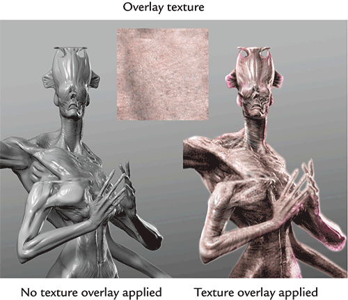
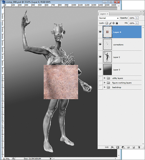
Noise can also be used to add texture to a surface. By using an image of random patterns as an overlay, you can give the impression of texture variation on a surface. Figure 5-10 shows a swatch applied as an overlay layer to create the impression of detailed skin.
Figure 5-9: Here you can see an image before and after adding a layer of noise. Noise can help degrade the extreme crispness for a 3-D render and help give it a more suggestive and atmospheric look.
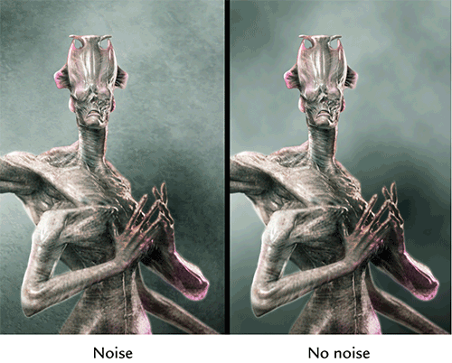
Figure 5-10: Here you can see a texture swatch applied as an overlay to give variation to the skin.
Organizing the Layer Stack
Now that we have the layers imported and we have a basic understanding of how to use layer modes to change the way the layers relate, we are now ready to organize the image. We will arrange the various render layers in order so the stack will allow us to let the lighting passes, like Ambient occlusion and Shadow, impact the render layers. Follow the steps below to organize the render layers and prepare the file for painting.
Follow these steps to organize the working layers.
1. BPR_Render.PSD is your base layer render. This is the sculpture with no shadow or ambient occlusion passes applied. Make this the bottom layer. Click and drag the rim light and specular layers so they sit above the BPR_Render layer. Above these, place BPR_Shadow.PSD and BPR_AO.PSD at the top of the stack (Figure 5-11).
Figure 5-11: the layer stack
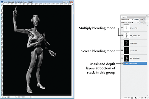
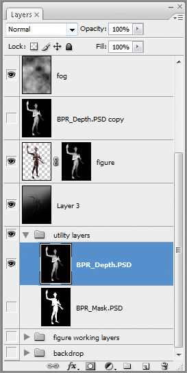
2. The Depth and Mask will be special-use layers. You can turn off visibility on those. I tend to keep them off at the top or bottom of the stack. Shift-select the two layers and press Ctrl + G to group them into a folder. Name this folder “Utility Layers.” You can drag this to the top or bottom of the stack. Turn off visibility by disabling the eyeball icon (Figure 5-12).
Figure 5-12: Group the Depth and Mask layers in a folder called Utility Layers. Turn off visibility and move them to the top or bottom of the stack.

3. Set both BPR_AO.PSD and BPR_Shadow.PSD to Multiply blending mode (Figure 5-13). This causes the darker areas to be multiplied into the image, effectively darkening the shadow areas defined by the AO and Shadow layers.
4. For the specular pass to read correctly, the layer needs to be set to screen blending mode. Figure 5-14 shows the before and after effect of this change. Remember that screen will lighten the layers beneath based on the white areas of a black-and-white image. Black will have no effect while white will lighten. At this stage your layer stack should look like Figure 5-15. I have the utility layers (Depth and Mask) in a group at the bottom of the stack.
Figure 5-13: The image on the left has no Shadow or Ambient occlusion passes applied. On the right, the two lighting passes are applied as Multiply layers.

Figure 5-14: The effect of setting the specular layer to Screen blending mode is to punch up the shiny qualities.
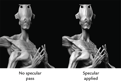
Figure 5-15: The layer stack at this stage with the lighting and specular passes in correct order and the utility layers at the bottom of the stack
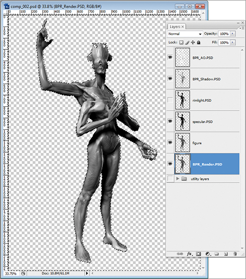
Next we will knock out the backdrop using the mask layer. This section will show you how to quickly create selections from the contents of a layer. It will also show you how to isolate elements on a transparent layer by deleting the background.
1. Open the Utility Layers group by clicking the arrow next to the folder. This will unfold it and grant you access to the layers inside (Figure 5-16).
select the white area of the image. The layer need not be visible to do this; Photoshop will know what to select as long as you click in the area of the figure while the Mask layer is active. Once the selection is made, the outline of the figure will be surrounded with the “marching ants marquee” (Figure 5-17).
3. Select the BPR_render layer and press Ctrl + J to jump the figure selection up. This creates a copy of the figure with no background (Figure 5-18). Name this new layer “figure”
Figure 5-16: Open the utility layers group by clicking the arrow next to the folder to access the mask layer.
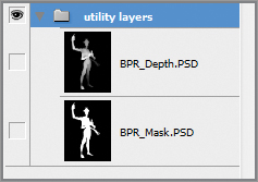
Figure 5-17: Selecting the mask
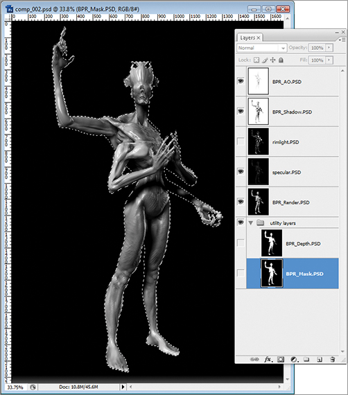
Figure 5-18: Jump figure up with the Ctrl + J hot key to create a new layer

4. We will now delete the background for all the layer renders. This will allow us to add a new backdrop and have total control over its color and value. Had we not deleted the background, we would have extra, unnecessary pixels in each layer getting in the way. By deleting the backgrounds, we now have only the figure on every layer except the bottom layer, where we keep the background itself. It makes for a much more organized and easy to manage image. Hold down the Ctrl key and click on the image for the figure layer to automatically select the figure outline. Make sure you click the image thumbnail and not the layer name. Ctrl + Click will create a selection that conforms to a layer’s contents.
5. Once you have the figure pixels selected, press Ctrl + Shift + I to invert that selection so the background, not the figure, is selected. Alternatively, you can invert the selection under the menu Select Inverse.
6. Now select each layer and press delete. Because the pixels on the outside of the figure are selected, this will remove the background from each layer. When you are done, you will see only the figure on a checkered backdrop (Figure 5-19).
Figure 5-19: Background deleted and checkered backdrop visible
Create a Backdrop Layer
Now we will create a new background for the image. We want to create a backdrop, over which we have the most control, allowing us to adjust the value relationship between the foreground and background by adjusting the levels and gradient of the backdrop image. This will be very helpful as we work since you may find that you need to make changes to the background to make the figure more visible. It is harder to do this if the backdrop is part of the same image as the figure or if the background is just a simple gradient bitmap.
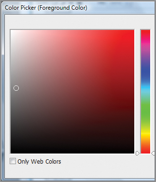
1. Create a new layer by pressing Ctrl + Shift + N. Name this new layer “Backdrop” in the dialogue box that appears. Click OK to create the layer. Move the layer under the figure layer. From the color palette at the left of the screen, select a middle gray (Figure 5-20).
Figure 5-20: Select middle gray from the palette.
2. Fill the layer by pressing Ctrl + A to select all, then Alt + delete to fill with foreground color. This will create a flayed gray backdrop for the figure. We want to create something with more depth, like the gradient falloff of a photo studio backdrop. To accomplish this, we will add an adjustment layer.
3. With the backdrop layer selected, press the adjustment layer icon at the bottom of the Layer menu and select levels (Figure 5-21). This will open the layers adjustment sliders on the right side of the screen (Figure 5-22).
4. Darken the image by dragging the middle point to the right. This will have the effect of darkening the overall background. We now want to add a gradient falloff to his effect. Click in the white box next to the levels layer in the Layer menu (Figure 5-23). This mask controls what part of the image is affected by the levels control. Areas of black are masked while areas of white will be impacted by the adjustment layer. Shades of gray in the mask layer will have an effect in proportion to how close the shade is to black.
Figure 5-21: Adding an adjustment layer to control the backdrop levels
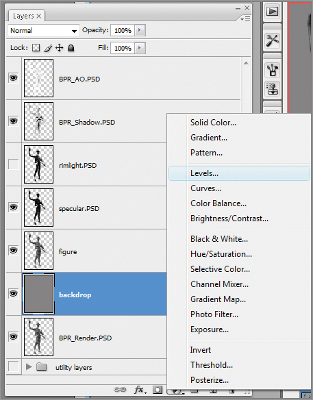
Figure 5-22: The levels control sliders
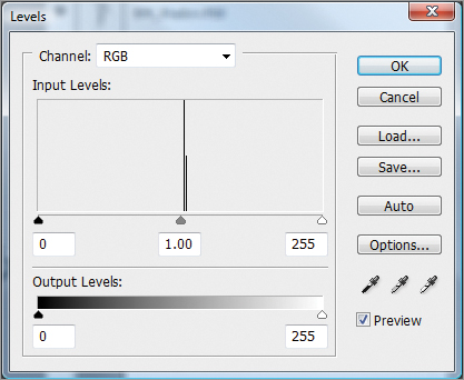
Figure 5-23: The white box next to the adjustment layer icon is the layer mask.

Benefits of Using Adjustment Layers
At this stage you could just fill the layer with a simple gradient between a lighter and darker value of gray. This is an acceptable approach, but by using an adjustment layer and a mask we get to learn how to use layer masks, adjustment layers, and we also gain a much greater level of control over the backdrop.
With this configuration, at any point later in the painting process you can easily double click the layer to access the level controls to adjust the lightness or darkness of the falloff. You can easily change the color of the background or even replace it with an image. You can also manipulate the layer mask to change the rate or the gradient. This is much more control than you would have available with a simple gradient bitmap. We also want to learn how to use adjustment layers, as we will revisit them to create a lighting effect on the figure itself later in this tutorial.
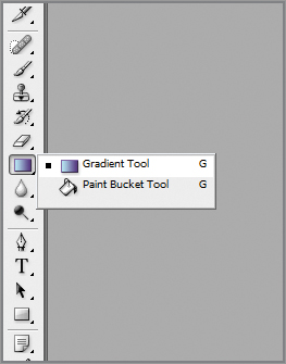
5. This is the mask associated with the adjustment layer. It’s plain white now, which means all of the image is affected by the layer control. We will add a gradient to this mask to obscure some of the effect, creating a gradual falloff to dark. Select the gradient tool from the left side of the screen (Figure 5-24).
Figure 5-24: The gradient tool
6. Make sure the gradient is set to opaque (Figure 5-25) and your colors are set to black and white. Click and drag to draw a gradient. This should be in the mask layer, so if you see an actual gradient on screen, undo and click on the mask layer. This gradient will cause the effect of the levels control to fade from no impact to full impact (Figure 5-26). You can then adjust the mask to further tweak the background falloff.
Figure 5-25: The gradient settings
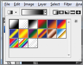
Figure 5-26: Here we can see the gradient in the mask layer as well as its effect on the appearance of the background image.
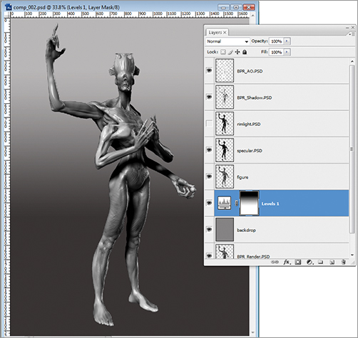
7. Lastly Shift-select all the backdrop layers (the adjustment layer and the backdrop itself) and press Ctrl + G to group them together. Name this group “Backdrop.” This will just make it easier to navigate and manage your document by keeping the layers organized.
The final effect should be a gradual falloff to dark. You can adjust the rate and the direction of the falloff by adjusting which direction you draw the gradient line and how far it extends. Longer gradient lines create a more gradual falloff. Remember that this approach gives you far more control than a simple gradient backdrop. If you prefer a more simple approach, you may use it, but be aware we will need to use and understand Layer masks and adjustment layers for the lighting effects we paint later in this chapter.
Adjust Specular and Collapse Layers
So far we have been combining the render passes from ZBrush into a suitable base upon which to add color and texture. When we have that image, we will hide the original working layers to keep the document as simple as possible. In this section, we will adjust the specular and add the rim light layer before collapsing into a simpler set of working layers.
Select the specular layer. Adjust the opacity to get the best effect. You may choose to erase some parts of the layer to reduce the shine in some areas compared to others. You can increase the shininess by adding another instance of the specular layer. Simply select the whole specular layer with the Ctrl + A hot key, then press Ctrl + J to jump a new copy up. This will immediately have a visible effect on the image (Figure 5-27). Adjust the opacity and erase as needed. Another useful trick is to use the Dodge tool to brighten areas of the specular layer you want to accentuate (Figure 5-28). Set the tool to highlights with a high opacity. This will brighten highlights as you brush over them. Press Alt to darken as you paint.
Figure 5-27: Adjusting the specular shine. The figure on the right has two instances of the specular layer applied to increase the level of shininess.
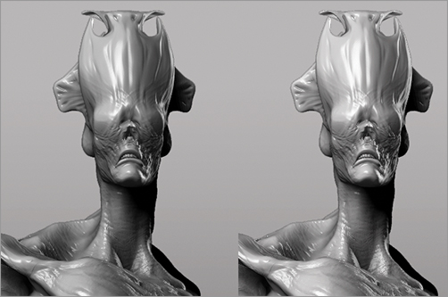
Figure 5-28: Dodge tool settings
Now we are ready to collapse in to a few simple layers to continue working. Follow the steps below to consolidate the layers into a more manageable working file. This will allow us to simplify the number of currently active layers we have to deal with while retaining the original layers in group, in case we need them later.
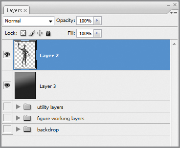
1. Turn off visibility on the backdrop and utility layers groups. The figure should be visible against a transparent checkerboard background (Figure 5-29).
2. Select the topmost layer and press the hot key Ctrl + Shift + Alt + E. This will collapse all visible layers into a new layer copy. This retains all the other layers underneath (Figure 5-30).
3. Turn off visibility on all layers but the backdrop group. Again press Ctrl + Shift + Alt + E to collapse the backdrop into a new copy. Move the backdrop up beneath the figure copy layer.
4. Select the individual figure layers and group them together with the Ctrl + G hot key. Name this group figure “Working Layers” and move it to the bottom of the stack. Your layer stack should look like Figure 5-31. Be sure to see the video on the DVD or download files where this process is fully narrated.
Figure 5-29: Turn off visibility on all groups but the figure layers.
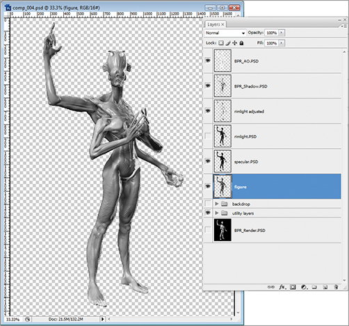
Figure 5-30: Collapse the figure layers into a new copy with the Ctrl + Shift + Alt + E hot key.

Figure 5-31: The layer stack at this stage has the background and figure collapsed into two separate layers. The original working layers are grouped together and stored at the bottom of the stack in case they are needed.
Painting Some Corrections
At this stage, I can make some corrections using the Paint Brush tools. We will use the eyedropper to sample color directly from the grayscale image and paint out any errors or artifacts in the sculpture. We can correct errors or paint in highlights in areas we may have missed before. In the steps below, I will show you how I paint out a rendering artifact in the abdomen.
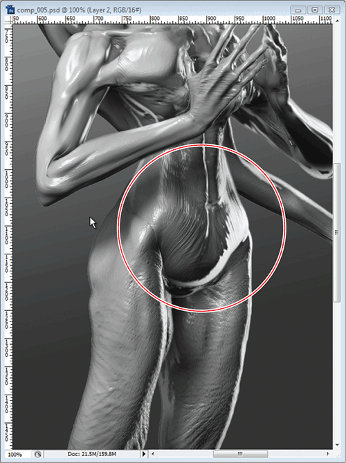
1. I zoom into the image with base layer selected. I focused on the abdominal area where the geometry has a faceting effect that is distracting (Figure 5-32).
2. We always want to avoid painting directly into a layer whenever possible. This allows us more freedom to revert from changes or turn them off entirely. Create a new layer by pressing the Ctrl + Shift + N hot key. Name this layer “Corrections.” We will paint our corrections into this layer rather than the original figure layer.
3. From the Brush menu, select a round brush and turn the hardness all the way down so the edges are as soft as possible. Turn down opacity to about 60%.
. This allows you to sample color directly from the image itself. This is a huge benefit when trying to paint into an image. It allows you to use the image itself as your color palette rather than try to use the color picker to find accurate hues and values.
Figure 5-32: We can see the geometry in the abdomen has some faceting that needs to be corrected.
5. Sample color from the immediate area of the artifact and start brushing over the problem areas. Remember to sample often from the areas of highlight and shadow already present in the image to maintain a more natural gradation of values. In Figure 5-33 you can see the effect of sampling color and painting out the problem areas.
As you paint with most Photoshop tools, you can control the opacity by pressing the numbers 1 through 0 at the top of your keyboard. This will change the opacity setting in multiples of 10.
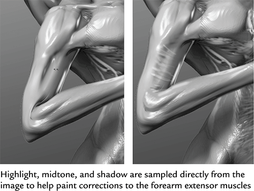
6. The forearm has a similar problem area where the geometry folded in an unappealing manner. Using the same techniques of sampling values directly from the image, paint the forearm extensor muscles in, to correct this area (Figure 5-34). You can see this correction painted in real time on the DVD or download files. The process is one of sampling the highlight, midrange, and shadow tones directly from the area you are painting. Be sure to vary your brush hardness as needed.
Figure 5-33: Sample color directly from the image to paint out the artifact on the abdomen
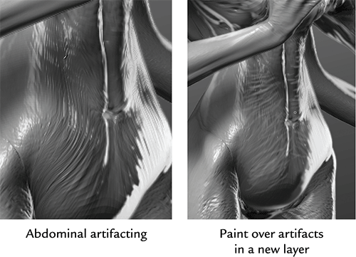
Figure 5-34: Here I use the same technique to correct this error in the forearm
7. Some areas may have noticeable polygon faceting. In Figure 5-35 you can see this faceting on the pectoral muscles. I need to add some more detail to this area to suggest striations in the muscles that fan from the sternum to the lower arms. Using the same technique of direct sampling, I paint these details in. I also stroke lighter marks across the muscles of the arm to suggest a bit more texture in this area.
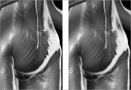
8. You can also use the Blur brush to smooth out polygon faceting. Set the Blur brush strength to 50% and touch the areas of faceting. Very little application is needed to render these artifacts invisible (Figure 5-36).
Figure 5-35: The chest is given more detail in the pectoral region by painting in muscle striations and areas of light and shadow.
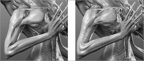
Figure 5-36: The polygon faceting is easily removed with the Blur brush.
Using the Color Picker Sample Size
The color picker tool has some options that can make your work more accurate. When the color picker tool is selected, there will be a tool option at the top of the screen defining sample size. This is read in pixel-by-pixel radius. The larger this radius the closer your sampled color will be to what you spot by eye on screen. This is because your eye blends the color of several pixels in close proximity. By using a larger sample size of the color picker, you will sample a color closer to the one you are seeing rather than the exact color of the pixel on which you happen to click as with a single point setting.
Continue to correct any problem areas in this manner. On small areas like this, I try to sample color directly and paint in. I avoid the Clone brush at this point because it tends to create repetitive stamped patterns unless used very carefully.
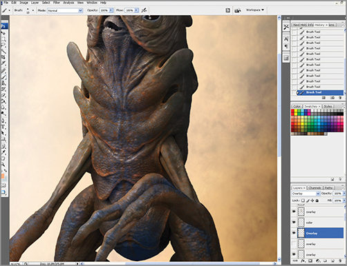
Create Color and Texture Overlays
In this section, we will give the skin a sense of color modulation by using overlay images. This is my favorite approach to creating a skin texture, as it is quick, effective, and helps foster those surprising “happy accidents” as you start to tinker with color balance and blending modes. As we apply images of skin directly to the model, we will use the hue and saturation controls to adjust their appearance on the model. These layers will be applied as overlay or soft light blending mode.
This approach allows us to quickly build up a sense of skin texture without having to painstakingly paint a texture map for the character. Remember that speed is important in creating a concept image like this, so the faster you can generate multiple ideas, the better. With this approach to creating skin texture you are only rendering a single view of the character using evocative texture and color passes. This creates the impression of skin without having to paint it explicitly. Figure 5-37 shows a selection of skin sample images that can be used as overlays to create texture on the character. The following steps illustrate the process of adding skin texture overlays from reference photos.
1. From the DVD or download files, load skinswatch2.psd (Figure 5-38). Select the image with the Ctrl + A hot key and copy it to the memory buffer with Ctrl + C. Switch to the creature illustration and paste this skin swatch in as a new layer by pressing Ctrl + V (Figure 5-39).
Figure 5-37: These skin swatches can be used as overlay images to quickly introduce skin texture and color variation to the character.

Figure 5-38: Load skinswatch2.psd from the DVD or download files.

Figure 5-39: Paste the skin swatch in as a new layer.
2. Press Ctrl + T to transform this skin swatch layer. Scale it up to cover the entire body. Set the layer blending mode to Overlay.
3. Ctrl + Click on the figure layer to select the pixels of the figure. With the skin swatch layer selected, press Ctrl + Shift + I to invert the selection and then press delete to clear any image that does not cover the figure (Figure 5-40).
4. Zoom into the head and select the eraser tool. Dial down the opacity and erase out areas of the face. We are doing this because we want there to be texture variation in the figure and some areas will be textured by different overlay images than others (Figure 5-41).
Figure 5-40: Set the skin swatch layer as overlay and delete any pixels not covering the figure.

Figure 5-41: Erase the overlay texture in some areas to help create variation.
5. The effect of the overlay image can be tweaked by changing the color hue and saturation. With the overlay layer selected, press the Ctrl + U hot key to bring up the Hue Saturation menu. Alternatively, you could go to Image Adjustment Hue/Saturation (Figure 5-42).
6. From the DVD or download files, open the file skinswatch.psd. Copy and paste it into the illustration. Move the layer to cover the character’s head and change the blending mode to Overlay (Figure 5-43).
7. Open the Hue/Saturation menu again with the Ctrl + U hot key. Hue shift the overlay image toward a purple to unify it with the body textures (Figure 5-44). Delete any unneeded pixels from the head overlay as in previous steps.
Figure 5-42: Open the Hue/Saturation menu to shift the values of the overlay image, changing its effect. Here we see it pushed toward a more purple skin tone.
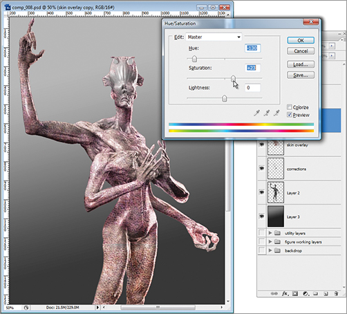
Figure 5-43: For variation, the head will be textured using skinswatch.psd. Here we see it as an overlay layer over the figure.
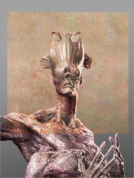
Figure 5-44: The texture overlay for the head is hue shifted toward purple to unify it with the body textures.

8. Duplicate a copy of the head overlay by pressing the Ctrl + J hot key while the head overlay layer is active. You will see the intensity of the texture increase (Figure 5-45). We will create texture variation by erasing out areas from the top layer so some portions of the head texture are more saturated than others (Figure 5-46).
9. To simplify the layer stack again, we will now turn off visibility on the background and collapse all visible layers into a new layer. Name this layer “Collapsed Skin.” This will create a new layer with all the skin overlays and figure merged together (Figure 5-47). Group the skin overlay images together in a group called “Skin Overlays,” in case you need them later.
10. Turn on visibility again on the background layer and with the new figure layer selected, I adjust the hue and saturation to get an overall look I am happy with (Figure 5-48).
Figure 5-45: Duplicate a copy of the head overlay layer with the Ctrl + J hot key.

Figure 5-46: Erase out areas of the topmost layer to create variation in intensity and saturation within the head texture overlays.

Figure 5-47: Collapse the skin overlays and figure into a new layer. Group the overlay files in case you need them later.
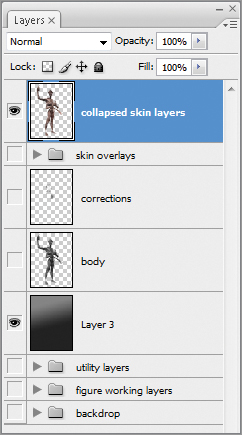
Figure 5-48: Adjust the hue and saturation on the collapsed figure layer to get the best look possible.
Be sure to check the fully narrated video on the DVD or download files, for this full process in real time. On this video, we discuss a few more concepts and considerations that we just don’t have the space to address in print. Be sure to check your media files or the download link for E-reader versions of this book.
Beyond Color: Lighting Effects
In this section, we will look at how to create dynamic and atmospheric lighting for our image. We will use gradients to create dramatic lighting. We will look at how to paint rim lighting directly into the image.
We will also create the look of a colored key and fill light on the character. Lastly, we will add a fog to create a sense of atmospheric perspective. This gives a mysterious feeling to the figure and also lets us drop part of it into a deep shadow.
Adding Dynamic Lighting Falloff to the Image
In this section, we will see how to create a dramatic key light that lights the figure from the upper left and falls off into shadow at the feet. This technique of massing areas of light around the key point of the image (the head and chest) while letting the lower body fall into shadow is a common design trick. By showing just the legs in shadow we describe their shape in silhouette without having to spend time painting the details. This is a huge timesaver when working under a tight deadline. Make sure you have the legs visible in rim light and shadow. This allows the viewer to read the forms and place them in their mental picture. If these areas fall into darkness, it will call attention to their absence and just look like you didn’t finish the figure.
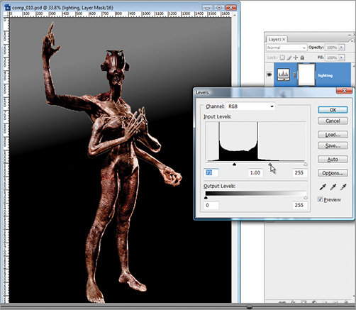
1. As we did before, when setting up the backdrop layer, we will be using an adjustment layer. Go to the Layer menu and select new Adjustment Layer Levels (Figure 5-49). This will create a new adjustment layer at the top of the layer stack. Adjust the levels controls to darken the overall image as seen in Figure 5-50.
Figure 5-49: Create a new Levels adjustment layer
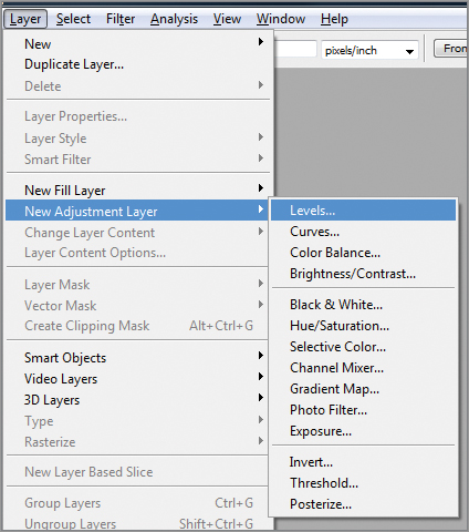
Figure 5-50: Adjust the levels controls to darken the image.
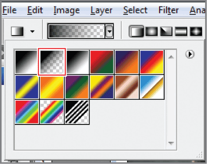
From the tool options at the top of the screen, make sure that the Foreground to background solid gradient is selected (Figure 5-51).
3. Click on the layer mask so it is active. You can tell the layer mask is active when there is a small rectangle around the white square of the mask (Figure 5-52).
4. Draw the gradient from the upper left to lower right of the screen. The levels will adjust to gradually fall off across the image, giving the impression of dramatic lighting (Figure 5-53).
Figure 5-51: Make sure to select the Foreground to background solid gradient preset for the gradient tool.

Figure 5-52: Make sure the layer mask is selected before drawing the gradient on the image. That way the gradient will be applied to the mask and not the image itself.

Figure 5-53: The gradient creates the impression of dramatic lighting by adjusting the falloff of the levels adjustment.

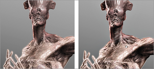
5. We can further adjust the lighting by painting directly into the layer mask. Painting lighter values into the mask with the paintbrush will darken areas while painting black will lighten them (within the limits of the original levels adjustment). Figure 5-54 shows the effect of painting directly into the layer mask with a soft round brush and the color black to pick out areas of light. The rim light along the arm in the right-hand image was created in this manner as well as the various highlights in the arm.
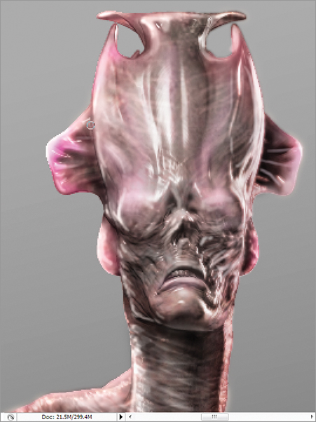
6. Further details can be added by using the same technique of sampling color directly from the image and painting into a normal layer. Figure 5-55 shows the before and after images of the head after some skin striations and highlights have been painted in to add interest to the area.
Figure 5-54: Painting black into the layer mask will brighten areas that have been darkened. This is useful to pick out highlights in the dark areas.
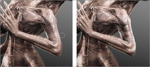
Figure 5-55: Sample values directly from the figure layer to further detail the head and neck. The idea is to pick out areas of shadow and highlight to create visual interest.
Painting Glows with Linear Dodge
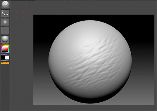
The glow effect is created on the sphere using a Linear Dodge (Add) layer blending mode. The same Linear Dodge (Add) layer is used to create the impression of translucency in the skin. A common Subsurface Scattering effect is to see the scattering of light in the material along its edge. This is most commonly seen in backlit ears. Subsurface scattering also manifests as a radiance or glow to the skin. We will create a similar translucency effect to the shell of this character’s head. Follow these steps to create the glowing sphere and backlight effects.
1. Create a new layer and name it “Sphere Color.”
2. Select a soft round brush and from the color picker select a purple hue (Figure 5-56).
3. Set the layer blending mode to Linear Dodge (Add) and start to paint the purple over the sphere. It will take on a luminescent quality as a result of the layer blending mode. Adjust the layer opacity as needed to get the proper intensity for the effect (Figure 5-57).
4. We will now select the whole sphere layer with Ctrl + A and press Ctrl + J to duplicate the layer up. Name this layer “Sphere Color copy.” This will increase the power of the glow effect (Figure 5-58).
5. Set the blending mode for sphere color to Overlay. You may want to adjust the levels on this layer to get the best glow effect. Leave the sphere glow copy layer blending mode as Linear Dodge (Add). Use the Smudge tool to drag tendrils off the sphere (Figure 5-59). The Smudge tool is located under the Blur tool. Figure 5-60 shows the image at this stage of the tutorial.
Figure 5-56: Select a soft round brush and a purple hue from the color picker.
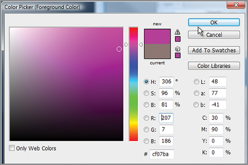
Figure 5-57: Painting the luminescent sphere using a purple hue on a Linear Dodge (Add) layer
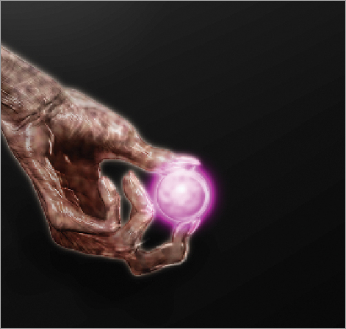
Figure 5-58: Duplicate the sphere color layer to increase the intensity of its effect.

Figure 5-59: Use the Smudge tool to drag fine tendrils off the sphere.
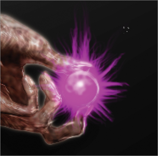
Figure 5-60: The figure with the glowing sphere at this stage of the tutorial
6. Lastly, we want to create the sense that the glow of the sphere is casting a purple rim light along the leg of the figure. Create a new layer and call it “Sphere Reflected Light.” Set this layer to Overlay. With the same purple hue, stroke along the outer edge of the leg and abdomen as seen in Figure 5-61. Adjust the levels and opacity as needed until the glow seems to be cast from the sphere onto the leg. I also add a soft, cast purple light to the undersides of the arms and to any area that would catch a glow from the sphere. Remember the light will be stronger the closer it is to the sphere, and it should fall off in intensity as you get farther from the source.
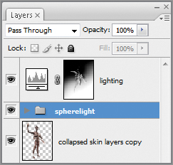
7. To help keep the image organized, group the glow layers together and name this group “Spherelight” (Figure 5-62).
Figure 5-61: Painting in a glow from the sphere shining on the body

Figure 5-62: Group the sphere glow layers together in a group called “Spherelight”.
In the previous steps, you can see what a unique and powerful effect the Linear Dodge (Add) blending mode has. We will now use it to create the impression of subsurface scattering along the crest of the creature’s head. We want to recreate the effect of light refracting within the translucent material of the skin, giving it a signature soft glow. We will replicate that effect on the large organic crest of the creature’s head. This will help make the creature feel fleshy and more alive because it suggests a translucent material for the head rather than an opaque form.
1. First we will create a new layer. Call this layer “Backlighting” and set the blending mode to Linear Dodge (Add). Zoom into the head of the figure (Figure 5-63).
2. From the color picker, select a dark purple hue that’s slightly unsaturated. In this case, I chose RGB 127 53 93.
3. Stroke this color over the edges of the head crest. This will start to give the forms a slightly translucent glow (Figure 5-64).
4. Once you have painted in some of the areas, you may want to adjust the levels on the layer to tweak the effect. Changing the levels will shift the color of the backlight glow (Figure 5-65). Figure 5-66 shows the final head and crest after adding a few more passes of color to the layer.
Figure 5-63: We will paint backlighting into the crests to give a sense of translucency.

Figure 5-64: Painting into the backlight layer to create a translucent glow
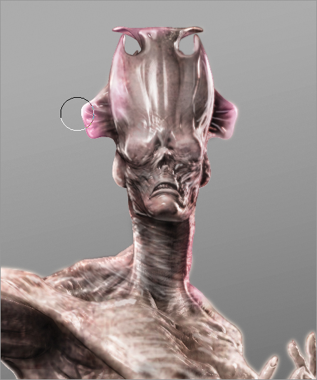
Figure 5-65: Altering the levels on the layer will shift the hue of the backlight
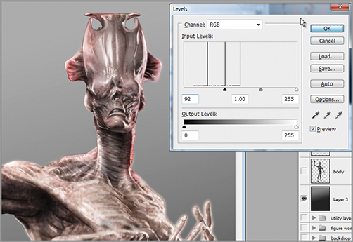
Figure 5-66: The final translucency effect on the head crest
Creating Light Gradients
Now we want to create some more visual interest by creating a warm and cool color contrast in the lighting of the image. The image as it stands is lit with a single white key light, a white rim light, and a purple incidental glow. To create a more interesting image, we will introduce a cool cast to the key light and a purple cast to the fill. By breaking up the color temperature across the image, we give the eye more variation and generally create a far more interesting final image. To create the appearance of colored key andfill lights, follow these steps.
1. First we need to determine the color contrast we will use between the two lights. We will have one light shining from the upper left and another from the lower right. I choose to contrast a cool blue light from the upper left and a purple light from the lower right.
2. Create a new layer at the top of the layer stack by pressing Ctrl + Shift + N. Name this layer “key light.”
3. Open the color picker and choose a warm red orange such as RGB 137 213 190.
4. Select the gradient tool and select Foreground to transparency as the gradient type (Figure 5-67).
Figure 5-67: Select Foreground to transparency as the gradient style.
5. Draw a gradient from the upper left across to the middle of the figure. Adjust the layer opacity and levels until you have a suitable cool blue light effect (Figure 5-68). Set the layer blending mode to Soft Light.
Figure 5-68: A cool blue light effect before and after setting the layer to soft light blending mode
6. Repeat this process for the purple light. Create a new layer called “purple light.” Select a purple hue from the color picker (RGB 203 88 202) and draw a gradient from the lower right corner of the image. Set the blending mode to Overlay and dial back the opacity on this layer so it’s a more subtle lighting effect (Figure 5-69).
Figure 5-69: The purple gradient before and after setting the layer blending mode to Overlay
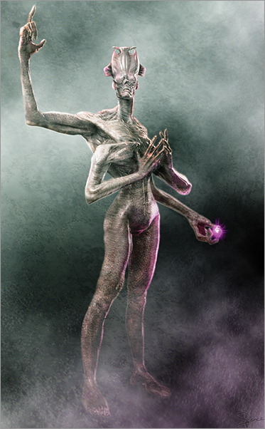
The final effect is the impression of colored spotlights shining on the figure from two angles (Figure 5-70). The color temperature contrast helps add interest to the image.
Figure 5-70: The final lighting effect
Adding Atmospheric Clouds
To create a sense of atmosphere, we will add a cloud layer. This will allow us to create the impression of space around the figure. A misty atmosphere helps in creating a sense of the dramatic and mysterious. Fog such as this also helps create atmospheric perspective and depth of the image.
1. Create a new layer at the top of the stack. Name this layer “fog.”
2. Go to Filter Render Clouds to fill the layer with clouds (Figure 5-71).
3. Select the layer and scale it up. This will give a larger noise pattern to the fog so it feels more misty and airy rather than the more high-frequency cloud pattern generated by default (Figure 5-72).
4. Dial back opacity on this layer to about 80%. Set the blending mode to Overlay and move the fog layer between the figure and the colored light layers (Figure 5-73).
5. Duplicate the fog layer by selecting all with Ctrl + A and pressing Ctrl + J to jump copy the layer up. This will create a new instance of the fog layer named “fog copy.” (Figure 5-74).Make sure the blending mode on this fog layer is set to Normal.
Figure 5-71: Layer filed with clouds
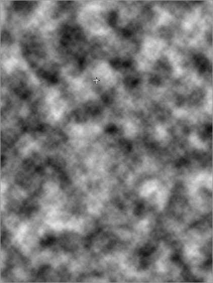
Figure 5-72: Scale up the cloud layer for a larger cloud pattern.
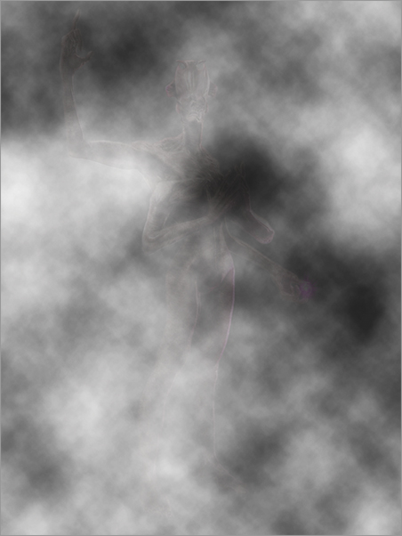
Figure 5-73: Set the blending mode on the fog layer to Overlay and move the layer to sit between the colored gradients and the figure.
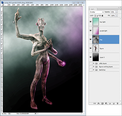
Figure 5-74: Create a copy of the fog layer.

6. Use the Eraser brush at 40% opacity to knock out the majority of the fog from the focal point of the image. You want this layer of fog to serve as a framing element, to help keep the eye focused on the upper half of the figure (Figure 5-75).
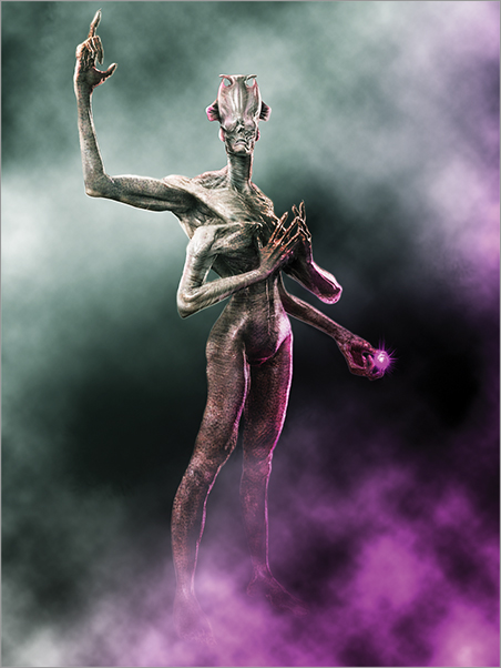
7. We will soften the fog layers by using the Gaussian Blur filter. Click Filter Blur Gaussian Blur and set the radius to approximately 3.2 (Figure 5-76). You can see the final effect of the fog layers in Figure 5-77. The fog serves to add atmosphere as well as create visual interest with a layer of noise that helps fill in background dead space.
Figure 5-75: Erase the fog from the focal point of the image so the majority of the effect serves to frame the figure.
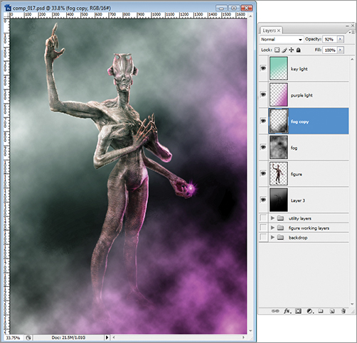
Figure 5-76: Apply a Gaussian Blur effect to the fog layer.

Figure 5-77: Final cloud effect
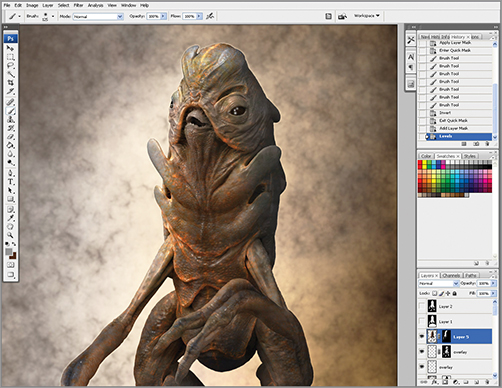
Final Effects: Noise and Depth of Field
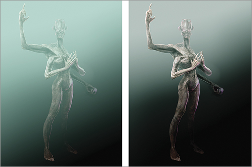
We have nearly completed this illustration. Now we will add the final touches to help pull the image together. This section will look at how to add a layer of noise to the image as well as create the impression of depth of field. Both of these effects are borrowed from the discipline of photography where noise and depth of field are natural occurrences in all photos and help create a sense of realism. Noise is a random pattern that can be applied to the image as an overlay. The purpose of noise is to subtly introduce visual irregularities that mimic film grain or other imperfections. These imperfections tend to soften the perfectly crisp lines and images of 3-D art. Adding noise layers helps to unify the various renders, paint strokes, and textures of the image into a single whole.
Depth of field refers to the tendency of a photographic lens to hold only a certain depth of image in sharp focus. The term is from photography but the best way to illustrate is to pick a point in space and stare at it. Notice how the rest of the room that is closer and farther away is less focused than the center of your attention. This is the focal depth of your eye. By mimicking this effect we are able to recreate the look of a photograph as well as draw the viewers’ attention to focal points in the image that remain in sharp focus. Figure 5-78 shows two examples of depth of field (DOF). In the first image, there is a deep focal depth, as only the background falls into a blur. In the second image, we have a shallower focal depth as the figure’s face is in sharp focus with elements of the figure, foreground, and background falling out of focus.
Figure 5-78: Examples of shallow and deep depths of field.
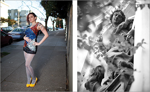
Photos by Tristan Crane, www.tristancrane.com
To create this effect, we will use the depth pass rendered by ZBrush. The Depth image represents the relative distance from the camera to the figure. White areas are closer while darker areas are receding. This data can be read by Photoshop’s lens blur filter to introduce the effect of depth of field. DOF helps sell an image as real because it mimics the effect of an actual camera as well as the human eye. Areas that fall outside the range of focus fall into a blur. This is a stark contrast to default digital images where all aspects are in unrealistically sharp focus. We create a lot of atmosphere and interest by allowing the image to lose detail as much as by adding details. The legs falling into shadow, with areas lost in darkness or becoming blurred by depth of field, all add up to a suggestive image.
Follow the steps below to create a depth of field effect for the image.
1. Select the figure layer. Create a new layer mask by going to Layer New Layer Mask Reveal All (Figure 5-79). This will create a white layer mask attached to the figure layer (Figure 5-80). We will add the depth pass into the layer mask because the Photoshop lens blur filter reads from the layer mask to create an accurate depth of field.
Figure 5-79: Create a new layer mask for the figure layer
Figure 5-80: This creates a layer mask attached to the figure layer

2. Open the utility layers group and select the depth layer. Turn on visibility on the layer (Figure 5-81). Press Ctrl + A to select all and then Ctrl + C to copy the depth layer into memory.
Figure 5-81: Select the depth layer from the utility layers group.
3. Select the figure layer again while holding Alt-click on the layer mask. The image will now appear white, as this makes the mask visible. Press Ctrl + V to paste the depth pass into the layer mask. Click the icon for the figure image in the layer menu to return to image view from mask view. The figure will appear transparent in the areas that are farther from the camera (Figure 5-82). That is because the depth pass is in the layer mask. We will disable the mask after we use it to define the depth of field, so ignore this effect. We will delete the mask by the end of this section.
4. Open the Filter Blur LensBlur menu (Figure 5-83). This opens the Lens blur plug-in window.
5. Set the depth map setting to layer mask. This will read the depth from the mask we just created form the ZBrush depth image. This allows Photoshop to make accurate calculations on how the blur should be applied across the image as if it were a photo of a three-dimensional object. Adjust the Blur focal distance slider or alternatively click in the image on the area you want in sharpest focus. Photoshop will calculate for that point. The rest of the figure should become somewhat fuzzy. If the face becomes blurry, click the Invert checkbox.
6. The level of blur can be controlled by adjusting the radius slider. Find the right look for your image and click OK. When you return to the Photoshop window, the blur effect will not yet be visible because the layer mask is still active. Right click on the layer mask and select Delete Layer Mask from the popup menu (Figure 5-84). Figure 5-85 shows the final depth of field effect.
7. You can manually accentuate the blur effect with the Blur brush as needed. In Figure 5-86, I am adding a soft edge to the underside of the arm to help remove some of the sharp hard edges of the render and give the image a more painterly look.
Figure 5-82: The layer mask will temporarily give the image a partially transparent look.
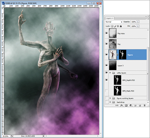
Figure 5-83: Adjust the Lens Blur settings to read from the layer mask. Click in the image itself to define the focal center.
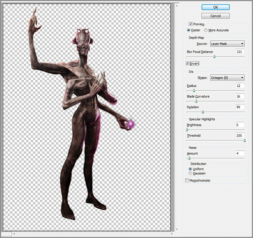
Figure 5-84: Delete the layer mask to see the Lens Blur effect.

Figure 5-85: DOF effect applied
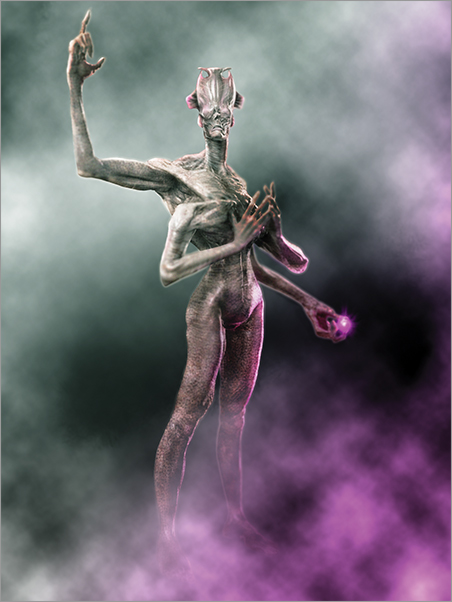
Figure 5-86: Manually accentuate the blur using the Blur brush as needed.
8. At this stage, for added grime and realism I add one more overlay layer of noise. Open the file Overlay8.jpg from the DVD or download files (Figure 5-87).
9. Copy and paste it into a new layer at the top of the document (Figure 5-88). Set the blending mode to soft light.
10. Adjust the opacity on the noise layer until it is a very subtle overly effect (Figure 5-89).
Figure 5-87: Open the image Overlay8 from the DVD or download files for use as a noise layer.
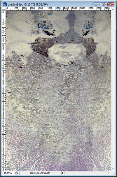
Figure 5-88: Paste the noise layer into the image and set the blending mode to soft light.
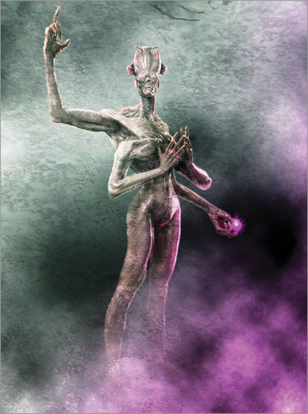
Figure 5-89: Adjust the layer opacity until the noise overlay is suitably subtle. You don’t want it to overpower the image.
The final step is to crop the image to the correct golden rectangle proportion. Along the way, my image got wider than it needs to be. You will recall from the last chapter we discussed the benefit of composing within a golden rectangle. Figure 5-90 shows the image cropped and resized to the correct proportion of 1600 × 2592.
Figure 5-90: The final image cropped to the golden proportion
That concludes this first look at painting over our sculptures in Photoshop. This chapter has introduced several very important points, from composition to the mechanics of working in Photoshop with layers and blending modes, as well as how to use texture overlays and level adjustments to quickly create interesting light and color effects on the skin. Before we move on, I would like to share some tips from a good friend and fantastic artist, Tristan Schane.
Speculative Anatomy and Creature Design with Tristan Schane
I am thrilled to share this chapter with New York-based concept designer, illustrator, sculptor, and painter Tristan Schane. Here, Tristan shares a few tips as he walks through his creation of an insectoid alien creature.
Whenever designing a character for myself or for a client, I always have two fundamentals of design in mind. I try to consider the basic type of character and then, based on that, the physiognomy of that character. Physiognomy can be interpreted to mean how the physical appearance influences our perception of character.
Concept and Design
Firstly, I imagine an overall character type—is it reptilian, insect-like, a bone or rock creature? What type of creature is it? I try to give the character a comprehensive concept. Unless the character is described as being some kind of a hodge-podge of disparate elements, each aspect of the creature—limbs, head, tail, antennae, etc.—must work within the whole conceptual framework. When creating a creature, I can’t help myself imagining my design like it must have evolved somewhere. Its entire form would result from an imagined environment. This helps me visualize the character better. What type of claws might it have? Where does it fit in the imagined ecosystem’s food chain? What’s the creature’s general level of intelligence (more intelligent creatures might need a design that enables the use of tools, for example)?
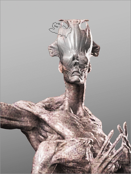
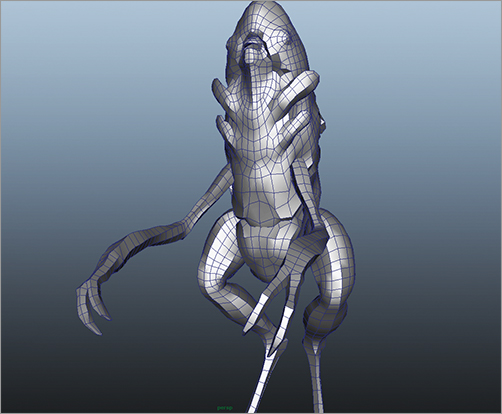
The other fundamental is the physiognomy—how the musculature and skeletal structure (if it’s to have one) works. For me, the fun of creature design is creating a strange limb or a complex facial structure, and then defining the anatomy to show how these body parts will likely move. The term I use when describing this process is Speculative Anatomy. I should say when talking of anatomy I am also thinking of skin and fatty tissue, which also—when rendered realistically—add to the quality of a creature’s design. Here you can see how I have taken care to determine how the exoskeletal plates of this character interlock and articulate from the back view (Figure 5-91).
Figure 5-91: The exoskeletal articulations as seen from behind
I have a traditional arts background and have spent a great deal of time working with anatomies of all types, real and imagined. This was especially true in traditional sculpture where you recognize how muscles and joints function. I love taking this information and applying it to the speculative anatomy of creature design.
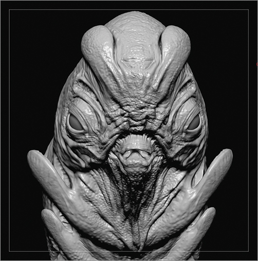
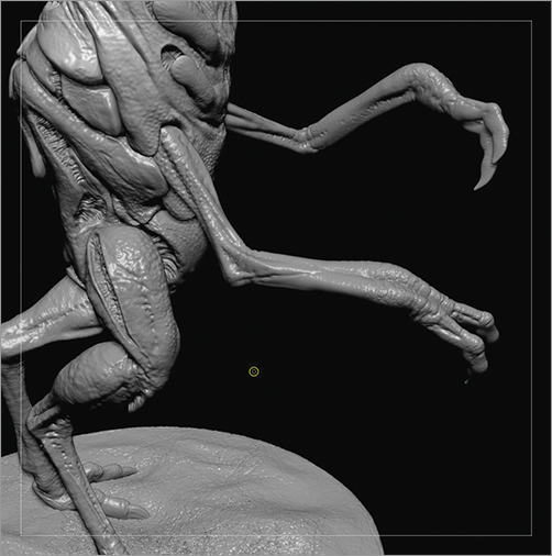
Often I am trying to design a being whose limbs or other body parts don’t exist anywhere in nature. However, even for a static two-dimensional concept painting, the anatomy of this creation must look like it works. I like to design this speculative anatomy so that when someone sees the concept, in their mind they are already seeing it move and recognizing how the muscular and skeletal (or exoskeletal) structure enables this movement. Simply having big muscles or odd and interesting textures and body parts is nothing. Good creature designers are masters at creating believable speculative anatomy that ties all these elements together and gives them the realism that sells the concept. This is what appeals to me as a concept artist. Sometimes the idea for a character is inspired by images of real creatures, like insects or animals. Other times I try not to look at reference images and just design without any reference. This character was done like this. The only two thoughts I had in starting was I wanted him to be insect-like and I wanted him to have some sort of flap/valve organs to show an unconventional respiratory system (Figure 5-92).
Figure 5-92: The flaps in the exoskeleton serve as a design feature and imply a kind of alien respiratory system.
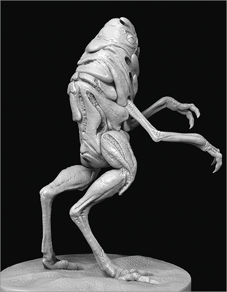
I started with a base mesh in Maya (Figure 5-93) and then sent it in to ZBrush to begin sculpting. I usually start with base meshes rather than using ZSpheres, but I really don’t have one set way of working that I follow for every piece. After a little bit of work, I finally have a basic design for the silhouettes and overall form of the character. I then do some quick retopologizing back in Maya and then shoot him back in ZBrush to get to the actual sculpting.
Figure 5-93: The base mesh
The Importance of Working Globally
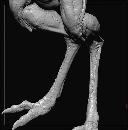
When I’m working on a character’s musculoskeletal system, I am imagining how tendons and muscles would contract to animate the character. I flesh out anatomy with an idea of how muscles and tendons function, contracting in one area to bend a joint, while an opposing muscle group is in place to extend it, and supplemental musculature is also identifiable to stabilize or provide more dynamic movements. For this character, as I wanted him to have an insect-like quality, his limbs are spindly and the movement is characterized by gangly sinews and well-delineated joints. Figures 5-94 and 5-95 show the creature’s arms and legs, respectively.
Figure 5-94: The arms of the character are insectoid and spindly.
With all art pieces, I feel it’s important to work globally, meaning working on the piece overall rather than focusing on one section of the piece and getting that to an advanced stage before moving to another area. Working globally is especially important for characters so that you can evenly apply the level of detail and anatomy to all the parts. For this character, while he walks upright, his fore limbs don’t let him handle tools, so I imagine him as being at something around the intelligence of a dog or a dolphin. If I wanted to suggest a more feral mentality, I would have made him less humanoid in structure. If I wanted to suggest greater intelligence, I might have changed the design of his “hands” (and feet).
Figure 5-95: The legs are also elongated and sinewy.
After I’ve sculpted in all the muscle, sinew, joints, and skeletal plates, I start to think about surface detail (Figures 5-96 and 5-97). Again, I am going for something insect-like. I didn’t want it to be too noisy a texture. I was very happy with the detail of the body shapes with their interlocking, puzzle-like formations, and the semi-open, fibrous slitted areas and didn’t want to bury this behind a super busy surface detail. For surface detail, I do a lot of freehand sculpting and then supplement with custom brushes, which use my own alphas rather than using straight alphas. Each time I use an alpha, I go in and customize the settings on the alpha as well as tweak the settings of the brush (almost always a Standard brush). So, rather than doing this over and over, I make a new brush with all the custom settings in place. I also prefer to make my own alphas, but there are a few from the Pixologic Download Center that I employ straight out of the box.
Figure 5-96: The surface texture is coarse but understated so as not to overpower the design.
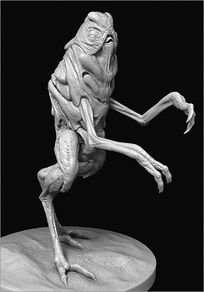
Figure 5-97: The Ostrich Skin alpha below is a favorite for bumpy skin textures. This alpha is available on the DVD or download files.

The main brushes I use for my sculpting are the Clay Tubes brush, the Standard with a soft fall off alpha, the Move brush, the Form brush, the Flatten brush (for flattening and also for smoothing), the Inflate brush and the Damian Standard; lowering the ZIntensity on the Dam Standard to around 10 makes it excellent for gentle wrinkles or light cracking in chitinous surfaces (Figure 5-98). I almost never use any of the other brushes for organic character work.
Figure 5-98: The Dam Standard brush with ZIntensity set to 10 works well for freehand sculpting light wrinkle patterns.
With the sculpting all done, it’s time to get some renders, then bring it in to Photoshop to composite, and then paint the sucker.
Adding Color and Other Details
I don’t have one set technique I use repeatedly for each concept painting. Rather, I have a set of tools, which I utilize in different ways depending on the piece and on my mood. I am always experimenting with my own technique and also looking at the techniques of other artists.
In general, I use Multiply mode layers to add color and shadow. I use Color and Overlay mode layers to further play with colors and Normal mode layers to add highlights, details, and to define or redefine the creature. Occasionally I will also use a Screen mode layer for an effect, but I rarely at all use any of the other mode layers.
I use Liquefy and the Transform functions regularly, as well as play with the various level and color adjustments settings as I work.
To begin, I quickly create a background color and texture. This is simply a layer placed behind the figure layer in Photoshop (Figure 5-99). Sometimes I start building up the character’s colors before I add something in the background, but here I wanted something to give contrast early on.
Then I do a little more work on the character using Multiply and Color layers (Figure 5-100). Color sections are painted into Multiply layers to tint the underlying gray model. Highlights are painted into a layer set to Normal blending mode. The highlights are painted with a small round brush set to about 80% opacity. These will be the specular highlights.
Color, Overlay, and Multiply layers are used to build up color with normal layers adding highlight and fleshing out the smaller anatomical details (Figure 5-101).
Now I cool off the image by giving it a bluish tint. This is accomplished by painting blue and green hues into a layer set to Overlay blending mode. I also play with the saturation of different layers till I get what I want. I’m using Overlay mode layers to add some orange highlight around the edges of his body plates to add a crustacean-like look to the insect-like structure (Figure 5-102).
Figure 5-99: The background texture is applied in a separate layer to quickly help create contrast.
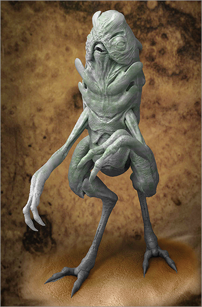
Figure 5-100: Basing in the initial color passes
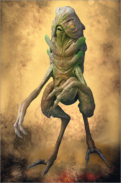
Figure 5-101: Further color passes are added in the form of green washes.
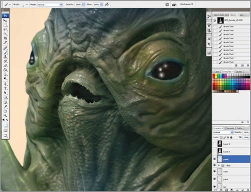
Figure 5-102: The body color is cooled off and orange rim lights are painted in along the edges of the plates.
I want to intensify the lighting on the creature’s right side (the left side of the painting). I press the Ctrl + Alt + Shift + E hot key to create a flattened copy of all the layers on top of the layer stack. I then intensify the levels and lower the saturation of the flattened, top layer. Now I erase most of the image, leaving a border area, giving a look of a more intense light from that side (See Figure 5-103).
Figure 5-103: Intensifying the rim lighting
I add a little motion blur (Figure 5-104) on the background for dramatic effect and ... Voilà! The final image (Figure 5-105).
Figure 5-104: Adding motion blur to soften edges and add a sense of depth
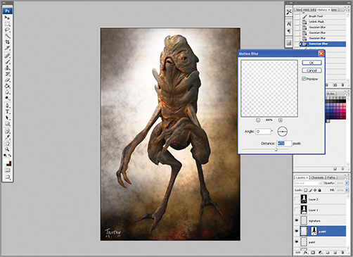
Figure 5-105: The final image
