
Chapter 16
Getting Artistic with Point Type
IN THIS CHAPTER
![]() Using point type in graphic design
Using point type in graphic design
![]() Styling point type
Styling point type
![]() Scaling and rotating point type blocks
Scaling and rotating point type blocks
![]() Placing type on a path
Placing type on a path
![]() Embedding and outlining fonts
Embedding and outlining fonts
In the wild 1960s, a band called American Breed had a song that went “bend me, shape me, anyway you want me.” They could have been talking about what Illustrator can do with point type.
In this chapter, you create and style point type for designs, posters, logos, and other graphical typography. And you discover how to place type along a path — that is, type that flows along a line.
Many type techniques, such as basic editing and formatting, are the same for both area type and point type. I cover these common features in Chapter 15, and zoom in on artistic design with a few words or characters using point type in this chapter.
Understanding How Point Type Works
Working with point type is more similar to editing graphic objects in Illustrator than it is to editing text in a text editor. (Conversely, area type is more like editing with a text editor than editing graphics.)
I can illustrate a key difference between point type and area type this way: When you change the size, shape, or rotation of point type, the type changes, but when you change the size, shape, or rotation of an area type box, the box changes. For example, in Figure 16-1, I rotated point type (on the left) and area type (on the right). The point type rotated, but only the area type box rotated (and some of the text no longer fits, as indicated by the red + symbol).

FIGURE 16-1: Rotating point type (left) and an area type box (right).
 By the way, when I refer to the container that has point type, I call it a block, as in “select the point type block.” I call area type containers a box, as in “be careful not to click in an area type box.” These terms are widely used in the Illustrator community.
Creating and Editing Point Type
Point type can be either a horizontal or vertical line of text that begins at the point (get it, point), where you click before your type. By default, point type is left aligned but it can also be centered or right aligned.
Follow these steps to create and edit point type:
-
Set an insertion point for the point type:
- Select the Type tool. (Or press T if you're not already in an area type box or a point type block — and you should not be if you're creating a new type box.) The cursor changes to an I-beam within a dotted box. The horizontal line near the bottom of the I-beam identifies the baseline where the text will be aligned.
- Click the canvas to define an insertion point, but avoid clicking an object. If you do click an object, you will generate area type, not point type.
Placeholder text (Lorem Ipsum) is displayed.
-
Use the Control panel, the Properties panel, or the Character panel to define properties such as font, size, and style.
See Chapter 15 for an exploration of the Character panel and how to use it to style type.
- Enter point type by simply typing. When you finish, click the Selection tool.
- As you enter text, the placeholder text is replaced by what you type. The type is displayed with a black fill and no stroke color, as shown in Figure 16-2.
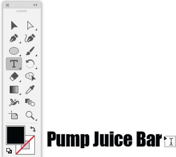
FIGURE 16-2: Entering point type.
- Point text doesn’t wrap, so to create a new line, press Enter or Return.
- To stop entering text in one point text block and start a new point text block, press Ctrl-click (Windows) or ⌘ -click (Mac) and start typing a new block of type inserted at a different point. Or press Esc and then press T again.
- As you enter text, the placeholder text is replaced by what you type. The type is displayed with a black fill and no stroke color, as shown in Figure 16-2.
-
Style the point type.
After you generate point type, you can apply stroke and fill colors and other style attributes such as fonts, boldface, or italic where available, and other basic style features available from the Control panel when text is selected. In Figure 16-3, I applied a fill and stroke color.
- Edit the point type:
- Use the Selection tool to double-click the point type in a point type block. The point text becomes selected and a cursor appears.
- Use your mouse or keyboard to navigate in the point type block and edit the text.
- To start a new point type box, click outside the selected box.
- To finish creating point type, press Esc or select another tool.
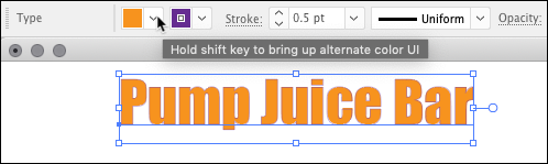
FIGURE 16-3: Applying basic styling to point type.
Contorting Point Type
You can resize and reshape area type by changing the type block. To put that another way, when you change the size, shape, or rotation of a point type block using the Selection tool and the bounding box, the type itself transforms.
For example, if I select a point type block and stretch it vertically, the type stretches; if I stretch the block vertically, the type size gets taller. I show you how this works in this section.
Scaling point type
As with area type, you can change the horizontal or vertical scale for selected point type (or an entire selected text object) by using the Character panel. I won’t review how that works here because I cover it extensively in Chapter 15.
But here’s where the magic of point type kicks in. When I stretch a block of point type, the Horizontal Scale value automatically changes in the Character panel, as shown in Figure 16-4.

FIGURE 16-4: Stretching point type horizontally.
The same approach works a bit differently when you change the height of a point type block. Instead of the vertical scale value changing, the point font size changes, as shown in Figure 16-5.
 You might be wondering whether a professional printer will be able to handle typography using the techniques I discuss in this chapter. Rule number one with issues like this is to consult with your printer. As you transform point type interactively, you will probably end up with a font size or horizontal spacing that is not supported by your printer output. Here, as with every print job, consult first with your printer on how she or he wants to handle irregularly sized type. The safest option when handing off point typography to a printer is to convert type to outlines, a topic I address at the end of this chapter, in the “Outlining type” section.
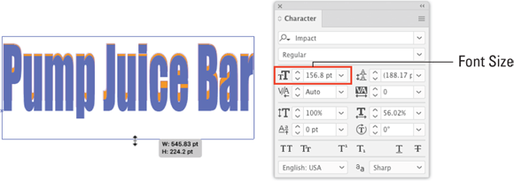
FIGURE 16-5: Changing font size interactively.
Rotating point type
Before I explain how to rotate point type, let me distinguish rotating a block of point type from rotating individual characters. You rotate selected type characters by using the Character Rotation icon in the Character panel, as shown in Figure 16-6.
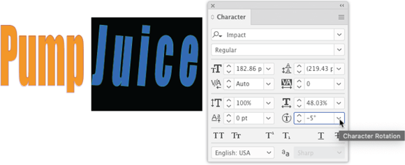
FIGURE 16-6: Rotating characters.
Rotating type blocks, however, maintains the original rotation angle of a character but rotates the block itself. You can do that interactively with the Selection tool, as shown in Figure 16-7.
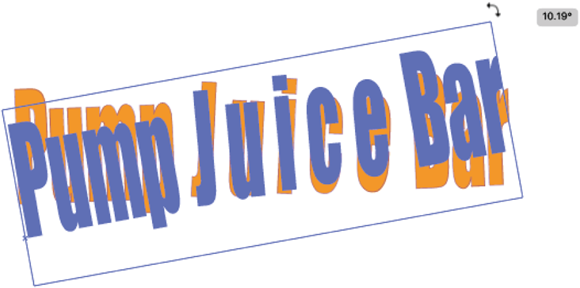
FIGURE 16-7: Rotating a block of type.
Can you to rotate both an area type box and the type itself? Sure. You do this in two steps, just as I did in this section: Rotate the text object, and then apply rotation to the type.
Interactive Styling with the Touch Type Tool
The Character panel in Illustrator is powerful but not intuitive. It’s easier for a designer to adjust styling such as the space between characters, rotation of characters, size of characters, and baseline shift (vertical displacement) by using the Touch Type tool.
You activate the Touch Type tool by pressing Shift+T. Then click any character in a point type block. The Touch Type tool works with area type as well, but it’s more useful for the kind of fine-tuning of characters associated with point type projects such as logos. After you select a character, you can control it as follows:
- To change the vertical scale, use the top-left handle.
- To change the horizontal scale, use the bottom-right handle.
- To adjust the height and width at the same time, as shown in Figure 16-8, use the top-right handle.
- To change the rotation, use the rotation handle at the top of the character, as shown in Figure 16-9.
- To interactively kern or change the baseline shift, click the character and drag to the left or right or up or down. I’m dragging a character up in Figure 16-10.

FIGURE 16-8: Resizing a character with the Touch Type tool.
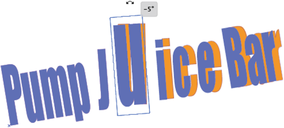
FIGURE 16-9: Rotating a character with the Touch Type tool.
Following are a few tips on interactive styling with the Touch Type tool:
- All the changes you make to font size, baseline shift, kerning, or rotation — or any other changes you make interactively — are reflected in the Character panel. And, in turn, you can fine-tune those changes digitally in the Character panel.

FIGURE 16-10: Interactively changing kerning and baseline shift with the Touch Type tool.
- Selecting specific characters can get a little weird when you're editing with the Touch Type tool. For example, pressing the right or left arrow doesn’t move from one character to the next; it moves the selected character to the right or left (respectively). So it’s best to just select characters with your mouse.
- Use the Touch type tool on individual characters, not to style entire paragraphs. The purpose of the tool is to be able to fine-tune the placement of characters within a paragraph.
Placing Type on Paths
One of the more exciting things you can do with type is to align it on a path. Type aligned on a path is used for headlines, poster art, and other illustration projects with a small amount of type, such as the curved type in the logo in Figure 16-11.
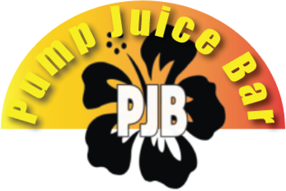
FIGURE 16-11: Type on a path.
You use the Path Type tool to place type on a path as follows:
-
Create the path along which you will align type.
This path can be the edge of a shape, or any open or closed path you create with any tool (including the Pen, Pencil, or Curvature tool).
-
Select the Type on a Path tool from the Tools flyout.
The Type on a Path tool is available from the Type tool flyout on the Basic toolbar.
-
Apply type to the path:
- With the Path Type tool selected, click the path to which you will align type. The path is filled with placeholder text.
- Type (or paste) text. The text aligns to the path, as shown in Figure 16-12.

FIGURE 16-12: Moving type on a path.
When you apply type to a path, the path loses all stroke and fill properties. After you align type on a path, you can apply stroke and fill colors and other styling to the original path by selecting the path with the Direction Selection tool, as shown in Figure 16-13.

FIGURE 16-13: Applying a stroke and fill to a path to which type is aligned.
When you place type on a path, it usually doesn’t look quite the way you want it to. The type may be misaligned vertically (for example, off center). It might be too close to, or too far from the path to which it is aligned. I show you how to address those design challenges next.
Changing baseline shift on aligned type
A first step in tweaking how your type on a path looks, after you have edited the path itself, is to change the baseline shift.
Changing the baseline shift of the type can raise type above the path (with a positive value). Or if you enter a negative value for a baseline shift, the type is lowered below the path. The example project in Figure 16-11, for example, has a negative baseline shift that locates the type inside the semicircle.
Figure 16-14 shows the effect of a positive baseline shift, moving type above the shape to which it is aligned.
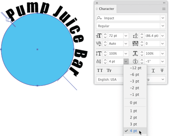
FIGURE 16-14: Applying a positive baseline shift to type on a path.
Baseline shift works a little differently with descenders (such as the bottom part of a lowercase g) and ascenders (such as the top of a lowercase d). How characters with ascenders or descenders or without a baseline (such as an apostrophe) align to a baseline depends on how the font was designed. Exactly how any font’s descenders or ascenders will align is best managed by trial-and-error with different baseline shift settings to see how they work with the specific text you select.
Moving type on a path
I’m not going to lie to you. You almost always need to adjust the placement of type on a path, and doing so is tricky.
When you use the Selection tool to select type placed on a path, three vertical bars appear: a beginning stop, an end stop (both accompanied with little boxes), and a center bar.
You can use the Selection tool to drag either the beginning or end stop to change where the placement of the text on the path begins or ends. In Figure 16-15, I’m changing the end point of a path.
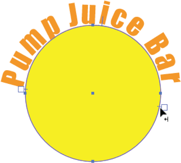
FIGURE 16-15: Moving the end point for type on a path.
You can adjust the location of the aligned type within the defined start and stop points by dragging on the center vertical bar, as shown in Figure 16-16.
Applying effects to type on a path
Illustrator provides a set of cool Path type effects that let you distort the orientation of characters on a path. Actually, Illustrator has many ways to apply effects to type on a path, but the most applicable and accessible are the effects available through the Type on a Path Options dialog.
To experiment with these options, select type on a path and choose Type ⇒ Type on a Path ⇒ Type on a Path Options. The Type on a Path Options dialog appears, and if you select the Preview check box, you can experiment interactively with different effects.
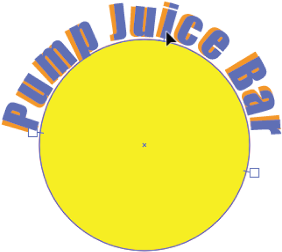
FIGURE 16-16: Moving the center point for type on a path.
In Figure 16-17, I changed the circle you've seen in other figures into an oval because some Type on a Path effects aren’t as noticeable on a circle.
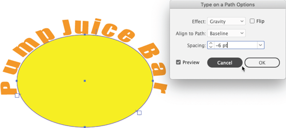
FIGURE 16-17: Experimenting with Type on a Path Options.
Sharing Fonts and Outlining Type
Having explored just how radically you can style and contort type in Illustrator, let’s quickly look at the challenges involved in handing off files to other users without losing the customizing and styling you applied to type.
A couple basic approaches exist to making sure the person to whom you hand off a file can access the fonts you use. One is to rely on the person to have access to Adobe’s font library as well as any non-Adobe fonts you used in your illustration.
But if you’re handing off files to a print shop or a designer who might not even have Adobe Creative Cloud (yes, they exist), you should consider outlining type. I explain what that means shortly and what you need to do to make that happen, but here suffice to say that anyone who can open a vector file saved to any of Illustrator’s vector file formats (including the old-school but still widely used EPS format) will be able to open your graphic without losing any of your text effects.
Sharing fonts
Illustrator provides thousands of fonts to registered users of Adobe Creative Cloud. When you click the Font drop-down in the Character panel, you can select Find More, as shown in Figure 16-18, to access those fonts.

FIGURE 16-18: Accessing Adobe fonts.
If you use any Adobe fonts, those fonts will be accessible if the person you hand off the file to has access to CC’s font library.
For proprietary fonts, or fonts that are not part of the set of Adobe fonts, the person you hand off the file to will have to obtain a license to use them. Some typeface license agreements allow you to embed a font with your Illustrator file, in which case the embedded font will be saved with your Illustrator file.
Outlining type
The most failsafe way to be sure the fonts you use are available to the designers you hand off your file to is to convert type to regular vector paths, or outlines.
 But before you convert type to outlines, save two copies of your Illustrator file! Save one with the original (not outlined) type, and one with outlined type. Hand off the outlined type version, and keep the non-outlined type version so that you can make edits, if necessary, with the Type tools.
To convert type to an outline, select a text object — or select everything in your document including text by pressing Ctrl+A (Windows) or ⌘ +A (Mac) — and choose Type ⇒ Create Outlines. The result will be a group of paths that do not require any installed font to be opened by another user.