
In this chapter, I explore how to expand your knowledge of simple widgets so it covers the full canvas of controlling your overall application and activity layout and design. I use Android layouts as the definition-based way of describing how to organize and display all of the widgets and other UI artifacts that comprise your user interface. In order to understand how layouts work, you need to think of layouts as containers. A layout stores all of the widgets and their attributes so that they are ready to be used, just like ingredients in kitchen containers. The widgets I introduced in Chapter 5 are fine, but as soon as you want two or more widgets on a screen, it becomes increasingly cumbersome to manage each one—each has its own position, spacing, and inter-widget relationships—if you attempt to manage each individually. You have already seen a hint of how managing groups of widgets makes your life easier—through the RadioGroup element, which allows the aggregate control of multiple RadioButton widgets.
This is where Android’s concept of containers for UI layout comes to the forefront. As you will see during the introduction to each of the layout styles Android supports, one of the key features provided by layouts is inheriting implicit layout specifications for the various widgets you wish to display. This lets you focus on the key parts of your UI design that add the functionality, flair, or behavior you seek and spend less time laboriously specifying repetitious drawing instructions. This approach is also flexible enough to cover any given screen that is “inflated” from a container, or multiple containers that are nested, stacked, or otherwise combined together.
In this chapter, I walk through the four major layout containers provided by Android:
- RelativeLayout—Now the default in Android for new projects, the RelativeLayout is a rules-governed approach to having UI elements self-arrange.
- LinearLayout—Historically the most commonly used Android layout (and the default for new projects until Android 4.0 and later). Following a traditional box model, LinearLayout imagines all widgets as boxes to fit within and around each other.
- TableLayout—A model that considers the screen area a grid, to be filled in a similar way to how an HTML table gets filled.
- GridLayout—Not to be confused with the grid approach for TableLayout, the GridLayout uses an infinite fine-line approach to splitting screen space into successively more specific areas.
Following on from there, I explore, in more depth, the process of building layouts with the layout editor introduced earlier, and the fundamentals of manipulating your XML layouts from Java code. Lastly, I show you how to rewrite your click-counting button application so it uses layouts. This is a big chapter, so let’s get started.
Working with Relative Layouts
The RelativeLayout, as you would assume, given its name, places your widgets on the screen based on their relationships with other widgets and the parent container itself. If you look back at the examples I used in the first chapters of the book, you’ll see that they all used RelativeLayout by default, and in fact, this is the default for a new layout.xml file if you use ADT in Eclipse or Android Studio. For example, you can place a given widget below another, have top edges align, or ensure all widgets align to the right edge of the container or a parent widget, and so forth.
Relative referencing relies on a set of standard attributes that describe the desired relationships, which you include within your widgets’ element definitions in the XML specification.
Positioning Relative to the Activity Container
The most fundamental of relationships is covered by specifying how a UI widget relates to its parent container. A range of true/false attributes are used to specify these relationships, including the following:
- android:layout_alignParentTop: Aligns the widget’s top edge with the top of the container.
- android:layout_alignParentBottom: Aligns the widget’s bottom edge with the bottom of the container.
- android:layout_alignParentStart: Aligns the widget’s start side with the left side of the container; used when taking account of right-to-left and left-to-right written scripts. For instance, in an English language left-to-right layout, this positioning would control the widget’s left side.
- android:layout_alignParentEnd: Aligns the widget’s end side with the left side of the container; used when taking account of right-to-left and left-to-right written scripts.
- android:layout_centerHorizontal: Positions the widget horizontally at the center of the container.
- android:layout_centerVertical: Positions the widget vertically at the center of the container. If you’d like both horizontal and vertical centering, you can use the combined layout_centerInParent.
Note that other layout modifiers like padding are taken into account when determining edges, so you should think of any edge-aligning attributes as applying to the absolute outer boundary of you widget.
Identifiying Properties for Relative Layout
To further control the layout of widgets and to describe their relative position to other widgets in the layout, you need to provide the identity of the widget in the layout container. Do this by using the android:id identifier attribute on any widget that you want to refer to.
The first time you reference an android:id value, ensure you use the plus modifier (i.e., @+id/button1). Subsequent references to the same widget do not need to use the plus sign. Using the plus notation helps the ADT linting tools spot instances in which you start referring to an id that has not been properly introduced. Think of this as equivalent to declaring variables before using them. Note that if you are using a version of the SDK older than level 16, no linter support is available, but runtime checks are still performed for missing plus notation on first use of an id.
With the id in place, another widget, such as another button like button2, can now reference our example @+id/button1, introduced earlier,by nominating that id string in its own layout-related properties. Note that names like button1 and button2 are OK for this example, but in reality, you want to choose meaningful names for your widgets; you should consider thinking up a naming scheme that will help you manage your layouts when they become more complex.
Relative Positioning Properties
With the id semantics in place, you can use these six properties to control the position of widgets relative to each other:
- android:layout_above: Used to place a UI widget above the widget referenced in the property
- android:layout_below: Used to place a UI widget below the widget referenced in the property
- android:layout_toStartOf: Used to indicate that the end edge of this widget should be placed at the start edge of the widget referenced in the property
- android:layout_toEndOf: Used to indicate that the start edge of this widget should be placed at the end edge of the widget referenced in the property
- android:layout_toLeftOf: Used to place a UI widget to the left of the widget referenced in the property
- android:layout_toRightOf: Used to place a UI widget to the right of the widget referenced in the property
More subtely, you can also use one of numerous other properties to control the alignment of a widget when compared to another. Some of these properties include the following:
- android:layout_alignStart: Flags that the widget’s starting edge should be aligned with the start of the widget referenced in the property
- android:layout_alignEnd: Flags that the widget’s ending edge should be aligned with the end of the widget referenced in the property
- android:layout_alignBaseline: Flags that the baseline of any text, regardless of borders or padding, of the two widgets should be aligned (see below)
- android:layout_alignTop: Flags that the top of the widget should be aligned with the top of the widget referenced in the property
- android:layout_alignBottom: Flags that the bottom of the widget should be aligned with the bottom of the referenced widget in the property
Tip If you have ever tried to exactly position text in a label to line up with text in an editable field in any UI design system, you know it can be a pain nudging each widget so that the text alignment of the characters entered by your user looks “right,” especially when you consider different fonts, labels with no borders versus EditView with borders, and so on. RelativeLayout provides a great attribute called android:layout_alignBaseline that does all the hard work of this for you automatically. It’s a great one to use for TextView and EditView combinations.
In your two-button example, if you want button2 to be positioned to the right of button1, then in the XML element for button2, include the attribute android:layout_toRightOf="@id/button1".
Determining the Order of Layout Relationships
Since way back in Android 1.6, Android has used a two-pass approach to process the evaluation of relative layout rules; this means that it is safe to have forward references to as-yet-undefined widgets. Prior to version 1.6, only a single-pass method was used, meaning you couldn’t reference a widget until it had been declared in the layout XML. This complicated some layouts, making developers take awkward workarounds. Thankfully, it’s unlikely you’ll have to develop for a pre-version-1.6 envionment, so you can safely use forward-referencing without further thought.
Before you get lost in too much theory surrounding relative layouts, it is time to actually see an example. Listing 6-1 shows the RelativeLayout from the ch06/RelativeExample project.
Let’s examine the various elements in this RelativeLayout. First and foremost is the RelativeLayout root element. In addition to the XML namespace attributes, I specify three other attributes for the layout itself. I want the RelativeLayout to span the entire available width on whatever sized screen is being used, so I choose android:layout_width="match_parent". I could do the same for the height, but instead, I tell the RelativeLayout to only use as much vertical space as is required to enclose the contained widgets. That’s the purpose of android:layout_height="wrap_content".
When you examine the remaining code, you also see four widgets as child elements. These are the TextView of my label, the EditView for my editable field, and the buttons, Button1 and Button2.
For the TextView label, my layout instructs Android to align its left edge with the left edge of the parent RelativeLayout, using android:layout_alignParentLeft="true". I also want the TextView to have its baseline automatically managed once I’ve introduced the adjacent EditView, so I invoke the pixel-nudging perfection using android:layout_alignBaseline="@+id/entry". Note that I introduce the id with a plus sign because I haven’t yet described the EditView, so I need to forewarn of its impending existence.
For the EditView, I want it to be to the right of the label so that baseline magic can work, and I want to have the EditView itself sit at the top of the layout, consuming all the remaining space to the right of the TextView. I instruct it to lay out to the right using android:layout_toRightOf="@id/label" (which was already introduced, so I do not need to add the plus notation). I then force the EditView to sit as high as possible in the remaining space of the RelativeLayout using android:layout_alignParentTop="true" and take the remaining space on the canvas to the right of the TextView by using android:layout_width="match_parent". This works because I know I also asked the parent to use the maximum available remaining space for width.
The daisy-chaining of relative rules continues with the two buttons. I want Button1 placed below the EditView and aligned with its right side, so I give it the attributes android:layout_below="@id/entry" and android:layout_alignRight="@id/entry". I then tell Android to place Button2 to the right of Button1 so the tops of the buttons are aligned using android:layout_toLeft="@id/Button1" and android:layout_alignTop="@id/Button1".
By using the stock skeleton of a new Android project in Android Studio or Eclipse, you can see the resulting layout, rendered in Figure 6-1.
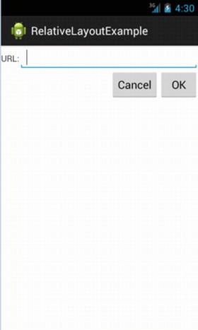
Figure 6-1. The RelativeLayoutExample sample application
Overlapping Widgets in Relative Layouts
One feature unique to the RelativeLayout is its ability to have widgets overlap each other so that when they are rendered in the Android UI, they appear to sit on top or under one another. Android achieves this by keeping track of the child elements from the XML definition, and it successively adds new “layers” for each new child element in the RelativeLayout. This means that items defined later in the layout sit on top of older/earlier items if they use the same space within the UI.
Let me show you how this works in a very straightforward example. Listing 6-2 shows the layout definition from ch06/RelativeOverlapExample. The layout has two buttons declared.
The first button is set to fill all available screen real estate in the activity using the match_parent options for width and height. Because I used such a large button, you can immediately tell that the next widget defined—in this case, the second button—will overlap this one to some degree. I’ve chosen the wrap_content option for Button2 so that it takes only as much space as is needed to display the text. You can see the resulting effect of Button2 sitting on top of (or if you prefer, in front of) Button1 in Figure 6-2.
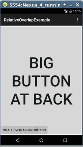
Figure 6-2. Overlapping widgets in action
You can overlay any combination of widgets like this, and they can be of any type. All of the widgets are still responsive in the normal way, except where they overlap. In the region of overlap, any taps or clicks are handled by the top-most widget. As to why you would want to overlap widgets, there are numerous reasons, from artistic desires for slight overlaps, to tricks you might want to practice with widgets “hidden” behind others but still contributing in some way to activity functionality, among others.
Working with Linear Layouts
If you have every worked with other widget toolkits, such as Swing, or the graphic design world, you have probably heard of the box model, which at heart, asks you (the UI designer) to think of the interface as a set of widgets that are added in rows and columns. Because it was the original default layout for earlier versions of Android (now superseded by RelativeLayout), you can use LinearLayout for pretty much all your layout container needs, and then spend time tweaking how your widgets are boxed, nested, and so on. You don’t get some of the fancy features of other layouts—such as the overlap capabilities of RelativeLayout I described earlier—but it works, after a fashion.
Controlling the Five Key Qualifiers for LinearLayout
For any given LinearLayout, you configure a core set of attributes to control the positioning and appearance of the container and its widgets.
The most basic attribute of a LinearLayout is to control whether the widgets fill the layout in order horizontally, or vertically. For instance, in the box-model metaphor, are the boxes stacked from the top down, or from one side to the other? You control orientation in your XML Layout by using the android:orientation attribute of the LinearLayout element, or at runtime, by using the setOrientation() method, passing either HORIZONTAL or VERTICAL as the parameter.
In a LinearLayout container, when widgets are placed by default, no extra space is allocated as a buffer between the widgets. You can alter this behavior using the margin-based attributes, android:layout_margin, which affects all sides of a widget, or the various one-sided attributes such as android:layout_marginTop. The value for the margin attributes is a margin size, such as 10dip.
Specifying a margin in this way has a similar effect to the padding attributes I discussed with relative layouts. The key difference is that margin attributes are only relevant where the widget has a nontransparent background, such as is the case with a button. In these cases, padding is considered to be within the boundary of the background, so in the button example, the edges of the button are pushed further away from the text that is written on it. Margin, on the other hand, affects the space outside the boundary of the widget, creating a metaphorical moat that makes it so no other widgets can encroach. For any widget without nontransparent backgrounds, margin and padding have identical effects.
Recall the discussion in the RelativeLayout example on using wrap_content or match_parent as a way to specify how much space should be filled by a given widget. To recap, wrap_content instructs the widget to dynamically size itself so it is only as large as it needs to be to contain its content (whether that’s button text, an image, text in a TextView, etc.). In contrast, match_parent instructs the widget to take as much of the parent’s available layout space as possible (that’s simplifying things a little, but I’ll return to this topic in more depth).
In LinearLayout containers, all contained widgets must specify a fill method, passing values to the attributes android:layout_width and android:layout_height. Three options for specifying fill method are available: wrap_content, match_parent, and lastly, the least common method of specifying an exact device-independent pixel value, such as 256dip.
There is an obvious issue with using the fill method of match_parent with more than one widget in the LinearLayout container. If two (or more) widgets are demanding all the available free space, which one gets what? Weight is the answer!
In order to allocate the space across multiple widgets demanding the match_parent behavior, the android:layout_weight attribute is added to those widgets to assign the proportion of free space each one should receive. This attribute takes a simple number, such as 1 or 7. Android then parses all of the widgets with an android:layout_weight attribute in the layout, sums the weights, and gives a given widget its fraction of the total.
As an example, if you have two buttons, both configured to match_parent, and you set one to android:layout_weight=1 and the other to android:layout_weight=7, then the first button takes up one-eighth of the available space, 1/(1+7); and the other button takes up the remaining seven eighths, 7/(1+7).
Other methods are available to set the weight as well, but this proportional method is the most intuitive.
The default behavior for a LinearLayout is to align all widgets—from the top if you are using VERTICAL orientation, or from the left if you are using HORIZONTAL orientation. There are situations in which this is not what you want, such as for fancy display effects, or when you are manually overriding Android’s built-in regional and language settings to force right-to-left layout. The XML attribute android:layout_gravity allows you to override the default behavior, as does the method setGravity() at runtime.
Acceptable values for VERTICAL orientation for android:layout_gravity are left, center_horizontal, and right. For HORIZONTAL orientation, Android defaults to aligning with respect to the invisible base of the text of your widgets. Use the value center_vertical to have Android use the notional center of the widget instead.
An Example LinearLayout
All the LinearLayout options can be daunting when you are thinking in purely theoretical terms. The dynamic example in Listing 6-3 shows you how many of these options work.
This example is very simple to begin with. I have defined two separate RadioGroup widgets—one containing RadioButtons to control orientation, the other to contol gravity. I start with the XML definition including the android:orientation="vertical" orientation, which stacks the RadioGroups one above the other, and the RadioButtons within them in vertical fashion as well. Rather than leaving this as is, I override this vertical stacking of the two radio buttons in the first RadioGroup, giving them a horizontal layout by specifying android:orientation="horizontal". This shows another useful feature that is available to you—nested elements can inherit defaults but can also override them. To finish the initial definition, I set some padding around all of my widgets—5dip—and opt for the wrap_content option.
If I run a default Android project with just this layout definition and no supporting Java code, you will still see the layout take effect, even if the radio buttons do nothing for now. The layout is shown in Figure 6-3.
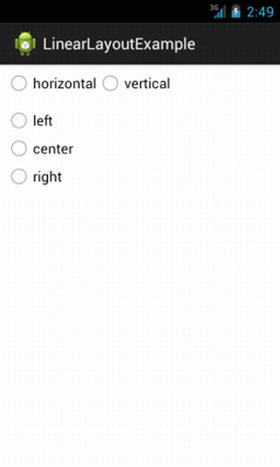
Figure 6-3. The starting point for the LinearLayoutExample application
Obviously, to show the working options changing your layout’s orientation and gravity, I need to add some Java code to make the relevant runtime calls. Listing 6-4 covers the code that brings each RadioButton to life.
The setup for my code is straightforward. During the applications onCreate() call, I use setOnCheckedChangedListener() to register two listeners for clicks on the RadioGroup widgets. As I implement OnCheckedChangeListener in the activity, it becomes the listener.
When a click occurs, the listener invokes the callback onCheckChanged(). The first thing I determine in the callback method is which RadioButton was clicked. Based on that, I call either setOrientation() to toggle from vertical to horizontal layout flow, or setGravity() to the relevant left, right, or center value. Some examples of how the layout changes are shown in Figures 6-4 and 6-5.
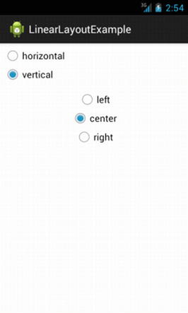
Figure 6-4. Example changes in the LinearLayout
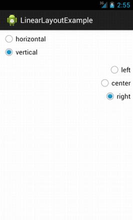
Figure 6-5. Example changes in the LinearLayout
If you remember the early days of the World Wide Web, you probably have memories of page design of the times. I am not just talking about the gratuitous use of the blink tag, but more specifically, about the tendency to use HTML tables as layout containers for everything people wanted to see on a web page. Whether it was for the title bar, menus, pictures, or text, the table could do a passable job of managing layout.
In the Android world, this approach is also supported, thanks to the TableLayout container. TableLayout has many of the same quick-to-use, hard-to-perfect characteristics of the HTML use of tables, but it is certainly useful in many layout situations. The key to TableLayout is its use of TableRow child elements to control the size of the table (its number of columns and rows). This should remind you even more of HTML if you have ever used it, with its <table> and <tr> tags for table and rows.
Understanding Widget Behavior within TableLayout
Before using TableLayout, it is helpful to understand what you can control directy using XML layout attributes or Java at runtime and what Android will implicitly manage for you.
You Count the Rows, Android Counts the Columns
Adding rows to your TableLayout is as simple as you would expect. Within your TableLayout XML definition, you simply add one or more TableRow child elements to act as subcontainers for widgets. When it comes to adding columns, on the other hand, you don’t explicitly specify a number of columns in advance. Instead, when detailing the widgets in your rows, Android pays attention to the row with the highest widget count. This implicitly becomes the number of columns used to render your TableLayout.
Obviously leaving column counting to Android is great from a simplicity perspective, but you may find yourself wanting a more fine-grained control over widget and column behavior. You can achieve this, at least partially, by providing an android:layout_span attribute to any widget, where you would like that widget to span more than one column.
As an example, this layout fragment uses a TextView that spans five columns and an EditView that only uses one implicit column. Android then renders this as if it is effectively six columns.
<TableRow>
  <TextView android:text="How old were you at your last birthday?:"
    android:layout_span="5" />
  <EditText
    android:id="@+id/age" />
</TableRow>
By default, Android fills widgets into columns starting with the first avaliable column. You can override this behavior by specifying an explicit android:layout_column attribute for your UI widget.
Caution Android uses zero-based column numbering! As much as this seems sensible to the hard-core computer science major, it will inevitably cause you—as a keen new Android developer–to stumble into column numbering purgatory at least once. Zero-based indexing of columns will eventually become second nature to you.
We can amend the above fragment to “push” our TextView and EditView to later columns as follows:
<TableRow>
  <TextView android:text="How old were you at your last birthday?:"
    android:layout_column="3"
    android:layout_span="5" />
  <EditText
    android:id="@+id/age" />
</TableRow>
When I use this approach, my TextView starts in column 4 (remember, zero-based column indexes!) and continues until it has consumed through to column 8. The EditText field is then automatically placed in column 9 since I have done nothing to alter Android’s built-in column handling at that point.
Widgets without TableRows in a TableLayout
It is possible to intersperse UI widgets in your table outside of a TableRow child element. In this case, any widgets so defined implicitly behave as if they were placed in a LinearLayout with VERTICAL stacking, and their fill method implicitly defaults to match_parent. Effectively, any widget in your TableLayout but outside a TableRow stacks downward from the last TableRow, filling the full width of the row determined to be the widest of all your TableRows.
You might wonder why you would ever want to use this approach. To continue my earlier HTML analogy, if you have ever used the <hr> element in HTML, you know that it creates a horizontal rule (line) across the entire screen area. You can use the widget-outside-TableRow approach to do the same thing, without needing to worry about how many columns Android determines your layout has at runtime.
Controlling the Size of Columns in a TableLayout
Controlling the width of a given column is left to Android by default. It follows a scheme similar to wrap_content, wherein Android sizes the column to fit the natural width of the widest widget within it. This often works well, but at times, you want to have more control over column width, particularly when you’re dealing with very wide or very narrow widgets whose default width causes an undesirable look to your UI.
Android offers three attributes to provide hints on final sizing of columns. I should say that again for emphasis. Column sizing is not precise, and you, as the developer, can only do so much to influence the final size of a column. This might sound like a restriction, but as you experience more of the UI feature set of Android, and the plethora of device sizes and resolutions, you will appreciate that this is actually a benefit. Here are the three attributes to guide column sizing:
- android:stretchColumns: The column(s) specified stretch to consume any extra space available on the TableRow.
- android:shrinkColumns: Any of the column(s) specified that contain text have their horizontal space reduced and the text word-wrapped to reduce the space they consume.
- android:collapseColumns: The column(s) specified are initially included in the logical layout, but are hidden from display when the UI is initially rendered. You can reveal them at runtime using the setColumnsCollapsed() method.
Each of these attributes takes a comma-delimited set of column numbers. You can shrink and stretch columns at runtime by using the setColumnsShrinkable() and setColumnsStretchable() methods.
An Example TableLayout
Now that you have the theory of TableLayout under your belt, let’s look at a working example that demonstrates a variety of the attributes I discussed earlier. Listing 6-5 shows an example TableLayout, which mimics the earlier layout you saw for RelativeLayout. You can also find the code in ch06/TableLayoutExample.
If you include this layout with a stock project from Android Studio or Eclipse, you see the output as shown in Figure 6-6.
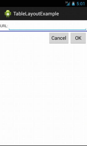
Figure 6-6. Using TableLayout to mimic the earlier RelativeLayout
A TableLayout appeals to those who yearn for HTML-style or CSS-style pixel precision (or lack thereof). Often you’ll find yourself knowing how you’d like the elements of your layout to appear relative to one another, or needing more finess when it comes to specifying the placement of widgets in your layout. Enter the all-new GridLayout, released with Android 4, Ice Cream Sandwich.
GridLayout is a layout that places its children onto a grid of infinitely detailed lines that separate the area into cells. The key to GridLayout’s fine control is that the number of cells, or more accurately the grid lines used to describe the cells, has no limit or threshold—you specify how many or how few grid lines your GridLayout should have using rowSpec and columnSpec properties. This means you can create a layout that mimics a simple table with a few cells (that is, rows and columns), or for those demanding situations in which you need fantastically fine precision, you can go crazy specifying thousands or even millions of cells.
Note To complement GridLayout’s different view of the UI world, it uses android:layout_gravity in place of android:layout_weight.
As an example, here in Listing 6-6 is a GridLayout used in an XML layout file (from ch06/GridLayoutExample):
In an Ice Cream Sandwich Android emulator, you can see the activity using the GridLayout as shown in Figure 6-7.
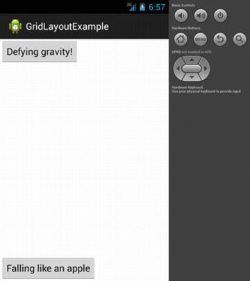
Figure 6-7. The GridLayoutExample sample application
The buttons have followed their various gravity directions to place themselves on the GridLayout, using the defaults for rowSpec and columnSpec counts. You can observe the utility of the GridLayout not needing the somewhat tedious static layout directives of the TableLayout by adding another button to your declarations in activity_grid_layout_example.xml.
...
    <Button
        android:text="Defying gravity!"
        android:layout_gravity="top" />
    <Button
        android:text="Floating middle right"
        android:layout_gravity="right|center_vertical" />
    <Button
        android:text="Falling like an apple"
        android:layout_gravity="bottom" />
...
Figure 6-8 shows how your GridLayout adapts to display its children:
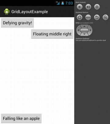
Figure 6-8. The GridDemo revised
Layout Manipulation with the Layout Editor
So far in this chapter I have used a write-your-own-XML approach to adding widgets to your user interface. Although it’s certainly possible to do this for more and more complex interface designs, you probably want an easier and more elegant way to design the look and feel of your applications. That’s exactly what Android offers you by allowing you to edit the XML-based layout files with developer tools like the graphical layout editor in Android Studio and Eclipse.
Recap of the Layout Editor UI
Like any developer, you will face the age-old user interface development tug-of-war: should user interfaces be coded logically and clinically, or laid out with flair and fashion on some design canvas in graphical form?
The good news is that the Android developer tools cater to both approaches, even simultaneously! You already saw the layout editor introduced briefly in Chapter 2. Let’s now take a longer look to be sure you know its key capabilities, and then you can decide for yourself when to lay out on a canvas, when to handcraft XML, and when to code Java to deal with layout at runtime (which I cover next in this chapter). You can access the editor by opening any layout XML file in your res/layout directory. So far in the example applications you have typically only had one layout file, such as the FirstApp example using the res/layout/activity_first_app.xml layout specification. Click on it, and when it opens, you’ll see the graphical layout editor’s default view, shown in Figure 6-9.
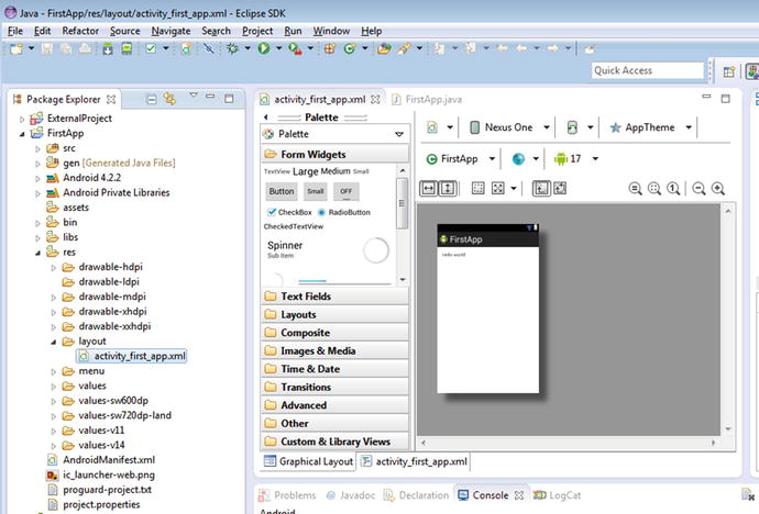
Figure 6-9. Graphical Layout of the FirstApp activity
This actually works on any layout file. You might have many activities in your application, each with a layout. You can also have layouts and layout XML files for only part of a view. For instance, in the next chapter, we explore adapters and lists, and you can have a layout for an individual row in a list.
Note the two tabs at the bottom of the layout: Graphical Layout and activity_first_app.xml. These are two presentations of the same thing. The activity_first_app.xml tab contains the actual textual content of that file, which is the XML specification that describes your layout. The Graphical Layout tab is the notional user interface that your XML file describes. This tab shows the results of the developer toolset parsing the XML and layout out the visual interface your users would see for the given layout file.
On the left side of the graphical layout editor, you see categories for all of the widgets—or layout elements—that are provided in stock form with Android. This includes text fields, check boxes, buttons, and more that I introduced in Chapter 5. You also see a Layouts category, which includes all of the layout containers I’ve already discussed in this chapter.
Android’s SDK ships with the Android Asset Packaging Tool (AAPT), which is designed to take all of the various XML resource files, including layouts, and package/process them into their final usable state. For layouts, your toolset (Eclipse, Android Studio, Ant, Beacon Mountain, etc.) invokes AAPTand its principle job in this instance it to generate the R.java source files within your project’s gen directory. The mystery of the R file is solved! As you’ve already seen, this allows you to access your layouts and their widgets directly from within your Java code.
Even More Reasons for XML Layouts
We have already explored how using XML layouts lets you describe each aspect and interface element of your Android application, without you needing to use Java. We return to the Java story shortly, but there is another very compelling reason to use XML for layout definitions, even though many people consider it a little cumbersome and text-heavy.
One of the best reasons to use XML layouts is so you can enable the creation of tools, like the graphical layout editor I just recapped, that, in turn, greatly assist in creating new layouts, but more importantly, in rereading the definition into a design tool to support edits and extensions. This kind of programmatic parsing and rendering is a huge challenge, but it is made so much more tractable when the data is in a structured format like XML.
If you have experienced other development environments, you know that this principle of separating layout definitions and application logic is a very popular architectural choice—equivalents such as XUL, GWT, and XAML from Microsoft, Google, and Mozilla are all examples of this technique.
Converting to XML-based Layouts with Java Logic
The good news about Java-driven layouts, and XML layouts, is that you can change your mind. You might like to prototype in XML and use the graphical layout editor, or you might like to try really fancy runtime layout choices using Java. At any point, you can change your mind with a little recoding or rewriting of XML. As an example, Listing 6-7 shows the counting Button from Chapter 2’s first application, converted into an XML layout file. You can find this code in the ch06/FirstAgain sample project.
You can see the XML equivalents of the pieces we put together for the sample application, including these:
- Establishing the root element and namespace for the layout, and deciding to use RelativeLayout.
- Defining the Button child element and giving it an android:id so we can reference it from Java (where our counter keeps track of the number of button clicks).
- androind:layout_alignParentBottom, androind:layout_alignParentTop, androind:layout_alignParentLeft, and androind:layout_alignParentRight: Each of these four layout attributes controls how this widget aligns with its parent. In the current example, these are a little redundant, because our button and its parent consume the whole activity space, so you won’t notice any effect. You can try editing the layout to remove these to demonstrate this for yourself.
- android:layout_width and android:layout_height: As I did in the original example, here I have the button’s width and height match the parent (the entire screen).
- android:text: Indicates the initial text to be displayed on the button, which, in this case, is an empty string.
This is admittedly a simple example converted to XML. More complex examples need more that just the one child Button element: they are likely to end up with multiple branches of XML hierarchies. You get to see more and more complex examples from here on, because I favor XML layouts over Java-defined ones for the rest of the book, unless I am demonstrating a particular runtime effect or behavior.
Attaching Layout Definitions to Java
Let us assume you have become a convert to the XML layout approach and have sweated over the definitions for the widgets and containers for your activity’s view in an XML layout file. How do you tell your Java logic which layout to use (even if you only have one)? I’m glad you asked. When it is invoked in your activity’s onCreate() callback, one simple method joins up the parts. This is the setContentView() method. In order for your example application to use the newly-minted XML layout in res/layout/activity_first_again.xml, simply invoke it like this:
setContentView(R.layout.activity_first_again);
If you look back to the original version of our first example app, you can see that setContentView() was called there as well. What differs here is that you are passing a reference to the XML-based view you’ve defined, based on the aapt utility having parsed your XML, and you’ve generated the R class so that you can reference it in this way. No matter how many layout files you have, AAPT packages them all and makes them available in the R.layout namespace, using the format R.layout.<your_layout_file_name_without_the_XML_extention>.
In order to then access the various widgets in your layout, you invoke the findViewById() method and pass it the numeric reference for your widget. Wait! What numeric reference? I’m glad you asked. At packaging time, AAPT also assigns each widget in your layouts an ID number and includes it as member data in the R.java file. You can open the file at any time to see this, but tracking and using explicit numbers would be cumbersome and error prone. Instead, you can have Android resolve the ID number for you using the R.id.<widget_android:id_value> parameter. You can use this to resolve the ID for any widget subclassed from the base View class (which is pretty much everything).
You can already see some of the possibilities this approach enables. Different activities can be passed different instances of a View, and more intriguingly, you can change the View based on some program logic, enabling you to, for instance, use a different layout when you detect a different style of device.
Completing Your Revised App
In the original FirstApp demo, the button’s face showed the number of times the button had been clicked, starting with 1 for when the button was loaded via onCreate(). The majority of your existing logic, like counting clicks, still works in your modified (FirstAgain) application. The key change is shown in Listing 6-8, substituting the previous Java calls in your activity’s onCreate() callback with a definition from the XML layout.
The twin changes I described earlier are visible in the onCreate() method. First, use setContentView() to load the AAPT-created R Java class for your desired XML layout. Then find the button to use with the rest of your logic by invoking the findViewById() method, asking it to find the widget that has the android:id value of "button". This gives you the reference you need in order to track and update the value of your click counter.
The results look strikingly similar to the original FirstApp demo, as shown in Figure 6-10.
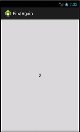
Figure 6-10. The revised FirstAgain sample activity
By now, you can probably imagine where you might start using some of the containers and layout styles I have described, and you might also make some educated guesses about what kinds of layouts and containers some of your favorite applications use. You’ve come to the end of this chapter, but read on for some more advanced layout and widget use.