
Building Layouts with Lists and Adapters
The previous two chapters focused on widgets that convey single pieces of information or provide basic interaction, and different ways to implement the layout of those widgets in your activities. In this chapter, I cover some of the more advanced data-driven UI elements. With these UI elements, not only do definitions in your layout XML files govern the content and even the size and shape of the interface, but the interface adapts and changes based on the data populating it.
A very common design goal for application developers is to want to present users with a constrained list of choices from which they can choose. Think of applications like music players, or phone dialers working from a contact list. What the developer desires is for the user to pick the one entry they want, and then have some action performed with that entry.
That all sounds simple, right? Well, in Android, it is actually quite straightforward to show a dynamic set of content and trigger a follow-on action, which allows you to avoid the need to traverse to and fro across networks leveraging databases and remote services. All you need to do is specify two complementary parts of the solution. First, from where should the options or values originate? Second, what should the UI—our activity in this case—look like in order to present these options? Android provides adapters for sourcing data and several more advanced views that are all derived from the base View object for presenting data. Let us dive in and see how these work in tandem.
Using Adapters to Populate Options
Adapters are one of Android’s fundamental building blocks; they enable you as a developer to build data-driven applications. By letting a user drive behavior by selecting choices, such as contacts, songs, to-do list entries, and similar tasks, you create applications that tailor themselves to each of your users by basing application behavior on their individual data.
Why Adapters?
In the previous paragraph, I mentioned many possible uses for data-driven applications. Songs, contacts, and other classes of data are all rich sources from which to shape an application. But imagine if every time you want to work with a type of data—say, videos—you have to completely rewrite the code that controls how to find those videos on your device or on the Internet, come up with the way of describing and updating data about those videos, and put rules in place for important constraints like format, length, and so on. And just to make the scenario even more burdensome, imagine you can reuse this work for songs, or ebooks, or photos, or phone numbers.
Wanting to avoid the need to reinvent the wheel in this way is the reason Android built adapters into the development framework. Adapters provide a common interface into a myriad of different kinds and sources of data. Android adapters are purpose-built to feed data from all sorts of inputs into one of Android’s list-style UI elements; a user then selects one or more of the items presented. In practice, this can mean the user chooses songs for a playlist, dials a person’s phone number, or checks off a to-do list item.
In order to provide you, the developer, with maximum flexibility, Android’s adapter design gives you control over not only the source data for the widget that will host the data, but also optional control over the way an item of data in the widget is laid out and presented. This blurring of logic and presentation may sound a little crazy, but you are going to see some examples where it makes perfect sense.
The most basic of adapters in your Android toolkit is the ArrayAdapter. As its name implies, an ArrayAdapter takes a Java array or array-like object, such as java.util.List, along with your desired layout for a row of data, and returns an ArrayAdapter object, ready to use.
Listing 7-1 shows a very simple code fragment with all the steps you need to create your first ArrayAdapter.
That is all there is to it. After instantiating the array, you can call the constructor and pass these parameters:
- The desired context for this adapter
- A layout suitable for rendering the data (which, in this case, is an Android default, android.R.layout.simple_list_item_1, but you can and will want to design your own)
- The source data array or List
When invoked over an array or List, by default, ArrayAdapter assumes the source information is text in nature and cast to string as necessary. (In later chapters, I show you how you can control this to deal with nontext data.) Once the raw data is consumed, the layout you provide is applied to generate the rendered widgets so they display in the final container—whether that is a list, a checklist, a spinner, or something else.
To get an idea of how Listing 7-1 is going to render your array, you can open the Android-provided layout android.R.layout.simple_list_item_1 by searching for the simple_list_item_1.xml file in your SDK installation path. Depending on the version of the Android SDK and developer tools you are using, it should look something like Listing 7-2.
I have omitted the multiline licensing boilerplate from the listing so you can concentrate on the actual XML. First, you can see that the resulting rows will be rendered as TextView items. That’s great, because you learned all about TextView layouts in Chapter 5. You can also see that, by default, the items will stretch horizontally to match the parent width; this means they will stretch to fit the spinner, list, or other type of container I will shortly introduce. Height is set to wrap_content and therefore only consume as much space in the rendered layout as is needed to show the relevant text, and you can set some other padding and appearance characteristics to give a pleasing UI.
In the next chapter, I explore more advanced approaches that let you control how rows are created and rendered even further, but for now, you should feel comfortable with what the ArrayAdapter is doing to the data in your array.
Android, like many other UI toolkits, includes a basic list widget for presenting sets of data. This is the ListView, which, as the name suggests, is derived from the base View object, just as all the other widgets we have discussed have been derived. You can link a ListView to the adapter providing the source data and layout view by invoking the setAdapter() method. Finally, you can configure a ListView for user interaction by registering a listener with setOnItemSelectedListener() so that you can add your logic to react to the user’s choice.
A complete example that links an ArrayAdapter to a ListView is available in the ch07/ListViewExample project, which is a simple list with a label on top that shows the current selection. Listing 7-3 shows the XML layout including the specification for the ListView:
The Java code to control the list’s logic and connect it with its ArrayAdapter is shown in Listing 7-4:
One of the first things you should note about this Java class is my choice of base class for the activity. I have derived from the ListActivity, which I haven’t previously introduced. The name ListActivity probably helps you understand the purpose here, but just to be clear, if you are creating an activity in which the only child UI widget (or at least far-and-away the most prominent and important) is a ListView, then you can use the ListActivity subclass to shortcut many of the housekeeping steps a list-based activity warrants.
With that mystery solved, you can focus on where the list is configured to the adapter via setListAdapter()—in this case, the method call provides an ArrayAdapter wrapping an array quoting a soliloquy from a somewhat-famous play. Your application can listen in using an override for onListItemClick() to find out when the selected items in the list change, and you can invoke whatever logic you want for your application based on such a change. The running application is shown in Figure 7-1.
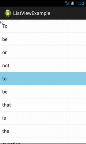
Figure 7-1. ListView with data from an ArrayAdapter
When you look at the way each row of the list has been rendered, you should be able to spot the effects of the “free” default layout XML I mentioned at the start of the chapter. The overall look is sourced both because we correctly configured the ArrayAdapter to use this layout, and because our ListActivity is our base class and only activity, which means we get things like the overall padding, font choice, Material Design or Holo theme, and more. I’ll return to themes at a later point, but you can start to see what they offer and how you can easily capture their defaults with choices like ListActivity and other more tightly-focused subclasses.
Making More Sophisticated Lists
If you have used other widget toolkits like Swing, AWT, .Net and so on, you are familiar with some of the more advanced list interfaces that are very common across desktops, the Web, and even mobile devices. One very common extension of the list approach is to provide a pick list or multi–pick list from which a user can select one or more options in one pass.
You can modify the ListView example I introduced earlier to support the ability to pick one or more entries. In making these changes, you also see how the basic constructs stay the same, and all you need to do is make one configuration choice and pass an appropriate layout for your row data to have everything work as intended.
You can control whether your ListView accepts one selection or multiple selections by invoking its setChoiceMode() method or by configuring the android:choiceMode attribute in the corresponding XML element for the ListView layout. There are only two options from which to choose with setChoiceMode():
- CHOICE_MODE_SINGLE, which as the name suggests, configures the ListView to only allow one selection at a time
- CHOICE_MODE_MULTIPLE, which allows any or all of the options in the ListView to be simultaneously selected
Having told Android what behavior your ListView will have, you now need to make sure it can render an appropriate onscreen widget to allow for your selection options. The following are the relevant defaults packaged with the Android SDK from which you can freely choose:
- android.R.layout.simple_list_item_single_choice: To be used in conjunction with single-choice lists
- android.R.layout.simple_list_item_multiple_choice: To be used when multiple choice is desired
You can also create your own, tweaking layout options if you wish.
The overall XML layout for the activity changes very little—note the additional bold lines in Listing 7-5 as compared to Listing 7-3.
The key change in the layout is to set android:choiceMode to multipleChoice. That instructs Android to allow your user to select more than one entry (without it automatically deselecting other entries). The only other change you need to make is in your Java code to ensure you pass an appropriate layout to the ArrayAdapter constructor that helps the user understand and use the new multi-choice capability. In this case, Listing 7-6 shows the code using Android’s default android.R.layout.simple_list_item_multiple_choice layout.
It will not surprise you that you have now immortalized Shakespeare, and Hamlet, in a much more functional multi-choice ListView, complete with checkboxes for the users to pick out their favorite words from that part of the play. Figure 7-2 shows the multiple-choice ListView in action.
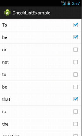
Figure 7-2. Multiple choice ListView with data from an ArrayAdapter
It is no coincidence that all of the words in the preceding ListView examples are short. Really, really short, in fact. You might be thinking we are wasting a huge amount of screen real estate by putting each word on its own row in a ListView. Android provides a solution to situations like this; you want situations in which a View makes the most of the available real estate, while still supporting single- or multiple-selection.
The GridView provides a row-and-column grid of items you can use in presenting “lists” of data to your users. In true Android style, GridView tries to do some of the heavy lifting for you, which means, in practice, you can control some of the aspects of the layout—the number and size of columns—while Android takes care of automatically managing the rest, in particular, the number of rows. This is similar in concept to the TableLayout we explored in Chapter 6.
You control the number and size of columns using the following attributes:
- android:numColumns: A well-named attribute that specifies how many columns to render. You can also use the value auto_fit to have Android compute how many columns will fit the available space based on the other properties listed here and the size of the activity or screen.
- android:columnWidth: Specifies the width of each column in pixels.
- android:verticalSpacing: Indicates spacing between rows.
- android:horizontalSpacing: Indicates spacing across one row between items in the GridView.
- android:stretchMode: Where you choose to use auto_fit for android:numColumns, this controls the behavior of unused space when laying out columns. Choices are columnWidth or spacingWidth, which gives the spare space to either the columns or the whitespace between them, respectively.
In all other respects, GridView operates in much the same way as the already-introduced list selection widgets; it takes an adapter with an associated layout that is able to be registered with a listener via the override for setOnItemSelectedListener()
To see a GridView in action, examine the example project in ch07/GridViewExample, which you can see in Listing 7-7.
The key visual attributes for our grid are that we have elected to consume the entire screen/activity space, except for the allowance for the label at the top. We further choose to let Android decide on the optimal number of columns using the auto_fit value for android:numColumns, and we specify horizontal spacing and column width to our desired pixel sizes of 5dip and 75dip, respectively.
The structure of the supporting Java code is very similar to the earlier ListView examples, with the only material changes being that I substituted in our GridView widget in the appropriate places and selected a suitable layout file for binding to the adapter, as shown in Listing 7-8.
For the curious, Listing 7-9 shows the cell.xml file from the res/layouts folder used by the adapter (as R.layout.cell) to define the rendering of each cell in the grid.
By choosing large verticalSpacing and columnWidth values in our layout (both 75dip), I am attempting to create large box-like cells in the resulting application. In fact, such large cells are almost like implied buttons. This effect is useful, and you can even go so far as to have widgets like Buttons or ImageViews as the content of your cells (remember, you are in complete control of the layout the adapter uses). Figure 7-3 shows our grid as it first appears.
Remember that your emulator or device might have a different screen size, and so our android:numColumns="auto_fit" value can result in a layout of differing numbers of rows/columns than the one you see in Figure 7-3.
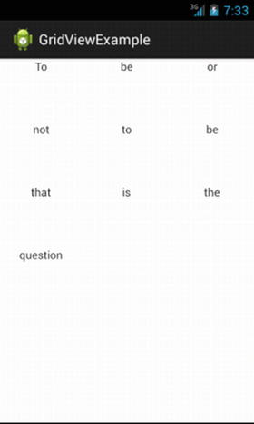
Figure 7-3. GridView with data from an ArrayAdapter
Taking Options for a Spin
There are times when you want to provide your users with a full list of items from which to choose, but for other design reasons or constraints, you simply don’t have the space to show them the entire list in one go. Other widget toolkits address this with the notion of a drop-down or pick list. In Android, the same approach to saving space is achieved with the spinner.
Even without code of your own, you can see how a spinner works by simply playing with the time and date settings of any Android device. In these cases, the source data is taken from the system clock. When designing your own spinners, the general approach is the same as the one you took with ListView or GridView: create an adapter to provide the data you want displayed, pick an appropriate view layout for your spinner “rows,” and hook up a listener object with setOnItemSelectedListener() to carry out your desired logic when a user makes their choice.
Unlike other selection widgets, a spinner has two visual forms: the collapsed version and the dropped-down version that appears while selection is in progress. If you want to also customize the look and feel of your spinner in its dropped-down state, you still configure the adapter (just as you do for the regular state of all selection widgets) and not the Spinner widget itself. You do this with a call to the setDropDownViewResource() method, where you provide the necessary resource ID of your desired view for the dropped-down state.
Listing 7-10 shows our ongoing Hamlet example converted to use a spinner.
The attribute android:drawSelectorOnTop controls whether the arrow that provides the hint that this is a Spinner widget is drawn on the side of the spinner UI.
You can now pour in the Java code that should look mostly familiar to you by now, with the necessary substitutions to populate and use the spinner, as shown in Listing 7-11:
In the Java implementation, when you use spin.setOnItemSelectedListener(this), the activity itself is designated as the selection listener. You can do this because the activity implements the OnItemSelectedListener interface. As I described earlier, it is possible to have a custom View for both the collapsed and dropped-down states of a spinner, and the call to aa.setDropDownViewResource() achieves this. I have used android.R.layout.simple_spinner_item as the View for each row on the spinner—this is another of the defaults shipped with the SDK. OnItemSelectedListener() updates the other label widget with the chosen selection just as we did with the ListView and GridView examples.
Figures 7-4 and 7-5 show the spinner in action.
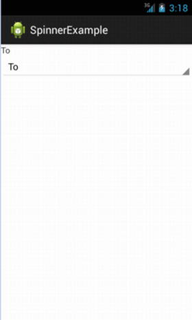
Figure 7-4. Spinner showing initial state/collapsed state
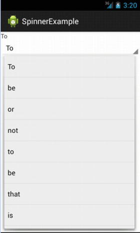
Figure 7-5. Spinner in dropped-down state
In Figure 7-4 you can see one of the questionable design philosophies at play in Google/Android’s contemporary widgets from recent editions like Lollipop, KitKat, and so on. Although there are strong theoretical underpinnings in the minimalist look of the spinner and the little arrow showing its capability (from cognitive neuroscience, if you must know), to the uninitiated, the spinner doesn’t exactly announce its purpose with great fanfare to the user. You might want to keep this in mind when opting between selection widgets in your applications. One thing you can do to help your user in the case of using a spinner is to add a TextView label providing a hint or suggestion as to its purpose.
Automatic Field Population
Lists of data can be long. Really, really long. Think for a moment about how many songs you have as MP3 or other formats, or how many people you know on social media. If you had to run through an entire list of hundreds or thousands of entries, you would probably give up. What would help is some kind of quick filtering mechanism built right into the list. That is exactly what the AutoCompleteTextView offers you.
You can think of the AutoCompleteTextView as a hybrid of the EditText and Spinner views. The autocomplete part of its name should help you understand what it offers. As users type into the widget, their text is taken and used as a search-stub to find any matching items from a provided adapter prefixed with that text. Any matching candidates are shown in a successively more refined drop-down view, just like a spinner. It is up to the users to continue typing, all the way up to the full entry they want, or they can choose an item from the suggested list at any time.
Caution Be careful with really, really long lists. It takes some time to load the data into the view when a list has hundreds or thousands of entries, and browsing that list, or typing for matches, is also a slow experience. In Chapters 17, 18, and 19, I explore other ways, like databases, files, and preferences, to feed data to your applications that are better at dealing with much larger sets.
The AutoCompleteTextView is a subclass of EditText, which means all of the properties and attributes I described for EditText views in Chapter 5 are available for use. There are also properties specific to AutoCompleteTextView, including the attribute android:completionThreshold, which indicates the minimum number of characters a user must type to trigger the list-filtering behavior.
Adapters for the source data to your AutoCompleteTextView are set using the same setAdapter() call you are now familiar with for other list objects. Because the user is allowed to enter a value not provided by the adapter instead of registering listeners to determine what choice was made, you use a TextWatcher instead to be notified when the text changes. This is available on all TextView derived classes.
Listing 7-12 switches the running example to use the AutoCompleteTextView in the layout.
The Java code to support the layout and register the TextWatcher is shown in Listing 7-13.
When you implement the TextWatcher, a new set of callbacks becomes available; it is worth familiarizing yourself with these:
- beforeTextChanged(): Where you can specify logic to invoke before the selected or typed item takes effect
- onTextChanged(): Logic to invoke at the point text changes, such as when the user types the next character or deletes the previous one
- afterTextChanged(): Logic to invoke after the selection of text entry is resolved
Our example uses onTextChanged() to set the value of the label in the activity. You can see the AutoCompleteTextView and its behavior in Figures 7-6 and 7-7.

Figure 7-6. The AutoCompleteTextView waiting to show its capabilities
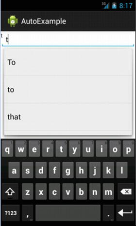
Figure 7-7. AutoCompleteTextView in action
Summary
That completes the introduction to lists and adapters, contributing to your growing toolset for application design. I come back to this topic later in the book when we explore databases, files, content providers, and other sources of information with which to populate your widgets.