
Working with Android Widgets
In Chapters 2 and 3 you briefly walked through the process of creating a new project and saw the files and project structure generated by the Android build tools. You also delved into modifying and enhancing your first project in Chapter 4, adding a button to the user interface and some program logic behind it. As you have probably guessed, there is much, much more to the world of creating Android user interfaces and the logic that drives them.
In this chapter I introduce the many different kinds of user interface elements and how you can used them to create a huge variety of applications. You will master not only how to use these UI widgets in their own right, but you will also start to learn how they can control, influence, and interact with your activities and the other program logic of your application. Let’s get to it.
Understanding Activity Fundamentals
In Chapter 4, I introduced the activity as the basic building block for the screens or windows with which your users interact with your Android application. Your application probably has many different screens for showing data, capturing user input, displaying results of actions, and more.
Android has developed a design philosophy that promotes less visually crowded or cluttered screens that have plenty of space around screen elements or widgets. In its current form, this design approach is known as Material Design, and you can find out much more about it at http://developer.android.com/design/material/index.html. By no means do you need to become an expert in all the suggestions on that site. As a new Android developer, the one point to take on board right now is that if your application has activity user interfaces (UIs) that are less cluttered and with fewer widgets, you will almost certainly end up with more screens to cover all of your desired functionality. In Android terms, that means more activities. In fact, the many-activity approach predates Material Design and its predecessors (and will probably outlive its successors, too). With the knowledge of UI widgets you gain in this chapter, let your activities flourish! Consider them cheap, easily used, and easily discarded, and always feel at liberty to add more activities whenever it suits your design needs.
Naming with Labels
Labels are the most fundamental and straightforward of all user interface widgets. Almost every UI toolkit ever devised has the notion of a label—a simple piece of (hopefully descriptive) text that sits next to some other UI element or widget to add explanation, a caption, detail, or notes. In Android, the label is known as a TextView. It is designed to be a static string, though there are ways in which TextView values can be changed at runtime.
As with all widgets, you are totally at liberty to define a TextView in Java within your application. Those of you familiar with designing nontrivial user interfaces solely in code will realize that this gets very tedious very quickly. The faster, easier, and more elegant way of adding labels is by inserting the TextView XML element into your XML layout through the graphical layout editor, which will make the XML layout file changes for you.
Whether you code directly in Java or use the layout editor, setting the android:text property is key to making your text appear as the label text. Even though you have used the XML layout approach to use the TextView label, you can still control its value (the text seen on screen) by referring to a string resource. I cover this later in the chapter, but examples of when you might want to do this include when you want to localize your UI into different languages, or when you want to adopt a user’s chosen preference.
Over 70 different properties can control the appearance and behavior of TextView labels. These are some of the most commonly used properties:
- android:hint: A hint to display.
- android:typeface: Sets the typeface to use for the label (e.g., monospace).
- android:textStyle: Indicates what combination of bold (bold), italic (italic), or both (bold_italic) should be applied to the text.
- android.textAppearance: An omnibus property that lets you combine text color, typeface, size, and style in one go!
- android:textColor: Uses the common RGB notation in hexadecimal to choose the text color for the label. For example, #0000FF is blue.
When you open the ch5/LabelExample project, you see the contents for the layout.xml resource, as shown in Listing 5-1.
With only this layout, along with the bare-bones Java inserted for you by using the new project option in either Android Studio or Eclipse, you get the result shown in Figure 5-1.
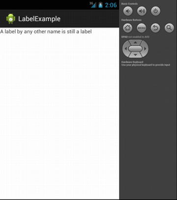
Figure 5-1. The label example showing TextView in action
Pressing Buttons (redux)
We return to the topic of buttons, and in particular, the widget that you first employed in the race to get coding in Chapter 2. Let me provide you with a little more detail to arm you with all the useful knowledge you need for adding Buttons to your UIs. First, as with all other widgets, Button is derived from the View object, and in particular, it is a subclass of the TextView. This means everything mentioned in the previous section on labels applies to the Button.
Android allows you two approaches when dealing with the on-click listener for a Button. The first option is the “classic” way of defining an object and explicitly stating in the definition that it implements View.OnClickListener. Even better than the classic method is the contemporary Android way of simplifying things. This simple option has two steps:
- Create a public method on your activity that returns void. Have this method accept a View parameter.
- Modify your Button element in the XML to include the android:OnClick attribute. Set the string value of the attribute to the method name defined in step one.
Here is an example of how this looks in the Java code:
...
public void methodOnMyActivity(View myButton) {
    // method logic
}
...
And here is the matching XML layout to wire the Button widget to the method:
...
<Button android:onClick=" methodOnMyActivity " />
...
At first you may not feel this is any simpler than the traditional approach. But consider the ease with which this method opens up options to change the Activity for a given Button through simple dent of differing options in your XML specification—for instance, under different language locales, screen sizes, and so on. I talk more about these options in coming chapters.
Handling Images with ImageView and ImageButton
There’s an old saying that a picture is worth a thousand words. In that vein, as a developer, you often want to let an image or picture speak for you, rather than attempt to deploy a long text description. Android offers a number of image-based UI widgets. The two most commonly used are parallels to the TextView and Button you have already seen; the ImageView and ImageButton are their graphical equivalents.
Like the text-based widgets, you will most often define these in your XML layout rather than build them laboriously in Java. The key XML attribute that both ImageView and ImageButton share is android:src, which indicates the image to be used. If you remember back to the overview of the typical project layout in Chapter 3, you can likely guess that the default approach for specifying android:src values is to refer to graphics resources you have placed in your project’s res/drawables directory (and/or density-specific variants thereof).
As the name suggest, ImageButton adds button-like behaviors, meaning onClickListener() and other behaviors and semantics you use with a Button can also be used. Listing 5-2 shows an example of an ImageView configured to use a picture from res/drawables.
You can find the code for this example in the ch05/ImageViewExample project, and it includes a picture of my favorite chair. You can see the results in Figure 5-2.
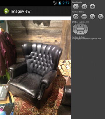
Figure 5-2. The ImageView in action
Fielding Text with EditText
Static strings of text and interesting images are vital parts of many user interfaces, but a time comes when you need the user to act, and that can mean asking them to input text. As with almost every other widget toolkit ever invented, Android provides a UI widget for soliciting text input: the EditText widget.
EditText is subclassed from TextView, and therefore inherits many of the same characteristics available to TextView such as textAppearance. Also, a number of specific properties ensure you can craft exactly the input field you want. These include the following:
- android:autoText: Manages the use of the built-in spelling correction feature.
- android:digits: Limits the field to only accept digits as input.
- android:password: Configures the field to display password dots as characters are typed into the field, hiding the typed characters.
- android:singleLine: Manages the behavior of the enter key to determine if this should create a new line within the text field or more focus to the next widget.
An alternative approach exists for specifying field characteristics for EditText, which is the use of the inputType property instead. I cover this in much more detail along with keyboards and input methods in Chapter 8. For now, Listing 5-3 shows inputType in action with other options.
In this example, I set the android:inputType attribute to flag that the user’s text should have the first word automatically capitalized, and android:singleLine is false, enabling multiple lines of text within the one widget. Listing 5-4 shows the accompanying Java package. You will find this example in ch05/EditTextExample.
You can see the results from this example in Figure 5-3.
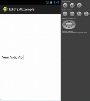
Figure 5-3. Text input example showing EditView in action
If you look closely at Figure 5-3, you can see some telltale signs that this is an editable field. Android’s built-in dictionary and spell-check features have flagged words with red underlining that they think are misspelled. We’ll have to forgive the stock dictionary for not including famous Latin phrases. You can also see the cursor at the end of the text; it’s ready for you to actually edit, as the name EditText implies. If you think your users will tire of doing all the typing themselves, you can employ Android’s AutoCompleteTextView variant (again subclassed), which prompts the users with auto-completed suggested words as they enter text.
CheckBox? Got It.
Let’s continue with the familiar theme of UI widgets you have certainly seen before—Android includes the classic CheckBox, which provides a binary yes/no or checked/unchecked widget. As with the other widgets we have discussed, this is a subclass of View and TextView, which means a range of useful properties are inherited.
The CheckBox object provides you with some Java helper methods to do useful things with your check boxes:
- isChecked(): A method to examine if the CheckBox is checked.
- setChecked(): Checks (sets) the CheckBox regardless of the current state.
- toggle(): Toggles the state of the CheckBox.
Listing 5-5 is an example check box layout with simple logic, which you can find in the ch05/CheckboxExample project:
To have the check box actually do something useful, you can add Java logic to partner your layout. Listing 5-6 is the Java package that demonstrates the check box.
Surprise! Obviously much more is going on in that code than just the auto-generated skeleton from Android Studio or Eclipse with ADT. The fifth import in the Java code alludes to what is happening. By importing OnCheckedChangeListener and providing the implementation for the onCheckedChanged() callback method, we’ve set up our check box to be its own listener for state change actions. When the check box is toggled, the callback fires, and the code updates the text of the check box with a written description of its new state. This not only acts to nicely parcel all the behavior of the widget in one place, but it means you can do things like form validation during entry, without needing to pass all of the data and widget attributes to some other function for checking. Using this method, you avoid lots of delays, and your code and its own sanity checks are nicely side by side.
You can see the results of this immediate update to the text along with the check box in Figures 5-4 and 5-5.

Figure 5-4. An unchecked check box
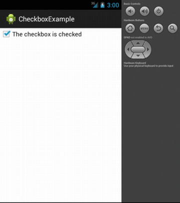
Figure 5-5. The check box is now checked
Switching to the Switch
New to Android 4.0 and later releases (Ice Cream Sandwich, Jelly Bean, KitKat, Lollipop, and Marshmallow) is a variant on the Checkbox. This is a two-state toggle Switch that provides users with the ability to swipe or drag with their finger as if they were toggling a light switch. They can also tap the Switch widget as if it were a Checkbox to change its state.
The Switch provides an android:text property to display associated text with the Switch state, which is controlled via the setTextOn() and setTextOff() methods of the Switch.
Other useful methods available for a Switch include these:
- getTextOn(): Returns the text used when the Switch is on
- getTextOff(): Returns the text used when the Switch is off
- setChecked(): Changes the current Switch state to on (just like Checkbox)
For example, Listing 5-7, an excerpt from the ch05/SwitchExample project, shows a simple switch layout:
Note that we can’t call the widget “switch,” due to reserved word conventions in Java. The corresponding SwitchExample.java shown in Listing 5-8 retrieves and configures the behavior of the switch:
You can see from the general structure, use of methods, and behavior that the Switch operates in very similar ways to the Checkbox. In fact, if you line up the layout and the code side by side for both check box and switch examples, you can see a one-for-one equivalence in both the layout and logic. You can see the results in Figures 5-6 and 5-7 with the switch in each possible state.
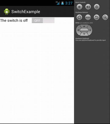
Figure 5-6. The switch in the off position
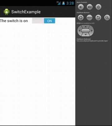
Figure 5-7. The switch is now on
Working with Radio Buttons
With the previous widget examples, I have mentioned how common they are across lots of other UI toolkits. This trend continues with the RadioButton widget. The RadioButton shares the two-state operation that you see with CheckBox and Switch widgets, and it gains many of the same features by also being a subclass of CompoundButton. This means you can set colors, fonts, and so on, just as you can with the other widgets; you can also diagnose and set state through methods like toggle() and isChecked().
RadioButton takes these capabilities further by adding an extra layer of functionality to allow multiple radio buttons to be grouped into a logical set, and then allowing only one of the buttons to be set at any time. That should sound familiar if you have used a web page or other Android application any time in the last decade or so. The grouping is achieved through adding each RadioButton to a RadioGroup container element in the XML layout.
You can assign the RadioGroup a reference ID in the layout via the android:id attribute (just like you can with all other widgets), and by doing this, you can then access additional methods available on the entire group of RadioButtons. These methods include the following:
- check(): Checks/sets a specific radio button via its ID, regardless of its current state.
- clearCheck(): Clears all radio buttons in the RadioGroup.
- getCheckedRadioButtonId(): Returns the ID of the currently checked RadioButton (this will return -1 if no RadioButton is checked).
Listing 5-9 is taken from the ch05/RadioExample application as an example of the XML layout for RadioButtons inside a RadioGroup.
You can add other widgets such as a TextView within the RadioGroup too, and these render within the group structure. You don’t need to add any custom code to the skeleton of a newly generated project—you can see the RadioButton behavior just fine, as shown in Figure 5-8.
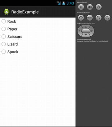
Figure 5-8. Fresh from the Big Bang Theory TV show, everyone’s favorite game in RadioButtons
Note I’ve taken liberties with the traditional Rock-Paper-Scissors game, using the new rules popularized in a certain comedy TV show. I think it’s for the best.
You can observe the behavior described above for a freshly instantiated RadioGroup. None of the RadioButtons is set by default. If you wish to have a default set at rendering time, you can use setChecked() on the RadioButton from your onCreate() callback in your activity.
Timing All Manner of Things with Clocks
A pair of simple widgets are available to display the current time on an Android device; which you choose to use depends on your preference for analog or digital readouts. Both the DigitalClock widget and AnalogClock widget do all the work for you by refreshing themselves based on the system clock.
You do not need Java code to use either widget. Simply place the relevant widget XML into your layout file, as shown in Listings 5-10 and 5-11.
You can use either of these layouts with a stock new Android project from Android Studio or Eclipse to display the running clocks shown in Figures 5-9 and 5-10.
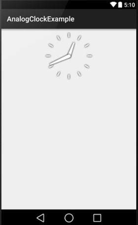
Figure 5-9. The AnalogClock in action
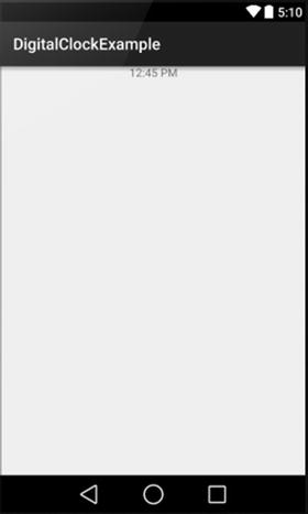
Figure 5-10. The DigitalClock in action
These examples are available in the ch05/ folder. I cover some other examples of clocklike views, such as timers and other time counters, in later chapters.
When we looked at EditView earlier, I mentioned one of the attributes available to you was android:digits, for limiting the field so it only accepts numeric input. This can be very useful for the input of data such as telephone numbers, but sometimes you want people to provide numeric or pseudo-numeric input in places where typing digits is awkward or tedious.
Enter the SeekBar widget, which can be used to gather user input. The user simply slides the selector on the SeekBar to a visual point of the user’s liking. Classic examples of where this type of user interface appears include volume controls (though we cover Android’s dedicated volume control widgets in Chapter 12), color mix selection, answers to survey questions on a disagree-to-agree scale, and so forth.
By default, positioning the selector determines the numeric property of the SeekBar somewhere between 0 and 100. You can override the default range by using the setMax() method. The getProgress() method, while it has a slightly misleading name, is used to determine the current position and associated numeric value of the selector. You can also register a listener for the SeekBar using the setOnSeekBarChangeListener() method to capture activity and values whenever a user changes the selector position. You can find the code for the example in ch05/SeekBarExample.
Views: The Base of All UI Widgets
All of the UI widgets described in this chapter inherit from the same base class: View. Because this is true, you are provided with benefits, some of which you have already seen, such as font settings, colors, and so forth.
In addition to these, you have a range of attributes and methods available that are inherited from View, and these are fully covered in the Android documentation. Here are just a few of the most commonly used ones.
Useful Common Inherited Properties
Properties available to all View-descended widgets that you will commonly use include these:
- android:contentDescription: This is a text value associated with any widget that accessibility tools can use, where the visual aspect of the widget is of little or no help to the user.
- android: visibility: Determines if the widget should be visible or invisible at first instantiation.
- android:padding: Expands the size of the overall widget beyond the minimum size required to fit its content. For example, this can increase the size of a button beyond what is required for its text or image. Dimensions are in pixels, device-independent pixels, or millimeters.
- android:paddingLeft, android:paddingRight, android:paddingTop, android:padding Bottom: A fine-grained alternative to android:padding, which allows different pad values on all sides of the widget.
Note that for padding, you may also use the setPadding() method in Java to achieve padded layout at runtime.
Useful Common Inherited Methods
As you might already have guessed, the commonly used methods inherited from View for all widgets mostly revolve around basic state management, and navigating what widgets exist, their groupings, their parent and child objects in the layout, and so forth. The most commonly used include the following:
- getParent(): Finds the parent object, whether its a widget or container.
- findViewById(): Finds the widget with a given ID.
- getRootView(): Gets the root of the tree provided from the activities original call to setContentView().
- setEnabled(), isEnabled(): Sets and checks the enabled state of any widget, commonly used when you wish to deactivate other widgets on screen based on checked items, switched options, or radio button options.
Even More UI Widgets
We have covered many of the UI building blocks in this chapter, and you should now know how to start building the activity interfaces you might want to use for your application. Note that this coverage is not exhaustive. In particular, I return to cover some of the media-focused widgets in the audio and video chapters.
I cover an additional widget, TabView, in the next chapter on layouts, because its use and features rely on some understanding of FrameLayout, which is also covered in that chapter.
And lastly, there are more complex widgets for dealing with dynamically generated content, choice of data, and so forth, which I cover in Chapter 7.