
Chapter 13. Business Intelligence Semantic Model (BISM)
In the previous chapter, we reviewed the Microsoft business intelligence offering as it existed before the release of SQL Server 2012. Microsoft was seen by Gartner as a dominant player in the BI space with significant enterprise adoption of Analysis Services due to a low cost and minimal barrier to entry given the large installed base of SQL Server. With the release of SQL Server 2008 R2, Microsoft shipped add-ins to Excel and SharePoint that brought a new simplified model for end user and community business intelligence named PowerPivot. PowerPivot leveraged a new in-memory storage model that allowed end users to manipulate millions of rows of data within Excel and SharePoint. Both of these offerings were well received, but left Microsoft with a fractured product offering; one product for BI professionals and another for self-service. With the release of SQL Server 2012, Microsoft unifies the platform with the Business Intelligence Semantic Model, or BISM.
Why Business Intelligence Semantic Model?
BISM is the next generation of Analysis Services. BISM extends analysis services and opens up development to a new generation users. Today’s power users are more familiar with relational data structures then traditional star schema structures that are used for traditional OLAP databases. BISM brings the familiar relational data model to the BI platform and unifies it with the multidimensional model. This added flexibility within Analysis Services expands the reach of Microsoft’s business intelligence platforms to a broader group of users.
BISM Design Goals
Provide a unified model for BI professionals and self-service users
Enable a central hub for data modeling, business logic, and data access methodology independent of the end user client tools or the source data’s original format
Provide a single end user-friendly data model for reporting and analysis across all Microsoft client tools: Reporting Services, Excel, PerformancePoint, and Power View
Enable Analysis Services to support the next generation of BI scenarios focused around the the mash-up of data sources from on-premise and cloud-based data sources
Business Intelligence Semantic Model Architecture
The Business Intelligence Semantic Model Architecture (seen in Figure 13-1) is designed to encompass as wide a sphere of data sources and consumption options as possible in order to bring the most complete and comprehensive business intelligence solutions to the masses.
BISM can consume a wide variety of data sources, and so is especially adept at providing mash-up data solutions. From several different databases, to line of business applications, to files, to OData feeds from cloud-based sources, the possibilities for data integration into the solution are endless.
With the unified dimensional model of prior Analysis Services, data first need to be staged and made to conform to a local set of database tables. The role of Analysis Services was to optimize the query experience by computing aggregations that enabled faster data exploration. With BISM, Microsoft expands the reach of Analysis Services to the cloud.
In addition, expanding upon the model’s hub-like role in marrying together disparate data sources, BISM also allows a multitude of consumers to connect to and analyze the data from the model. By supporting varying levels of business intelligence needs, a wide variety of consumers can be serviced, from personal “quick and dirty” business intelligence created in PowerPivot for Excel all the way up to major Analysis Services projects built by entire development teams.
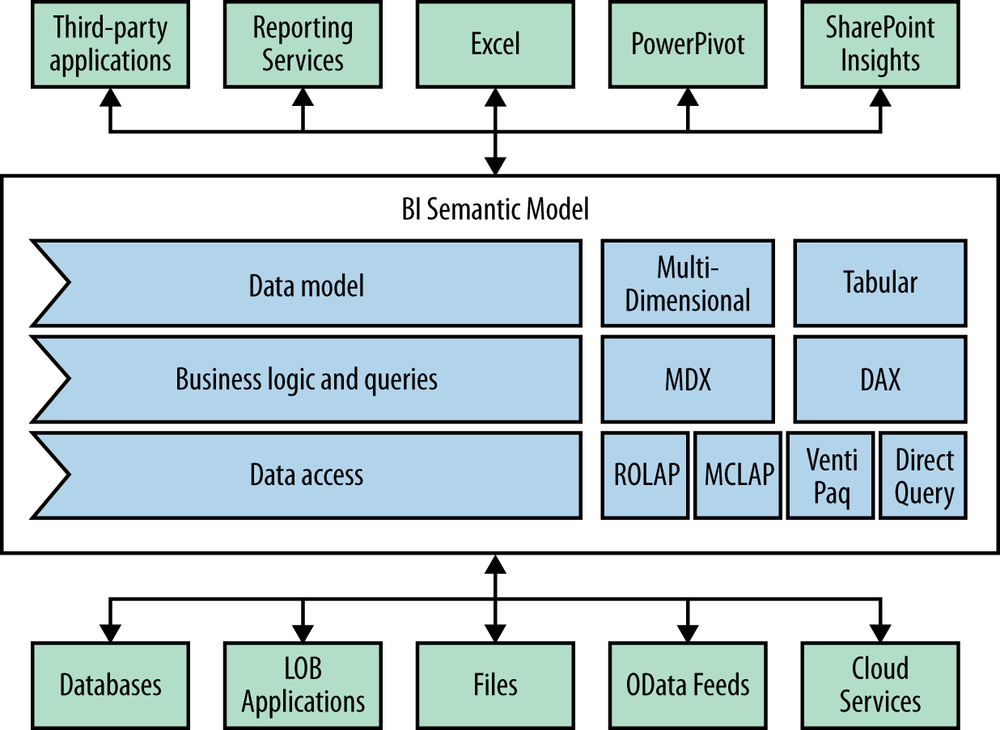
For the accountant who just wants to run some quick figures, the simple Excel with PowerPivot plug-ins option provides full access to the Business Intelligence Semantic Model. As a result, he or she can quickly mock up business intelligence reports without having to rely on a development team or needing to have extensive development experience.
Consuming Data from OData Sources
Additionally, BISM’s ability to consume other models from other reports allows different users to build pieces and components with which they are familiar, allowing someone else to simply source from their model’s published results in order to extend other reports and models.
This is particularly useful with Reporting Services. Starting with SSRS 2008 R2, Microsoft enabled Reporting Services to provide access to the data behind your report via an OData feed. OData stands for Open Data Protocol and is an open standard Representational State Transfer (RESTful) web service based on ATOM. IBM, SAP, Microsoft and others support OData, making it a key enabler for service enablement across public cloud and on-premise solutions.
One great example of where this can be useful is with access to SAP BW information. If your company has a large SAP implementation, the odds are that you have a BW warehouse and that reporting from that data is difficult and requires copying the data and permissions to a SQL Server or Oracle-based data warehouse. Reporting Services 2012 comes with a data provider that can talk directly to SAP NetWeaver BI over XMLA with a graphical query designer. By publishing a report against SAP BW, we are also able to consume that data in our Analysis Services cube by using the OData feed provided by Reporting Services.
Let’s explore Figure 13-2, which shows the continuum of solutions made possible by the new BISM architecture. In memory, the PowerPivot version 2 Excel add-in for Excel 2010 or above allows the end user to manipulate millions of rows in Excel, create relationships between data sources, and enhance the model with key performance indicators (KPIs) and measures (sum, count, min, max, etc.). This desktop version is local to your computer and running in memory, making it fast, but in order to share it, you need the Excel file that contains the model.
Team or community BI solutions are available so you can publish the model you created to SharePoint. When you do that, a few things happen. One or more of your SharePoint application servers are running an Analysis Services in-memory database engine. This is the PowerPivot instance of Analysis Services and works as a full-fledged Tabular Mode Analysis Services solution. This permits you to connect to the cube with a basic Excel client without the PowerPivot add-in, via Reporting Services, or with PowerView. It also enables reporting at a central administration dashboard showing which PowerPivot solutions are gaining popularity and may need to be scaled or governed by IT due to their increasing importance.
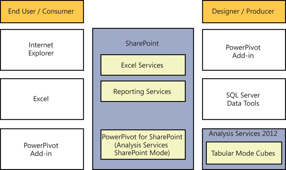
Finally, there is a more traditional BI professional–created Analysis Services solution. This can consume data from other SharePoint-hosted solutions and can be presented to end users using the same clients of Excel, Reporting Services, and Power View. In this case the cube is hosted on a non-SharePoint hosted Analysis Services machine, which may be important for scalability as all this data is stored in memory. You will find that many users create and share solutions via SharePoint, but when they really catch on, you can easily upgrade the solution to run on a dedicated Analysis Services machine.
How Do Existing Analysis Services Applications Translate to the New Semantic Model?
Existing Analysis Services cubes would have been built on the Unified Dimensional Model (UDM). In the new paradigm, every Unified Dimensional Model–based application will essentially be wrapped to become a BISM application due to the underlying fact that the new model understands and supports the new concepts and approaches as well as the old model’s concepts.
This allows us to have one model encapsulating our business logic, measures and calculations, and the dimensional data that we wish to analyze created using either a tabular in-memory storage paradigm or a multidimensional MOLAP disk-based storage methodology as befits our solution.
Pixel perfect Reporting Services reports can be created by teams using the SQL Server Data Tools in Visual Studio or by power users using the Report Builder click-once application launched from SharePoint or your report server. At the same time, managers armed with only their browser leveraging Power View can create live interactive explorations of the data even inside of PowerPoint. The BI Semantic Model offers the flexibility of both tabular and multidimensional models to all clients. It’s also offers easy tabular model creation in PowerPivot for Excel and advanced BI professional features in Visual Studio.
![Using the BI Semantic ModelComment [GM4]: AU: Please insert figure title..](http://imgdetail.ebookreading.net/software_development/6/9781449324667/9781449324667__developing-business-intelligence__9781449324667__httpatomoreillycomsourceoreillyimages1715422.png)
In contrast, an end user may not be familiar with DAX expressions and the tabular data model. Most end users are, however, very familiar with Excel. Utilizing Excel, the user could leverage the familiar multidimensional model and its Multidimensional Expressions (MDX) query language.
The underlying xVelocity engine in the semantic model understands and integrates these seamlessly and the end result remains the same. The user is able to leverage the new performance of the xVelocity engine while remaining with a query language and data model with which they are already familiar.
![Multidimensional and Tabular Cubes in the BI Semantic ModelComment [GM6]: AU: please insert figure title.](http://imgdetail.ebookreading.net/software_development/6/9781449324667/9781449324667__developing-business-intelligence__9781449324667__httpatomoreillycomsourceoreillyimages1715423.png)
One key difference you will notice when connecting to the same model with Excel and Power View is that Excel surfaces any hierarchies that are defined in the data and takes advantage of those hierarchies when you slice the data. For example, with a year, month, week, date hierarchy, you could simply drag in the hierarchy and drill from the year to the month to the week with your measures quickly displaying as the aggregations have been precalculated and stored in memory.
When looking at the same model in Power View, you will see the individual year, month, and week properties on your dimension, but the hierarchies do not display. What you get in exchange is an ability to filter your measures. For example, you could ask to see only those accounts with average sales of over $100,000. In Excel, you can sort and do a “top 10” analysis, but can’t explicitly filter a measure in that way.
As you can see, the multidimensional and tabular access models of BISM are quite complimentary. Using SharePoint, we will create reporting solutions using each of the Microsoft-supplied clients for BISM that ship in the SQL Server 2012 and SharePoint 2010 products.
![Attributes of the BI Semantic ModelComment [GM8]: AU: Please insert figure title](http://imgdetail.ebookreading.net/software_development/6/9781449324667/9781449324667__developing-business-intelligence__9781449324667__httpatomoreillycomsourceoreillyimages1715424.png)
Pros and Cons of the New BI Tabular Data Model
When comparing the tabular model to traditional Unified Dimensional Model, many folks wrongly believe that the tabular model is meant to replace the UDM. Rather than a replacement, tabular BISM is a new option that is appropriate for many, but not all scenarios. Let’s explore some of the criteria that will help us make the decision.
Pros:
Familiar to most users and developers
Easier to build and results in faster solution creation
Quick to apply to raw data for analytics
Learning curve is not as steep
Query language is based on Excel calculations, which are widely known and understood
Easy to integrate many data sources without the need to stage the data
Cons:
Advanced concepts like parent/child and many-to-many relationships are not natively available and must be simulated through calculations
Requires the learning of another query language; DAX in this case
No named sets in calculated columns
How Do the Data Access Methodologies Stack Up?
With so many different options for accessing data, let’s take a look at each of them and see how they compare.
xVelocity (Tabular)
The xVelocity engine stores all data in memory. For this reason, the computer on which the processing takes place should be optimized for maximum memory. xVelocity will spool to disk when it runs out of memory, but performance degradation quickly becomes unacceptable once spooling begins.
The power of the xVelocity engine is its brute force approach to processing the data. For it to yield maximum results, the entire contents of the target data set should safely be able to fit in memory. The xVelocity engine employs state-of-the-art compression algorithms that typically yield about a 10:1 compression ratio for processed data. Basic paging is supported because physical memory usage is the prime limitation. There is no performance tuning (other than adding RAM) for the engine.
For optimal performance, in a PowerPivot for Excel workbook for example, the end user’s amount of RAM will be the most significant contributor to their performance experience. Given that today’s typical laptops have multiple gigabytes of RAM, xVelocity can safely process millions of rows on the typical computer.
MOLAP (UDM)
Multidimensional Online Analytical Processing (MOLAP) is a disk-based store. Though it also leverages state-of-the-art compression algorithms, its compression ratio is generally only around 3:1. It leverages disk scans with in-memory caching, but extensive aggregation tuning is required for optimal performance.
Because of its disk-based nature, data volumes can scale multiple terabytes. In addition, it has extensive paging support to allow for processing such vast amounts of data. Pre-computation and storage of data (i.e., building cubes) are required with this data access methodology.
Due to the precomputational status of its source data, MOLAP is generally more performance optimal than ROLAP. When an end user connects to a MOLAP cube they do not need access rights to the data sources or the datamart used to process the cube. All data required to service queries has been cached to a number of files on the Analysis Services Server.
ROLAP (UDM)
Relational Online Analytical Processing (ROLAP), like MOLAP, uses the Multidimensional Data Model, however, it does not require the precomputation and storage of data. Instead of processing cubes of data, it processes the relational database, but due to locking conflicts it’s usually an industry best practice for the target database to be a copy of the live production database.
It is generally considered more scalable than MOLAP, especially in models that have dimensions with high cardinality. Cardinality is a mathematical term that simply relates to the number of elements in a set of data. In addition, row level security allowing results to be filtered based on the user is made possible by the underlying relational foundation of this model.
In this data access technique, the user’s rights against relational tables are important. While ROLAP does have a cube design, the aggregations haven’t been preprocessed, so every query is still translated out to the source tables, making this much slower but allowing you to preserve any database access rights stored in the source systems.
DirectQuery (Tabular)
Analysis Services allows for the retrieval of data and the creation of reports from a tabular data model by retrieving and aggregating directly from a relational database using the DirectQuery mode. The major difference with DirectQuery is that it is not a memory-only model like that of xVelocity. When Direct Query the end user’s queries are translated back to the source data once again allowing you to enforce permissions that may be stored in the source system.
Business Logic
Business logic in BISM is driven by the new Data Analysis Expressions (DAX) language, which is a formula-based language that is used in PowerPivot workbooks. DAX and Multidimensional Expressions (MDX) are not related to each other by anything other than the fact that both are used in BI systems. DAX is considered an extension of the formula language found in Microsoft Excel and its statements operate against the in-memory relational data store that is served up by the xVelocity engine. As we have already discussed, the xVelocity engine serves up a relational data store. Please refer to earlier notes on the relational data model for more information. For our purposes, it’s only important to note that the data store is comprised of tables and relationships.
Because of the fact that we can use DAX expressions to create custom measures and calculated columns, it does not guarantee that DAX data will always be normalized to 1NF, 2NF, or 3NF. The best way to think about the data is in de-normalized form similar to a spreadsheet; i.e., as it is displayed in PowerPivot.
DAX cannot be used where MDX is required and vice versa. The two are not interchangeable. As a core component of PowerPivot technology, DAX can only be used in tabular BISM projects either in PowerPivot for Excel, PowerPivot for SharePoint, or Analysis Services Tabular Mode. You cannot use DAX to extend normal Excel data columns and create new calculated columns. MDX can only be used in a multidimensional model and cannot be used in PowerPivot or an Excel workbook.
DAX Syntax
The syntax of DAX formulas may remind you of Excel formulas—and as an extension to the Excel calculation language, it should. DAX is used to create new derived columns of data. Even though DAX expressions are processed by the xVelocity engine through an in-process instance of SQL Server Analysis Services, it’s important to note that DAX expressions can only be used with tabular models such as PowerPivot and the SSAS Tabular Mode. For a complete reference to the DAX syntax online, start here.
It is important to understand how DAX works, so we will look at a couple of examples to help clarify the syntactical use. One of the most common things people are looking for when dealing with BI data is the ability to filter that data in different ways. Consider Table 13-1 for example.
Quarter | Tickets Opened | Tickets Closed |
Q2 2012 | 945 | 932 |
Q2 2012 | 943 | 912 |
Q3 2012 | 998 | 945 |
Q4 2012 | 902 | 951 |
If we consider Table 13-1 in the context of our help desk ticket system, a couple of things should jump out when analyzing the numbers. Clearly, there was a slowdown in closure rate during Q2. Additionally, we can see a spike in tickets being opened in Q3 and in Q4, we actually closed more tickets than were being opened. Beyond this, we can’t say much more about the data.
If we consider that our company is an international company with tickets being opened all over the world and that we also have teams that are dispersed across the globe that work on these issues, it becomes clear that we need to filter our tickets a little more in order to get more detail on which geographic region generated the most tickets.
Let’s say that we wish to see the difference between foreign and domestic tickets. As long as the data is captured in our system, we can use DAX to create an on-the-fly calculated column that represents said data, for example:
FILTER('TicketsOpened', RELATED('Locations'[Country])<>"US")In this expression, we are using the FILTER syntax to create a column that contains only values that match our filter. The first parameter to the FILTER statement is that of the target column that we wish to use as the source of data for this new column that we are creating. In this case, the column is called “TicketsOpened.” Next, we relate the data in that column to another datasheet in the PowerPivot data set, in this case “Locations,” and we specify the field or column of data to relate, “Country” in our example. Lastly, we supply the filter statement and in this case we used anything that doesn’t match “US.” This DAX syntax is translated into the following:
Give me all the values from the TicketsOpened column where the location of the ticket is not US.
What about blank rows, you may wonder. Blank rows can be problematic in BI reports and as such, we’d want to be able to filter those out quickly. DAX makes this a snap. Using the following syntax:
ALLNOBLANKROW('Tickets')We can retrieve all rows in the Tickets sheet while filtering out the blank rows.
Another example could be trying to determine something like how many users actually opened tickets. In this case, we want to count the number of rows in the dataset and while this is easily done with the COUNTROWS syntax, we also need to eliminate duplicates. For this purpose, DAX provides us with the DISTINCT syntax. Using these two together with:
=COUNTROWS(DISTINCT(ALL(Tickets[OpenedBy])))
we can get the data we need since the above syntax will translate to
Give me the “OpenedBy” column in the “Tickets” dataset, but give me all the rows regardless of filters applied and then filter out any duplicates so that only distinct values by this “OpenedBy” column are returned and then count the number of rows that are returned.
Getting Started with DAX
We just looked at some basic DAX syntax in order to become familiar with how it’s used. Now let’s look at how that is actually done inside PowerPivot. We will be using PowerPivot version 2 for Excel 2010.
For more information on the installation and configuration of PowerPivot, see Chapter 35.