
Chapter 22. PivotTable Named Sets
When working with pivot tables, you often want to work with the same set of items from the data over and over again. For example, you might be responsible for help desk tickets from six different productions and want to create a set of reports about your product areas, but the list that describes which products are “your” products isn’t in the data source. Named sets in Excel 2010 give you the ability to create and reuse this logical grouping of items as a single object that you can add to PivotTables, whether it existed in the data source or not.
Beyond creating a reusable group of items for use in PivotTables, named sets in Excel 2010 enable you to:
Create reusable groupings of common sets of items for reuse in PivotTables
Combine items from different hierarchies in ways that otherwise wouldn’t be possible
Dynamically change your PivotTables based on filters by using dynamic sets
Create PivotTables based on your own custom MDX
To fully explore the power of named sets in Excel PivotTables, let’s walk through a scenario with the dashboard you created earlier in this chapter. Our goal is to look at recent trends in our ticket volume and the average time to closure. To do this, we will look at the last four years of ticket counts and the average time to closure over that time period.
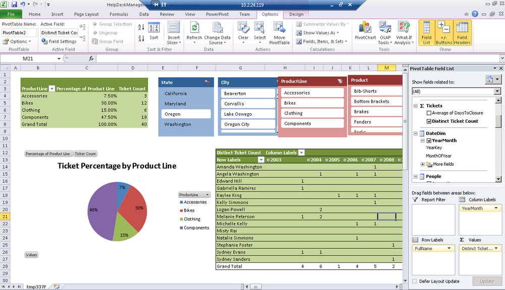
We will use our second PivotTable that currently shows ticket count by creator name to complete this exercise.
Scenario: Last Four Years of Ticket Counts and Total Average Time to Closure
Select your second PivotTable.
Add the YearMonth from the Date dimension to the Columns. The result is tickets over time, as you can see in Figure 22-1.
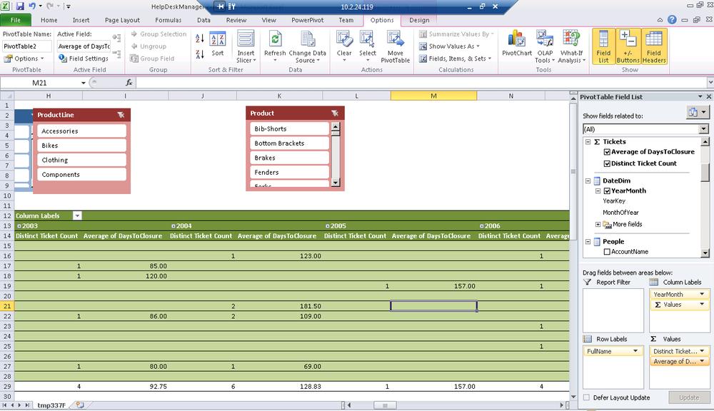
Drag Average Days To Closure into Values (Figure 22-2). Notice that the volume of data shown makes this view completely unusable.
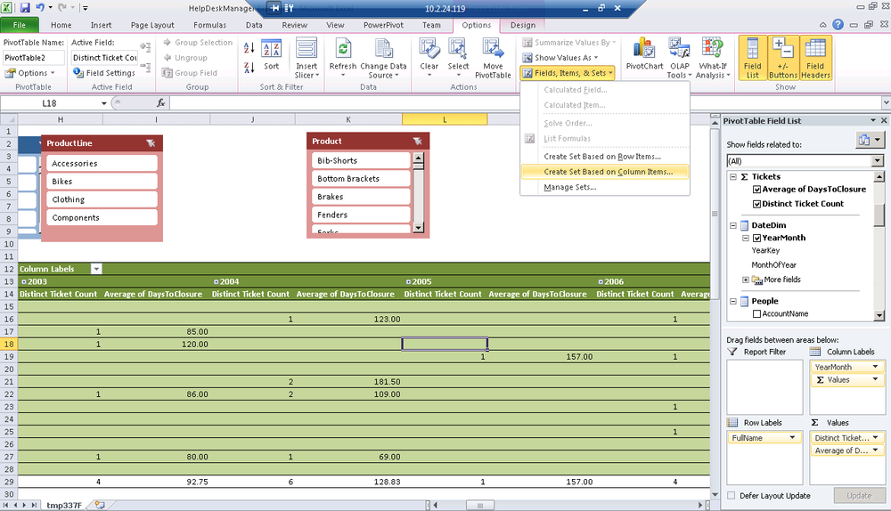
From the PivotTable Options ribbon, select Fields, Items, and Sets. Create a Set that is based on Column Items, as shown in Figure 22-3.
The set editor (see Figure 22-4) shows the distinct combination of dimensional values and measure values that make up the set. Notice that you can see each year in the left and the distinct ticket count and average days to closure measures in the values on the right. You can also provide a name and optional folder in which to display this set if you wanted to reuse it in your workbook.
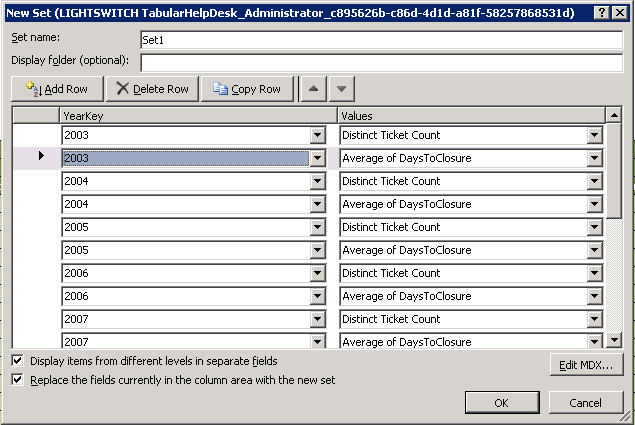
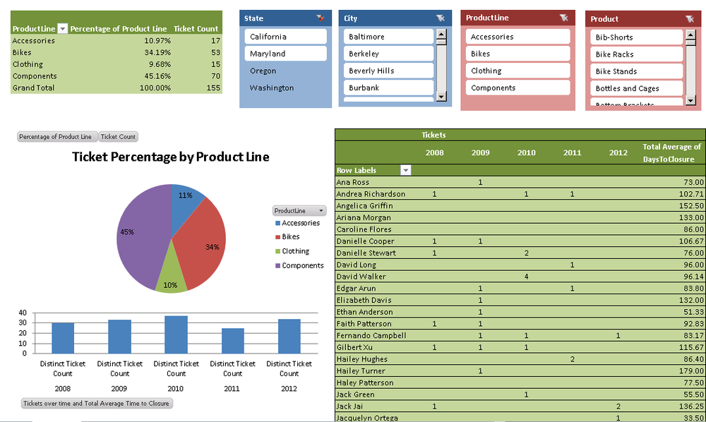
Figure 22-5 shows the result of applying our named set to create an asymmetric report. You have four years of ticket trend data and the average total days to closure over the life of the queue. You are displaying less data here and focusing in on the relevant information in a way that a normal PivotTable wouldn’t allow you to do.
![Applied named set for asymmetric reportComment [GM4]: Figure title needed..](http://imgdetail.ebookreading.net/software_development/6/9781449324667/9781449324667__developing-business-intelligence__9781449324667__httpatomoreillycomsourceoreillyimages1715559.png)
Reusing a Named Set for Another Chart
Let’s continue our example by adding a new chart to our dashboard that reuses our named set. This allows us to visualize the data from our named set using a PivotChart.
Select the cell in your workbook where you want the chart.
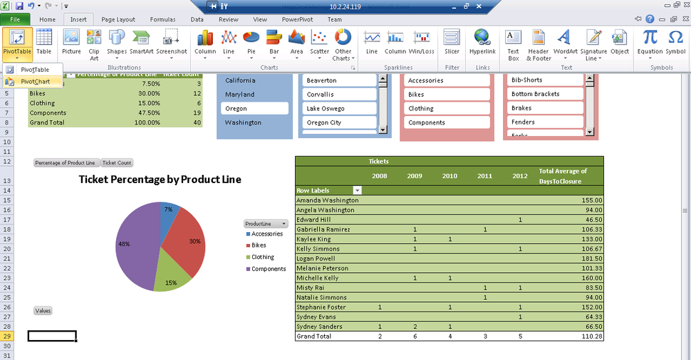
From the Insert ribbon, select Insert a new PivotTable → PivotChart (Figure 22-6)
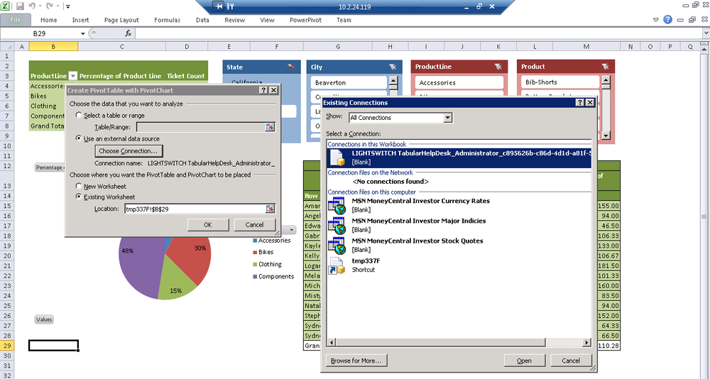
Using the same technique as you did when adding a new PivotTable, choose to reuse the existing data connection from this workbook, as shown in Figure 22-7. This should be very familiar.
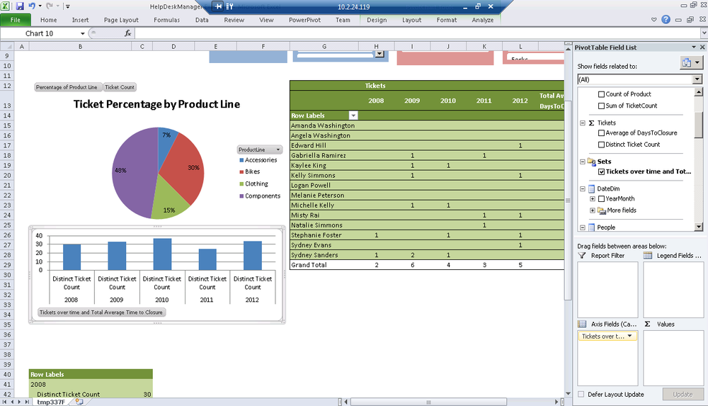
In the PivotTable Field List on the right, you’ll notice you now have Sets displayed in the same way that you previously had measures and dimensions.
Drag the named set to the Axis Fields at the bottom of the PivotTable Field List (Figure 22-8).
For a finished look, clean up the borders and move the chart into place (Figure 22-9)
For advanced users who are familiar with MDX, you are now able to create just about any PivotTable you’d like by creating sets based on your own custom MDX definition. The set manager allows you to create a new set using an MDX editor, and also allows you to set advanced options on your set, including making the set recalculate its items based on its context (a “dynamic set”). For example, you can make a set that shows combinations of products and salespeople when you’re filtering by one manager, but shows products and sales channels when you’re filtering by another. Advanced MDX is beyond the scope of this book, but many books on MDX are available.
Summary
This is probably a chapter that you will want to read more than once. Even PivotTable ninjas often have never used named sets. When your data is particularly unwieldy and misshapen, named sets are incredibly powerful. Named sets give you the ability to shape the data you are pivoting with unprecedented control. Remember that named sets exist and are great for really unwieldy data then flip back to this chapter if you need a hand. In the next chapter, we’ll introduce more new visualizations called sparklines and data bars.