
Chapter 25. Reporting Services Basics
What Is Reporting Services?
SQL Server Reporting Services (SSRS) enables IT professionals, developers, and end users to create screen- or print-ready formatted reports in a variety of styles. You can create interactive, tabular, graphical, or free-form reports from relational databases or cubes quickly and easily. Reports can be designed with charts, maps, and sparklines. You can publish reports, schedule delivery, or request reports on-demand. You can select from a variety of viewing formats, export reports to other applications such as Microsoft Excel, and subscribe to published reports. Reporting Services reports can be served right from your SharePoint site or integrated into custom applications via a URL or web service access. You can also create data alerts on reports published to a SharePoint site and receive email messages when reporting data changes.
In additional to its role as a visual report generator, Reporting Services also provides an OData feed for each of the datasets in a report. These feeds can be used as an OData source for our LightSwitch application or for a PowerPivot or tabular cube.
Report Architecture
Let’s start with a quick introduction to the major components of a Reporting Services solution. A data source stores the connection information about the endpoint we’re going to connect to. Many providers are available for Reporting Services data sources, including SQL Server, Analysis Services, Oracle, and SAP BW. Remember this ability to talk to many different data sources because it rocks. You may have scenarios where you want to incorporate data from Oracle or SAP into your LightSwitch or PowerPivot scenarios. The ability to connect to many data sources and emit an OData feed makes SSRS incredibly valuable.
Once a data source is created, we create a dataset. Datasets represent the specific query we’ll be running against our data source. Additional filters and sorts can be applied at runtime in the dataset layer if that’s required.
The presentation layer of the SSRS solution is the report itself. Reports contain the visual layout definition and describe the charts, tables, and matrices that will display your data as well as any conditional formatting logic.
Both data sources and datasets can be flagged as “shared,” allowing them to be reused across reports. This is a best practice that makes it easier if and when the connection information changes for your data source.
Creating a Reporting Services Data Source
We begin in the PowerPivot Gallery that you configured in Chapter 20. To keep things organized, it’s a best practice to create folders to organize your data sources and datasets allowing your end users to just browse the renderable reports.
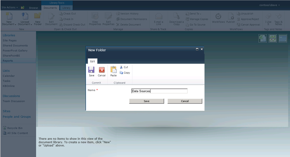
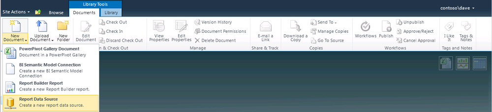
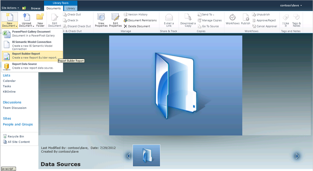
From the Documents tab in the Library, you can create new folders to store data sources, as shown in Figure 25-1. Then create a report data source using the content type we configured in Chapter 24 (see Figure 25-2).
Next, complete the details of the new report data source including connection string, credentials, and impersonation information (see Figure 25-3). You can see in this example that we are using an Analysis Services Provider to talk to the tabular cube. Analysis Services only accepts Windows credentials so it’s very important to check the “Use as Windows credentials” checkbox if you want to store a username and password to connect to your cube.
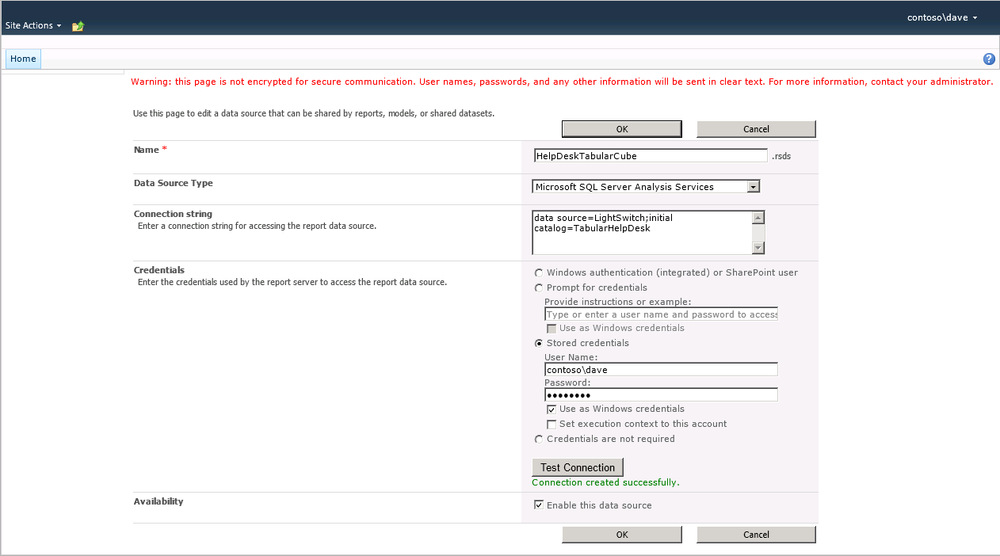
Note
The credentials you store on this page are encrypted before they are stored in the report server database. Make sure that your administrator backs up the server encryption key or you will lose all sensitive information if you restore from backups.
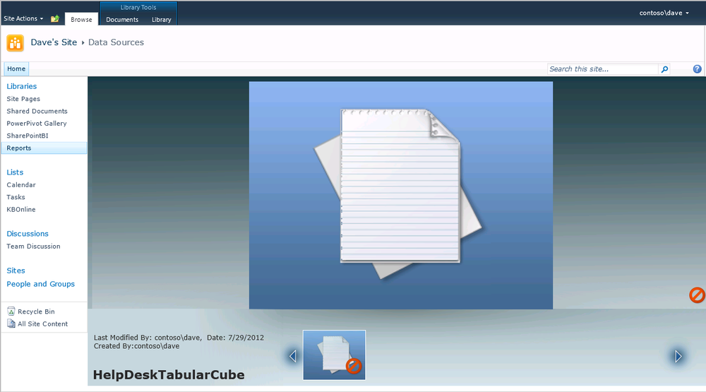
That’s all you need to do to create a shared data source. Because you added this data source to your library rather than creating it as part of the report, your data source is reusable across all reports. In Figure 25-4 you can see the result: a new file in the data sources folder that will be used to connect your reports to your tabular cube.
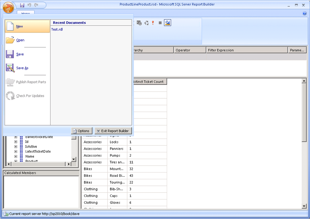
Launching Report Builder 3.0
Now that you’ve created your data source, we want to launch the Report Builder application to create your dataset and reports. Navigate back to the top of the Reports library and add a Report Builder report from the New Document list on the ribbon as shown in Figure 25-5. If you don’t see Report Builder report on this list, please see Chapter 24 for information about configuring your library.
Report Builder is a ClickOnce application designed to let information workers quickly and easily create or modify reports and save them back to SharePoint. ClickOnce is a Microsoft technology that enables the user to install and run a Windows application by clicking a link in a web page. This technology allows a .NET application to be deployed to a client over the web rather than running a traditional installer, simplifying deployment and upkeep of smart client applications.
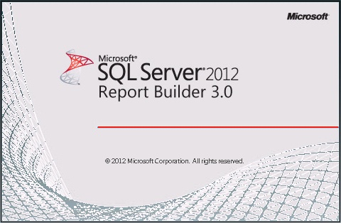
As the software streams down and installs on your desktop, you’ll see the splash screen shown in Figure 25-6. Depending on your connection speed, this may take a few minutes the first time while the software is downloaded and installed. In the future when you launch Report Builder, it’s smart enough to know that the software is already installed and runs it from your local machine.
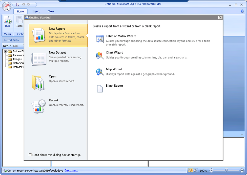
Once the install has completed, you’ll see the screen shown in 25-7 and we’ll proceed with creating our dataset against our cube.
Creating Datasets
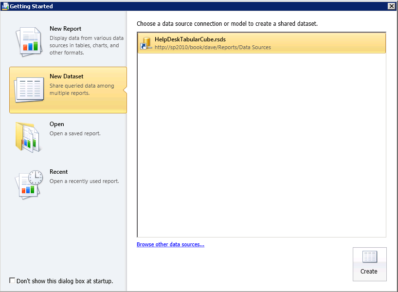
Report Builder starts with a Getting Started dialog that makes it easy to create common reports using a wizard or to create a new dataset. We’ll start by creating a new dataset, as shown in Figure 25-7.
When you choose New Dataset, you are presented with a dialog box to choose the data source against which you’d like to create the dataset. This is how you’ll map your dataset back to the connection from which you’ll be getting data. Navigate to the data sources folder and select the data source you’ve just created, as shown in Figure 25-8.
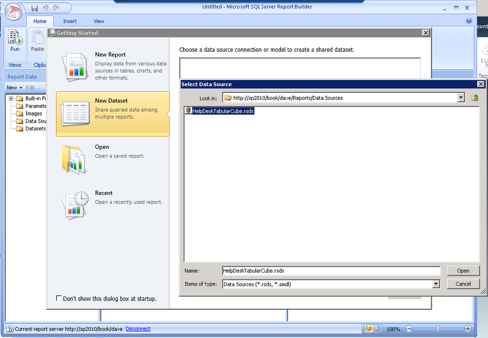
In Figure 25-9, you can see that we have a data source (HelpDeskTabularCube) selected and you can see the path in SharePoint where that data source file is stored. Go ahead and hit create to start the New Dataset wizard.
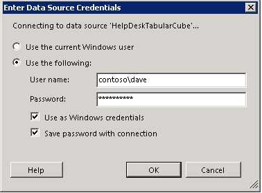
Now, you are prompted to confirm your data source credentials (see Figure 25-10). When you save the password with the connection, your password will be stored encrypted in the report server.
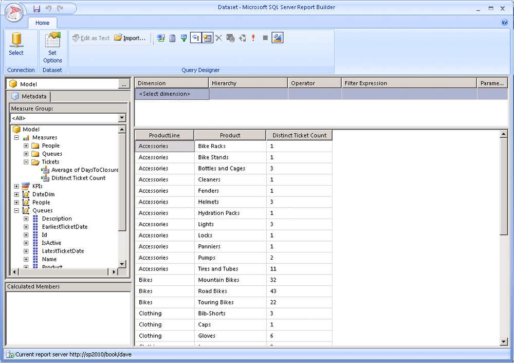
With the mechanics of setting up a data source and credentials out of the way, we get to the more interesting steps. Figure 25-11 shows the familiar multidimensional query designer. You’ll recognize this as being very similar to the cube browser from SQL Management Studio or Visual Studio.
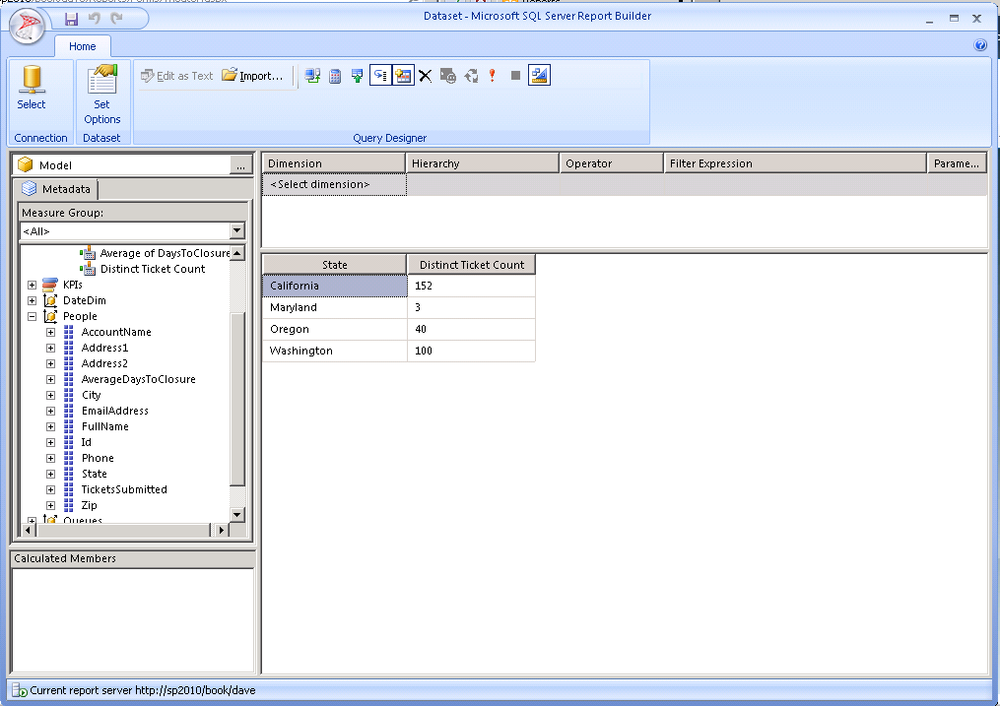
To create our first dataset, drag on the Distinct Ticket Count measure from the Tickets measure group. Then drag on ProductLine and Product from the Queues dimension. The resulting query should look exactly like Figure 25-11.
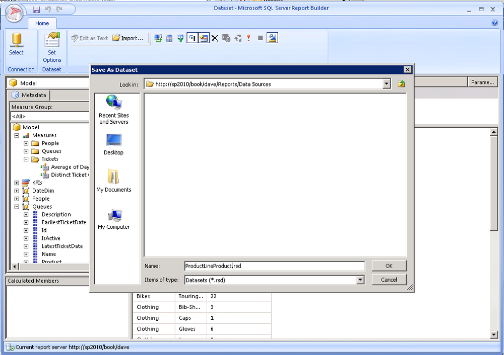
When you finish creating your query, hit the Save icon on the toolbar.
Provide a name for the dataset and store it in the data sources folder because it’s nonvisual and doesn’t need a preview. If you prefer, you can create a datasets folder for these; the real point is just to group together the end user facing reports and separate them from the nonvisual assets that we’ll use behind the scenes. This save process is shown in Figure 25-12.
With the Report Builder application still open, use the orb in the upper left corner to relaunch the New Document wizard as shown in Figure 25-13. This will let you add an additional dataset that you’ll use in your report. The Report Builder application takes a little bit of getting used to as the usability is different from Excel or Visual Studio, but it is very productive once you know your way around.
For this query, we’ll use Distinct Ticket Count sliced by State from People. Then save this dataset as TicketsByState to the same folder in SharePoint. This dataset is shown in Figure 25-14.
Creating a Reporting Services Report
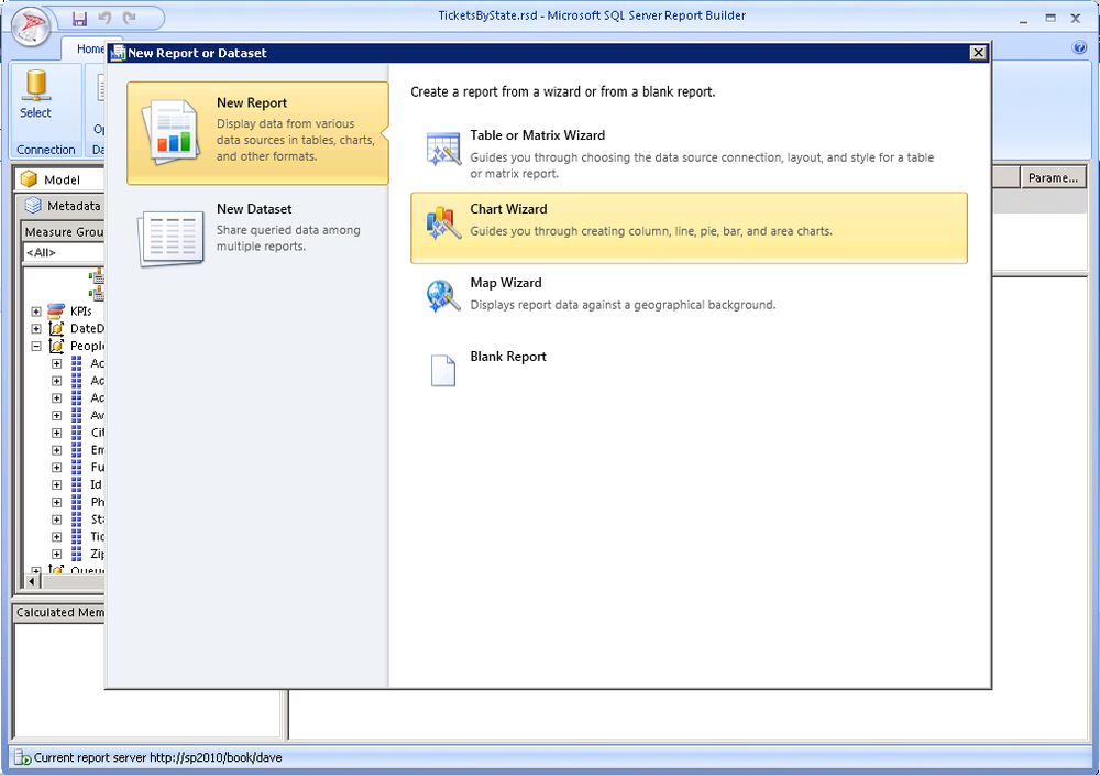
After saving our dataset, let’s continue by creating a report. Our first report will be a chart showing the number of tickets by product line. Again, we’ll use the orb to launch the New Report or Dataset dialog box. Instead of choosing Dataset, this time we’ll choose Chart Wizard, as shown in Figure 25-15.
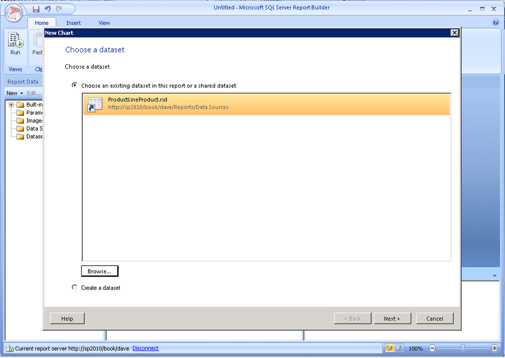
In the New Chart wizard, choose an existing dataset and select the dataset you recently created. Choose an existing dataset and browse for the ProductLineProduct dataset you saved to SharePoint, as shown in Figure 25-16. Think back to your architecture; you have now connected the report to the dataset to the data source.
Adding a Chart
After you click Next, the next step is to choose a chart type. We suggest you choose a column chart for this example, as shown in Figure 25-17.
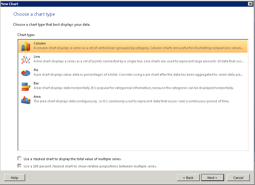
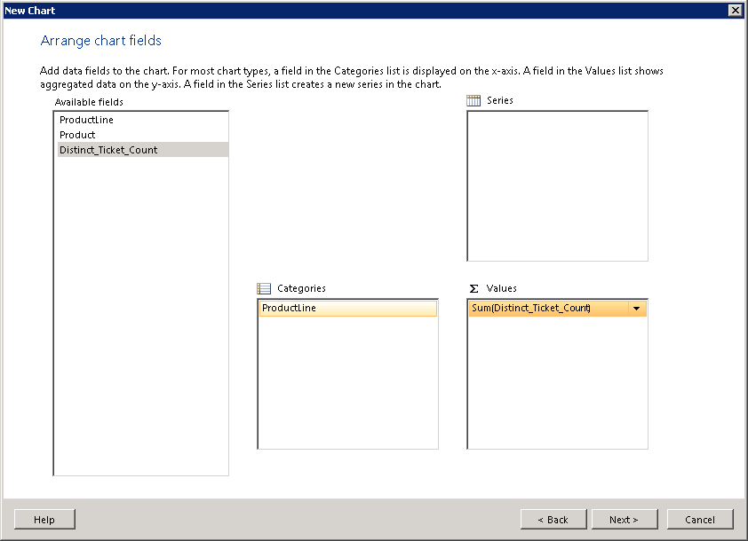
Figure 25-18 continues the New Chart wizard allowing you to position the fields returned from your dataset into the values and categories and series areas supported by this chart type. Had you chosen a different chart type or even a map, you would be mapping your dataset to different areas on the visualization, but the concept is exactly the same.
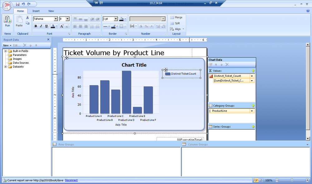
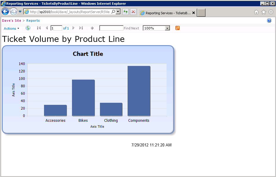
In this case, let’s use the ProductLine as a category and the Sum(Distinct Ticket Count) as our value. This will produce a chart showing the number of tickets by product line.
Finally, let’s apply a style to your chart. You can customize any aspect of your chart formatting, but predefined styles let you quickly and easily produce professional, consistent results for your charts as shown in Figure 25-19.
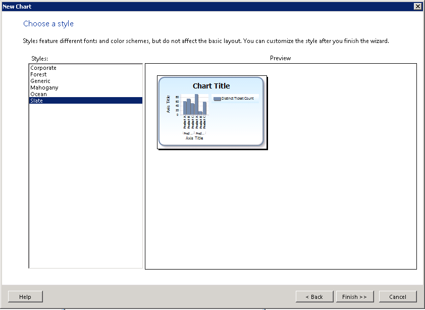
Figure 25-20 shows the preview of your chart. You can resize as needed, add a label to the header, and otherwise tweak the formatting easily in a visual way.
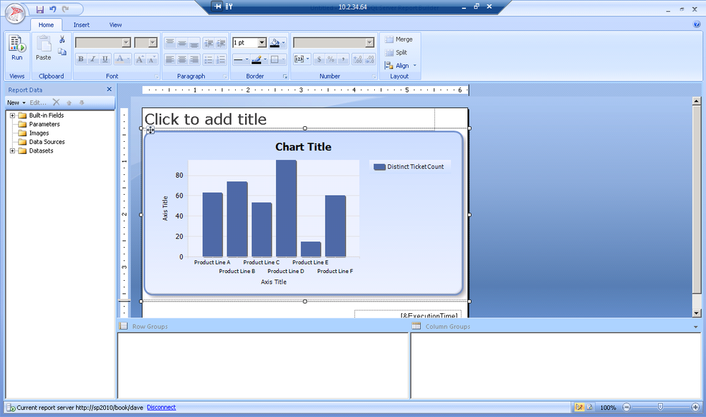
Modifying the report is easy. Take this example: remove the legend to make more room for the chart. Simply select the legend and click delete, as shown in Figure 25-21.
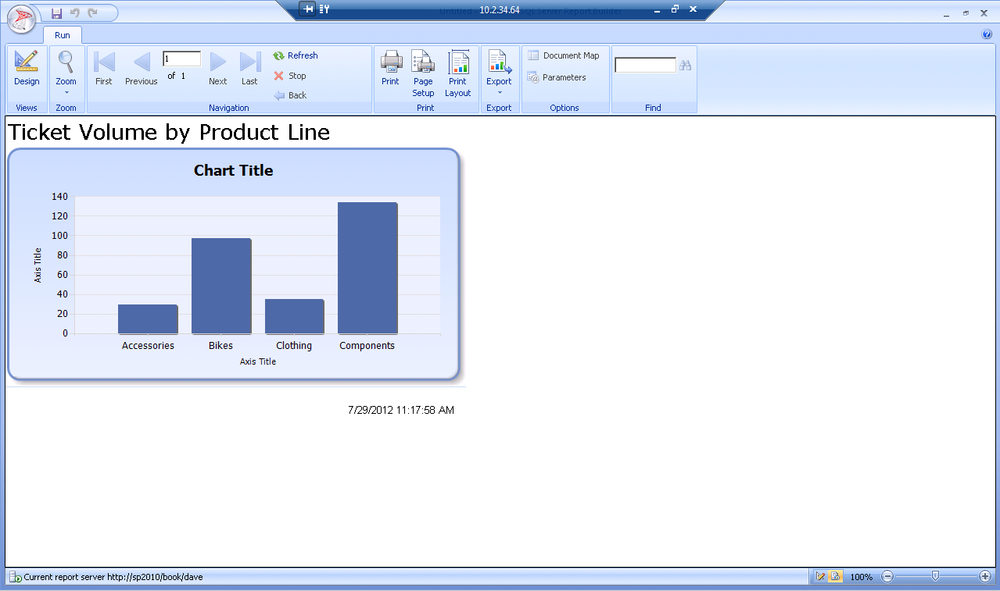
By selecting Run on the ribbon, we can preview the chart as shown in Figure 25-22.
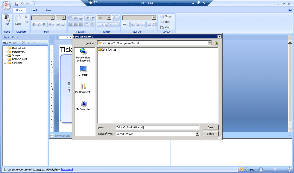
Once you have achieved a report that reflects your data, save it back to SharePoint. Just hit the save icon on the top of the toolbar, browse to the reports folder in SharePoint, give it a name, and click Save as shown in Figure 25-23.
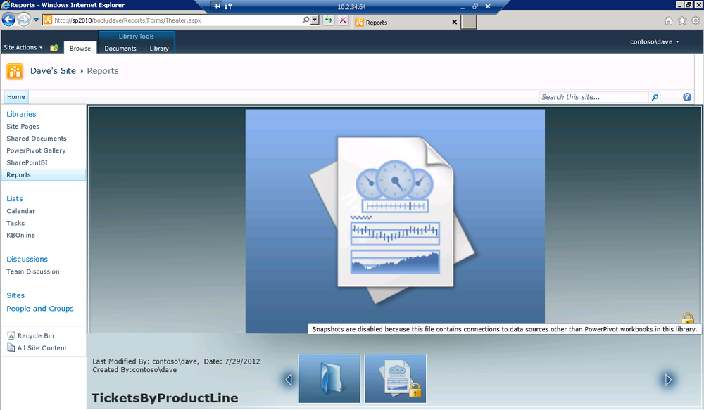
After you’ve saved your report, you’ll see it appear in the library. If you are using a PowerPivot data source in this library, you’ll see a preview of the report; otherwise a report icon will be rendered, as shown in Figure 25-24.
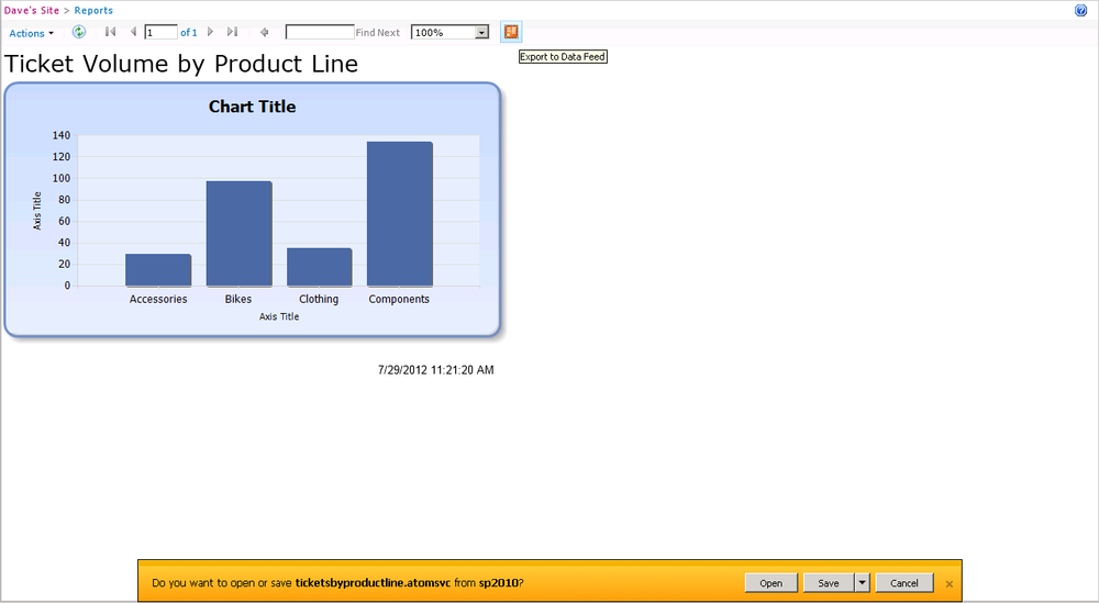
To render the report from your SharePoint site, simply click the report to run it as shown in Figure 25-25. You will see a rendering of your report without SharePoint Chrome despite being rendered by the SharePoint integrated version of Reporting Services. You could easily grab the URL of this page and place it in a Page Viewer web page if you wanted to embed this in a dashboard or on your team’s home page. You can also use the Actions menu in the upper left to export this to a variety of supported formats including PDF, Excel, Word, and others. Also, from the Actions menu, you can schedule delivery via email or to a SharePoint document library. We’ll talk more about those advanced features in Chapter 27.
Consuming an OData Feed from Reporting Services
One of our favorite capabilities in SQL Server Reporting Services is the ability to export an OData feed of the data in the report. When this was released in the 2008 version of SQL Server, it was much less interesting because OData wasn’t mature and there really wasn’t much one could do with it. We are living in an incredibly exciting time for producers and consumers of OData.
This OData feed can be used as a table in your Visual Studio 2012 LightSwitch applications. You can consume OData in PowerPivot 2010, directly in Excel 2013 for incorporation into our BI Semantic Model, or just use as a table.
So why do you want to use SSRS as an OData consumer? Well for one, it’s quick and easy. You can connect to slower or more difficult to connect to data sources from the cloud, Oracle, SAP, or Teradata, Sybase, Informix, DB2, Access, Excel, or a CSV file using PowerPivot or a tabular cube. Then, schedule your cube to refresh on a schedule and expose really fast simple feeds from your cached data. We are really talking about the ability to connect to the major data sources in your enterprise with PowerPivot and cache them, enhance them with DAX as we discussed in Part III of this book, and then present them as Open Data Protocol feeds for consumption in LightSwitch or for self-service BI scenarios.
This is not only really powerful stuff, but it’s also quick and easy to do from your Reporting Services report. In the upper right corner, click the orange OData icon to export to a data feed. When prompted as in Figure 25-26, save the atomsvc file to some place that is easy to find, such as your desktop. This file doesn’t store the data, it’s just a pointer to the OData service that you can open later to refresh your data.
When you double-click that atomsvc file, PowerPivot for Excel 2010 or Excel 2013 will open depending on what you have installed on your workstation. If you have multiple charts, tables, or matrixes in your report, you’ll get a wizard that walks you through the import process.
It’s important to remember that you are not creating a static copy of your data during this process. Let’s talk about what is happening:
You are creating a tabular cube when you open the OData feed in Excel.
The OData feed is being added as a data source to the cube.
When the cube is refreshed, Analysis Services will call back to the OData services (in this case, Reporting Services).
Reporting Services will in turn process its dataset by calling the data sources for the report.
The really nice thing about the layered architecture is that from a performance perspective, you are insulated from your data sources. Your end users will only experience the time it takes to read the data from the cube that is acting as a caching layer.
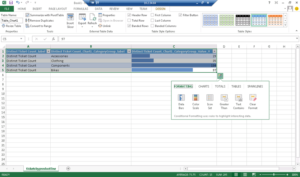
In Figure 25-27, you see the result of consuming the OData feed from your chart in Excel 2013. You can also see that Excel 2013 suggests data bars to format your ticket count after you pull in the data. You’ll find many new shortcuts in Excel 2013 to help you format your data faster.
Note
What about LightSwitch? You may be wondering how to consume your atomsvc file as a table in Visual Studio LightSwitch 2012. When you add a new OData feed to LightSwitch, it asks for just a URL. The easiest way to the get the URL for your OData feed is actually just to open Fiddler before pulling the atomsvc file into Excel. You’ll see Excel making a request back to the report server as it pulls in the OData feed and you can just copy that URL as your feed URL that you’ll need for LightSwitch.
The implications of this are pretty huge. Today, you can use any data source to power reference data tables inside LightSwitch and join that to our application data. No other application programming technology gives you this flexibility nor the amazingly fast time to market.
Summary
In this chapter, we’ve walked through the architecture of Reporting Services and the basic skills you need to create a Reporting Services solution. We’ve talking about the incredible power of OData and how we can use Reporting Services as an OData server. For more information about OData.
In the next chapter, we’ll continue with more advanced user interfaces that you can create using Reporting Services, including the ability to create drill-down reports.