
Chapter 28. Excel Services and Power View
What Is Excel Services?
Excel Services is a set of technologies introduced in SharePoint 2007 that allows users to upload and share the contents of an Excel 2007 or greater workbook with other members of the team site. Excel Services is different from the Excel Web App, which is focused on editing files as part of the Office Web Apps. Excel Services is a native component of SharePoint 2010 Enterprise Edition. It renders an interactive HTML version of the Excel desktop experience and is built upon a server-hosted version of the Excel calculation engine. Advantages include enabling users to interact with Excel workbooks directly in their web browser without having to download the solution or launch Excel. This increases the reach of our Excel-based solutions to anyone with a web browser.
What Is Power View?
Power View is a new feature of the SQL Server 2012 Reporting Services add-in for Microsoft SharePoint Server 2010 Enterprise Edition. What is it? Power View is all about interactive data exploration, visualization, and presentation. Design goals for the product are to create a fun environment where you are never more than two or three clicks from the display you’re looking for. This is the first release of the product and it’s a really great first release. We’ll walk through using Power View to create views against PowerPivot and tabular cubes. Then we’ll save a PowerPoint that has the ability to slice your data live within PowerPoint. As we mentioned before, this is the first release of Power View so you’ll see lots of new investment and growth in the SharePoint 2013/Office 2013 life cycle.
Power View provides intuitive ad hoc reporting for analysts, decision makers, and information workers. They can easily create and interact with views of data from data models based on PowerPivot workbooks published in a PowerPivot Gallery, or tabular models deployed to SQL Server 2012 Analysis Services (SSAS) instances. In this first release, Power View is a browser-based Silverlight application launched from SharePoint that allows you share data and insights.
Why Are We Talking About Excel Services and Power View Together?
Excel Services and Power View are already closely linked in the SharePoint 2010/SQL Server 2012 release. When you publish an Excel sheet that contains a PowerPivot model to a PowerPivot 2012–enabled SharePoint server, your Excel solution lights up with the ability to create Power View reports against the data contained in the PowerPivot model using a Silverlight add-in to SharePoint. With the SharePoint 2013 and Excel 2013 release, the integration gets even stronger as Excel gains the ability to create Power View charts on a worksheet right inside your Excel workbook. When you publish the workbook to a SharePoint 2013 server, the Power View content is rendered in the same way as other content in Excel, right out of a document library.
We’ll get started by publishing your Excel solution created in Chapter 20 to SharePoint 2010 with PowerPivot 2012. This will enable end users to launch Power View from any PowerPivot model saved in a SharePoint PowerPivot Gallery. Then we’ll add a connection to your tabular cube and use that to model some reporting for our help desk application. Everything we’re going to do in Power View works exactly the same against a PowerPivot model or against a tabular cube. The only real differences are those discussed in the beginning of Chapter 19: security model, scalability, and manageability.
Publishing a PowerPivot Model to Excel Services
This first walkthrough is based on the PowerPivot model that you created in Chapter 21, Building the PowerPivot 2012 Model. The Excel workbook that you created contains a PowerPivot cube with an in-memory representation of the data from your help desk manager application. When the PowerPivot model is refreshed from the PowerPivot add-in in Excel, the cached data is updated. By publishing your workbook to SharePoint, not only do you have a single copy of this workbook shared with the team, but you also gain the ability to automate the refresh of your data on a daily or weekly basis.
Because the dashboard you created is based on a tabular cube instead of PowerPivot, let’s hold off on publishing that until the next section. To publish the PowerPivot to SharePoint:
Open our Excel workbook.
Activate the Office Backstage.
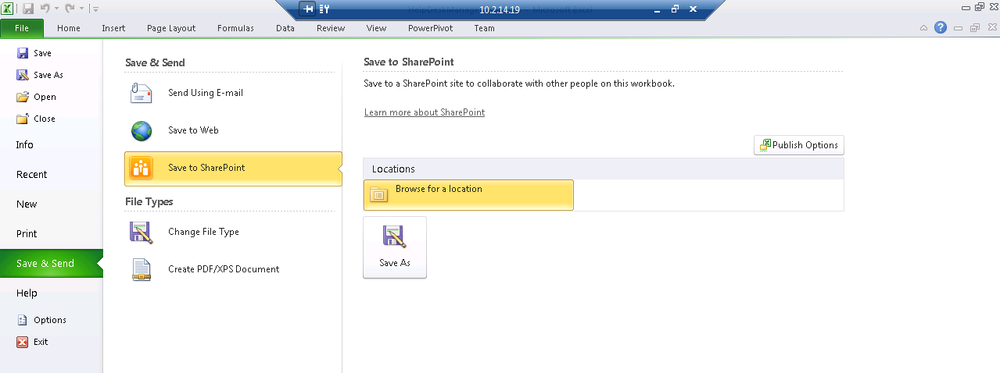
Select Save & send.
Save to SharePoint (see Figure 28-1).
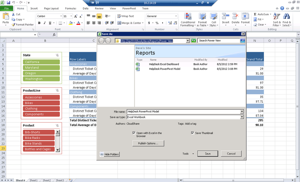
Browse for a location.
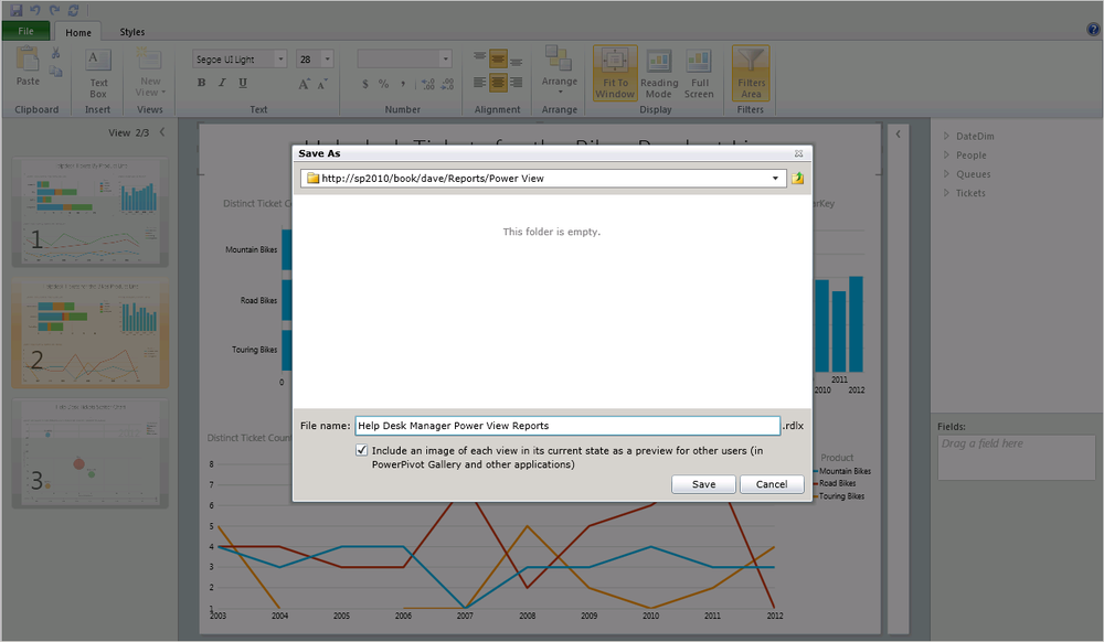
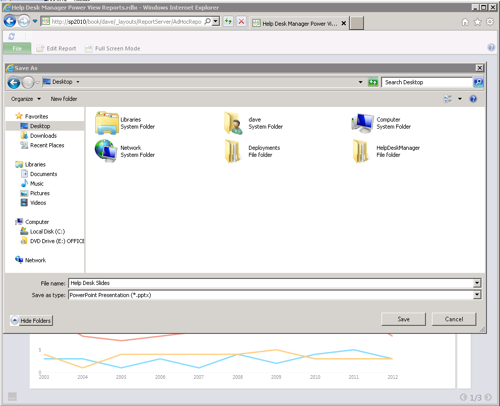
Enter the path to your PowerPivot library on the browse path of the Save As dialog box and click Enter to browse that SharePoint site (Figure 28-2).
Check the Save Thumbnail box to create a preview of our workbook.
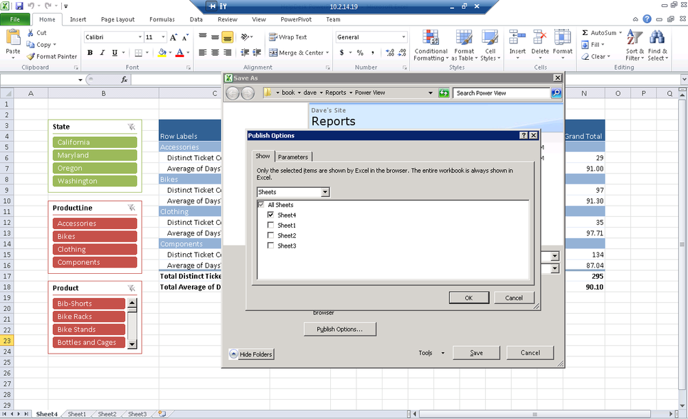
Open the Publish Options dialog (see Figure 28-3).
Select only the sheets you’d like displayed via Excel Web Access.
Excel will upload your model and file to SharePoint 2010 with PowerPivot 2012. Behind the scenes, an Analysis Services database will be provisioned on a SharePoint App Server that is running Analysis Services in PowerPivot mode (see Figure 28-4). A browser will open with our workbook rendered as HTML.
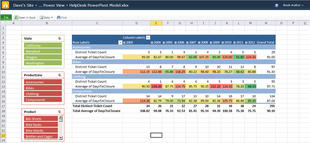
Assuming that your server is correctly configured, your workbook will remain interactive when rendered to the Web. Go ahead and filter by a slicer or via a column filter. If it doesn’t work, then read the PowerPivot configuration chapter in Part V to learn about troubleshooting issues with your installation.
The same technique can be used to publish the dashboard you created
using your tabular cube. Simply open the Excel sheet and save the file to
your SharePoint library. Once again, you’ll see a working dashboard with
some great slicers. Again if you have trouble, check out Part V to learn about using the
effectiveusername to allow credentials
to pass between SharePoint and Analysis Services without having to
configure Kerberos.
If you notice a number of callouts to the configuration section, it’s not a coincidence. This is a really powerful software stack, but there are a lot of moving pieces, which led us to devote pages to making sure you can build a working environment. This is the one area you may struggle with most, so make good use of that section if you get stuck.
Using Excel Services 2013 as an OData Feed
Excel Services in SharePoint Server 2010 introduced a REST API for use in getting and setting information in Excel workbooks stored in SharePoint document libraries. The 2010 REST API is useful for basic remote interaction with objects in the Excel workbook and is often used to extract an image of a chart for display on a web page.
SharePoint Server 2013 Excel Services adds an interaction that uses the Open Data Protocol (OData), which you can use to get data from Excel sheets that are stored in SharePoint 2013. As we’ve mentioned, OData is an open web protocol for querying and updating data by using a URL with query parameters to get or update information. Excel Services uses OData to get information about tables in a workbook that is stored in a SharePoint library.
The context of the OData feed can be used as a table in LightSwitch or can be incorporated into a BI sematic model.
Use the following syntax to access Excel services via OData in SharePoint 2013 on premise or in the cloud.
https://myserver.sharepoint.com/_vti_bin/ExcelRest.aspx
      /SiteName/DocLibrary/MyFile.xlsx/OData
Using Power View on a PowerPivot Model
In the last part of this book, you started by publishing your PowerPivot model to a PowerPivot Gallery on SharePoint 2010. You published the model shown in Figure 28-4 first rather than the dashboard shown in Figure 28-5. The first workbook you published contained a model that was created in Excel. When you published the Excel file to SharePoint, a cube was created in the PowerPivot instance of Analysis Services that you can use to do Power View reporting. The second workbook with the fancy dashboard was created against a tabular cube so there is no data contained in the workbook itself. We will walk through connecting to a tabular cube later in the chapter after working with PowerPivot data.
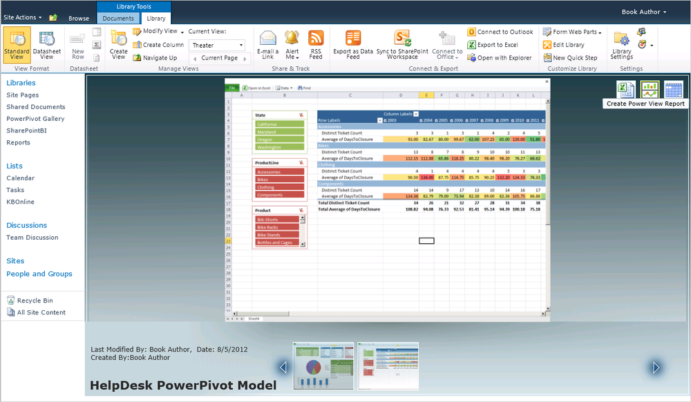
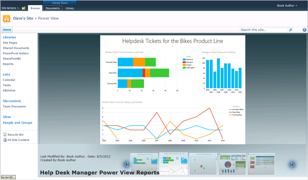
Let’s begin in our PowerPivot Gallery with the Theater list view that you selected in Chapter 25 when you configured this library. The Theater view provides a thumbnail of each of the reports saved in this folder along the bottom of the screen. The center portion of this Silverlight user interface showcases a large preview of the report with three icons in the upper right, as shown in Figure 28-6.
The first icon launches Excel, creating a PivotTable connected to our PowerPivot model hosted on the server. The great thing about doing this is that the server does the lifting, meaning that clients need not even have the PowerPivot add-in installed. This is just an Analysis Services connection to Excel.
The second icon launches Power View and creates a new report, and the third icon controls the schedule to refresh the data inside PowerPivot. PowerPivot data refresh is akin to processing the cube; new data is fetched from the data sources and processed according to the rules that are defined in the model. Simply click the second icon to create a new Power View report.
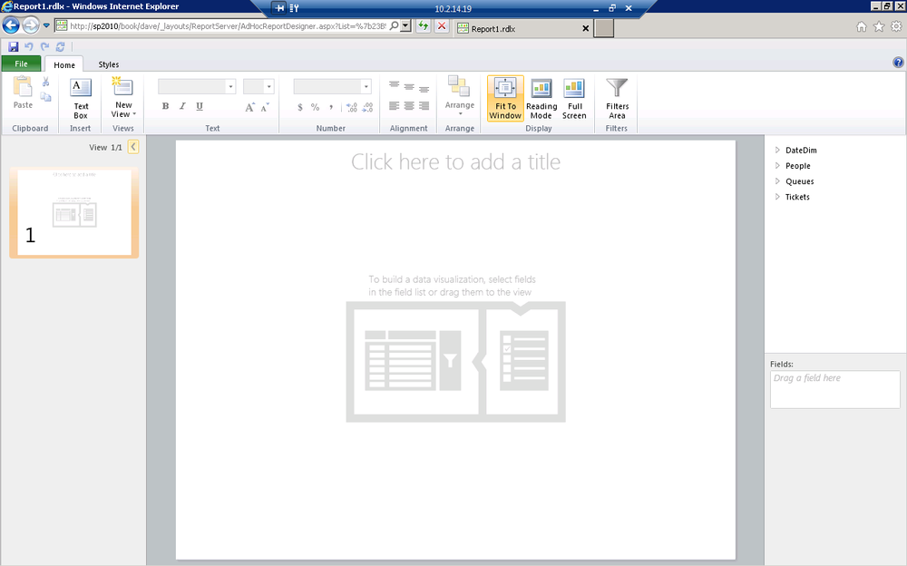
Power View is a Silverlight application that runs in SharePoint and reads from your cube to the web services hosted on SharePoint. The ad hoc report designer shown in Figure 28-7 enables users to create new interactive visualizations easily. Let’s explore the user interface to get oriented.
Despite running as a Silverlight control, Power View sports many of the user interface features you’ve come to expect from an Office application. These include:
A context-sensitive ribbon that adjusts based on the selected content
A limited version of the Backstage focused on saving and exporting to PowerPoint
An ability to scroll through and select a view similar to browsing through slides in PowerPoint on the left
A large drag-and-drop design surface in the center of the page
A field well similar to Excel PivotTables on the right
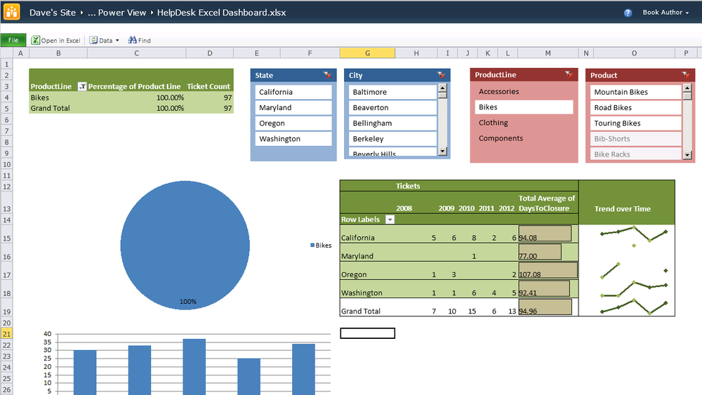
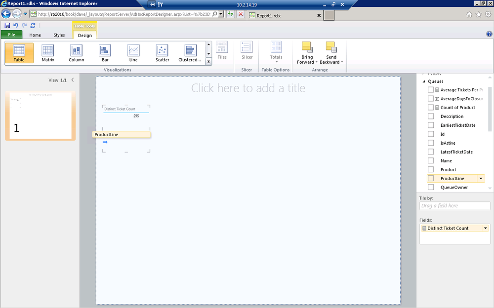
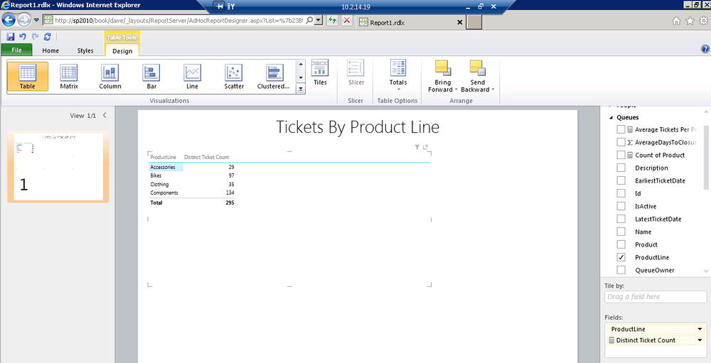
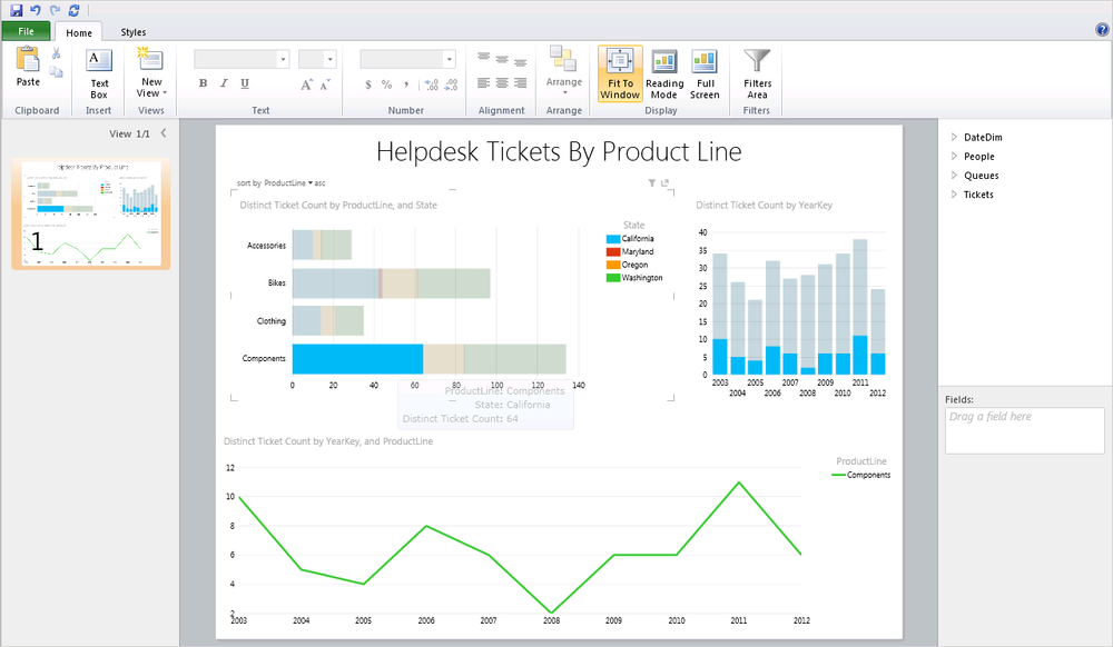
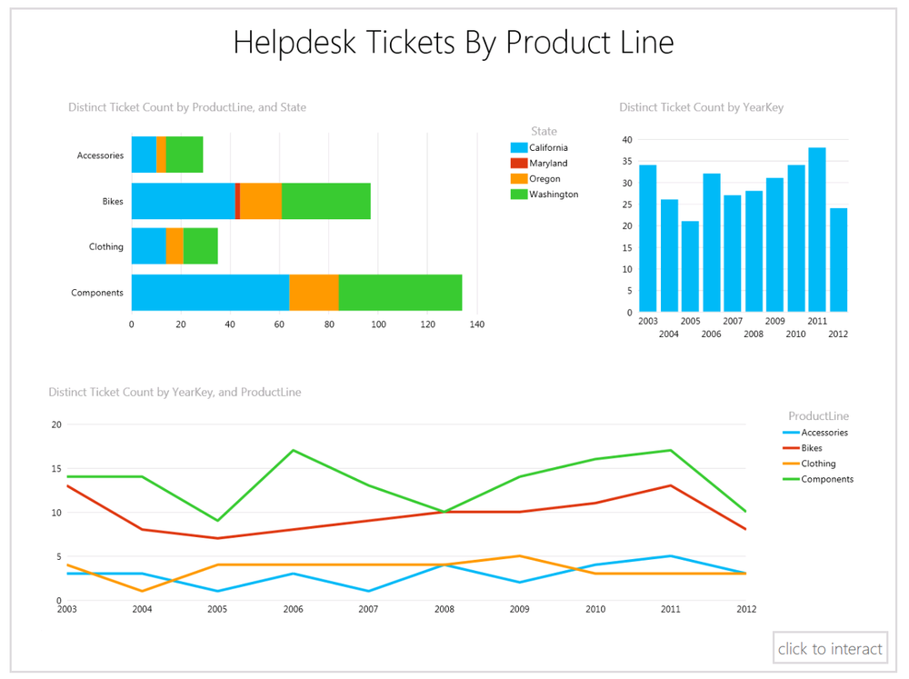
Already, you can see that the design of Power View is meant to be familiar with strong ties to the rest of the Office 2010 suite. To build visualizations, just drag items from the field well to the center of the page. It’s that easy! Power View uses the relationships built into your BI Semantic Model so it knows how the data from different tables relates together. Figure 28-8 shows the distinct count of tickets from the tickets table and adding ProductLine from the Queues table.
In Figure 28-9, you see the result of dragging on ProductLine. Notice that we can reorder the fields by dragging them on the design surface or by reordering them within the field well.
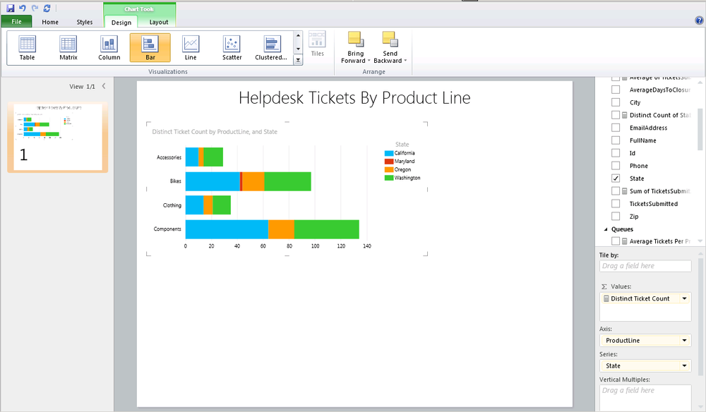
With the table of data still selected, choose the bar chart from the visualizations on the Design ribbon. In the table above, both Product Line and Ticket Count were displayed as fields. When we change to a chart, ticket count is moved automatically to the values area and product line is shown on the axis. Drag the State field from the People dimension into the series area, as shown in Figure 28-10. Within a couple of clicks, you are already learning new information about your data.
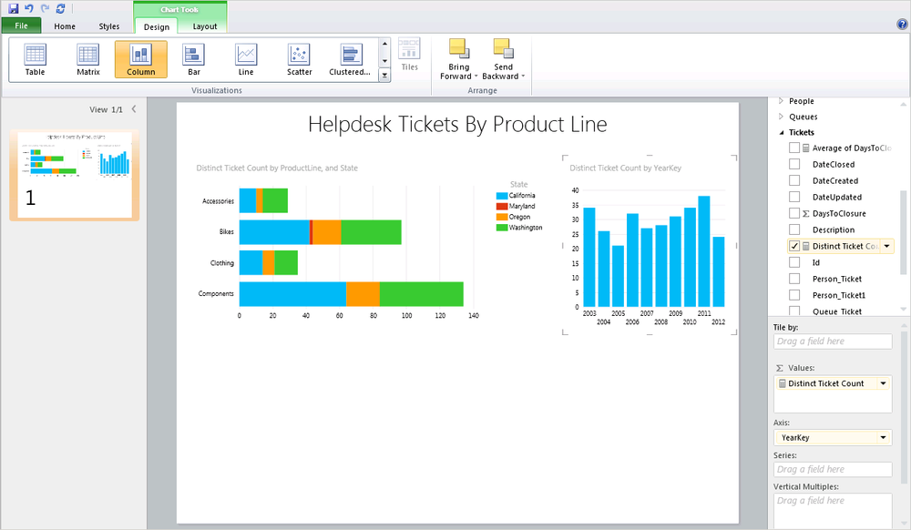
One thing that is great about Power View is how simple and fun it is to use. In Figure 25-11, we dragged the year of the date dimension onto another area of the design surface and then dragged in the Distinct Ticket Count measure. Once again, grab a visualization such as column chart—and presto, instant visualization!
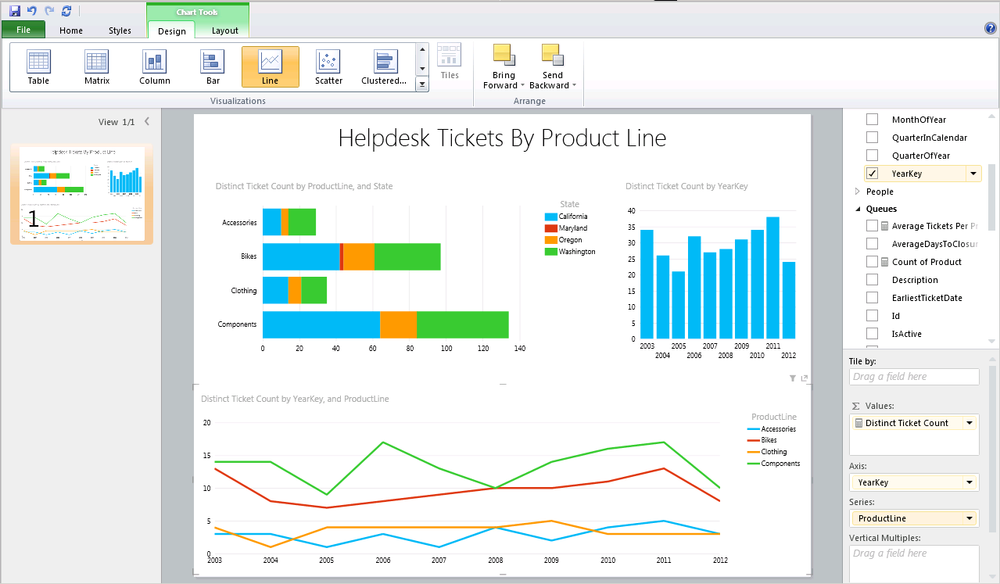
To complete our view, add one more chart to illustrate ticket volume for our product lines over time. We have a couple of great choices with either a matrix for a textual representation or a line chart for an image. You can see the results of choosing a line chart in Figure 28-12. Again, just drag and drop the fields, and choose a visualization.
So what else can you do with this fun and simple toy? One of our favorite capabilities is the way you can slice your data three-dimensionally. We drilled into tickets for components sold in the state of California. You can see the tooltip that fades up over each element of every chart, providing the details on the chart member you’re viewing (see Figure 28-13).
What’s great is that we can see ticket volume over time for components in California in the other charts on this view. When you drill into any chart on a given view, the others all accept that parameter as a filter as well. It’s fun, simple, and tells you a tremendous amount about your data.
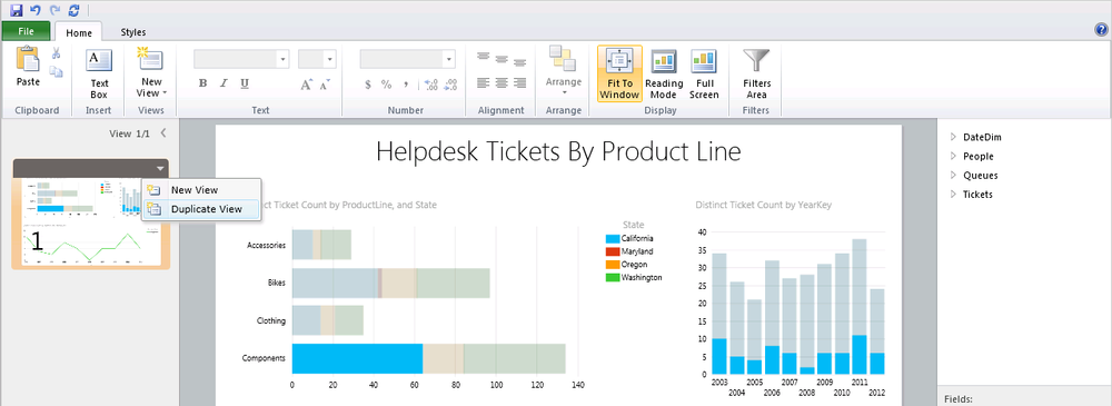
When you hover over the view on the left, an arrow appears to the right of the thumbnail. On that menu, you can create a new view or duplicate the view you’re currently in. Let’s duplicate this view and then continue to refine (see Figure 28-14).
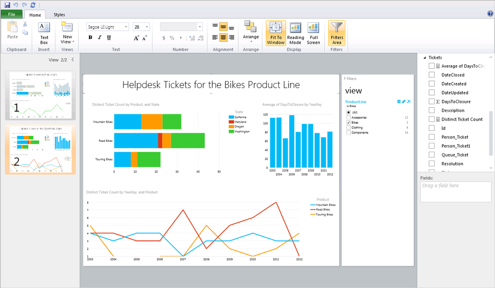
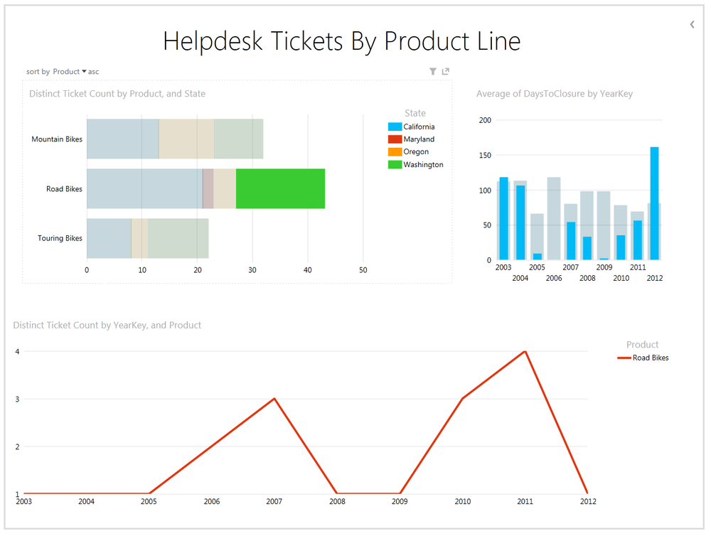
After duplicating the view, make some customizations to create a dashboard tailored for the Bikes product line. The finished result is shown in Figure 28-17.
Show the filters area by toggling it on the ribbon.
Drag ProductLine onto the view filter to the right of the design surface.
Highlight the bar chart and replace ProductLine with Product to give more detail about which products are driving ticket volumes.
Select your column chart and replace the Sum of Distinct Tickets per Year with the Average Days to Closure measure to show how long it took each year to close out help desk tickets.
Replace ProductLine with Product on the line chart to show ticket volume over time for each product in the Bikes product line.
Note
Filters can be applied to an entire view or just to an individual table, matrix, or chart.
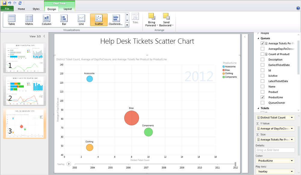
The scatter chart shown in Figure 28-16 is perhaps the most unusual, misunderstood, and powerful chart in this release of Power View. What makes it tricky is how much information you can convey in a single chart. Here’s the breakdown:
The distinct sum of the ticket count is on the vertical Y axis.
The average days to closure is on the horizontal X axis.
The size of each point on the scatter chart is based on the average number of tickets each product in the product line received.
The color grouping is based on the product line.
The play axis animation is based on the year.
In short, you can see year-over-year animation showing ticket volume versus average days to closure. Looking at your data in this many ways can provide new insights you wouldn’t have seen. In this case we see the Components product line receives many tickets, but the number of tickets per product is much lower than the Bikes product line.
Saving Your Power View
Once you’ve created your Power View report, saving back to SharePoint is easy. Just click the Save button, select a location in your PowerPivot library, and click Save again, as shown in Figure 28-17.
Back in the Theater view of your SharePoint PowerPivot library, each of the views in the Power View report appear as distinct thumbnails at the bottom of the display as shown in Figure 28-18.
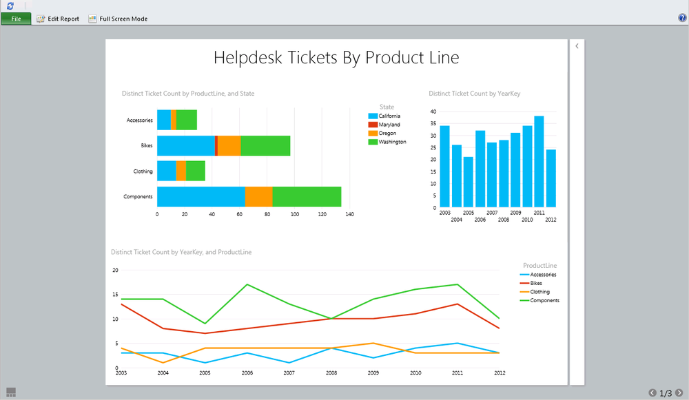
When you click on the main image in the Theater view, Power View opens the selected view in a read-only viewer, as shown in Figure 28-19. When viewing the Power View, you can choose to edit or view in full screen from the toolbar. These various modes are all set via URL parameters, so it’s easy to pass them into Power View if you want to link to a report or include it within a PageView Web Part or iframe. Power View is fun, easy to create, and always ready to present in Full Screen Mode.
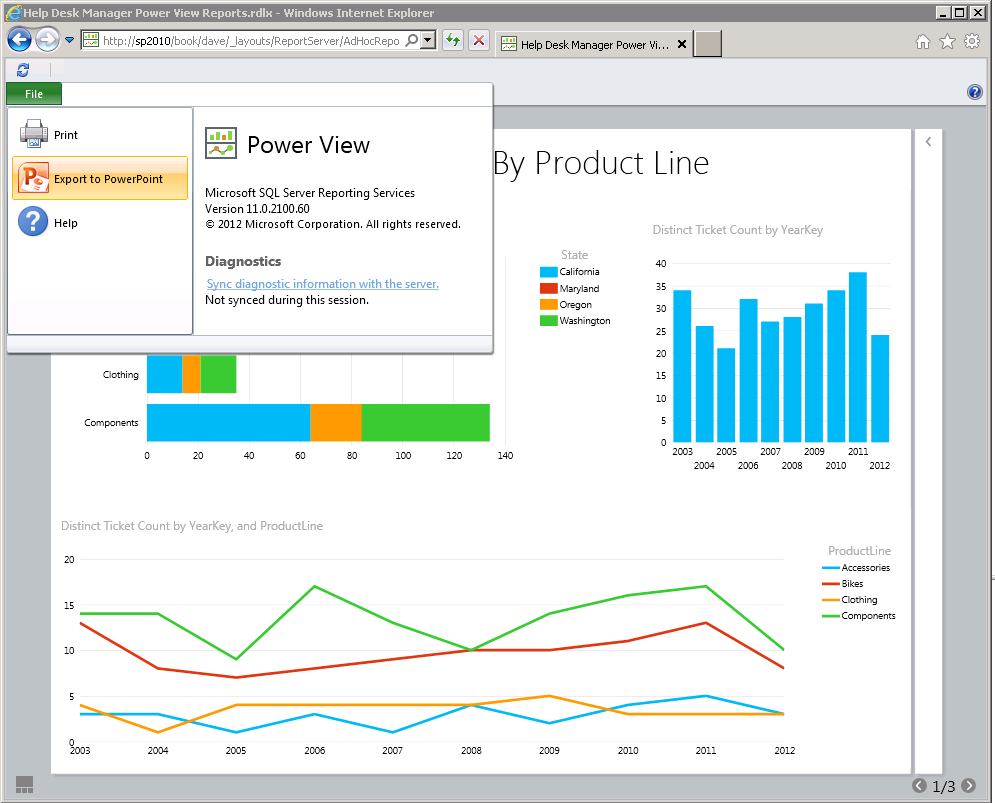
Exporting to PowerPoint
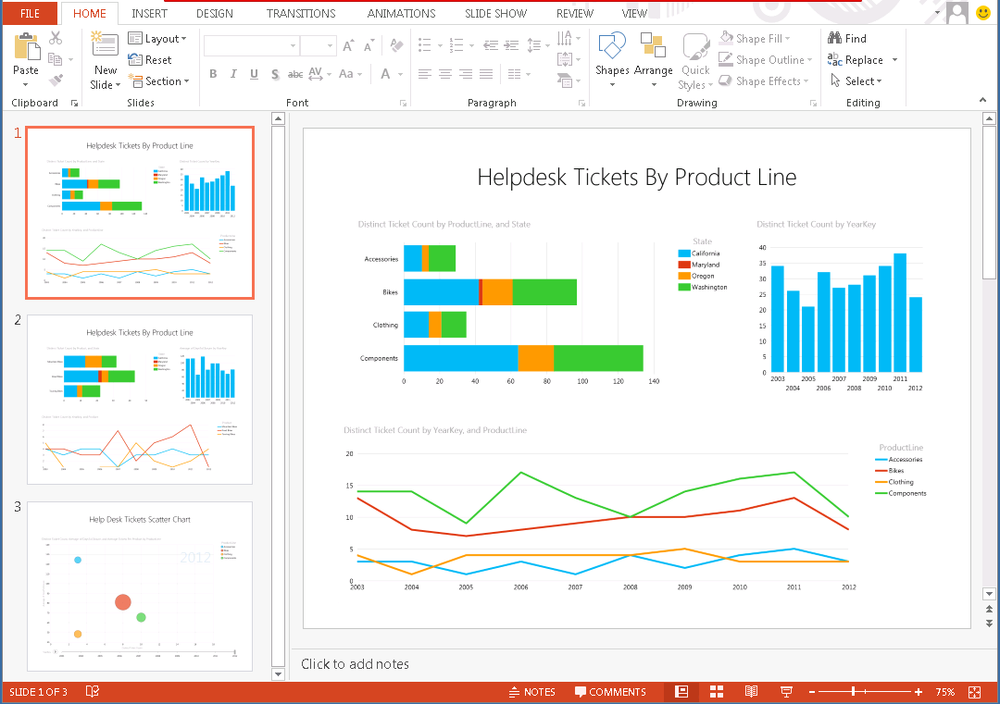
Select File → Export to PowerPoint. Power View will cycle through each slide and generate a preview image that will be placed into the PowerPoint deck as shown in Figure 28-20
Power View prompts you to save.
Choose a location to save the PowerPoint as shown in Figure 28-21.
When you open the PowerPoint file, you’ll see an image on each slide, as shown in Figure 28-22. These images are based on the default parameters for each view inside the Power View report. Each of these preview images can be copied and pasted. You can even create a new presentation based on a corporate template and drop individual views into it without losing your interactivity.
When entering presentation mode, you’ll notice the spinning circle as Silverlight loads. Interactivity only occurs if Silverlight 5 is installed on the client machine as shown in Figure 28-23. Click to interact will be overlaid on the lower right corner of each slide.
After choosing click to interact, you will notice a brief delay as Silverlight calls back to the Analysis Services endpoint to refresh the data. At this point, all of your charts and slices become fully interactive as shown in Figure 28-24.
You can safely use this PowerPoint file as a client and know that you will always be looking at the current data served from the cube.
Connecting to Tabular Cubes
Often you may want to connect to a tabular cube instead of a PowerPivot cube. Tabular cubes offer improved scalability and the ability to refresh data on any schedule. We can easily connect to a tabular cube using the BI Semantic Model Connection that we added as a content type in Chapter 24.
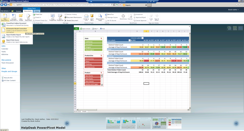
From the Documents ribbon in our SharePoint library, choose Create a new BI Semantic Model Connection from the New Document drop-down, as shown in Figure 28-25.
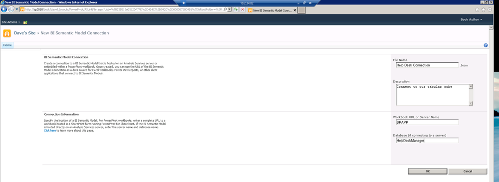
Next provide a name, description, server name, and database name, as shown in Figure 28-26.
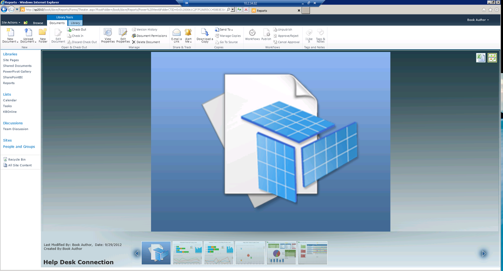
In Figure 28-27, you can see the BISM Connection file shown in SharePoint. From the BISM Connection file, you can easily launch Excel or Power View against your new data connection by clicking the buttons in the upper right.
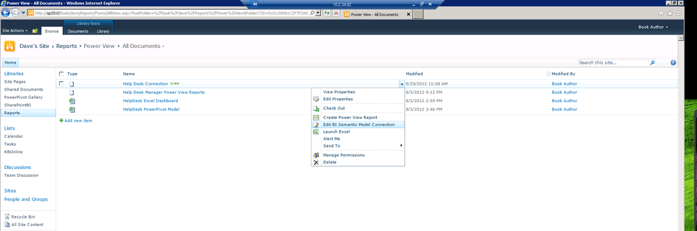
If you ever need to edit the server name or the cube name, you can edit the BI Semantic Model Connection from the context menu in the All Items view as shown in Figure 28-28.
Summary
In this chapter, we built upon the work we did earlier to create a PowerPivot solution by sharing it in SharePoint via Excel Services. We leveraged the data in our solution to build a new interactive Power View, giving us access to new insights about our data. We took our completed Power View slides and exported them to PowerPoint where we can present them and interact with our data live in the boardroom. Finally, we connected to Analysis Services tabular cubes using the BI Semantic Model Connection file. The BI Semantic Model Connection file provides the same capabilities we had with PowerPivot, and allows us to leverage a highly scalable Analysis Services server. In the next chapter, we’ll talk about what’s new in the 2013 version of Excel and SharePoint. Many organizations will take some time to get to SharePoint 2013 and everything we’ve done this far works with Excel and SharePoint 2010. Next, we’ll look into the great changes in the next version.