
10. Color Management Workflow: Where the Rubber Meets the Road
We’ve been straining the analogy of profile as map throughout this book, so let’s give it one more good hefty yank. A few of us appreciate profiles, or maps, as works in their own right, but for most of us, they’re simply tools, and maps aren’t all that useful if we never go anywhere.
At this point, you probably know slightly more than normal people need to know about profiles. In this chapter, we look at where the rubber meets the road—how you use profiles with your various devices and applications to drive your color where you want it to go.
We give you the holistic overview of how your color management components interact, and describe the major principles that govern how you configure your applications to let color management make your color flow smoothly and predictably—from capture, through editing, to document assembly, to proofing, and to final output (or outputs).
You may be tempted to just skip ahead and delve into the chapters that describe your applications. Instead, we beg you to take the time to digest the material we present here, because while the application-specific material will tell you which buttons to push, vendors have a tendency to move and rename those buttons each time they revise the applications. If you understand the bigger picture we paint here, you’ll know what kinds of buttons to look for, and you’ll understand how, why, and when to press them to make your applications handle color the way you want them to.
What Is Color Management Workflow?
“Workflow” is one of those slippery words like “quality,” “art,” or “postmodernism,” where every expert claims to know what he’s talking about, but no two can agree on its definition. We won’t try to provide a comprehensive definition of workflow. Instead, we’ll just tell you what we mean when we talk about color management workflow.
In a nutshell, color management workflow is the art and science of defining what colors the numbers in your documents represent, then preserving or controlling those colors as the work flows from capture, through editing, to output. In this chapter we’ll look at how color management workflow applies to three different areas:
• The flow of documents or objects within a program. For each application, how do we configure it for color management, and what procedures should we use to open and save documents, import objects into the program, and copy and paste colors between windows in the program?
• The flow of documents between programs. As we move color documents from program to program, or even from person to person, how do we keep colors looking right, and when and how do we convert to different forms for output?
• The flow of materials into or out of a color-managed environment. How do we bring in documents and objects from non-color-managed devices or applications, and integrate them with our color management documents? How can we get maximum benefit out of our color management efforts before sending our jobs off to environments where other non-color-managed steps may happen?
We color-manage two types of things: documents, and objects in documents. One program’s document may be another’s object. For example, a document in Photoshop consists of a raster image, but in Illustrator, QuarkXPress, or InDesign, this very same raster image may be just one object among many in an assembled document. And each one of these objects may have a different profile assigned to it (see Figure 10-1).
Figure 10-1 Documents and objects
Ultimately, all these elements will wind up being converted to the same output space. There are really only two variables that differentiate the very large number of possible color management workflows:
• When the conversions occur
• How the color meaning is conveyed
As we told you way back in Chapter 3, these are the only two things that color management systems do. Applications may dress color management up in fancier clothing, but all color management features ultimately break down into some combination of these two basics.
But timing conversions and conveying color meaning raise different types of issues. When to convert is a strategic decision that is in considerable part dictated by the type of work you do, while the way color meaning is conveyed is largely a tactical decision that’s dictated by the capabilities of your applications. So we’ll look at the bigger, strategic question first. But before doing so, we need to address one other issue.
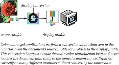
Display Conversions
It may not be immediately obvious, but almost every time you display an image in a color-managed application, there’s a conversion going on from the document’s space to your monitor’s space—the only exception is if the document is already in monitor RGB. If this conversion didn’t happen, all your color would be displayed inaccurately.
From a workflow standpoint, however, the display conversion is out of the loop. Color-managed applications apply the display conversion on the fly to the data that gets sent to the video card—it never touches the documents themselves.
The beauty of this approach is that it allows color management to account for the quirks of each individual’s display, transparently and automatically, without affecting any of the actual data being pushed through the workflow (see Figure 10-2).
Figure 10-2 Monitor compensation
When to Convert
Back in the 1990s, workflow was a hot topic that allowed consultants to earn large sums of money, mostly by telling their clients what they already knew and wanted to hear. But one useful distinction that dates from those halcyon days is the distinction between a late-binding and an early-binding workflow:
• Early-binding workflow converts all the color into final output space as soon as possible—traditional prepress workflows that took output CMYK right from the scanner are a classic example.
• Late-binding workflow delays the conversion to final output as long as possible. In-RIP separations in the platesetter’s or imagesetter’s RIP represent an extreme late-binding workflow.
However, late binding versus early binding isn’t a binary, either/or choice. Rather, late binding and early binding define two ends of a continuum. Most color management workflows fall somewhere between the two extreme examples cited above.
Early Binding Advantages
The biggest advantage of early-binding workflows is simplicity. Early in the workflow, everything gets converted to a single output space. As long as they stay in this closed-loop environment, there’s no ambiguity about the color meaning of the device values in each document and object.
A second advantage is that it’s easy to introduce color management gradually into existing early-binding prepress workflows. The only changes that color management brings are that operators see accurate color on their monitors instead of being forced to rely strictly on the numbers, and it becomes possible to pull intermediate comps and preproofs from inexpensive inkjet printers. The basic workflow doesn’t change at all.
A third early-binding advantage is that it prevents designers from using non-reproducible colors in their designs. If everyone works in final output space, it’s impossible by definition to create out-of-gamut colors.
Early Binding Disadvantages
The huge disadvantage of early-binding workflows is their inflexibility. Everything in the workflow is targeted to a single output process—all the color is squeezed into the output gamut and optimized for the output’s tonal response. So early binding is practical in situations where the output process is always the same—a daily newspaper or monthly magazine, for example—but it’s pretty useless for a freelance designer who may have to work on jobs where the output process isn’t even known yet.
A second disadvantage when the output is CMYK is that many creative effects, such as a large number of Adobe Photoshop filters, are only available in RGB. And even those available in CMYK often make terrible assumptions about CMYK behavior, resulting in poorer quality effects.
A third disadvantage is that output files are usually CMYK, while most capture devices produce smaller RGB files (they only have three channels, as opposed to four-channel CMYK), so early binding means larger files, and slower performance in opening, saving, or copying files across a network. While workstation storage is reasonably cheap, an extra 33 percent on a network, on the Internet, or in asset storage, is not insignificant.
Late Binding Advantages
The great advantage of late-binding workflows is flexibility. Maintaining the color gamut of the originals means that the work is easily repurposed for conditions as different as sheetfed printing, newsprint, or the Web.
Late binding also allows you to do a great deal of useful work before the final output conditions have been determined, and it’s well suited to situations where the color is assembled from many different sources.
Late Binding Disadvantages
The major disadvantage of late binding is its inherent complexity, not in the sense that it’s difficult, but in the sense that there are many more places for things to go wrong. A single incorrect application setting can wreck one or more elements in the job.
A second disadvantage with extremely late-binding workflows such as in-RIP separations is that you don’t have a chance to evaluate the final output data until very late in the game. In early-binding workflows, particularly those based on an established traditional prepress workflow, color management can be reasonably called a luxury, albeit a very useful one. But in a late-binding workflow, it’s a mission-critical necessity.
Avoiding Extremes
The late binding/early binding distinction is a useful one to keep in mind, but it’s important to remember that the terms represent two extremes. Most real color-managed workflows fall somewhere in the continuum that stretches between the two extremes.
It’s also tempting to think of early binding as an all-CMYK workflow and late binding as an all-RGB one, and in a great many cases, you’d be right. But bear in mind that while all capture devices capture RGB (even the big prepress drum scanners that produce CMYK output scan in RGB, then convert the data), not all outputs are CMYK, so the distinction really does revolve around when you commit all your color to output space, which may or may not be CMYK.
There’s one more important issue to factor into this equation. Most capture spaces and most output spaces aren’t that well suited to editing color, so many color management workflows use an intermediate space between capture and output spaces to avoid the worst extremes of early or late binding, and to simplify the workflow.
Intermediate Spaces
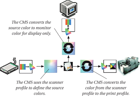
If color reproduction were simply about reproducing original imagery or artwork as exactly as possible, it might make sense to keep all our color imagery in the RGB space in which it was captured until it was time to convert to final output space, as shown in Figure 10-3.
But, in the real world, things are rarely that simple. Our originals almost always have a wider gamut than our output, and even the best profile with the best perceptual rendering is unlikely to do equal justice to all images—we typically need to make different compromises to a picture of a black cat in a coal cellar and one of a polar bear in the snow, to cite a couple of extreme examples. So we almost always need to edit our images, even if they were captured perfectly.
Input device spaces describe the behavior of capture devices, and as a result they usually have two properties that make them less than ideal as image-editing spaces:
• Input spaces are rarely gray-balanced.
• Input spaces are hardly ever perceptually uniform.
In a gray-balanced space, equal values of R, G, and B always produce a neutral gray, which simplifies one of the most powerful techniques for correcting color: pull the neutrals into place and the rest of the color follows. In a non-gray-balanced capture space, this is a lot more difficult to accomplish.
In a perceptually uniform space, the same incremental change in the numbers produces the same degree of change in the appearance, no matter where in the color gamut and tonal range it takes place. Capture spaces generally lack this property, which again makes them more difficult to use for editing.
Device-independent RGB
One solution, embodied in Adobe Systems’ applications but usable by others, is to use a device-independent, gray-balanced, perceptually uniform space such as Adobe RGB (1998) for editing. This approach has proven sufficiently popular to spawn a plethora of editing spaces—often named for their developers—and debating the merits of each is decidedly outside the scope of this book. Instead, we’ll simply say that the main criterion in choosing an editing space is its gamut.
Bigger isn’t necessarily better. The trade-off is between finding an editing space that won’t clip colors in either your capture or your output, and finding an editing space that doesn’t waste huge numbers of bits describing colors that you can’t capture, display, print, or in some cases, even see. In practice, it’s pretty much impossible to find a space that contains all your colors yet doesn’t waste bits, so you simply have to pick the best trade-off for your particular purposes.
CIELAB
Why not simply use LAB as the intermediate space? It is, after all, gray-balanced and reasonably perceptually uniform. LAB-based workflows are quite popular in Europe, but less so in the United States. LAB-based workflows can be very predictable and productive, with two caveats. First, LAB is not a particularly intuitive space in which to edit: most LAB-based workflows use editing applications, such as Heidelberg’s NewColor, that put an LCh interface between the user and LAB. Second, LAB is a very large space indeed, since by definition it contains every color we can see. As a result, it wastes an awful lot of bits on non-reproducible colors, so all major editing should be done at the capture stage on high-bit data—an 8-bit-per-channel LAB file is a fairly fragile thing that doesn’t respond well to big moves in tone or color.
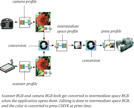
So a more typical color management workflow might look like that shown in Figure 10-4, where captures from multiple sources are converted early on into an intermediate editing space.
Figure 10-4 Capture to edit to print
The Intermediate Space Advantage
Intermediate-space workflows combine most of the simplicity of early-binding workflows with all of the flexibility of late-binding workflows. Early in the process, all imported color gets converted to the intermediate space, and all new colors get defined in the intermediate space, so there’s little room for ambiguity. And as long as the intermediate space encompasses the gamuts of all likely output processes, or at least the colors likely to be output, it’s easy to repurpose the work for different outputs, or to do most of the work before the output process has been decided. Adobe’s applications use the term “Working Space” to define an intermediate editing space—see Chapter 12, The Adobe Common Color Architecture.
Conveying Color Meaning
Even though we’re discussing it second, conveying color meaning is really the first part of the color management puzzle. You can’t ask the CMS to match a color if you can’t tell the CMS what that color is by supplying a source profile. And there are only two ways to supply the source profile:
• We can tell the CMS explicitly by embedding a profile in the document or object (or assigning a profile—see the sidebar “Terminology: Tagging, Assigning, Embedding, and Assuming,” later in this chapter).
• We can tell the CMS implicitly by configuring applications to assume that, absent any indication to the contrary (such as an embedded profile), all RGB content is in ProfileX space, and all CMYK content is in ProfileY space.
The two options aren’t mutually exclusive—many color management workflows, including the one we used to produce this book, make use of both embedded and assumed profiles.
Embedded Profiles
The least ambiguous and most robust way to tell the CMS what colors the numbers in the document represent is to embed the profile that describes them. In an embedded-profile workflow, the profile always travels with the object to which it applies, and is always available to serve as the source profile for any conversion (see Figure 10-5).
Figure 10-5 Embedded-profile workflow
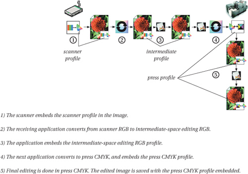
When you embed a profile, you literally write a copy of the profile into the document. All color-managed applications know how to interpret embedded profiles in TIFF, JPEG, and, on the Macintosh platform, PICT documents. Some applications also offer some degree of support for profile embedding in EPS and PDF documents, but it’s sufficiently variable that we’ll discuss it fully in the individual application-specific chapters that follow this one.
Embedded-profile workflows are by far the safest choice when your production chain takes inputs from multiple sources and converts them to outputs for multiple destinations, such as a service bureau operation. When you always embed profiles, there’s never any ambiguity as to the color meaning of the numbers in your documents. Many production people will argue the safest choice is one without any profiles that deals with color problems through an iterative proof-then-color-correct process. It’s only safe because it’s familiar, and it’s extremely inefficient to use human skill to solve the problem of various devices having their own peculiar behavior. Such use of skill and craft is often necessary even in a color-managed workflow, but to nowhere near the same degree as in a traditional one.
One major disadvantage of embedded-profile workflows is that they increase file size, sometimes by a little, sometimes by a lot. Matrix-based RGB editing space profiles are relatively tiny—less than a kilobyte—but if you’re uploading 30 images to a Web page, and embedding the same profile in each one, you’re uploading 30 kilobytes of redundant data. CMYK output profiles can be quite large—the ones we used to make this book weigh in at 2.4 megabytes apiece—and if we chose to embed a profile in every single graphic in the book, we’d be shoving an extra one or two gigabytes through the production chain.
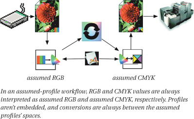
Assumed Profiles
The key feature of the assumed-profile workflow is that, instead of relying on embedding profiles in all our documents, we agree on a single profile to use for untagged documents that we push through the production chain, and we configure all our applications to assume that untagged documents have this profile as their source (see Figure 10-6).
Figure 10-6 Assumed-profile workflow
Of course, an assumed-profile workflow puts all the onus on the user to disprove the old saw that “when you assume, you make an ass out of u and me”—you don’t have the safety net offered by embedded profiles, so you have to make sure that the untagged objects were brought correctly into the assumed profile space to start with, and you also have to make sure that the assumed profiles are set correctly in each application so that, if conversions do occur, they’re the right conversions.
As a result, assumed-profile workflows require a great deal more coordination between programs and people than do embedded-profile workflows, so they’re best suited either to situations where a single individual is in control of all the work, or where a group with good communications is working towards a single output, such as a book or a periodical. In situations such as these, many people find an assumed-profile workflow makes it simpler to keep things straight. All programs that deal with any RGB color values use the same assumed RGB profile. All programs that deal with any CMYK color values use the same assumed CMYK profile, and all conversions from RGB to CMYK use the same source and destination profiles.
Hybrid Workflows
In practice, most real color management workflows are hybrids, using embedded profiles and assumed profiles either for convenience, or because applications or devices force one or the other.
For example, Adobe Illustrator can assign profiles to EPS files, but it can’t embed them. So when you transfer Illustrator EPS files to another application, you have three options: use an assumed profile in the receiving application, manually assign a profile in the receiving application, or consider the EPS “print-ready.” The last case means that all color management must occur prior to saving the EPS file, and the values in the file will be sent to the output device.
It’s also important to note that embedded-profile workflows, while robust, aren’t bulletproof. (The first person to make a bulletproof workflow will get very rich, very quickly!) If one person opens an image in a non-color-managed application (such as Adobe Photoshop 4), does some minor editing, and resaves the file, the embedded profile is gone. In this scenario, if you spot what happened quickly, you can save the situation by simply re-embedding the profile with a suitable application.
But here’s a worse scenario. If someone opens the image in Photoshop 5, and the application is configured to convert images to her working space and to save without embedding profiles, not only will the embedded profile get stripped out, but the numbers in the image will have changed drastically and no profile will be embedded upon resaving the image. So simply re-embedding the profile won’t work—you’d have to find out what working space Photoshop 5 was set to use, then embed that profile to retrieve the correct color meaning for the new set of numbers in the image, which may be difficult for those of you who aren’t mind-readers.
The lesson here is that profile embedding is a useful tool for communicating color meaning, but it isn’t a substitute for clear communication between the people in the production chain.
Workflow Within a Program
Workflow within a single program can be broken down into two aspects:
• How the program handles untagged documents
• How the program handles tagged documents
Remember, color management only does two things—convey color meaning and convert numbers to preserve that color meaning. So there are really only three possible things the application can do in either case, though the implications are slightly different in each.
Opening Untagged Documents
Any color-managed application has to make some assumption about the source profile for untagged documents. It needs a source profile so that it can display the document on your monitor and convert it to other profiles’ spaces on request. So when the program encounters an untagged document, whether by the Open command or by commands like Import, Place, or Get Picture, it can only do one of three things:
• Assume a profile
• Assign a profile
• Assign a profile, and do a conversion to some other profile
Some applications allow you to do only one of these things, while others may allow you to choose between two or three alternatives, but these are the only three possibilities—see the sidebar, “Terminology: Tagging, Assigning, Embedding, and Assuming,” earlier in this chapter, for the subtle distinction between assuming and assigning a source profile.
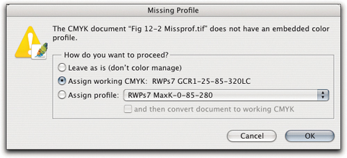
The other factor to consider is that some applications only allow you to set a default behavior that applies to all untagged documents automatically, whereas others offer the option of choosing the behavior on a case-by-case basis by presenting a warning dialog like the one shown in Figure 10-7.
Figure 10-7 Photoshop’s Missing Profile warning
Note that in all cases, the question is fundamentally one of supplying a source profile for the untagged document. Once the application has done so, the only difference between tagged and untagged documents is that if you change the default profiles in the application, untagged documents take the new default profile as their source, whereas tagged documents keep their source profile until you explicitly change it by doing an assignment or conversion.
Note that the “assume profile” possibility is the only one which leaves the document/object untagged. In all other cases the document effectively becomes tagged—Macromedia FreeHand and CorelDRAW, for example, always assign the default profile rather than assuming it. However, the assumed-profile workflow, where documents/objects remain untagged, is the most common workflow.
Opening Tagged Documents
As with untagged documents, applications can only do one of three things when they encounter a document—whether by the Open command or by commands like Import, Place, or Get Picture—that contains an embedded profile:
• Use the embedded profile as the source profile.
• Use the embedded profile as the source profile, then convert from that source profile to another profile.
• Ignore the embedded profile and assume or assign a different profile.
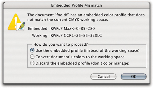
Some applications only offer one of these alternatives, while others may offer two or three, but these are the only three possibilities. And some applications only let you choose a single behavior to apply to all documents automatically, while others may again let you choose on a case-by-case basis by presenting a warning dialog like the one shown in Figure 10-8.
Figure 10-8 Photoshop’s Profile Mismatch (Open) warning
Color Management Between Documents
When you move objects between documents in color-managed page-layout or illustration applications, where a document may comprise multiple objects, each with its own source profile, you have exactly the same three options you have when you open, import, or place tagged documents:
• Use the embedded profile as the source profile for the object.
• Use the embedded profile as the source profile for the object, then convert from that source profile to another profile.
• Ignore the embedded profile and assume or assign a different profile to the object.
Some applications, such as QuarkXPress 4 and 5, allow you to set these options on a per-document basis as well as setting an application default, which is potentially powerful, but also potentially confusing. So you need to pay attention to the color management settings for each document, or decide to standardize your settings for all documents (in which case, make sure that you know what you’re doing when you open a document that was created by someone else, because she may have set the color management preferences differently).
A different choice arises in applications such as Adobe Photoshop, where each document has a single profile governing all elements. When you move pixels (whether via copy and paste, or drag and drop) from one document to another in Photoshop, and the two documents have different source profiles, you have only two choices:
• Move the numerical values of the pixels (which means that their appearance will change because it will be governed by the source profile of the receiving document).
• Move the color appearance of the pixels (which means that the numerical values will change to re-create the original appearance in the different profile space of the receiving document).
A less-wordy description of the choice is: convert, or don’t convert (as the dialog box shown in Figure 10-9 indicates).
Figure 10-9 Photoshop’s Profile Mismatch (Paste) warning
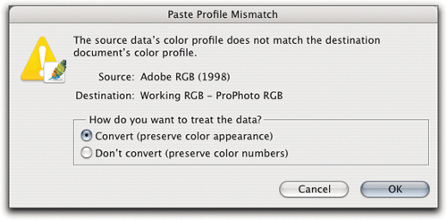
Some applications will always do one or the other without giving you a choice, in which case you need to figure out which one the application in question is doing. But these are the only two possibilities.
Assigning, Converting, and Soft-Proofing
So far, we’ve looked at what applications let you do when you open or import a document or object, transfer an object between documents, or combine different objects into a single document. But most color-managed applications also let you do profile assignments, profile conversions, and soft-proofs, which are really sets of conversions that are applied temporarily to let you use your monitor to simulate final output—see the sidebar, “Soft-Proofing Basics,” later in this chapter.
In the case of applications like Photoshop, where a document can only have one profile, these options are relatively straightforward. You can assign a source profile to a document, you can convert a document to another profile’s space with a choice of rendering intents, and you can set the monitor to provide a live preview of how the document would appear after a conversion to some other space—so you can, for example, work on an RGB document while previewing the effects your RGB edits would have on the file if it were converted to output CMYK.
With applications whose documents may contain multiple objects in different color spaces, such as page-layout applications, profile assignment becomes trickier. The main factor is that objects native to the layout application are handled differently from linked objects such as imported graphics. (By native objects, we mean text, lines, shapes, backgrounds, and so on, that were created inside the application.)
Native objects inherit the assumed or assigned profile that applies to the document in which they are placed—the key point is that you don’t assign profiles to native objects directly. If the document has ProfileX assigned to it, all native objects assume that profile as their source. If you change the document profile, you change the source profile for all native objects.
For linked objects, however, a newly assigned profile only applies to the specific instance of the object in that page-layout document. It doesn’t affect the original file—to do so, the page-layout application would need to be able to go out and rewrite the linked file, which the major page-layout applications can’t do.
Essentially, the assigned profile acts like an assumed profile inside that specific page-layout document, and only to the specific instance of the object to which it’s applied—if you import the image again, and place it in a different part of the page-layout doc, it’ll use either the embedded profile or the default profile. We think that assigning profiles other than the true source profile to linked objects in a page-layout application is a dangerous practice, and avoid it in all but the direst emergency. We’d rather go back to the application that originated the object and assign a new profile there, then update the link in the page-layout application.
Conversions in page-layout applications generally apply only to native objects, not to linked or imported ones. We almost always try to create everything in our layout applications in final CMYK from scratch, but when this is impossible (because, for example, the final CMYK isn’t known when we start creating the document), we use the page-layout applications’ conversion features to convert the native objects. Then we make sure that all the linked objects are in the correct space, and if necessary, do any conversions in the applications that originated them.
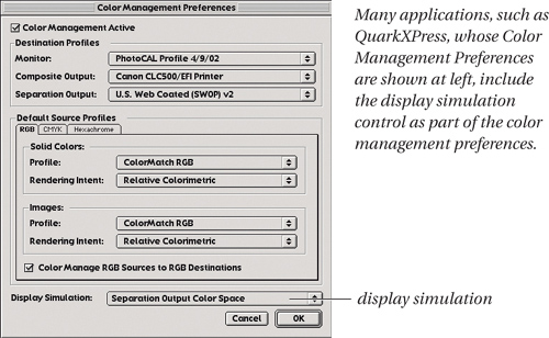
Simulations always apply to the entire document, whether it’s a single image in Photoshop or a whole book in a page-layout application. In some applications, such as QuarkXPress or Adobe PageMaker, the simulation controls are presented as part of the color management preferences (see Figure 10-10).
Figure 10-10 Monitor simulation
In other applications, such as Adobe Photoshop, Illustrator, and InDesign, simulations are controlled by commands accessed from the main menu bar (see Figure 10-11).
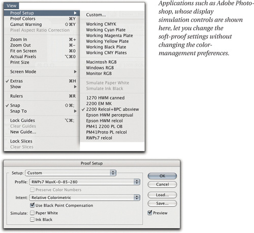
However they’re presented, the soft-proofing simulations do the same thing. They convert all the supported objects in the document—on the fly, for display only—to the designated output profile space, then they convert that simulation to monitor RGB to display the predicted output correctly on the monitor. (Formats such as EPS or DCS EPS don’t allow page-layout applications to change their preview, so you can’t do soft proofs of objects in these formats.)
Some applications offer per-object control over the rendering intent from the object’s space to the simulated output space, some apply perceptual rendering to raster images and relative colorimetric rendering to vector graphics, and some simply use the profile default rendering in all cases. Most applications do relative colorimetric rendering from the simulation space to monitor RGB, though a few offer control over the rendering from simulation to monitor space. We’ll look at these details in the application-specific chapters that follow this one.
Printing and Proofing
The last set of color management controls that work inside individual applications are those that deal with printing both final color and proofs of final color.
All the color-managed applications we know of allow you to perform a conversion from the source profile or profiles in the document to a single target output profile, as part of the print stream. The document itself remains unchanged—the conversion only applies to the data that gets sent to the printer driver.
Tip: Disable Color Management in the Printer Driver When You Use Application Color Management to Print
At the risk of belaboring the obvious, if the application performs a conversion to the data being sent to the printer driver, you almost certainly don’t want the driver itself to do a conversion on top of the application’s conversion—so when you use this feature, make sure that you turn off any color management in the printer driver itself.
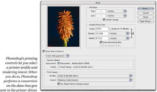
In applications whose documents contain multiple objects with individual profiles, the rendering intent controls are the same as the ones offered for soft-proofing. Applications such as Adobe Photoshop, whose documents contain only one source profile, may allow you to choose a rendering intent (see Figure 10-12).
Figure 10-12 Printing controls
In addition, most color-managed applications allow you to print a simulation of the final output to a composite printer such as a desktop inkjet or color laser.
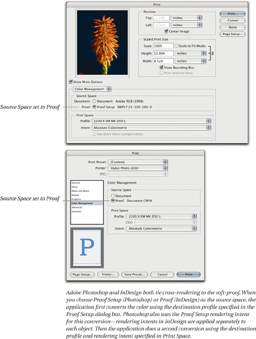
In some applications, such as Adobe Photoshop, Illustrator, and InDesign, this feature is tied to the soft-proof setting, so that instead of choosing the document space as the source profile, you choose the soft-proof space. This makes the application perform the conversion(s) from object spaces to the soft-proof space as part of the print stream. You then choose an output profile and rendering intent to cross-render this simulation of the final output to your desktop printer, which makes the application do one more conversion from the output simulation to your desktop printer space using the selected rendering intent (see Figure 10-13).
Figure 10-13 InDesign and Photoshop cross-rendering
Other applications may force you to actually convert every element to final output space as the only way to cross-render to a composite printer, in which case the conversion is simply one from document space to printer space.
Workflow Between Programs
You can convey color meaning between programs by either, or both, of two methods:
• Embedding profiles in any objects that travel between programs
• Ensuring that both the originating and receiving application use the same assumed profiles
Our tendency, which is by no means a hard and fast rule, is to embed profiles in RGB, and assume profiles in CMYK, for two reasons:
• RGB profiles are typically small and add little to the file size, while CMYK profiles are often larger than the actual files themselves.
• At least two important CMYK formats—CMYK EPS and CMYK DCS EPS—don’t reliably support profile embedding, and are often treated as “output-ready” formats, both by people and applications.
However, when we don’t embed profiles in CMYK, we always leave some kind of audit trail that tells us what flavor of CMYK the numbers in the file represent. We may archive the files in a specific folder that also contains the profile, or we may include the profile name in the document name, in the file information, or in whatever form of metadata the file format permits.
Workflow between applications is perhaps the one aspect of color management where common sense applies. All applications that deal with color have to make some assumption about the colors represented by RGB and the colors represented by CMYK. Color-managed applications can only get those assumptions from one of two places, a default profile or an embedded profile. If you make sure that your default profiles are synchronized across all your applications, and you set your applications to deal with embedded profiles the way you want them to, your color will flow reliably and predictably from one to another.
Workflow Into and Out of Color Management
Even though this is a book about color management, we can’t deny the fact that large chunks of the world aren’t color managed. What we call the “color management workflow” may be just a small piece of the overall workflow. We constantly bring materials in from devices, software, and people who don’t use profile-based color management. At the other end, we prepare documents for further non-color-managed stages. For example, with some workflows, as soon as someone converts color to CMYK, he employs more-traditional CMYK correction, targeting, and output techniques that don’t involve profile-based color management.
There’s a widespread and totally incorrect assumption that color management is an all-or-nothing proposition—unless you have profiles for all your inputs and all your outputs, and you use them religiously, you can’t do color management. If that were true, color management would be a great deal less useful than it is.
We routinely bring color from non-color-managed sources into a color-managed workflow, and we equally routinely export color from a color-managed workflow into The Great Non-Color-Managed Unknown.
Bringing Color Into a Color-Managed Environment
The first question we always ask when we’re confronted with bringing non-color-managed documents into the color-managed workflow is, “Can we deduce the source profile?”
Known sources
If the source profile is known, or, with a little deductive reasoning, knowable, we can simply assign it, and from then on, the offending document is color-managed. A trivial example would be an image from a scanner whose software doesn’t embed profiles, for which a profile is available. We’d simply open the scan in Photoshop and assign the scanner profile (and then we’d very likely convert it immediately to an intermediate editing space for further work).
A less-trivial example would be an untagged image sent by a peer who is reachable by that most-overlooked color management tool, the telephone. Usually, a few questions could determine which space the image was saved in, and again, we’d assign the correct profile.
Unknown sources
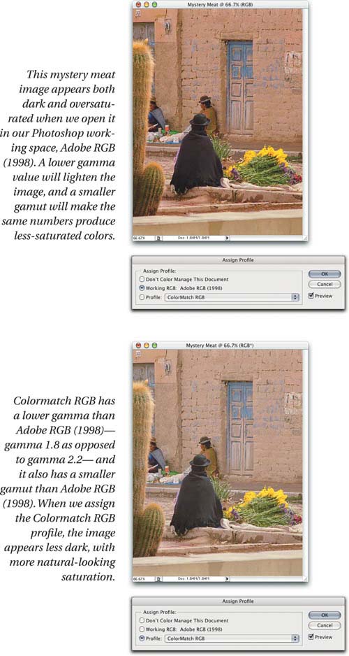
In many cases, however, the source profile is simply unknowable, either for technological reasons—the image was shot on an unprofiled digital camera, or scanned from a color negative—or for human ones—the person who created the material is either unreachable or is sufficiently clueless about color management that asking questions is an exercise in futility. In that case, you have what Bruce fondly calls “mystery meat.” We recommend different strategies for RGB mystery meat and CMYK mystery meat:
• In the case of RGB, we usually try a few different editing-space profiles to see if one produces a more reasonable appearance than another—there’s an element of guesswork or mind-reading in this, so we don’t hope for miracles. It’s overwhelmingly likely that the color was created in either a monitor-like space such as ColorMatch RGB or sRGB, or an editing space such as Adobe RGB, so those are the ones we generally try. If the image appears dark in a gamma 2.2 space, we try a gamma 1.8 space. If it appears washed out in a relatively large-gamut space such as Adobe RGB, we try a smaller one such as sRGB. We then assign the profile that produces the most reasonable appearance (yes, this is a very subjective criterion), and use it as the basis for any editing and subsequent conversions (see Figure 10-14).
• In the case of CMYK, we lean to the view that guessing games are pointless because there are simply too many possibilities to address. We take the not-entirely-unreasonable position that if someone sends us a CMYK file, he expects us to print it, so we assign the CMYK profile for the project to which the document is related, and use that profile as the basis for any necessary editing. If the on-screen result is truly disgusting, we may try assigning some different output spaces to see if we can find a suitable match, and then convert to our CMYK, or we may simply edit the file, trusting our calibrated and profiled display as an additional aid to the process.
When Color Management Starts
The details of the recipes we gave above for turning mystery meat into something more palatable are ones we find useful, but what’s really important is why they work. And the simple reason why they work is that, as soon as you open a mystery meat document in a color-managed application, you’re using a known source profile to look at the color. Any application that can convert color from one color mode to another—from RGB to CMYK, for example—has to make assumptions about the color appearance represented by both the RGB and CMYK numbers. One of the things that makes color management a cool tool is that, in color-managed applications, you can easily see and control those assumptions.
All color-managed applications let you set default profiles, which they use to interpret the numbers in untagged documents, so when you open an untagged document, you know which profile the application is using as the document’s source profile, and you know what color that profile makes the document display on your calibrated monitor.
It may not be a source profile that represents the intent of the person who sent it to you, but you’ve gone from knowing nothing about the color to knowing how it looks in, say, Adobe RGB. Color management purists might blow a gasket at the notion, but we’d say you’ve already started to color manage the document.
The purist (Bruce says “fascist”) view of color management is that its goal and purpose is to take an original image, and represent it as faithfully as possible on various outputs. Purists see color management as a scalpel. We liken it more to a Swiss Army Knife—it’s neither as precise nor as specialized as they claim. But it’s a lot more useful.
In fact, it’s impossible to not use color management in any application that does color conversions. All you can do is hide the assumptions the application makes when it does so, which we think is pointless. So as far as we’re concerned, color management starts as soon as you open a file in a color-managed application.
The Limits of the Knowable
Of course, when you’re dealing with mystery meat, there’s always an element of mind-reading—because the person who sent you the mystery meat hasn’t (yet) learned to use color management to convey his color meaning clearly, which is bad, but he also hasn’t learned any other way to do so, which is the real problem.
Color management lets you attach a specific color appearance to a set of RGB or CMYK numbers. Getting from that appearance to the appearance the originator intended is not something that color management can address—it’s a people problem, not a technology problem. Color management can help by letting you try out various plausible and implausible alternatives, but if people give you untagged files with no other information, you simply have to use your best judgment. Of course, you can always try asking why you’re being given untagged files—see the sidebar, “Fear of Embedding,” on the facing page.
Tip: Always Send Hard-Copy References
If you’re dealing with someone whose workflow is obviously non-color-managed, and you’re going through multiple edit rounds, always send a hard-copy reference such as an inkjet print, cross-rendered to the output space, that clearly indicates your color meaning. It’s unlikely that the other person will see the same appearance you do when she opens your edited file, so the hard copy provides a less ambiguous reference.
If we have an agenda in writing this book, it’s to make mystery meat go away. Lack of clear color communication is never a good idea—it simply creates extra work for all concerned. Embedding profiles is one simple way to remove ambiguity, but it’s not the only way, and if you’re dealing with someone who is seriously terrified of color management, it may not be the best way. So do whatever you can to eliminate mystery meat, but remember that gentle persistence almost always works better than wild-eyed evangelism, and in those cases where mystery meat is just a fact of life, use the guidelines we provided above to render it somewhat less mysterious.
Preparing Materials for a Non-Color-Managed Print Environment
There’s no particular magic trick here. You simply have to find out as much as possible about the printing conditions, then convert to a CMYK profile that bears some reasonable resemblance to those conditions.
If the job is large or critical, and you have profiling capabilities, you may want to consider profiling the proofing system—just have the printer print the profiling target the same way they’d print your job, then measure it and build a profile.
Failing that, try to find out the ink limits and anticipated dot gain on press, and create your CMYK document using a profile that matches those conditions. Basically, you’re aiming at the side of a barn—you want to try to hit it somewhere close to the middle.
Convert all your color to final CMYK, don’t embed any profiles, and submit the job. You may have to go through some rounds of proofing and correction—that’s the normal, expected workflow—but your first submission will likely be in the ballpark.
Some non-color-managed shops will claim that they can accept RGB files and convert them to CMYK themselves. We usually treat such claims with suspicion, to say the least. If the shop can tell us what flavor of RGB they expect, we may at least go ahead and try a test. But if the response makes it clear that multiple flavors of RGB is a concept they’ve yet to entertain, we’ll walk away.
However, if you submit RGB, with embedded profiles, on a CD or other non-rewriteable medium, there can be no argument about what you’ve submitted—and by accepting RGB files, the printer has taken the responsibility for the RGB-to-CMYK conversions. So if things go badly, you’ve at least covered your bases.
Preparing Materials for the Non-Color-Managed Internet
The vast majority of Web browsers simply take the RGB values in files and send them unmodified to the screen. So unless you go and calibrate the monitor of every user who is likely to look at your site, you have no way of knowing exactly what they’re going to see.
Various vendors have touted schemes for managing color on the Internet. They all work, up to a point, but they all do so by forcing the viewer to do some kind of visual monitor characterization, which they then use to alter the information that gets sent to that particular Web browser. Most of these solutions are sufficiently complex and expensive that they can only be implemented at the enterprise level, and by all accounts, no one is making huge amounts of money doing so.
One day, all monitors will be self-calibrating and self-characterizing, and all operating systems will use display compensation as a system-wide feature. Until that lucky day arrives, we suggest that the only practical solution is to aim for the lowest common denominator. Fortunately, that lowest common denominator is exactly what the sRGB space was designed to represent—it purports to represent the “average” uncalibrated Windows monitor. So our simple recommendation is to convert all your color to sRGB, and then save without embedding a profile, before uploading it.
The only color-managed browsers we know of exist on the Macintosh. For Mac OS 8, 9 and X, it’s Microsoft Internet Explorer. If you enable ColorSync in Explorer’s Preferences, it will assume sRGB for untagged images and use the embedded profile in all other images, using your monitor profile as the destination profile. And on Mac OS X only, it’s OmniGroup’s OmniWeb, which currently always assumes images are sRGB and uses display compensation.
So Macintosh users who use a display gamma of 1.8 will at least have a chance of seeing correctly. For most Windows users, sRGB is at least in the ballpark. And while gamma 2.2 images will seem dark and muddy on an unmanaged Macintosh gamma 1.8 display, the Mac users should be used to that.
Internet Color Workflow
When you prepare materials for the Internet, you’ll probably have to use a mixture of color-managed and non-color-managed applications. If you aren’t bothered by the color appearing different in color-managed and non-color-managed applications, you don’t need to do anything, but if you’re at all like us, you may find that disconcerting.
There are really only two solutions to the problem that make sense to us:
• If your work is exclusively for the Internet, calibrate your monitor to sRGB—most monitor calibrators offer sRGB as a preset, and for those that don’t, use 6500 K as the white point and 2.2 for gamma. Then, do everything in sRGB. Your calibrated color in the color-managed applications will closely match your uncalibrated color in the non-color-managed ones.
• Use monitor RGB as the source profile for all your Internet work. Color-managed applications will see that your RGB is already monitor RGB, so they’ll just send the values in the file to the screen, the same way non-color-managed applications do. Then, when the work is complete, convert it to sRGB.
If you expect your target audience to be primarily Macintosh users, you may consider targeting Apple RGB instead of sRGB. Neither solution is ideal, but until such time as the Internet becomes something other than a very large collection of random output devices, they’re the best we have to offer.
Understanding Workflow
In this chapter, we’ve tried to present the essential workflow concepts and features that all color-managed applications share, no matter how they’re presented, while relating them to the fundamental concept that color management does only two things—convey color meaning, and convert device values to preserve that color meaning.
Once you grasp these basic concepts, you’ll find that you can look at just about any application and figure out what each color management feature does, because they always boil down to some combination of the two fundamentals. In the following chapters, we’ll look at the specific ways color management is presented in some of the most common color-managed applications, but we can’t cover them all, and it’s often all too easy to get bogged down in the details. So use this chapter, and the concepts it presents, to keep the bigger picture in mind when you’re grappling with the minutiae of this or that application—the answer is almost always simpler than it might first appear.