
Chapter 28. Creating WPF Applications
In This Chapter
• Building WPF Applications with Visual Studio 2012
• Understanding the eXtensible Application Markup Language (XAML)
• Understanding Visual Tree and Logical Tree
• Arranging Controls with Panels
• Introducing the Application Object
• Brief Overview of WPF Browser Applications
Over the years, the requirement for high-quality applications has dramatically increased. Modern technologies enable users to perform even more complex tasks; technology and computers are a significant part of users’ lives. Computer applications need to respond to such requests. The user experience is something that cannot be disregarded anymore, even if an application works perfectly on data access. The more complex the task an application can perform, the more important is the need of an interactive user interface that enables the user to easily perform tasks through the application. And this is something that is strictly related to different kinds of applications: business applications, home applications, and multimedia and entertainment applications. Windows 8 Store Apps are the most recent examples of great user interfaces. For many years, .NET developers could build user interfaces based on the Windows Forms, which has been a good and important framework for creating user experiences with the .NET technology. Windows Forms has big limitations, especially if you need to create dynamic interfaces or complex data-bindings. Also, .NET Framework 4.0 signaled the last point in which some enhancements have been added to Windows Forms, but Microsoft stopped investing in that platform, even if it’s still supported. With the purpose of providing a unified programming model for building advanced user interfaces, being suitable for combining data access, dynamic interfaces, multimedia, and documents capabilities, Microsoft created the Windows Presentation Foundation technology (WPF), which dramatically increases developer productivity and offers a great environment for styling the application layout by a professional designer. WPF combines in one framework all you need to build new generation applications. If you are an experienced WPF developer, maybe this chapter is just a quick recap for you. If you are new to WPF, this and the following chapters give you the basics for beginning to build modern applications with Visual Basic 2012.
What Is WPF?
Windows Presentation Foundation (WPF) is the premier framework from Microsoft for building user interfaces in desktop applications for Windows 8, Windows 7, and Windows Vista. WPF is not intended to be a replacement for Windows Forms; it can be considered as a revolutionary alternative for building rich client applications. Windows Presentation Foundation offers several advantages that make user interface development straightforward. First, it is built on the top of the Microsoft DirectX graphic libraries, meaning that WPF applications can embed audio, videos, pictures, animations, and 3D graphics, all in a .NET-oriented fashion, with few lines of code. You can create rich client applications continuing to write Visual Basic code as you are already used to doing. WPF takes advantage of the GPU support of a graphics card, but it is also fully compatible with software rendering and can fall back on that when a GPU is not available (although it is actually expensive in terms of performance). Second, WPF has a powerful data-binding engine that makes it easier to build data-oriented applications. Third, it provides a separation layer between the developer and the designer so that professional designers can completely restyle the application’s layout with specific tools, improving what the developer built. WPF completely changes the way you think of your user interfaces but does not change the way you write Visual Basic code. WPF has some big differences with Windows Forms in its architecture; therefore, you need a different approach to some problems. As an example, WPF handles events via the routed events that are completely different from the event infrastructure in Windows Forms. You can handle events in WPF the same way you do in Windows Forms. The way you write code is the same, on the top of different technologies. WPF has been the first platform using the XAML markup language for declaring the user interface; XAML was later brought to Silverlight, Silverlight for Windows Phone, and now to Metro-style apps for Windows 8 (with some small differences due to their different contexts). This means that all the investments you made (or you are ready to make) in learning WPF are also valid in a number of other development platforms; by using the same programming approach you can quickly be productive against different platforms and scenarios. This should be enough to convince you why learning WPF is so important.
Personal Suggestions on Approaching WPF
I delivered several technical speeches on Windows Presentation Foundation, and one thing I noticed is that lots of developers do not approach WPF correctly. This is because the Internet is full of impressive demo applications with enhanced user interfaces and graphical experience and lots of presentation demos are built to show advanced WPF topics. Seeing a 3D application with animations is surely impressive, but it can be quite frustrating if you try to reproduce it after a few days’ experience with WPF. Because of this, often developers do not continue studying WPF. The best approach is instead to understand what one needs to work with WPF even if the UI is not so impressive. When you know how user controls work and how they are built, you can easily search within the MSDN library to make them nicer.
Improvements in WPF 4.5
If you already have experience with WPF, you might be interested in getting some hints about improvements in the new version. The Visual Studio 2012 designer has been significantly improved to make your experience even better. A plethora of improvements is strictly related to data-binding; in most cases you will not see performance improvements but it is worth mentioning that you can now control the behavior of the VirtualizingStackPanel object by setting its ScrollUnit attached property. You can set the Delay property of a data-binding to avoid a data source to be updated immediately (think of a slider moving continuously and causing performance overhead). You can now perform data-binding against static properties. Data sources can now automatically reflect to the user interface the result of a filter or of a sorting operation. Last but not least, a RibbonControl has been introduced in order to make it easier to create applications that mimic the Office 2007 and 2010 layout (and of some applications included in Windows 7 and Windows 8). The full list of improvements that are part of WPF 4.5 is available at this address of the MSDN library: http://msdn.microsoft.com/en-us/library/bb613588(v=vs.110).aspx.
In the next sections you learn the foundations of WPF and learn about specific features of this interesting technology.
Note
This is a language-oriented book; therefore, covering every aspect of the WPF technology is not possible. If you want to learn more about the WPF technology, consider Windows Presentation Foundation Unleashed from Sams Publishing.
WPF and Windows 8: The Future of Desktop Development
Since the first developer preview of Windows 8, one of the biggest concerns for developers has been related to the future of WPF and, more generally, of the desktop development for Windows. The reason is that Windows 8 Store Apps are a real revolution for an operating system like Windows, and Microsoft is pushing this kind of development so much that some developers got confused, thinking that only Store Apps will be the development platform on the new operating system. As you might know, Windows 8 on a PC can work both as Desktop and with apps. This implies that not only the Desktop is still alive and will survive for a long time, but also that WPF is the one platform that developers will use to build applications for the Desktop in Windows 8, although only for x86 and x64 processors. Developing for ARM processors only allows building Windows Store Apps. Also, do not forget Windows 7 and Windows Vista: You can still use WPF 4.5 to build client applications for those operating systems. All the investments you made in WPF will be still there, ready for Windows 8’s desktop. So, don’t be afraid if you are migrating from Windows Forms or if you made previous investments: The present and future of the desktop development is Windows Presentation Foundation.
Introducing the WPF Architecture
WPF relies on a layered architecture that is represented in Figure 28.1. The first layer is the Windows operating system. The second layer is constituted by the combination of two communicating layers: User32, which is the part of the operating system responsible for exchanging messages with applications, and the DirectX libraries, which are the real power of WPF. The next layer is named Milcore and is written in unmanaged code. It is responsible for integrating the unmanaged area of the architecture with the managed architecture that starts from the next layer, the Common Language Runtime (CLR), which is the root of every managed activity or layer. The PresentationCore is the first WPF layer that is responsible for implementing several important features such as the XAML language (covered later) or the integration with media contents. The next layer is the PresentationFramework, which is fundamental because it exposes all namespaces and classes that developers can take advantage of for building applications (and that are also utilized by Visual Studio when generating new projects).
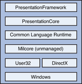
Figure 28.1. Windows Presentation Foundation architecture.
PresentationFramework exposes namespaces and classes through a complex hierarchy of inheritance, in which the root class is System.Object. The hierarchy provides the infrastructure for the user interface elements. This hierarchy is composed of the following list of classes, where each class inherits from the previous one:
• System.Object
• System.Threading.DispatcherObject
• System.Windows.DependencyObject
• System.Windows.Media.Visual
• System.Windows.UIElement
• System.Windows.FrameworkElement
• System.Windows.Controls.Control
The System.Threading.DispatcherObject is responsible for threading and messages that WPF relies on. The dispatcher takes advantage of the User32 messages for performing cross-thread calls. The WPF architecture is also based on a complex properties infrastructure that in most cases replaces methods and events. This is because a property-based architecture is preferable for showing contents of UI controls and because they better integrate with other development models. To provide this infrastructure, the WPF architecture exposes the System.Windows.DependencyObject class that implements a common set of properties for derived objects. The main capability of this class is keeping track of property changes so that bound objects can automatically update their statuses according to those changes. System.Windows.Media.Visual is responsible for the graphic rendering of all elements belonging to the user interface, under the form of a tree (known as Visual Tree that is covered later). System.Windows.UIElement adds other functionalities to the infrastructure, such as the capability to receive input from the user and other overridable members. System.Windows.FrameworkElement is important, exposing special features of WPF such as objects lifetime, styles, animations, and the data-binding engine. The last class is System.Windows.Controls.Control, which is the base class for WPF user controls and that adds further functionalities that empower base controls and custom user controls. Now that you have a basic knowledge of the WPF architecture, it is time to create the first application.
Building WPF Applications with Visual Studio 2012
You create WPF applications in Visual Studio 2012 by selecting one of the available project templates. WPF project templates are available in the Windows section of the New Project window, as shown in Figure 28.2, and are summarized in Table 28.1 (for your convenience, the list of project templates in Figure 28.2 has been restricted to WPF ones by using the search box, as the figure itself demonstrates).
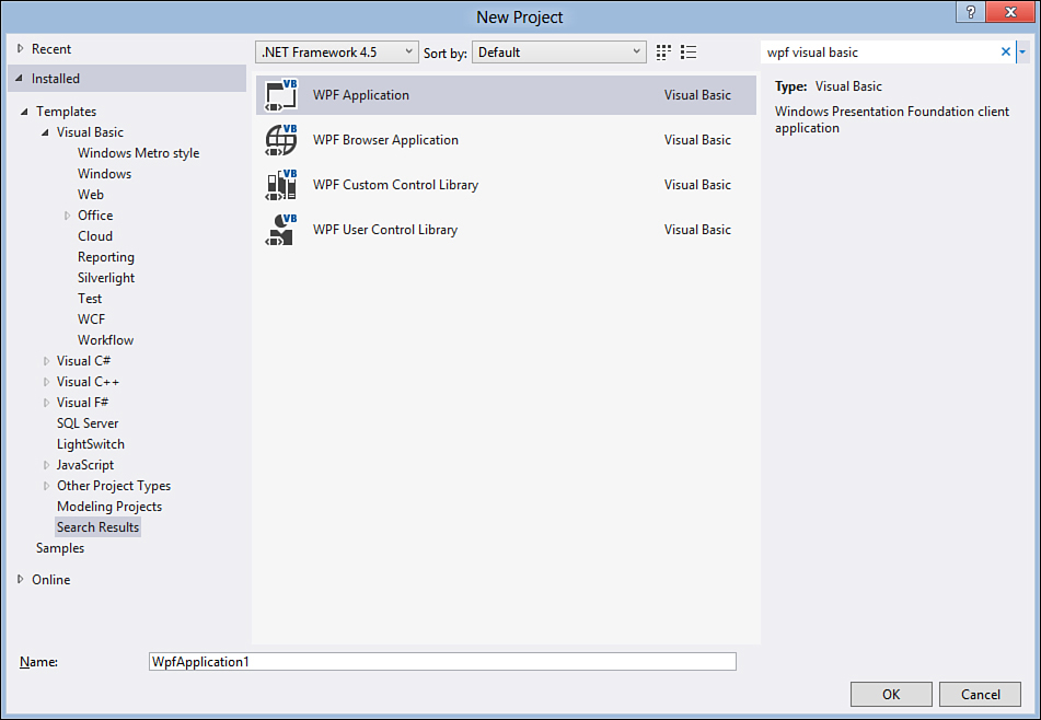
Figure 28.2. Available project templates for WPF applications.
Table 28.1. WPF Project Templates
This chapter shows you WPF in action with a desktop Windows application. Select the WPF application template and name the new project WPFDemo_Chapter28. After a few seconds, the IDE shows the code editor, so in Solution Explorer double-click the MainWindow.xaml file so you access the designer, as shown in Figure 28.3.
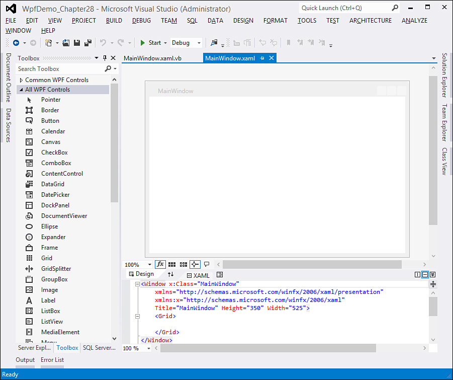
Figure 28.3. The IDE is ready on a new WPF project.
As you can see, things are a little different from a Windows Forms project. In the upper part of the IDE, you can see the designer showing the main window of the new application. On the left side is the Toolbox; this is a tool that you already understand and that contains specific WPF controls. In the lower part of the IDE is a special code editor for the eXtensible Application Markup Language (XAML, pronounced as ZAMEL) that you must know as a WPF developer. The next section describes XAML and explains how it works. In Solution Explorer, you can see a new kind of file, with the .xaml extension. Each .xaml file can represent a window, control (or set of controls), or set of resources. For each .xaml file there is a Visual Basic code-behind file (with a .xaml.vb extension) that you can access by expanding the filename. The reason for this separation between the .xaml file and the .xaml.vb file is part of a key concept in the WPF development, which is the separation of roles between developers and designers that is described better in the next section.
My Project
WPF applications enable you to take advantage of the My Project designer similarly to other kinds of client applications. If you examine the window, you see these similarities, and you also see how different options are self-explanatory.
Understanding the eXtensible Application Markup Language
In Windows Presentation Foundation applications, the user interface is defined via the eXtensible Application Markup Language (XAML), which is a markup language that allows defining the interface in a declarative mode and that derives from the XML language. This markup language is revolutionary because it allows the separation of the roles of designers and developers. Professional designers can style the application’s layout by using specific tools that allow generating and editing XAML without the need of knowing the programming fundamentals, leaving unchanged the code that empowers the application.
Note on Designer Tools
Designers typically use professional tools such as Microsoft Expression Blend for styling WPF and Silverlight applications. Because this book’s focus is developer-oriented, the usage of Expression Blend for manipulating XAML is not covered, whereas the focus is on what you do need to know as a developer from within Visual Studio 2012.
This discussion provides an explanation that for each .xaml file there is a VB code-behind file. The .xaml file contains XAML code that defines the user interface, whereas the .xaml.vb code-behind file contains Visual Basic code that makes the user interface alive with the rest of the application. XAML logic is simple: Each XML element represents a user control, and each XML attribute represents a property to a control. Because of the special XML syntax, XAML refers to a specific XML schema for WPF controls.
You need to learn how XAML works if you are also interested in developing rich Internet applications with Microsoft Silverlight or mobile applications with Silverlight for Windows Phone. As explained in Chapter 36, “Building Rich Internet Applications with Silverlight 5” and in Chapter 38, “Building Apps for Windows Phone 7.5,” Silverlight and its mobile counterpart are also based on XAML for the UI side.
Now take a look at Listing 28.1 that contains the code generated by Visual Studio 2012 when a new project is created.
Listing 28.1. XAML Default Code for a WPF Project
<Window x:Class="MainWindow"
xmlns="http://schemas.microsoft.com/winfx/2006/xaml/presentation"
xmlns:x="http://schemas.microsoft.com/winfx/2006/xaml"
Title="MainWindow" Height="240" Width="500">
<Grid>
</Grid>
</Window>
In WPF applications, every window is wrapped by a System.Windows.Window control. The root element in the XAML code is a Window element. The x:Class attribute (which is actually a property) points to the Visual Basic class that handles the Window on the runtime side. The Title property contains text shown on the window’s title bar. Width and Height are self-explanatory properties that define the window’s size. Also notice how XML schemas are imported via xmlns tags.These schemas have two purposes: enabling IntelliSense in the XAML code editor and ensuring that only valid elements are used in the XAML code. Grid is one of the WPF panels. Unlike Windows Forms, user controls in WPF are arranged within panels; the last part of this introduces them better. Now you understand better what was explained at the beginning of this section: In XAML every element (except for resources) represents a control with properties (attributes). XAML offers a hierarchical organization of controls. For example, a Window can contain one or more panels that can contain other panels that can contain controls, and so on. This hierarchical logic is versatile because it enables great customizations of the interface, as you see in this chapter and subsequent ones. As previously stated, the XAML editor fully supports IntelliSense. You can check this out by writing code, as demonstrated in Figure 28.4.
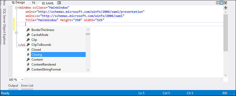
Figure 28.4. The XAML code editor fully supports IntelliSense.
You are not obliged to manually type XAML code to design your user interface. Every time you drag a control from the Toolbox onto the designer, Visual Studio generates the related XAML code for you and you can assign event handlers in the Properties window. In some circumstances manually editing the XAML code is a good task to fix a control’s position. Moreover, although initially writing XAML can seem annoying, when you understand its hierarchical logic, it becomes straightforward, also due to IntelliSense. What you perform manually writing XAML can be accomplished with the design tools.
Declaring and Using Controls with the Designer and XAML
To add controls to the user interface, you have two possibilities: dragging controls from the Toolbox onto the designer surface or manually writing XAML. For a better understanding, we first show you how to drag from the Toolbox. With the Toolbox open, click the Button control and drag it onto the designer. When you release it, the IDE should look like Figure 28.5.
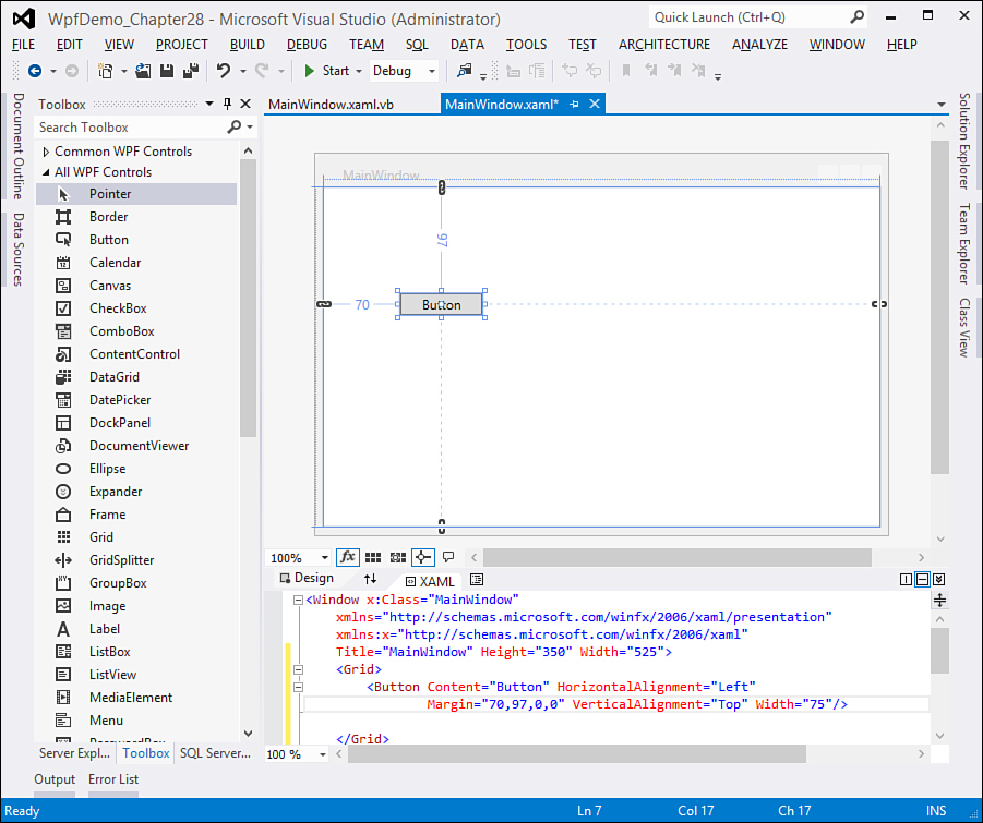
Figure 28.5. Dragging controls and generating XAML.
As you can see from Figure 28.5, Visual Studio also generates the XAML code for the controls you add to the UI. For the new button, this is the XAML code generated:
<Button Content="Button" Height="23"
HorizontalAlignment="Left"
Margin="90,84,0,0" Name="Button1"
VerticalAlignment="Top" Width="75" />
Confirming that each control is represented as an XML element, the most interesting properties here are Name, which assigns an identifier to the control, and Content, which stores the control’s content. To manage your controls you now have two choices: editing its XAML code or using the Properties window, which is represented in Figure 28.6.
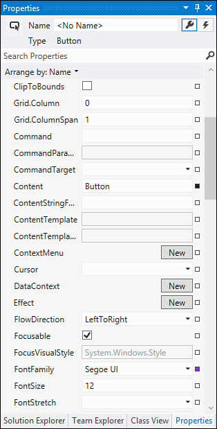
Figure 28.6. Managing controls with the Properties window.
If you are not familiar with WPF, probably you can find lots of properties that you do not know yet. You can learn most of these properties in this book and in your further studies; what is important here is to understand how the designer can control the UI members. The Properties window for WPF controls also offers a special tab that you can enable by clicking the Events button (in the upper side of the tool window); that enables associating event handlers to each event exposed by that specific control (see Figure 28.7). Obviously, event handlers are written in Visual Basic code; the next section explains how you handle events.
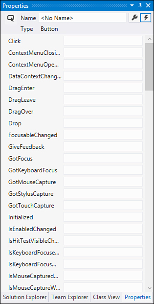
Figure 28.7. The Properties window enables the selecting of event handlers. Click the combo near the desired event and pick an event handler.
Declarative and Imperative Modes
Writing (or letting Visual Studio generate) XAML code is known as declarative mode. This is because XAML allows declaring elements required by the user interface but does not allow them taking actions. By the way, an important statement is that with Visual Basic (or Visual C# as well) you can do anything you do in XAML, meaning that you can declare user interface elements in Visual Basic code and add them to the user interface at runtime. Moreover, managing controls with Visual Basic allows them taking actions. This is the imperative mode. For a better explanation, consider the following XAML code that declares a simple button:
<Button Content="Button" Height="30"
Name="Button1"
Width="100"/>
The same thing can be also accomplished in Visual Basic. The following code demonstrates this:
Dim Button1 As New Button
With Button1
.Width = 100
.Height = 30
.Content = "Button1"
End With
Me.Grid1.Children.Add(Button1)
The difference is that in Visual Basic you need to explicitly add your control to a panel in the user interface.
Understanding Visual Tree and Logical Tree
When talking about WPF applications, you will often hear about the Logical Tree and the Visual Tree. The Logical Tree is a tree representation of the .NET classes for user interface controls. Consider the following XAML code:
<Window>
<StackPanel Orientation="Horizontal" Margin="5">
<TextBlock Text="Sample controls" Margin="5"/>
<Button Content="Test button" Margin="5"/>
</StackPanel>
</Window>
This code uses .NET objects within a hierarchical structure that can be reconfigured in a Logical Tree, as shown in Figure 28.8.
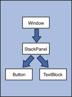
Figure 28.8. The Logical Tree provides a hierarchical view of the UI elements.
You can investigate the Logical Tree in a more convenient way, with the Document Outline tool window (you find it in View, Other Windows) that provides a hierarchical view of the interface (see Figure 28.9).
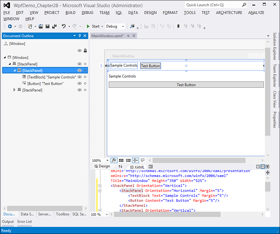
Figure 28.9. Investigating the Logical Tree with the Document Outline tool.
The Visual Tree is a more complex concept that is important. As explained in the next chapters, WPF controls are the result of the aggregation of primitive elements, and they can be completely redefined with control templates. For example, a default Button is made of Chrome, ContentPresenter, and TextBlock controls. The combination of these elements creates a Visual, which represents a visual element in the user interface. The Visual Tree is thus the representation of all the visual elements in the UI that are rendered to the screen, plus their components. Consider the following simple XAML:
<StackPanel Orientation="Horizontal" Margin="5">
<Button Content="Test button" Margin="5"/>
</StackPanel>
The visual tree representation is reported in Figure 28.10.
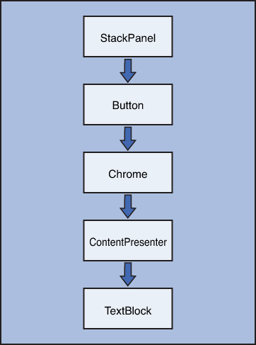
Figure 28.10. The Visual Tree representation for UI elements.
Understanding the Visual Tree is important for understanding another key concept in the WPF development—routed events. These are described just after introducing how you handle events in WPF.
Handling Events in WPF
You handle events in WPF the same way you do in other kinds of applications: You code a Visual Basic event handler and associate the handler to a control event. What actually changes is the way you assign the handler to the event. For example, you can assign an event handler to a control event directly within the XAML code editor. To accomplish this, you type the name of the event you want to handle (events are recognizable within IntelliSense with the Lightning icon) and then press Tab when IntelliSense shows the <New Event Handler> pop-up command (see Figure 28.11 for details).
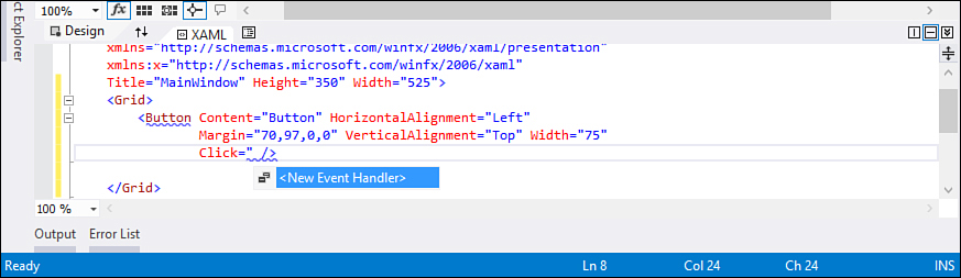
Figure 28.11. Generating a new event handler with IntelliSense.
This generates an event handler stub in your code-behind file. Continuing the example of the previous button, Visual Studio first assigns a new identifier to the Click event in XAML, which looks like this:
Click="Button1_Click"
As you can see, the IDE generates the event handler’s identifier considering the control’s name. Now right-click the event handler’s name and select the Navigate to Event Handler command from the pop-up menu. This redirects to the Visual Basic event handler generated for you, which looks like this:
Private Sub Button1_Click(ByVal sender As System.Object,
ByVal e As System.Windows.RoutedEventArgs)
End Sub
It is worth mentioning two aspects. The first one is that the event handler signature requires an argument of type RoutedEventArgs. WPF introduces the concept of routed events that is covered in the next section. The second one is that in this case there is no Handles clause. This is because the IDE added an AddHandler instruction behind the scenes in the Window1.g.vb file (which is generated at compile time). Notice that such a filename depends on the current Window name, in this case Window1. As an alternative, you can specify the Handles clause the same way you would do in other kinds of applications. However, in this case you must not specify the event handler in XAML, to avoid an event being caught twice. You can also double-click a control in the designer to generate an event handler for the default event. For instance, say a button’s default event is Click, so double-clicking a button in the designer generates an event handler stub for handling the Click event. The default event for a TextBox control is TextChanged, so double-clicking a text box generates an event handler stub for the TextChanged event, and so on. When you add event handlers by double-clicking controls, such handlers use the Handles clause on the method name. As previously mentioned, the last alternative is to assign an existing event handler to a control’s event with the Properties window.
A More Thorough Discussion: Introducing the Routed Events
WPF introduces a revolutionary way to generate and handle events, known as routed events. When a user’s interface element generates an event, the event passes along through the entire Visual Tree, rethrowing the event for each element in the tree. The WPF runtime can then understand what element first generated the event that is the actual handled event. Event handlers whose job is managing a routed event must include an object of type System.Windows.RoutedEventArgs in their signature. For a better understanding, consider the following basic XAML code that implements three buttons:
<StackPanel Button.Click="OnClick">
<Button Width="100" Height="30"
Content="Button One" Name="Button1" />
<Button Width="100" Height="30"
Content="Button Two" Name="Button2" />
<Button Width="100" Height="30"
Content="Button Three" Name="Button3" />
</StackPanel>
Notice how no event handler is specified for buttons, whereas a unique handler is specified within the StackPanel definition taking advantage of the Button.Click attached event. This enables the establishing of one event handler for each button in the StackPanel’s children. In the code-behind file, write the following handler:
Private Sub OnClick(ByVal sender As Object, ByVal e As RoutedEventArgs)
Dim element As FrameworkElement = CType(e.Source,
FrameworkElement)
Select Case element.Name
Case Is = "Button1"
MessageBox.Show("You clicked Button1")
Case Is = "Button2"
MessageBox.Show("You clicked Button2")
Case Is = "Button3"
MessageBox.Show("You clicked Button3")
End Select
End Sub
Thanks to routed events, we can write just one common handler. To get the instance of the element that actually generated the event, you need to convert the e.Source property (which is of type Object) into the appropriate type. In this case the conversion could be with a Button type, but FrameworkElement is utilized to include various kinds of elements or controls. This is because with routed events you can intercept events from each element in the Visual Tree (such as the ContentPresenter for buttons), thus not only user controls.
Introducing Routing Strategies: Direct, Tunneling, and Bubbling
Routed events are implemented according to three modes, known as routing strategies. Strategies are implemented by the System.Windows.RoutingStrategy enumeration and can be summarized as follows:
• Direct—The event is generated directly against the target object. This is what usually happens in other kinds of .NET applications, such as Windows Forms, and is the most uncommon strategy in WPF.
• Tunnel—In the tunneling strategy, an event is generated from the root object and passes through the entire Visual Tree until getting to the target object.
• Bubble—The bubbling strategy is opposite to the tunneling one, meaning that an event starts from the target object and passes back through the Visual Tree.
In most cases, such as the preceding code example, you face tunneling routed events or bubbling ones. Offering a thorough discussion on routed events is beyond the scope of this chapter; you can refer to the MSDN official page that you can find at http://msdn.microsoft.com/en-us/library/ms742806(VS.110).aspx.
Arranging Controls with Panels
WPF changes the way you arrange controls on the user interface. This is because one goal of WPF is to provide the ability to create dynamic interfaces that can be rearranged according to the user’s preferences or when the user resizes the interface. Because of this, WPF controls are arranged within special containers, known as panels. WPF provides several panels, each allowing different arrangement possibilities. This is different from Windows Forms, where you place controls on the user interface, but the controls are not flexible. Although some types of panels are available, Windows Forms panels are not as versatile as WPF panels. In this section you learn about WPF panels and how you use them to arrange controls. The most important thing that you have to keep in mind is that WPF controls have a hierarchical logic; therefore, you can nest multiple panels to create complex user experiences. Panels are all exposed by the System.Windows.Controls namespace from the PresentationFramework.dll assembly.
The Grid Panel
The Grid is one of the easiest panels to understand in WPF. It allows creating tables, with rows and columns. In this way you can define cells and each cell can contain a control or another panel storing nested controls. The Grid is versatile in that you can just divide it into rows or into columns or both. The following code defines a Grid that is divided into two rows and two columns:
<Grid>
<Grid.RowDefinitions>
<RowDefinition />
<RowDefinition />
</Grid.RowDefinitions>
<Grid.ColumnDefinitions>
<ColumnDefinition />
<ColumnDefinition />
</Grid.ColumnDefinitions>
</Grid>
RowDefinitions is a collection of RowDefinition objects, and the same is true for ColumnDefinitions and ColumnDefinition. Each item represents a row or a column within the Grid respectively. You can also specify a Width or a Height property to delimit row and column dimensions; if you do not specify anything, both rows and columns are dimensioned at the maximum size available, and when resizing the parent container, rows and columns are automatically rearranged. The preceding code creates a table with four cells. The Visual Studio 2012 Designer offers a convenient way for designing rows and columns. When the cursor is within the Grid definition in the XAML code editor or when the Grid has the focus in the designer, you use the Rows and Columns properties in the Properties window. Figure 28.12 shows how you add columns to the Grid and how you can set properties for each column. Adding rows works exactly the same.
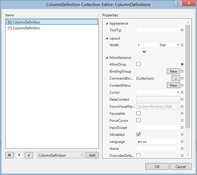
Figure 28.12. Adding columns with design tools.
To place controls in the Grid, you specify the row and column position. The following code places two buttons, the first one in the upper-left cell and the second one in the upper-right cell:
<Button Width="100" Height="50" Grid.Column="0"
Grid.Row="0" Name="Button1" Content="First button"/>
<Button Width="100" Height="50" Grid.Column="1"
Grid.Row="0" Name="Button2" Content="Second button"/>
To place controls, you select the column via the Grid.Column property, whose index is zero-based, meaning that 0 is the first column from the left. This kind of property is known as attached property and allows setting a property of a parent container from within the current object. Specifying the row works similarly, in that you assign the row via the Grid.Row attached property. The property’s index is also zero-based, meaning that 0 represents the first row from the top. You can place nested containers within a cell or a single row or column. The following code shows how to nest a grid with children control into a single cell:
<Grid Grid.Row="1" Grid.Column="0">
<Grid.ColumnDefinitions>
<ColumnDefinition />
<ColumnDefinition />
</Grid.ColumnDefinitions>
<Grid.RowDefinitions>
<RowDefinition />
<RowDefinition />
</Grid.RowDefinitions>
<Button Width="50" Height="50" Grid.Column="0"
Grid.Row="0" Name="Button3" Content="Button3"/>
<Button Width="50" Height="50" Grid.Column="1"
Grid.Row="0" Name="Button4" Content="Button4"/>
</Grid>
If you run the code shown in this section, you get the result shown in Figure 28.13. This should give you an idea on how controls can be placed within a Grid.
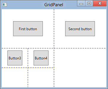
Figure 28.13. Arranging controls within a Grid.
Showing Grid Lines
Grid lines are not shown by default. To make them visible, add a ShowGridLines property to the Grid element and set its value to True.
Personal Suggestion
Each time you study a WPF container, try to resize the application windows or controls so that you can get a good idea of how panels work.
The StackPanel Panel
The StackPanel panel allows placing controls near each other, as in a stack that can be arranged both horizontally and vertically. As with other containers, the StackPanel can contain nested panels. The following code shows how you can arrange controls horizontally and vertically. The root StackPanel contains two nested panels:
<StackPanel Orientation="Vertical">
<StackPanel Orientation="Horizontal" Margin="5">
<TextBlock Text="Sample controls" Margin="5"/>
<Button Content="Test button" Margin="5"/>
</StackPanel>
<StackPanel Orientation="Vertical" Margin="5">
<TextBlock Text="Sample controls" Margin="5"/>
<Button Content="Test button" Margin="5"/>
</StackPanel>
</StackPanel>
The Orientation property can be set as Horizontal or Vertical, and this influences the final layout. One of the main benefits of XAML code is that element names and properties are self-explanatory, and this is the case of StackPanel’s properties, too. Remember that controls within a StackPanel are automatically resized according to the orientation. If you do not like this behavior, you need to specify Width and Height properties. If you run this code, you get the result shown in Figure 28.14.
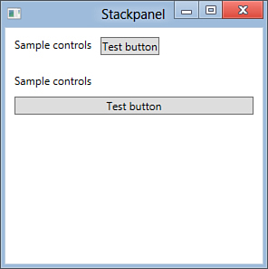
Figure 28.14. Arranging controls within StackPanels.
If you want to provide a dynamic user interface, you need to take care of some considerations. If you do not provide static Width and Height values, your controls will be resized along with the StackPanel, which also automatically adapts to its parent container. Alternatively, controls arranged within a StackPanel are not resized, but they have the limitation of being hidden when decreasing the parent’s container size, as better represented in Figure 28.15.
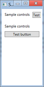
Figure 28.15. Resizing fixed controls within a StackPanel causes them to be hidden.
If you predict that your application will encounter such a situation, you should implement a WrapPanel panel, which is covered in the next subsection.
The WrapPanel Panel
The WrapPanel container works like StackPanel, but it differs in that it can rearrange controls on multiple lines in the interface so that they are never hidden. Figures 28.16 and 28.17 show how the WrapPanel enables the rearranging of controls when resizing the parent container (a Window, in our examples).
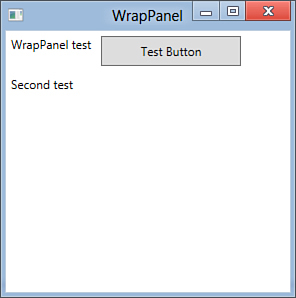
Figure 28.16. WrapPanel arranges controls similarly to the StackPanel.
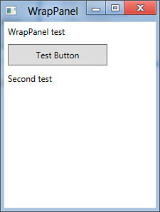
Figure 28.17. WrapPanel rearranges controls dynamically making them always visible, as if they were implemented line-by-line.
In code terms, the panel is represented by a WrapPanel element in XAML. The following code reproduces what you saw in the previous figures:
<WrapPanel>
<TextBlock Text="WrapPanel test" Margin="5"/>
<Button Width="140" Height="30" Content="Test Button"
Margin="5"/>
<TextBlock Text="Second test" Margin="5"/>
</WrapPanel>
The VirtualizingStackPanel Control
In some situations you need to show a big number of elements in your user interface. This is the case of the DataGrid or ListBox controls, which can display hundreds of elements within a single control. This would heavily affect the application performances if you were using a classic StackPanel, which would show all the available items. The VirtualizingStackPanel control offers a valid alternative that can calculate how many items can appear in a particular moment and then arranges controls according to the calculation result. You do not need to implement the VirtualizingStackPanel manually (it is the default item template of data controls) but, if you need to, you write the following definition:
<VirtualizingStackPanel>
<!--Nest controls here...-->
</VirtualizingStackPanel>
This kind of panel works like the StackPanel, with the previously described difference.
The Canvas Panel
Most WPF containers allow the dynamic rearrangement of controls within the user interface. This is useful when you want your user to adjust interface settings, but it can complicate things when you need to place controls in a fixed, unchangeable place (as happens in Windows Forms). To accomplish this, you use the Canvas container, which allows absolute placement, meaning that it allows specifying the position of nested controls. When you place controls into a Canvas container, you specify the absolute position with some attached properties: Canvas.Left, Canvas.Top, Canvas.Right, and Canvas.Bottom. The following code shows how you place a button that never changes its position in the user interface, thanks to the Canvas.Left and Canvas.Top attached properties:
<Canvas>
<Button Width="100" Height="50" Content="Test Button"
Canvas.Left="30" Canvas.Top="50"/>
</Canvas>
The DockPanel Panel
The DockPanel container has some similarities with the StackPanel in that it allows arranging child controls near each other. The main difference in DockPanel is that child controls are docked to the panel sides according to the direction you specify, and they are docked to each other and you can establish the position and size for each child control. The most common usage of the DockPanel panel is creating interfaces for placing menus and toolbars. The following example shows how you can dock multiple toolbars and their buttons within a DockPanel:
<DockPanel VerticalAlignment="Top"
LastChildFill="True">
<ToolBar DockPanel.Dock="Top"
Name="MainToolbar" >
<Button Content="First Button"/>
<Button Content="Second Button"/>
</ToolBar>
<ToolBar DockPanel.Dock="Top"
Name="NextToolbar" >
<Button Content="First Button"/>
<Button Content="Second Button"/>
</ToolBar>
</DockPanel>
You set the DockPanel orientation by specifying either the VerticalAlignment property or HorizontalAlignment. The LastChildFill is a property that indicates whether child controls must completely fill the available blank space in the container. Notice how within child controls (such as the Toolbars) you specify the docking position by taking advantage of an attached property named DockPanel.Dock, whose value indicates where the control must be docked within the DockPanel. This is because child controls are not limited to being docked into one side of the panel but can be docked into any of the four sides. The preceding code produces the result shown in Figure 28.18.
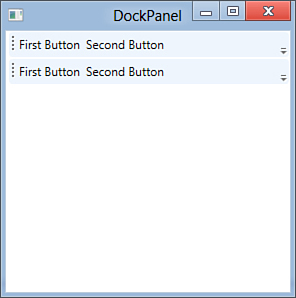
Figure 28.18. Docking controls within a DockPanel.
The ViewBox Panel
The ViewBox panel allows adapting nested controls to its size, including the content of controls. For example, consider the following code:
<Viewbox>
<Button Width="150" Height="75">
ViewBoxed button
</Button>
</Viewbox>
You immediately notice how the button’s text is expanded to best fit the button size. This also happens if you decrease or increase the window size, as demonstrated in Figure 28.19.
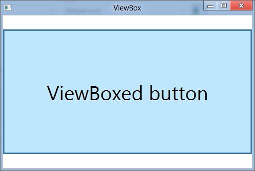
Figure 28.19. The ViewBox panel in action.
In a few words, the ViewBox allows resizing controls and their content.
Managing Windows
WPF allows managing windows similarly to Windows Forms, although there are some obvious differences, such as the fact that WPF windows can be considered as the root container for all other child panels when arranging UI elements. Whatever way you decide to apply windows properties, at design time such properties are addressed in XAML code, but you are also allowed to set them at runtime in Visual Basic code. Available properties enable the establishing of the window startup position, its resize mode, its appearance on the task bar, and so on. Table 28.2 summarizes the most important available properties.
Table 28.2. Window’s Properties
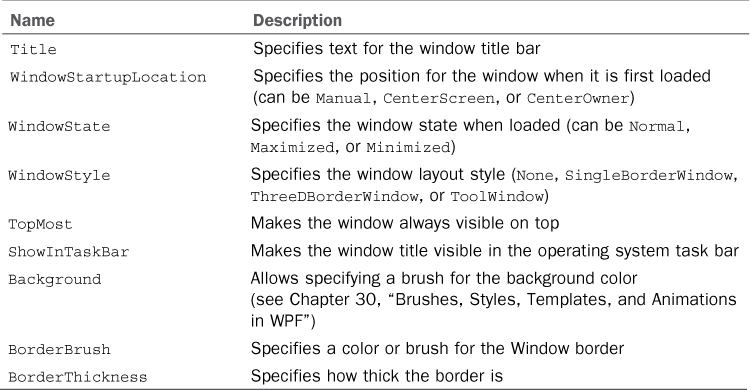
You can take advantage of the Properties tool window for setting the previously mentioned properties at design time. The following XAML code snippet shows how you can set some window properties:
<!-- The following code sets the Window as Maximized,
its startup position at the center of the screen,
its style as a Window with 3D borders and keeps it
always on top. It also replaces the default title-->
<Window x:Class="MainWindow"
xmlns="http://schemas.microsoft.com/winfx/2006/xaml/presentation"
xmlns:x="http://schemas.microsoft.com/winfx/2006/xaml"
Title="Chapter 31 demonstration" Height="240" Width="500"
WindowStartupLocation="CenterScreen"
WindowState="Maximized" WindowStyle="ThreeDBorderWindow"
Topmost="True">
</Window>
This is what you do at design time. The same result can be accomplished in managed code as follows:
'Me is the current Window
With Me
.Title = "Chapter 31 demonstration"
.WindowStartupLocation = Windows.WindowStartupLocation.
CenterScreen
.WindowState = Windows.WindowState.
Maximized
.WindowStyle = Windows.WindowStyle.
ThreeDBorderWindow
.Topmost = True
End With
To add more Window objects to your project you select the Project, Add Window command and assign the filename in the New Item dialog box. Remember that every Window in the project inherits from System.Windows.Window. When you have multiple windows in your project, you can also establish which of them must be the startup object. To accomplish this, go to My Project and select the new window in the Startup URI combo box. Figure 28.20 shows how to accomplish this.
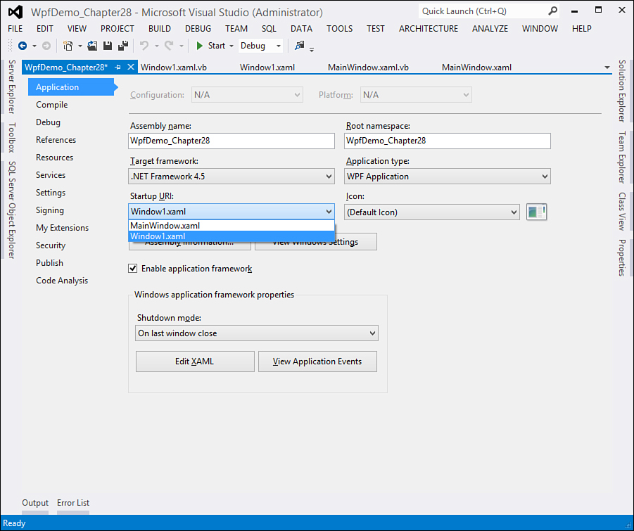
Figure 28.20. Selecting a different Window as the startup object.
The window is specified via the related XAML file address (Uri).
Instantiating Windows at Runtime
Creating and displaying windows at runtime is a common task in every client application. To do this, you create an instance of a System.Windows.Window and then invoke the Show or ShowDialog methods, depending on whether the Window must be considered a modal dialog box. The following Visual Basic code demonstrates how you create and show a new Window:
Dim aWindow As New Window
'Set your Window properties here...
aWindow.ShowDialog()
'....
aWindow.Close()
In the preceding code, a new Window is generated from scratch, so this requires specifying all properties. In most cases you can instead create and show instances of existing windows that you implemented at design time; for this, in the above code you just replace Window with the name of your custom window. This works the same as Windows Forms, although all the backend technology is completely different. This approach helps you when moving your Windows Forms applications to WPF.
Introducing the Application Object
As for Windows Forms, WPF also provides an Application class that allows interacting with your application instance. The class exposes several methods and properties that allow the getting or assigning of settings available within My Project. First, you need to get the instance of the running application. You accomplish this by assigning the Application.Current property to a variable as follows:
Dim myApp As Application = CType(Application.Current, Application)
When you get the instance of the application, you can get or set required information. The following code shows how you can retrieve the startup Uri (which corresponds to the startup object referred to in a XAML file), the main application window, and assembly information:
'Gets the startup object under the form of a XAML file
Dim startupObject As Uri = myApp.StartupUri
'Gets (but also allows setting) the application main window
Dim mainWindow As Window = myApp.MainWindow
'Get assembly information
With myApp.Info
Dim companyName As String = .CompanyName
Dim appName As String = .ProductName
'get other info here...
End With
The Application class does not directly expose a Close method as instead happens in Windows Forms. If you want to programmatically shut down your application, you invoke the Current.ShutDown shared method as follows:
Application.Current.Shutdown()
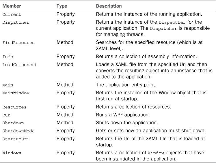
Table 28.3 summarizes the most important members of the Application class.
Table 28.3. Application Class’s Most Important Members
Tip
Chapter 19, “The My Namespace,” discussed the My namespace. WPF applications provide a special extension of My that allows interacting with the application by invoking the My.Application property.
The Application class is also important for another reason: It contains the entry point (that is, the Sub Main) that effectively runs your application and is the place where you control application events, such as the startup or the shutdown. This class is implemented as a partial class. In Solution Explorer, you can find the Application.xaml file that can store application-level resources; the file has a code-behind counterpart named Application.xaml.vb where you can write code that influences the entire application instead of single elements of the user interface. The following code shows how you can handle the Startup and Exit events that represent the initial and final moments of the application lifetime:
Class Application
' Application-level events, such as Startup, Exit,
' and DispatcherUnhandledException
' can be handled in this file.
Private Sub Application_Startup(ByVal sender As Object,
ByVal e As System.Windows.
StartupEventArgs) _
Handles Me.Startup
MessageBox.Show("Application is starting up")
End Sub
Private Sub Application_Exit(ByVal sender As Object,
ByVal e As System.Windows.ExitEventArgs) _
Handles Me.Exit
MessageBox.Show("Application is closing")
End Sub
End Class
You use the Application class for controlling specific moments in the lifetime; when you instead need to set application properties, the best choice is opening the My Project designer.
Brief Overview of WPF Browser Applications
Since the first version of WPF, developers have been allowed to build applications that can run within a web browser, such as Microsoft Internet Explorer or Mozilla Firefox. This kind of application is named WPF Browser Applications (formerly known as Xaml Browser Applications) or XBAP. Several differences exist between a client application and an XBAP; first, Browser Applications can only be executed online (from the Internet or an intranet). Second, they are executed with the limitations of the Internet Zone of the .NET Framework’s Code Access Security rules. Because of this, Browser Applications cannot perform several tasks. The main advantage is instead that, keeping in mind the previously mentioned limitations, you can use the same programming model.
Choose Silverlight
WPF Browser Applications were first introduced when the real web counterpart of WPF, Silverlight, was not at today’s levels. Silverlight is the real .NET offering for creating rich Internet applications, with both multimedia and business capabilities. You should use Silverlight applications instead of Browser Applications. Browser Applications are kept for compatibility reasons, but situations where you should use them are limited. If your company needs an online application with WPF capabilities but with a small number of functionalities, Browser Applications could do well, but Silverlight provides a full-featured environment for each kind of rich web application.
You create an application of this kind by selecting the WPF Browser Application project template from the New Project window. Then, create a new Browser Application naming the project WpfBrowserApplication_Chapter28. When the project is ready, you soon notice another difference from classic WPF applications. In the XAML code editor, you can see how the root object is now a Page instead of a Window. This is required for applications to work within a web browser. The second difference is the presence of a strong name file (with .pfx extension) in Solution Explorer. This is required because of the CAS rules. At this point we can implement some features to see the application in action. The goal of the example is to create an application that can validate an email address showing the validation result. Listing 28.2 shows the user interface implementation, which is simple.
Listing 28.2. Defining the XBAP’s Interface
<Page x:Class="Page1"
xmlns="http://schemas.microsoft.com/winfx/2006/xaml/presentation"
xmlns:x="http://schemas.microsoft.com/winfx/2006/xaml"
xmlns:mc="http://schemas.openxmlformats.org/markup-compatibility/2006"
xmlns:d="http://schemas.microsoft.com/expression/blend/2008"
mc:Ignorable="d"
d:DesignHeight="300" d:DesignWidth="300"
Title="Page1">
<StackPanel>
<Label Content="Enter the e-mail address to validate:" Margin="5"/>
<TextBox Name="MailTextBox" Margin="5"/>
<Button Width="100" Height="30" Content="Validate" Margin="5"
Name="Button1" />
</StackPanel>
</Page>
On the Visual Basic side, we need to implement a method that validates the user input and an event handler for the button’s Click event. Code in Listing 28.3 shows how to accomplish this.
Listing 28.3. Providing Actions for the XAML Browser Application
Imports System.Text.RegularExpressions
Class Page1
Private Sub Button1_Click(ByVal sender As System.Object,
ByVal e As System.Windows.RoutedEventArgs) _
Handles Button1.Click
If String.IsNullOrEmpty(Me.MailTextBox.Text) = True Then Exit Sub
MessageBox.Show("Is a valid address: " & IsValidEMail(Me.MailTextBox.Text))
End Sub
Function IsValidEMail(ByVal EMailAddress As String) _
As Boolean
Dim validateMail As String = _
"^([w-.]+)@(([[0-9]{1,3}.[0-9]{1,3}.)" & _
"|(([w-]+.)+))([a-zA-z]{2,4}|[0-9]{1,3})(]?)$"
Return Regex.IsMatch(EMailAddress, _
validateMail)
End Function
End Class
Notice how you handle a routed event the same way you would in a Windows application. The IsValidEmail method is already explained in this book; it uses regular expressions for validation. If you run the application, you get the result shown in Figure 28.21.
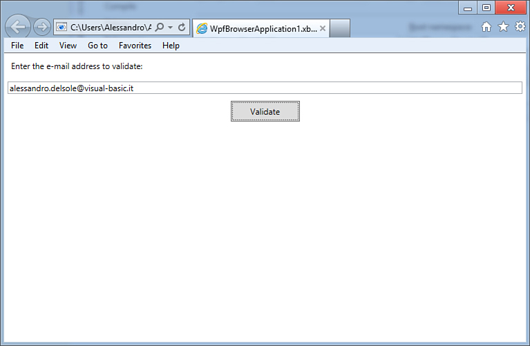
Figure 28.21. The WPF Browser Application running in the default web browser.
When the application is launched from the Visual Studio debugger, the default web browser is launched and points to the application.
Deploying an XBAP is a task that you should perform through ClickOnce. This technology, which is covered in Chapter 52, “Deploying Applications with ClickOnce,” is perfect for this purpose because it can deploy the application to a web server, manage CAS settings, and deploy an application as “online” (a required scenario for XBAPs). Finally, ClickOnce cannot install assemblies to the GAC, and thus you can be sure that the target machine will not be affected.
Summary
In this chapter you took a first look at the Windows Presentation Foundation technology. You saw what WPF is and how it is architected. You then saw how to create your first WPF application with Visual Studio 2012, getting a high-level introduction of the XAML markup language and the interaction with managed code. For the architecture, you learned about some concepts such as the Logical Tree and the Visual Tree. For the Visual Tree, understanding this led you to another key concept: routed events. These events enable the generating of cascade events through the hierarchical structure of the user interface. After this, you made a contact with WPF, understanding how you arrange controls within panels, getting also a first overview of all available panels. Last, you saw another kind of client application in action with WPF: Browser Applications. You saw how this kind of application can run within a web browser, although with some limitations due to their nature. With these basics, you are now ready to take some more control over WPF. This is the goal of the next chapters.