
Chapter 36. Building Rich Internet Applications with Silverlight 5
In This Chapter
• Creating Silverlight Projects with Visual Basic 2012
• Adding Controls and Handling Events
• Introducing Navigation Applications
• Introducing WCF RIA Services
• “Out of Browser” Applications
The evolution of the Internet over the years has had the consequence of requiring web applications to be even more powerful and interactive, with the addition of multimedia, animations, high-quality graphics, and even business capabilities. Although powerful for its business productivity, ASP.NET has lacked in terms of interactivity and media features. If you think of the Adobe Flash plug-in for a web browser, you’ll have a good idea of how multimedia and interactivity can improve the success of web applications. A few years ago, Microsoft realized that it should create a plug-in for a web browser with media, interactivity, and business features for the .NET platform integrating the coolest WPF graphic characteristics into web applications produced on the robust ASP.NET platform. This is where Microsoft Silverlight comes in. In this chapter you learn about building rich Internet applications (RIAs) with Silverlight and Visual Basic 2012 and take a tour of the most important features of this technology. You also learn about the most important new features in version 5 (for a full list of additions, check out the MSDN documentation at: http://msdn.microsoft.com/en-us/library/gg986857(v=vs.95).aspx). This chapter is also important because the overview you get of Silverlight here will be particularly useful in Chapter 38, “Building Apps for Windows Phone 7.5,” where you learn that developing for that device relies on a specific version of Silverlight 4.
Introducing Silverlight
Microsoft Silverlight is a cross-browser, cross-platform, and cross-device plug-in for building rich Internet applications that offers the best from WPF and ASP.NET. Silverlight is a plug-in for web browsers that needs to be installed on the client side to run new generation web applications, and its size is about 5 megabytes. By installing Silverlight, you allow your web browser to run cool applications where data access, multimedia, and rich contents can be linked together. As you see later in this chapter, developing Silverlight applications can be easier if you are already familiar with WPF. Silverlight can be considered as a WPF subset for the web, meaning that you can create the user interface with XAML and write Visual Basic code to execute the application tasks. Before continuing to read this chapter, you need to install the Silverlight plug-in and the latest updates of the Visual Studio tools. You need the following components:
• Silverlight tools for Visual Studio—This installs the Silverlight runtime and enables the IDE to the Silverlight development. These tools are included in the Visual Studio 2012 setup, so you should not need to install them manually. It is worth mentioning that such tools are also available for Visual Studio 2010 with Service Pack 1 as a separate download from http://silverlight.net.
• Silverlight Toolkit (http://silverlight.codeplex.com)—This contains additional user controls to improve your development experience.
This chapter focuses on Silverlight 5, which is the latest (and probably the last) version available. What makes Silverlight so powerful is that you can still write code the way you know, thus taking advantage of your existing .NET Framework and Visual Basic skills without the need to write in different languages and on different technologies.
The HTML5 Story
There has been an incredible growth of the diffusion of mobile devices in the last years, such as smartphones and tablet devices, with different operating systems, different hardware, different requirements, and different audiences targeted, but all of them have one thing in common—making it easy to browse the Internet and connect with social networks. So web designers and web application developers know that their websites must run on a plethora of platforms, which means being portable. Plug-ins like Microsoft Silverlight and Adobe Flash Player are not portable, or at least they are only partially portable because they can run on different operating systems but not on all operating systems. They can run on some web browsers but not on all available web browsers, neither can they run on all the various hardware available today. For all these reasons, HTML has come back as the preferred choice for building web applications because it is the only language supported everywhere. Microsoft is strongly investing in HTML5 and JavaScript to enable developers to build rich web applications that are as portable as possible. In summary, if you plan to build web applications that run on Windows and Apple machines, Silverlight is still a reasonable and valid choice. But if your need is building rich Internet applications that not only run on Windows and Apple, but also on iPad, iPhone, Android devices, and Windows 8 devices, you are strongly encouraged to have a look at the HTML5/JavaScript pair (or at ASP.NET for more business-oriented applications).
Creating Silverlight Projects with Visual Basic 2012
One of the greatest benefits of Microsoft Silverlight is that you can create applications with Visual Basic 2012 the same way you create .NET applications. When you select File, New Project in the New Project dialog box, you have a project templates folder named Silverlight and a number of available project templates, as shown in Figure 36.1.
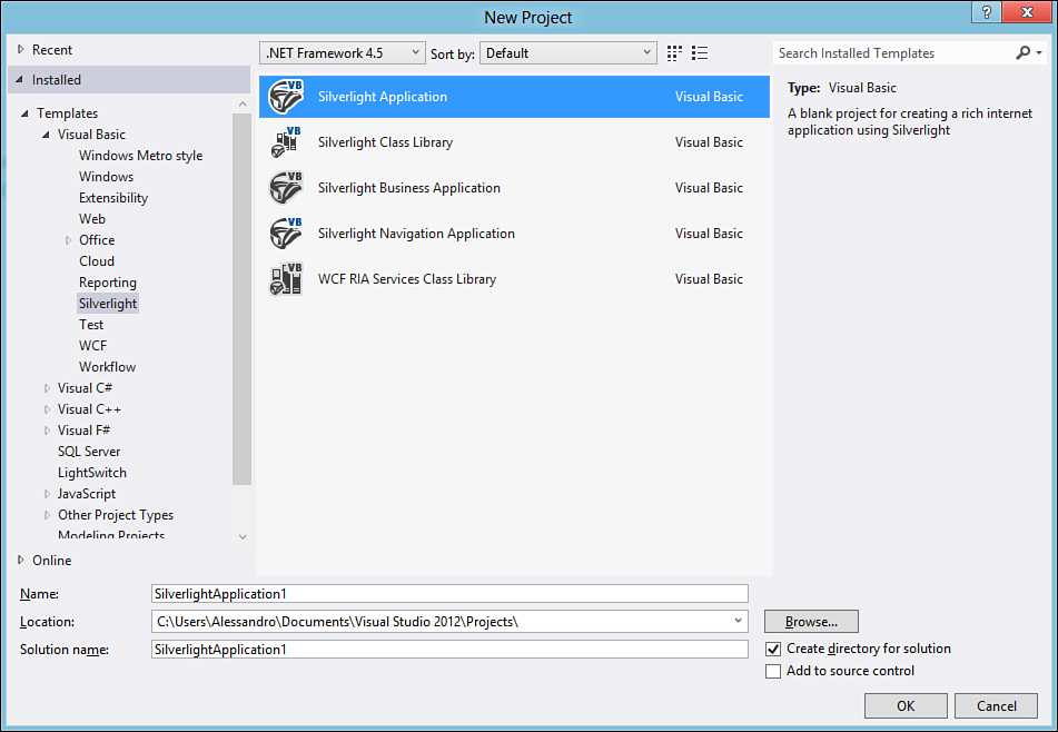
Figure 36.1. Selecting a Silverlight project template.
The project template for general purposes is the Silverlight Application. Ensure this is selected and then follow these steps:
1. Leave the project name unchanged, and then click OK.
2. You will be asked to specify how the new Silverlight application will be hosted. Silverlight applications are based on user controls that need to be hosted by an ASP.NET web application, such as a website or an MVC application. Also you can host your Silverlight applications inside existing web applications instead of specifying a new one. When the dialog box appears, leave the default selection on a new web application unchanged (see Figure 36.2 for details). Notice how you can also select the Silverlight runtime version and enable the application for RIA Services, which is introduced later in this chapter. Click OK.
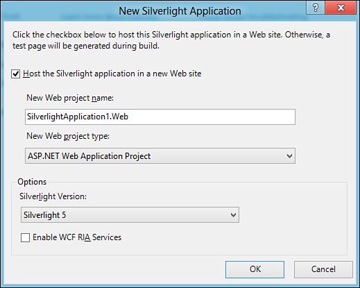
Figure 36.2. Specifying a host project and runtime version.
After a few seconds, the new project is ready. Visual Studio now looks similar to WPF projects, as demonstrated in Figure 36.3.
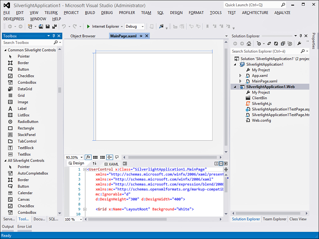
Figure 36.3. The IDE is ready on the new Silverlight project.
There are several differences from WPF; first, in the XAML code editor, the root element is a UserControl. This is because you essentially develop Silverlight controls to be hosted by an ASP.NET application. Next, notice the presence of two projects in Solution Explorer. The first one is the actual Silverlight application, which will be executed on the client side. The structure of the project is similar to WPF projects, with XAML files and Visual Basic code behind files.
Silverlight applications work within a web context, although the current version has full-trust support. Considering web limitations imposed by the Silverlight Base Class Library (BCL), you will see several similarities with the WPF programming model (such as user interface elements and user controls); this is the reason multiple chapters were devoted about WPF.
The second project is the web application that hosts the Silverlight user control. Notice the presence of a .js file that contains the JavaScript code that makes the control reachable from the ASP.NET application. Also, an .aspx web page shows the Silverlight control, and an HTML page exists for hosting the Silverlight application for testing. When you have your project, you are ready to add and manage user interface (UI) elements.
Adding Controls and Handling Events
Adding controls and UI elements to a Silverlight user control is an easy task and looks like what was already described about WPF. While you go through adding controls, you can also notice how Silverlight properties are in most cases the same as WPF properties. Replace the Background property value in the main Grid from White to SteelBlue. This provides better visibility of the user control in the web browser. You can still apply brushes as in WPF. Next, add a TextBlock control and place it at the top of the user control. Set its properties so that the foreground color is white and the font size is 24. Finally, drag a Button control from the toolbox onto the user control surface. Also notice how Visual Studio also generated the appropriate XAML code for each of the operations accomplished. To handle events, you still write event handlers as you are used to doing in other .NET applications. In this case, double-click the Button and write the following simple handler:
Private Sub Button1_Click(ByVal sender As System.Object,
ByVal e As System.Windows.RoutedEventArgs) _
Handles Button1.Click
MessageBox.Show("You clicked a Silverlight button!")
End Sub
It is important that Silverlight still offers the routed events infrastructure as in WPF, so handling events in both technologies is identical. It is worth mentioning that Silverlight 5 adds support for multiclick events. This means you can determine how many clicks have been made over a control and decide to take an action based on the number of clicks. The following code provides an example:
Private Sub Button1_MouseLeftButtonUp(sender As Object, e As MouseButtonEventArgs) _
Handles Button1.MouseLeftButtonUp
Select Case e.ClickCount
Case Is = 1
'One click, take an action here...
Case Is = 2
'Double-click, this should be the default...
Case Is = 3
'Triple-click, take a different action...
End Select
End Sub
You check the value of the MouseButtonEventArgs.ClickCount property to determine how many clicks the control has received. The MouseButtonEventArgs class is not available for the Click event—only with MouseLeftButtonUp, MouseLeftButtonDown, MouseDown, MouseUp, MouseRightButtonUp, and MouseRightButtonDown. Now press F5 to start the application with an instance of the Visual Studio debugger attached. Figure 36.4 shows how the application runs inside the web browser.
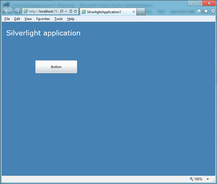
Figure 36.4. The Silverlight application running.
New features in Silverlight 5 enable you to customize lines of text within TextBlock and TextBox controls. With the CharacterSpacing property, you can specify the distance between characters; such a distance is measured by the 1000th of the current font size. This means that if your font is 24 and you specify a distance of 200, it will be (24 * 200)/1000 = 4.8 pixel. The following code shows an example:
<TextBlock Height="45" CharacterSpacing="200"
Name="TextBlock1" Text="Silverlight application"
FontSize="24" Foreground="White" />
You can also specify the line height with the LineHeight property in multiline text controls and, differently from CharacterSpacing, it is measured in pixels. It works like this:
<TextBlock Margin="5" LineHeight="30">
Lorem ipsum dolor sit amet, consectetur adipiscing elit.
<LineBreak />
Lorem ipsum dolor sit amet, consectetur adipiscing elit.
<LineBreak />
Lorem ipsum dolor sit amet, consectetur adipiscing elit.
</TextBlock>
A technique called Line Stacking Strategy is also available and allows you to specify how each line is formatted. The following code provides an example:
<TextBlock Margin="25" FontSize="12">
Lorem ipsum <Span FontSize="20">dolor sit amet</Span>, ...
<LineBreak />
Proin aliquam augue quis ipsum <Span FontSize="38">rhoncus</Span> ...
<LineBreak />
Quisque eleifend ante vitae velit vehicula luctus. ...
</TextBlock>
Next, you use a Span element within each LineBreak and specify the FontSize and other properties such as LineHeight. Now that you have built and run your first rich Internet application and learned a bunch of new features of Silverlight 5 for text controls, you need to learn how Silverlight applications are packaged and deployed.
How Silverlight Applications Are Packaged
When you create a Silverlight application, in the web host project is a folder named ClientBin. When you compile the project, this folder contains the build output of the Silverlight client project (not the web project). For this, you need to know that Silverlight applications are packaged into .xap files, which contain the actual application and its resources. Thus, when the build process is complete, the ClientBin folder contains the generated .xap file. When you run the application by pressing F5, it will be packaged and deployed on the local file system and will be hosted by the ASP.NET development server so that you can run it in your web browser. Because of all these operations, you can deploy the application with existing web deploying techniques.
Deploying Silverlight Applications
Silverlight applications are hosted inside an ASP.NET web application, so to publish a Silverlight application, you follow the same rules as for ASP.NET. For instance, you can right-click the web project in Solution Explorer and then select Publish from the pop-up menu.
Playing Media
As in WPF, Silverlight provides its implementation of the MediaElement control that enables media reproduction and streaming from networks. This means that you can interact with the control the same way as in WPF. Right-click the Silverlight project in Solution Explorer and then select Add New Item. (You could also create a new project from scratch, but you need to know how to change the default page.) In the dialog box, select the Silverlight User Control item template, as shown in Figure 36.5.
Figure 36.5. Adding a new user control.
The goal of the example is implementing a basic media player. When ready, write the XAML code shown in Listing 36.1—notice how the implementation is identical to WPF.
Listing 36.1. Implementing a Basic Media Player with Silverlight
<UserControl x:Class="SilverlightApplication1.MediaPlayerControl"
xmlns="http://schemas.microsoft.com/winfx/2006/xaml/presentation"
xmlns:x="http://schemas.microsoft.com/winfx/2006/xaml"
xmlns:d="http://schemas.microsoft.com/expression/blend/2008"
xmlns:mc="http://schemas.openxmlformats.org/markup-compatibility/2006"
mc:Ignorable="d"
d:DesignHeight="300" d:DesignWidth="400">
<Grid x:Name="LayoutRoot" Background="White">
<Grid.RowDefinitions>
<RowDefinition/>
<RowDefinition Height="40"/>
</Grid.RowDefinitions>
<!-- Set the MediaElement.Source property
pointing to a video on a web server-->
<MediaElement Grid.Row="0" Name="Media1"
Source="http://www.mywebsite.com/MyVideo.wmv"/>
<StackPanel Grid.Row="1" Orientation="Horizontal">
<StackPanel.Resources>
<!—Using a style for buttons—>
<Style x:Key="ButtonStyle" TargetType="Button">
<Setter Property="Width" Value="80"/>
<Setter Property="Height" Value="30"/>
<Setter Property="Margin" Value="5"/>
</Style>
</StackPanel.Resources>
<Button Name="PlayButton" Style="{StaticResource ButtonStyle}"
Content="Play"/>
<Button Name="PauseButton" Style="{StaticResource ButtonStyle}"
Content="Pause"/>
<Button Name="StopButton" Style="{StaticResource ButtonStyle}"
Content="Stop"/>
</StackPanel>
</Grid>
</UserControl>
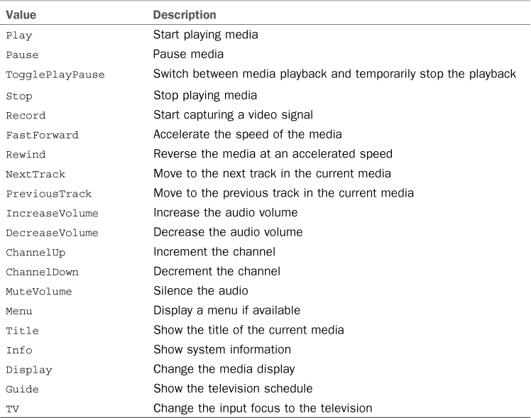
Just remember to assign the MediaElement.Source property with a valid media content address from a web server. Before implementing reproduction capabilities, it is worth mentioning that Silverlight 5 introduces support for remote control devices via the System.Windows.Media.MediaCommand enumeration and the MediaElement.MediaCommand event. Assuming your hardware supports receiving signals from remote controls, when a remote control sends a command to the Silverlight application, the MediaElement.MediaCommand is raised. This stores information inside an instance of the MediaCommandEventArgs class, including a property of type MediaCommand that determines the action sent from the remote device. Table 36.1 summarizes the list of values exposed by such an enumeration.
Table 36.1. Values of the System.Windows.Media.MediaCommands Enumeration
Now switch to the code-behind file and write the Visual Basic code shown in Listing 36.2 that can provide reproduction capabilities.
Listing 36.2. Enabling the Media Player to Content Reproduction
Partial Public Class MediaPlayerControl
Inherits UserControl
Public Sub New()
InitializeComponent()
End Sub
'If you plan to set the MediaElement.Source property
'in code, ensure its value is not Nothing
Private Sub PlayButton_Click(ByVal sender As System.Object,
ByVal e As System.Windows.
RoutedEventArgs) Handles PlayButton.Click
Me.Media1.Play()
End Sub
Private Sub PauseButton_Click(ByVal sender As System.Object,
ByVal e As System.Windows.
RoutedEventArgs) Handles PauseButton.Click
Me.Media1.Pause()
End Sub
Private Sub StopButton_Click(ByVal sender As System.Object,
ByVal e As System.Windows.
RoutedEventArgs) Handles StopButton.Click
Me.Media1.Stop()
End Sub
Private Sub Media1_MediaFailed(ByVal sender As Object,
ByVal e As System.Windows.
ExceptionRoutedEventArgs) Handles Media1.
MediaFailed
MessageBox.Show(e.ErrorException.Message)
End Sub
Private Sub Media1_MediaCommand(sender As Object,
e As MediaCommandEventArgs) Handles Media1.MediaCommand
Select Case e.MediaCommand
Case Media.MediaCommand.Play
Me.Media1.Play()
Case Media.MediaCommand.Stop
Me.Media1.Stop()
Case Media.MediaCommand.Pause
Me.Media1.Pause()
End Select
End Sub
End Class
Notice that only a few values from the MediaCommand enumeration have been handled here due to a limited number of features that the sample media player is offering. However, you are free to extend the code with additional values. Figure 36.6 shows new user control after implementing the user interface.
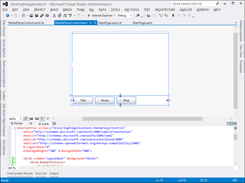
Figure 36.6. The new media player control within the Visual Studio Designer.
Before running the application, you need to replace the startup object with the new user control. You do this by replacing the code in the Application.Startup event handler available in the App.xaml.vb code file. The original event handler looks like this:
Private Sub Application_Startup(ByVal o As Object,
ByVal e As StartupEventArgs) _
Handles Me.Startup
Me.RootVisual = New MainPage()
End Sub
The RootVisual property (of type UIElement) represents the root element in the user interface and is assigned with an instance of the desired page. According to this, replace the RootVisual assignment as follows:
Me.RootVisual = New MediaPlayerControl
Finally, ensure that you have supplied a valid media URL for the MediaElement.Source property and then run the application by pressing F5 to play/pause/stop the media file. Notice that Silverlight’s version of the MediaElement control cannot play all media directly; instead, it supports only some specific encoding formats, which are described in detail at the following MSDN page: http://msdn.microsoft.com/en-us/library/cc189080(VS.95).aspx.
Capturing Camera
Silverlight 4 introduced interesting graphic APIs that enable accessing the webcam installed on your machine and microphone so that you can capture the cam output. These APIs are still available in Silverlight 5, and you can use them to enrich your media applications. You can check out the MSDN documentation about the System.Windows.Media.VideoCaptureDevice class and the following article written by the author of this book: “Using Silverlight 4 APIs to Interact with Webcams and Microphones,” available at http://www.informit.com/articles/article.aspx?p=1608134.
Silverlight 5 has also some new and interesting features for media reproduction. For instance, you can easily control the media speed by using the PlaybackRate property:
'Normal speed
Me.Media1.PlaybackRate = 1
'5 times faster
Me.Media1.PlaybackRate = 5
'2 times slower
Me.Media1.PlaybackRate = -2
Now you also have an opportunity of playing low-latency audio files—that is, .wav files, without the need of complex conversion operations. This is possible because Silverlight 5 includes libraries from the XNA Game Studio platform, so you just need to add a reference to the Microsoft.Xna.Framework.dll assembly. The following code demonstrates how to play a .wav file directly (this requires an Imports Microsoft.Xna.Framework.Audio directive):
'Replace with a valid .wav file Uri
Dim resource As StreamResourceInfo = Application.GetResourceStream _
(New Uri("tada.wav",UriKind.RelativeOrAbsolute))
Dim effect As SoundEffect = SoundEffect.FromStream(resource.Stream)
effect.Play()
With a few lines of code, you can play a .wav file without the need of a complex analysis and elaboration of the file itself, as happened in the previous versions of Silverlight.
Animating UI Elements
Silverlight enables animating elements in the user interface similarly to what happens in WPF, so this section provides a brief and fast description of animations. Read Chapter 30, “Brushes, Styles, Templates, and Animations in WPF,” for further details. Several kinds of animations are available, such as DoubleAnimation, PointAnimation, and ColorAnimation. They all come from the System.Windows.Media.Animations namespace. To understand how animations work in Silverlight, look at the code shown in Listing 36.3.
Listing 36.3. Implementing Double Animations
<UserControl x:Class="SilverlightApplication1.AnimatingUIElements"
xmlns="http://schemas.microsoft.com/winfx/2006/xaml/presentation"
xmlns:x="http://schemas.microsoft.com/winfx/2006/xaml"
xmlns:d="http://schemas.microsoft.com/expression/blend/2008"
xmlns:mc="http://schemas.openxmlformats.org/markup-compatibility/2006"
mc:Ignorable="d"
d:DesignHeight="300" d:DesignWidth="400">
<Grid x:Name="LayoutRoot" Background="White">
<Grid.ColumnDefinitions>
<ColumnDefinition/>
<ColumnDefinition/>
</Grid.ColumnDefinitions>
<!-- Replace with a valid image file -->
<Image Grid.Column="0" Name="Image1"
Source="/SilverlightApplication1;component/Images/AnImageFile.jpg">
<Image.RenderTransform>
<TransformGroup>
<SkewTransform x:Name="SkewImage"/>
<ScaleTransform x:Name="ScaleImage"/>
</TransformGroup>
</Image.RenderTransform>
<Image.Triggers>
<EventTrigger RoutedEvent="Image.Loaded">
<EventTrigger.Actions>
<BeginStoryboard>
<Storyboard x:Name="ImageStoryBoard">
<DoubleAnimation Storyboard.TargetName="SkewImage"
Storyboard.TargetProperty="AngleY"
From="0" To="15" Duration="0:0:3"
AutoReverse="True"
RepeatBehavior="Forever" />
<DoubleAnimation Storyboard.TargetName="ScaleImage"
Storyboard.TargetProperty="ScaleX"
From="1" To="0.3" Duration="0:0:3"
AutoReverse="True"
RepeatBehavior="Forever" />
<DoubleAnimation Storyboard.TargetName="ScaleImage"
Storyboard.TargetProperty="ScaleY"
From="1" To="0.3" Duration="0:0:3"
AutoReverse="True"
RepeatBehavior="Forever" />
</Storyboard>
</BeginStoryboard>
</EventTrigger.Actions>
</EventTrigger>
</Image.Triggers>
</Image>
<TextBlock Grid.Column="1" Text="Animated Text" FontSize="24"
FontFamily="Verdana" FontWeight="Bold"
HorizontalAlignment="Center"
VerticalAlignment="Center" RenderTransformOrigin="0.5 0.5">
<TextBlock.Foreground>
<LinearGradientBrush>
<GradientStop Offset="0" Color="Red" />
<GradientStop Offset="0.5" Color="Yellow" />
<GradientStop Offset="1" Color="Orange"/>
</LinearGradientBrush>
</TextBlock.Foreground>
<TextBlock.RenderTransform>
<TransformGroup>
<RotateTransform x:Name="RotateText" />
<SkewTransform x:Name="SkewText"/>
</TransformGroup>
</TextBlock.RenderTransform>
<TextBlock.Triggers>
<EventTrigger RoutedEvent="TextBlock.Loaded">
<BeginStoryboard>
<Storyboard x:Name="TextAnimation">
<DoubleAnimation Storyboard.TargetName="RotateText"
Storyboard.TargetProperty="Angle"
From="0" To="360" Duration="0:0:5"
RepeatBehavior="Forever" />
<DoubleAnimation Storyboard.TargetName="SkewText"
AutoReverse="True"
Storyboard.TargetProperty="AngleX"
From="0" To="45" Duration="0:0:5"
RepeatBehavior="Forever" />
</Storyboard>
</BeginStoryboard>
</EventTrigger>
</TextBlock.Triggers>
</TextBlock>
</Grid>
</UserControl>
You can specify some transformations for user interface elements you want to animate, and then you can establish the event that will launch the animation with an EventTrigger element within a Control.Triggers property node. The actual animation is provided by a StoryBoard object that contains one or more DoubleAnimation objects to animate the desired transformations. Figure 36.7 shows the result of the animation running.
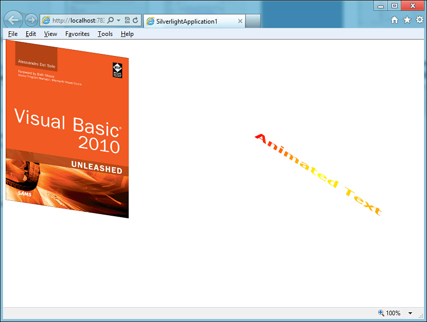
Figure 36.7. Animations in action.
Silverlight 5 and 3-D Graphics
Silverlight 5 introduces for the first time the support for 3D graphics. This is an extraordinary addition that reduces the gap with WPF even more and is made possible via a number of libraries that are part of the Microsoft XNA Game Studio platform, which are also included in Silverlight 5’s runtime. You can find additional information in the MSDN documentation at http://msdn.microsoft.com/en-us/library/gg197424(v=XNAGameStudio.35).aspx.
Introducing Navigation Applications
Silverlight enables you to create applications for the Web, and in most cases a web application is not made of just one page. To provide support for navigation between pages, in a master page/details pages approach, Silverlight offers an infrastructure called Navigation Framework. This offers the capability of having a master page and then navigating different pages with different user controls. To create a navigation application, select File, New Project and then the Silverlight Navigation Application project template in the Silverlight templates folder, as shown in Figure 36.8.
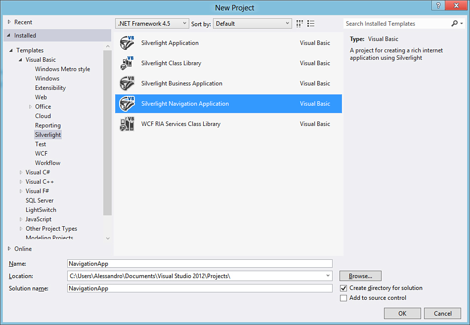
Figure 36.8. Creating a new navigation application.
When the project is ready, you can notice that the main page offers a page skeleton with borders and buttons. This can be considered as the master page. If you take a look at the XAML code, you notice the presence of the following lines, among others:
<navigation:Frame x:Name="ContentFrame"
Style="{StaticResource ContentFrameStyle}"
Source="/Home"
Navigated="ContentFrame_Navigated"
NavigationFailed="ContentFrame_NavigationFailed">
<navigation:Frame.UriMapper>
<uriMapper:UriMapper>
<uriMapper:UriMapping Uri="" MappedUri="/Views/Home.xaml"/>
<uriMapper:UriMapping Uri="/{pageName}"
MappedUri="/Views/{pageName}.xaml"/>
</uriMapper:UriMapper>
</navigation:Frame.UriMapper>
</navigation:Frame>
The System.Windows.Controls namespace provides a Frame control that has an infrastructure for navigating between pages via a relative Uri that contains the folder and filename for the page to be browsed. This is accomplished by setting properties in the Frame.UriMapper property. Among the number of files in the project, pages are stored in the Views subfolder. A couple of predefined pages are available, such as Home.xaml and About.xaml. The goal is now showing how you can add and browse a new page. Right-click the Views subfolder and select Add New Item. When the dialog box appears, select the Silverlight Page item template in the Silverlight folder and leave the Page1.xaml filename unchanged. When the new page is ready, add a simple text message to the main grid:
<Grid x:Name="LayoutRoot">
<TextBlock Text="This is a secondary page"
FontSize="32"/>
</Grid>
This is just a simple sample, but this is the place where you can provide your complex user interface. Now go back to the MainPage.xaml file and add the following button just above the other ones:
<HyperlinkButton x:Name="CustomLink" Style="{StaticResource LinkStyle}"
NavigateUri="/Page1" TargetName="ContentFrame"
Content="page1"/>
This can take advantage of an existing style for hyperlinked buttons and launch the new page specified via the NavigateUri property. What happens behind the scenes when you require browsing a new page is determined by the ContentFrame_Navigated event handler that appears as follows in the code-behind file:
Private Sub ContentFrame_Navigated(ByVal sender As Object,
ByVal e As NavigationEventArgs) Handles ContentFrame.Navigated
For Each child As UIElement In LinksStackPanel.Children
Dim hb As HyperlinkButton = TryCast(child, HyperlinkButton)
If hb IsNot Nothing AndAlso hb.NavigateUri IsNot Nothing Then
If hb.NavigateUri = e.Uri Then
VisualStateManager.GoToState(hb, "ActiveLink", True)
Else
VisualStateManager.GoToState(hb, "InactiveLink", True)
End If
End If
Next
End Sub
The code gets the instance of HyperlinkButton controls and invokes the GoToState method to browse the specified page inside the Frame control. Now run the application by pressing F5. When ready, click the page1 hyperlink at the top of the page. This redirects to the new custom page, as shown in Figure 36.9.
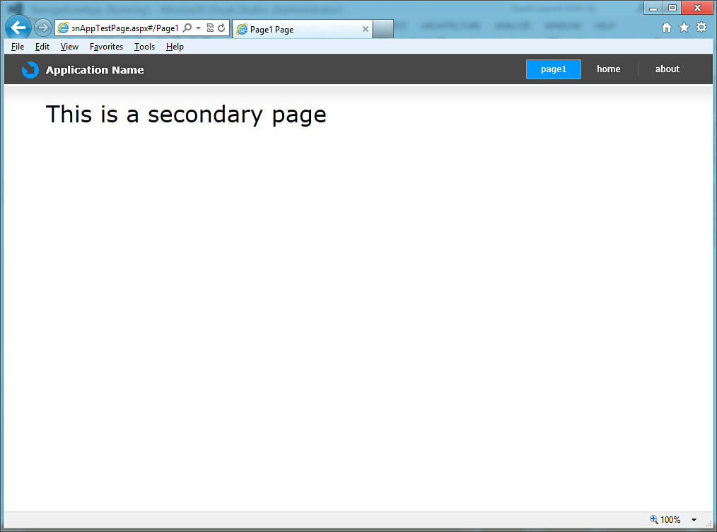
Figure 36.9. The custom page being browsed via the navigation framework.
Take a look at the Uri in the address bar of your web browser and look how it is formed by the relative path of the loaded page separated by a # symbol. Click Home or About to show predefined pages or go back to Visual Studio for editing your code and adding new custom pages. Finally, you can press the back and forward buttons in your browser to navigate pages. This is possible thanks to the System.Windows.Navigation.NavigationService object that provides, behind the scenes, support for browsing and loading pages into the Frame and for maintaining the URL history. Another important class in navigation applications is System.Windows.Navigation.NavigationContext, which is responsible for keeping track of the page context such as the URL and parameters passed in query string.
Introducing WCF RIA Services
WCF RIA Services (formerly known as .NET RIA Services) are a specific framework, offered by the System.Windows.Controls.Ria.dll assembly, for exposing data through networks that can then be consumed by Silverlight applications and that typically are implemented as a middle-tier for business applications. In this section you learn how to create a Silverlight business application consuming data from an Entity Data Model (EDM) exposed through RIA Services.
WCF RIA Services provide a well-structured and fast way of building line-of-business applications, but they are not the only way you can access data from Silverlight. Generally speaking, you can implement your logic within a WCF service and expose data that a Silverlight application can consume, such as Entity Data Models or LINQ to SQL models.
To create a business application based on WCF RIA Services, create a new project by selecting the Silverlight Business Application project template, as shown in Figure 36.10.
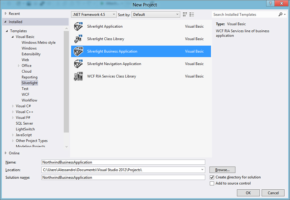
Figure 36.10. The WCF RIA Services project template.
Name the new project as NorthwindBusinessApplication and click OK. When the project is ready, in Solution Explorer you notice a plethora of files and folders. This is because RIA Services projects have an interesting structure based on models and views, other than providing login and authentication infrastructure. Also, when opening the designer, the new project is based on the navigation application template as described in the previous section, so this can help you build complex user interfaces. The first thing to do now is add a data source containing data you want to expose through the network.
Adding the Data Source
To add a data source based on the Northwind database (used in several other code examples in this book), follow these steps:
1. Right-click the NorthwindBusinessApplication.Web project and select Add New Item; in the dialog box, select the ADO.NET Entity Data Model template, name it Northwind.edmx, and click OK.
2. When the wizard starts, choose to generate the model from an existing database, and then select the Northwind database available on SQL Server as the data source.
3. When the list of database objects is available, select at least the Orders table and then click Finish.
4. Very important: because in Visual Studio 2012 by default Entity Data Models are based on the DbContext class instead of the ObjectContext class, and because at the moment WCF RIA Services do not support the DbContext, you have to change the model generation so that the ObjectContext is used. This can be done by right-clicking the Entity Data Model’s designer and then selecting Properties; then you change the value of the Code Generation Strategy property from None to Default. Finally, in Solution Explorer you have to expand the .edmx file and remove both .tt files. When you rebuild the project, the Entity Data Model will re-generate code files based on the ObjectContext class.
Tip
The web application project represents the server-side application that exposes data through services. Remember that Silverlight applications act on the client side and will consume data from services, so this is why you just added the data model (and will add domain services) to the server-side application.
You now have a data source you can expose. Remember to build the project, so that it will be updated with references to the new EDM. As a final note, remember that Silverlight has full support for the Model-View-ViewModel (MVVM) pattern because it has been exposing the ICommand interface since version 4. In this chapter, we do not cover the MVVM pattern because we prefer to show how Silverlight works rather than discussing scenarios that are not specific to this technology; anyway you got a brief example of creating an MVVM-based Silverlight application when we talked about the Portable Class Library projects in Chapter 17, “Creating Objects: Visual Tools and Portable Libraries.”
Adding the Domain Service Class
To make the data model consumable from clients, you need to implement your business logic. In WCF RIA Services-based applications, this is accomplished by implementing a Domain Service Class. Such kinds of classes inherit from LinqToEntitiesDomainService(Of T) and expose queries and methods for performing create/read/update/delete (CRUD) operations and can contain other custom logic. To add one, right-click the Services folder and select Add New Item. In the Add New Item dialog box, select the Domain Service Class template and name it OrdersDomainService.vb. The goal is to provide logic for accessing the Orders entity set (see Figure 36.11).
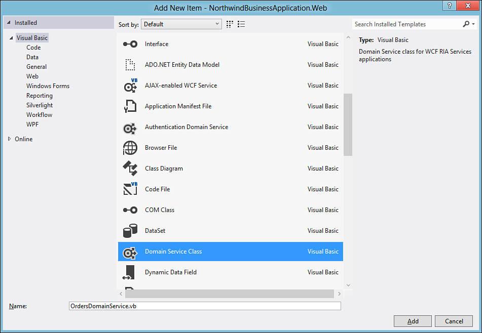
Figure 36.11. The item template for adding a domain service class.
At this point, the IDE requires you to specify entities you want to be mapped into the domain service class and the access level. Figure 36.12 represents the dialog box that Visual Studio 2012 shows to provide such specifications.
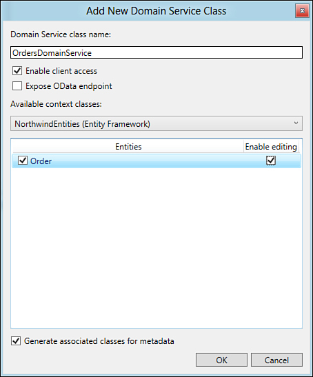
Figure 36.12. Specifying settings for the new domain service class.
Ensure that the Enable Client Access check box is flagged so that Silverlight applications can consume data. Select the entity data model from the combo box, and then choose one or more entities you want to be exposed by the domain service class. Also check the corresponding Enable Editing check box if you want to provide the ability of data editing. After you click OK, Visual Studio generates a domain service class that looks like the code shown in Listing 36.4.
Listing 36.4. The Domain Service Class
Imports System
Imports System.Collections.Generic
Imports System.ComponentModel
Imports System.ComponentModel.DataAnnotations
Imports System.Data
Imports System.Linq
Imports System.Web.DomainServices
Imports System.Web.DomainServices.Providers
Imports System.Web.Ria
Imports System.Web.Ria.Services
'Implements application logic using the NorthwindEntities context.
' TODO: Add your application logic to these methods or in additional methods.
' TODO: Wire up authentication (Windows/ASP.NET Forms) and uncomment the following to disable anonymous access
' Also consider adding roles to restrict access as appropriate.
'<RequiresAuthentication> _
<EnableClientAccess()> _
Public Class OrdersDomainService
Inherits LinqToEntitiesDomainService(Of NorthwindEntities)
'TODO: Consider
' 1. Adding parameters to this method and constraining returned results, and/or
' 2. Adding query methods taking different parameters.
Public Function GetOrders() As IQueryable(Of Order)
Return Me.ObjectContext.Orders
End Function
Public Sub InsertOrder(ByVal order As Order)
If ((order.EntityState = EntityState.Added) _
= false) Then
If ((order.EntityState = EntityState.Detached) _
= false) Then
Me.ObjectContext.ObjectStateManager.
ChangeObjectState(order, EntityState.Added)
Else
Me.ObjectContext.AddToOrders(order)
End If
End If
End Sub
Public Sub UpdateOrder(ByVal currentOrder As Order)
If (currentOrder.EntityState = EntityState.Detached) Then
Me.ObjectContext.AttachAsModified(currentOrder,
Me.ChangeSet.GetOriginal(currentOrder))
End If
End Sub
Public Sub DeleteOrder(ByVal order As Order)
If (order.EntityState = EntityState.Detached) Then
Me.ObjectContext.Attach(order)
End If
Me.ObjectContext.DeleteObject(order)
End Sub
End Class
Listing 36.4 shows how Visual Studio 2012 automatically implements logic for querying, adding, updating, and removing orders in the Orders entity set, working against an instance of the ObjectContext class from the Entity Framework. You can eventually add your own logic or edit the default one. For example, replace the GetOrders default method with the following that sorts orders by customer ID (adding an OrderBy clause is also mandatory if you plan to add data paging as we are going to do in a few minutes):
Public Function GetOrders() As IQueryable(Of Order)
Return Me.ObjectContext.Orders.OrderBy(Function(ord) ord.CustomerID)
End Function
Then add the following simple method for saving changes, remembering that you can use your existing Entity Framework skills:
Public Sub SaveChanges()
Me.ObjectContext.SaveChanges()
End Sub
Comments added by the IDE give you some suggestions to improve the class logic—for example, by providing authentication applying the RequiresAuthentication attribute. When you have the domain service class, which actually returns data, you first need to build the project again; then you are ready to bind such data to the appropriate controls in the user interface.
Data-Binding to Controls
The drag’n’drop data-binding techniques that you saw in WPF are also available in Silverlight projects. This is useful in WCF RIA Services applications because it enables easily generating data-oriented web pages. You now need to add user controls for showing data within the desired page. In the Silverlight project, expand the Views folder and double-click the Home.xaml page. You could consider adding a dedicated page, but for the sake of simplicity, an existing one can do the work the same. When the page is opened inside the Visual Studio designer, build the project and then open the Data Sources window by selecting the Data, Show Data Sources command. In the Data Sources window, you find some business objects produced by the generation of the RIA Services application, including the Order entity. Drag this onto the DataGrid and when you release the mouse, you notice that Visual Studio 2012 has generated the following XAML code:
<riaControls:DomainDataSource AutoLoad="True"
d:DataContext="{d:DesignInstance my:Order,
CreateList=true}" Height="0"
Name="OrderDomainDataSource"
QueryName="GetOrdersQuery" Width="0">
<riaControls:DomainDataSource.DomainContext>
<my:OrdersDomainContext />
</riaControls:DomainDataSource.DomainContext>
</riaControls:DomainDataSource>
<sdk:DataGrid AutoGenerateColumns="False" Height="200"
ItemsSource=
"{Binding ElementName=OrderDomainDataSource,
Path=Data}" Name="OrderDataGrid"
RowDetailsVisibilityMode="VisibleWhenSelected"
Width="400">
<sdk:DataGrid.Columns>
<sdk:DataGridTextColumn x:Name="CustomerIDColumn"
Binding="{Binding Path=CustomerID}"
Header="Customer ID"
Width="SizeToHeader" />
<sdk:DataGridTextColumn x:Name="EmployeeIDColumn"
Binding="{Binding Path=EmployeeID}"
Header="Employee ID" Width="SizeToHeader" />
<sdk:DataGridTextColumn x:Name="FreightColumn"
Binding="{Binding Path=Freight}"
Header="Freight" Width="SizeToHeader" />
<sdk:DataGridTemplateColumn x:Name="OrderDateColumn"
Header="Order Date" Width="SizeToHeader">
<sdk:DataGridTemplateColumn.CellTemplate>
<DataTemplate>
<sdk:DatePicker
SelectedDate=
"{Binding Path=OrderDate,
Mode=TwoWay,
NotifyOnValidationError=true,
TargetNullValue=''}" />
</DataTemplate>
</sdk:DataGridTemplateColumn.CellTemplate>
</sdk:DataGridTemplateColumn>
<sdk:DataGridTextColumn x:Name="OrderIDColumn"
Binding="{Binding Path=OrderID}"
Header="Order ID" Width="SizeToHeader" />
<sdk:DataGridTemplateColumn
x:Name="RequiredDateColumn"
Header="Required Date" Width="SizeToHeader">
<sdk:DataGridTemplateColumn.CellTemplate>
<DataTemplate>
<sdk:DatePicker
SelectedDate=
"{Binding Path=RequiredDate,
Mode=TwoWay,
NotifyOnValidationError=true,
TargetNullValue=''}" />
</DataTemplate>
</sdk:DataGridTemplateColumn.CellTemplate>
</sdk:DataGridTemplateColumn>
<sdk:DataGridTextColumn x:Name="ShipAddressColumn"
Binding="{Binding Path=ShipAddress}"
Header="Ship Address" Width="SizeToHeader" />
<sdk:DataGridTextColumn x:Name="ShipCityColumn"
Binding="{Binding Path=ShipCity}"
Header="Ship City" Width="SizeToHeader" />
<sdk:DataGridTextColumn x:Name="ShipCountryColumn"
Binding="{Binding Path=ShipCountry}"
Header="Ship Country" Width="SizeToHeader" />
<sdk:DataGridTextColumn x:Name="ShipNameColumn"
Binding="{Binding Path=ShipName}"
Header="Ship Name" Width="SizeToHeader" />
<sdk:DataGridTemplateColumn
x:Name="ShippedDateColumn"
Header="Shipped Date"
Width="SizeToHeader">
<sdk:DataGridTemplateColumn.CellTemplate>
<DataTemplate>
<sdk:DatePicker
SelectedDate=
"{Binding Path=ShippedDate,
Mode=TwoWay,
NotifyOnValidationError=true,
TargetNullValue=''}" />
</DataTemplate>
</sdk:DataGridTemplateColumn.CellTemplate>
</sdk:DataGridTemplateColumn>
<sdk:DataGridTextColumn
x:Name="ShipPostalCodeColumn"
Binding="{Binding Path=ShipPostalCode}"
Header="Ship Postal Code"
Width="SizeToHeader" />
<sdk:DataGridTextColumn
x:Name="ShipRegionColumn"
Binding="{Binding Path=ShipRegion}"
Header="Ship Region"
Width="SizeToHeader" />
<sdk:DataGridTextColumn
x:Name="ShipViaColumn"
Binding="{Binding Path=ShipVia}"
Header="Ship Via"
Width="SizeToHeader" />
</sdk:DataGrid.Columns>
</sdk:DataGrid>
The DataGrid is now data-bound to a DomainDataSource control, which is the design-time representation of the domain service class, whereas the DomainDataSource.DomainContext property represents the data context for querying, loading, and submitting data. Notice how, similarly to what happens in Windows Presentation Foundation, the IDE generated DataGrid columns specific for the bound data type. At this point, you must build the project. Further considerations on executing the application are discussed in the next subsection. To make things even better, you can take advantage of the DataPager control, which allows the paging of data and provides better performance. To accomplish this, add the following row definitions to the LayoutRoot grid:
<Grid.RowDefinitions>
<RowDefinition/>
<RowDefinition Height="40"/>
</Grid.RowDefinitions>
Next, drag the DataPager control from the toolbox onto the newly created row in the current page and then edit the code removing all margins and spacing properties, so that it appears like this:
<sdk:DataPager PageSize="10" Grid.Row="1" />
The DataPager also supports the drag’n’drop data-binding, which means you can drag the Orders collection from the Data Sources window onto the control and Visual Studio will automatically bind the data source to the DataPager as well as to the DataGrid. Once you perform this operation, the code looks like the following:
<sdk:DataPager PageSize="10" Grid.Row="1" Source="{Binding Data,
ElementName=OrderDomainDataSource}" />
The PageSize property determines how many items per page are loaded. To make a better example, replace 10 (which is the default) with 50.
Running the Application
After implementing business logic and providing data-binding for UI data controls, you are ready to run the application, so press F5. After a few seconds, you can see how the list of orders is correctly shown within the DataGrid in the Home page and how you can browse data with the DataPager control visible at the bottom of the page, as demonstrated in Figure 36.13.
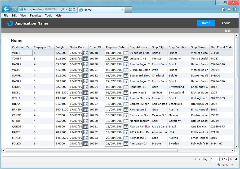
Figure 36.13. The application based on WCF RIA Services shows requested data.
You could create a different page for showing data and making it reachable via the navigation framework, as described in the dedicated section of this chapter.
Filtering Data with the PivotViewer Control
Silverlight 5 introduces a new data-bound control called PivotViewer, which allows displaying data based on some filters and sorting conditions. To understand how it works, add a new page to the project or remove the DataGrid and DataPager control definitions from the home page of the previous example. First, you need a PivotViewer instance that you can drag from the toolbox onto the page in the designer. The control’s definition in the XAML code looks like this:
<sdk:PivotViewer HorizontalAlignment="Left" Margin="0,10,0,0" VerticalAlignment="Top"
Height="430" Width="640" ItemsSource="{Binding Data,
ElementName=OrderDomainDataSource}">
</sdk:PivotViewer>
Then you need a DomainDataSource control, which holds the list of data you want to be shown, in this case the list of orders (if you are editing the previous example you already have an instance):
<riaControls:DomainDataSource x:Name="OrderDomainDataSource" AutoLoad="True"
Height="0" QueryName="GetOrdersQuery" Width="0">
<riaControls:DomainDataSource.DomainContext>
<local:OrdersDomainContext/>
</riaControls:DomainDataSource.DomainContext>
</riaControls:DomainDataSource>
The PivotViewer control requires specifying three things:
• The data source that will be displayed
• Which elements from the data source will be included in the data view
• How elements from the data source will be presented
The first item in the previous bulleted list is represented by the DomainDataSource instance. The second item is represented by a group called PivotViewer.PivotProperties, which contains a number of objects representing columns in the database table. The following code, which you include inside the PivotViewer definition, provides an example:
<sdk:PivotViewer.PivotProperties>
<sdk:PivotViewerStringProperty Id="OID" Options="CanFilter" DisplayName="Order ID"
Binding="{Binding OrderID}" />
<sdk:PivotViewerDateTimeProperty Id="ODate" Options="CanFilter"
DisplayName="Order Date" Binding="{Binding OrderDate}" />
<sdk:PivotViewerStringProperty Id="CID" Options="CanFilter"
DisplayName="Customer ID" Binding="{Binding CustomerID}" />
</sdk:PivotViewer.PivotProperties>
The PivotViewer control has a large number of properties and options, but you need to know how to represent types. The PivotViewerStringProperty object enables you to represent string values, whereas the PivotViewerDateTimeProperty object enables you to represent date/time items. Other available objects are PivotViewerLinkProperty (to show links) and PivotViewerNumericProperty (to show numbers).
Control Properties and Custom Data Representation
Because I can’t cover every possible property available in the PivotViewer control and how to implement custom types presentation, I suggest you have a look at the official MSDN documentation for the control available at http://msdn.microsoft.com/en-us/library/system.windows.controls.pivot.pivotviewer(v=vs.95).aspx.
Notice how every object is data-bound via the Binding markup extension to the specified property in the data source, exactly as you did in the DataGrid control with columns. The third item to supply is how elements from the data source will be presented—an item template. The following group, which you include in the control’s definition and that is taken from the MSDN documentation, represents items from the collection with a blue box and white text:
<sdk:PivotViewer.ItemTemplates>
<sdk:PivotViewerItemTemplate>
<Border Width="200" Height="200" Background="Blue">
<StackPanel Orientation="Vertical">
<TextBlock Text="{Binding OrderID}"
FontSize="16" Foreground="White" />
<TextBlock Text="{Binding OrderDate}"
FontSize="16" Foreground="White" />
<TextBlock Text="{Binding CustomerID}"
FontSize="16" Foreground="White" />
</StackPanel>
</Border>
</sdk:PivotViewerItemTemplate>
</sdk:PivotViewer.ItemTemplates>
If you now run the application, you will see how data can be filtered and sorted based on the columns you specified in code. Figure 36.14 shows an example in which the application displays orders from customer QUEEN for the year 1997.
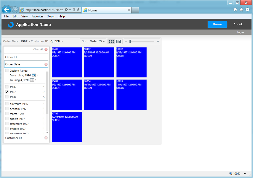
Figure 36.14. Filtering and sorting data with the PivotViewer control.
It is easy to experiment with the various options offered by the control. This is definitely a useful addition to line-of-business applications.
“Out-of-Browser” Applications
You have the possibility of locally installing Silverlight applications so that they can be run in a desktop environment. This kind of application is generally known as “out of browser.” Typically, you use this feature if you want to have a local copy of the application that does not need to be connected to a network for most of its requirements or in particular scenarios in which you need elevated permissions to access local resources. To make a Silverlight application be installable, you need to enable out-of-browser settings. To demonstrate how this works, create a new Silverlight project with Visual Basic 2012. When the new project is ready, in the main page type the following XAML:
<Grid x:Name="LayoutRoot" Background="White">
<StackPanel>
<Button Content="Get status" Height="40"
HorizontalAlignment="Left" Margin="5"
Name="Button1" VerticalAlignment="Top"
Width="150" />
<TextBlock Height="30" HorizontalAlignment="Left"
Margin="5" Name="TextBlock1"
VerticalAlignment="Top" Width="340"
FontSize="16" />
</StackPanel>
</Grid>
The goal is programmatically understanding whether the application is running inside or outside a web browser, so when the user clicks the button, a text message will be shown. Now in the code-behind file, handle the Button.Click event as follows:
Private Sub Button1_Click(ByVal sender As System.Object,
ByVal e As System.Windows.
RoutedEventArgs) Handles Button1.Click
Me.TextBlock1.Text = "Running out of browser: " & _
App.Current.IsRunningOutOfBrowser.ToString
End Sub
The App.Current property, of type Application, provides access to several application-level objects, including some for working with out-of-browser features. The IsRunningOutOfBrowser property returns True or False according to the execution context. Before running the demo application, you need to enable specific settings, so click My Project in Solution Explorer; then ensure the Silverlight tab is selected and check the Enable Running Application out of the Browser check box. Next, click the Out-of-Browser Settings button that launches the same-named dialog box where you can customize settings for your offline application, as shown in Figure 36.15.
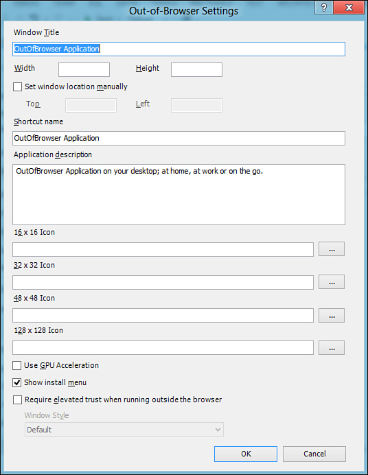
Figure 36.15. Customizing settings for out-of-browser applications.
These settings should be self-explanatory. If you do not want a default icon to be used, you can supply your own. You can also provide a shortcut name because you can choose to add a shortcut to the desktop or to the Start menu to the offline application. Now you can run the application. When ready, click the button so that you can verify that the code can determine that the application is running inside the browser, as shown in Figure 36.16. To install the application locally, right-click in the browser window and select the Install ApplicationName onto This Computer command, as shown in Figure 36.16. At this point, the Install Application dialog box will ask you to specify where you want to place shortcuts for running the application locally, such as the Desktop, the Start menu, or both (see Figure 36.17 for an example).
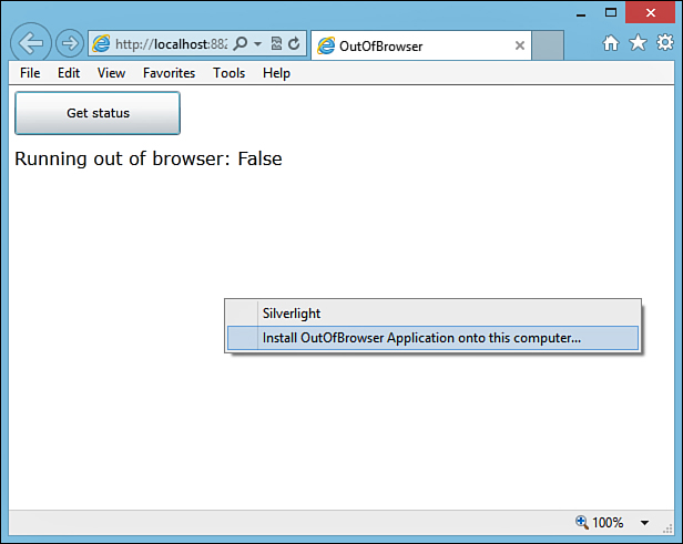
Figure 36.16. Running the application and selecting the local installation option.
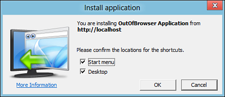
Figure 36.17. Installing the application locally.
After it’s installed, the application will be automatically launched out of the browser. Figure 36.18 shows how the demo application looks. Notice that you can uninstall the application by right-clicking inside the local window and then choosing the Remove command.
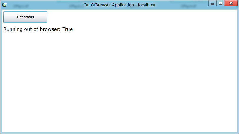
Figure 36.18. The application running out of the browser, locally.
Elevated Permissions and Security Considerations
Silverlight applications are normally considered partial-trust because they run on the Web and therefore cannot access resources on the local machine. This is the default behavior, but Silverlight 4 introduced support for COM Automation, which is particularly useful if you want to interact with Microsoft Office’s applications. Other than COM Automation, Silverlight 4 introduced support for accessing the local file system and printers. All these possibilities require elevated privileges, which is why Silverlight 4 provided out-of-browser applications: by running on the desktop, an application can be full-trust and can interact with local resources. This could be annoying because you needed to deploy your application under the form of a desktop application, losing the benefits of offering your app through the Web. Fortunately, Silverlight 5 removes this limitation, introducing elevated permissions for in-browser applications as well. This new version lets you mark an in-browser application as full-trust, so that it can have elevated permissions and access local resources. To accomplish this, you need to go to the Silverlight’s project properties and enable the Require elevated trust when running In-browser option. This works fine on the development machine, but the application must be signed with a valid X.509 certificate after you publish it.
Accessing the Local File System
With Silverlight 4, an out-of-browser application could access the local file system, but this is true only for folders at the user level such as My Documents or My Music. Attempting to access different folders would result in a SecurityException. This limitation has been removed in Silverlight 5, so now you can access other folders as well, but remember that the application inherits the rights the current user has. So, if the current user does not have enough permissions to access a specified folder, the runtime will throw an exception even if Silverlight 5 has support for the local file system.
XAML Debugging
Probably the most interesting new feature in Silverlight 5 is the possibility of placing breakpoints directly inside the XAML code editor to enable debugging of data-binding assignments. To understand how it works, open the project called NorthwindBusinessApplication that you created while reading the section called “Introducing WCF RIA Services.” Open the Home.xaml file and locate the assignment of the ItemsSource property of the DataGrid control. Select the line of code and press F9. Visual Studio will add a breakpoint on the Binding markup extension, as demonstrated in Figure 36.19.
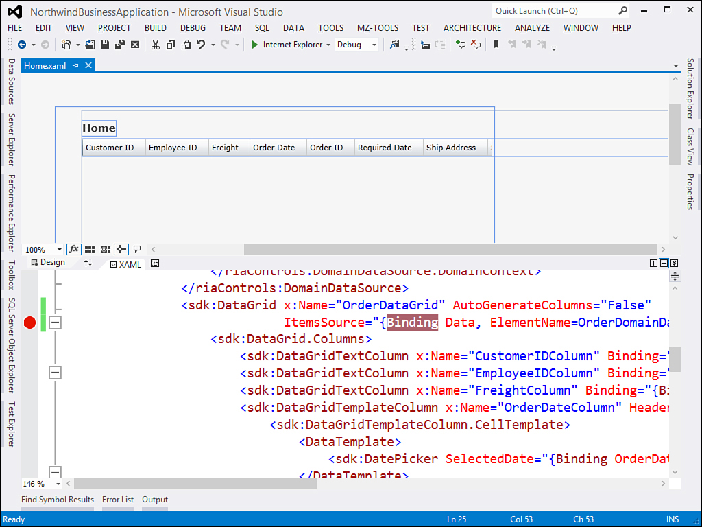
Figure 36.19. XAML debugging with breakpoints.
When you run the application and the runtime starts loading the data, Visual Studio will break the execution on the specified breakpoint. If you open the Locals window, you will see a BindingState value representing the progress of the data-binding operation (see Figure 36.20). This contains a lot of useful information such as the BindingExpression value and the progress of the UpdateTarget operation, or the ValidationErrors collection. You will find the Error value that describes any data-binding error particularly useful because it will help you solve data-binding problems within a convenient debugging environment.
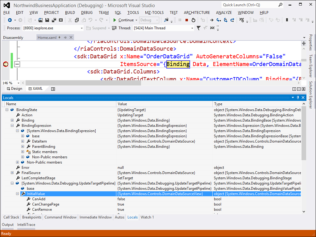
Figure 36.20. The debugger breaks the execution and shows the current state of data-binding.
Additional New Features in Silverlight 5
Following is a list of additional new features in Silverlight 5 that you might find useful and that are described in detail in the MSDN documentation:
• P/Invoke support. With the aforementioned improvements about elevated permissions, Silverlight 5 applications can invoke Windows APIs like any other desktop application. P/Invokes are discussed in Chapter 48, “Platform Invokes and Interoperability with the COM Architecture.”
• Support for 64-bit browsers.
• Support for multiple windows via the Window class.
• Direct support for Windows Azure.
• Performance improvements in several areas such as startup, XAML parsing, and thread contention.
Before completing this chapter, it is very important for you to know that as of today, Microsoft has not yet talked about public plans for a sixth version of Silverlight. With the introduction of Windows 8 and the Windows Runtime, it is reasonable to think that Microsoft will not produce Silverlight 6, even if the current and the previous versions are supported and your investments are still valid.
Summary
In this chapter, you saw that Silverlight is a cross-browser, cross-platform, and cross-device plug-in for building rich internet applications based on the .NET Framework. You found out the many similarities that exist between Silverlight and WPF in both creating projects and in writing code (XAML and Visual Basic). You saw how Silverlight programming is based on the concept of user control and how you add user controls to the user interface and handle events. Next, you learned some common scenarios, such as playing media contents and animations. You also took a tour inside some important features for the business: navigation applications, which provide a framework for browsing pages as if you had master page and subpages, WCF RIA Services, a recent data framework for building business applications, drag’n’drop data-binding, and the new PivotViewer control. You saw how to make an application run on the desktop via the out-of-browser feature that offers the possibility of locally installing a Silverlight application. You also got an overview of security enhancements and how to debug your data-bindings directly in XAML with the support of breakpoints.