Chapter 9. Interpretation of Three-Dimensional Seismic Data*
* For all figures in this chapter (in the printed book only), see the preface for information about registering your copy on the InformIT site for access to the electronic versions in color.
By David C. Metzner
Introduction and Philosophy
This chapter focuses on the techniques employed in the interpretation and structure mapping of 3D seismic data on a workstation. The focus is on unconventional reservoirs with examples from the Eagle Ford, Wolfcamp, Marcellus, and Haynesville plays and shows how a principled approach to 3D interpretation applies in all geological settings. Space does not allow this chapter to be a comprehensive work on all aspects of seismic interpretation, but it does provide fundamental methods that are compatible with the other writings in this textbook (such as Chapters 2, 5, 7, and 8) and with textbooks and memoirs published by other authors. For a more comprehensive discussion and examples of many case histories using 3D seismic data in subsurface mapping, we refer the reader to Brown (2011), Hart (2011), and Krantz et al. (2016) as a starting point. Data examples used in this chapter were provided by the companies cited with each figure except where the providers desired to remain anonymous. Finally, the choice of unconventional plays described in the text and figures was determined by data availability, interesting geology, and relevance to current unconventional production and reserves in North America. During this review of structural features, 10,300 Km2 of seismic data were viewed or mapped. For more detail on each play, we refer the reader to the following: Eagle Ford, Breyer (2016); Haynesville, Hammes and Gale (2013); and Midland Basin, Sinclair et al. (2017), Blomquist (2016). For an overview of all major unconventional plays refer to Stoneburner (2017).
The Philosophical Doctrine Relative to the Workstation
Chapter 1 of this book reviews the Philosophical Doctrine of Accurate Subsurface Interpretation and Mapping utilized to construct viable and accurate maps. Great economic value is achieved by providing high-quality subsurface interpretations with accompanying maps. The proper construction and use of these maps has a direct positive impact on a company’s financial bottom line. This holds true whether you are working conventional or unconventional reservoirs. It does not matter which basin, structural style, or stratigraphic complexity is being imaged: 3D seismic has proven its value for decades. Technological innovation in seismic acquisition, data processing, and of course, workstation functionality is moving very quickly. For workstations, this includes faster algorithms, faster processors, statistical analysis, reservoir characterization, and machine learning. We cite several areas of performance improvement discussed in this textbook that apply today to workstation-based interpretations.
Speed. High-speed hardware and software enable interpreters to complete the basic framework interpretation in just minutes for relatively uncomplicated areas. More complex areas may require several iterations and usually some manual editing and contouring to be considered final.
Accuracy. Modern 3D seismic data have imaged increasingly finer details of the subsurface geology, allowing more accurate and reliable interpretations.
Integration. Workstations in use today allow unprecedented integration of all types of data at a high rate of delivery. Proper integration of geological, geophysical, and engineering data leads to optimal development plans for conventional and unconventional plays.
Optimization. Optimizing hydrocarbon recoveries through accurate reservoir models is attainable. A common practice in use today is geocellular modeling made possible with modern workstations populated with 3D seismic volumes and geological and/or geomechanical properties.
The Philosophical Doctrine is valid when work is done with or without a workstation. Take time to review the basic principles before reading this chapter because they provide the context and background to the techniques and workflows described in the following sections. Even though most of the 10 points in the Philosophical Doctrine are self-explanatory, point 4 requires a bit of clarification relative to the workstation. Point 4 states that “all subsurface data must be used to develop a reasonable and accurate subsurface interpretation.” In the 3D seismic world, this does not mean that you interpret by hand every line, crossline, time slice, and arbitrary line in the 3D data set. Methods are discussed in this chapter on how to use all available data to make sound 3D interpretations in a time-efficient manner, allowing geoscientists and engineers the time to do the quality geoscience or engineering that we need to do.
Data Optimization
From the preliminary design to the delivery of the 3D seismic survey and loading of the final processed seismic data to a workstation, it is beneficial for the eventual interpreters to be informed about the acquisition and processing of the data volume. Seismic interpreters who are involved from the start of a project potentially have a much better understanding of the limitations and resolution of the final 3D volume. Interpreters can provide insight, in advance, as to where the targets are and how to best image them. If interpreters are involved early in the processing flow, they can assist in quality control of the results as work progresses. They can recommend preservation of certain intermediate data sets along the way in case another workflow is applied to the latter stages of the processing. Finally, interpreters need to specify which products are to be delivered. Many options are available as final products; however, most commonly, a prestack time migration is delivered. Poststack processing such as filtering, noise suppression, scaling, attributes, and inversion can be performed either by the vendor or in-house by the interpreters themselves or coworkers.
Once the seismic volume has been finalized and delivered from processing, the next step is to preview the data on the workstation. The interpreter should scroll through the volume and determine how the data look and optimize views and display parameters. The process gives the interpreter an idea of the general structural style of the area. Most interpreters have guidelines or standards as to what, if any, filtering, scaling, or noise suppression is applied. Today’s workstations give the interpreter complete control over how the data look and allow the interpreter to select parameters based on how the data are used. Whatever the case may be, it is the interpreter’s responsibility to understand as much as possible about the data he or she is interpreting.
Work Environment
Subsurface interpretation and mapping, data integration, and rock property characterization have, with a few exceptions, all migrated to the digital world. Geoscientists and engineers now collaborate as team members from their offices or small workrooms that have wide-screen visualization capabilities. Worldwide real-time sharing of data and interpretations is made possible with high-speed Internet connections and cloud computing. Artificial intelligence, machine learning, and big data analytics enable the ability to analyze multiple types of engineering, geological, and geophysical data to find optimal solutions to today’s challenges (Chopra et al. 2018). With all these capabilities in the hands of highly trained professionals working as a team, more is accomplished in less time than in previous generations, and we can understand the reservoir more clearly.
Optimizing Interpretation in Three-Dimensional Space
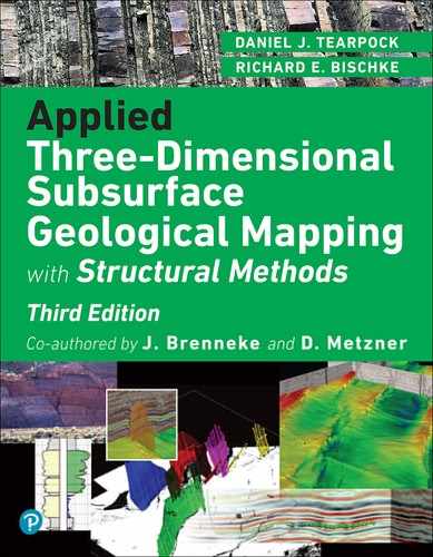
Many interpreters work in 3D visualization software environments (Fig. 9-1), which allow for any scale, orientation, and color scheme imaginable. Within this type of display environment, multiple seismic attributes can be individually selectable by slice or vertical seismic displays (VSD). Figure 9-2 contains a solid cube display of a coherence attribute volume. This is typically used for fault interpretation or identifying subtle stratigraphic features. Multiple seismic volumes can also be co-rendered as a single volume. Figure 9-3 is a co-rendering of reflectivity and coherence. Using this combination of volumes or other volumes of choice in the same 3D scene is an effective reconnaissance and well planning tool. Applying an artificial light source creates highlights and shadows to enhance subtle features in mapped surfaces (Fig. 9-4). Of course, color is still a great way to bring out the details in the data you need to see. Figures 9-5 through 9-8 show several examples of color schemes, although the options are not limited to those shown.
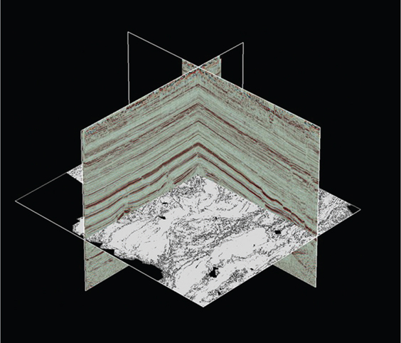
Figure 9-1 This example from the Eagle Ford play in South Texas shows a 3D color visualization view with inline and crossline vertical panels displaying reflectivity and a horizontal slice view displaying the coherence attribute. Interpreters can select any panel and move it to any location within the volume, rotate the volume, zoom in, make an interpretation on the panel, and repeat as necessary to build a 3D interpretation. (Data published with permission from Seitel Data Ltd.)
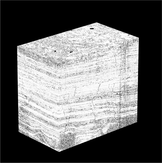
Figure 9-2 Eagle Ford: Example of a 3D coherence attribute volume used to enhance subtle structural and stratigraphic features. Interpreters can slice this volume in any orientation and rotate to view any side. (Data published with permission from Seitel Data Ltd.)

Figure 9-3 Eagle Ford: Multiple volumes are co-rendered and independently colored to enhance features in the volume. In this example, reflectivity in color is co-rendered with coherence in black and white to enhance faulting and stratigraphic layering. (Data published with permission from Seitel Data Ltd.)
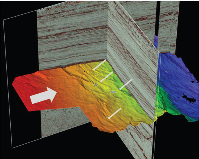
Figure 9-4 Eagle Ford: An artificial light source from the left (large arrow) creates a shadow effect on the interpreted horizon. Note how the fault offsets are enhanced including the subtle features (a few are noted with small arrows). (Data published with permission from Seitel Data Ltd.)

Figure 9-5 Color scheme with high-intensity colors at the extremes. Subtle colors in the low range. Polarity is preserved. (Data published with permission from Seitel Data Ltd.)
Figure 9-6 Color scheme with high-intensity colors at the extremes. Subtle colors in the low range. Polarity is preserved. (Data published with permission from Seitel Data Ltd.)

Figure 9-7 Color scheme with dark colors at the extremes. Bright colors in the low range. Polarity is preserved. (Data published with permission from Seitel Data Ltd.)
Figure 9-8 Color scheme with dark colors at the extremes. Bright colors in the high range. Subtle colors in the low range. Polarity is preserved in the high range only. (Data published with permission from Seitel Data Ltd.)
In addition to color, horizontal and vertical scale settings can enhance or suppress structural or stratigraphic features. Vertical exaggeration (VE) is the ratio of vertical scale to horizontal scale. To enhance faults on a vertical section, expand the VE. Figure 9-9 shows an Eagle Ford example of a dip profile at a typical regional scale. Figure 9-10 is a VE version of Figure 9-9 showing how the faults are much easier to interpret at this scale. Stratigraphic features such as channels, prograding sequences, and unconformities can also be interpreted in this manner. An example of the San Andres formation in the Midland Basin is presented in Figure 9-11. The prograding sequences are interpreted in yellow. The use of alternative color schemes and VE allow stratigraphic details to become more visible to the interpreter. How much of a seismic profile is displayed is a balance between how much of the line you need to see to get the big picture and how much detail is necessary to make an accurate interpretation. For example, when working in unconventional plays, where wells are drilled horizontally, one geoscientist may be mapping trends on a regional scale, while another is focused on the wellbore scale and tracking a drilling target horizon. Figure 9-12a shows a typical horizontal well plan with seismic from the Midland Basin Wolfcamp play. The actual well path, as in Figure 9-12b, shows the drilled well path and is displayed with the gamma ray (GR) log used to geosteer the horizontal part of the well. The seismic scale has a VE of 10x, which allows the simultaneous viewing of well path details against a seismic backdrop. Drillers of horizontal wells that encounter structural changes along the well path are challenged to keep the drill bit in the target zone. Using 3D seismic and nearby wells with proper directional drilling and geosteering techniques, these wells can be successfully drilled within the target (Fig. 9-13).
Figure 9-9 Eagle Ford: Regional seismic line for reconnaissance (with slight VE). Regional scale faults are dark blue, Base Eagle Ford horizon is green, basement is red, and salt is shown in light blue. Note smaller faults are difficult to see at this scale. (Data published with permission from Seitel Data Ltd.)
Figure 9-10 Eagle Ford: Expanded vertical exaggeration of Figure 9-9 shows how increased VE improves fault identification. Regional faults are shown in blue, and smaller faults are in red. The Base Eagle Ford horizon is green. (Data published with permission from Seitel Data Ltd.)
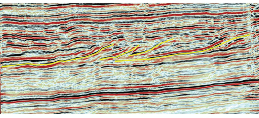
Figure 9-11 Midland Basin: Prograding sequences in the San Andres formation. Stratigraphic detail is shown using a 10x vertical exaggeration. Sequences bounded in yellow are deposited from right to left.
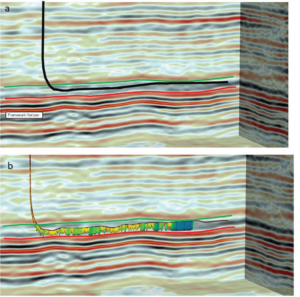
Figure 9-12 (a) Midland Basin: Wolfcamp example of a planned horizontal wellbore displayed on a depth seismic line at 10x vertical exaggeration. The planned well path is black. The target window is 50 ft thick between the green and red horizons. Note that the only interpreted framework horizon mapped in this image is the orange horizon. (b) The same horizontal well, post drill, shown with the GR log used to geosteer the wellbore within the target window.
For basic interpretation and mapping of a fault and horizon framework, most 3D visualization software platforms are generally very similar in capability; therefore, this chapter is not intended to compare various interpretation systems. All have a central database from which to fetch information and display in 3D space on the desktop. The various capabilities mentioned previously are generally available. Experienced interpreters likely have had the opportunity to use many different software platforms over time. The best platforms give geoscientists the freedom to create interpretations in an accurate and efficient way while sharing that information with the team for better decision making and better well results.
Framework Interpretation and Mapping
Philosophical Doctrine point 8 states, “The mapping of multiple horizons is essential to develop reasonably correct, 3D interpretations of complexly faulted areas.” Framework horizon mapping is the practical application of this philosophy. A framework horizon is a seismic or geological correlation marker that is laterally extensive but may not necessarily be a target horizon. Target horizons should be “framed” above and below by framework horizons to ensure the interpretation is valid in 3D. At first, it may seem excessive to interpret and map horizons that are not prospective; however, not all geologic markers, as correlated on well log data, have a corresponding seismic horizon. All fault and horizon surfaces should be interpreted so that they intersect correctly in 3D space. In particular, fault interpretations benefit from interpreting some vertical sections in the strike direction to control the shape of the fault surface. Making the effort to create geological framework surfaces that are valid in three dimensions may seem to be a waste of time, but the time invested is typically saved by not having to clean up these surfaces when the structure maps are made.
Framework horizons are effective quality-control tools. They can be used to create isochron or isochore maps with target horizons or other framework horizons. Isochron maps represent the difference (or thickness in time) between two time surfaces. Isochore maps represent the difference (or true vertical thickness [TVT]) between two depth surfaces (see Chapter 14). If certain areas or fault blocks appear to be abnormally thick or thin between framework horizons, this may indicate a miscorrelation. Also, if a computed isochron or isochore generates a negative value, this indicates a mapping bust on one or both horizons. The best method to ensure 3D validity of a framework interpretation is to do the interpretation in 3D space. Otherwise, view all completed surfaces in a 3D visualization environment for quality control. Once framework horizons are interpreted, mapped, and checked for vertical compatibility, it becomes much faster and easier to work additional target horizons internal to the existing framework.
Framework structure maps are equally as important in unconventional reservoirs as they are in conventional reservoirs. Faults large enough to cut across multiple bed boundaries are not desirable around horizontal wellbores where hydraulic fracturing is needed to establish the flow of hydrocarbons. Faults can and do often channel frac energy along the fault surface, thus hindering the growth of a more desirable complex fracture network. In horizontal drilling operations, operations geologists often deal with small tolerances for error. As previously mentioned, they often geosteer a horizontal well to remain within a narrow vertical target window and thus keep the drill bit within the optimal reservoir rock. If the bit goes out of zone, the eventual well production performance may be reduced, costing valuable time and money (review Fig. 9-13; see also Figs. 2-32 and 2-33 for accurately contouring horizontal well data).
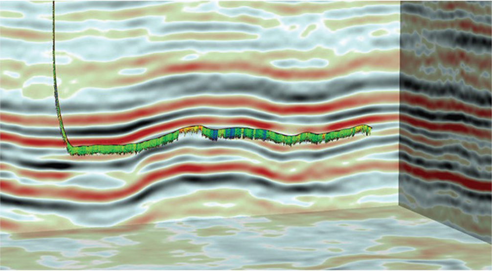
Figure 9-13 Midland Basin: Wolfcamp example of a horizontal well in a deeper target showing structure along the well path. Even with structural variability, using 3D seismic and nearby well control, this well was successfully drilled within the target interval.
Planning an Effective Three-Dimensional Interpretation Project
The Role of the Geoscientist
The development of conventional or unconventional reservoirs, sometimes referred to as resource plays or shale plays, takes a lot of effort to position resources such as people, materials, and equipment efficiently. The success of bringing a new producing well online is the culmination of 8 to 14 months of planning and coordination among many groups, both internal and external to the corporation.
Geoscientists play an integral role in that process. From the early stages of mapping a prospective area to the design of well plans to the geosteering of the wellbore during drilling operations, the geoscientist must develop and use the skills necessary to accomplish the task. To begin, geoscientists interpret and map existing well tops and seismic to provide the structure maps for the framework and target horizons. They then team with engineers (drilling, completion, reservoir, and facilities), land negotiators, regulatory personnel, and data analysts to determine areas for development. The geoscientists and the rest of the team lay out a plan of horizontal wells and surface drilling sites (called pads) and determine which reservoirs to target for each area.
The next phase in the well cycle is well planning. Structure maps and cross sections based on nearby wells and 3D seismic are the primary tools used to plan a new well. The geoscientist is tasked with determining the vertical depth to the target horizon and the structural dip to follow to keep the drill bit in the target zone throughout the lateral portion of the well. Often, more than one well is planned from a pad, in which case, multiple wells are designed to optimize drilling and completion operations (i.e. where most of the capital is spent).
Once drilling begins, the operations geologists are tasked with interpreting the geology as it is encountered by the drill bit. Well logs (usually GR logs) are acquired while drilling and, throughout the day (note 24-hour operations), the logs are electronically transmitted to the surface and relayed to the geologists for interpretation. The operations geologists correlate the incoming GR log with other GR logs from nearby wells to determine the stratigraphic position of the bit and whether it is in the target zone. They then relay to the directional drillers guidance on adjustments to the borehole trajectory. This process continues until a well has reached total depth and drilling stops. Once a well reaches total depth, the rest of the well cycle primarily involves engineering operations.
The process of communication between the rig and home office operations and back to the rig is becoming increasingly automated. Data flow happens in real time, enabling key personnel to process information and make decisions faster. Recent developments in automated geosteering will prove valuable as operations geologists are able to increase their efficiency, allowing companies to increase the number of wells drilled without proportionally increasing personnel.
As operations scale up to grow the number of wells drilling in the same basin, it is important to have a comprehensive planning tool in place. Tools such as a Gantt chart, spreadsheet, or database are necessary to coordinate the timing of well design, land surveys, regulatory permits, rig movements, fracture stimulation crews, and facilities construction. Managing this plan ensures that critical phases of the well cycle are executed on time. Idle time for rigs and crews will negatively impact a company’s bottom line. As has been stated many times, “Teams don’t plan to fail, they fail to plan” (Tearpock 1997).
Developing an Interpretation Workflow
Workflows are developed to accomplish the 10 objectives listed in our Philosophical Doctrine. How does a workflow differ from a plan? A workflow is the detailed step-by-step actions taken to accomplish a task or series of tasks in a plan; for example, a workflow might comprise the steps required to interpret faults throughout a data set, to construct maps, or to create a velocity model for depth conversion. By describing, step-by-step, how a task is to be done, the workflow provides a level of consistency when similar tasks are done on the same project by different people. The same workflows can also be used in different basins, either unchanged or, if necessary, modified. Seismic interpretation workflows are usually specific to one type of interpretation software and can be difficult to translate to other systems. For this reason, this chapter does not discuss software but rather lays out the philosophical basis for developing or improving your workflow on whatever software is in use.
In practice, following a plan usually requires some tasks to be dependent on completion of other tasks. Each task has a workflow specific to the software in use. For example, the task to design a well plan involves the use of correlated well tops and structure maps that are seismic in depth. Immediately, it becomes obvious that to complete the task of making an accurate well plan, a lot has to happen before reaching this step. Included in this process are a fault interpretation workflow if faults are present, a horizon interpretation workflow, a depth conversion workflow, and a mapping workflow.
Workflows should be developed with the Philosophical Doctrine as a backdrop within the context of the project data and time constraints. Allow enough time to do the work correctly. Computer mapping is a great tool, but it should not have to hide an incorrect interpretation.
Organizing a Workstation Project
Workflows can be made even more effective if the output of interpretation and mapping is well organized. An efficient naming convention allows interpreters to find faults, horizons, maps, or other displays quickly. Workstation databases can store large amounts of data and interpretation. Usually, lists can be sorted by name, interpreter, or last modified date, so these attributes can be used to group similar items. For example, faults can be grouped by their location and color (e.g., NE red, S blue), appending a number if the selection of colors runs out (e.g., NE red00, NE red01, …). Some interpreters prefer to use A through Z, then AA through ZZ, and so on. Consistency is the most important aspect of a naming convention to ensure that everyone involved can quickly find what they need.
Following are two additional actions to take that are known to most experienced interpreters but usually are learned the hard way:
Export or back up a copy of the data, interpretations, and databases on a routine basis. Protect the interpreted work from a system crash, power outage, file corruption, and of course, user error.
Clean up old versions of interpretation. If every version is saved, eventually no one will know the good from the bad. It may not be clear whether a specific map or interpreted horizon is the final result or some older version.
Documenting Work
One way to keep work organized is to document the work on paper or digitally (Philosophical Doctrine point 10). Doing so will benefit all who follow. Even if an area has a history, such as a previous interpretation, most people, understandably, want to do their own interpretation. Nonetheless, knowing what previous interpreters have done can save time and effort in the current work. Avoiding issues noted by predecessors saves valuable time, and building on what they have accomplished increases efficiency during the next phase of interpretation.
Handwritten notes are not as critical today as they once were, but it is often helpful to take a few seconds to jot down key observations or the steps taken to generate a particular display. Most software enables users to save a template that can be used to re-create a display in a certain way. Templates promote consistency and reduce the amount of work entailed in creating new workflows. Making a screen capture of interesting features is another way to catalog important aspects of the interpretation. The work performed by employees of a company has value. We recommend keeping a record of progress and sharing knowledge when needed.
Key Point: A systematic approach and well-organized interpretations are effective time-saving strategies.
Fault Interpretation
Introduction
The principles discussed in the following sections apply to any workstation software and are relevant to extensional or compressional tectonic environments as well as conventional and unconventional reservoirs. The importance and technique of making fault surface maps is discussed in detail in Chapter 7. This section presents traditional methods of fault interpretation and mapping for the workstation. A three-dimensionally correct fault interpretation provides the solid foundation upon which all subsequent horizon interpretation and mapping are built. It is not enough simply to pick fault segments on a series of parallel vertical and/or horizontal seismic profiles. The resulting fault surface should make sense geologically and geometrically and be valid in three dimensions. Therefore, faults should not only be interpreted as individual picks on the data but also viewed as fault surfaces in order to be deemed geologically valid in three dimensions.
As of this writing, several of the 3D interpretation software packages are capable of some form of autotracking of faults in a 3D seismic volume. Some autotrackers are designed to work on one fault surface at a time, while others autotrack multiple faults throughout the entire volume. Parameters can be optimized to obtain a meaningful result. However, because these autotracking capabilities and results vary widely based on the software, input data quality, and geologic complexity, a detailed discussion is not provided here. These are exciting developments in workstation capabilities and will undoubtedly gain more acceptance with time. Interpreters of 3D seismic data are encouraged to test this technology on their data and see if the promise of quality and efficiency holds true. As with any machine-driven interpretation, quality control and geologic validity are paramount. The following discussion provides methods of interpreting faults as well as methods of quality control and visualization of results.
Generally, fault surfaces tend to be smooth, nearly planar, or arcuate surfaces. They typically do not change radically in strike or dip unless the fault surface has been deformed. For most faults, throw varies in a systematic manner along the strike of a fault surface and can increase or decrease with depth. Fault throw and horizontal extent are related. The larger the throw, the greater the lateral extent will be. A rapid change of throw along a fault likely indicates a fault intersection or bifurcation.
One question that arises during framework interpretation is how much detail is necessary to define a good framework. The answer is usually based on the complexity of the geology or, in some cases, the quality of the seismic. If the fault interpretation is started on widely spaced parallel lines and not tied via intersecting lines or horizontal slices, we may interpret a fault segment on one profile that appears to belong to the same fault as segments picked on other profiles. However, as we tie additional lines, the fault picks may be found to be either a series of unconnected faults or several faults that coalesced to form a fault system. What may be initially interpreted to be a single fault surface may in fact be separate faults with different timing and orientation. Figures 9-14 through 9-17 demonstrate how this would look on 3D seismic data. Figures 9-14 and 9-15 are parallel dip lines from a 3D data set. Individual fault picks are color-coded to identify them in subsequent figures. The red and blue fault picks are the first fault encountered in the down dip direction on each dip line, but the true relationship between the faults emerges when viewed on a strike line (Fig. 9-16). Note how each fault has a unique shape and that the two faults are not connected. Figure 9-17 shows the same relationship in a horizontal slice view using the coherence attribute.

Figure 9-14 Eagle Ford: Dip line A-A′. Parallel to Figure 9-15. The red fault is the most northerly major fault encountered in the down dip area. (Data published with permission from Seitel Data Ltd.)

Figure 9-15 Eagle Ford: Dip line B-B′. Profile is located 2 miles southwest of Figure 9-14. The blue fault is also the most northerly fault encountered in the down dip area. (Data published with permission from Seitel Data Ltd.)
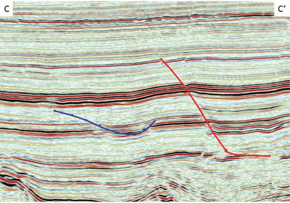
Figure 9-16 Eagle Ford: Strike line C-C′ demonstrates that the red and blue fault picks do not belong to the same fault. (Data published with permission from Seitel Data Ltd.)
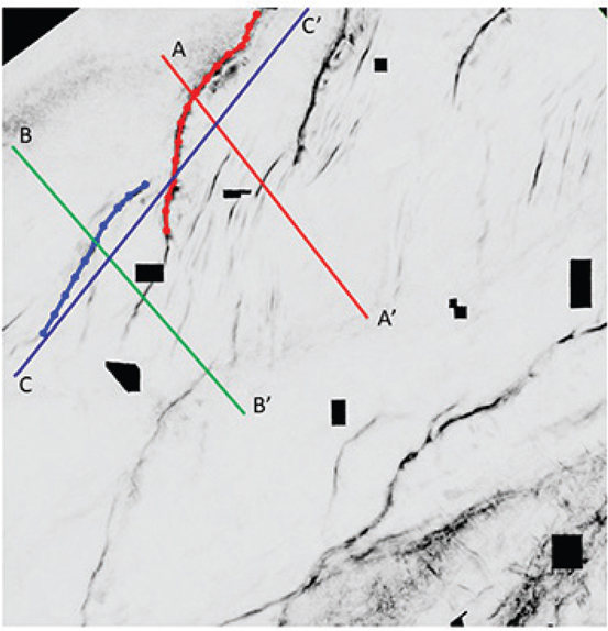
Figure 9-17 Eagle Ford: A horizontal coherence attribute slice view confirms that the red and blue faults are similar but are not the same fault. Profiles from the previous three figures are shown. (Data published with permission from Seitel Data Ltd.)
Key Point: It should be stated that without interpreting fault surfaces to their fullest extent, horizon mapping becomes more challenging and locating wells near faults becomes riskier. Fault surface maps and their integration with the structural horizons provide the best means to determine the location, orientation, extent, and throw of the faults within a 3D survey.
Reconnaissance
We recommended taking some time at the beginning of an interpretation project to review the data in vertical and horizontal orientations to get a sense of which direction the structures are trending, the structural style(s), and where the problem areas may be. Take notes and screen captures of your observations. Seismic attributes such as coherence and curvature are also valuable reconnaissance tools. Figure 9-18 demonstrates how difficult it can be to identify faults on reflectivity time slices through a 3D data volume. Figure 9-19 shows the same time slices, but they are now displayed using the coherence attribute to enhance discontinuities. Fault trends and relationships are more easily determined using this type of attribute display.
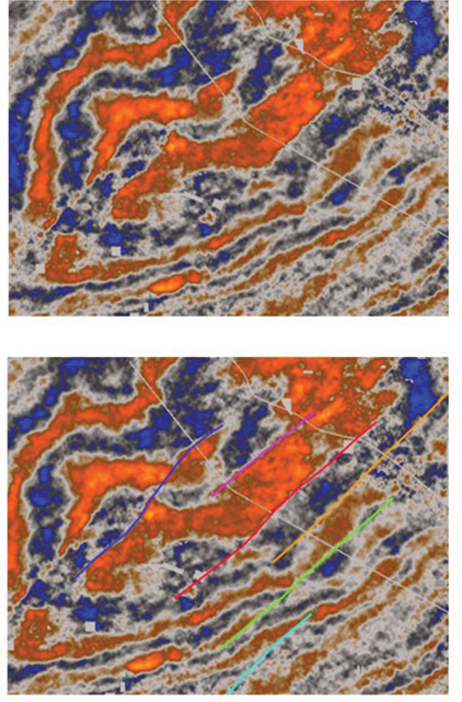
Figure 9-18 Haynesville: Reflectivity time slice shown with and without interpreted faults (shown in color). The faults are difficult to see without the colored lines. (Data published with permission from CGG Land.)
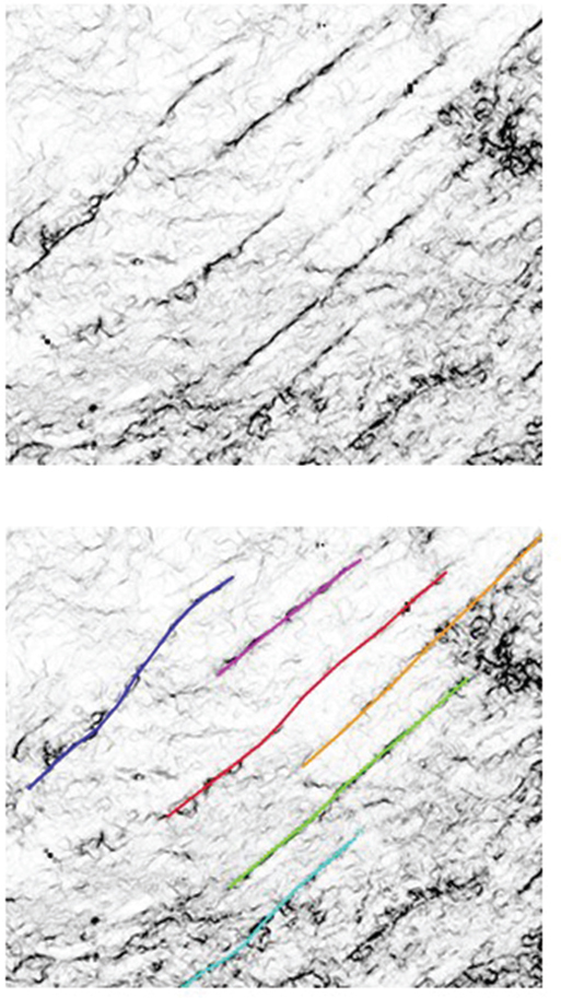
Figure 9-19 The same time slice as in Figure 9-18 now extracted from a coherence attribute volume. The faults are highly visible on this display. (Data published with permission from CGG Land.)
Creative color bars (palettes) used on variable density displays can enhance discontinuities in the data and allow better fault identification. Some ideas for color schemes were shown previously, but interpreters are not limited to those few. The goal is to identify faults as quickly as possible, so use creativity when it comes to use of color and various display scales. From this reconnaissance, develop a plan to approach the fault interpretation. Consider well locations, any missing or repeated section-correlated in the well logs, and how much detail is necessary to correctly map the faults in your 3D data set.
One of the most effective ways to recon a seismic volume is to autotrack one or more of the most coherent horizons. In Figure 9-20, hundreds of square miles of data have been autotracked in the Haynesville play and are displayed with a dip attribute. Note how quickly the complex fault pattern (A) in the Haynesville play can be identified. In addition, more simple faults (B) and also subtle lineations likely to be faults (C) are highlighted. A similar effect can be seen in Figure 9-21 where the same horizon is displayed as a light-colored time structure. Fault trends stand out in this view.
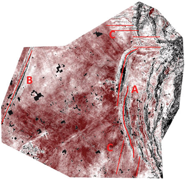
Figure 9-20 Haynesville: Reconnaissance using a preliminary autotracked horizon demonstrates how quickly the regional fault trend can be identified. In this example, the Smackover (just below the Haynesville) is shown with a dip attribute. Complex faulting (A), simple faulting (B), and subtle faulting (C) can be easily identified. (Data published with permission from CGG Land.)
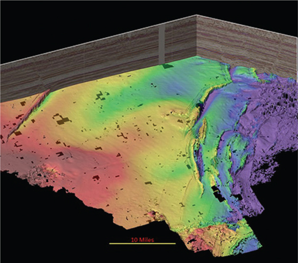
Figure 9-21 Haynesville: This view shows an autotracked Smackover horizon colored by time structure with shading. This is another effective reconnaissance tool. Note the horizon has not been rigorously quality checked and is used only for recon of the data volume. (Data published with permission from CGG Land.)
Similarly, the Marcellus play can be quickly evaluated using the same technique. Figure 9-22 captures the essence of the complex reverse fault trends and crosscutting structures of the seismic reflector nearest the Marcellus shale. Figure 9-23 is a view from above with light shading from the side. In this view, both the primary faults and crosscutting structures are clearly identified.
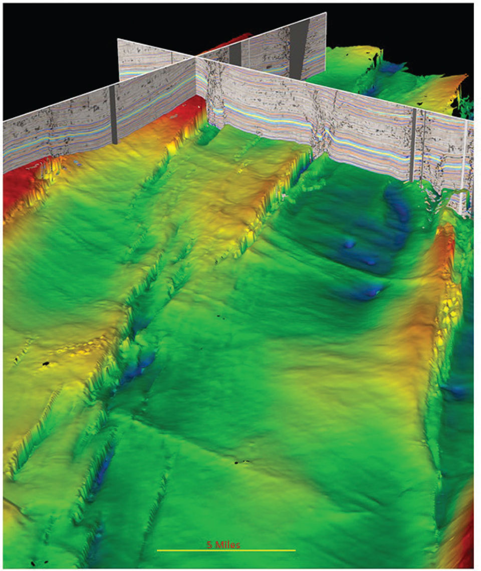
Figure 9-22 Marcellus: Reconnaissance using a 3D perspective view captures the complex reverse fault trends and crosscutting structures of the seismic reflector nearest the Marcellus shale. (Data published with permission from CGG Land.)

Figure 9-23 Marcellus: View from above with light shading from the side. In this view, both the primary faults and the crosscutting structures are clearly identified. (Data published with permission from CGG Land.)
Key Point: Autotrack a strong seismic reflector for a quick look at the structural trends. Follow up with using slice views of a fault-detection attribute volume to perform reconnaissance along with vertical displays of a reflectivity volume. Use color and scale to enhance the view.
Tying Wells Using Synthetic Seismograms
One of the most important steps to take early in the interpretation of an area is to create synthetic seismograms. The process of tying well data in depth to seismic data in time using a velocity trend is fundamental to the integration of all data into an interpretation. Prior to tying the seismic, a well log (usually a GR log) is correlated with logs from surrounding wells to establish a formation tops framework. This includes wells that have missing or repeated section, which means there is either a normal fault, unconformity, or reverse fault cutting the well. In cases where well control is sparse, the seismic can be used to help locate faults in wells. The method to do this is described later in the text.
Wells that have sonic and/or density logs, the basic ingredients to a synthetic seismogram, are good candidates to begin with. The quality of the log curve data should be reviewed and edited if necessary, and the logs should extend over a large depth range for best results. Synthetic seismograms are generated by first computing impedance by multiplying sonic velocity times bulk density. The impedance log is then used to compute a series of reflection coefficients, which are then convolved with a wavelet to generate the synthetic seismogram. The velocity trend used to convert log depth to seismic time can be obtained from integration of the sonic log velocities, vertical seismic profile, checkshot survey, or from time and velocity picks used in data processing, to name a few of the key sources. The quality of the tie between a synthetic seismogram and seismic data can range from very good to very poor. Techniques to adjust the synthetic traces to tie the seismic involve bulk shifts, phase rotation, stretching, or squeezing. Care must be taken not to overcorrect the synthetic and cause an unrealistic velocity. The synthetic seismogram in Figure 9-24 shows an example of a good tie to a 3D seismic volume in the Spraberry-Wolfcamp play. The goal is to match reflection patterns (peaks and troughs) in the synthetic traces (red) to similar patterns in the 3D data at the well (blue). From this we determine which horizons are the best to be mapped as the framework. Differences in reflectivity observed between the synthetic and seismic (such as between 1150 and 1350) can be a result of either (1) a higher sample rate for log data than for seismic data, allowing finer detection of geologic beds in the synthetic, or (2) events caused by multiples that exist in the seismic being nongeologic and therefore not seen on the synthetic. The topic of framework horizon selection is discussed later in this chapter.

Figure 9-24 Typical synthetic seismogram in the Midland Basin. The left column shows the velocity log (in red) derived from the sonic log. The center column is the reflection coefficient series. The red traces on the right are the synthetic traces, and the blue traces on the far right are from the seismic volume at the well location.
Integrating Well Control
When working in an area where wells are sparse and there is a suspected fault present in a well, create a synthetic seismogram at the well and then:
Display two or three seismic sections that pass through the well location but without the well information displayed on the seismic data. Choose orientations that are based on your reconnaissance of the dip direction of the fault. These sections should intersect in map view.
Look for seismic event terminations that indicate the presence of a fault and interpret a fault segment that would represent a most likely location for the fault. If no fault is obvious, interpret several possible segments or choose another line orientation.
Now redisplay the seismic section showing the well data posted along with the interpreted fault segment. How closely do the seismic fault segment and fault cut from log correlation agree? If they do not agree, consider the following four possible reasons for the mis-tie:
The fault pick in the well needs adjustment.
The seismic interpretation needs adjustment.
The time versus depth relationship between the well and seismic (i.e., the synthetic seismogram) needs adjustment.
The well location is inaccurate (incorrect surface location or erroneous directional survey).
Any one of these explanations is possible. In the case of sparse well data, begin by reviewing the well log correlation. Attempt to adjust the fault cut in the well to match the seismic interpretation. If the time-to-depth relationship appears reasonable from the synthetic tie (or other means), the seismic fault and subsurface pick in the well should be very close when displayed on the time seismic volume. If not, other issues could be present. Check for errors in the deviation survey, or in the case of a vertical hole, it may be that it is not really vertical or that the surface location of the well may be misspotted. Well location problems are more common than one would suspect. Because fault surfaces typically dip at much higher angles than bedding surfaces, errors in well location generate much larger discrepancies in fault ties than they do in horizon ties. Also, make sure the vertical separation interpreted on the 3D seismic sections agrees with the vertical separation as determined from log correlation (refer to Figure 7-38).
The key point is that any discrepancies between the seismic data and the subsurface control should be understood and resolved if possible. After tying the well control, continue working this fault with one of the following strategies.
Fault Interpretation Strategies
There are many ways to approach fault interpretation and mapping in the workstation environment. Some are more efficient than others. As software evolves, techniques also evolve to take advantage of new functionality. Even with more powerful hardware and software, however, the underlying objective in fault interpretation does not change. That objective is to create an accurate 3D representation of all fault surfaces, which leads to better structure maps and better well placement. As mentioned previously, the topic of automated fault interpretation is not covered in this chapter, but the techniques discussed here can be used to validate and correct the machine driven fault interpretation.
A sound fault interpretation strategy is based on the following principles:
Define the preliminary fault surfaces quickly with a minimum of fault picks.
Integrate the well control.
Add fault picks and validate the fault surfaces in 3D.
Complete the interpretation of the primary framework faults before completing the final horizon interpretation.
Following are three basic strategies:
Traditional method using tied vertical sections verified in map view and horizontal slice view.
Alternate method to interpret a fault pick on a coherence or symmetry horizontal slice then add picks on vertical displays.
Three-dimensional visualization method verified in 3D space.
Which approach to take depends on available software and interpreter preference. Traditional methods are effective in most areas and available on all workstations. Three-dimensional visualization is effective in all areas including structurally complex areas. When possible, use 3D visualization software as a validation tool for the fault surfaces and to refine a preliminary fault interpretation. As visualization capabilities expand, so does the routine use by interpreters.
Strategy 1 is a more traditional approach to fault interpretation. Figures 9-25 through 9-34 demonstrate the workflow for the single fault method. The first step is to interpret a fault segment on the first vertical line (Fig. 9-25). Next, choose two additional lines that tie the first line (Fig. 9-26 basemap) and interpret the fault based on the tie with the previous line. The fault segments interpreted on the two tied seismic lines are shown in Figures 9-27 and 9-28. Figure 9-29 shows the interpretation based on just three intersecting interpreted lines. Coloring the interpretation gives a sense of the fault strike. This is all it takes to begin a preliminary fault interpretation using strategy 1. Continue the interpretation by moving the three intersecting vertical profiles until the fault surface is completely defined (Fig. 9-30). The goal is to accurately define the fault surface in as few segments as possible, so it is acceptable to clean up an interpretation by “pruning” out redundant segments as long as the surface remains valid in three dimensions. The fault surface generated after interpreting 14 intersecting lines is reasonable (Fig. 9-31). The fault surface should also be validated in strike view (Fig. 9-32) and in 3D (Fig. 9-33). These views help visualize the fault shape and compatibility with the seismic. Finally, Figure 9-34 demonstrates how deformed rocks in the footwall can affect the shape of a fault surface. In this case, salt movement has created enough instability to warp the fault surface.
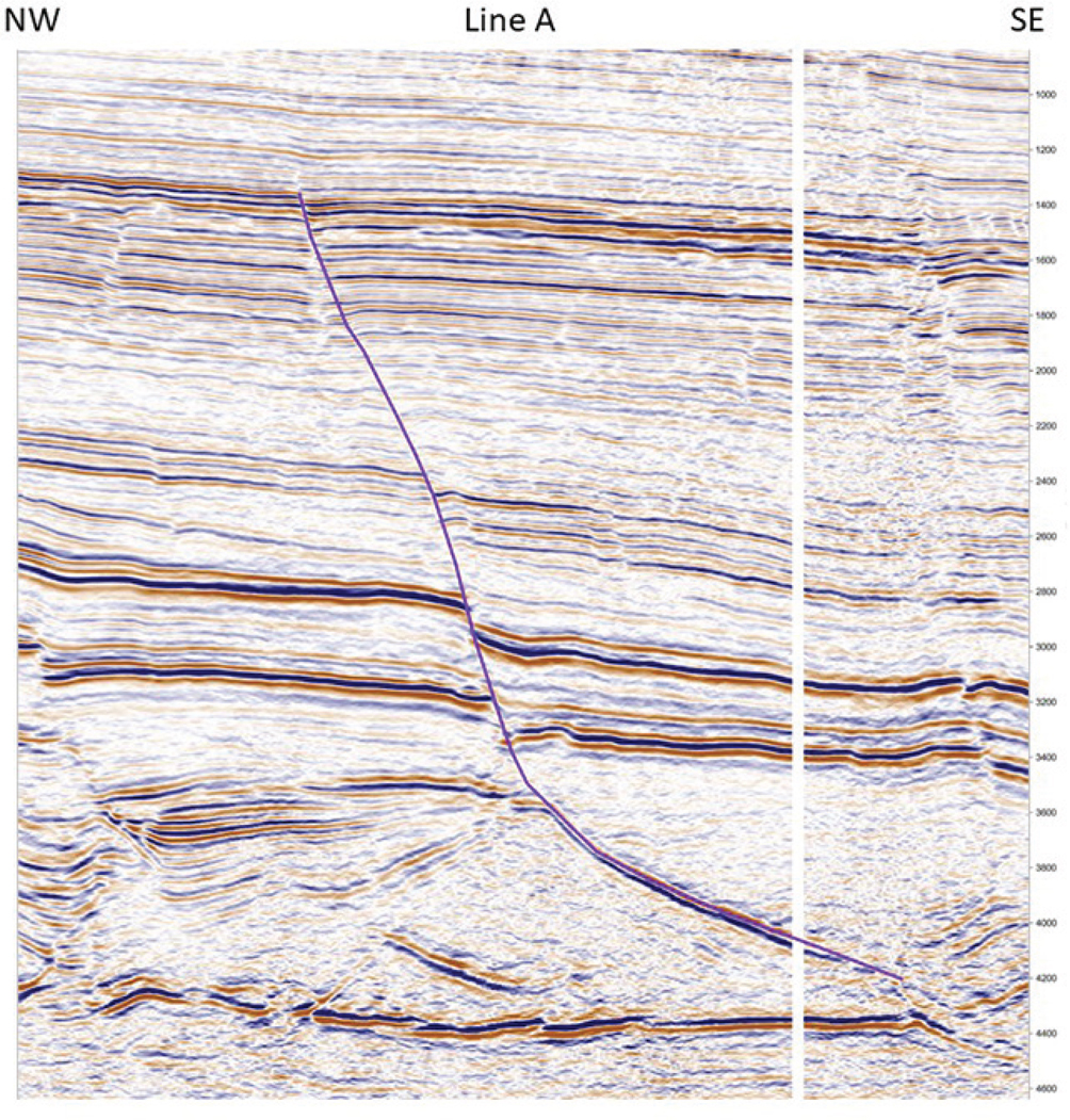
Figure 9-25 Eagle Ford: Fault strategy 1. Line A. First interpreted line for the purple fault. (Data published with permission from Seitel Data Ltd.)

Figure 9-26 Eagle Ford: Fault strategy 1. Basemap showing the initial interpretation plan for the purple fault. (Data published with permission from Seitel Data Ltd.)
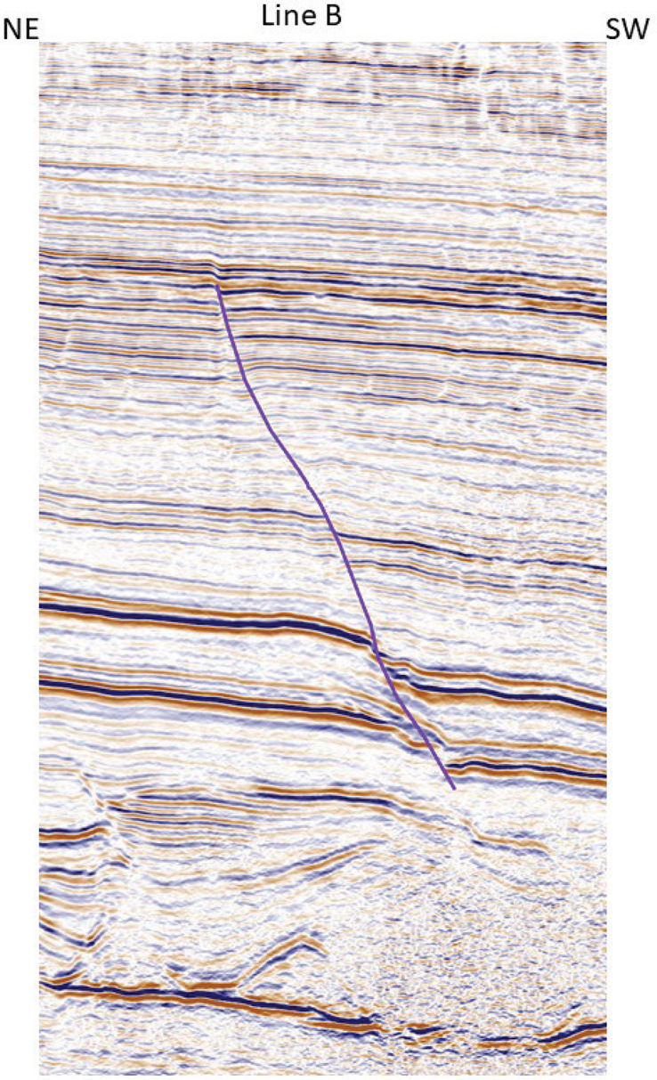
Figure 9-27 Eagle Ford: Fault strategy 1. Second interpreted line for the purple fault tied to the first line. Line B. (Data published with permission from Seitel Data Ltd.)

Figure 9-28 Eagle Ford: Fault strategy 1. Third interpreted line for the purple fault tied to the previous lines. Line C. (Data published with permission from Seitel Data Ltd.)
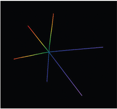
Figure 9-29 Eagle Ford: Fault strategy 1. Perform a quick quality check of three tied interpreted lines for the purple fault colored by z value. (Data published with permission from Seitel Data Ltd.)
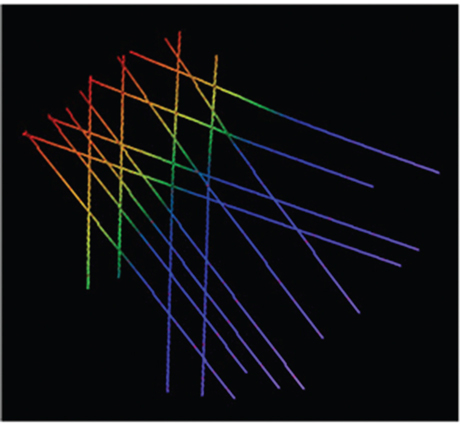
Figure 9-30 Eagle Ford: Fault strategy 1. Fourteen interpreted lines for the purple fault colored by z value. Each line is tied to at least one other line. (Data published with permission from Seitel Data Ltd.)

Figure 9-31 Eagle Ford: Fault strategy 1. Final fault surface map for the purple fault. The strike line is shown in Figure 9-32. (Data published with permission from Seitel Data Ltd.)
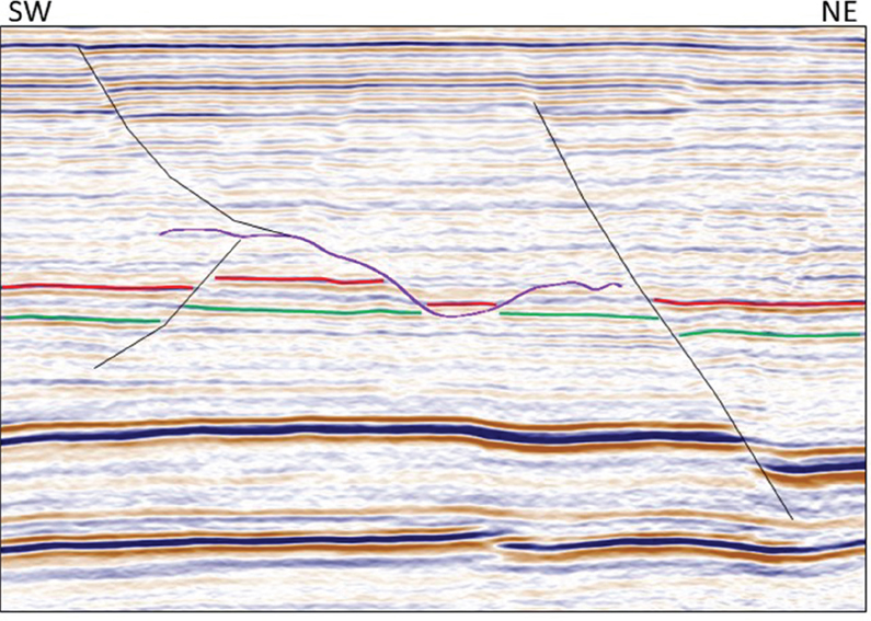
Figure 9-32 Eagle Ford: Fault strategy 1. Strike view for the purple fault. Also shown are other nearby faults (black) and interpreted horizons showing the fault offset (red and green). (Data published with permission from Seitel Data Ltd.)
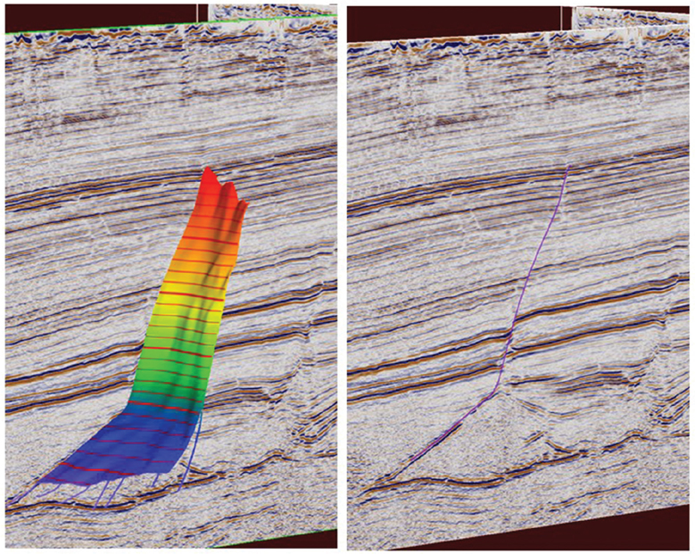
Figure 9-33 Eagle Ford: Fault strategy 1. Three-dimensional view for the purple fault. Left: Full surface cut by a dip seismic line. Right: Intersection of the fault with the seismic line. (Data published with permission from Seitel Data Ltd.)
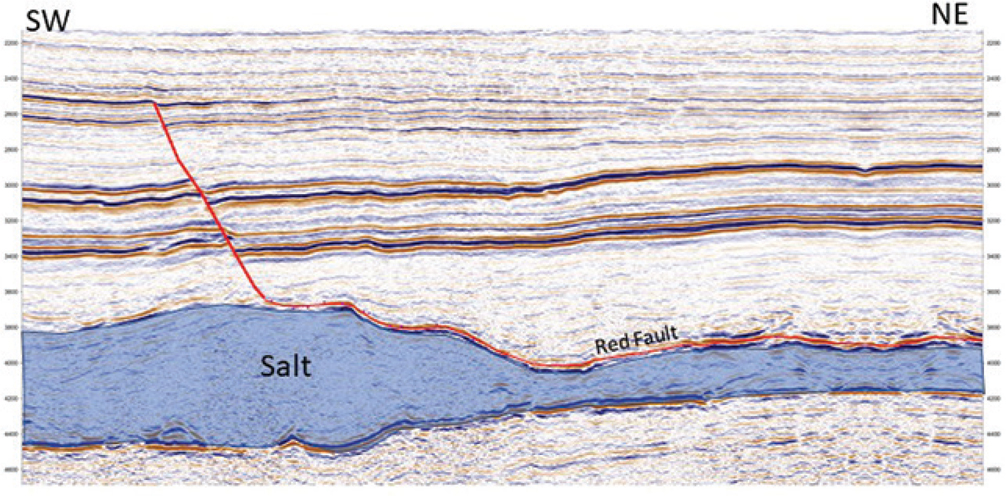
Figure 9-34 Eagle Ford: Fault strategy 1. Another fault (red) is shown in strike view. The shape of the red fault is affected by the underlying salt. (Data published with permission from Seitel Data Ltd.)
Using a series of intersecting seismic displays and interpreting one fault at a time, such as in strategy 1, is generally an efficient and effective methodology. It is important to note that these are near final fault surfaces that may need to be refined after completion of the framework horizon interpretation. The resulting surface should be a good representation of the geometry of the fault, how far it extends, and in what direction. It should be noted that as faults are interpreted on seismic data, the map view of the resulting contoured fault surface should be updated. This allows quality control on the fly to catch any big errors, such as abnormal changes in fault dip, strike, or miscorrelation, before getting too deep into the interpretation. We recommend not to pick more fault segments than are needed to define the fault surface. The key points are to determine where the major faults occur and how they intersect in the subsurface, if indeed they intersect.
Strategy 2 is one of the most time-efficient fault interpretation methods available. It begins with a horizontal slice from any fault detection attribute volume, such as coherence.
Use the slice view to identify and interpret a single segment for each fault identified.
Display a dip-oriented vertical seismic display from a standard reflectivity volume.
Using the cross-posting of the faults picked on the slice, interpret all visible fault segments that were identified previously.
Move the vertical panel and repeat the fault picking process. Interpret in this way until the edge of the area of interest is reached.
View each fault surface in 3D view and adjust or add picks as needed.
Figures 9-35 through 9-38 show how the process is done.
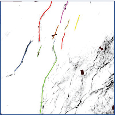
Figure 9-35 Eagle Ford: Fault strategy 2. Eleven faults are identified and interpreted in color on a coherence slice. (Data published with permission from Seitel Data Ltd.)

Figure 9-36 Eagle Ford: Fault strategy 2. Initial fault picks from the slice are tied to a vertical line. Each fault intersected is interpreted on the vertical display. (Data published with permission from Seitel Data Ltd.)

Figure 9-37 Eagle Ford: Fault strategy 2. Vertical seismic display moved to the southwest from the location in Figure 9-36. Interpretation continues until the fault (or data) terminates. (Data published with permission from Seitel Data Ltd.)

Figure 9-38 Eagle Ford: Fault strategy 2. View each fault surface in 3D and quality check each surface. (Data published with permission from Seitel Data Ltd.)
Strategy 3 is similar to strategies 1 and 2 except that the entire process is done in a 3D view. In areas where it is important to sort out the details of a fault interpretation and the data quality is sufficient, it is best to use a 3D visualization display. This allows the data to be viewed in rapid succession in any orientation. Putting the data in motion, so to speak, allows you to see a single fault surface or the entire fault framework. This validation process takes very little time, and it is well worth the effort when planning and drilling wells near faults.
Begin by displaying a combination of vertical and slice sections. Interpret the first fault on a vertical section using the horizontal slice as a reference.
Interpret additional fault segments on the vertical and horizontal slices. Periodically check the fault ties and fault shape on the strike view or slice view. Interpret the fault surface until the edge of data is reached or the fault terminates.
Interpret additional faults in the same way until the framework of major faults is complete. Numerous small or subtle faults can be left for a later time, possibly after the horizon interpretation framework is completed.
Figures 9-39 through 9-43 demonstrate the method. Two faults (Red SE and Blue SE) are interpreted in 3D view. Note the fault surfaces intersect but are clearly not the same fault.
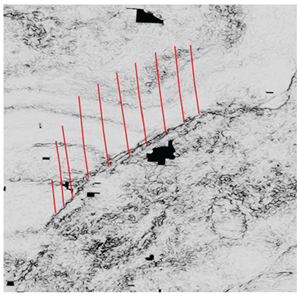
Figure 9-39 Haynesville: Fault strategy 3. Begin the interpretation of the Red SE fault in a 3D view. Red segments were interpreted on vertical sections using the coherence slice as a guide. (Data published with permission from CGG Land.)
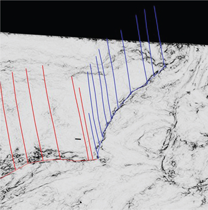
Figure 9-40 Haynesville: Fault strategy 3. Interpret the second fault (blue). Both the Red SE and Blue SE faults are tied along the intersection with the horizontal slice. The coherence attribute clearly shows the red and blue faults are not the same fault. (Data published with permission from CGG Land.)
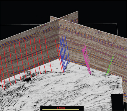
Figure 9-41 Haynesville: Fault strategy 3. Example of an initial fault interpretation for four faults (red, blue, magenta, and green lines) in a 3D view. (Data published with permission from CGG Land.)
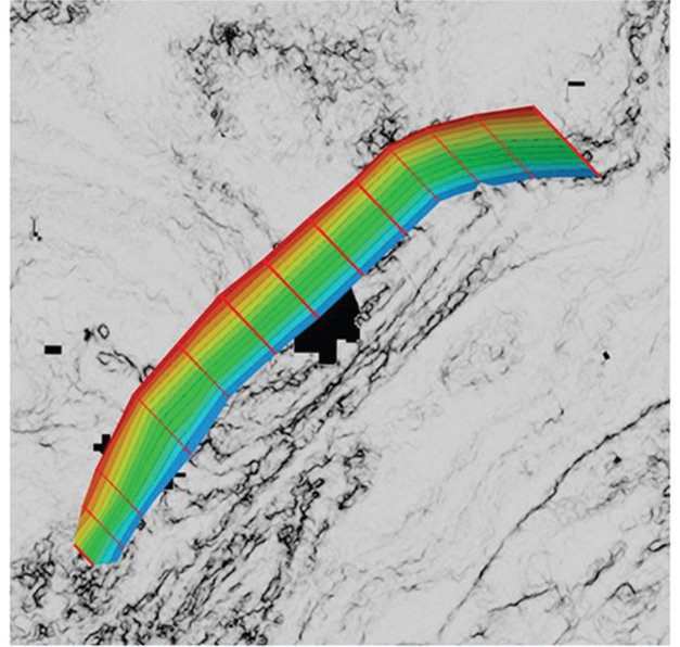
Figure 9-42 Haynesville: Fault strategy 3. Quality check the final fault surface for the Red SE fault. (Data published with permission from CGG Land.)
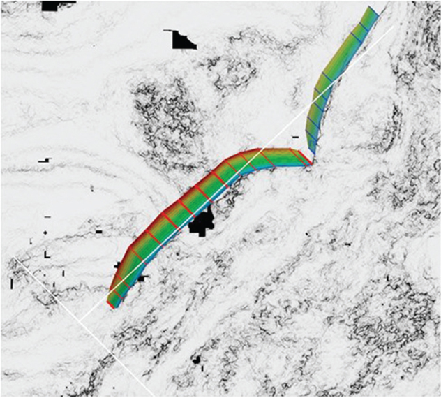
Figure 9-43 Haynesville: Fault strategy 3. Final fault surface for both faults. (Data published with permission from CGG Land.)
Strategy 3 can be applied to any situation, whether it be conventional or unconventional reservoirs in extensional or compressional terrains. Figures 9-44 through 9-48 demonstrate the same methodology for the reverse faults in the Marcellus play.

Figure 9-44 Marcellus: Fault strategy 3. Set up for the red fault interpretation. Horizontal slice is a coherence attribute, and the vertical slice is reflectivity data co-rendered with coherence. (Data published with permission from CGG Land.)
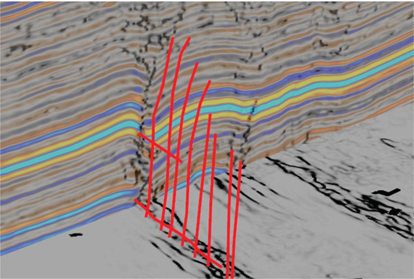
Figure 9-45 Marcellus: Fault strategy 3. Interpreted fault picks on a series of vertical and horizontal slices for the red fault. (Data published with permission from CGG Land.)
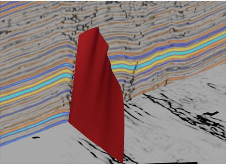
Figure 9-46 Marcellus: Fault strategy 3. Complete the red fault interpretation. (Data published with permission from CGG Land.)
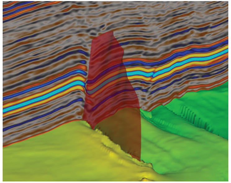
Figure 9-47 Marcellus: Fault strategy 3. Quality check the red fault surface against the autotracked Marcellus horizon. (Data published with permission from CGG Land.)
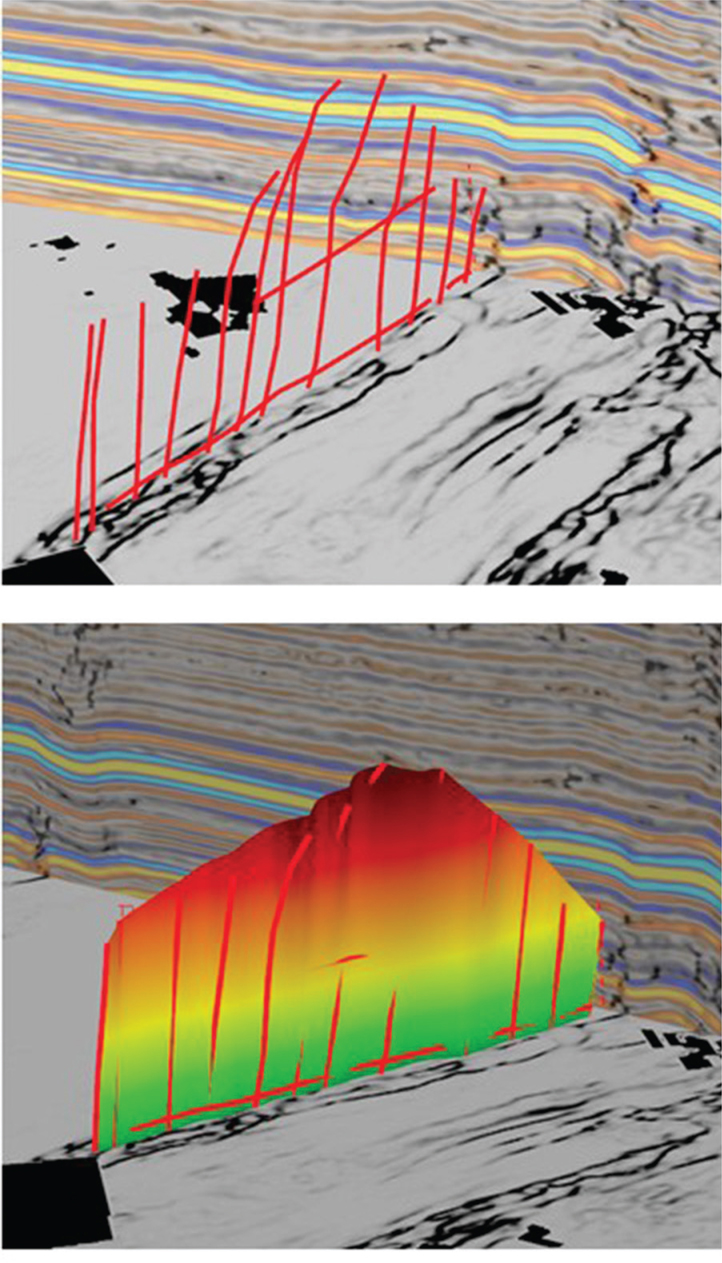
Figure 9-48 Marcellus: Fault strategy 3. Quality check the full fault surface colored by z value. (Data published with permission from CGG Land.)
Horizon Interpretation
Selecting the Framework Horizons
The choice of which framework horizons to map and how many are needed is a function of the geologic complexity, reservoir targets, and seismic volume used. Some of the framework horizons may be needed to provide a reference to create target horizons later, and some may be needed only as control for the depth conversion to be performed once the framework interpretation is complete. We recommend a minimum of three framework horizons: one shallow, one intermediate, and one deep. The intermediate horizon should be near the primary objective(s) whenever possible. In this section, we use examples from the Eagle Ford to demonstrate how to map horizons with fault gap polygons.
As mentioned previously, synthetic seismograms are used to tie the well data to the seismic. Figure 9-49 is a synthetic for a typical well tie with framework and target horizons noted. In most cases, the best framework horizons are those that show an acoustic impedance contrast between the shales or tight siltstones and thick limestones. Some target horizons within shale plays are generally subtle or not imaged at all on seismic and therefore need to be mapped with reference to a nearby framework horizon. This is sometimes known as a phantom horizon. For more discussion on synthetic seismograms and phantom horizons, refer back to Chapter 5.
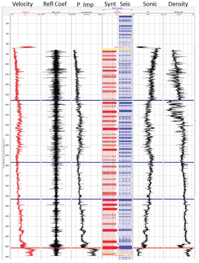
Figure 9-49 Eagle Ford: Synthetic seismogram showing the tie between model traces (Synt) and the seismic trace nearest the wellbore (Seis). Framework horizons and tops are shown in blue, and the Base Eagle Ford in red. (Seismic data published with permission from Seitel Data Ltd.)
Unconformities must often be mapped as one of the framework horizons because the structure and rock properties are likely to be different above and below the unconformity. Angular unconformities, onlaps, and downlaps sometimes generate complex reflections that are easily identified but difficult to interpret as a horizon. Such an interface may need to be interpreted entirely by hand, which could be a time-consuming process. The techniques described in the following section are intended to make the process of horizon interpretation more effective and efficient.
Interpretation Strategy
Horizon interpretation is a rather straightforward process, but there are things that can be done to make a more accurate interpretation in a reasonable amount of time. One important time saver has already been mentioned: complete the preliminary fault interpretation prior to starting the framework horizon interpretation. This is very important because it significantly reduces the possibility of getting off track if an autotracking method is used in a faulted area. Also, we must remember that most hanging wall structures are formed by large faults. As discussed in Chapters 10 and 11, a geometric relationship commonly exists between fault shape and fold shape. Therefore, the greater the geoscientist’s understanding of the faults, the greater the accuracy and geological validity of the horizon interpretations.
One major change implied earlier in this chapter, and since the second edition of this book was published, is the emergence and maturation of unconventional plays such as the Barnett, Eagle Ford, Wolfcamp, Marcellus, Haynesville, and many others. Correspondingly, workstation and software technology have advanced significantly. With this combination of geology and technology came the increased use of autotracked horizons, which is now commonly used by most geoscientists working in unconventional play areas. That said, there is still a place for manual methods to be employed in areas of low reflectivity or poorly imaged areas. These areas, in particular, are notoriously difficult to autotrack, and sometimes the best solution is to interpret manually. We first discuss autotracking and then manual methods that work to fill in areas where autotracking is ineffective.
Autotracking Methodology
A synthetic seismogram helps determine whether the framework horizon is a peak (positive impedance contrast), trough (negative impedance contrast), or zero crossing. Set the tracking parameters accordingly and also set constraints on the tracker, such as the maximum dip change, minimum correlation confidence, and when to stop picking. Next, starting near the tied well, pick a starting point (a seed point) on the seismic event to be tracked and run the autotracker. Hundreds of square miles of 3D seismic data can be tracked in seconds. Quality check the results by stepping through a series of vertical seismic panels and observe how well the autopicks match the seismic. Review the map view of the result and look for large jumps or skips in the tracking. Ask the following questions: Did the tracker pick the areal extent desired? Did the tracker stay on track (i.e., following the correct seismic event even as it crossed faults)? If the answer is yes to both questions, then you are finished and ready for the next horizon. If the answer to one or both questions is no, try adding more seed points or adjust parameters, and rerun the tracker until a satisfactory result is obtained. Figures 9-50 through 9-54 show the results of four autotracked framework horizons in the Eagle Ford. Note that the rectangular untracked areas are gaps in 3D coverage. If there are areas remaining that are still not tracked due to low coherency, complex faulting, or consistently tracking the wrong event, those areas may need to be manually interpreted.

Figure 9-50 Eagle Ford: Autotracked shallow framework time horizon. Note the rectangular untracked areas are gaps in seismic coverage. (Published with permission from Seitel Data Ltd.)
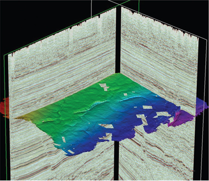
Figure 9-51 Eagle Ford: Autotracked intermediate framework time horizon. (Published with permission from Seitel Data Ltd.)
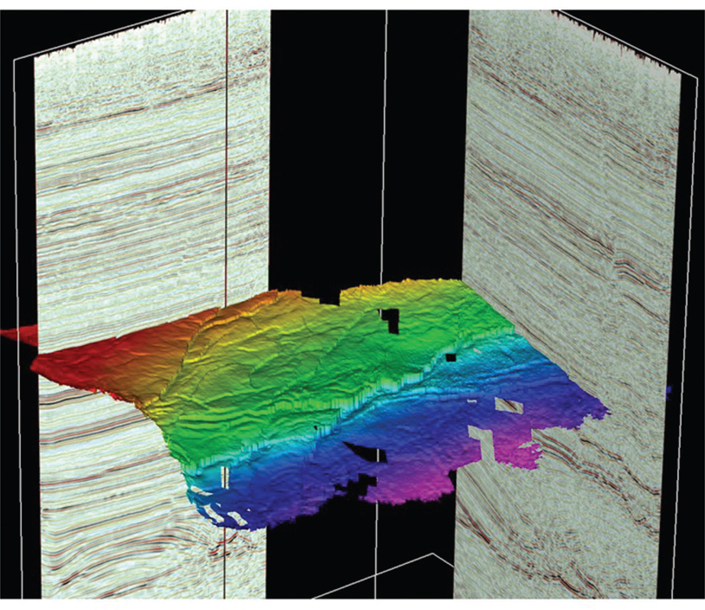
Figure 9-52 Eagle Ford: Autotracked deep framework time horizon. (Published with permission from Seitel Data Ltd.)
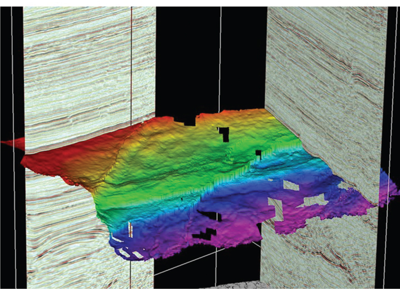
Figure 9-53 Eagle Ford: Autotracked deepest framework time horizon. (Published with permission from Seitel Data Ltd.)
Figure 9-54 Eagle Ford: All four autotracked framework time horizons. (Published with permission from Seitel Data Ltd.)
Manual Interpretation Methodology
It is the authors’ experience in both conventional and unconventional plays that coherent seismic reflectors are commonly found that can be autotracked as framework horizons. However, on occasion, some framework horizons or targeted reservoirs require a great deal of manual interpretation. This can be done in a 3D workspace by using a combination of manual picking in a mesh pattern and interpolation. Another way is to use manual picking in a mesh pattern and gridding. Gridding can create a better-looking surface but may have limitations on editing (depending on the software used). These infill strategies are discussed later in this section.
Our basic philosophy for manual picking can be summed up this way. Horizons should be interpreted in such a way as to be easily revised. Workstations allow selective areal deletion on interpreted surfaces, consequently making repicking a loose mesh pattern more efficient than a line-to line correction. Having a 3D survey on a workstation does not change the basic need to tie lines to crosslines and resolve mis-ties in a manual interpretation, such as would be done with a pencil and eraser on 2D paper sections (refer to Chapter 5).
If starting from a blank surface, it is best to begin near a well (or wells) tied by a synthetic seismogram and work outward from there. When working areas between wells, either of two approaches will work. The first is to use a combination of lines and crosslines to tie data between the wells. The second is to use an arbitrary line directly in line with the wells in question. In either case, picks from intersecting lines can be used as a guide to tie other lines and crosslines. When using arbitrary lines to initially seed an area with interpretation, it is advisable to keep that horizon separate from the line/crossline horizon that will be used for mapping. The reason for this is that, for some of the software in use, editing horizons on arbitrary lines is inefficient once the focus has moved to other arbitrary lines. Keeping them separate allows for fast editing and cleanup later. They can always be merged later, if necessary, for mapping. Figure 9-55 shows an example of an arbitrary seismic line that intersects several wells in a 3D data set. Note that the red correlation marker in the wells corresponds to the magenta horizon that has been manually picked on the section. Figure 9-56 is a map view of the horizon from the arbitrary line and the tied wells with the red marker depths noted. Figure 9-57 shows an example inline with the same magenta horizon interpreted and tied to the red marker. Figure 9-58 is a well-tie horizon interpretation done on lines and crosslines only. There are advantages to both methods, and both can be done quickly. These ties should then be used to work outward from the well control to complete the interpretation. In the case of highly directional wells, be sure to locate the seismic tie at the horizon penetration point in the wellbore.
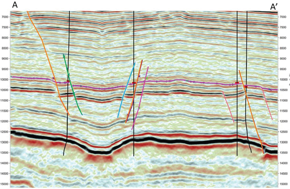
Figure 9-55 Eagle Ford: Arbitrary A-A′ line tying four wells containing the red marker. The faults are honored in the manual interpretation. These picks provide a reference for interpreting a mesh pattern of inlines and crosslines that tie back to the wells. The VE for the section is 3x. (Published with permission from Seitel Data Ltd.)
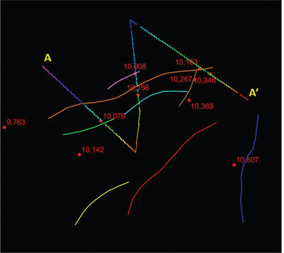
Figure 9-56 Eagle Ford: Map view showing interpretation from arbitrary line A-A′. The faults are colored individually in map view as in the vertical panel. These picks provide a reference for interpreting a mesh of inlines and crosslines that tie back to the wells. (Published with permission from Seitel Data Ltd.)
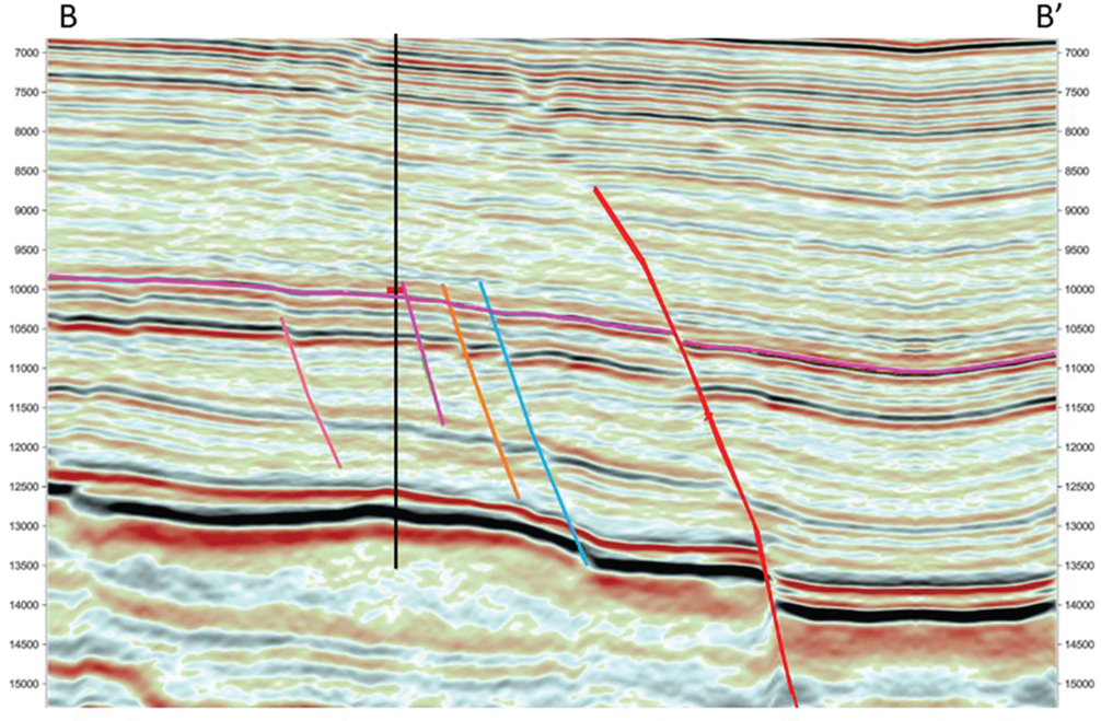
Figure 9-57 An inline B-B′ tying one of ten wells with the red marker. The faults are colored individually. These picks provide the starting point for interpreting a mesh of inlines and crosslines that tie back to the wells. The VE for the section is 3x. (Published with permission from Seitel Data Ltd.)

Figure 9-58 Map view showing interpretation from two inlines and three crosslines tying seven wells. These picks provide the starting point for interpreting a mesh of inlines and crosslines that tie back to the wells. (Published with permission from Seitel Data Ltd.)
How dense should the interpretation be when manually interpreting seismic horizons for structure mapping? The answer is similar to the fault interpretation philosophy: only as dense as needed to accurately define the surface. In our Philosophical Doctrine, point 4 states, “All subsurface data must be used to develop a reasonable and accurate subsurface interpretation.” It is not necessary to interpret every line, crossline, time slice, and arbitrary line. All orientations should be used as needed to ensure the interpretation is valid in 3D. Well data should be tied to the seismic data. The manual interpretation performed on selected sections should be preserved and not altered by automated processes such as autotracking or interpolation. The latter should be saved separately so that results can be compared to the manually picked interpretation. If editing becomes necessary, it is much easier to work on a relatively loose mesh of interpreted data than to fix every inline or crossline after the horizon is filled in.
So, what is the optimum density of manual interpretation? That has already been answered to some extent, but for example, if a 20-inline by 20-crossline interpretation yields an accurately contoured structure map on a simple unfaulted structure, then it is not necessary to do a 10 × 10 or 5 × 5. The level of detail at which to begin is dependent on your data and the geology, so start with a wide spacing and move toward increasing levels of detail as complex areas are encountered. Figures 9-59 and 9-60 compare a 20 × 20 line interpretation versus a 10 × 10 line interpretation of the same area. The 10 × 10 shows a higher level of fault detail is attained.
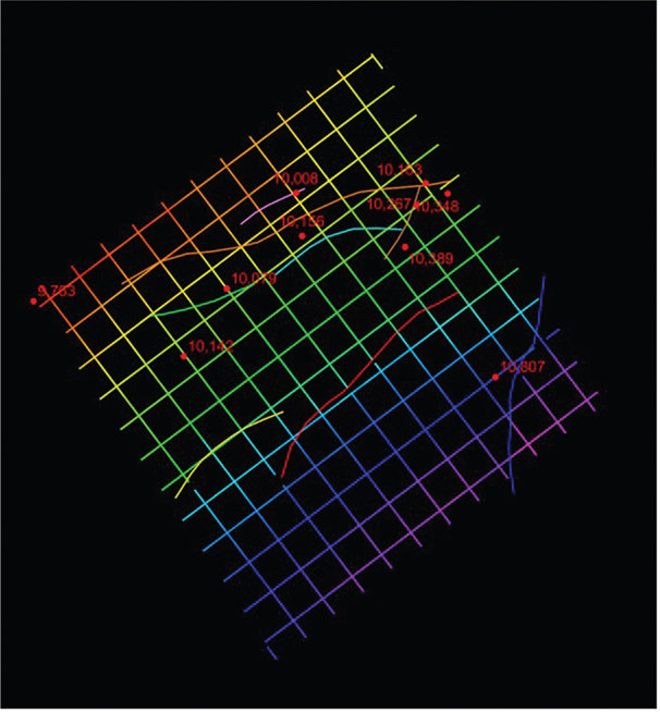
Figure 9-59 Manual interpretation on a 20 × 20 inline-crossline mesh pattern. In faulted areas, this increment lacks detail around the fault intersections, fault trend, and terminations. (Published with permission from Seitel Data Ltd.)
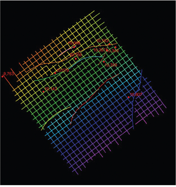
Figure 9-60 Manual interpretation on a 10 × 10 inline-crossline mesh pattern. The detail (lacking in the previous figure) is enhanced. (Published with permission from Seitel Data Ltd.)
Given what we have said about the density of interpretation, if a framework horizon is a high-impedance contrast, laterally continuous seismic event, it may require only a few picks in an area or a fault block to allow autotracking to infill the rest. If this is the case, then autotracking is always the better choice. If for some reason the picks drift off the event, it is better to spend your time adding manual interpretation to the input and rerunning the autotracker rather than trying to clean up afterward. However, autotracked horizon surfaces are notorious for being noisy and generally do not contour well without smoothing.
Infill Strategies in the Absence of Autotracking
There are basically four methods to infill a surface. The acceptability of the result depends on data quality, structural complexity, desired objectives, and which software parameters are being used. The four methods are autotracking (discussed previously), manual picking, interpolation, and gridding. Before looking at the methods, these questions should be asked: Why infill a horizon surface at all? Can an accurate structure contour map be constructed without infilling a horizon? If that is the only objective, then yes, it can be done without additional interpretation. There are many reasons, however, why an infilled surface may be necessary. It can be used as a reference for seismic attribute extraction, such as amplitude or coherence. It can be used for detailed structure mapping where there are subtle complexities. Infilled surfaces are essential when performing layer computations such as isochores, isochrons, and depth conversion. Finally, these surfaces can be used as a reference for analysis, targeting horizontal wells, flattening cross sections (or seismic), or a myriad of other uses. The objective for using infilled horizon surfaces will determine which method is best suited to the task.
Manually picking each line is an option that should be used sparingly when needed. For example, when working (1) complexly deformed or difficult areas such as very small fault blocks, (2) near fault intersections, (3) around faults of limited extent that could affect pressure communication between wells, (4) within intersecting fault patterns, (5) in areas of stratigraphic complexity such as angular unconformities or facies changes, or (6) poorly imaged areas. These types of situations usually do not autotrack well, not to mention the difficulties they create in gridding and contouring mapped surfaces later. Detailed manual picking to fill in small areas is one of those tedious tasks that should be used as a last resort but is necessary from time to time. Figure 9-60 discussed previously, is the starting point for comparing interpolation, gridding, and autotracking.
Interpolation is faster than manually picking every line. Simply stated, with linear interpolation, the computer uses two interpreted lines and calculates horizon values between them. This is usually tied to the 3D survey geometry, inlines, and/or crosslines and therefore, is unique for that 3D survey. The prerequisite for this to work is that interpretation must be done closely enough to reasonably represent the interpreted seismic event. Interpolation can be used to bridge gaps in the data or across sparse interpretation where no changes are expected to occur. It can be used as a quick and dirty infill strategy. Figure 9-61 is an example of an interpolated horizon. The surface is reasonable, but some issues are noted around faults.
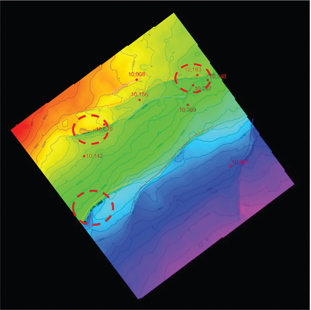
Figure 9-61 Interpolated horizon from manual interpretation on a 10 × 10 inline-crossline mesh pattern. Contouring around faults is poor due to edge effects of the interpolation. (Published with permission from Seitel Data Ltd.)
Gridding is the most common infill technique besides autotracking. Gridding takes data from sparse and/or irregularly spaced interpretation and computes a surface in XYZ space. The X-Y dimension is known as the grid cell size and is not tied to a particular 3D inline/crossline geometry. Gridding algorithms and parameters can be selected to show every nuance of a structural surface or can act as a smoothing filter to remove noise in the interpretation. Parameters for gridding techniques may be specific to an area or play; therefore, we do not discuss each gridding algorithm in detail. Suffice to say that in specific cases, one gridding method is more applicable than another. Experimentation to find the right combination of gridding algorithm and parameters that work best for the data set is acceptable. Computing a gridded surface will usually yield the best-looking map over the other infill methods. Figure 9-62 is a gridded version of Figure 9-60 and, when compared to the autotracked version (Fig. 9-63), the cleaner appearance can easily be seen. Results from all three infill techniques will improve significantly with smoothing. But as with any interpretation, the result should always be validated with the seismic to ensure compatibility between the two. Most workstation software allows infilled horizons and gridded surfaces to be used interchangeably; however, a few techniques require one or the other exclusively.
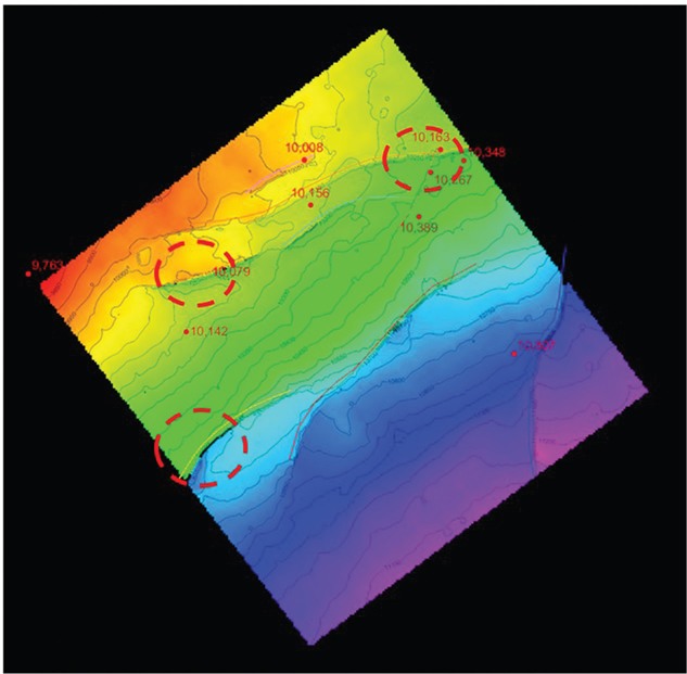
Figure 9-62 Gridded surface from manual interpretation on a 10 × 10 inline-crossline mesh pattern. Contouring around faults is significantly improved. (Published with permission from Seitel Data Ltd.)
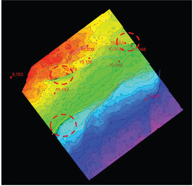
Figure 9-63 Autotracked surface tracked in just seconds from one seed point. However, this result shows the noisy nature of autotracked horizons and some issues with contouring near faults. The maps made by each of the three infill techniques will improve significantly when smoothing is applied. (Published with permission from Seitel Data Ltd.)
Accurate well log correlation and accurate interpretation of framework and target horizons are the most important elements when making reliable structure maps. Using efficient interpretation techniques allows large data sets with many framework and target horizons to be evaluated in a reasonable amount of time. By using autotracking technology and other infilling strategies, interpreters can have maps ready at any stage for quick evaluation while they continue to refine areas of higher interest. In the next section, we discuss a common technique to convert time-scaled horizons, grids, faults, and seismic volumes into depth-scaled objects in preparation for creating the final structure maps.
Structure Mapping
The final phase after the interpretation of the framework horizons and faults is to make a time structure map on each horizon and any non-framework target horizon maps. Structure maps are made by gridding and contouring each surface and accounting for any faults that intersect that surface. We previously mentioned that it is helpful to make preliminary structure maps early in the project to quality check each surface for potential pitfalls such as interpretation mis-ties, fault location, and agreement with existing well control. They are also useful to test the 3D validity with other framework horizons. However, once the depth conversion process is complete, it is best to work completely in the depth domain. The following sections describe the process of making final time-structure maps, although these methods also apply to depth surfaces.
Drawing Accurate Fault Gaps and Overlaps
Drawing accurate fault gaps and overlaps on maps is one area in which good software goes a long way. The many ways to accomplish this task depend on which software is used. Some tools allow the interpreter to manually draw the fault gaps, whereas others compute gaps based on the integration of the fault and horizon surfaces. Some tools work in 2D, while others work in 3D. Construction of fault gaps and overlaps is described in this book in Chapter 8, but generally stated, they are defined as the map representations of the footwall and hanging wall horizon cutoffs where the horizon is intersected by a fault surface. Normal faults create a gap, and reverse faults create an overlap in the horizon. The locations of horizon cutoffs and the width of fault gaps and overlaps in complex areas are extremely important with regard to well design and drilling and completion practices.
Fault gaps are either manually drawn by the interpreter or autogenerated. For speed, it is usually best to autogenerate the fault gaps; therefore, it is important to have well-defined fault surfaces and horizons. The autogenerated fault gaps will usually need some manual editing. Manually drawn fault gaps take slightly longer to produce, but doing it this way provides total control for the interpreter and is sometimes necessary in poor data areas or in complex geology where faults intersect. The author prefers manually drawn fault gaps because, once completed, they rarely need updating.
Figure 9-64 is a typical Eagle Ford vertical seismic display with the Navarro Formation and several faults interpreted. In map view, the series of faults cutting through the horizon provide a guide for manually drawn fault gap polygons (Fig. 9-65). It is our opinion that manually drawn fault gap polygons are one of the best ways to ensure a geologically valid map. In the workstation environment, they also serve to control the horizon infilling process (discussed previously) and computer contouring.

Figure 9-64 Eagle Ford: Typical seismic line showing a series of small faults cutting up through the Navarro Formation (magenta horizon is near the top of Navarro). (Published with permission from Seitel Data Ltd.)

Figure 9-65 Eagle Ford: In map view, the series of faults cutting up through the Navarro Formation provide a guide for hand-drawing the fault gaps as shown. (Published with permission from Seitel Data Ltd.)
The position and heave of the fault gap can be checked in the workstation environment. One way is to display contours from each surface and locate the points of intersection of contours of equal value. Figure 9-66 is a good example of 3D integration of fault and horizon surfaces. Another way to do this is to simply subtract the fault surface grid from the horizon surface grid. Where the two grids intersect, the values should be at or very near zero. Set the map color scale to highlight the very low values near the intersection of the two surfaces. The fault gap should correspond closely to the computed intersection (Fig. 9-67).
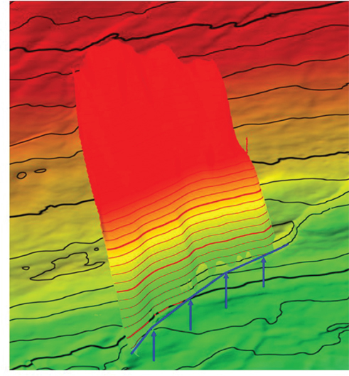
Figure 9-66 Eagle Ford: Each fault gap can be validated by the intersection of the fault surface and horizon surface. The hanging wall fault cutoff is drawn where the contours of equal value intersect (blue line). The same process is repeated for the footwall. (Published with permission from Seitel Data Ltd.)
Figure 9-67 Eagle Ford: Subtracting the two intersecting surfaces results in a good indication of where the fault gap should be. In this figure, the green-red color boundary depicts the location of the zero line where the surfaces intersect. The fault gap is shown in yellow. (Published with permission from Seitel Data Ltd.)
Creating accurate horizon surfaces and fault gaps leads to accurate structure maps. With the framework horizons complete, we are now able to build a velocity model to rescale our time-scaled data into depth.
Depth Conversion
Time horizons, faults, and time-scaled seismic volumes can be transformed into depth-scaled data in several ways, such as the following:
Single-well-or multiple-well-based velocity functions
Time to depth from a checkshot
Time to depth from a VSP (vertical seismic profile)
Time to depth from a synthetic seismogram tie (or ties)
Volume based
Velocity volumes derived from seismic processing analysis
Velocity models calculated from time horizon surfaces and corresponding well log formation tops
Prestack depth migration
The many possible hybrid versions of these methods make a huge number of possible combinations. For the purposes of this chapter, we focus on using time surfaces and well tops to create a velocity model (such as in B2).
The Basic Methodology
The two essential ingredients to using this method are:
Infilled time surfaces from seismic measured in two-way time in seconds (twt). Note that two-way time is divided by 2 to calculate one-way time for velocity calculations.
Formation tops picked in the wells measured in true vertical subsea depth (d) (positive below sea level).
Figure 9-68 is a typical synthetic seismogram from the Midland Basin. Four horizons are chosen as framework horizons, and the corresponding seismic peak or trough is shown on the right. These horizons are tracked on the corresponding seismic reflectors throughout the area of interest. In Figure 9-69, the completed time horizons are shown with the time-scaled seismic volume. The depth control in Figure 9-70 are the formation tops corresponding to the time surfaces. These data together comprise the input data for the velocity model and the subsequent depth scaling of the seismic and time surfaces. Even if the available data were limited to one time surface and one formation top, a single average velocity point (Vavg) can be calculated at the well using Eq. (9-1):

Figure 9-68 Midland Basin: A synthetic seismogram is used to choose the framework horizons for depth conversion. Formation tops are correlated to seismic traces using the character tie between the synthetic from the impedance log and the actual seismic traces at the well.
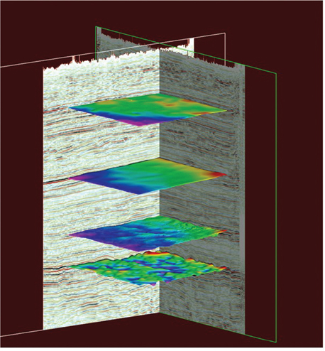
Figure 9-69 Midland Basin: Three-dimensional visualization of the framework horizons and seismic scaled in time.
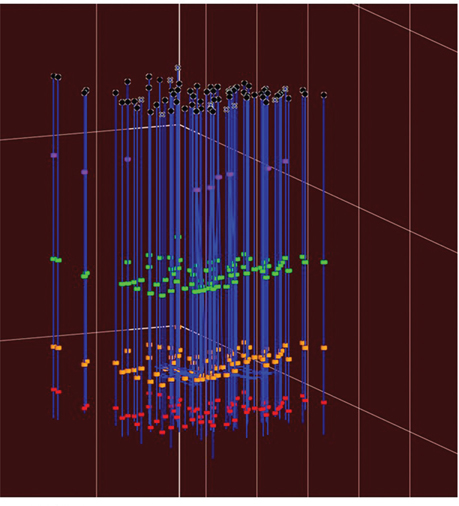
Figure 9-70 Midland Basin: All 80 wells and formation tops shown (four per well) are used as input to the velocity model.
To convert the entire time surface to depth, simply multiply the time surface by the computed velocity using Eq. (9-2):
In practice, this would be the simplest case for this method. More likely, a 3D model would be computed using multiple tops and horizons, as is shown in Figures 9-69 and 9-70. How much well control that is available for velocity calibration varies by location and target horizon. For instance, in the current example in the Midland Basin Wolfcamp play, there are 80 wells within a 40-square-mile area. Each well containing the formation top being mapped contributes a point of velocity control. These average velocity points are combined into a velocity cube model and then used to scale a time surface into a depth surface. By definition, this method creates a depth surface that ties each framework formation top exactly. Since the depth calibration depends on accurate formation tops and time surfaces, the result should be checked for anomalous velocity values. A rigorous quality control workflow should catch the largest anomalies.
An alternative method of computing a velocity model is one that uses interval velocities. Either method works, but there are pros and cons for each. For average velocity, each surface is computed independently, so there is no reference to isochore or isochron computations, which are a good quality-control tool. Of course, isochore and isochron maps can be computed for quality control prior to the average velocity computation, but they are not needed for the velocity model. When interval velocities are used, isochrons computed from time surfaces and isochores computed from tops are the key ingredients and provide a tool for quality control of the resulting velocity and depth maps. If a well does not have each of the tops used in the model, it cannot contribute to the portion of the model where the top is missing. Also, if multiple time horizons are cut by large listric growth faults or low-angle thrust faults, calculating an accurate isochron is challenging. A positive aspect to using interval velocities is that if lateral gradients exist within an interval, they can be discovered.
Final Steps
Once all of the framework well tops and time horizons have been quality checked, the next step is to build a velocity model and compute the depth grids and depth seismic volume. The actual workflow to accomplish this varies depending on which software is used. One method is to simply calculate the depth map from the time and velocity maps. However, the method of using a velocity model described in this chapter is one of many available, but one thing it does is tie all the well control (for better or worse), making a depth map as accurate as the formation tops and shaped by the time horizon. Most workstations are able to use the same information (tops and time horizons) to create 3D velocity models.
It is highly recommended that the velocity volume be reviewed in detail to ensure there are no obvious anomalous velocities that would cause errors in the depth scaling. Figure 9-71 is a 3D visualization of the seismic data co-rendered with the velocity model and framework horizons. Scrolling through the data reveals any areas needing closer scrutiny. More discussion on quality control is covered in the next section. Figure 9-72 is the visualization of all data scaled to depth. The value of having all data scaled in depth has been discussed previously, but to summarize, it is the most effective way to integrate seismic with well logs, petrophysical, whole core, and engineering data such as drilling, completion, and production data.

Figure 9-71 Midland Basin: The computed velocity model is co-rendered with the seismic reflectivity data. The vertical coloring shows the velocity change with increasing two-way time.
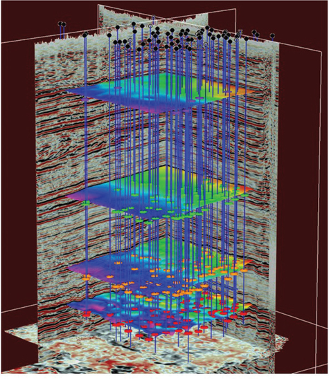
Figure 9-72 Midland Basin: The final computed depth framework showing seismic, formation tops, and horizons. With all data scaled in depth, the analysis and integration of these data with well log and petrophysical data and engineering data is far more effective.
Quality Control of the Results
We recommend checking the quality of the results of the velocity modeling and depth scaling. Figure 9-73 is an example of average velocity in color draped on top of a depth horizon with depth-scaled seismic in the background. Note the area containing an anomalously low velocity (magenta) at one of the wells (red arrow). Investigation of the well top and vertical distance from kelly bushing to sea level (KB) showed normal values; however, the time horizon has some localized mis-picks from autotracking. Figure 9-74 is the same scene but now with average velocity draped on the time horizon. While the same autotrack mis-picks are present on the horizon (green arrows), the horizon at large is much flatter, meaning that the velocity is miscalculated around the well (red arrow). By correcting the time horizon, as in Figure 9-75, and rescaling the horizons and seismic to depth, the anomalous velocity at the well is mitigated (large arrow). Figure 9-76 shows the corrected depth data after fixing the time horizon and rescaling to depth.

Figure 9-73 Midland Basin: Velocity data (in color) draped over a depth horizon shows an anomalously low velocity (magenta) at a well (large arrow). The well data checks out, but the time horizon has some mis-picks in the autotracking (thin arrows).
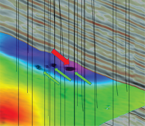
Figure 9-74 Midland Basin: Same scene as in Figure 9-73. However, the velocity data (in color) is draped on the time horizon. The same mis-picks exist in the autotracked horizon (thin arrows), but the horizon is generally flatter, meaning that the velocity is miscalculated around the well (large arrow).
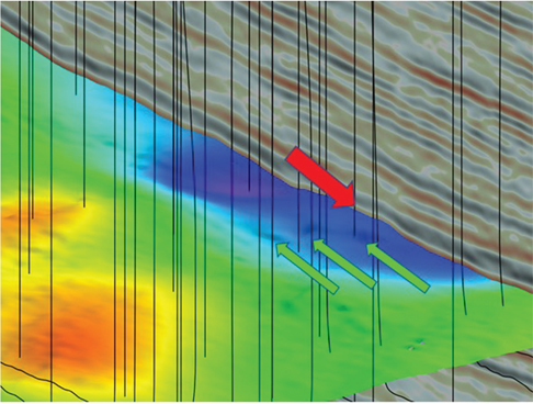
Figure 9-75 Midland Basin: By correcting the time horizon and recomputing the velocity model, the impact should be mitigated in the depth domain.
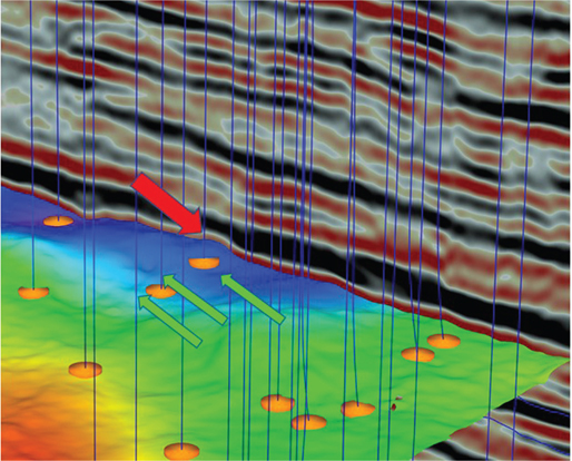
Figure 9-76 Midland Basin: The final computed depth framework horizon and seismic shows the problem is corrected. This is verified by the average velocity draped over the horizon, which is generally lying flat near the well (red arrow).
Creating and Contouring the Target Map
A preliminary depth map is shown in Figure 9-77. This map is not scaled and contoured with enough detail to be used in the horizontal well planning process. A geoscientist should assess the structural validity of the depth map surrounding the well being planned. This involves taking a close look at all nearby wells and the well depths for the specific interval targeted in the well. Though computed contours are generally acceptable and widely used, a hand-drawn contour map is highly recommended as the target structure map.

Figure 9-77 Preliminary depth structure map with a computer contour interval of 100 ft. Well tops used in the velocity model are posted in black. Note this map is not detailed enough to be used in the well planning process.
The landing depth in the horizontal well requires a high level of accuracy as well as the projected dip of the formation and whether any dip changes are predicted. In many cases, a nearby drilled horizontal well can be an analog for the well being planned, but the greater the distance away, the less value the analog will have. Examples of a planned well and a drilled well were shown previously in Figures 9-12 and 9-13.
Similar to the fault interpretation methods discussed previously, generating a horizon time-structure grid during the interpretation process is a good way to check and validate the accuracy of your interpretation. However, there is a big difference between these preliminary time grids and a final target depth grid used to guide a horizontal well. The difference lies in the level of detail and amount of seismic integration with the well data, for example, as in the depth conversion process. Advances in drilling, geosteering, and real-time monitoring of borehole conditions while drilling have routinely led to horizontal wellbores reaching 10,000 ft of lateral length or more while staying within a 50-ft vertical target window (review Figs. 9-12 and 9-13). The final target grids used in well path design have an extremely high standard for accuracy. They are usually contoured at a 10-or 20-ft contour interval. Unplanned structural deviations of ±10 ft or more can jeopardize keeping the bit in the best rock, or worse, lead to mechanical failure and sidetrack—a very costly situation indeed.
Let’s step back for a minute and review what a geoscientist can do to minimize error in the mapmaking process. For the most part, the answers have already been given: (1) Review the time-and depth-scaled seismic volumes and note any discrepancies between the two. (2) Tie the wells using synthetic seismograms to ensure the seismic data and polarity of the target horizons are zero phase. (3) Ensure that the interpreted framework is representative of the geology, which includes compatibility with nearby wells. We now discuss the final step in the process: making structure maps for targeting horizontal wells on a workstation.
In a previous section regarding depth conversion, it was noted that there is not always an optimal time horizon or well control when it comes to velocity mapping and subsequent depth scaling of the target horizons. Some average velocity maps have a high degree of relative variability. A velocity anomaly of more than 30 ft per second can result in a depth variation of 10 to 20 ft on the depth map. If the velocity anomaly lies near the planned well path, it will affect the depth map and consequently the predrill directional plan. This can be mitigated by a diligent geoscientist verifying the structure of the target horizon along the planned well path.
The first step is to verify the formation tops in each of the local wells. Wells found with depth issues are either fixed or removed from the grid. The second step is to verify compatibility with the seismic framework depth grid. A target grid in the Midland Basin Wolfcamp play is rarely the same as a mapped framework horizon, but it can be within a few hundred feet vertically. One solution is to create an isochore map between the framework and the target formation tops and then add (for targets below) or subtract (for targets above) the isochore map to/from the framework depth map. The result is a map that ties the target formation tops and generally has the shape of the framework depth map. Further verification of the target horizon map is needed. For example, many nearby drilled horizontal wells with a similar target will have a point of penetration with the top of the target, which can be mapped as well as additional control points interpreted from the geosteering solution along the well path. However, use of these horizontal wells as additional control should be done with care. For any given horizontal well, there will be increasing uncertainty in the well position along the drilled path. As a final step, a geoscientist involved in planning a horizontal well may opt to use computer contouring (Fig. 9-78) or to manually contour the final target map to remove any anomalous structure not previously removed from the quality-control process. Figure 9-79 shows two example horizontal well paths. Well A, which is planned primarily along strike, should not anticipate more than 20 ft of structural change along the path. The second, Well B, crosses a structural nose with about 50 ft of elevation change along the path. The dip change along the well path is anticipated to be 0.6 deg up then 0.6 deg down across the nose. These dip changes are well within the range experienced in the Midland Basin.

Figure 9-78 Computer gridded and contoured target horizon map with a contour interval of 10 ft. Regional structural dip is generally to the west; however, there is a lot of structural variation to account for when planning wells.

Figure 9-79 Target horizon map with planned wells shown (A and B). Wells planned within several hundred feet of each other can still require different well paths. Well A is generally flat with about 20 ft of vertical structure, while Well B is expected to encounter about 50 ft of structure in the well path.
Conclusion
In this chapter, we presented 3D seismic interpretation and mapping techniques consistent with the overlying principles discussed throughout this book. Using a consistent, principled workflow is critical to achieve repeated success in the current and future development of conventional and unconventional oil and gas resources. We discussed ways to increase efficiency through appropriate planning and organization of the geoscience work so that important milestones are met and the overall development plan remains on schedule. Constructing accurate maps to guide the planning and drilling of horizontal wells is a must for oil and gas companies in order to achieve the highest possible return on capital. Workstation technology provides unprecedented integration of geophysical, geological, and engineering data, leading to more robust solutions to some of the industry’s most challenging technical hurdles. The philosophy and techniques described in this chapter are meant to inspire geoscientists to apply their creativity using proper tools and skills to make accurate and timely interpretations leading to a positive career path and the success of their company in a competitive world market.