Chapter 25
Creating a Project Template
A lot of work goes into putting together a building design project. Not only must you coordinate the design intent, you must also coordinate the means to communicate it. Anyone interested in saving time and money to achieve the goals required by a project immediately begins to ask how they can simplify or automate the numerous tasks.
Project templates are the cornerstone to improving efficiency when you're working on an Autodesk® Revit® MEP 2016 project. Revit for MEP is a design and documentation tool, and those who are paid to do design work should not have to spend time on anything other than achieving their design goals. A well-developed project template lets you focus more on design without having to spend time developing and defining settings or standards each time a task is required, because they are already created for you.
The first consideration for creating a Revit project template should be the requirements for the delivery of the design. There is no need for certain settings or features in a template if they are not used on a project-by-project basis. Some clients may have certain standards that require a unique template altogether. Because project templates are the culmination of company or client standards, they should be managed by one person or a small group of people, with input required from the leads of each discipline. Project templates are fluid documents that require updates, so allowing global access to them can make them difficult to manage. However, input as to what should be included in a template can be made by anyone who works on projects and understands the need for features or functionality.
Revit MEP 2016 comes with template files that can be used for starting a project right away. You may choose to use these templates for a project or as a starting point for building your own template.
Whatever their use, project templates are the starting point that allows you to work seamlessly without breaking the momentum of collaboration and coordination efforts of your projects. The goal of creating a template is not to include every single item or standard that you use but to determine what is most often needed.
The creation of templates is usually assigned to the most Revit-savvy people in a company. If you are new to Revit, consider reading this chapter from an informational standpoint or skipping it altogether and coming back to it when you have developed a better understanding of Revit terminology, concepts, and best practices.
In this chapter, you will learn to do the following:
- Set up views and visibility
- Establish project settings
- Define preloaded content and its behavior
- Create sheet standards
Understanding Templates
The reason for setting standards is so that project documents look the same within a construction document set and so that different sets of documents appear to have come from the same place. Some companies care more about how their drawings look than others, but uniformity should exist regardless. This applies not only to the content that makes up a model but also to the organization of model views, the naming of views and schedules, and the overall drafting conventions used.
Once it has been determined how views should be displayed for each type and each discipline, you can establish those settings in your project template so that each project begins from the same starting point. Because every project is unique in some way, it is possible to modify the default settings as needed, but that does not eliminate the need for baseline settings.
You want to be able to begin working on a project without having to spend time setting up how the project appears in your views. Preset views and visibility settings increase productivity on your projects by eliminating the need to do repetitive tasks just to get started.
There is no right or wrong way to create a template. Choosing one way over another is just a matter of preference. As you go through this chapter, I will do my best to give you the best options for achieving an effective project template.
Determining the Number and Types of Views Needed
The ability to create a view and begin working without spending time setting it up can help reduce the time it takes to complete a project. It is also helpful in reducing drafting errors and maintaining a consistent look among construction documents.
We know that certain elements should be displayed in certain types of views and that some elements should be displayed differently depending on the type of view. For example, you may want to show plumbing fixtures as halftone in a mechanical heating, ventilation, and air-conditioning (HVAC) plan but display them normally in a plumbing plan.
The way that objects are displayed by default is set up in the object styles of a project. We'll discuss object styles later in this chapter. The way that a view displays the model and specific objects within the model is controlled by the properties of the view.
When you select a view in the Project Browser, its properties are displayed in the Properties palette; if you are not using the Properties palette, you can right-click a view and select Properties.
Some properties of a view are the result of the type of view that has been created. View types include floor plans, reflected ceiling plans, sections, elevations, and 3D views. These are all views used for displaying the model. There are also drafting and detail views that are used for displaying 2D details or diagrams. Some detail views are a combination of model display and detail components.
When building a project template, you should consider what types of views will be necessary. Choose to create only those views that you know will be used on nearly every project. Otherwise, you might end up creating more work for each project by having to clean out all the unused items. The types of views you create also depend on your workflow for a Revit project. If all the design disciplines share a common Revit model, you want to have the views that each discipline requires. Obviously, if you create a separate project file for each discipline, there is no need for all the discipline views in each template. However, managing multiple templates can be time-consuming and inconsistent standards could result in this giving a poor and difficult to manage documentation set.
Setting the Number of Levels
Another important consideration is the number of levels to include in a template. The architect typically determines the number of levels, so it is possible to not include any levels in your template and copy/monitor the architectural levels after the project file has been created. However, you must have levels in your template if you want to create views and view templates. So, a view should be created for each level and each type of view you want in the project template. It is important not to have too many default levels and views, especially if you end up deleting them all prior to using the Copy/Monitor tool.
Working with Plan Types
Views should be created in your template for each type of view to be used. These are generally determined by the Sub-Discipline property of the views. Whether your template is single-discipline or multidiscipline, a floor plan should be created at each level for each subdiscipline type.
When creating reflected ceiling plan views, you should create only one ceiling plan view for each level. This promotes coordination among disciplines because everyone will be viewing the same ceiling plan and because all components of the model that occupy the ceiling can be made visible. Because this type of view does not belong to any one specific discipline, you may want to assign it to the Coordination discipline to distinguish it as unique.
Reflected ceiling plan views that are needed for construction documents can be created for the specific discipline that requires them after the project has been created.
Creating a Working View
This type of view, also known as internal views not for publishing, is the same as the views that will be used on construction documents, but the settings can be different so that more or less of the model can be seen. Working views also allow for different graphic representations without having to constantly change back and forth within the view that goes on a sheet. For example, ductwork plans are typically shown with the Visual Style set to Hidden Line or Shaded With Edges, which can sometimes have performance issues. You can create a working view with the Visual Style set to Wireframe, which has the best overall performance but not the nicest look. Although it is easily navigable, it can be hard to understand; although you can model here, you wouldn't necessarily want this type of view to be printed.
One thing to note about using working views is that it may cause problems with keeping your project coordinated. If you are used to working in this type of view during the course of a project, you may place tags, dimensions, or other annotation elements in the working views, which will not show up in the view that actually gets placed on a sheet. To avoid this kind of problem, you may want to consider turning tags off in the working views. This way, whenever the designers attempt to tag an object, the tag won't be visible, reminding them that they are trying to tag in the wrong view.
Choosing Display Settings for Views
Once you have established the types and number of views to include in your template, you can set the properties that determine the display characteristics of the view. These settings will be the default, or baseline, settings because the need to change them occurs regularly while you're working in a project. In fact, the need is so common that a set of tools is available on the View Control Bar of the user interface for quick access to changing the settings. It may not seem necessary to set these properties because they can be easily changed, but it is good to start with the best options for these settings.
You can choose the default settings by editing these parameters:
- View Scale
- Detail Level
- Visual Style
For the most part, model plan views are set to 1/8″ = 1′-0″ (1:100 mm) scale and are displayed at Medium detail with a Hidden Line visual style. Consider using the Shaded visual style with the Show Edges option at a Fine level of detail for 3D views. This gives the viewer a better sense of the model and will display any pipes or conduit in full 3D.
When you're creating views that will include piping, setting the detail level to Fine enables you to see the actual pipe, pipe fittings, and accessories instead of their single-line representation. Many users prefer to model their piping systems in Fine detail because it is easier to see where connections are made and to discern differences in pipe sizes. For piping plans that are set to Fine detail, the Visual Style option could be set to Wireframe, because this may help improve performance when zooming or panning in the working view. The visual style should be set to Hidden Line when these views are designated as sheet views for printing so that it can be easily determined which pipes are crossing.
You may also want to edit the following parameters:
- Underlay
- Underlay Orientation
- Phase properties
You can use the Underlay and Underlay Orientation parameters to display other levels of the model as an underlay to the current view. Doing so causes the underlay to appear as halftone, whereas any detail or annotation graphics are displayed normally. You can choose which level to underlay by using the Underlay parameter; the Underlay Orientation parameter determines how the model is being viewed. Any level of the model can be used in any other view. Although these are useful settings for seeing how things line up in your model, it is not necessary to set an underlay in your default view settings.
Phase properties of a view are important when working in phased projects. They add another level of visibility that can cause frustration if not set properly. Although these are instance parameters, they really should be used to determine the types of views you create. If you do a lot of renovation work, it is good to have default existing and demolition phase views in your template, or to have them developed as view templates for applying to new views. Items placed into your model will take on the phase of the view in which they are placed. Another option is to have a template that is phase ready, for remodeling projects, and another one that is not, for your new construction projects.
Plan views have type parameters for setting what family to use for callout tags within the view and for setting what reference label is used when other callouts reference the view. Drafting views have the same type parameters as well as one for section tags. Once you have determined what families will be used for your sections and callouts, you can assign them to the appropriate views.
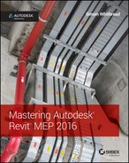
Section and elevation model views have a unique parameter called Hide At Scales Coarser Than. You can set a threshold that prevents Revit from displaying section and elevation view annotation in other views using a scale coarser than the threshold. Revit uses the words finer and coarser to distinguish between view scales. For example 1/8″ = 1′-0″ (1:100) is coarser than 1/2″ = 1′-0″ (1:20). This eliminates the need for controlling the visibility of these markers with Visibility/Graphic Overrides settings. Figure 25.1 shows the parameter for hiding a section view marker at a specified scale.
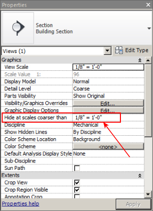
Figure 25.1 Parameter for hiding a section view
Visibility Settings for Template Views
There are many parameters for view properties that can be set by default. It is best to keep things simple by setting the most common parameters that will determine the general style of the view. Visibility settings are the most important to any view because you want to see what you expect to see in a particular type of plan. It can be frustrating and time-consuming to have to turn off unwanted model elements every time you open or create a new view.
There are two primary areas of visibility control within a view: the View Range settings, which determine the field of view when you're looking at the model, and the Visibility/Graphic Overrides settings, which allow for turning categories of elements on or off as well as other aspects of their appearance. For example, in a plumbing floor plan, you may want to use the Halftone check box under Visibility/Graphic Overrides for mechanical equipment and then turn off all ducts, air terminals, fire-protection elements, and so on. The pipe visibility can be controlled with filters, so you can turn off the mechanical pipe systems. The end result is a plumbing plan displaying only the elements that are relevant to the plumbing discipline, with all others either turned off or displayed in halftone.
View Range
There are two parts to View Range: Primary Range and View Depth. The primary range consists of the top, bottom, and cut plane of a view. For a floor plan, Top defines the elevation from which the model is being viewed. Bottom is the extent to which the model is being viewed from the Top setting. In other words, it is how far you are looking. Cut Plane refers to an imaginary plane that cuts through the architectural and structural elements. The portions of these elements in a floor plan view that are above the cut plane elevation are not visible.
For a ceiling plan (also called a reflected ceiling plan), the view is the other way around. Essentially it is as if you are looking up from the cut plane to the top of the view.
The View Depth setting can be used to extend the range of view beyond the top or bottom. However, any elements that fall within that range will not react to any overrides assigned to their category in the view. In other words, if you override the color of pipes to be blue in a view, only pipes that are between the Top and Bottom (the Primary Range) settings of the view range will be blue. Any pipes that fit within the range of the View Depth setting are displayed with the style assigned to the <Beyond> Line style, which can also be adjusted per view. Of course, you can manually override elements by using graphic overrides or the Linework tool under the Modify tab after they have been created.
Although you may have levels established in your template, there is no way of knowing what their actual dimensions will be until the building is modeled. However, there is a way to set default View Range settings that ensures that the initial view of the model will correctly show the building elements. For example, to establish a view range that ensures visibility of objects for a first-floor plan view, follow these steps:
- For plan views, choose View Properties ⇨ View Range and set Top to Level Above with an Offset setting of 0′-0″ (0 mm).
- Set Cut Plane to 4′-0″ (1200 mm).
- Set Bottom and View Depth to Associated Level with an Offset setting of 0′-0″ (0 mm).
Adjustments may be required, depending on the construction of the building, but these settings are a good starting point because they will display all the visible model components from floor to floor. Because the Cut Plane setting is what determines the visible architectural and structural components, you don't need to worry that the actual floor object of the level above will interfere with visibility.
Figure 25.2 shows an edited View Range for a floor plan. In the section behind, we can see the View Direction (looking down), Top has been set to Level Above with a -0′-9″ (-225 mm) offset, Cut Plane is set to 4′-0″ (1200 mm), and View Depth is set to Associated Level -2′-0″ (-600 mm) in the dialog box.
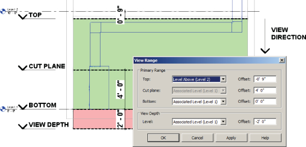
Figure 25.2 View Range settings for a floor plan view
For a ceiling plan view, the settings are different:
- Set Top to Level Above with an Offset setting of 0′-0″ (0 mm).
- Set Cut Plane to 6′-0″ (1800 mm).
- Set View Depth to Level Above with an Offset of 0′-0” (0 mm).
In Figure 25.3 you can see the major difference from a floor plan. The view direction is upward; the bottom is unavailable; and in this example, the view depth matches the top.
Figure 25.3 View Range settings for a ceiling plan view
Visibility/Graphic Overrides
In the Visibility/Graphic Overrides settings of a view, not only can you turn components on or off, you can also change their color, linetype, or transparency. Items that might ordinarily appear with normal lines can be set to Halftone. You can apply settings to the subcategories of components as well.
One of the ideas behind establishing default visibility settings is that you do not want certain items showing up in specific views. For example, lighting fixtures are typically shown on a separate plan from receptacles and power devices, but because all of these components are being placed into one model, they show up in every view (depending on the View Range settings) unless they are turned off.
It is a good practice to make a list of all model components that you would like to see in a particular type of plan, and then turn off all others. If you are not quite sure about some components, it is best to leave them on because seeing items encourages coordination, whereas not seeing them may lead to a design conflict in the model. Be sure to check the necessary disciplines from the Filter list pull-down in the upper-left corner of the Visibility/Graphic Overrides dialog box (see Figure 25.4).
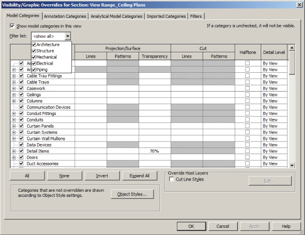
Figure 25.4 Visibility/Graphic Overrides
Annotation components are specific to the view in which they are placed, so it is not crucial to set up default visibility for them. After all, it is not likely that you will be placing air terminal tags in your lighting plan, for example, so there is no need to turn them off. In fact, if the air terminals are turned off from the Model Categories tab for the lighting plan, Revit can't display air terminal tags. Tags appear only when the model element is visible. However, there are some annotations for categories that you may want to adjust, such as setting the Space Tags category to Halftone. Many families contain nested annotations, so you should also check the subcategories of Generic Annotations to set any necessary visibility.
Relying on using linked files from other disciplines or consultants, you'll find that those links will react to whatever visibility settings you apply to the view. This usually works well when a project begins, but as the model is more fully developed, you will find that you are constantly managing the visibility of the linked files in views. Consider linking files into your template that will act as placeholders for the actual project files to be linked. Doing so lets you establish default visibility settings for the links before you get real files, ideally reducing the time spent managing visibility after the project is in design.
Worksharing cannot be enabled in a Revit template (RTE) file, so if you want to establish default worksets and visibility settings for them, you need to create a Revit project (RVT) file that is to be used as a project template, and then create a new project file by using the Detach From Central option when opening the file, rather than specifying a new project from template.
This scenario requires careful management of the file because of the nature of a worksharing environment. Some companies have written applications to make it easy for their users to set up a project this way without damaging or misplacing the project “template” file. You should set up your template this way only if you are absolutely certain that personnel who have extensive Revit experience will manage it.
For more information on worksharing, see Chapter 3, “Worksets and Worksharing.”
View Filters and View Templates
View filters let you identify and distinguish between elements assigned to systems, like pipes used for domestic hot water and those used for hydronic supply, for example. One of the systems needs to appear on the plumbing sheets and the other on the mechanical sheets; without filters, you can't do that. View templates allow you to control the graphical fidelity of as many similar views as you wish. View filters and view templates are discussed in more detail in Chapter 2, “View Filters and View Templates.”
Schedule Views
Preset schedules belong in a project template too because they ensure consistency and increase productivity. This topic is included here because, by displaying the data within the components that make up the model, schedule views are actually data-only views of the model components.
Schedule views can be saved within their own project file that can be loaded into a project as needed, so it is not necessary to have every schedule that you might use in your project template. The types of schedules you should include are ones that you know will be in every project. If you are going to create a schedule in your template, you must use parameters that are available in the template file. The parameters will be available either because they exist in components that are loaded into your template or because they are set up as project parameters. This is most easily achieved by using shared parameters because it is important that the parameters in your content are the same as those in the schedule. Be careful when determining what parameters need to be in the template before setting up a schedule. For more information on creating schedules, see Chapter 7, “Schedules.” For more about creating and managing parameters, see Chapter 6, “Parameters.”
Some types of schedules can be included in your template just because they are useful for managing the project. For example, consider adding a view list (a schedule of views) to your template. You'll be able to quickly see information about your views to determine whether you have all the views required for a project, whether they are named correctly and use the correct scale, and whether a view has not yet been placed onto a sheet. This is also a good way to change the parameters of your views without having to locate them in the Project Browser. Figure 25.5 shows a small sample of a View List schedule as it would look in a project file. Much more information can be added to a View List schedule, including any custom parameters that you create for views.
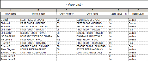
Figure 25.5 Sample View List schedule
Other types of schedules you should consider for your template are those that are used for quality assurance or analysis or schedule keys for applying values to parameters such as Space schedules. They hold a great deal of analytical information. Even if you do not use Revit for energy or engineering analysis, a Space schedule can be useful for merely managing their names and numbers.
The ability of Revit to generate spaces automatically is a great feature; however, it will generate spaces where there is no room object in the linked model. It can be tedious and time-consuming to search through a large floor plan looking for spaces that should not be in the model. When these spaces are found in a plan view, deleting them removes them only from the model and not from the project. A simple Space schedule can be used to find all the spaces that are not necessary, and it gives you the ability to delete all of them from the project with one click by selecting all the rows in the schedule and clicking on Delete Row.
Figure 25.6 shows a sample Space schedule that reports the room name and room number of each space. The blank rows indicate spaces that have been placed where there is no room object. These rows can be highlighted in the schedule and removed from the project by clicking the Delete button on the ribbon. If you do energy analysis with the Revit model, those spaces will be needed. However, for energy analysis I recommend that you set up another project because in most cases the architectural model will need to be altered in ways that are unacceptable for a typical documentation model. For the documentation model, those “blank” spaces are simply polluting the model and will create more work if you use the Tag All command.
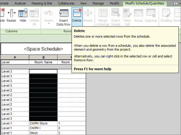
Figure 25.6 Space schedule
If you are using the Panel Schedule feature within Revit MEP, you can create templates for panel schedules and store them in your project template. Click the Panel Schedule Templates button on the Manage tab, and select Manage Templates. In the dialog box is a list of any templates in your file. You can create a new one by clicking the Duplicate button at the bottom of the dialog box. See Chapter 7 for more information on creating and editing panel schedule templates.
You likely will end up with an extensive list of schedules, some of which won't get used for all of your projects. This is the case with all mechanical equipment and accessory schedules. In addition, certain organizations may require you to build a separate schedule for their projects (for example, the U.S. Department of Veterans Affairs or the U.S. Army Corps of Engineers). Instead of cluttering your template with all those schedules, you may want to consider creating a project that contains all of your company schedules or multiple projects based on major clients. Designers can then use the Insert View From File tool or just copy and paste only the needed schedules for their projects. The same method can be applied to details, using a single Revit project to store all of your details.
Establishing Project Settings
Many settings can be preset in a project template just to make it easier to begin a project. Some settings relate to how system families behave, whereas others determine how objects will print or what text looks like. There are also settings for values that Revit uses in calculations. Having all of these set properly in your project template ensures that when you begin a project, you will see the model and data correctly and according to your standards.
Object Styles
The Object Styles settings within Revit determine how elements will be displayed by default (globally for the entire project) if no overrides are applied to them in a view (locally). You can set the defaults for model and annotation components as well as for the layers of any linked or imported CAD files (assuming you load dummy placeholder files). These settings can be applied to subcategories as well.
Even though the Visibility/Graphic Overrides settings are often used in views, it is important to set the standards for how elements display. The need for overrides comes from having several types of an element within one category. For example, plumbing fixtures may need to appear in halftone on the HVAC views and black in the plumbing views. This can be achieved by selecting the Halftone check box for plumbing fixtures on the Model Categories tab. However, if you need to do something similar for plumbing and mechanical equipment, you will find that there is no such thing as plumbing equipment in Revit. To be able to use halftone for the plumbing equipment in your HVAC views, you can create filters that are looking at a parameter within the mechanical equipment families (something like a Yes/No parameter called Is Plumbing Equipment). You could also use subcategories for this by creating subcategories in your mechanical equipment families for HVAC, plumbing, and so on, but you would need to ensure that all of your families are set up correctly for this to work. Possibly the easiest way to filter by trade within a single model would be to use worksets, but this is not what worksets were set up for, and you should take care whenever worksets are involved.
Before Revit MEP 2012, filters were used to separate the way pipes and ducts are displayed. But in Revit MEP 2012, Autodesk introduced system families called piping systems and duct systems, which allow you to control color and linetype globally for the project. The reason you need to know about this change and when it happened is that if your company has active projects in multiple versions of Revit, most likely you will need to consider managing multiple templates as well as training your users how to use the different methods.
You can access the Object Styles settings for your template from the Manage tab of the ribbon. The Object Styles dialog box lists all the model, annotation, and imported categories on separate tabs for easy access. These are the types of settings you can apply to a category:
- Line Weight Projection line weight is the thickness of the lines of an object if it falls within the view range and is not cut by the cut plane.
- Cut Line Cut line weight is the thickness of the lines of an object that is cut by the cut plane. Keep in mind that the cut plane does not apply to MEP objects and affects only architectural and structural elements, which is why the column is grayed out for MEP categories. Also worth mentioning is that walls that are less than 6′-0″ (2,000 mm) high will not show as “cut”; they are shown in your plan from above, regardless of the location of the cut plane. Architects generally use a lighter line weight for walls that are not full height, floor to floor, so Revit somewhat arbitrarily decides that walls 6′ or shorter will not use the cut line weight. Walls that have a top constraint, such as the level above the cut plane, but use a negative offset to reduce their height will use the cut line weight.
- Line Color This setting is for establishing the default color of objects within a category.
- Line Pattern This setting determines what type of line will be used for objects in a category. This setting does not use a line style but rather applies a line pattern directly to the objects.
- Material You can apply a material to a model category. This is primarily for rendering purposes, but it can also be useful for material takeoffs; however, the material applies to the entire category, so you cannot establish unique materials for different types of pipes or ducts by using this setting.
With duct and piping systems as system families, you can define properties for specific engineering systems and apply graphic overrides for unique display of the components that make up the system. The display of these systems is not established in the Object Styles dialog box but rather in the type properties of the system families, as shown in Figure 25.7.
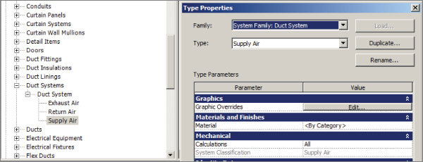
Figure 25.7 Duct system graphic overrides
The display of the new placeholder categories can be defined in the Object Styles dialog box, along with the lining and insulation categories that have been added for both pipes and ducts.
Drafting Line Settings
In the same way that the Object Styles settings define how model, annotation, and imported objects are displayed and printed, it is necessary in a template file to define the various line styles that will be used for any drafting or detailing that may be done in your projects. A line style is defined by its weight, color, and pattern. You can create different combinations of these settings to define lines that are used for specific drafting purposes or that match your standards.
Line Weights
The first settings to consider when creating line styles are the available line weights in your template file. You can access the Line Weights settings by clicking the Additional Settings button on the Manage tab of the ribbon.
With Revit, you can use up to 16 line weights. Typically, line weight 1 is the thinnest line, and line weight 16 is the thickest. The Line Weights dialog box has three tabs that give you access to the settings for lines, depending on what type of view or to what objects the line weights are applied. The first tab is for model objects. Model line weights are dependent on the scale of the view in which they appear. You can define a thickness for each of the 16 line weights as they appear in a specific view scale. This gives you the freedom to show lines that are usually very thick as much thinner when the view scale is larger (or coarser using the language of Revit). Figure 25.8 shows the Model Line Weights tab of the Line Weights dialog box. Notice that line weight 14 is half as thick in a 1⁄16″ scale view as it is in a 1⁄8″ scale view. This keeps items from printing as blobs in larger scale views without having to adjust the line weights of objects manually using Visibility/Graphic Overrides.
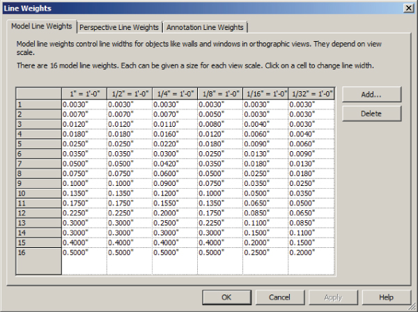
Figure 25.8 Model Line Weights tab
You can add or delete view scales for line weight settings by using the buttons on the right side of the dialog box.
The Perspective Line Weights tab lists the thickness settings for the 16 line weights as they would appear in a perspective view. These settings do not apply to the default 3D view types but only to views that are generated from an explicit camera position. There is only one setting for each line weight because perspective views don't have a view scale parameter.
The Annotation Line Weights tab is used for defining the thickness of lines used in annotation objects. These settings are also independent of the view scale. Another way to think of this is that the settings you apply determine how thick the lines will print. This is the easiest place to start when establishing your line weights for your template. Most people use only about six or seven different line weights, so it is not necessary to come up with a thickness for all 16 line weight options.
Once you have established the settings for your line weights on the Annotation Line Weights tab, you can then apply the same settings to the Model Line Weights and Perspective Line Weights tabs. For the Model Line Weights tab, you will need to decide how to reduce the thickness of your heavier line weights at larger scales. The line weights that you define will be available for use in your template and subsequent project files for setting object styles or overriding the visibility of categories in views.
Customizing line weights doesn't come without consequences. If you are relying on downloading content from manufacturers or online resources, the line weights might not appear consistently. Also, customizing the line weights may affect the people who receive your file. When working with Revit, you should always consider the rule, “Just because you can doesn't mean you should.” If you are just starting with Revit, I recommend trying to use line weights out of the box to see how well they work for you first.
Line Colors
The main thing to remember is that the color has no bearing on how thick the lines will print. You can have a red line with a line weight of 3 next to a blue line with a line weight of 3 and they will both print the same thickness.
Color can be useful for distinguishing systems or objects in a crowded engineering plan or detail. If you have a set of standards for the color of specific types of components, you can set the color for line styles that you create to represent those objects in the same way as you would set the color for model objects in the Object Styles settings. Be aware that using colors in Revit may cause printing issues. If your print settings are set to print color, then all colored lines and objects will print as expected. However, if you are printing to a black-and-white printer and your settings are set to grayscale, any colored objects or lines will print at the grayscale equivalent of that color, which could produce unexpected results. This relates to managing your print settings, but it is important to consider when deciding to apply colors to line and object styles. If your practice is to print with black lines, colors won't affect your output.
Line Patterns
To access the line patterns available in a Revit file, click the Additional Settings button on the Manage tab and select Line Patterns. Revit line patterns consist of dashes, dots, and spaces.
The line patterns in Revit are designed based on their printed size and independent from the view scale in which they are drawn, and there is no setting to apply a scale to an individual line. Therefore, you may need to create multiple line patterns for the same kind of line at different scales, if this is important to you. This will allow for various lengths of the dashes, and the spaces between dashes and dots, as needed to display the line pattern properly. In Figure 25.9, you can see in the Line Patterns dialog box that additional center line patterns have been created at lengths of 1/4″, 3⁄8″, and 5⁄8″. These will display consistently from view to view. Keep in mind that if you take the route of creating line patterns for the various scales, it may become cumbersome to manage them as views and change their scales. Line patterns for pipes and ducts should be controlled globally using duct and piping systems, not per view, even though you can control them per view with filters. So, ask yourself whether it is worth it. If it is, consider defining line patterns for the most common scales you use: 1/2″, 1/4″, and 1⁄8″.
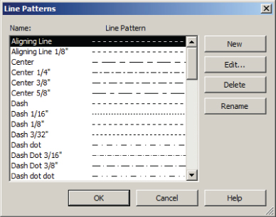
Figure 25.9 Line Patterns dialog box
You can modify the settings for a line pattern by clicking the Edit button on the right side of the dialog box. In the Line Pattern Properties dialog box, you will see the components that make up the line pattern. In the Type column, you can select a dash, dot, or space. Spaces can be used only after a dot or a dash. In the Value column, you assign the length of the dashes or spaces. Dots have a static length value that cannot be changed. You can enter up to 20 of these components, and when you reach the point where the pattern repeats, you are finished.
Variations of a line pattern can be made by first looking at the settings for a line pattern. Figure 25.10 shows the settings for a Dash Dot Dot line pattern. To create a similar pattern but with a different overall size, you would click the New button on the right side of the Line Patterns dialog box, give the pattern a name such as Dash Dot Dot 1/4″, and then put in the dashes and dots with values that are double those in the Dash Dot Dot 1⁄8″ pattern.
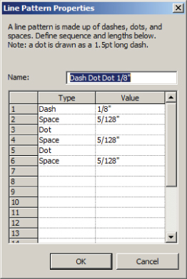
Figure 25.10 Line Pattern Properties dialog box
It is good practice to test your line patterns as you create them. You can do so by creating a drafting view and drawing some parallel lines. As you create new patterns, you can assign them to the lines to see how the variations appear and make adjustments to dash or space values as necessary. Figure 25.11 shows the multiple variations of a centerline pattern. The variations you create do not have to match the view scales. You can create variations that slightly modify the lengths of dashes and spaces so that the line pattern is more usable in certain situations. The 3⁄8″ and 5⁄8″ patterns in Figure 25.11 are examples of line patterns that may be used at any view scale, depending on the length of the line.
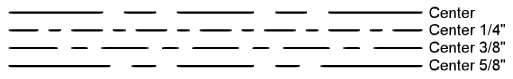
Figure 25.11 Line pattern variations
Line Styles
With line weights and patterns defined in your template file, you can create line styles that can be used for model or detail lines in your projects. Line styles are separate from object styles because they apply only to lines created by using the Detail Lines and Model Lines tools or when you're creating the boundary of a region. The line patterns (not line styles) you create will appear under the Lines category on the Model Categories tab of the Visibility/Graphic Overrides dialog box when you're changing the appearance of a view. You can access the Line Styles and Line Patterns settings by clicking the Additional Settings button under the Manage tab. Revit comes with some line styles that are coded into the program and cannot be removed or renamed, although you can change the settings for these lines. Figure 25.12 shows these lines and their default settings.
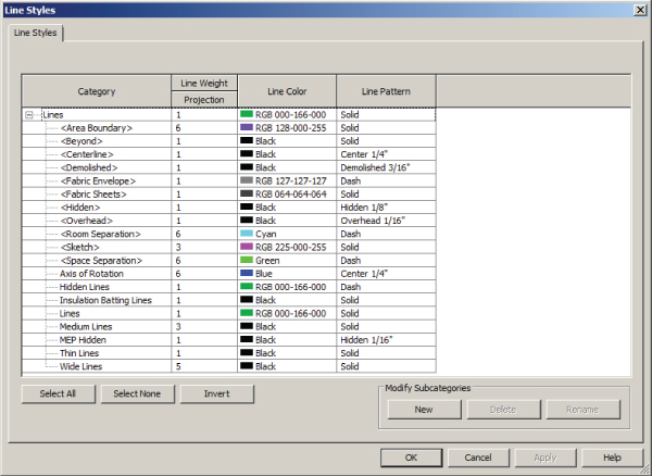
Figure 25.12 Line Styles dialog box
To create a line style, simply click the New button under Modify Subcategories at the lower-right side of the dialog box and enter a name. You can then assign a weight, color, and pattern to the line style. In some cases, it is useful to create line styles that match line patterns you have created to ensure consistency between model objects and drafting items. For example, if you create a line pattern that will be used for a domestic hot-water pipe, you may want to create a line style called Domestic Hot Water that uses that pattern. That way, the domestic hot-water pipe in your model can be given the pattern using a filter, and your diagrams and details can use the Domestic Hot Water linetype that matches. Otherwise, you would have to override each line in your diagram to the appropriate pattern.
Line styles are useful, but keep in mind that in your template, there should be enough line-based families and detail components that “drawing a line” should almost be a thing of the past.
Export Settings
To share your project with consultants, it is often necessary to export your Revit views to CAD. Once you are satisfied with line weights and styles, it is a good time to consider your settings for exporting views. This task can be a bit tedious and time-consuming, but the settings you define can be saved and used anytime. The settings used for exporting do not need to be applied to your template, but it is a good idea during your template creation to at least consider them.
You can access them from the Application menu, as shown in Figure 25.13. You can create settings for various types of CAD file formats and also for IFC export.
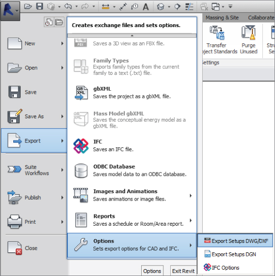
Figure 25.13 Export settings
When you click the Export Setups DWG/DXF option, a dialog box opens with options for defining Revit categories and styles in Autodesk® AutoCAD® software. This dialog box shows tabs across the top that are organized for specific settings. The buttons in the lower-left corner can be used to create a new setup or to manage existing setups. Creating these setups in your template makes them available to all of your projects.
The Layers tab is where you can assign Revit categories and subcategories to layers within the exported DWG file. Alongside the list of categories are columns that allow you to assign an associated AutoCAD layer name and color ID to each category and subcategory. The color ID is as it is defined in AutoCAD: 1 is for red, 2 is for yellow, and so on. There are also columns for assigning layers and colors to objects that are cut by the cut plane of a view. The Layer Modifiers column allows you to assign modifiers to the layer names depending on the category being exported. Clicking a cell in the column reveals the Add/Edit button for that category. Click the button to apply modifiers, as shown in Figure 25.14. Modifiers are useful for adding information to layer names, such as EXST or DEMO for existing and demolished work, respectively.
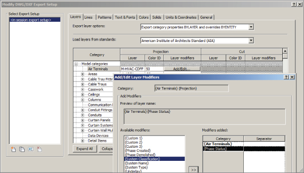
Figure 25.14 Adding a layer modifier to a Revit category
The Export Layer Options drop-down list has options for BYLAYER and how overrides are exported, as shown in Figure 25.15.
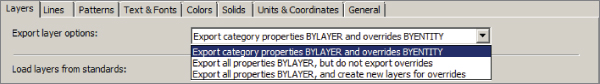
Figure 25.15 Export layer properties
You can choose an industry standard for export settings from the drop-down list over the columns, as shown in Figure 25.16.
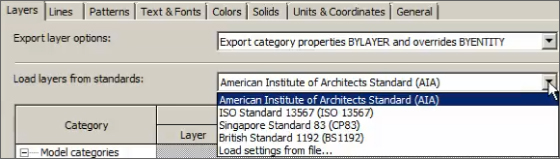
Figure 25.16 Layering standards
The Lines tab allows you to associate Revit line styles with linetypes within a specified linetype file. You can browse to any linetype file by using the ellipsis button. Once you have selected a linetype file, you can associate Revit line styles by clicking in the Linetypes In DWG column and choosing a linetype, as shown in Figure 25.17. If no linetype is chosen, one is automatically created on export. Notice the Set Linetype Scale drop-down list near the top of the tab.
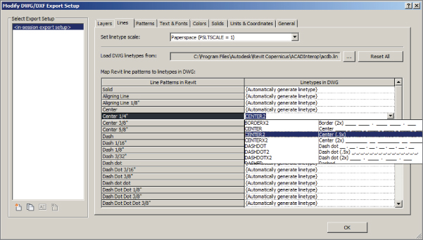
Figure 25.17 Selecting a linetype for a Revit line style
The Patterns tab is for associating Revit fill patterns to hatch patterns in the exported DWG file. The same process for associating linetypes with line styles is used. The Text & Fonts tab is for mapping text in Revit to text in the exported drawing file. Formatting options are available in the drop-down list at the top of the tab, shown in Figure 25.18.
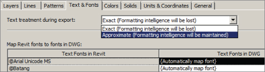
Figure 25.18 Text & Fonts properties
The Colors tab lets you choose between two color options, as shown in Figure 25.19.
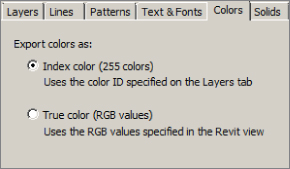
Figure 25.19 Color options
The Solids tab is for determining how solid objects will be exported to the DWG file. This applies only when exporting a 3D view. The drawing units and coordinate system can be set on the Units & Coordinates tab. The General tab has settings for room and area boundaries along with an option to define which layers will not be plottable. From here you can also decide the version of the exported DWG file and whether linked files are going to be acting like X-refs or inserted blocks after the export. Since Revit 2014 you have had the ability to hide objects such as scope boxes, reference planes, and unreferenced view tags, as shown in Figure 25.20.
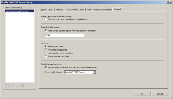
Figure 25.20 General options
Once you have established export settings, they can be used in other projects by using the Transfer Project Standards feature and transferring DWG/DXF Export Setup Settings. Consider creating these settings in a separate file and transferring them into your projects or templates as needed. This gives you a single file location to manage any changes or updates.
The process for creating export settings for DGN files has been greatly enhanced in Revit; instead of Layer selection, you have Levels. Possibly the biggest option here is the ability to specify a “seed” file, giving the translation process more accuracy and definition—this could be provided by your collaborating partner. File formats supported are DGN v7 and v8.
Annotation Styles
The goal of annotation style is to provide annotation that is consistent from drawing to drawing and from discipline to discipline. One of the benefits of using computers to do drafting is that it makes it easier to apply drafting standards. In the days of manual drawing, there was no guarantee that one person's lettering would look exactly like another's. Some may argue that you still don't have that guarantee by using computers. Regardless, it is important to establish your annotation standards in your Revit project template.
Text
The various text styles that you need can be created as types. Access the dialog box for text settings by clicking the small arrow located on the Text panel of the Annotate tab, shown in Figure 25.21.
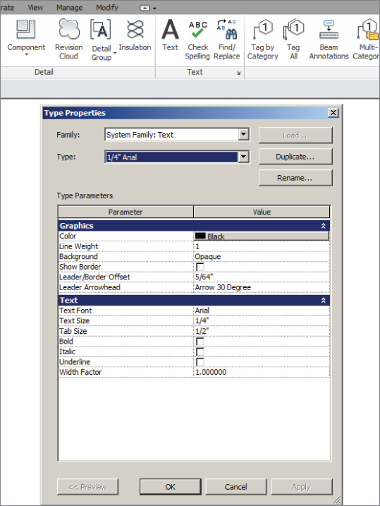
Figure 25.21 Accessing the type properties of the text system family
To create a new text type, duplicate an existing type and provide a name for your creation. It is a common practice to name text types by using the size and name of the font applied to the type. The type properties allow you to set the behavior and general appearance of the text type. Another common naming convention is to indicate what the type is going to be used for—Normal Notes, Bold Heading, Standard Heading, and so forth.
It is important to understand how Revit handles text types before choosing how to set up your text family types. Each text family type that is created is unique to the file in which it was created. Figure 25.22 shows an example of a text type called STYLE 1 that was created in a project and a text type called STYLE 1 that was created in an annotation family. When the annotation family is used in the project, the text within the annotation family maintains its settings as defined in the family file. It does not take on the settings for STYLE 1 as they are defined in the project, even though both family types have the same name.
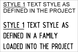
Figure 25.22 Text types with the same name
The easiest way to manage this behavior is to use the default font, which is Arial. Although this may be a deviation from your normal CAD standards, it provides a huge return in time savings. If you choose to use a different font, you will have to change the text and labels in every family or detail that you bring into your Revit project in order to maintain consistency in your construction documents. This includes all the preloaded content that comes with your Revit installation. One thing to consider is the font style of tags. By default, all tags in Revit use the Arial font. If that font doesn't comply with your company standards, you will have to go through all tags and modify them.
For all of your future family needs, you may want to consider creating family templates that can contain your company standards to avoid having text types with the same name, as Figure 25.22 shows.
By setting the properties of a text style, you can create several variations of text for use in your projects. Remember that these are type properties, so you will need to create a new text type for each variation in settings. The most common types are based on text height, background, and leader arrowhead style. You can also create types based on other properties, which are usually variations of your standard text types. For example, you can create a standard 3⁄32″ (2.5 mm) Arial text type for normal use and then create another type that is 3⁄32″ (2.5 mm) Arial and underlined for use where underlined text is required. This will save you time in having to edit text to make it underlined by giving you the option to switch from one type to the other. Although the Underline option is available as a Type and Instance parameter, you could create some confusion. For example, if you create text called 3/32″ (2.5 mm) Arial – Underlined, you can place the text and it will be underlined. But you would also have the option to highlight the text and deselect Underline from the ribbon, and you have text that is using the underline text style but is not underlined. This applies to Bold and Italic as well. So maybe those are best managed per instance instead of per text type.
The Show Border and Leader/Border Offset parameters allow you to create a text type that has a border automatically placed around the text that is offset a certain distance from the text. Even if you do not show the border, the Leader/Border Offset parameter determines the distance between where the leader starts and the text. The thickness of the leader and the border are determined by the Line Weight parameter. The Color parameter determines the color of not only the text, but also the border and leader. Figure 25.23 shows some sample text types, the names of which are based on the settings used for each type.
Figure 25.23 Sample text types
Arrowhead Styles
You can modify the look of arrowhead types to suit your needs if necessary. You can find the settings for arrowheads by clicking the Additional Settings button on the Manage tab and selecting Arrowheads. Arrowheads are a Revit system family, and although you can create different types, the Arrow Style parameter determines the shape of the arrowhead. You cannot create your own arrow styles.
By adjusting the settings, you can control the size of an arrowhead type. The Tick Size parameter controls the overall length of the arrowhead, while Arrow Width Angle determines the angle of the arrow from its point, which ultimately sets the width of the arrow. The dimension styles you establish can use these same arrowhead styles.
Dimension Styles
To establish the settings for your dimension styles, click on the Dimension panel of the Annotate tab, as highlighted in Figure 25.24. Each type of dimension can have its own unique settings. If you do not use dimensions very often in your projects, you may want to consider leaving the default settings. When the need arises to show dimensions, you could establish the settings or transfer the dimension settings from a file in which they have already been established, such as a linked consultant's file or a previous project.
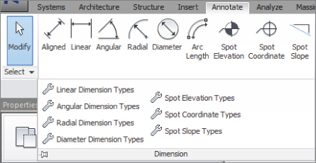
Figure 25.24 Accessing dimension settings
Each dimension style is a system family, and you can create types within that family in the same way that text types are created. Dimension styles have more parameters than text, however. Many of these parameters are for controlling how the graphics of the dimension will display. One of the key parameters in determining a dimension family type is the Dimension String Type parameter. This defines how the dimension will behave when a string of dimensions is placed. You have options for creating a continuous, baseline, or ordinate dimension string. If you use all or some of these types, you will need to create a separate dimension type for each one.
The Tick Mark parameter determines which arrowhead style is used. When you are editing this parameter, a drop-down list indicates all the arrowhead styles defined in the file. The line weight of the dimension can be controlled independently from the line weight of the tick mark by setting the parameters for each. The line weight for tick marks in dimensions should match the line weight for leader arrowheads in your text types for consistency. Because of their relatively small size, using a heavy line weight may cause your arrowheads to look like blobs, so choose wisely. The Interior Tick Mark parameter is available only when you have set the dimension tick mark to an arrow type. This determines the style of arrowhead to be used when adjacent dimension lines are too close together to fit the default tick marks.
Other parameters control the lengths of witness line components and gaps and also the text used in the dimension style. Some of the settings for text within a dimension style are the same as those in a text style, such as font and text height. The Read Convention parameter allows you to set the direction in which the text will be read for vertically oriented dimensions. With the Units Format parameter, you can set the rounding accuracy of dimension types independently from the default project settings.
Revit 2014 added the ability to assign alternate units. This allows companies to display their dimensions in imperial and metric units at the same time. We also gained more control over the Equality dimensions' appearance.
Project Units
Whether you are creating a template with metric or imperial units, you will need to carefully review which units of measurement are used and their precision. These settings will determine the default reporting of data, not only in views but also in schedules and parameters. They do not affect the accuracy of calculations. Click the Project Units button located on the Manage tab to access the settings for units.
You can set the default units for any graphical or engineering measurements. Figure 25.25 shows the Project Units dialog box. The drop-down list at the top contains the different discipline-specific groups of units, with the Common option containing units that are used by all regardless of discipline.
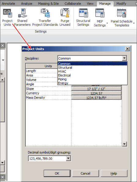
Figure 25.25 Project Units dialog box
Clicking the button in the Format column next to a unit activates the Format dialog box for that unit. Here you have a drop-down list for the options for that unit type. Once you have chosen a unit of measurement, you can determine the precision by selecting a Rounding option. The rounding increment will display to the right of the drop-down as an example of the option chosen. If you are using a decimal measurement, you can select Custom from the Rounding drop-down and designate the rounding increment manually. The Unit Symbol drop-down offers the option of displaying the measurement unit next to the value if desired. Check boxes in the bottom half of the dialog box enable you to suppress zeros or spaces, or to group digits depending on the type of unit you are formatting. When you click OK to finish formatting a unit type, you will see a sample in the button in the Format column next to the unit.
Setting the precision of certain unit types does not affect the availability of model elements, but it may cause nonsensical results to be shown in tags. For example, if you set the rounding of the Pipe Size unit to the nearest inch, then when you go to tag a pipe in the model that is less than 1/2″ in size, the pipe size tag will show 0″ (as shown in Figure 25.26). It also establishes the default units and rounding globally for the entire project. Certain elements can override those global settings; schedules are one example.
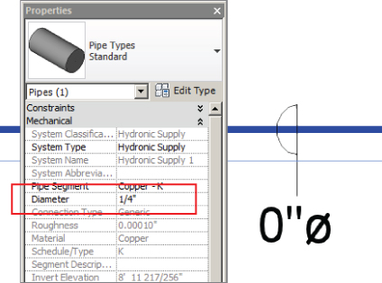
Figure 25.26 Pipe size tag showing 0″
Project Phases
Although each project is different, you may want to review and adjust settings for Phase, Phase Filters and Graphic Overrides in your project template if you are required to use them on many of your projects. The most common use of phasing is for renovation projects in which the existing portion of the project is modeled. Phasing can be difficult to manage, so having the settings preset in your template can be beneficial.
Click the Phases button on the Manage tab to access the settings for phases in your template. The Phasing dialog box has three tabs for setting up the phases and their behavior. The Project Phases tab is where you create and manage what phases exist in your file. Revit starts each file with at least an Existing phase and a New Construction phase by default.
You can add phases by using the buttons on the upper-right side of the dialog box, inserting new phases before or after the phase selected in the list. The list of phases starts from the earliest and ends with the latest. So if you were to insert a Demolition phase between Existing and New Construction, you could either select New Construction and use the Insert Before button or select Existing and use the Insert After button. The order of phases is important because when views are set up, you will establish what phase they belong to. Any items placed into the model will be part of the phase that is set for the view in which they are placed.
During the course of a project, it may be decided that a phase is no longer necessary. You can use the Combine With buttons at the right side of the dialog box to transfer the items from one phase to another.
The Phase Filters tab of the dialog box lists the different viewing options that can be applied to any view in order to display items from various phases, as shown in Figure 25.27.
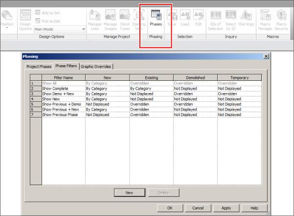
Figure 25.27 Phasing dialog box
The filter names describe what will be shown in the view to which they are applied. The New, Existing, Demolished, and Temporary columns define how the items that belong to the phases will be displayed. If you create a custom phase, the New column controls how the items are displayed in a view set to that phase. Any items placed in a phase prior to that are considered existing phases. When you demolish an item, you can assign the phase in which the demolition occurs; otherwise, the item is considered to be demolished in the phase that is applied to the view in which you are working. You can create custom settings by using the New button at the bottom of the dialog box to create a new filter. It is a good practice to name a filter so that it is evident what will be shown when the filter is applied to a view.
The options for the display of a phase are defined on the Graphic Overrides tab of the Phasing dialog box. Overrides to each phase status will affect only the objects when they are shown via a phase filter. They do not override the object styles defined in your project in views in which the objects are created. In other words, if you apply an override to the existing status, the overrides will not apply when you are working in an existing view, but only when the existing phase is displayed in a view of another phase.
Figure 25.28 shows three pipes in a view that is set to the New Construction phase. The pipe on the top has been modeled in a view that is set to the New Construction phase, and the next pipe down has been modeled in the Existing phase. The bottom pipe has also been modeled in the Existing phase but then demolished in New Construction. The Phasing dialog box shows the overrides for existing items. Notice in the properties of the view that the Phase Filter property applied to the view is Show Previous + New. These settings result in the existing pipe being displayed as halftone in the New Construction view and the demolished pipe displaying as dashed.
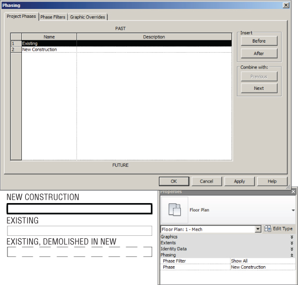
Figure 25.28 Existing and new pipes shown to demonstrate phase display
If you establish phases in your template file, it is helpful to create views for each phase with the proper Phase and Phase Filter properties to maintain consistency throughout the project and to ensure expected results when modeling.
Usually the engineers match whatever phasing customizations the architect has for a particular project. One place where you should check whether your phases are matching the architectural phases when you are setting up a project is in the Type Properties dialog box of the linked architectural background, under Phase Mapping (see Figure 25.29).
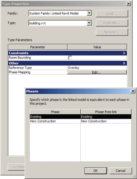
Figure 25.29 Phase mapping of linked files
When you have a project that involves phases, some planning and consideration can go a long way. Many companies are getting remodeling projects that they have completed in the past using AutoCAD. Even though those companies have moved to Revit, they still should ask themselves what they would gain by doing the project in Revit. If you need to redraw the existing project in Revit, and the demolition will be an ongoing process, doing the job in AutoCAD may not be a bad idea after all. Whenever you demolish a duct or a pipe, Revit produces a message that the element needs to be disconnected, as shown in Figure 25.30. Aside from the annoying fact that you need to respond to this message every time you demolish an element, those elements will become disconnected, and therefore making any further changes to them is much more time-consuming.
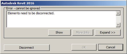
Figure 25.30 Warning that appears when you are demolishing connected elements like pipes and ducts
Another option you can consider is a hybrid project between AutoCAD and Revit. You can do all existing and demo plans in AutoCAD and all new construction in Revit. You can link the DWGs into Revit and still document the entire project in Revit. This would certainly help your project's bottom line.
Defining Preloaded Content and Its Behavior
There are three types of families that enable you to create content: annotation, component, and system families.
Annotation families are 2D symbols and text families used for sections, callouts, elevations, and tags. They are also used for creating standard symbols that are shown instead of the 3D geometry, like those in receptacles or switches for example. Refer to Chapter 21, “Creating Devices,” for more information on using annotations in families.
Component families are generally created separately from the project and loaded in as required. Although they can be created “in place,” this is not recommended for most MEP families.
System families include ducts, pipes, cable trays, and even text. They cannot be loaded into the project, and you can make new types only by duplicating the existing types and adjusting the settings in the Type Properties dialog box. There are only predefined profiles in Revit for system families; for example, you can only have a rectangular, round, or oval duct, and any other shape will need to be a component family and won't act as a duct.
When you begin a project by using a template file, you want to be able to start modeling right away, without taking the time to load components and set up system families up front or having to stop periodically during the design and modeling process. Determining what content is loaded or defined in the template gives you more time to focus on the model and design decisions and ensures consistency of standards across projects.
Annotation Families
Loading annotation families is especially important for consistent standards when you are working in a project that is shared by multiple disciplines. Even if you are creating a template for just one discipline, there are many annotations that are used on every project and should be included in your template.
The symbols used for sections, callouts, and elevations should all be defined in your template file. To set up these standards, click the Additional Settings button on the Manage tab. For section tags, you can define what annotation family is used for the head of the section as well as the tail. There is also a setting for how the section tag will appear when broken by using the Gaps In Segments grip on a section line. These settings apply to the section tag system family. You can then create different types of sections by defining what section tag is used in the type properties of a section.
Elevation marks are created in a similar fashion. You first define the different types within the elevation tag system family by indicating which annotation symbol is used and then applying the elevation tag types to their respective elevation mark types within the elevation system family. For callout tags, you can define what annotation is used and also the radius of the corners of the callout box that is drawn around a room or area of the model. The type properties of a callout define the callout tag and label to use when a callout references another view.
View titles are another type of annotation that should be defined in your template to match your drafting standards. To create custom viewport types, you first need to create, modify, and choose the annotation family to be used as a view title. These annotations do not require a line for the title line because title lines are part of the viewport system family and are generated automatically when the viewport is placed on a sheet. You also do not need to include a callout tag within the view title annotation because the tag to be used is defined in the type properties of a view. When creating the label that will be the view title, be sure to extend the limits of the label to accommodate a string of text; otherwise, your view titles will become multiple lines with only a few words. You can load several annotations into your template file to create multiple types of viewports.
To access the properties of a viewport, you need to place one on a sheet. You can then click the viewport and access its type properties. There, you can duplicate the selected type and give it a descriptive name. In the type properties of a viewport, you can define the annotation used for the title as well as the color, line weight, and pattern of the title line. There are also options for displaying the title or the title line, giving you the ability to create viewport types that do not display a title.
Another type of annotation to consider for your template is any tag that is commonly used. Pipe and duct size tags, wire tags, and equipment tags should all be loaded into their respective templates or into a template shared by MEP disciplines. In some cases, you may have more than one tag for a category, such as a pipe size tag and a pipe invert elevation tag. For categories with multiple tags, it is helpful when working in a project to have the default tag set. Click the small arrow on the Tag panel of the Annotate tab and select Loaded Tags to access the Tags dialog box. In the Tags dialog box, you can define which tag to use by default for each category. You can change this at any time during the project, but it is nice to start with the most commonly used option.
General annotations such as graphic scales or north arrows should also be included in your project template. You may choose to include a north arrow in your view title annotation, but keeping it separate gives you the freedom to rotate and place it anywhere on a sheet.
The same annotation families that are used in your model components can also be loaded into your template for creating legends. Legend components are limited in their placement options, so it may be easier to use annotation symbols; however, this method also results in having numerous annotation families loaded into your project that are there only for the legend view.
If you use a generic tag for plan notes, it should be loaded into your template. If you use the keynoting feature within Revit, you should have a keynote tag loaded as well as a keynote data file location defined. You access the Keynoting settings by clicking the small arrow on the Tags panel of the Annotate tab. In this dialog box, you can browse to the keynote data file to be used and set the path options. You can also define the numbering method to display the specification section number and text from the data file or use the By Sheet option, which numbers the notes sequentially as they are placed. Make sure to assign the appropriate leader for each loaded tag (and each tag's type) in the project template so your users don't have to do it later.
Component Families
The types of component families that you load into your project template depend on the discipline for which you are creating the template. If your template is used for a single MEP discipline, there is no need for components that are used by other disciplines, unless you use those types of components regularly in your projects.
The most effective use of preloaded components is to have components loaded that are used on every, or nearly every, project. The following are examples of the types of components to consider for each discipline:
- Mechanical Projects with HVAC systems will require air terminals and some type of distribution equipment. Consider loading an air terminal family for each type of air system into your template. Even if the types of air terminals used for the project end up being different from those in the template, at least you will have something to start with for preliminary design. The same is true for equipment. Load an equipment family that you most commonly use. Figure 25.31 shows an example of components loaded into a template for HVAC systems. Load any duct and pipe fittings that you will use to define pipe types or to be used in special situations where the default needs to be replaced. You should also set up the duct and piping system families you will require.
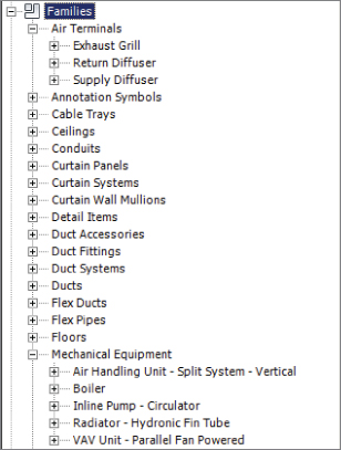
Figure 25.31 Sample HVAC components in a template
- Electrical Projects with lighting, power, and communications systems require fixtures and receptacles along with distribution equipment. Having the common types of these components that you use on every project loaded into your template will make it easy to begin laying out a preliminary design while decisions are being made for specific object types. The components used in a preliminary layout can easily be changed to the specified components after a decision is made. Figure 25.32 shows some examples of components loaded into a template for an electrical system design.
1
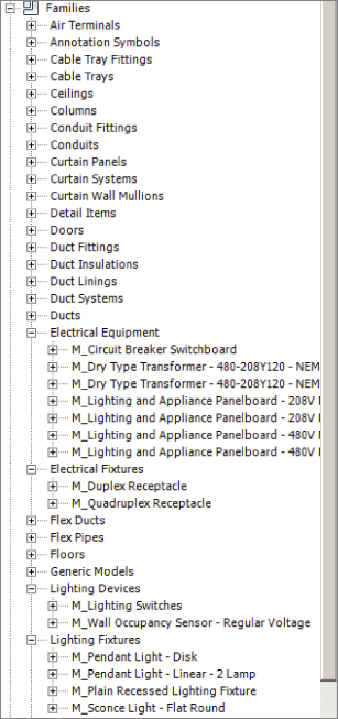
Figure 25.32 Sample electrical components in a template
- Plumbing The types of plumbing components you load into your project depend on your workflow and how you coordinate with the architectural model. If you work in an environment in which the architects typically show the plumbing fixtures, you do not need to have plumbing fixtures loaded into your template. It is important to have the fittings you will use to define pipe types loaded into the project. Sometimes you need to swap fittings out, so having additional ones loaded can save time.
One item that is useful is a plumbing fixture connector, which acts as a plumbing fixture and provides a connection point for piping. If there are valves or other types of components that you use regularly, they should be loaded into your template. You should also set up the piping system families you will require. Figure 25.33 shows some examples of plumbing components loaded into a template.
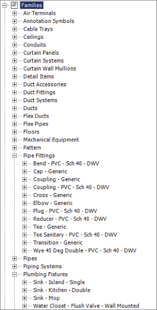
Figure 25.33 Sample plumbing components in a template
The goal is to keep it simple. Your template will be a fluid document that changes as your needs change or as you discover new requirements. If you find that you have to load a particular component on many projects, you should consider adding that component to your project template file.
Other components that you need in your template are all of the duct, pipe, cable tray, and conduit fittings that will be used by their respective system families. You also need your company titleblock, company logo, and company stamps.
System Families
Along with having components preloaded into your project, it is important to define your system families. This will establish the default behavior for any types of system families that you define. If you start your template from scratch without using another template as a basis for your file, you will need to attempt to draw a duct, pipe, cable tray, or conduit before the system family will appear in the Family Browser.
Once you have the desired system family in the Family Browser, you can right-click it to access its properties. The properties for MEP system families are primarily the same for each system. You need to define what types of fittings are used. You can create variations of a system family to use different fittings. System family types should be named descriptively to indicate their use. Additional fittings can be added at any time to create new family types, but it is best to start with the basics for your project template.
An MEP system family (duct systems, piping systems, conduits, and cable trays) will not be usable without fittings loaded and assigned. To assign a system family's fittings you can right-click on its name in the Project Browser and then click on Routing Preferences. You can use the Duplicate button to create a new type. In the Type Properties dialog box, you will see a button for editing the routing preferences. Once you are in the Routing Preferences dialog box you'll find you can assign the fitting component families you've loaded into the template. They are available in the drop-down of the Fitting parameter for each specific type of fitting. You can add as many of each type of fitting as you want and place them in order, and even give them size ranges. For pipe only, you can also specify different pipe segment types. This is useful, for instance, with chilled-water pipe, which would usually be copper up until a certain size and then carbon steel above that size. Figure 25.34 shows an example of the pipe routing settings for the piping system family.
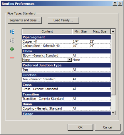
Figure 25.34 Routing Preferences for pipes
There are also duct and piping system families available that define duct and piping systems within your project. The properties of a duct or piping system allow you to control the graphical display of components that belong to the system. This is independent of the Object Styles settings for the components. However, view filter settings take precedence over the graphical settings for these systems, so if you use a filter to turn a supply duct blue, for example, it will be blue regardless of the settings defined in the supply duct system family. The dialog box will also give you the option for whether calculations are performed within the system, as shown in Figure 25.35. For piping systems, you can also choose the fluid type and temperature, which can be important if pressure drop is being calculated.
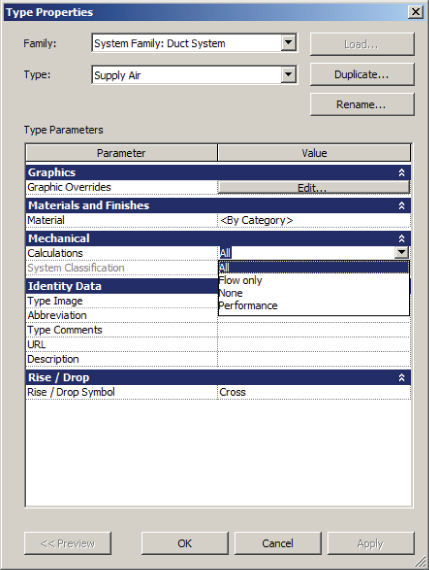
Figure 25.35 Type properties of a supply air duct system family
Now that we have covered the importance of settings in your project template, you can practice setting the properties of both views and model objects by completing the following exercise:
- Open the
RMEP2016_Ch25_Template Settings.rteRevit project template file at this book's web page,www.sybex.com/go/masteringrevitmep2016.First you'll set up the phases for each view, starting with the view to show new work.
- Access the properties of the 1 – Mech floor plan view. Set the Sub-Discipline parameter to HVAC. Set the Phase Filter parameter to Show Previous + New. Note that the phase for this view is set to New Construction.
- Click the Edit button in the View Range parameters. Set Top to Level Above, and set Offset to 0′-0″ (0 mm). Verify that the Cut Plane setting is at 4′-0″ (1200 mm), and that the Bottom setting is at Associated Level (Level 1) with an Offset setting of 0′-0″ (0 mm). Click OK.
- Click the Apply button in the Properties palette to apply the changes.
Now you are going to set up the view for showing existing services.
- Access the properties of the 1 – Mech Existing floor plan view. Apply all of the same settings as in steps 2 and 3, except set the Phase Filter parameter to Show All. Click the Apply button in the Properties palette. Note that the phase for this view is set to Existing.
- Open the 1 – Mech view, and access Visibility/Graphic Overrides. On the Annotation Categories tab, set Grids to Halftone. Click OK.
- On the Model category tab, set the Projection Line Weight parameter for the Ducts category to 5. Set Line Color for Ducts to Black. Click OK.
- In the Project Browser, expand Families and then expand Ducts. Right-click Standard under Rectangular Duct, and select Properties. Click the Duplicate button in the Type Properties dialog box. Name the new duct type Mitered Elbows – Taps, and click OK. In the Type Properties dialog box, select Routing Preferences. Then assign the Elbow parameter to use Rectangular Elbow – Mitered: Standard and move this to the top of the list. Verify that the Preferred Junction Type parameter is set to Tap.
- Choose settings for each of the fitting types from the available items in the drop-down list for each parameter. The Multi Shape Transition Oval To Round parameter can be left as None. Click OK to exit the Type Properties of the duct family.
- Use the Save As command to save the template in a location that you can access. Close the file.
Now you are going to test how the template works.
- Click the arrow next to New on the Application menu, and select Project. In the New Project dialog box, click Browse to find the location where you saved the file in step 10. Verify that Project is selected and click OK.
- Open the 1 – Mech Existing view. Click the Duct button on the Home tab. If the Properties palette is not visible, click the Properties button on the ribbon. Click the drop-down at the top of the Properties palette, and set the duct type to Rectangular Duct Mitered Elbows – Taps. Draw a duct from left to right in the view, and then change direction to draw a duct toward the bottom of the screen, creating a 90-degree bend. Notice that the duct is blue and that a mitered elbow fitting is used.
- Open the 1 – Mech view. Notice that the ductwork drawn in step 12 is displayed as halftone, which is because it was modeled in an existing view and is therefore existing ductwork. Click the Duct button on the Home tab, and draw ductwork in the 1 – Mech view. Notice that the ductwork is blue because it is new ductwork drawn in a New Construction phase view.
- Click the Grid button on the Architect tab, and draw a grid across the view. Notice that the grid line and bubble are halftone.
- Open the 1 – Mech Existing view. Notice that the ductwork drawn in the 1 – Mech view does not appear in this view. However, notice that the grid drawn in the 1 – Mech view does appear in this view.
MEP Settings
MEP settings are used to determine some of the graphical representations of systems as well as the available sizes and materials of system families used. Click the MEP Settings button on the Manage tab to access the settings for a discipline. You can also access them from the Routing Preferences dialog box of either the duct family or the pipe family. The settings you use may determine the type of template you are creating. Some of the standards defined for the MEP settings may be unique to a project type or client's requirements, which would result in a unique template for those settings.
- Mechanical Settings In the Mechanical Settings dialog box, you can establish the display of hidden-line graphics and also define values used in calculations. The left side of the dialog box lists all the settings. When you select a setting from the list, the options will appear in the right side of the dialog box. You can choose to include or exclude certain duct or pipe sizes for each type of pipe or duct. In Figure 25.36, the odd duct sizes have been excluded from use in projects and by Revit when ductwork is sized.
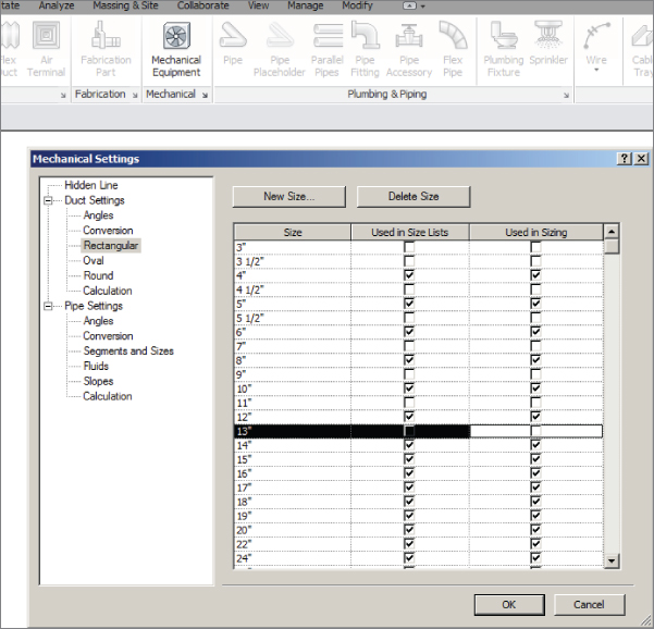
Figure 25.36 Mechanical Settings dialog box
Be aware that the options you choose for pipe settings will apply to all plumbing and mechanical piping, so you may have to experiment with different settings to achieve the desired results for both disciplines. This is another reason for creating separate template files for each discipline.
With the sloped pipe functionality in Revit MEP, it is important to define the available slopes within your projects. In the Slopes section of the Mechanical Settings dialog box, you can define any slope values that will be used in your projects, as shown in Figure 25.37.
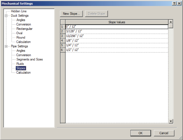
Figure 25.37 Slope settings for a project
You can also use specific angles for pipe, duct, conduit, and cable tray fittings. Configuring this setting properly ensures that your design is using industry standard fittings, which are cheaper than any custom fittings (see Figure 25.38).
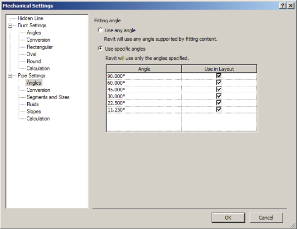
Figure 25.38 Fitting angles
- Electrical Settings In the Electrical Settings dialog box, the options you choose define the graphical representation of items such as tick marks or circuit names. Here you can also define voltages and the behavior of distribution systems. There are settings for conduit and cable tray displays and sizes as well. You also have the ability to designate the label to be used for spares and spaces in panel schedules, as shown in Figure 25.39. In addition, you can merge multi-pole circuits into a single cell. These settings are applied to all panel schedules in your projects.
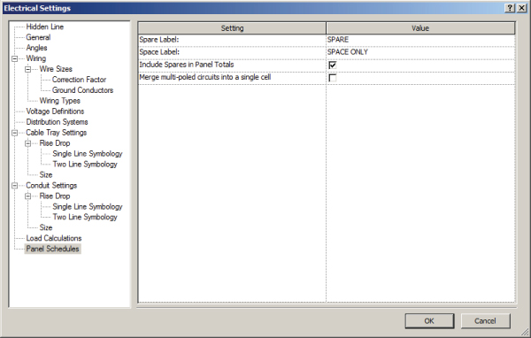
Figure 25.39 Panel schedule settings
There are also MEP settings for load classifications and demand factors as well as building/space type settings. All of these should be established in your template to the extent that they are used in your projects.
Creating Sheet Standards
Drawing sheets are a key element of your project template. Because these are often the delivered product, it is important that they are put together in a consistent manner. The ability to easily manage the information included in your sheet views is one of the benefits of establishing sheet standards in a project template.
Titleblocks
The sheet border of a construction document is called many things by many people and organizations. In this chapter and throughout this book, the graphics and information that make up the border of a construction document, or sheet, are referred to as a titleblock.
If you generally work as a consultant to the primary design discipline, you might not need a titleblock family for your template. In this type of environment, you would normally acquire the titleblock from the primary design discipline and load it into your project file(s).
If you work in the project's primary design discipline and have a titleblock that is unique to your standards, it should be included in your project template. You can have multiple titleblocks loaded into your template. Your clients may require their own standards for a titleblock. This is another reason that you might create multiple templates. If you incorporate all the titleblocks that you work with into one template, it is possible that the wrong one could be applied to a sheet. This is not to say that you need a separate template file for each variation of titleblock. For example, if you have a company standard titleblock that comes in two sizes, including both sizes in your template would be reasonable. When a project begins and the size of the sheets is determined, the unused titleblock should be removed to avoid confusion or to make sure it's not mistakenly being used.
For more information on the creation of titleblocks and how to include the desired information within them, see Chapter 23, “Sheets.”
Defining Sheets
You know that some types of sheets will be included in every project that you do. These sheets can be created in your template file to ensure that they are properly set up for each project. Any views that are required for these sheets can also be placed on them in advance. This way, when a project gets started, any modeling done in those views will appear on the sheets immediately, streamlining the process of creating construction documents.
Having multiple titleblocks in your template can complicate this slightly. Unless you want to set up each type of sheet with each available titleblock, it is best to use the most commonly used titleblock for your preset sheets. If the project requires a different titleblock, the default one can be switched by using the Type Selector.
Preset Sheets
With preset sheets, you can establish consistent locations of sheet-specific items such as plan notes, key plans, and graphic scales. Preset detail sheets give you a place to put drafting and detail views as they are loaded or created. General notes or legends that are used on every project can already be in place when a project begins.
Having a set of sheets is also useful for determining how views will be organized and how many sheets will be required for a project. Once a project begins, you can print the sheets to create a mock-up set, sometimes referred to as a cartoon set, to better determine the number of sheets that need to be added to or removed from the project as well as how the building model will fit onto plan view sheets. With this available at the start of a project, decisions can be made early on to increase efficiency and improve workflow.
As with any element or standard you create in your project template(s), it is important to recognize how much is needed on a project-by-project basis. Consult with the people who work on projects daily to determine the types of things they would like to have in their projects from the start to improve their workflow.
Placeholder Sheets
Placeholder sheets are a Revit feature that allow you to create a list of sheets without them being physically created (added to the Project Browser) yet. They are typically used to host information from other disciplines such as sheet name and number in order to create a complete sheet list within the project. Placeholder sheets can be created through a Sheet List schedule by inserting a data row. When you are creating a regular sheet from the View tab with the Sheet command, placeholder sheets will be listed in the bottom portion, and you can select one or more of them and convert them to regular sheets on which you can place views. Placeholder sheets can be created in the template, but they can't have views on them unless they are converted into regular sheets.
Understanding the Project Browser Organization
Keeping your project organized within the Project Browser in Revit goes a long way toward efficiency in your workflow. Consistency makes working on several projects at once easier. You always want to know where to find specific types of views and also what a view is by its name.
The first area of organization in the Project Browser consists of the views within the project. When transitioning from a traditional CAD program, it can be difficult at first to comprehend that each view is not a separate file. The views are created to determine how you are looking at the model. Views have many properties that determine their appearance and the discipline or system to which they belong. You can organize your views based on any of these properties to group like views together. Figure 25.40 shows the types of view organizations available by default. You access this dialog box by right-clicking the Views heading in the Project Browser and selecting Browser Configuration.
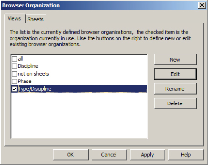
Figure 25.40 Default view organization types
Notice that the organization of views in the Project Browser is a system family. This means that you can create additional browser configuration types by selecting New, and you can rename, edit, or delete the default types—except for the type All, which cannot be changed or deleted—and then changing how the views are grouped and listed.
When you click the Edit button for the Folders parameter in the Type Properties dialog box, you can modify how the views are organized and listed in the Project Browser. Via the Filters tab you can choose up to three filters, and then with the Grouping And Sorting tab you can choose up to six levels for grouping (three in Revit MEP 2013 and prior) for your views and one sorting option. Each grouping option is determined by a view property. Once a property is chosen, you can select another level of grouping by using a different property, and then you can choose another level if necessary. When all the grouping options have been established, you can select the sorting option for the views. Thus, creating grouping options is similar to creating a folder structure for files, and the sorting option determines how the views are listed in the folder.
You can organize views in any number of ways. Figure 25.41 demonstrates a method that adds numbers in front of the browser organization name. This way, you have better control over the sorting.
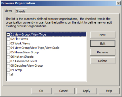
Figure 25.41 Sample browser organizations
Discipline Grouping
Every view within a project belongs to a design discipline. The Discipline property of a view is the most common property used for the first level of grouping. Revit has six disciplines to select from: Architectural, Structural, Mechanical, Electrical, Plumbing, and Coordination. When any MEP discipline is applied to a view, the architectural and structural model components are displayed in a sort of halftone and transparent mode. The objects are still in front of the object you are trying to select, and you still need to hide them or change the view mode in order to select anything. The Architectural and Structural disciplines display the model differently and are generally used when you want to view linked files as originally intended, whereas the Coordination and Architectural disciplines are great for viewing all disciplines together.
The Sub-Discipline parameter can be used as the second level of grouping to further distinguish views used for fire protection, plumbing, or other types of engineering systems. This parameter exists in the default templates that can be installed with Revit. If you choose to create a template or project without starting with one of the default templates, you have to create a parameter for this type of use.
You can also create a project parameter for your views. If you create a project parameter for your own company discipline structure, you can then have, for example, both Wet Fire (sprinkler systems) and Dry Fire (detectors) come under the same primary grouping even though they would usually come under Plumbing and Electrical, respectively. Using a Sub-Discipline type parameter makes it possible to separate views into their specific engineering systems. You can have all your electrical views listed under the Electrical discipline, but that may make it difficult to find views you want quickly. Having a second-level grouping that puts all the lighting, power, communications, and other systems views in their own groups creates a more organized environment in the Project Browser.
The Family And Type property of a view is another commonly used level of grouping. This is what defines your views as plan views, sections, elevations, 3D views, or ceiling plans. When you begin to annotate your views to place them on construction documents, it is important to place the annotation in the views that will be used on your sheets, so being able to easily locate the proper view for annotation is important. Each grouping option can be set to use all the characters of the parameter value or only a specific number of leading characters.
Another popular method is to separate the views by Plot and Work for their first level and again by another parameter for the subdisciplines (see Figure 25.42). This can be done through the creation of two custom parameters, in this case View Group and View Type. What you name the parameters is not important as long as it makes sense to you. This method has more flexibility because you can create additional first-level groups and not be limited to the six disciplines using the Discipline parameter.
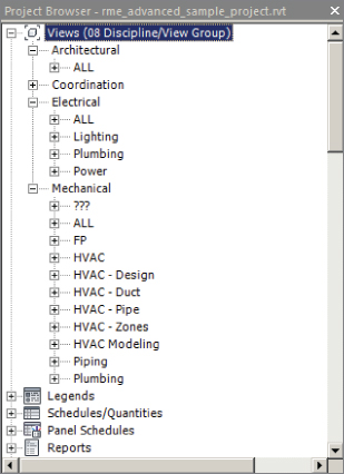
Figure 25.42 Using the parameter Discipline and Sub-Discipline for browser organization
You can also use filters to not show any views that are on sheets in the Views section of your Project Browser. These views would then have to be accessed via the Sheets section. However, this will not work when using dependent views unless the parent view is also on a sheet. Another use of the filters is to create a browser for only one discipline so you can remove all other disciplines except the one being worked on. This is discussed in more detail in the section “Sheet Organization” later in this chapter.
Sorting Views within Groups
Once you have established what types of views will be grouped together, you can determine how the views will be sorted in their respective groups. View Name is most often used, because ultimately you have to find the view you are looking for in the Project Browser. Views can be sorted in either ascending or descending order, alphabetically or numerically.
Figure 25.43 shows the setup of a view organization that uses the Discipline, Sub-Discipline, and Family And Type properties as a grouping structure, with the views sorted by View Name. Notice how the views are shown in the Project Browser because of this organization.
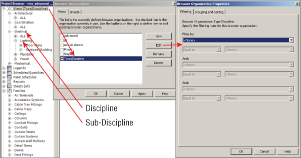
Figure 25.43 Sample view organization structure
Schedule views and legends are organized separately from model views. The only control you have over how they are listed is by your naming convention because they will be listed alphabetically. The sheets used in your project are the only other project element that you can sort and group in the Project Browser. Sheet organization options are discussed in the next section.
Sheet Organization
Whether you are creating a single-discipline template or one for use by multiple disciplines, it is important to establish the organization of your drawing sheets to make sheet management consistent from project to project.
Setting up sheet organization is similar to setting up the organization of views. You can set up the browser organization for the Sheets system family with different types to organize your sheets in any manner desired. To access this system family, right-click Sheets in the Project Browser and select Properties. Use the New button in the type properties of the system family to create a new organization method. It is helpful to name the type based on how it organizes the sheets so that what the type is used for is clear to all users. Once you have created a new family type, you can click the Edit button of the Folders parameter to set the organization settings. Figure 25.44 shows a sample of the settings for an organization type that is based on the discipline of sheets. In this example, the sheets are numbered using a discipline prefix and then organized by the first character in order to group each discipline's sheets together.
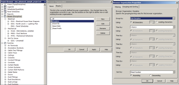
Figure 25.44 Sample sheet organization settings
Additional parameters can be applied to sheets that can be used as a basis for organization. These parameters can be included as project parameters in your template so that when a new sheet is created, it will have the parameters applied to it. If you create a drawing list that appears on your construction documents, you can use these parameters to organize the order of the list, which may not always match the order in the Project Browser. For more information on creating a drawing list or adding parameters, see Chapter 6 and Chapter 7.
The Bottom Line
- Set up views and visibility. The settings for views are crucial to being able to visualize the design and model being created and edited in a project. Establishing the default behavior for views and visibility of objects can increase not only the efficiency of working on a project but also the accuracy of design.
- Master It The properties of a view determine how objects and the model will appear in the view. Aside from Visibility/Graphic Overrides, identify a view property that affects how items are displayed in that view, according to their elevation within the view. For a floor plan view, describe all settings for this property.
- Establish project settings. Many project settings can be established in a Revit template to determine the display of objects in views and on construction documents. There are also settings that define the makeup of the project itself.
- Master It Phase settings for a project are important for defining what portions of a building design occur in certain phases. Explain why having phases established in a template might require a separate template file for phased projects.
- Define preloaded content and its behavior. The more items you have available for immediate use when a project begins, the more your focus can be on design decisions and less on loading required items. In a multiuser environment, preloaded content ensures that improper variations, which can cause inconsistencies in the project documentation, do not occur.
- Master It Having system family types defined in your template is just as important as having the appropriate components loaded. Explain why certain component families are required in order to create and define MEP system family types.
- Create sheet standards. As with other template elements, standards for sheets are a useful component to have established.
- Master It Having a predefined organization for drawing sheets in your template will ensure consistency from one project to the next. True or false: You must have all the required sheets for any project built into your template in order for them to be organized properly. Explain.