Chapter 1
Exploring the User Interface
The Autodesk® Revit® MEP 2016 software is similar to the majority of the software produced by Autodesk in that it uses a ribbon interface. This allows for not just ease of access to the tools needed for mechanical, electrical, and plumbing (MEP) design and modeling but also a familiarity between those different software packages, making the transition between them easier.
Although this book is titled Mastering Autodesk Revit MEP 2016, having a good knowledge of where tools are located and how to access the commands easily is the best way to efficiently use the software, so I included this chapter on the user interface. Improvements and changes have been made to the user interface for this version through the addition of tools in contextual tabs and improved functionality.
The ribbon-style interface works well in Revit because it allows many of the tools to be organized in one area of the interface, which gives you more screen real estate for viewing the model. Although the user interface is customizable, you are limited in the amount of customization and number of features that you can change. At first this may seem a bit restrictive, but as with any software, with familiarity comes an increased proficiency.
Some features have been added to improve workflow and efficiency, and typical workflow features that were previously accessed through buttons in the interface are now available as part of the interface itself.
In 2012, Autodesk introduced the Autodesk® Revit® program, which combined all the features of the Autodesk® Revit® Architecture, Autodesk® Revit® Structure, and Autodesk® Revit® MEP platforms. This version is available to those who purchase either Building Design Suites Premium or Ultimate packages released by Autodesk and gives users the option to deploy/install either each separate version of Revit or the all-inclusive one, giving them all the available Revit tools in one box. Knowing your way around the Revit MEP 2016 user interface is the first step to reaping the benefits of using a building information modeling (BIM) solution for your building projects.
In this chapter, you will learn to do the following:
- Navigate the ribbon interface
- Utilize user interface features
- Use settings and menus
The Ribbon
If you are familiar with the Revit MEP user interface prior to the 2010 version, transitioning to the ribbon-style interface may indeed take some getting used to. Once you understand the way that the ribbon is set up and how you can customize it to better suit your workflow, you will see that it is an optimal interface for a BIM and design application. If you are transitioning from an earlier ribbon interface, you will inevitably notice some changes to the location and order of the tabs and the introduction of additional tabs/commands.
Using Tabs
The ribbon portion of the user interface consists of several tabs, each organized by panels that relate to the topic of the tab. Each panel contains one or more buttons for the relevant features available in Revit MEP 2016. You can access a tab by simply clicking the name at the top of the ribbon. Although each tab is designed to provide a unique set of tools, some of the features of Revit are repeated on different tabs. Depending on your screen resolution, some of the buttons on the panels may become compressed to fit on your screen. In addition to this, there may be subtle differences in these images and those you see in your Revit interface. This is because the software used for the images in this book come from Revit, rather than Revit MEP. The panels and tools for each tab are described here (not all panels are shown for each tab):
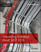
- Systems The Systems tab, shown in Figure 1.1, is the main tab for MEP modeling tools. Once known as the Home tab, this tab has been renamed to allow for continuity between Autodesk Revit MEP and Autodesk Revit. The tab is divided into panels that are specific to each of the main disciplines. Each of the discipline panels has a small arrow in the lower-right corner that provides quick access to the discipline-specific settings dialog box (1) or, new to Revit MEP 2016, the Fabrication settings dialog box (2).
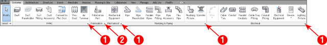
Figure 1.1 The Systems tab
- Architecture and Structure There will always be a need for creating architectural elements in a Revit MEP model, whether this is purely during a Copy/Monitor operation or if you are building an as-built model and have no architect to work with. This tab features most of the architectural tools required for this. From the Build panel with the basic architect's tools to openings, grids, and rooms, these are all available on the Architecture tab. Note that access to Color Schemes and Area And Volume Computations is available by clicking the small diagonal arrow on the Room & Area panel, as shown in Figure 1.2.
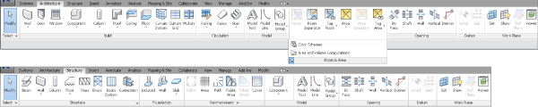
Figure 1.2 Architecture and Structure tabs
The Structure tab contains tools for modeling structural elements as well as some common tools for grids and reference planes. Both of these tabs are available in their entirety if you install Revit as part of a Building Design Suite (Premium or Ultimate) package.
- Insert Whether you want to link another Revit project file, overlay Design Web Format (DWF) markup, or insert 2D elements from another file, the Insert tab contains all these tools and more for bringing other files or objects into your Revit projects, as shown in Figure 1.3. The tab is organized by panels for linking and importing files, and it also contains tools for loading Revit families. The small diagonal arrow at the lower right of the Import panel is for accessing the Import Line Weights dialog box, where you can associate imported computer-aided design (CAD) color numbers to a Revit line weight, as indicated in Figure 1.4. The Insert tab also contains the Autodesk Seek panel, which provides a search window for content available on the Autodesk® Seek website.
Figure 1.3 The Insert tab
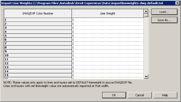
Figure 1.4 Import Line : Weights dialog : box
- Annotate On the Annotate tab, you can find the tools needed to add annotations to your model views along with drafting tools for creating details. The Dimension and Tag panels can be extended by clicking the arrow next to the panel name, which reveals the tools for establishing dimension settings and determining the default tags to be used upon initial placement, as shown in Figure 1.5. The Symbol button is used for placing annotation families onto views or sheets. The small diagonal arrow at the lower-right corner of the Text panel provides access to the Type Properties dialog box for creating or modifying text styles, as shown in Figure 1.6.
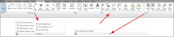
Figure 1.5 The Annotate tab
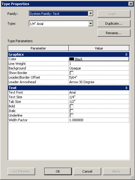
Figure 1.6 Text Type Properties dialog box
- Analyze Tools for model analysis and systems checking are located on the Analyze tab. Other tools on this tab allow you to add color to your ductwork and piping based on defined criteria. The Spaces & Zones panel contains the tools for placing Space objects and space separator lines. The Check Systems panel contains tools for checking MEP systems to ensure proper connectivity and valid system assignments of components. Note that access to the Color Schemes and Area And Volume Computations options is available by clicking the down arrow on the Spaces & Zones panel, as shown in Figure 1.7, whereas building and space properties, as shown in Figure 1.8, can be accessed from the arrow on the Reports & Schedules panel.
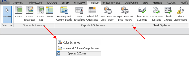
Figure 1.7 The Analyze tab
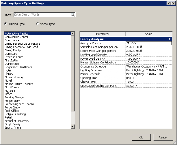
Figure 1.8 Building/Space Type Settings dialog box
Tools on the Energy Analysis panel allow for choosing a mass model or the building components to use as the basis for generating an energy analysis report:
- Massing & Site The Massing & Site tab combines the conceptual tools used for creating masses and the Modeling By Face objects. It provides MEP users with access to site tools, including topography, site and parking components, and building pads or foundations, as shown in Figure 1.9. The Site Settings dialog box, shown in Figure 1.10, for adjusting contour separation and site cut material, can be accessed by clicking the arrow on the Model Site panel.
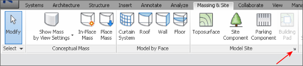
Figure 1.9 The Massing & : Site tab
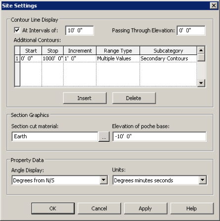
Figure 1.10 Site Settings
- Collaborate You need tools that allow you to keep your model coordinated with other disciplines and work within a multiuser environment. These tools can be found on the Collaborate tab. The Manage Collaboration panel has a drop-down list for setting the active workset, and the Coordinate panel contains tools for copying and monitoring objects from linked files. The Coordinate panel also has a tool for locating face-hosted elements that have lost their association to their host. You can check for clashes between model objects by using the Interference Check tool on the Coordinate tab. The Editing Requests button on the Synchronize panel allows you to see any requests that have been made to modify elements you are borrowing or own. You also have the option to connect to a Revit Server Accelerator by clicking the arrow, as shown in Figure 1.11.
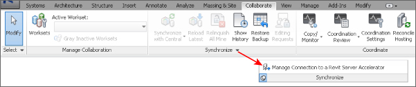
Figure 1.11 The Collaborate tab
- View Figure 1.12 shows the View tab; here you can use the tools to create different types of views. This tab also has tools for managing the views you have open in the drawing area. On the Graphics panel, there are tools for creating view templates and filters. The arrow on the base of this panel accesses the Graphic Display Options dialog box, shown in Figure 1.13. The Sheet Composition panel has tools for creating sheets as well as adding match lines or revisions. The User Interface button allows you to toggle the visibility of key user-interface features including the Properties palette, System Browser, and Project Browser.
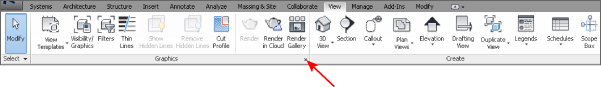
Figure 1.12 The View tab
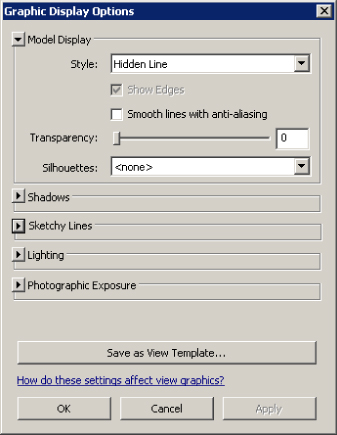
Figure 1.13 Graphic Display : Options
- Manage On the Manage tab, you can find the tools needed to establish project settings. The Inquiry panel has tools that can be used to locate specific objects in your project model, and to display any warnings associated with your project. Along with the settings that can be accessed from the tools on the Settings panel, clicking the Additional Settings button opens a drop-down list of even more options. The MEP Settings button is located on the Settings panel. This is where you can establish settings related to MEP components and system behavior. The Selection panel, as indicated in Figure 1.14, has tools that allow the user to save, load, and edit a selection set of objects for use in a filter list.
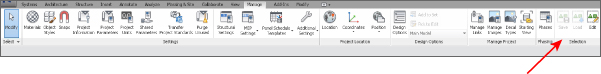
Figure 1.14 The Manage tab
- Modify The Modify tab, as shown in Figure 1.15, is located at the end of the tabs by default so that it is closer to the center of the user interface, for easy access. The Modify tab has the tools needed to make changes to components or linework in your project views. The tools on the Modify panel have been arranged with the more commonly used tools that have larger buttons. Some of the tools that have multiple-use options have a separate button for each use, such as the Mirror, Split, and Trim/Extend tools. The tools for creating groups, assemblies, or parts are located on the Create panel.
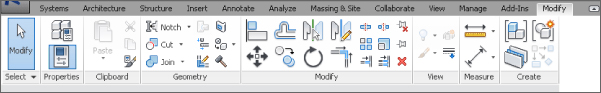
Figure 1.15 The Modify tab
The Modify button appears in the Select panel on every tab. This button allows you to exit from any active command, giving you an alternative to using the Esc key multiple times or selecting another tool. Another feature of this panel is the drop-down that contains options for selection in the drawing area. These options also appear as icons on the status bar. Figure 1.16 shows the various selection options available. Notice that you can select elements by clicking anywhere on the element by using the Select Elements By Face option. However, this option does not work when a view is set to Wireframe.
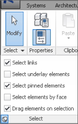
Figure 1.16 Selection settings
You may need to experiment with combinations of these settings to achieve the results that suit your workflow. Note that if you deselect the Select Underlay Elements check box, you cannot select non-MEP components such as doors, walls, or windows that may exist in your model.
- Add-Ins The Add-Ins tab appears on your ribbon as the next-to-last tab by default. This tab contains a BIM 360 panel with tools for use in the Autodesk® 360 environment and requires you to sign into an Autodesk account. If you have installed any external applications, the buttons or other features provided appear on the tab as configured. Some third-party applications create an additional tab on the ribbon.
Using Contextual Tabs
In addition to the tabs provided by default on the ribbon, other tabs appear when you select objects in your project. These are known as contextual tabs, which contain tools specific to modifying the selected object. Contextual tabs appear in the location of the Modify tab and are identified by their green color and a name that applies to the selected object. A contextual tab for a selected object is an extension of the Modify tab, which is why the base Modify tab is so compact compared to the other tabs. This allows for the selection-specific tools to appear on the right side of the Modify tab. Figure 1.17 shows the contextual tab (labeled Modify | Electrical Equipment) for an electrical distribution board selected in the model of a project. The rest of the Modify tab is still available to the left but is not shown in this figure for clarity.
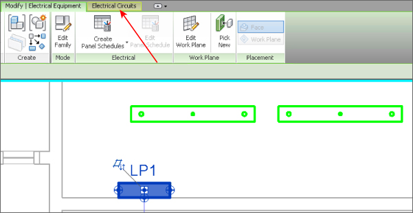
Figure 1.17 Contextual tab : for an electrical : distribution board
In addition to this, if any object is also part of a system another contextual tab appears with tools for editing the system. These tabs are completely separate from the standard Modify tab and contain only tools for system editing. If you select an object on a system, the system tab appears along with the contextual Modify tab, as shown in Figure 1.18. However, if you select an entire system, only the system tab appears. The panels and buttons on contextual tabs cannot be removed or rearranged on the ribbon. The buttons cannot be added to the Quick Access toolbar.
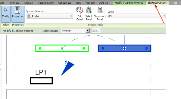
Figure 1.18 Contextual tab for Electrical Circuits
The tabs in the Family Editor environment differ from those in the project file environment. When you open a family file, the tabs on the ribbon contain some familiar tools, but the majority of them are specific to the creation and modification of family components. The tabs available in the Family Editor environment are as follows:
- Create The Create tab in the Family Editor environment, shown in Figure 1.19, contains tools for creating solid geometry and lines, adding system connectors, and creating and managing references.
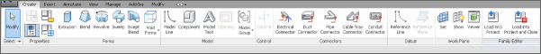
Figure 1.19 The Family Editor—Create tab
- Insert Figure 1.20 shows the Insert tab in the Family Editor; it contains tools for importing other files into your family file. The tools for linking are visible but disabled because importing is the only available method for bringing external geometry into a Revit family file. The arrow on the Import panel accesses the same dialog box as in the project environment and can be seen earlier in Figure 1.4.
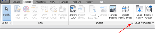
Figure 1.20 The Family Editor—Insert tab
- Annotate On the Annotate tab, seen here in Figure 1.21 within the Family Editor environment, you will find the types of annotation tools that can be used in a family file. Text and Dimension styles, as indicated previously in Figure 1.6, can be accessed from the appropriate access points shown.
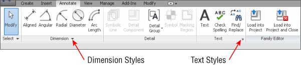
Figure 1.21 The Family Editor—Annotate tab
- View The View tab in the Family Editor environment, as shown in Figure 1.22, is limited to tools for managing the family views. Section views can be created and camera positions can also be established for 3D views.
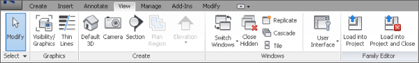
Figure 1.22 The Family Editor—View tab
- Manage In the Family Editor environment, the Manage tab, shown in Figure 1.23, is populated with tools for establishing settings within the family file. The MEP Settings button allows you to establish load classifications and demand factors, whereas the Additional Settings button drops down for access to general settings.

Figure 1.23 The Family Editor—Manage tab
- Modify The Modify tab in the Family Editor environment, as shown in Figure 1.24, is nearly the same as the one found in the project file environment. The main difference is that there is no View panel and the Geometry and Create panels have fewer tools. This tab is also compact, allowing for a contextual tab when objects within the family are selected.
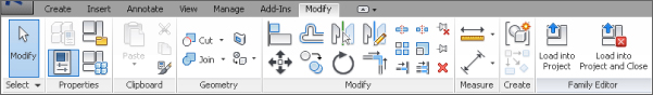
Figure 1.24 The Family Editor—Modify tab
- Add-Ins The Add-Ins tab also appears in the Family Editor environment, with the same BIM 360 panel as in the project file environment.
Finally, the Load Into Project buttons are available on each tab in the Family Editor environment. These allow you to either load and leave the family open, or save and load the family into other open files at any time.
Customizing the Ribbon
You can customize the ribbon interface to better suit your workflow. For example, you can rearrange the order of the tabs by holding down the Ctrl key and clicking a tab name to drag it to a new location.
You can move panels on a tab to different locations on the tab by clicking a panel name and dragging it to a new location. Figure 1.25 shows the Mechanical panel being dragged from its location on the Systems tab. The panels to the right slide over to fill in the space left by the moved panel.
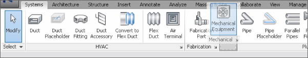
Figure 1.25 Moving a tab panel
You cannot move a panel from one tab to another, however. If you attempt to drop a panel onto another tab, it returns to its original location on its original tab.
You can remove panels from a tab and place them in another location on your screen. You can dock floating panels together by dragging one panel over the other, and you can move the docked panels as a group by clicking and dragging the gray grip that appears when you hover your mouse pointer over a floating panel. If you use dual monitors, you can even drag a panel to the second monitor. The panel's new position is maintained when you restart the software, but the panel does not appear until a file is opened. Keep in mind that moving tools to another screen may actually hinder your workflow, your efficiency, and possibly the stability of the program itself.
You can control the visibility of the ribbon tabs by clicking the small button to the right of the tabs. This button cycles through the different display options. You can also click the small arrow next to the button to display and select a specific option, as shown in Figure 1.26. Double-clicking a ribbon tab will also cycle through the various ribbon configurations.
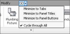
Figure 1.26 Ribbon visibility
You can establish the switching behavior of the tabs on the ribbon to determine which tab is displayed when you exit a tool or command. When you click a tool, the contextual Modify tab for that tool appears. The interface stays on the Modify tab when you exit the tool, or you can set it to return to the previous tab. These settings are located on the User Interface tab of the Options dialog box, which is discussed later in this chapter.
Quick Access Toolbar
As you are working, you may find yourself taking extra steps to switch tabs in order to access the desired tools. Figure 1.27 shows the Quick Access toolbar (QAT) as a place where you can put frequently used tools for instant access.

Figure 1.27 Quick Access toolbar
You can add tools from any of the standard tabs to the QAT simply by right-clicking that tool's button or drop-down and selecting the Add To Quick Access Toolbar option. The tool will be placed at the end of the QAT. To manage the tools available on the QAT, you can click the small arrow button to access the customization menu, shown in Figure 1.28. Each button on the QAT is listed, and removing the check mark next to it turns off its visibility in the QAT.
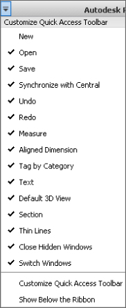
Figure 1.28 Quick Access toolbar customization menu
The option at the bottom of the list allows you to set the location of the QAT either above or below the ribbon. Setting it below the ribbon moves it closer to the drawing area for easier access. If you add several buttons to the QAT, you may want to move it below the ribbon so that it does not crowd out the filename on the title bar.
Clicking the Customize Quick Access Toolbar option in the drop-down menu opens the dialog box shown in Figure 1.29. In this dialog box, you can change the order of the buttons as they appear from left to right, create separator lines, or delete buttons.
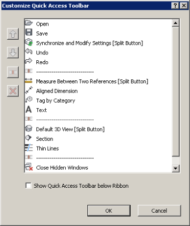
Figure 1.29 Customize Quick : Access Toolbar : dialog box
You can also right-click a button on the QAT for quick options such as removing the button, adding a separator line, or accessing the customization dialog box.
Additional User Interface Features
The Revit MEP 2016 user interface is full of features designed to help you design and model efficiently. Some items are new, some have been modified, and some are the same as they have always been. The title bar at the top of the screen informs you of what file you are in and what view is currently active in the drawing area.
Options Bar
Complementing the ribbon and its contextual tabs is the Options Bar, shown in Figure 1.30, which is an important part of the user interface. This should be the first place you look when a tool or object in the project is selected. Although the number of options that appear may be limited for each command you use, they are important to the task in which you are engaging. When placing round duct, for example, pay close attention to the Diameter and Offset options to ensure proper location.

Figure 1.30 Options Bar
You can dock the Options Bar at the top of the screen, below the ribbon (which is the default location), or at the bottom of the screen, just above the status bar. Right-click the Options Bar to change its docked position.
Properties Palette
The Properties palette is a dialog box that can stay open all the time and allows you to access the properties of items in your project. This feature reduces the number of mouse clicks necessary to access the properties of a model object or project component. You can dock the Properties palette to the sides of the screen or at the top of the drawing area just below the Options Bar, or it can float. If you dock the Properties palette to the same side of the screen as the Project Browser, there are two options for how they can be displayed. You can either show both, split in the docked space as seen in Figure 1.31, or have them both occupy the same docked space, depending on how you drag them to the docked space. A gray box appears to indicate whether they will split or share the space.
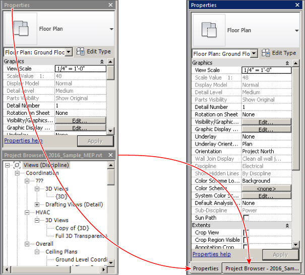
Figure 1.31 Project Browser : and Properties : palette docking : options
When the Properties palette and Project Browser are sharing the same docked space, you can access either one by the tabs that appear at the bottom. To remove either one from the shared docked space, click and drag its tab away from the dock.
If you do not have the Properties palette turned on, you can access it by clicking the Properties button located on the Modify tab or the contextual Modify tab of a selected object, or you can right-click anywhere in the drawing area. The Properties palette remains on until you close it.
When no object is selected in the model or in a drafting view, the Properties palette displays the properties of the current view in the drawing area. You can select a view in the Project Browser to view its properties in the Properties palette.
The top section of the Properties palette contains the Type Selector when an object is selected or a tool is chosen for placing an object. When an object is selected, you can switch to the properties of the current view by using the drop-down list located just below the Type Selector, as shown in Figure 1.32.
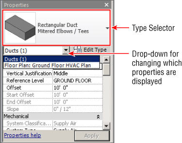
Figure 1.32 Properties palette
The properties shown in the Properties palette are instance properties. You can click the Edit Type button to display the Type Properties dialog box for a selected item or view. When you're viewing the instance properties of an object or view, the scroll bar on the right side of the palette holds its position when you move your mouse pointer away from the palette. The scroll bar remains in position even when other items are selected in the model.
When you make a change to a parameter in the Properties palette, you can click the Apply button at the bottom-right corner of the palette to set the change. Alternatively, you can simply move your mouse pointer away from the palette and the change will be applied.
View Control Bar
The View Control Bar is often overlooked, but it contains tools that are important to the display of the contents in the drawing area.
The Visual Styles button provides access to the Graphic Display Options dialog box, shown in Figure 1.33. This dialog box has settings that control the visual display of the view. These include Model Display, Shadows, Sketchy Lines, Lighting, Photographic Exposure, and the ability to save these settings as a view template. If you are working in a 3D view, the dialog box also has a Background setting.
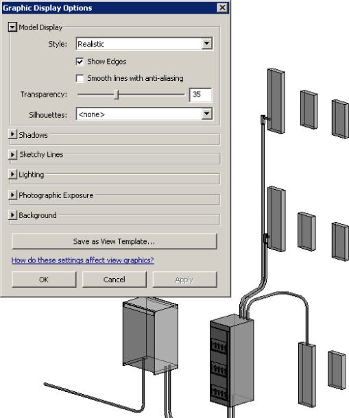
Figure 1.33 Graphic Display : Options dialog box
The View Control Bar, shown in Figure 1.34, has options for scale, level of detail, visual style, sun path, shadows, rendering, view crop, and crop region visible. You have the ability to save and lock the orientation of a 3D view. When a 3D view is locked, you can tag items in the view. You can zoom and pan in a locked view, but you cannot orbit the model.
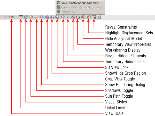
Figure 1.34 View Control Bar and Lock 3D view options
When you unlock a view, any tags applied in the view are not displayed until it is returned to its saved orientation.
Temporary Hide/Isolate, Reveal Hidden Elements, and Worksharing Display tools are next in line. The Temporary View Properties button allows you to temporarily override the properties of a view or temporarily apply a view template to the view. This enables you to change visibility settings without having to duplicate the view. Figure 1.35 shows the options available with this setting. When the setting is activated, a border appears around the drawing area.
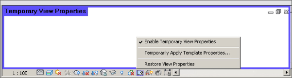
Figure 1.35 The Temporary View Properties setting applied to a view
The Show Analytical Model button allows you to toggle the visibility of the analytical model (a Structural feature) on and off. Displacement sets can be highlighted, as shown in Figure 1.36.
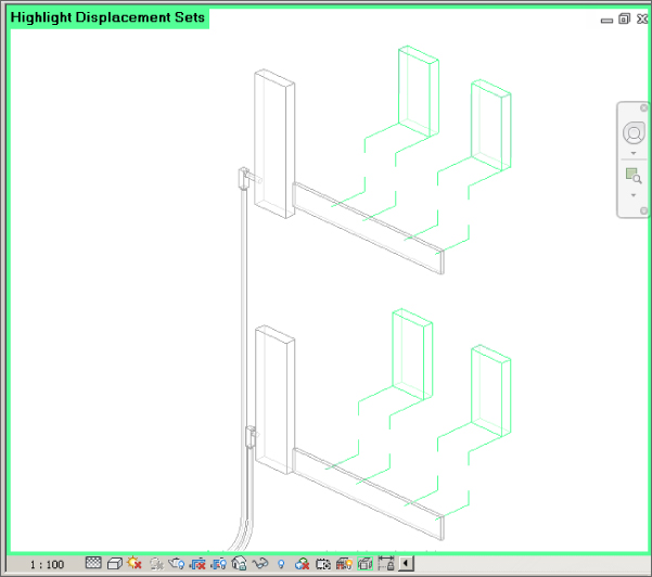
Figure 1.36 Displacement sets : highlighted in a : 3D view
Finally, there is a new button for Revit MEP 2016 (see Figure 1.37) that allows you to reveal constraints. This can be especially useful when joining a project to learn where elements have existing constraints, or as a memory jogger.
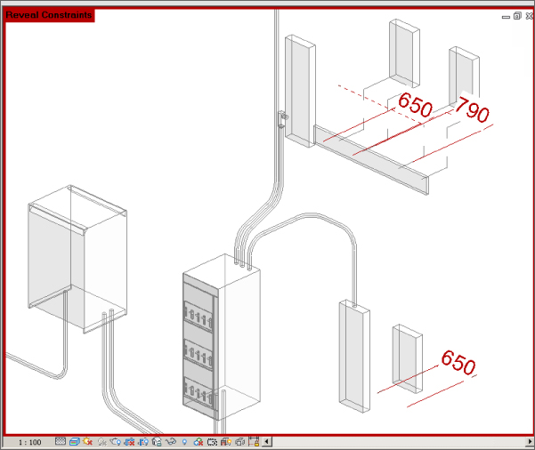
Figure 1.37 Reveal Constraints
If you have activated worksharing, then displaying the status of elements can be helpful for collaboration on a project and can save you time by helping you avoid trying to make changes to objects that are not editable. The Worksharing Display Settings option on the View Control Bar provides a menu from which you can access the Worksharing Display Settings dialog box, where you can establish the colors used for the various options of worksharing display. You can apply colors to worksets based on who owns them, whether they are up to date, or simply by their name. Figure 1.38 shows the dialog box and settings for worksets colored by their name. Notice that, in the Show Color column, you can choose to show a workset's color in the view by selecting its check box.
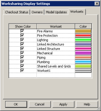
Figure 1.38 Worksharing Display Settings dialog box
When you choose an option for worksharing display, a box appears in the upper-left corner of the drawing area, indicating the option being displayed, as shown in Figure 1.39 (the colors are labeled for the black-and-white image). These settings take precedence over any view filters that may be applied to the view. If you override the graphics of a category in the view, only the changes to line weight are applied (color overrides are not displayed).
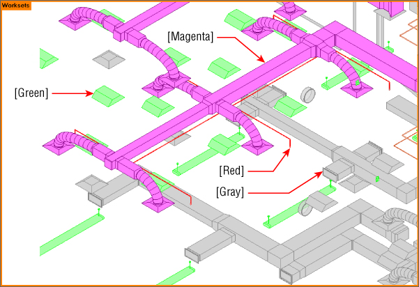
Figure 1.39 3D view with worksharing display activated
To turn the sun path on or off in a view, you use the Sun Path toggle on the View Control Bar, as shown in Figure 1.40. The Sun Settings option takes you to a dialog box where you can define the type of solar study performed, the project location, and the time of day.
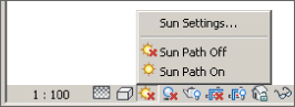
Figure 1.40 Sun path visual : display options
In the Visual Styles button menu shown in Figure 1.41, the Ray Trace option provides you with an interactive rendered view. In both this option and Realistic mode, any rich photorealistic content (RPC) objects display correctly.
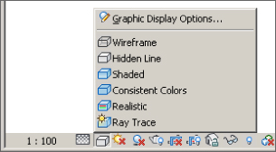
Figure 1.41 Visual styles
Take some time to explore the visual styles by completing the following exercise. If you do not have Hardware Acceleration turned on, you can do so by clicking the Options button on the application menu and choosing the Graphics tab. You must do this prior to opening the file. If activating Hardware Acceleration causes problems because of your video driver, you can choose not to activate it and skip step 5:
- Open the
RMEP2016_Ch01_Dataset.rvtfile found atwww.sybex.com/go/masteringrevitmep2016. - Click the Visual Styles button on the View Control Bar, and select Shaded. Zoom, pan, and orbit the view, and make note of the variations in color based on the model orientation.
- Click the Visual Styles button and select Graphic Display Options. In the dialog box that appears, deselect the Show Edges radio button and set Transparency to 50%; then click Apply. Notice the change to the view. Change Transparency back to 0% and click OK.
- Click the Visual Styles button and change the style to Consistent Colors. Notice that the colors remain a consistent shade when you zoom, pan, and orbit the view.
- Click the Visual Styles button and change the style to Realistic. Notice that the render material defined for the objects is now displayed.
- Click the Visual Styles button and change the style to Ray Trace. Notice that the performance considerably slows, but the image should be more like a rendered image.
- Click any object in the model. If you do not already have the Properties palette active, click the Properties button on the Properties panel of the contextual tab. Take some time to become familiar with the behavior of the Properties palette.
Status Bar
The status bar for Revit MEP 2016 reports information about a selected item and shows prompts with instructions for multilevel commands. It also has an active workset indicator and design options indicator. The selection options that are available on the Selection panel of the ribbon also show up on the status bar as icons, as shown in Figure 1.42.
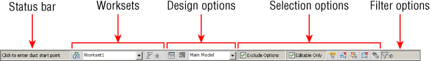
Figure 1.42 Status bar
You can access the Worksets dialog box by clicking the Worksets button next to the active workset window. You can switch between active worksets by clicking the window and selecting the desired workset, and you can view editing requests. These are the same tools as found on the Collaborate tab, but having them on the status bar eliminates the need to switch tabs on the ribbon to access them. This also eliminates the need to add the tools to the Quick Access toolbar. The Design Options window displays the active design option, and you can access the Design Options dialog box by clicking the button.
The Editable Only check box is for filtering a selection by only those objects that are editable in a worksharing environment. Similarly, you can choose to exclude options from the selection process.
Info Center
The Info Center is the portion of the title bar that gives you quick access to the Help menu or information about Revit MEP 2016. The search window allows you to search for information about a topic, as indicated in Figure 1.43.
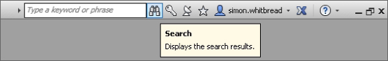
Figure 1.43 Info Center
You can easily access the Subscription Center by clicking the key icon. Any topics found in the search window or listed in the Subscription Center panel can be added to your Favorites list by clicking the star icon to the right of the topic. Clicking the star icon on the Info Center lists all your favorite topics. The Help menu is displayed by clicking the question mark icon. Revit 2016 has a web-based Help menu. You can access additional information by clicking the arrow next to the Help icon, as shown in Figure 1.44.
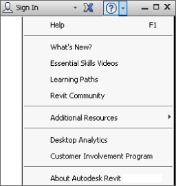
Figure 1.44 Additional Help options
You can sign into an Autodesk account by clicking the Sign In icon next to the Favorites star icon.
The Communication Center button is the one with the satellite dish on it. The Communication Center provides information about product updates and announcements.
Exchange Apps
Figure 1.45 shows the button for the Autodesk Exchange Apps store. This takes the user to a website where applications written for the Revit platform are listed. These are applications, either free or available for purchase, that can be loaded into Revit to provide enhanced performance and additional functionality.
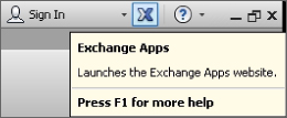
Figure 1.45 Accessing Exchange Apps
User Interface Control
Many components of the Revit MEP 2016 user interface can be turned on or off for workflow efficiency or to maximize screen real estate. The User Interface button, located at the far right of the View tab, allows you to select which user interface components are visible, as shown in Figure 1.46.
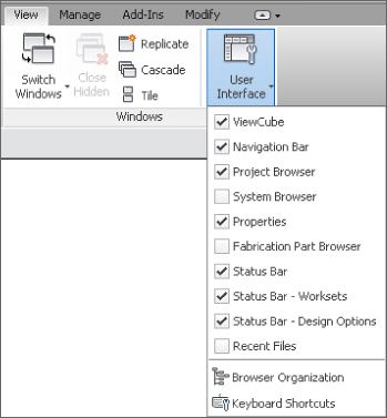
Figure 1.46 User Interface button options
The User Interface button is also a way to access the Recent Files screen—which cannot be accessed from the Switch Windows drop-down button until it has been activated by using the User Interface button—and the buttons to access and edit Browser organization and Keyboard Shortcuts.
Menus and Settings
The menus within Revit MEP 2016 offer access to many tools for user interface settings. Context menus, available by right-clicking an item, also contain various tools based on the selected item.
The Application menu includes options for exporting, printing, opening, and saving files. This menu also has an Options button for accessing settings that establish the behavior of the interface as well as the location of directories and files used for working on projects. You access the Application menu by clicking the Revit logo button in the upper-left corner of the user interface. The Options button is located in the lower-right corner of the menu, as shown in Figure 1.47.
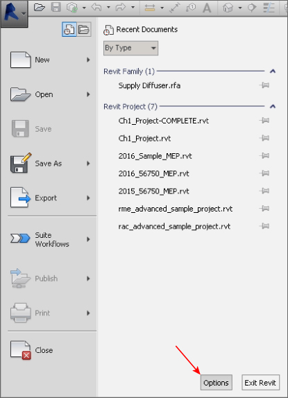
Figure 1.47 Application menu
The Options dialog box has several sections for different settings within Revit MEP 2016. The General section, as shown in Figure 1.48, contains a slider that allows you to control how frequently your file updates when you're working in a worksharing environment and using the Model Updates option of the worksharing display features.
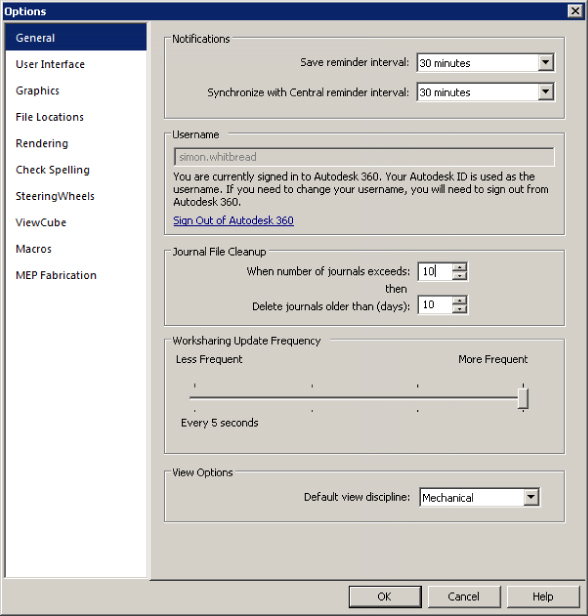
Figure 1.48 Options dialog box—General section
The General section is also where you define your username for Revit MEP 2016. This is important for worksharing because Revit uses this name to identify you for editing requests, workset ownership, and element borrowing. Notice that in this section, the author's name is grayed out, as he is signed into Autodesk 360. Revit will automatically establish the username when you are signed in, so if your company has a different method of creating usernames, such as company login or staff number, you would need to sign out of Autodesk 360 in order to change this.
This is also where you establish your default view discipline. This is important because it assigns this discipline to each new view that you create, unless the view is defined by a view template that has a different discipline setting.
The User Interface section, shown in Figure 1.49, is where you can set some general behavior for the interface. For example, you can choose between a light gray or dark gray theme for the interface from the Active Theme drop-down list. This tab is also where you determine which ribbon tabs and tools are available.
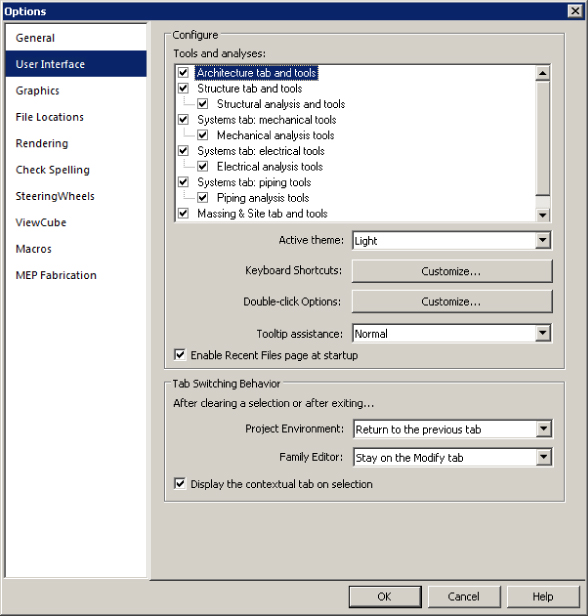
Figure 1.49 User Interface section of the Options dialog box
The Tab Switching Behavior section in this screen is where you define how the ribbon tabs behave after an action is completed. There are settings for the behavior in both the project environment and the Family Editor. The check box for displaying a contextual tab on a selection allows you to have the ribbon tab switch immediately to the contextual tab when an object is selected. If that check box is not selected, the contextual tab still appears on the ribbon, but it does not automatically become the active tab.
In addition, you can define the level of information provided by tooltips from the Tooltip Assistance drop-down menu, shown in Figure 1.50. If you are still learning the functions of different tools within Revit MEP 2016, you may want to set this option to High so that you receive detailed descriptions of how tools work when you hover over them with your mouse pointer. If you find that the tooltips interfere with your workflow, you can set this option to Minimal or None.
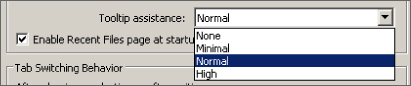
Figure 1.50 Tooltip assistance
Keyboard Shortcuts
On the User Interface tab of the Options dialog box is a button that enables you to customize your keyboard shortcuts. Clicking this button activates the Keyboard Shortcuts dialog box. In this dialog box, you can filter the commands to make the list easier to manage and edit. You can even filter by specific tabs or menus, as shown in Figure 1.51.
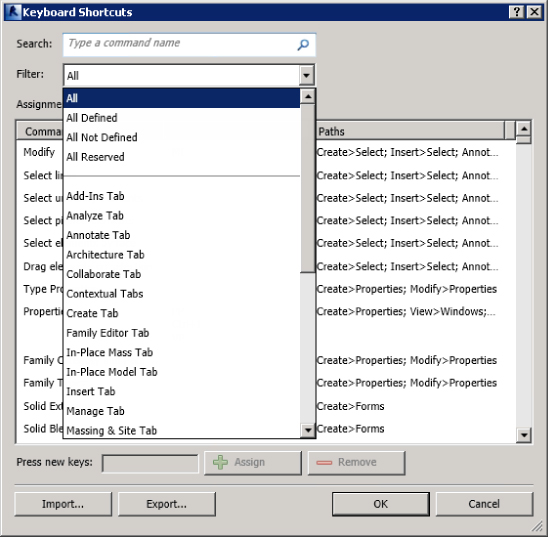
Figure 1.51 Filter options for : the Keyboard : Shortcuts list
You can sort the list in ascending or descending alphabetical order by clicking the desired column. Once you have located a command for which you want to create a keyboard shortcut, you can select the command to activate the Press New Keys text box at the bottom of the dialog box. Input the desired keys that will activate the command. You can input up to five characters for a keyboard shortcut. Reserved keys cannot be used for keyboard shortcuts; you can find the reserved keys by using the filter in the Keyboard Shortcuts dialog box. Click the Assign button to apply the shortcut to the selected command.
You can create multiple shortcuts for a single tool, and you can use the same shortcut keys for multiple tools. When you create a shortcut that is used for multiple tools, you must use the status bar to determine which tool to use when working in your project. When you type the shortcut, the first matching command is displayed on the status bar. You can use the arrow keys on your keyboard to cycle through available commands for the shortcut. Once the desired command is displayed on the status bar, you can activate it by pressing the spacebar. You can remove a keyboard shortcut from a command by selecting the specific shortcut and clicking the Remove button, as shown in Figure 1.52.
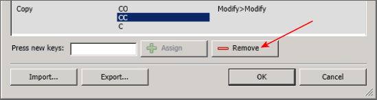
Figure 1.52 Removing a : keyboard shortcut
You can export your keyboard shortcut settings by clicking the Export button at the bottom of the Keyboard Shortcuts dialog box. This saves your settings as an XML file that can be edited in a spreadsheet program. Using a spreadsheet is another way to manage and share your keyboard shortcuts. The XML file can then be imported into Revit by using the Import button, allowing you to set a standard for keyboard shortcuts in a multiuser work environment.
Graphics
The Graphics section of the Options dialog box allows you to set the Selection, Pre-Selection, and Alert colors used in the drawing area, as shown in Figure 1.53. The drawing area's background color can be changed to any other color you find comfortable working with. Settings for temporary dimensions are also available to make them more readable. You can set the background for temporary dimensions to Transparent or Opaque.
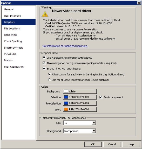
Figure 1.53 Graphics section of : the Options dialog : box
If you are experiencing graphics issues, you may need to change the Graphics Mode settings. Hardware acceleration works best when you are using an Autodesk-certified video driver. Certified and recommended drivers are available for download here:
http://usa.autodesk.com/adsk/servlet/syscert?id=18844534&siteID=123112
Settings for the appearance and behavior of the SteeringWheels® and ViewCube® features can be found in their respective sections in the Options dialog box.
Context Menus
Although the ribbon interface is designed for efficient workflow, context menus can be the easiest, most effective way to access settings or make changes to components of your Revit projects. A context menu is one that appears when you right-click in open space in the drawing area, on an item in the Project Browser, or on an object in the drawing area. Right-clicking in open space in the drawing area activates a context menu that includes the Repeat and Recent Commands tools. The last command used can be activated by pressing the Enter key or by clicking the Repeat option on the context menu. The Recent Commands option displays a list of recently used commands for easy access during repetitive work. Figure 1.54 shows a context menu and the recent commands used during a working session. The Recent Commands list displays the last five commands used.
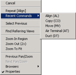
Figure 1.54 Context menu : showing recent commands
The options displayed on a context menu depend on the object selected when the menu is accessed. One nice feature of Revit MEP 2016 is the ability to define the selection set when the Select All Instances option is chosen. Figure 1.55 shows that you have the option to select only the objects in the active view or to select them throughout the entire project. This makes the Select All Instances feature much more useful because you don't have to worry about objects that should not be selected being inadvertently included in the selection set.
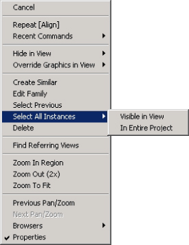
Figure 1.55 Selection set options
You can also right-click an element in the Project Browser to access a context menu. Right-clicking a view activates a menu with options for applying or creating a view template from that view. You can also save the view to a new file, as shown in Figure 1.56.
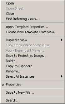
Figure 1.56 Context menu for a : view selected in the Project Browser
When you right-click a family in the Project Browser, you get a context menu with options to edit, rename (although the recommended workflow would be to open the family, edit, and then choose Save As and load into the project), or reload the family. You can right-click a family type in the Project Browser to access its type properties or to select the instances in the project without having to locate one of the instances in the model, as shown in Figure 1.57.
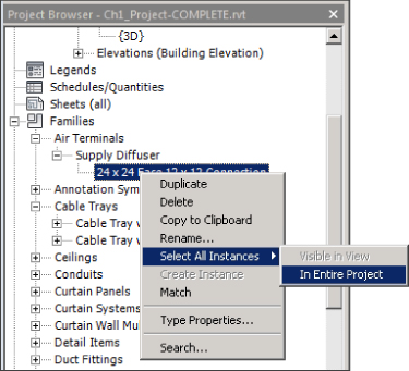
Figure 1.57 Context menu for a selected family type
You can also use a context menu to manage linked files through the Project Browser. Figure 1.58 shows the options available on a context menu when a linked Revit file is selected in the Project Browser.
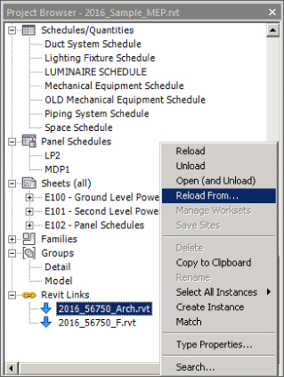
Figure 1.58 Context menu for a linked file in the : Project Browser
The Bottom Line
- Navigate the ribbon interface. The ribbon is an efficient user interface style that works well in Revit. The ability to house numerous tools in a single area of the interface allows for maximum screen real estate for the drawing area.
- Master It Along with the standard tabs available on the ribbon interface, contextual tabs are available while you're working on a project. Explain what a contextual tab is and how it may differ throughout your workflow.
- Utilize user interface features. Many features are available in the Revit MEP 2016 user interface that allow for quick access to tools and settings. The use of keyboard shortcuts can also improve workflow efficiency.
- Master It To enhance workflow efficiency, it is important to know how to access features of the user interface. What tool can be used to activate or remove user interface features?
- Use settings and menus. Establishing settings for your user interface is another way to create a working environment that is the most efficient and effective for your use of Revit MEP 2016.
- Master It The use of keyboard shortcuts has been part of design and drafting software for a long time. The ability to customize the shortcuts to best suit your workflow is critical to improved efficiency. How can the settings for keyboard shortcuts be accessed? How can modified keyboard settings be reset?