
Chapter 12
Bringing Graphics to Life with Gradients, Blends, and Transparency
IN THIS CHAPTER
![]() Defining and applying gradients
Defining and applying gradients
![]() Using blends for productivity and design
Using blends for productivity and design
![]() Defining and applying transparency to objects
Defining and applying transparency to objects
![]() Styling with opacity blends
Styling with opacity blends
![]() Combining transparency and gradients in opacity masks
Combining transparency and gradients in opacity masks
Let’s talk about the real world for a moment. Objects in the real world can't be represented simply with vectors with solid strokes and solid-color, opaque fills. In real life you encounter objects with colors that merge gradually. In Illustrator, you can more closely approximate a real object by using gradients to generate and fine-tune transitions between colors.
In real life, objects that are the source of an illustration (or a product of the imagination) are often part of a larger set of objects. For example, a step is usually part of a staircase. A stone in a creek might be part of a path of stones that cross the creek. In Illustrator, you can use blends to generate sets of objects that transition from one object to another along a defined path.
In real life, not all objects are opaque (hiding everything behind them). Many elements of an illustration, such as a windowpane or thin piece of fabric, reflect real-life objects that are only partially opaque, with an aspect of transparency. Illustrator’s transparency features allow you to apply any degree of transparency to objects, from fully opaque to almost completely transparent.
In this chapter, I show you how to use gradients, blends, and transparency to bring illustrations to life.
Merging Colors with Gradients
Gradients merge two or more colors in an object. Gradients can be used to reflect color transitions in real-life objects. Figure 12-1, for example, captures the transition between the white part of a watermelon slice that is no fun to eat, and the sweet, juicy, red part that is almost too much fun to eat.

FIGURE 12-1: A gradient applied to a slice of watermelon.
Gradients can add the appearance or feel of three-dimensional depth to an illustration. In Figure 12-2, I added gradients to add depth to the room with receding light.
Illustrator CC allows you to generate three types of gradients:
- Linear gradients blend color from one point to another, horizontally, vertically, or diagonally, as shown in Figure 12-3.
- Radial gradients also mix colors from one point to another point but they do so by radiating out from the center of an object. The fill in the setting sun in Figure 12-4 is a radial gradient.
- Freeform gradients are more flexible than either linear or radial gradients, as shown in Figure 12-5. Fluent Illustrator designers will find freeform gradients a more accessible and versatile way to create effects similar to, if not quite as complex, as those created with gradient mesh.

FIGURE 12-2: A gradient applied to create the illusion of depth.
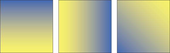
FIGURE 12-3: Horizontal, vertical, and diagonal linear gradients (left to right).
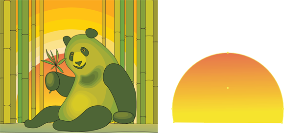
FIGURE 12-4: The setting sun in the illustration uses a radial gradient fill.
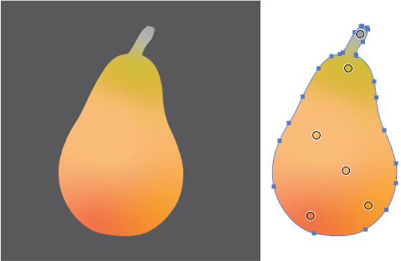
FIGURE 12-5: A freeform gradient.
Applying gradients
You apply defined gradients to selected objects pretty much the same way you apply color to objects. If you’re not familiar with organizing and applying color, a quick visit to Chapter 11 will serve as a helpful prerequisite to working with gradients.
The short version is this: Select an object and then click a gradient in a swatch panel, and the gradient is applied to the selected object.
There’s more to the story, of course. Gradients can be tweaked, created from scratch, and applied in many different ways, as I outline in the introduction to this chapter. But let’s start with the basics: picking a gradient and applying it to an object.
Applying a gradient from a swatch library
The simplest way to apply a gradient is to use an Illustrator preset gradient. Illustrator provides an impressive set of built-in gradients, and custom gradients (I get to those next) often begin with a preset.
You access Illustrator’s robust set of preset gradients by choosing Window ⇒ Swatch Libraries ⇒ Gradients and then clicking one of the many sets of gradient swatches.
When you select an object and choose a gradient from any of the swatch libraries, that gradient is applied to the selection, and the gradient swatch is added to your document’s Swatches library. Figure 12-6 shows three gradient swatch libraries, with a gradient (Sky 3) being applied to a selected rectangle, and all applied gradients added to the Swatches panel.
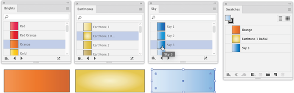
FIGURE 12-6: Applying a gradient from a swatch panel.
 In Chapter 11, I explain how to configure and use Swatch libraries.
Applying a gradient to a stroke
If you want to apply a gradient to a stroke (and you can!), change the Tools panel color focus to Stroke, and then click the gradient swatch you want to load into the Stroke color box. With the gradient defined as a stroke color, click any object to apply the gradient to that object’s stroke, as shown in Figure 12-7.

FIGURE 12-7: Applying a gradient to a stroke.
Unleashing linear gradients
If the dozens of preset gradient swatch libraries don’t have the gradient you need, you can edit an existing one or create one from scratch.
If you're customizing an existing gradient, start with these steps:
-
Select a starter gradient in the Swatches panel.
If the gradient you're using as a starter gradient is not in the Swatches panel, drag it there from one of the gradient swatch libraries.
- Duplicate and rename the starter gradient swatch:
- Choose Duplicate Swatch from the Swatches panel menu.
- Double-click the swatch (not the swatch thumbnail) in the Swatch panel to open the Swatch Option dialog.
- Enter a new swatch name, as shown in Figure 12-8, and click OK to apply the new swatch name.
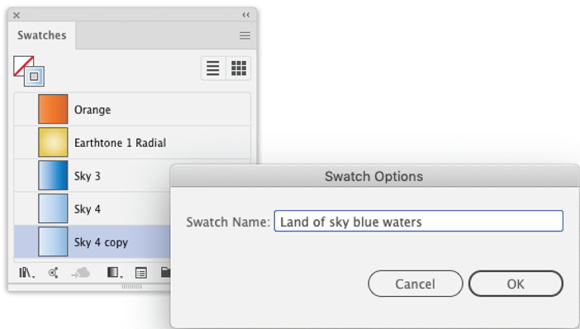
FIGURE 12-8: Renaming a swatch.
-
Open the Gradient panel to edit the gradient.
With the new gradient selected in the Swatches panel, view the Gradients panel, as shown in Figure 12-9.
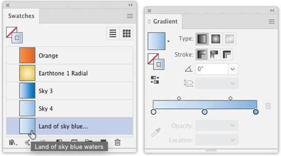
FIGURE 12-9: Editing gradient properties.
You’re now ready to edit the properties of the swatch. I explain how to do that next.
To create a gradient, I usually start with an existing gradient and tweak it, as I explain in the preceding section. But you can also create a gradient from scratch. Do that by double-clicking the Gradient tool in the Tools panel (on the Basic toolbar). The Gradient panel opens, ready for you to define a new gradient.
The next step is to choose a gradient type. As I note in the beginning of this chapter, the three types of gradients are linear, radial, and freeform. The process of defining each of these is similar.
Because linear gradients are the most widely applicable, l start by explaining how to define a linear gradient, and how to apply linear gradients interactively with the Gradient tool. Then I point out what’s different when you define and apply a radial or freeform gradient.
Linear gradients can be horizontal, vertical, or diagonal — I demonstrate all three options at the beginning of this chapter.
Follow these steps to define any one of the three types of linear gradients:
- In the Gradient dialog, click the linear gradient icon (the first one).
- Define the start and finish gradient colors:
- Click in the gradient slider at the bottom of the panel.
- Double-click the far-left gradient color stop and choose a color from the color box that opens.
- Double-click the far right gradient color stop and choose a color from the color box, as shown in Figure 12-10.
-
Add color stops:
- Hover your cursor under the gradient slider until a + appears.
- Click to define the new color stop.
- Apply a color to the new stop using the technique in Step 2.
Color stops can be placed or moved anywhere on the gradient ramp.
To delete a gradient stop, drag it out of the Gradient panel.
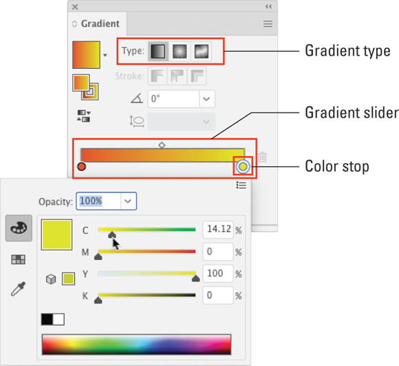
FIGURE 12-10: Defining beginning and ending color stops.
-
Adjust the location of the transition between color stops.
After you create gradient stops and apply colors to them, adjust the gradient by changing the location of the diamond-shaped midpoints between each color stop, as shown in Figure 12-11.

FIGURE 12-11: Adjusting the midpoint in a gradient transition.
- Rotate the fill:
- Change the angle setting.
- Draw a rectangle. You won’t see the effect of changing the rotation of a fill until you apply it, so it's helpful at this stage to draw a rectangle. The gradient will be reflected in the rectangle, as shown in Figure 12-12.
-
Define transparency.
You can define opacity for each selected color stop; lowering the opacity applies some transparency to that color. In Figure 12-13, I dialed down the opacity of the far left color stop to 20%. You can see that when this gradient is applied to the rectangle, the underlying black ellipse shows through the semitransparent section of the gradient.

FIGURE 12-12: Defining gradient rotation angle.
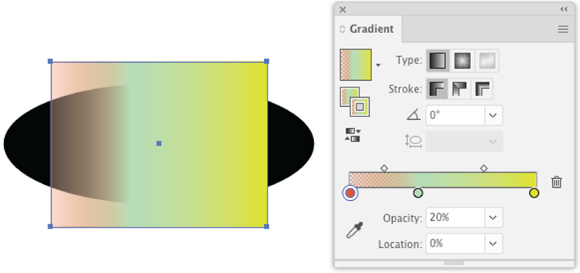
FIGURE 12-13: Applying transparency to a color stop.
- Define how the gradient will appear when applied to a stroke:
- Draw a rectangle with a thick stroke on the canvas and keep it selected while you define the gradient stroke style. Drawing a rectangle helps you to preview how your stroke gradient settings will appear.
- In the Tools panel, focus the selection on the stroke. You can apply a gradient within, along, or across a stroke using the three icons under the set of three stroke icons. These icons are active only if you have selected the stroke focus, not the fill focus.
- Experiment with the three options for applying the gradient to a stroke. Figure 12-14 shows the Apply Gradient within a Stroke option applied.

FIGURE 12-14: Defining a gradient for strokes applied within the stroke.
-
To change the location of gradient stops, drag them to a different location on the gradient slider.
Alternately, you can define a location value of a selected color stop in the Location box at the bottom of the Gradient panel. Color stop locations values are defined in percent, with the beginning of the gradient at 0% and the end at 100%.
-
Save your defined gradient:
- Drag the gradient swatch in the upper-left corner of the Gradient panel to the Swatches panel, as shown in Figure 12-15.
- Name the new gradient in the Swatches panel.
When you save your document, the swatches panel is saved with the document, including your defined gradients.

FIGURE 12-15: Adding a gradient to the Swatches panel.
Radiating radial gradients
Defining a radical gradient in the Gradients panel is similar to defining a linear gradient. The most essential difference is that you select the radial gradient icon in the Gradient panel when you define the gradient, as shown in Figure 12-16.
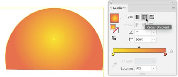
FIGURE 12-16: Defining a radial gradient.
Following are a couple radial-specific tips:
- The default aspect ratio setting of 100% produces a circular gradient. Changing that transforms the gradient into more of an egg-shaped ellipse, as shown in Figure 12-17.

FIGURE 12-17: Changing a radial gradient from a circle to an ellipse.
- If you change the aspect ratio to something other than the default, you can rotate the radial gradient using the angle setting, as shown in Figure 12-18.

FIGURE 12-18: Rotating a radial gradient.
Transforming gradients with Gradient Annotator
Gradient Annotator lets you edit gradients directly on the canvas as they are applied to an object. To activate Gradient Annotator, select an object with a gradient applied to it, and click the Gradient tool.
Wielding Gradient Annotator is pretty intuitive. For linear gradients, Gradient Annotator essentially replicates the options in the Gradients panel for defining a gradient, except that you can apply those options and see the effect instantly. And when you display Gradient Annotator, you also see the Gradient panel, so you can bounce back and forth between changing settings interactively with Gradient Annotator and entering values in the Gradient panel.
Here’s how to apply changes to a gradient with Annotator:
- To change the color of a color stop, double-click the stop and change color settings, as shown in Figure 12-19.
- To change the rotation angle of a gradient, hover your cursor over the end point of Annotator until the rotation icon appears, as shown in Figure 12-20, and then drag to rotate the gradient.
- Editing the location and transparency of color stops with Annotator is similar to editing those options in the Transparency panel.
- In addition to the features for interactively editing linear gradients, Annotator displays a dotted ring for radial gradients. You can rotate that ring to change the rotation of the radial gradient, as shown in Figure 12-21.

FIGURE 12-19: Editing a color stop with Gradient Annotator.

FIGURE 12-20: Rotating a linear gradient interactively.

FIGURE 12-21: Rotating a radial gradient interactively — Gradient Annotator and the Gradient panel are displayed here.
Using freeform gradients
The linear and radial gradients explored so far in this chapter are defined by and emanate from a single point. They can flow from one side of a graphic to another, or from somewhere within an elliptical frame to another point within that elliptical frame.
For more complex gradients, Illustrator offers two options: the Gradient Mesh tool and freeform gradients. Both options allow you to define gradients using multiple points, not just one point. For a gradient mesh, those multiple sources are bunches of points. For freeform gradients, those sources are either a set of points or a line. I focus on the points option because it's more widely applicable.
 Before you commit to defining and using a freeform gradient, note that you can't apply a freeform gradient to a stroke, unlike linear and radial gradients. Freeform gradients apply only to object fills.
A freeform points gradient is defined by a set of color stops that function as independent points within the object to which the gradient is applied.
The following steps demonstrate how to create and apply a freeform line gradient:
- Apply the default freeform points gradient to an object:
- Click the Gradient tool and then click an object on the canvas.
- In the Gradient panel, click Freeform Gradient. Illustrator’s default gradient is applied to the selected object.
- Select points from the set of three types of gradients in the Gradient panel, as shown in Figure 12-22.

FIGURE 12-22: Defining a points gradient.
-
Recolor the freeform gradient stops.
Double-click a stop to open the color panel and change the color, as shown in Figure 12-23. To assign the same color to multiple stops, Shift-click multiple stops and open the Color panel (choose Window ⇒ Color).

FIGURE 12-23: Recoloring stops in a points gradient.
- Add, move, or delete color stops:
- Add a color stop: Click anywhere on the selected object.
- Move a color stop: Drag the color stop.
- Delete a color stop: Drag it outside the object area and then click Delete in the Gradient panel or press the Delete key.
- Define the size of the gradient point spread for stops.
- Spread is the diameter around the color stop where the gradient is applied. The default spread is 0%, and the largest spread is 100%.
- To define the value of the spread, use the Spread box in the Gradient panel, Control panel, or Properties panel. You can also define spread interactively by dragging on the edge of the slider, shown in Figure 12-24.

FIGURE 12-24: Defining spread for color stops for a freeform points gradient.
Freeform gradients tend to be use-once-and-that’s-it because they are so specific to the size and shape of the object to which they are applied. You can't save them as swatches. But you can copy them and apply them to other objects using the Eyedropper tool.
Blending for Beauty and Productivity
Illustrator blends are both a design tool and a productivity tool. Blending exploits the fact that because vector graphics are, deep down, just math, we can apply complex math to figure out how transitional objects between two selected objects should look.
Blends can be used to save the work of seemingly endless copying, pasting, and tweaking sets of objects, such as the set of stairs in Figure 12-25.
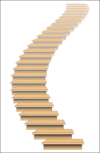
FIGURE 12-25: A step blend applied to generate … steps.
Or blends can be a design tool when used to create a rough, gradient-like look, as shown in the panda in Figure 12-26.
Blends can be smooth or steps. Smooth blends are file-size and processor heavy. The results of a step blend overlap considerably with the effects available (generally more efficiently) from gradients.
Step blends (as illustrated in Figures 12-25 and 12-26) can save time in generating multiple objects along a path and can be used for interesting effects. For those reasons, I focus on step blends.

FIGURE 12-26: A step blend applied to generate concentric shapes.
Setting blend options
Before you apply a blend, use the Blend Options dialog box to define the kind of blend you want to apply and how you want to apply it. To access the Blend Options dialog, double-clicking the Blend tool in the Basic toolbar or choose Object ⇒ Blend ⇒ Blend Options.
The following list explains the defining options for step blends:
- Spacing: Use this drop-down to choose between a smooth blend, or one of two ways to define a step blend: Specified Steps or Specified Distance. As you guessed, Specified Steps lets you define how many steps to generate (not just literally steps as in Figure 12-26, of course, but iterations of the blended objects to be generated). Specified Distance defines how much space to create between generated steps.
- Orientation: The two Orientation options for step blends are Align to Page and Align to Path. With the Align to Page option, objects that start vertical, for example, stay vertical throughout the blend. With the Align to Path option, intermediate objects in a blend will rotate in conformity with the path along which they are generated.
You can redefine these options for an existing blend by selecting the blend and choosing Object ⇒ Blend Options.
Working with blends
To apply a blend after you’ve defined blend options, select two (only two) objects and choose Object ⇒ Blend ⇒ Make.
To remove a selected blend, choose Object ⇒ Blend ⇒ Release.
After you generate a blend between two or more paths, you can modify the blend interactively on the artboard. Simply use the Direct Selection tool to move one of the objects used to create the blend, as shown in Figure 12-27.
You can also change the curve of a blend by editing the anchors that define the path, as shown in Figure 12-28.
Sometimes, after letting Illustrator’s Blend tool do the work of generating a bunch of objects, you’ll want to change the result into discrete, editable objects. You do that by expanding the blend: Select the blend and choose Objects ⇒ Blend ⇒ Expand. The result is a set of grouped objects that you can edit. After you expand a blend, it loses its blend properties. You can no longer adjust the blend options or edit the path on which the blend is applied.

FIGURE 12-27: Changing the length of a blend path.

FIGURE 12-28: Bending a blend.
Applying Transparency
Transparency is a hot topic these days. Political candidates are supposed to be transparent about where their funding comes from. Websites are supposed to be transparent about where their content comes from. Consultants are supposed to disclose where they have invested in a product they recommend. If you’re looking for advice on the ethical and legal implications of all this, I have to be completely transparent: You bought the wrong book.
But if you’re looking to apply semi-opacity to objects in Illustrator, you have the right book and you’re reading the right section.
Transparency is applied in degrees, ranging from 1 percent (almost completely opaque) to 99 percent (almost completely invisible). An object with 0 percent opacity is completely transparent, and an object with 100 percent opacity has no transparency.
Defining and applying transparency
You can define some transparency features from the Control and Properties panels, but to get to one-stop-shopping for all transparency features, choose Window ⇒ Transparency. The Transparency panel that opens can define opacity and transparency for any selected object or objects.
Managing opacity applied to overlapping objects
Note that I wrote “object or objects.” You can apply transparency to multiple selected objects. When semitransparent objects overlap, their opacity reflects the sum of the opacity of each object. For example, in Figure 12-29, the two red objects alone are 50 percent opaque but are 75 percent opaque where they overlap.

FIGURE 12-29: Applying transparency to overlapping objects.
Applying transparency to strokes or fills
When you apply transparency from the Transparency panel, the level of opacity you choose is applied to all selected objects. And it is applied to both the stroke and the fill of an object.
To apply transparency settings to only the stroke or fill of an object, select the object to which you want to apply transparency and open the Appearance panel. Then click Stroke or Fill in the panel, and adjust the transparency for each. Figure 12-30 shows 25% transparency assigned to a red fill, and no transparency assigned to the black stroke.
Using transparency blending modes
In addition to normal transparency, Illustrator’s Transparency panel provides blending modes that transform colors in the underlying layer. These blending modes work something like sunglasses or a colored piece of glass — tinting, distorting, or enhancing the effect of a transparent overlay.
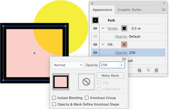
FIGURE 12-30: Applying transparency to just a fill.
The following blending effects are available in the Transparency panel from the blending mode drop-down list (which is displaying Normal in Figure 12-30). You can experiment with them, but here are short explanations of what to expect from each:
- Normal provides just transparency, no distortion of color.
- Multiply darkens the resulting color.
- Screen lightens the resulting color.
- Overlay sharpens the contrast of a color (or pattern) filter by intensifying the contrast.
- Soft Light lightens the underlying object if the filtering object color is lighter than 50 percent gray. Otherwise, the underlying object is made darker.
- Hard Light simulates shining a bright light on the underlying object.
- Color Dodge brightens the underlying object.
- Color Burn darkens the underlying object.
- Darken changes any underlying colors that are lighter than the overlay color to the overlay color.
- Lighten lightens underlying colors that are darker than the overlay.
- Difference calculates a new color based on the difference between the brightness values of the overlapping colors.
- Exclusion changes color using the same kind of calculation as the Difference effect, but the contrast between the original color and the changed color is muted and less dramatic than the Difference effect.
- Hue retains the color of the top filtering object(s) while assuming the saturation (intensity) and brightness of the bottom object(s).
- Saturation retains the saturation (intensity) of the top filtering object(s) while assuming the brightness and color of the bottom object(s).
- Color retains the hue and saturation of the top filtering object(s) while assuming the brightness of the bottom object(s).
- Luminosity retains the brightness quantity (intensity) of the top filtering object(s) while assuming the saturation (intensity) of the bottom object(s).
In Figure 12-31, I picked four blending modes to compare to normal transparency.
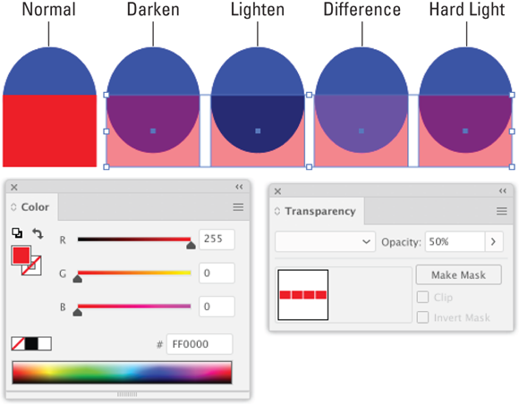
FIGURE 12-31: Experimenting with transparency modes with 50% opacity.
Many blending modes are defined by calculations based on hue, saturation, or brightness values. As you experiment with different blending modes, you’ll develop your ability to anticipate the effect they will have when used as filters.
If your output is destined for hardcopy that will use spot color printing, avoid the Difference, Exclusion, Hue, Saturation, Color, and Luminosity blending modes. They’re not supported by spot colors. For more on spot color printing, see Chapter 11 and the discussion of working with print shops in Chapter 2.
Clipping with opacity masks
An opacity mask reveals part of an underlying object through an opacity lens. Let me break that down: Opacity masks combine transparency, explained in the earlier part of this section, and masking.
In this section, you see how opacity masks work, which gives me a chance to describe how transparency and gradients can combine to create some cool results.
The following steps walk through an example of applying a gradient fill as an opacity mask:
- Create or open any kind of illustration, simple or complex, or use one you have handy.
- Group all the objects in the illustration.
- Create a circle on top of the illustration, and fill it with a black-to-white gradient fill.
- Use the default gradient fill.
- Move the masking object (the circle with the gradient fill) above the illustration, as shown in Figure 12-32.

FIGURE 12-32: Preparing a gradient-filled shape and an illustration for an opacity mask.
-
Use the circle as an opacity mask.
Select both the mask object (the circle) and the underlying illustration and choose Make Opacity Mask from the Transparency panel menu, as shown in Figure 12-33, or use the Make Mask button in the panel.
- When you apply an opacity mask, the Clip check box in the Transparency palette is selected by default. Leave it selected.
- If you select the Invert Mask check box, you reverse the effect that dark and light colors have on the underlying image.
- If you reduce the opacity of the masking object, the resulting mask is more transparent.

FIGURE 12-33: Applying an opacity mask.
- View and tweak the results.
- Click outside the masked set to reveal the results of the opacity mask.
- To unlink the opacity mask from the underlying image, click the Link button in the Transparency palette — it’s visible when an opacity mask is selected.
- With the opacity mask unlinked from the underlying image, you can move either the underlying (masked) image or the opacity mask to change the area that is revealed through the mask, as shown in Figure 12-34.
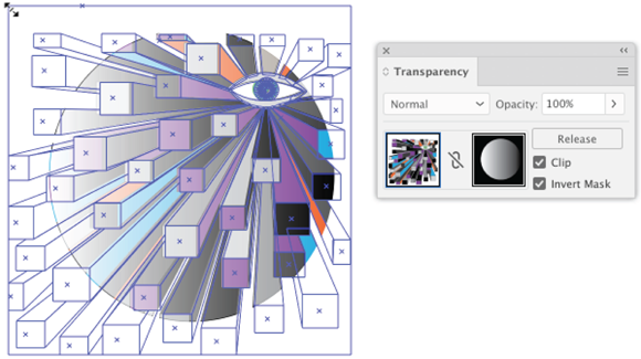
FIGURE 12-34: Adjusting the area of an opacity mask.
If you are designing a commercial print project and using Transparency, consult with your printer on what kind of settings they require to reproduce your project as designed.
The opacity mask uses the intensity of the grayscale value of the masking object (not the actual colors) to apply a gradient-like filter over the underlying object, combining transparency and gradients to produce some interesting possibilities in your design journey, such as my result in Figure 12-35.

FIGURE 12-35: The result of an opacity mask.