
Chapter 14
Styling with Effects
IN THIS CHAPTER
![]() Understanding raster and vector effects
Understanding raster and vector effects
![]() Defining and applying effects
Defining and applying effects
![]() Managing effects with the Appearance panel
Managing effects with the Appearance panel
![]() Applying 3D effects
Applying 3D effects
![]() Saving graphic styles
Saving graphic styles
The Effect menu in Illustrator opens the door to an incongruous plethora of wild, crazy, and only vaguely related techniques. These features can be roughly divided into effects (intuitive enough) and filters. In this chapter, I break down what effects are, what filters are, how they’re different, and when you use which.
I also show you how to apply some of the most useful and widely applicable effects, such as drop shadows, 3D extrusions (converting a rectangle into a cube), and fun distortions (such as puckering paths). And I walk you through a substantial project that involves combining a rotated path with mapped artwork.
Navigating the Universe of Effects
Some effects are specific and not what you would normally think of as an effect, such as crop marks for printers, and the convert to shape feature, which turns any selected object into a rectangle or an ellipse.
Many effects duplicate features you can apply in other ways, such as Pathfinder effects, which more or less duplicate Pathfinder tools. In Chapter 4, I explain how to use Pathfinder tools and their relationship to Pathfinder effects.
In this section, I guide you through the different sets of effects and deconstruct how they work.
Getting your money’s worth from effects
In this section, I will try to order the chaos of the Effect menu. In general, effects have two things in common:
- They do not change the paths in a selected object.
- They do a bunch of things at once that you could accomplish without using an effect, but the process would take a lot longer.
For example, in Figure 14-1, I applied a single effect to generate the 3D bar from the square next to it.

FIGURE 14-1: An extruded square.
Note the green bounding box that appears with the selection. That actually is the object. The extrusion is simply an effect applied to the appearance of the square. It’s as if I put on a Batman suit to make myself look like a body builder with six-pack abs. It would just be me under that suit, but I’d appear to look like Batman.
To emphasize the point, in Figure 14-2, I copied the extruded square and am editing the actual path (by using the double-sided arrow to pull on a side of the square). The effect is adjusting accordingly.
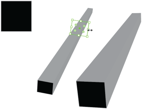
FIGURE 14-2: Editing the path of an object to which an effect has been applied.
Now we get to the second characteristic of effects: They are productivity tools. Imagine creating all the extruded rectangles in the illustration in Figure 14-3 by hand versus generating extrusions and then tweaking and combining both the extruded object and the effect.
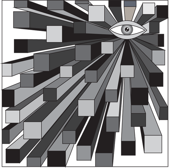
FIGURE 14-3: Generating all these extrusions saves time.
Again, all the paths and fills in Figure 14-3 could have been created with the Pen tool (which I cover in Chapter 7) and basic stroke and fill styling. But that would be much more tedious and time consuming than applying an effect.
After you get your head around these two aspects of effects, you’ll be able to make sense of the mix of options on the Effect menu and get your money’s worth out of what effects have to offer.
Using Photoshop effects with care
The Effect menu includes a large subsection of Photoshop effects. Photoshop is Illustrator’s raster-editing cousin (that is, primarily bitmap and non-vector). In fact, raster editing is almost synonymous with Photoshop, as in “that fast-food hamburger must have been Photoshopped to make it look that good.”
As a general rule, raster editing — and raster effects — are best left to Photoshop. When you apply Photoshop (raster) effects to objects, you essentially rasterize them. The applied Photoshop effects will not have all the magic of vectors. They won’t be infinitely scalable. They will bulk up file size. They won’t be as easily integrated into digital projects such as infographics, interactive graphics, animation, or zoomable artwork.
Am I saying avoid Photoshop effects when working in Illustrator? Kind of, but not totally. You will inevitably be involved in hybrid illustration projects that necessarily combine raster artwork (such as photos) and vector graphics. And there are scenarios, particularly if you are preparing artwork for fixed-size print reproduction (such as a poster or a magazine ad), where you can safely and sanely apply raster effects to Illustrator artwork because the project is not going to be rescaled. Where that is the case, you can choose Effect ⇒ Document Raster Effects Settings and define a resolution compatible with your print projects. For more on defining resolution for raster print output, see Chapter 2.
As a general rule, you should use Photoshop effects in Illustrator only when you are preparing a project for a fixed-size print output.
Appreciating SVG filters
Scalable Vector Graphics (SVG) is a powerful format for sharing Illustrator-built vector graphics in digital output. It provides an alternative set of results to those available in the Effects set of options on the Effect menu, but it can be exported in ways that mesh powerfully with digital interactive and animated design.
SVG filters are accessible from the Effect menu. I’m not devoting space in this chapter to SVG filters, but that’s not because they are not important. Just the opposite. Because SVG output and SVG filters are such a critical path on which Illustrator and vector design in general are evolving, an entire chapter, Chapter 18, is devoted to them.
Choosing and Applying Effects
Having sifted through the three kinds of options on the Effect menu (effects, Photoshop effects, and SVG filters), let’s quickly survey all the effects options on the Effect menu. Then I’ll zoom in on a few widely applicable effects and, in the process, demonstrate widely applicable techniques for employing any effect.
The following list provides a quick guide to what’s what on the Effect menu:
- 3D accesses the most powerful tools on the Effect menu to apply a range of 3D effects. I focus on these effects shortly.
- Convert to Shape converts any object to a rectangle or an ellipse.
- Crop Marks applies crop marks around selected objects for handing off to printers.
- Distort and Transform accesses a set of quick transforms you can apply to paths, such as pucker (shown in Figure 14-4) and bloat.
- Pathfinder effects basically mirror the features available in the Pathfinder panel, except they apply transformations as effects rather than changes to the anchors and paths in an object. I walk through Pathfinder tools, when to use them, and how they relate to Pathfinder effects in Chapter 4.
- Rasterize converts selected objects to rasters but retains the original path that you can use if your printer requires raster (not vector) graphics.
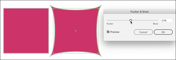
FIGURE 14-4: Generating a pucker effect.
- Stylize applies drop shadows and other frequently needed transformations in outlines around paths.
- SVG Filters are effects that are specific to SVG files. They preserve vector properties in screen display. I walk through SVG filters, their role, and how to use them in Chapter 18.
- Warp effects apply arcs (shown in Figure 14-5), arches, bulges, waving flags, and other distortions of shapes.

FIGURE 14-5: Experimenting with warps.
I’ve identified a few keys to working with effects so far. But if you’ll hang with me a moment, I want to reinforce them because they are key to not getting lost, overwhelmed, or eating too much chocolate while experimenting with effects:
- There’s nothing you can do with an effect that you can't do “by hand,” using tools such as the Pen tool, fill and stroke properties, or drawing tools. But effects save time.
- Effects do not change the underlying path of an object, which means you can edit the underlying path or get rid of the effect if you want.
- You will experience a lot of trial-and-error in generating effects. Rely on the Preview check box in the dialog that appears as you define an effect to see how it works.
- The appearance of an object to which an effect has been applied is a result of both how the effect is defined and how you edit the path of the original object.
- Okay, here’s something I haven’t clued you in on yet, but it’s important: If you want to change an effect, don’t do it through the Effect menu. Choosing to apply the effect again from the menu will stack another instance of the effect on a selected object, creating a mess. Instead, edit effects through the Appearance panel. I show you how to do that next.
- Effects can be applied to objects, groups, or layers.
Managing Effects
The more powerful effects are applied with dialogs that display a Preview check box. Use that check box to see how an effect will change the appearance of the object(s) to which it is being applied. I illustrate a couple of those dialogs in Figures 14-4 and 14-5 (for the Pucker & Bloat tool and Warp tool, respectively).
After you generate and apply an effect, you’ll likely want to tweak it. I walk you through how effects can be added, deleted, restacked, and tweaked by using the Appearance panel.
And you might want to expand the effect. I emphasize that when you apply an effect, you don’t change the underlying path of objects to which the effect has been applied. But sometimes you need to apply an effect to an object’s path to expand your ability to tweak the graphic. I walk through how to expand an effect.
Finally, after you go through all the blood, sweat, and tears (that was a metaphor, I hope) of creating just the right combination of effects and settings, you might want to save that set of changes. You do this by saving a graphic style, and I show you how that process works as well.
Using the Appearance panel
You can edit effects through either the Properties panel or the Appearance panel. View the Properties panel by choosing Window ⇒ Properties, and view the Appearance panel by choosing Window ⇒ Appearance.
If you have a single effect applied to an object, the Properties panel can handle that, as shown in Figure 14-6.
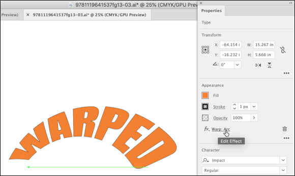
FIGURE 14-6: Accessing editing tools for a warp effect in the Properties panel.
However, as soon as you stack a second effect on an object — and that’s not a rare occurrence — you’ll get no more help from the Properties panel than an info icon directing you to the Appearance panel, as shown in Figure 14-7.

FIGURE 14-7: The Properties panel can handle only one effect.
That’s why, despite the general utility of the Properties panel, I head straight for the Appearance panel when I need to edit an effect.
Examining and editing effects
The Appearance panel displays all the effects applied to the selected objects, as shown in Figure 14-8, allowing you to manage sets of effects. You can use the eye icon to toggle between displaying and hiding effects.

FIGURE 14-8: Identifying multiple effects in the Appearance panel.
To edit a particular effect, click the effect, as shown in Figure 14-9. The options panel for that effect appears, and you can edit how the effect displays.

FIGURE 14-9: Launching the options dialog for a warp.
Ordering effects
The Appearance panel displays effects for a selection more or less in the order in which you applied them to the artwork. Sometimes the stacking order of effects doesn’t really matter, but sometimes it does. For example, in Figure 14-10, the drop shadow is higher in the list of effects than the pucker & bloat effect, so the drop shadow is applied to the stroke of the ellipse but not to the result of the pucker and bloat effect.
In Figure 14-11, I’ve dragged the drop shadow effect to move it on top of the pucker and bloat effect. Now the drop shadow is applied to the pucker and bloat effect instead of the original path.
Expanding effects
Often, after saving yourself a ton of valuable time by generating effects, you need to convert them into editable paths to complete your project. You can do that by selecting the object(s) and choosing Object ⇒ Expand Appearance on the main Illustrator menu, as shown in Figure 14-12.

FIGURE 14-10: Examining the order of effects.

FIGURE 14-11: Reordering effects.

FIGURE 14-12: Expanding the appearance of effects.
 The main menu has an Expand option as well as the Expand Appearance option I’m selecting in Figure 14-12. The Expand option doesn’t work for effects. In Figure 14-12, the Expand option appears dimmed because the selection includes effects.
When you expand objects to which effects have been applied, you end up with discrete paths that can be edited independently. In Figure 14-13, I’ve detached the shadow from the puckered rectangle, and I’m manipulating the puckered rectangle independent of the shadow.

FIGURE 14-13: Editing objects generated by expanding an effect.
Saving graphic styles
After you piece together a set of graphic styles, including effects, you can save the entire batch as a graphic style. That graphic style can then be applied to other objects.
You save the styles applied to any object by dragging the object to the Graphic Styles panel. Like all panels, the Graphic Styles panel is available from the Window menu. In Figure 14-14, I’m saving appearance styling that combines a pucker with a drop shadow, along with fill and stroke properties, as a graphic style. I do that by dragging the object to which this set of styles has been applied to the Graphic Styles panel.
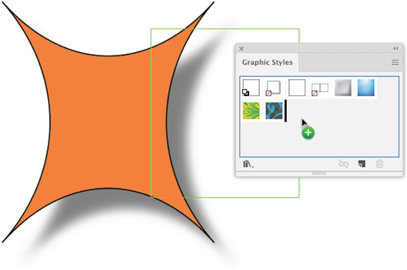
FIGURE 14-14: Creating a graphic style.
In Figure 14-15, I’m applying that graphic style to a set of selected rectangles by clicking the graphic style in the Graphic Styles panel.
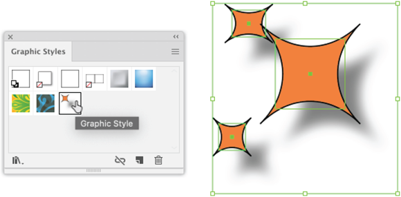
FIGURE 14-15: Applying a graphic style.
Generating 3D Effects and Mapping Artwork
The most powerful effects are 3D effects. You can use them to extrude shapes, as I describe earlier in the chapter. And there are much more 3D powerful effects for rotating paths and mapping symbols. Before closing this chapter, I walk through an example of how rotated paths and mapped symbols can open the door to complex designs that would take a prohibitive amount of time to create without effects.
Mapping artwork
In the following set of steps, you generate a globe from a path, and then map a literal map of the earth on that globe.
Don’t get confused: I’m using the word map in two senses here. You find out how to place an actual map of the world on a sphere, and then rotate that sphere at will to present different sections of the planet. And I show you how to do that using a process Illustrator calls mapping. Applying a map to a 3D effect in Illustrator means taking an image or graphic saved as a symbol, and pasting it onto a 3D effect. If you can visualize drawing on a balloon, and then blowing up that balloon to different sizes and rotating it, you understand the concept.
The process is complicated but doesn’t require special talent or skill. And after I show you how to do it, I think you’ll appreciate how powerful mapping a map, or any other artwork, can be.
Using Adobe Stock images
The project I am about to walk you through uses Adobe Stock images, so this is a good opportunity for me explain how they work. Adobe Stock is a service that provides designers and businesses with access to a huge collection of royalty-free artwork, including vector graphics. Your company may have a subscription. Subscription plans priced for individual designers, small shops, and teams are also available.
In lllustrator (and other CC apps) you can drag a watermarked (preview) version of any stock image from the Libraries panel to your project. So if you don’t have a subscription to Adobe Stock Images, keep your credit card in your pocket for now.
Because you will be using Adobe Stock images in the following steps to learn effects and mapping, just use a preview of the image without buying it. That preview image will have a watermark that indicates it is a sample, but that’s okay. (When I am prototyping for a client, I use the preview image and wait until the client signs off on the design before purchasing the stock images.)
Exploring 3D effects and mapping
The following journey is more long and winding than most of the techniques you learn in this book, but I think you’ll find it worthwhile as a substantial experience with some of Illustrator’s most powerful features (effects, plus a few other techniques I throw in). And it’s going to be fun!
With all those provisos, here’s how to map a map of the globe onto a rotated sphere.
-
Create and save a new file.
You can create this project in any size artboard and any set of document settings. Save the file as an AI file, using any filename you want (globe.ai will work just fine).
- Prepare a map of the world as mappable artwork by converting it to a symbol as follows:
- View the Libraries panel (choose Window ⇒ Libraries).
- In the Search box, enter map of planet.
- Use the drop-down at the top of the panel to search Adobe Stock, as shown in Figure 14-16, and note the options.

FIGURE 14-16: Searching Adobe Stock images.
- Choose the world map vector abstract illustration pattern AI file and download it as a preview, as shown in Figure 14-17.

FIGURE 14-17: Downloading a preview version of a world map.
- Drag the preview image from the Libraries panel to your workspace.
- With the world map image selected, choose Embed Images from the Links panel, as shown in Figure 14-18.
- Drag the embedded map of the world image from the workspace to the Symbols panel. If the panel is not visible, choose Windows ⇒ Symbols.
-
No need to worry about any of the symbol options, just name it map. The map will appear in the Symbols panel, as shown in Figure 14-19.
Only artwork placed in the Symbols panel can be mapped onto 3D effects. To learn more about how to define and use symbols, see Chapter 10.

FIGURE 14-18: Converting a linked image to an embedded image.
-
Create a semi-circle with a white fill and no stroke as follows:
- The easiest way is to click the Ellipse tool, hold down the Shift key, and click and drag to draw an ellipse that is constrained to a circle (constrained because you're holding down the Shift key).
- Use the Toolbar or the Control panel, or the Properties panel (so many choices!) to remove any stroke from the ellipse and apply a white fill.

FIGURE 14-19: Viewing artwork in the Symbols panel.
- Use the Direct Selection tool to select the left anchor in the ellipse, as shown in Figure 14-20, and delete that anchor by clicking the Delete key on your keyboard.
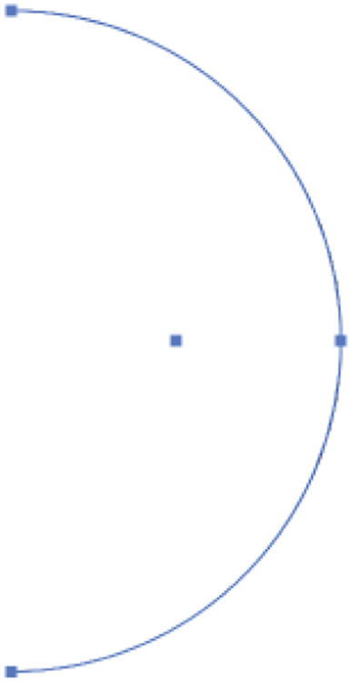
FIGURE 14-20: Creating a semicircle.
I walk through how to edit shapes, including converting a circle into a semicircle, in Chapter 4.
- Rotate the semicircle by using the Revolve effect:
- Select the semicircle and choose Effect ⇒ 3D Revolve.
- Set all three Rotation angles to zero.
- Choose the Plastic Shading surface and enable Preview. The settings and generated globe should look like Figure 14-21.

FIGURE 14-21: Generating a globe.
- Map the artwork of the world map:
- Click the Map Art button to enable mapping.
- In the Map Art dialog, choose from the Symbol drop-down the map symbol you created.
- Click the Scale to Fit button to size the symbol to match the globe. The settings and mapped map should look like Figure 14-22.
- Click OK to apply the symbol, and click OK again to apply the effect.
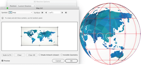
FIGURE 14-22: Mapping a symbol.
- Use the Appearance panel to edit the rotation of the 3D effect to display different sections of our planet:
- With the generated globe and map selected, click the 3D Revolve (Mapped) effect, as shown in Figure 14-23.
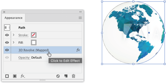
FIGURE 14-23: Accessing a 3D effect in the Appearance panel.
- Select the Preview check box in the 3D Revolve Options dialog to see the effect of edits you are about to make to the revolve effect.
- Experiment with different positions from the Position drop-down, as shown in Figure 14-24.
- When you find a rotation angle you want to apply, click OK.
- With the generated globe and map selected, click the 3D Revolve (Mapped) effect, as shown in Figure 14-23.
The resulting globe can be easily copied and pasted, and different pasted copies can have their rotation angles edited to produce a set of globes like the one in Figure 14-25.

FIGURE 14-24: Changing the position of a 3D Revolve.

FIGURE 14-25: Using a set of globes created with the 3D Revolve effect.
As promised (warned), you just completed a substantial set of steps to experiment with the 3D Revolve effect combined with mapping. Take a deep breath and reflect on the work that would have been required to create an illustration like this without 3D effects!
To end the chapter, I return to the two defining things about effects:
- Effects apply to vectors but don’t change the fundamental paths of the vector. In the case of the globe experiment, that meant you were able to start with a simple semicircle, apply an effect, map a symbol, and then edit that graphic to your heart’s content (in my case, copying and pasting it, and then tweaking the effect for each pasted copy).
- Effects save eons of time. Okay, that was hyperbole, but when you have a finite timetable to create a project, the ability to save time by applying effects can save your eyes, your back, and your sanity. And that may not be hyperbole.