
Working with Input Methods, Menus and Dialogs
There is far more to designing great Android application activities than placing widgets on a screen. Those widgets are good for many different kinds of interaction with your user, but there are times when you need more. Whether it’s dealing with more sophisticated approaches to input, offering options via menus, or providing important alerts and prompts for action via dialogs, Android has you covered.
In this chapter we will cover a number of key components that expand your user interface possibilities to all manner of things that “pop up” in the interface: keyboards, menus, and dialogs. I will cover Android’s Input Method framework, which controls the use and behavior of virtual keyboards. I will also introduce you to the different approaches to menu design in Android, and explore the traditional menu approach. I will also investigate using dialogs and some of the related design ideas that apply to all of these areas.
Using The Input Method Framework
Shortly after releasing Android, Google reoganized the ways in which users can enter data on-screen into the Input Method Framework (IMF). This framework groups the ways in which users can actually input text data on-screen into three categories: The very familiar soft keyboard; hardware keyboards (either integral to the device, or as separate accessories), and handwriting recognition.
While the very first Android device (the G1, or Dream) came with a physical keyboard, the majority of the tens of thousands of Android devices since released do not. There are still models released with physical keyboards today though, and Android’s IMF means support for either type - physical or virtual - is seamlessly handled.
Android’s internals include the necessary capabilities to detect the presence of a physical keyboard. If none is detected, Android makes available an input method editor (IME) for any EditText view which a user might select. By default, the stock IME will pick up a range of sensible settings from the user’s locale and language settings, providing a useful and usable soft keyboard straight away, as well as other locale-specific prefernences such as whether the period or comma is used as the decimal “point”, and so on. Many developers are happy with such defaults, and you can test for yourself what these look like with any of your applications. A significant majority of Android applications need no customizing code for their IMEs.
Where you do decide customizing IMEs is necessary for your application, the work is very straight-forward. If you examine the example EditTextExample application shown in Figure 8-1, you can probably think of a number of useful tweaks to the default soft keyboard, as well as some changes to the behavior of the text the user inputs. (The code for this example is available in ch06/EditTextExample. If you test this code, be sure to use a virtual device that does not have a hardware keyboard enabled).

Figure 8-1. The input method editor showing as a soft keyboard in the EditTextExample application
Customizing IMEs
From the introduction of Android 1.5, customizing your IME has been addressed through the bundle of attributes you can assign to a given View (e.g. an EditText) via the android:inputType attribute. This allows you to control all manner of style customizations for your field, by providing class options in a pipe-delimited “stacked” list. The combination of options chosen instructs Android what kinds of input to allow for the field. Android in turn uses that information to disable or remove from the soft keyboard any keys that can’t be used with the resulting field. For instance, a phone number field would have no need for currency symbols, so these wouldn’t be available from the resulting soft keyboard the input method framework generates.
The available classes of inputType are:
- text (set by default)
- number
- phone
- date
- time
- datetime
Within each of these inputType classes, there are potentially additional modifiers available to allow even more customization. Listing 8-1 demonstrates some of the inputType classes in action, and you can find the code in the activity_imeexample1.xml layout file from the ch08/IMEExample1 project.
The layout from Listing 8-1 uses a TableLayout to host five variants EditText, each with different uses of inputType to demonstrate the customizations from the IMF.
- The first row impicitly is an absolutely plain text field, as the inputType attributes on the EditText is not set, meaning you get the default behavior.
- By using the android:inputType = "date" for the second field, we instruct the IMF to generate and IME that specifically allows only (valid) dates.
- The third row allows for email addresses to be input, via android:inputType = "text|textEmailAddress".
- The fourth row is configured to allow for decimal numeric input, using android:inputType = "number|numberDecimal".
- Finally, the last EditText caters to multiline input, and uses autocorrection for any spelling mistakes.
You can see all of these classes and collections of modifiers customizing the keyboard when you run the example code. For example, a plain text-entry field results in a plain soft keyboard, as shown in Figure 8-2.
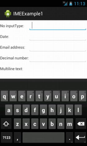
Figure 8-2. A default soft-keyboard IME
Remember that the default soft keyboard IME can differ between devices, particularly when user locale and language settings are considered by the IMF. Exploring our inputType results further, we can see the email customization with the @ symbol present, in Figure 8-3.
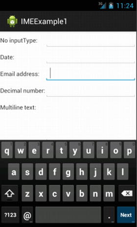
Figure 8-3. The soft-keyboard IME for email inputType in stock Android
Even here, you cannot always assume that different IMEs will necessarily present the @ symbol on the keyboard with an inputType of email. The stock Android Lollipop and earlier builds will do this, but you can both develop your own custom IMEs, and buy or license them from other developers. In both cases, the @ symbol could be behind the ?123 option button, or indeed hidden further.
A more dramatic difference in the soft keyboard IME can be seen when we select a decimal field. You can see the resulting soft keyboard in Figure 8-4.
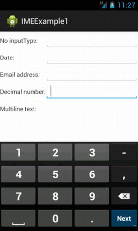
Figure 8-4. The soft keyboard IME for a decimal number
The numeric keyboard shown is deliberately restricted to only providing digits and associated decimal points and commas for entering valid numbers. These ancillary soft keys will change depending on locale settings. For instance, in Europe where the comma is the decimal separator, that comma will appear on the bottom row to the right of the zero.
This kind of point-of-entry validation and filtering is one of the key additional benefits of the IMF and the various soft keyboards at your disposal. With a well-chosen android:inputType you can provide users of your application an intuitive soft keyboard for the data entry your application needs.
Accessorizing with Soft Keyboards
Look more closely at the preceeding Figure 8-1 through Figure 8-4. You should notice some other subtle differences. In Figure 8-1, the key in the lower right corner of the soft keyboard is a blue Done button. In Figure 8-2 it is a return arrow. In Figures 8-3 and 8-4, the lower right key is a blue Next button. This lower-right button is known as the accessory button, and its label and behavior changes depending on other inputType values.
There are two broad implicit behaviours. If you have an EditText widget with no modifiers for android:inputType, then the accessory button will take the blue-colored Next label, and when pressed will move the focus to the next EditText in the activity. The exception here is for the last EditText on a given screen. In this case, the accessory button will have the Done label.
You can control the labeling and behavior of the accessory button using the android:imeOptions attribute. For example, in the imeexample2.xml layout file from the ch08/IMEExmple2 project, I have modified the previous example to enhance the accessory buttons, as shown in Llisting 8-2:
In Listing 8-2 I have plugged in the Send action for the accessory button, so that when pressed we trigger the actionSend action using the e-mail address. Similarly with the the middle field, we have a Go label and action, with android:imeOptions="actionGo". Pressing Next moves the focus to the following EditText, and Go attempts to take the user to the “target” of the text that has been typed. For example, Android might attempt to infer that a number is a phone number or other numeric identifier.
You can also attempt more complex or sophisticated actions with the accessory button by using the setOnEditorActionListener() on the EditText. Part of the payload you receive will be the relevant flag indicating the action specified, such as IME_ACTION_SEND.
Scrolling in to View
The sharp-sighted amongst readers will have noticed another aspect of the code in Listing 8-3 for the IMEExample2 application. The example introduces the ScrollView container to wrap the layout.
While there has been a proliferation in different Android devices, the vast majority of them are still phones, and those phones have small displays. You should also be aware of “developer bias”, where as a developer you are more likely to skew towards a power user, and own and use devices with larger screens and more features. There are many approaches you as a developer can use to maximize information display, and deal with small screens. Scrolling is a well-known metaphor on the desktop, and works in a broadly similar way on Android. In principle, you can take any layout that you might otherwise describe for your Android activities, and wrap it in a ScrollView. In doing so, the user will be presented with the part of your contained layout that fits the screen, and automatic scrolling logic and scrollbars will be added to enable the user to move to the parts of your layout that don’t fit on screen.
Note there are two Views that govern explicitly enabled scrolling in this fashion: ScrollView for vertical scrolling, and HorizontalScrollView for horizontal scrolling. You cannot stack these to get both forms of scrolling, so you will need to decide which suits your layout.
In addition to the implicit layout changes that scrolling introduces, use of the IME triggers other changes in your layout. When the user interacts with a widget that demands Android present the IME, screen real estate is needed to show the actual resulting soft keyboard. Where does this screen space come from, and how do you control the behavior? I’m glad you asked.
There are multiple possibilities that depend on device type and your application development choices. Amongst the options Android can take to rearrange the on-screen layout to fit your soft keyboard are:
- Activity panning can be used to slide your entire as-is layout off the “edge” of your screen, in effect moving the screen up or to the side such that only part of it is rendered and visible, but the user has the illusion that the rest still exists. The IME is then shown in the resulting, freed up space.
- Your activity can be resized, scaling the rendered layout to a smaller-than-specified scale so that the IME can fit below the activity layout, and both be visible at the same time. This approachworks well for some of the list-based layouts we explored in Chapter 7, but less well for layouts that are graphics-intensive.
- Android can choose to completely obscure your activity, and allow the IME to occupy the entire screen.
- If your activity exists within a Fragment (covered in Chapter 11), Android can reflow and rearrange all of the activities within the Fragment, and use one or more of the above techniques in combination to have the IME and original activity layouts present side-by-side as far as is feasible. This works best on larger screens and with applications written to use the fragments model.
If you choose to do nothing and let Android take the default approach, then it will bias toward the first two options of panning and resizing. When you want to take control of the IME presentation behavior, use the android:windowSoftInputMode attribute on the activity element in your manifest file for your project. Listing 8-3 shows the AndroidManifest.xml file for IMEExample2:
Looking at the manifest, you can see the android:windowSoftInputMode="adjustResize" entry which instructs Android to ignore its implicit preferences and attempt to shrink the activity’s layout to accommodate the IME when it needs to be presented. You can see this in action in Figure 8-5.
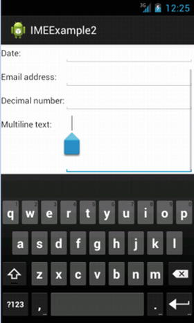
Figure 8-5. Scaling the IME with explicit control
Because we have defined our layout within a ScrollView, when the scaling occurs we also gain the benefit of the ScrollView’s scroll bars being triggered for use. This is even though the Material Design excesses of Android Lollipop make those scroll bars hard to see.
You can control Android’s behavior to maximize screen real-estate using the additional methods introduced in Honeycomb, and refined in Icecream Sandwich and Jelly Bean. Use the Java methods setSystemUiVisibility() with the STATUS_BAR_HIDDEN option to hide the System Bar and allow even larger full screen modes, or setDimAmount() to tweak the brightness of the home buttons to remove distractions from your regularly resized full-screen layout.
Forcing the IME out of Existence
There are times when the automatic triggering of the IME would be counter-productive or interfere with the user’s experience of your application. Android uses a background system service, InputMethodManager, to govern appearance, disappearance, and other behaviors of IMEs. Listing 8-4 shows a code snippet that invokes the hideSoftInputFromWindow() method, which is available to you to forcably override the appearance of an IME.
Here I’ve used the verbose but hopefully instructive name myEditTextforIMEHiding as the EditText field for which I wish to hide the IME. This will always ensure that the IME is hidden in the first instance.
But be warned, your user can always force the IME to reappear. If they explicitly tap the EditText field on a device with no physical keyboard, the IME will appear. It will also appear for both EditText-style fields and those widgets that don’t normally trigger a soft keyboard if the user hits the menu (soft) button. In the case of tapping the EditText, you can alter the call to the hideSoftInputFromWindow() method as follows:
myIMM.hideSoftInputFromWindow(myEditTextforIMEHiding.getWindowToken(),
InputMethodManager.HIDE_IMPLICIT_ONLY);
In changing the second parameter to the method call, you instruct the InputMethodManager to surpress the IME even on an explicit tap. Take care when using this approach and test it thoroughly, lest you accidentally trigger IME supression and prevent the user from entering text when you most want them to.
Working with Menus
Menus are a way in which your users will interact with your application outside of the widgets you present in your UI layout. Just like the IME, menus appear near or over your layout, and understanding their behavior will help you create useful additional interaction modes for your application.
You and your users will almost certainly be familiar with the menu metaphor from using desktop or notebook computers, and even TV sets. As well as application level menus, Android provides the ability to create context menus for various UI elements, meaning you can create a context menu for an EditText or similar field. In a traditional operating system, users would normally have a mouse with which they could right-click or command-click to make a context menu appear. In the Android world, gestures such as the “long press” can be used to invoke a context menu.
Note Historically Android devices came with a fixed “menu” button or soft button equivalent. With Google’s release of Honeycomb, and especially since the advent of JellyBean, KitKat and Lollipop, interface standards have shifted to heavily discourage the existence of any permanent menu button. Interface standards instead promote use of the Action Bar, which we will cover in Chapter 10. You may still find users deploying applications on devices with dedicated menu buttons, so knowing the overall picture of menus remains useful.
Android offers two broad types of menus for use in your applications. The first is the Activity or Options menu, and then there is the Context menu mentioned. Activity menus, since the advent of Android Honeycomb, have migrated to the Action Bar, but they are still available as Options menus on older devices. We’ll return to talk more about menus in the Action Bar context in Chapter 10.
Creating Menus for your Application
Traditional menus are created using the dedicated callback method onOptionsMenuCreate(). This method is triggered at the time a menu would come in to existence, and it is passed an instance of a Menu object. If you want to keep updating or modifying what your menu can do in response to further user actions, for instance making an option unavailable once a one-time activity has occured, you should preserve the Menu object so you can reference it after the callback has gone out of scope.
Android will have its own notions of the various system features and other options that should be injected in to your menus, and you can take advantage of what Android can do by making the first line of you onOptionsMenuCreate() implementation a call to the super.onCreateOptionsMenu(menu) method. Doing so allows Android to implicitly add additional items for you, such as the “back arrow” button.
Following that step, you can add your own particular featuers to the Menu object using its add() method. This is a highly overloaded method, meaning its many variants won’t be apparent to you immediately, but here are some of the common parameters taken by the most commonly used forms of add() for a Menu object:
- A choice identifier, which is a unique int value for each menu item, and is passed to the onOptionsItemSelected() callback when the relevant menu item is selected.
- An order identifier, which is an int value specifying the placement of your item in the menu hierarchy, based on the lowest order identifier being at the top. This is especially useful when interspersing your own custom menu items with those Android provides for the call to the super class. You can also use the value NONE to allow Android to manage ordering implicitly.
- The menu text, which can be a resource ID reference or String value. You should get used to using resource ID references to allow for future language changes, internationalization and localization.
Your call to the add() method for a Menu object will return a MenuItem object, which itself has several interesting methods. Some of the most commonly used are the setAlphabeticShortcut() and setNumericShortcut() methods, which enable you to provide a one-character/digit shortcut for chosing your menu item when the UI has invoked keyboard (IME) menu input using the setQwertyMode() method for the menu.
The options you choose from to populate your menu are not limited to simple text. You also have the option of invoking the menu’s setCheckable() method, passing in a choice identifier, to nominate that menu item as having a checkbox associated with it. This gives your user immediate information and feedback on the setting that a given menu item controls, such as whether WiFi is on or off. This concept can be extended further by the introduction of group identifiers and the setGroupCheckable() method. A group identifier is also an int property that can be assigned when using the menu’s add() method, and you can provide the same group identifier to more than one menu item. You can then use setGroupCheckable() to create a radio button that covers all items with that group identifier, such that only one of those menu items can be turned “on” at a time. Using the WiFi example again, you could implement available networks as menu items with the same group identifier, and cover the selection of the user’s preferred network with setGroupCheckable().
Tip You can create submenus within menus by using the addSubMenu() method. Your submenus require choice identifiers, but in other respects you are free to add other entries such as checkboxes, and to control a submenu’s behavior much as any other menu. Android prevents you going crazy with nested submenus, limiting you to one extra level below the main menu.
Whatever form your menu takes, when a user actually chooses an item from your menu, you are notified through the onOptionsItemSelected() callback. The callback will pass the MenuItem object corresponding with the user’s choice. You can then invoke your desired behavior, and can use common patterns such as a switch statement to handle all the options available to the user and your consequential reactions to their choice.
Context menus are conceptually similar to ordinary menus. The main areas that differ are in flagging which of your UI elements will support a context menu, how menu items are constructed, and how your application gets notified of the user’s choice. Let’s deal with these in order.
To nominate that a particular UI element will support a context menu, make a call to registerForContextMenu() from your activity’s onCreate() implementation passing as a parameter the View that will host a context menu. Obviously, if you have multiple on-screen elements that you want to have context menus, you will need to make multiple calls.
Regardless of how many widgets in your activity have context menus, they will all call onCreateContextMenu(), at the point the user invokes the context menu on a given widget. This is unlike regular activity/options menus that are instantiated once at activity creation time. You need to implement the onCreateContextMenu() and based on the View object passed (that is, the widget the user has selected), you will need to then build the necessary context menu. The typical pattern for doing this involves using a switch block in your Java code to handle which item needs its context menu, and then to proceed with the necessary creation.
When a user chooses a context menu item, the onContextItemSelected() callback is fired. It’s incumbent on you to implement this method in your activity, and as with the regular menu case, you will be passed the MenuItem instance that the user chose. You can use the switch statement again to trigger the desired program logic at this point.
Caution Because you are only given the MenuItem that the user chose, and not immediately given the relevant widget, it is best to ensure every menu item has a unique choice identifier across the entire scope of your activity. You can make calls to getMenuInfo() for the MenuItem passed in the onContextItemSelected() callback, which will return a ContextMenu.ContextMenuInfo structure from which you can determine which widget had its context menu invoked, but it is far easier to spare yourself the need for this logic by using activity-wide unique identifiers.
Menus In Action
With all of that theory now digested, let’s examine what a working application with menus looks like. In the following example, I have used the ListViewExample application from Chapter 7, and I have adapted the Java implementation to illustrate a range of the menu capabilities introduced so far in this chapter.
package com.artifexdigital.android.menuexample;

import android.app.ListActivity;
import android.os.Bundle;
import android.view.ContextMenu;
import android.view.Menu;
import android.view.MenuItem;
import android.view.View;
import android.widget.AdapterView;
import android.widget.ArrayAdapter;
import java.util.ArrayList;

public class MenuExampleActivity extends ListActivity {
    private static final String[] items={"To", "be",
            "or", "not", "to", "be",
            "that", "is", "the", "question"};
    public static final int MENU_RESET = Menu.FIRST+1;
    public static final int MENU_UPPER = Menu.FIRST+2;
    public static final int MENU_REMOVE = Menu.FIRST+3 ;
    private ArrayList<String> words=null;

    @Override
    protected void onCreate(Bundle savedInstanceState) {
        super.onCreate(savedInstanceState);
        setContentView(R.layout.activity_menu_example);
        setupAdapter();
        registerForContextMenu(getListView());
    }

    @Override
    public boolean onCreateOptionsMenu(Menu menu) {
        menu.add(Menu.NONE, MENU_RESET, Menu.NONE, "Reset");
        return(super.onCreateOptionsMenu(menu));
    }

    @Override
    public void onCreateContextMenu(ContextMenu menu,
                                    View v,
                                    ContextMenu.ContextMenuInfo menuInfo) {
        menu.add(Menu.NONE, MENU_UPPER, Menu.NONE, "Upper Case");
        menu.add(Menu.NONE, MENU_REMOVE, Menu.NONE, "Remove Word");
    }

    @Override
    public boolean onOptionsItemSelected(MenuItem item) {
        switch (item.getItemId()) {
            case MENU_RESET:
                setupAdapter();
                return(true);
        }

        return(super.onOptionsItemSelected(item));
    }

    public boolean onContextItemSelected(MenuItem item) {
        AdapterView.AdapterContextMenuInfo menuInfo=
                (AdapterView.AdapterContextMenuInfo)item.getMenuInfo();
        ArrayAdapter<String> adapter=(ArrayAdapter<String>)getListAdapter();

        switch (item.getItemId()) {
            case MENU_UPPER:
                String word=words.get(menuInfo.position);
                word=word.toUpperCase();
                adapter.remove(words.get(menuInfo.position));
                adapter.insert(word, menuInfo.position);
                return(true);

            case MENU_REMOVE:
                adapter.remove(words.get(menuInfo.position));
                return(true);
        }

        return(super.onContextItemSelected(item));
    }

    private void setupAdapter() {
        words=new ArrayList<>();

        for (String someItem : items) {
            words.add(someItem);
        }

        setListAdapter(new ArrayAdapter<>(this,
                android.R.layout.simple_list_item_1, words));
    }

}
This example is deceptively long, so let’s get to the heart of the menu logic. First, we are using a simple ListView and an ArrayAdapter to present the familiar list of words from Shakespeare’s Hamlet soliloquy. So you can refer back to Chapter 6 for the various details on the behavior of the ListView and adapter logic. That leaves the actual code setting up the options menu and the context menu, and then dealing with their invocation.
The methods onCreateContextMenu() and onCreateOptionsMenu() are very straight-forward, simply adding the items we wish to appear in each type of menu. The options menu receives the MENU_RESET entry, with the label “Reset Word List”, while the context menu gets the “Upper Case” and “Remove Word” entries tied to the the MENU_UPPER and MENU_REMOVE references.
Just as the menu setup methods are paired for the options menu and context menu, so too are the selection handlers. The onContextItemSelected() method deals with the logic of capitalizing entries for the MENU_UPPER selection, and removing items from the ListView for the MENU_REMOVE selection. Similarly, onOptionsItemSelected() deals with the MENU_RESET logic to return the ListView to the originally populated version from the ArrayAdapter.
You can run the MenuExample application yourself and experiment with the menus. Figure 8-6 shows the running application with the context menu showing after a long-click on one of the items in the ListView.
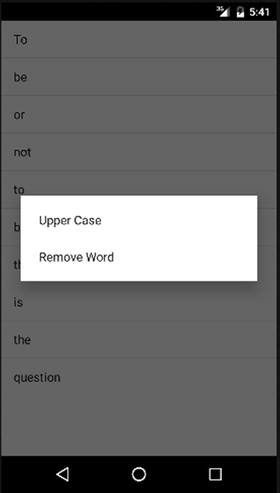
Figure 8-6. Displaying the Context Menu
As you click and choose multiple “Upper Case” and “Remove Word” items from the context menu, the ListView population will eventually change to appear more like that shown in Figure 8-7.
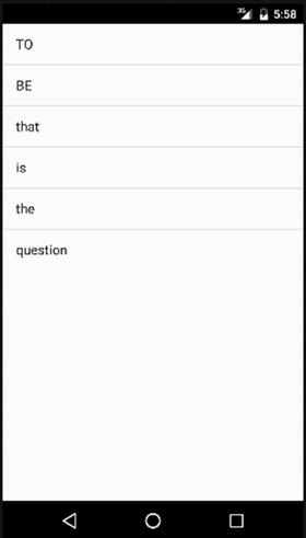
Figure 8-7. The MenuExample UI after multiple uses of the menus
Inflating Menus from XML
In earlier chapters I demonstrated how any UI widget can be defined purely using XML in your res folder. From there I showed how you can rely on Android to “inflate” your XML definition into a real UI widget. The same principle applies to menus: You can fully describe menus in XML, and then rely on Android to inflate them into existence.
Menu XML files are held in your project’s res/menu folder. As with other XML resources such as layouts, you can create as many menu variants as you like, and have your chosen variant inflated whenever you need, such as in response to a user initiating a context menu. Listing 8-5 shows the ch08/MenuXMLExample application’s menu definition.
A menu definition has as its root a <menu> element. Within the <menu> element, you can then specify any number of <item> elements to appear as menu items in your menu. You can also use the <group> element to manage a set of menu items as a group, just as you can in Java by providing a group identifier int for each item.
All of the behavior we explored with Java coded menus is available with XML definition for run-time inflation, including the submenu structures and options. To create a submenu, add a <menu> element as a child of the root <menu>. You can then add items, groups, and so forth to the submenu just as you would to its parent.
To be able to refer to your menu in code, and to find out when and what menus items are selected by your application’s user, be sure to include an android:id attribute with a unique ID for each menu item.
Further Options for XML-Based Menus
The XML-based approach to menu definition provides all of the power of Java-coded menus, which means support for all the optional methods we introduced for menus earlier in the chapter. Table 8-1 shows the optional attributes you can apply to menu item elements in your XML definition, and the corresponding behavior.
Table 8-1. XML Menu Options
|
XML Menu Attribute |
Behavior |
|---|---|
|
android:title |
The visible label for your menu item, when shown in the activity’s UI. This can be a hard-coded String or a resource reference (e.g. @string/MenuText1) |
|
android:icon |
The icon to display adjacent to the android:title text. This is a reference to a drawable resource. |
|
android:orderInCategory |
Used to override the order of menu items in the XML definition. This is a zero-based reference to allow Android to re-order your menu at runtime. You might want to do this for instance so in your XML menu layout file you group items by function, but in you menu UI they are presented alphabetically. |
|
android:enabled |
True and False values for the the android:enabled attribute provide the same control that the Java methods setEnabled( ) and setGroupEnabled( ) offer. The XML definition will control the initial rendering of the menu item. To enable and disable a menu item subsequently, you will need to invoke the relevant logic and Java method in response to your user’s actions. |
|
android:visible |
You can optional decided to hide menu items when first rendered (not just disable them through a android:enabled=“false” attribute). This is often used in combination with a parent menu item that has a checkbox, which went activated invokes the Java logic via setVisible( ) or setGroupVisible( ) methods to make a previously invisible group or submenu item visible. |
|
android:alphabeticShortcut |
Nominate a letter shortcut from a soft or hard keyboard to activate this menu item. |
|
android:numericShortcut |
Nominate a digit shortcut from a soft or hard keyboard to select a desired menu item. |
Inflating an XML-Defined Menu
With a XML definition for your menu, the next step is to wire up the necessary application behavior to inflate your menu into existence as and when required. The key Java class involved in inflating you definition into a useable menu is MenuInflater. Listing 8-6 shows the complementary code listing for the XML menu from the ch08/MenuXMLExample project we introduced in Listing 8-5.
Here, we see how MenuInflater “pours” the menu items specified in the menu resource (e.g., R.menu.option) into the supplied Menu or ContextMenu object.
We also need to change onOptionsItemSelected() and onContextItemSelected() to use the android:id values specified in the XML:
@Override
public boolean onOptionsItemSelected(MenuItem item) {
  switch (item.getItemId()) {
    case R.id.add:
      add();
      return(true);

    case R.id.reset:
      initAdapter();
      return(true);
  }

  return(super.onOptionsItemSelected(item));
}

@Override
public boolean onContextItemSelected(MenuItem item) {
  AdapterView.AdapterContextMenuInfo info=
    (AdapterView.AdapterContextMenuInfo)item.getMenuInfo();
  ArrayAdapter<String> adapter=(ArrayAdapter<String>)getListAdapter();

  switch (item.getItemId()) {
    case R.id.cap:
      String word=words.get(info.position);

      word=word.toUpperCase();

      adapter.remove(words.get(info.position));
      adapter.insert(word, info.position);

      return(true);

    case R.id.remove:
      adapter.remove(words.get(info.position));

      return(true);
  }

  return(super.onContextItemSelected(item));
}
You should notice the resulting menu UI in your application is broadly similar to the Java-based menu creation examples.
Interacting with Dialogs
There are times when you need to interrupt your user’s normal use of your application, to notify them of an important event, change, or error. Anyone familiar with traditional desktop or web development will recognize dialog boxes and overlays in web pages that provide status or error information. Android provides two different kinds of pop-up dialog for use when notifying or interacting with the user: A Toast object for transient notification, and Alert objects for full dialog-style interaction.
In addition to these UI-centric approaches, Android also has a fully-fledged notifications system that facilitates communication for intents and services which we will cover later in the book. For now, let’s examine what the user will see with toasts and alerts.
Creating Toast Notifications
Toast messages appear as an overlay to the current activity without interrupting its focus or the user’s input. This means things like keyboard entry, touch actions and so forth won’t be lost if a Toast notification is displayed.
Because of its non-interfering nature, as an application developer you need to keep in mind a few other characteristics of a Toast. First, you can’t control for how long the Toast will be present. Android will manage the Toast’s lifetime on your behalf, and typically presents a Toast message for several seconds before it fades from existence. As the user need not press a button or otherwise dismiss a Toast, you will also not receive any notification or callback that the user has seen the Toast, or responded to it. This means you typically want to use a Toast to present non-critical, advisory information.
To create and configure a Toast object, simply call the class’ static makeText() method with the following three parameters:
- The text you wish to display, as either a String or resource ID reference
- The Activity or Context with which the Toast is to be associated
- A duration value, using either of the constants LENGTH_SHORT or LENGTH_LONG
You can also create more elaborate or sophisticated Toast notifications that go beyond simple text. For instance, you can create a Toast the presents an ImageView by creating a new Toast instance, invoking the constructor, and then calling the methods setView() and setDuration() to provide the View object for the Toast to use and its desired lifetime. With these values configured, calling show() will the present the final form of the Toast to your user.
Generating Traditional Dialog Alerts
The one drawback of Toast alerts is the lack of interactivity with the user. You may need to explicitly gather a response in your application. And sometimes you just want the traditional look, feel and behavior of a dialog box. Android covers these requirements with the AlertDialog class.
An AlertDialog has fundamentally well-known behavior when compared with dialog boxes on other platforms. It creates a pop-up overlaying the current UI, acts in “modal” form where the user is forced to interact with the AlertDialog before returning to the Activity or Context, and can be constructed with a range of buttons and other Views to prompt the user for meaningful interaction.
There are two general approaches to constructing your AlertDialog. The first approach is to use the Builder class to stitch together calls to the various options (and their methods) which suit the kind of dialog you would like to display. The second approach is to instantiate an AlertDialog instance, using its create() method, and then make subsequent calls to the methods needed.
Whichever approach you take, you ultimately call the show() method for your AlertDialog to finally present the dialog to the user of your application, and await their response of clicking one of the available buttons. You can configure listeners for any button on your AlertDialog if you want to catch the user’s response and perform some subsequent action, or use the null listener where you don’t have actions to perform.
Note Android will automatically dismiss the AlertDialog once a button is pressed, regardless of listener configuration. There is no way to have the dialog persist on-screen while your listener callback is processed.
Here are some of the useful methods that are commonly used when constructing AlertDialogs:
- setTitle() Configure the caption that appears as the title of the AlertDialog
- setMessage() Configure the body text that appears in the AlertDialog
- setIcon() Configure an icon to appear in the leading corner of the AlertDialog, where leading corner is adapted by Android depending on left-to-right or right-to-left layout.
- setPositiveButton(), setNegativeButton() Choose the buttons that appear beneath the message text, along with the button text to display and the logic to invoke when selected.
- show() This method has a number of overloaded forms, but they all act to show a configured AlertDialog instance.
Pardon The Interruption
It is time to see both the Toast and AlertDialog options in action. Listing 8-7 introduces the basic layout for a Button that I will then use to trigger an AlertDialog, followed by a Toast pop up. You can find this code and the subsequent Java logic in the ch08/PopUpExamples project.
The logic of creating and displaying our AlertDialog and Toast notifications is in the actual Java code shown in Listing 8-8.
The logic here is straight-forward, and is driven by the simple button in our layout. When the button is pressed, we use the Builder() approach to construct the AlertDialog, giving the dialog a caption, text, and a Button of its own which in turn triggers the Toast. Our PopUpExample application showing the AlertDialog after the initial button press is shown in Figure 8-8.
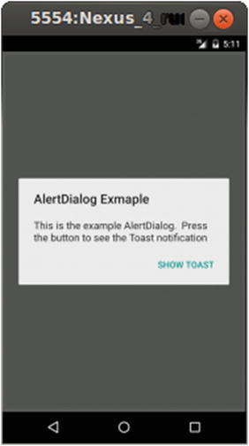
Figure 8-8. The AlertDialog presented to the user
Once the “positive” button on the AlertDialog is pressed, the dialog is dismissed and the listener bound to the button press activates the creation of our Toast message. You can see the Toast displayed in Figure 8-9.
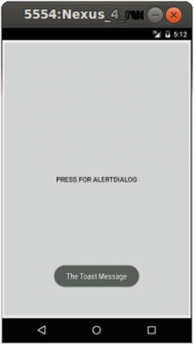
Figure 8-9. A Toast message popping up over the Activity
Summary
In this chapter you have seen all manner of UI elements that leap to the user’s attention: IMEs, menus, and dialogs. You will continue to use these items in examples throughout the rest of the book.