Scientific Visualization
20.1 Mapping Numbers to Pictures
Scientific visualization utilizes computer graphics, image processing, and other techniques to create graphical representations of the results from computations and simulations. The objective of creating these representations is to assist the researcher in developing a deeper understanding of the data under investigation.
Modern computation equipment enables mathematical models and simulations to become so complex that tremendous amounts of data are generated. Visualization attempts to convey this information to the scientist in an effective manner. Not only is visualization used to post-process generated data, but it also serves an integral role in allowing a scientist to interactively steer a computation.
In this chapter we will provide an introduction to visualization concepts and basic algorithms. Following this we will describe different methods for using the OpenGL pipeline to accelerate some of these techniques. The algorithms described here are useful to many other application areas in addition to scientific visualization.
20.2 Visual Cues and Perception
Visualization techniques draw from a palette of visual cues to represent the data in a meaningful way. Visual cues include position, shape, orientation, density, and color cues. Each visual cue has one or more perceptual elements used to represent some aspect of the data. For example, shape cues encompass length, depth, area, volume, and thickness; color includes hue, saturation, and brightness. Multiple visual cues are combined to produce more complex visual cues, paralleling the way nature combines objects of various colors, shapes, and sizes at different positions.
Many visual cues have a natural interpretation. For example, brightness of an object is interpreted as an ordering of information from low to high. Similarly, hue expresses a natural perception of the relationship between data. The red hue applied to objects makes them appear warmer, higher, and nearer, whereas the blue hue makes objects appear cooler, lower, and farther away. This latter perception is also used by some of the illustration techniques described in Section 19.2.
Scientific visualization isn’t limited to natural visual cues. Other visual representations such as contour lines, glyphs, and icons once learned serve as powerful acquired visual cues and can be combined with other cues to provide more expressive representations. However, care must be taken when using both natural and acquired cues to ensure that the characteristics of the data match the interpretation of the cue. If this is not the case, the researcher may draw erroneous conclusions from the visualization, defeating its purpose. Common examples of inappropriate use of cues include applying cues that are naturally perceived as ordered against unordered data, cues that imply the data is continuous with discontinuous data (using a line graph in place of a bar graph, for example), or cues that imply data is discontinuous with continuous data (inappropriate use of hue for continuous data).
20.3 Data Characterization
Visualization techniques can be organized according to a taxonomy of characteristics of data generated from various computation processes. Data can be classified according to the domain dimensionality. Examples include 1-dimensional data consisting of a set of rainfall measurements taken at different times or 3-dimensional data consisting of temperature measurements at the grid points on a 3D finite-element model. Dimensionality commonly ranges from 1 to 3 but data are not limited to these dimensions. Larger dimensionality does increase the challenges in effectively visualizing the data. However, data that includes sets of samples taken at different times also creates an additional dimension. The time dimension is frequently visualized using animation, since it naturally conveys the temporal aspect of the data. Data can be further classified by type:
• Nominal values describe unordered members from a class (Oak, Birch, and Maple trees, for example). Hue and position cues are commonly used to represent nominal data.
• Ordinal values are related to each other by a sense of order (such as small, medium, and large). Visual cues that naturally represent order (such as position, size, or brightness) are commonly used. Hue can also be used. However, a legend indicating the relative ordering of the color values should be included to avoid misinterpretation.
• Quantitative values carry a precise numerical value. Often quantitative data are converted to ordinal data during the visualization process, facilitating the recognition of trends in the data and allowing rapid determination of regions with significant ranges of values. Interactive techniques can be used to retain the quantitative aspects of the data, for example, using a mouse button can be used to trigger display of the value at the current cursor location.
Finally, data can also be classified by category:
• Points describe individual values such as positions or types (the position or type of each atom in a molecule for example). Point data are often visualized using scatter plots or point clouds that allow clusters of similar values to be easily located.
• Scalars, like points, describe individual values but are usually samples from a continuous function (such as temperature). The dependent scalar value can be expressed as a function of an independent variable, y = f(x). Multidimensional data corresponds to a multidimensional function, y = f(x0, x1, …, xn). Scalar data is usually called a scalar field, since it frequently corresponds to a function defined across a 2D or 3D physical space. Multiple data values, representing different properties, may be present at each location. Each property corresponds to a different function, yk = fk(x0, x1, …, xn). Scalar fields are visualized using a variety of techniques, depending on the dimensionality of the data. These techniques include line graphs, isolines (contour maps), image maps, height fields, isosurfaces, volumetric rendering, and many others.
• Vector data sets consist of a vector value at each sample rather than a single value. Vector data differs from multivariate scalar fields, such as separate temperature and pressure samples, in that the vector represent a single quantity. Vector values often represent directional data such as flow data. The dimensionality of the vector is independent of the dimensionality of the field. For example, a 2D data set may consist of 3D vectors. Complex data sets may consist of multiple data types (points, vectors, and scalars) at each sample. Vector data are often visualized using arrow icons to convey direction and magnitude. Particle tracing and stream lines are used to visualize flows through the fields.
• Tensor values generalize the scalar and vector field categories to a tensor field where each data value is a rank k tensor. A scalar field is a tensor field composed of rank 0 tensors, a vector field is a tensor field composed of rank 1 tensors, and a rank k tensor field stores a k-dimensional matrix of values at each sample point. Tensor fields require sophisticated visualization techniques to convey all of the information present at each sample. Tensor field visualization frequently combines multiple perceptual elements: color, size, position, orientation, and shape. Examples include tensor ellipsoids (Haber, 1990) and hyperstreamlines (Delmarcelle, 1993).
Taking the combination of domain dimension, data type, data category, and multiple values results in a large combination of data set classifications. Brodlie (1992) used the notion ![]() to describe a data set with domain dimension d, type X = {P, S, Vn, Tn}, and multiplicity m. A two-dimensional scalar field is expressed in this notation as
to describe a data set with domain dimension d, type X = {P, S, Vn, Tn}, and multiplicity m. A two-dimensional scalar field is expressed in this notation as ![]() , and a 3-dimensional vector field with two-element vectors at each point is expressed as
, and a 3-dimensional vector field with two-element vectors at each point is expressed as ![]() and so forth.
and so forth.
Many visualization techniques are available. Some techniques, such as graphics and charts, have been in use long before the computer came into existence, whereas newer techniques involving complex per-pixel calculations have only become available in the last 10 to 15 years. Nevertheless, it is important to recognize that newer techniques are not necessarily better for all types of data. Older and simpler methods may be as or more insightful as new methods. The following sections describe visualization methods, the types of data for which they are useful, and methods for effectively using the OpenGL pipeline to implement them.
20.4 Point Data Visualization
Point data sets often arise in statistical models and a number of techniques have been created to visualize such data (Wong, 1997). Point data visualizations consider each value to be a point in a multidimensional space. The visualization technique projects the multidimensional space to a 2D image.
20.4.1 Scatter Plots
Scatter plots use positional cues to visualize the relationship between data samples. 1-dimensional point data sets ![]() can use a 2D plot with positions along one axis representing different point values. A marker symbol is drawn at the position corresponding to each point value. Ordinal and quantitative values naturally map into positions; nominal values are mapped to positions using a table-mapping function.
can use a 2D plot with positions along one axis representing different point values. A marker symbol is drawn at the position corresponding to each point value. Ordinal and quantitative values naturally map into positions; nominal values are mapped to positions using a table-mapping function.
Data sets with two values at each point ![]() can be represented using a 2D plot where each pair of values determines a position along the two axes. This technique can be extended to 3D plots, called point clouds, for
can be represented using a 2D plot where each pair of values determines a position along the two axes. This technique can be extended to 3D plots, called point clouds, for ![]() data sets. Alternatively, if two of the three data types are quantitative or ordinal and the third is nominal, a 2D plot can be used with the nominal value used to select different marker shapes or colors.
data sets. Alternatively, if two of the three data types are quantitative or ordinal and the third is nominal, a 2D plot can be used with the nominal value used to select different marker shapes or colors.
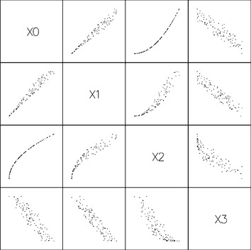
Higher-order multivariate data also be rendered as a series of 2D scatter plots, plotting two variables at a time to create a scatter plot matrix. The set of plots is arranged into a two dimensional matrix such that the scatter plot of variable i with variable j appears in the ith row and jth column of the matrix (see Figure 20.1).
All of these types of visualizations can be drawn very efficiently using the OpenGL pipeline. Simple markers can be drawn as OpenGL point primitives. Multiple marker shapes for nominal data can be implemented using a collection of bitmaps, or texture-mapped quads, with one bitmap or texture image for each marker shape. The viewport transform can be used to position individual plots in a scatter plot matrix. OpenGL provides a real benefit for visualizing more complex data sets. Point clouds can be interactively rotated to improve the visualization of the 3D structure; 2D and 3D plots can be animated to visualize 2-dimensional data where one of the dimensions is time.
20.4.2 Iconographic Display
Multivariate point data ![]() can be visualized using collections of discrete patterns to form glyphs. Each part of the glyph corresponds to one of the variables and serves as one visual cue. A simple example is a multipoint star. Each data point is mapped to a star that has a number of spikes equal to the number of variables, n, in the data set. Each variable is mapped to a spike on the star, starting with the topmost spike. The length from the star center to the tip of a spike corresponds to the value of the variable mapped to that star point. The result is that data points map to stars of varying shapes, and similarities in the shapes of stars match similarities in the underlying data.
can be visualized using collections of discrete patterns to form glyphs. Each part of the glyph corresponds to one of the variables and serves as one visual cue. A simple example is a multipoint star. Each data point is mapped to a star that has a number of spikes equal to the number of variables, n, in the data set. Each variable is mapped to a spike on the star, starting with the topmost spike. The length from the star center to the tip of a spike corresponds to the value of the variable mapped to that star point. The result is that data points map to stars of varying shapes, and similarities in the shapes of stars match similarities in the underlying data.
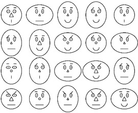
Another example, Chernoff faces (Chernoff, 1973) map variables to various features of a schematic human face: variables are mapped to the nose shape, eye shape, mouth shape, and so on (see Figure 20.2). These techniques are effective for small data sets with a moderate number of dimensions or variables. To render glyphs using OpenGL, each part is modeled as a set of distinct geometry: points, lines or polygons. The entire glyph is constructed by rendering each part at the required position relative to the origin of the glyph using modeling transforms. The set of glyphs for the entire data set is rendered in rows and columns using additional transforms to position the origin of the glyph in the appropriate position. Allowing the viewer to interactively rearrange the location of the glyphs enables the viewer to sort the data into clusters of similar values.
20.4.3 Andrews Plots
Another visualization technique (see Figure 20.3) for multivariate data, called an Andrews plot (Andrews, 1972), uses shape cues, plotting the equation
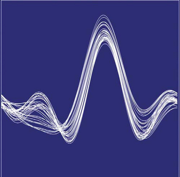
over the range t = [−π, π]. The number of terms in the equation is equal to the number of variables, n, in the data set and the number of equations is equal to the number of samples in the data set. Ideally, the more important variables are assigned to the lower-frequency terms. The result is that close points have similarly shaped plots, whereas distant plots have differently shaped plots.
20.4.4 Histograms and Charts
For 1-dimensional point data consisting of nominal values, histograms and pie charts can be used to visualize the count of occurrences of the nominal values. The data set values are aggregated into bins. There are various display methods that can be used. Sorting the bins by count and plotting the result produces a staircase chart (see Figure 20.4). If staircase charts are plotted using line drawing, multiple staircases can be plotted on the same chart using different colors or line styles to distinguish between them.
If the counts are normalized, pie charts effectively display the relative proportion of each bin. The methods described in Chapter 19 can be used to produce more aesthetically appealing charts.
20.5 Scalar Field Visualization
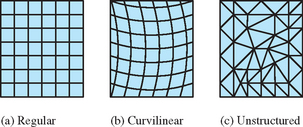
Scalar field visualization maps a continuous field, f(x1, x2, … xn), to a visual cue, frequently to color or position. The data set, ![]() , is a set of discrete samples of the underlying continuous field. The sample geometry and spacing may be regular, forming an n-dimensional lattice, or irregular (scattered) forming an arbitrary mesh (Figure 20.5). An important consideration is the true behavior of the field between data samples. Many visualization techniques assume the value changes linearly from point to point. For example, color and texture coordinate interpolation calculations interpolate linearly between their end points. If linear approximation between sample points introduces too much error, a visualization technique may be altered to use a better approximation, or more generally the field function can be reconstructed from the data samples using a more accurate reconstruction function and then resampled at higher resolution to reduce the approximation error.
, is a set of discrete samples of the underlying continuous field. The sample geometry and spacing may be regular, forming an n-dimensional lattice, or irregular (scattered) forming an arbitrary mesh (Figure 20.5). An important consideration is the true behavior of the field between data samples. Many visualization techniques assume the value changes linearly from point to point. For example, color and texture coordinate interpolation calculations interpolate linearly between their end points. If linear approximation between sample points introduces too much error, a visualization technique may be altered to use a better approximation, or more generally the field function can be reconstructed from the data samples using a more accurate reconstruction function and then resampled at higher resolution to reduce the approximation error.
20.5.1 Line Graphs
Continuous information from 1-dimensional scalar fields ![]() can be visualized effectively using line graphs. The m variables can be displayed on the same graph using a separate hue or line style to distinguish the lines corresponding to each variable. Line graphs are simply rendered using OpenGL line primitives. Different line stipple patterns can be used to create different line styles. The illustration techniques described in Chapter 19 can be used to produce more aesthetically appealing graphs. Two dimensional data, where one of the dimensions represents time, can be visualized by animating the line graph.
can be visualized effectively using line graphs. The m variables can be displayed on the same graph using a separate hue or line style to distinguish the lines corresponding to each variable. Line graphs are simply rendered using OpenGL line primitives. Different line stipple patterns can be used to create different line styles. The illustration techniques described in Chapter 19 can be used to produce more aesthetically appealing graphs. Two dimensional data, where one of the dimensions represents time, can be visualized by animating the line graph.
20.5.2 Contour Lines
Contour plots are used to visualize scalar fields by rendering lines of constant field value, called isolines. Usually multiple lines are displayed corresponding to a set of equidistant threshold values (such as elevation data on a topographic map). Section 14.10 describes techniques using 1D texturing to render contour lines.
Two dimensional data sets are drawn as a mesh of triangles with x and y vertices at the 2-dimensional coordinates of the sample points. Both regular and irregular grids of data are converted to a series of triangle strips, as shown in Figure 20.5. The field value is input as a 1D texture coordinate and is scaled and translated using the texture matrix to create the desired spacing between threshold values. A small 1D texture with two hue values, drawn with a repeat wrap mode, results in repeating lines of the same hue. To render lines in different hue, a larger 1D texture can be used with the texture divided such that a different hue is used at the start of each interval. The s coordinate representing the field value is scaled to match the spacing of hues in the textures.
The width of each contour line is related to the range of field values that are mapped to the [0, 1] range of the texture and the size of the texture. For example, field values ranging from [0, 8], used with a 32×1 texture, result in four texels per field value, or conversely a difference in one texel corresponds to change in field value of 1/4. Setting texels 0, 4, 8, 12, 16, 20, 24, and 28 to different hues and all others to a background hues, while scaling the field value by 1/8, results in contour lines drawn wherever the field value is in the range [0, 1/4], [1, 5/4], [2, 9/4], and so forth. The contour lines can be centered over each threshold value by adding a bias of 1/8 to the scaled texture coordinates.
Simple 2-dimensional data sets are drawn as a rectangular grid in the 2D x − y plane. Contour lines can also be drawn on the faces of 3D objects using the same technique. One example is using contour lines on the faces of a 3D finite element model to indicate lines of constant temperature or pressure, or the faces of an elevation model to indicate lines of constant altitude (see Figure 20.6).
20.5.3 Annotating Metrics
In variation of the contouring approach, Teschner (1994) proposes a method for displaying metrics, such as 2D tick marks, on an object using a 2D texture map containing the metrics. Texture coordinates are generated as a distance from object coordinates to a reference plane. For the 2D case, two reference planes are used. As an example application for this technique, consider a 2D texture marked off with tick marks every kilometer in both the s and t directions. This texture can be mapped on to terrain data using the GL_REPEAT texture coordinate wrap mode. An object linear texture coordinate generation function is used, with the reference planes at x = 0 and z = 0 and a scale factor set so that a vertex coordinate 1 km from the x − y or z − y plane produces a texture coordinate value equal to the distance between two tick marks in texture coordinate space.
20.5.4 Image Display
The texture-mapped contour line generation algorithm generalizes to a technique in which field values are mapped to a continuous range of hues. This technique is known by a number of names, including image display and false coloring. The mapping of hue values to data values is often called a color map. Traditionally the technique is implemented using color index rendering by mapping field values to color index values and using the display hardware to map the index values to hues. With texture mapping support so pervasive in modern hardware, and color index rendering become less well supported, it makes sense to implement this algorithm using texture mapping rather than color index rendering. One advantage of texture mapping is that linear filters can be used to smooth the resulting color maps. The color index algorithm is equivalent to texture mapping using nearest filtering.
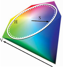
Suitable hue ramps are often generated using the HSV color model (see Section 12.3.8). The HSV color model maps the red, yellow, green, cyan, blue, and magenta hues to the vertices of a hexagon. Hue and saturation of a color are determined by the position of the color around the perimeter of the hexagon (angle) and distance from the center, respectively (see Figure 20.7). Hue ramps are created by specifying a starting, ending, and step angle and calculating the corresponding RGB value for each point on the HSV ramp. The RGB values are then used to construct the 1D texture image. The mapping from data values to hues is dependent on the application domain, the underlying data, and the information to be conveyed. HSV hue ramps can effectively convey the ordered relationship between data values. However, the choice of hues can imply different meanings. For example, hues ranging from blue, violet, black might indicate cold or low values, greens and yellows for moderate values, and red for extreme values. It is always important to include a color bar (legend) on the image indicating the mapping of hues to data values to reduce the likelihood of misinterpretation.
Choropleths
Another form of false coloring, often used with geographic information, called a choropleth, is used to display 2D information. The data values in choropleths describe regions rather than individual points. For example, a map of census data for different geographic regions may also use hue for the different values (see Figure 20.8). However, continuous scalar fields usually have gradual transitions between color values. The choropleth images have sharp transitions at region boundaries if neighboring regions have different values.
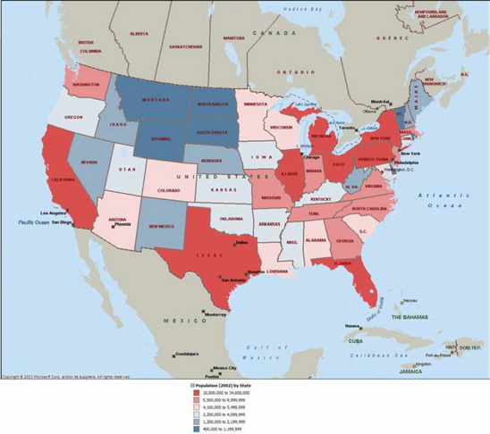
Using OpenGL to render a choropleth involves two steps. The first is modeling the region boundaries using polygons. The second is drawing the boundaries with the data mapped to a color. Since the first step requires creating individual objects for each region, the color can be assigned as the region is rendered.
20.5.5 Surface Display
The 3D analog to a 2D line graph is a surface plot. If the scalar field data is 2-dimensional, field values can be mapped to a third spatial dimension. The data set is converted to a mesh of triangles, where the 2D coordinates of the data set become the x and z coordinates of the vertices and the field value becomes the y coordinate (the y axis is the up vector). The result is a 2D planar sheet displaced in the normal direction by the field values (see Figure 20.9). This technique works well with ordinal and quantitative data since the positional cue naturally conveys the relative order of the data value. This technique is best for visualizing smooth data. If the data is noisy, the resulting surfaces contain many spikes, making the data more difficult to understand.
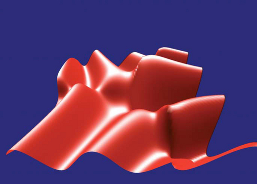
For a regular 2-dimensional grid, the geometry is referred to as a height field, since the data set can be described by the number of samples in each dimension and the height values. Warping a sheet with elevation data is frequently used in geographic information systems (GIS) where it is called rubber sheeting. Regular grids can be drawn efficiently in OpenGL using triangle and quad strips. To reduce the data storage requirements, the strips can be generated on the fly so that there is no need to store x and y coordinates. However, if the data set is not prohibitively large it is more efficient to create a display list containing the entire geometry.
Irregular grids are also drawn using triangle and quad strips. If the algorithm for generating the strips is simple, it can also be executed on the fly to avoid storing x and z coordinates for each sample. However, for complex grids it may be necessary to pre compute the meshes and store them, often using arrays of indices into the vertex data. For irregular data, a Delaunay triangulation algorithm is a good choice for generating the meshes, since it produces “fat” triangles (triangles with large angles at each vertex), giving the best representation for a given surface. A detailed description of Delaunay triangulation algorithms is beyond the scope of this book. O’Rourke provides a detailed treatment on triangulation and similar topics in (O’Rourke, 1994). See Section 1.2 for a discussion of tessellation.
The height of the surface corresponds to the field value. Linear scaling can be achieved using the modelview transformation. More complex scaling, for example—plotting the logarithm of the field value—usually requires preprocessing the field values. Alternatively, vertex programs, if supported, can be used to evaluate moderately sophisticated transforms of field data. Combining perspective projection, interactive rotation, depth cueing, or lighting can enhance the 3D perception of the model. Lighting requires computing a surface normal at each point. Some methods for computing normals are described in Section 1.3. In the simplest form, the mesh model is drawn with a constant color. A wireframe version of the mesh, using the methods described in Section 16.7.2, can be drawn on the surface to indicate the locations of the sample points. Alternatively, contouring or pseudocoloring techniques can be used to visualize a field with two variables ![]() , mapping one field to hue and the second to height. The techniques described in Section 19.6.1 can also be used to cross-hatch the region using different hatching patterns. Hatching patterns do not naturally convey a sense of order, other than by density of the pattern, so care must be used when mapping data types other than nominal to patterns.
, mapping one field to hue and the second to height. The techniques described in Section 19.6.1 can also be used to cross-hatch the region using different hatching patterns. Hatching patterns do not naturally convey a sense of order, other than by density of the pattern, so care must be used when mapping data types other than nominal to patterns.
Surface plots can also be combined with choropleths to render the colored regions with height proportional to data values. This can be more effective than hue alone since position conveys the relative order of data better than color. However, the color should be retained since it can indicate the region boundaries more clearly.
For large data sets surface plots require intensive vertex and pixel processing. The methods for improving performance described in Chapter 21 can make a significant improvement in the rendering speed. In particular, minimizing redundant vertices by using connected geometry, display lists or vertex arrays combined with backface culling are important. For very large data sets the bump mapping techniques described in Section 15.10 may be used to create shaded images with relief. A disadvantage of the bump mapping technique is that the displacements are limited to a small range. The bump mapping technique eliminates the majority of the vertex processing but increases the per-pixel processing. The technique can support interactive rendering rates for large data sets on the order of 10000 × 10000.
Some variations on the technique include drawing vertical lines with length proportional to field value at each point (hedgehogs), or the solid surfaces can be rendered with transparency (Section 11.9) to allow occluded surfaces to show through.
20.5.6 Isosurfaces
The 3D analog of an isoline is an isosurface—a surface of constant field value. Isosurfaces are useful for visualizing 3-dimensional scalar fields, ![]() . Rendering an isosurface requires creation of a geometric model corresponding to the isosurface, called isosurface extraction. There are many algorithms for creating such a model (Lorensen, 1987; Wilhelms, 1992; O’Rourke, 1994; Chiang, 1997). These algorithms take the data set, the field value, α, and a tolerance ε as input and produce a set of polygons with surface points in the range [α − ε, α + ε]. The polygons are typically determined by considering the data set as a collection of volume cells classifying each cell as containing part of the surface or not. Cells that are classified as having part of the surface passing through them are further analyzed to determine the geometry of the surface fragment passing through the cell.
. Rendering an isosurface requires creation of a geometric model corresponding to the isosurface, called isosurface extraction. There are many algorithms for creating such a model (Lorensen, 1987; Wilhelms, 1992; O’Rourke, 1994; Chiang, 1997). These algorithms take the data set, the field value, α, and a tolerance ε as input and produce a set of polygons with surface points in the range [α − ε, α + ε]. The polygons are typically determined by considering the data set as a collection of volume cells classifying each cell as containing part of the surface or not. Cells that are classified as having part of the surface passing through them are further analyzed to determine the geometry of the surface fragment passing through the cell.
The result of such an algorithm is a collection of polygons where the edges of each polygon are bound by the faces of a cell. This means that for a large grid a nontrivial isosurface extraction can produce a large number of small polygons. To efficiently render such surfaces, it is essential to reprocess them with a meshing or stripping algorithm to reduce the number of redundant vertices as described in Section 1.4.
Once an efficient model has been computed, the isosurface can be drawn using regular surface rendering techniques. Multiple isosurfaces can be extracted and drawn using different colors in the same way that multiple isolines can be drawn on a contour plot (see Figure 20.10). To allow isosurfaces nested within other isosurfaces to be seen, transparent rendering techniques (Section 11.9) or cutting planes can be used. Since blended transparency requires sorting polygons, polygons may need to be rendered individually rather than as part of connected primitives. For special cases where multiple isosurfaces are completely contained (nested) within each other and are convex (or mostly convex), face culling or clipping planes can be used to perform a partition sort of the polygons. This can be a good compromise between rendering quality and speed.
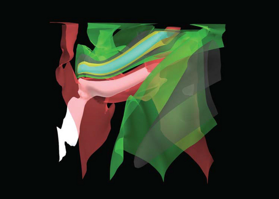
Figure 20.10 3D isosurfaces of wind velocities in a thunderstorm. Scalar field data provided by the National Center for Supercomputing Applications.
Perspective projection; interactive zoom, pan, and rotation; and depth cueing can be used to enrich the 3D perception. The isosurfaces can be lighted, but vertex or facet normals then must be calculated. The techniques in Section 1.3 can be used to create them, but many isosurface extraction algorithms also include methods to calculate surface gradients using finite differences. These methods can be used to generate a surface normal at each vertex instead.
Three dimensional data sets with multiple variables, ![]() , can be visualized using isosurfaces for one of the variables, while mapping one or more of the remaining variables to other visual cues such as color (brightness or hue), transparency, or isolines. Since the vertices of the polygons comprising the isosurface do not necessarily coincide with the original sample points, the other field variables must be reconstructed and sampled at the vertex locations. The isosurface extraction algorithm may do this automatically, or it may need to be computed as a postprocessing step after the surface geometry has been extracted.
, can be visualized using isosurfaces for one of the variables, while mapping one or more of the remaining variables to other visual cues such as color (brightness or hue), transparency, or isolines. Since the vertices of the polygons comprising the isosurface do not necessarily coincide with the original sample points, the other field variables must be reconstructed and sampled at the vertex locations. The isosurface extraction algorithm may do this automatically, or it may need to be computed as a postprocessing step after the surface geometry has been extracted.
20.5.7 Volume Slicing
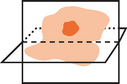
The 2D image display technique can be extended to 3-dimensional fields by rendering one or more planes intersecting (slicing) the 3-dimensional volume. If the data set is sampled on a regular grid and the planes intersect the volume at right angles, the slices correspond to 2-dimensional array slices of the data set. Each slice is rendered as a set of triangle strips forming a plane, just as they would be for a 2-dimensional scalar field. The planes formed by the strips are rotated and translated to orient them in the correct position relative to the entire volume data set, as shown in Figure 20.11. Slices crossing through the data set at arbitrary angles require additional processing to compute a sample value at the locations where each vertex intersects the volume.
Animation can be used to march a slice through a data set to give a sense of the shape of the field values through the entire volume. Volume slices can be used after clipping an isosurface to add an isocap to the open cross section, revealing additional detail about the behavior of the field inside the isosurface. The capping algorithm is described in Section 16.9. The isocap algorithm uses the volume slice as the capping plane rather than a single solid colored polygon.
20.5.8 Volume Rendering
Volume rendering is a useful technique for visualizing 3-dimensional scalar fields. Examples of sampled 3D data can range from computational fluid dynamics, medical data from CAT or MRI scanners, seismic data, or any volumetric information where geometric surfaces are difficult to generate or unavailable. Volume visualization provides a way to see through the data, revealing complex 3D relationships.
An alternative method for visualizing 3-dimensional scalar fields is to render the volume directly. Isosurface methods produce hard surfaces at distinct field values. Volume visualization methods produce soft surfaces by blending the contributions from multiple surfaces, integrating the contribution from the entire volume. By carefully classifying the range of field values to the various source contributions to the volume, and mapping these classified values using color and transparency, individual surfaces can be resolved in the rendered image.
Volume rendering algorithms can be grouped into four categories: ray casting (Hall, 1991), resampling or shear-warp (Drebin, 1988; Lacroute, 1994), texture slicing (Cabral, 1994), and splatting (Westover, 1990; Mueller, 1999).
Ray casting is the most common technique. The volume is positioned near the viewer and a light source, and a ray is projected from the eye through each pixel in the image plane through the volume (as shown in Figure 20.12). The algorithm (and many other volume rendering algorithms) use a simplified light transport model in which a photon is assumed to scatter exactly once, when it strikes a volume element (voxel) and is subsequently reflected. Absorption between the light source and the scattering voxel is ignored, while absorption between the viewer and the scattering is modeled. Using this simplified model, the color of a pixel is computed by integrating the light transmission along the ray. The integration calculation assumes that each volume element emits light and absorbs a percentage the light passing through it. The amount absorbed is determined by the amount of material contained in the voxel, which is mapped to an opacity, α, as part of the classification process. The pixel color for a ray passing through n voxels is computed using the back to front compositing operation (Section 11.1.2),
where voxel 0 is farthest from the viewer along the ray.
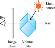
The ray-casting process is repeated, casting a unique ray for each pixel on the screen. Each ray passes through a different set of voxels, with the exact set determined by the orientation of the volume relative to the viewer. Ray casting can require considerable computation to process all of the rays. Acceleration algorithms attempt to avoid computations involving empty voxels by storing the voxel data in hierarchical or other optimized data structures. Performing the compositing operation from front to back rather than back to front allows the cumulative opacity to be tracked, and the computation along a ray terminated when the accumulated opacity reaches 1.
A second complication with ray casting involves accuracy in sampling. Sampled 3D volume data shares the same properties as 2D image data described in (Section 4.1). Voxels represent point samples of a continuous signal and the voxel spacing determines the maximum representable signal frequency. When performing the integration operation, the signal must be reconstructed at points along the ray intersecting the voxels. Simply using the nearest sample value introduces sampling errors. The reconstruction operation requires additional computations using the neighboring voxels. The result of integrating along a ray creates a point sample in the image plane used to reconstruct the final image. Additional care is required when the volume is magnified or minified during projection since the pixel sampling rate is no longer equal to voxel sampling rate. Additional rays are required to avoid introducing aliasing artifacts while sampling the volume.
If one of the faces of the volume is parallel with the image plane and an orthographic projection with unity scaling is used, then the rays align with the point samples and a simpler reconstruction function can be used. This special case, where the volume is coordinate axis aligned, leads to a volume rendering variation in which the oriented and perspective projected volume is first resampled to produce a new volume that is axis aligned. The aligned volume is then rendered using simple ray casting, where the rays are aligned with the sample points.
Shear-warp and related algorithms break the rendering into the resampling and raycasting parts. Warping or resampling operations are used to align voxel slices such that the integration computations are simpler, and if necessary warp the resulting image. The transformed slices can be integrated using simple compositing operations. Algorithms that rely on resampling can be implemented efficiently using accelerated image-processing algorithms. The shear-warp factorization (Lacroute, 1994) uses sophisticated data structures and traversal to implement fast software volume rendering.
The following sections discuss the two remaining categories of volume rendering algorithms: texture slicing and splatting. These algorithms are described in greater detail since they can be efficiently implemented using the OpenGL pipeline.
20.5.9 Texture Slicing
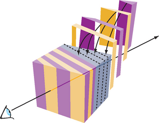
The texture-slicing algorithm is composed of two parts. First, the volume data is resampled with planes parallel to the image plane and integrated along the direction of view. These planes are rendered as polygons, clipped to the limits of the texture volume. These clipped polygons are textured with the volume data, and the resulting images are composited from back to front toward the viewing position, as shown in Figure 20.13. These polygons are called data-slice polygons. Ideally the resampling algorithm is implemented using 3D texture maps. If 3D textures are not supported by the OpenGL implementation however, a more limited form of resampling can be performed using 2D texture maps.
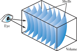
Close-up views of the volume cause sampling errors to occur at texels that are far from the line of sight into the data. The assumption that the viewer is infinitely far away and that the viewing rays are perpendicular to the image plane is no longer correct. This problem can be corrected using a series of concentric tessellated spheres centered around the eye point, rather than a single flat polygon, to generate each textured “slice” of the data as shown in Figure 20.14. Like flat slices, the spherical shells should be clipped to the data volume, and each textured shell blended from back to front.
Slicing 3D Textures
Using 3D textures for volume rendering is the most desirable method. The slices can be oriented perpendicular to the viewer’s line of sight. Spherical slices can be created for close-up views to reduce sampling errors. The steps for rendering a volume using 3D textures are:
1. Load the volume data into a 3D texture. This is done once for a particular data volume.
2. Choose the number of slices, based on the criteria in the section on Sampling Frequency considerations (p. 552). Usually this matches the texel dimensions of the volume data cube.
3. Find the desired viewpoint and view direction.
4. Compute a series of polygons that cut through the data perpendicular to the direction of view. Use texture coordinate generation to texture the slice properly with respect to the 3D texture data.
5. Use the texture transform matrix to set the desired orientation of the textured images on the slices.
6. Render each slice as a textured polygon, from back to front. A blend operation is performed at each slice. The type of blend depends on the desired effect, and several common types are described shortly.
7. As the viewpoint and direction of view changes, recompute the data-slice positions and update the texture transformation matrix as necessary.
Slicing 2D Textures
Volume rendering with 2D textures is more complex and does not provide results as good as with 3D textures, but can be used on any OpenGL implementation. The problem with 2D textures is that the data-slice polygons can’t always be perpendicular to the view direction. Three sets of 2D texture maps are created, each set perpendicular to one of the major axes of the data volume. These texture sets are created from adjacent 2D slices of the original 3D volume data along a major axis. The data-slice polygons must be aligned with whichever set of 2D texture maps is most parallel to it. The worst case is when the data slices are canted 45 degrees from the view direction.
The more edge-on the slices are to the eye the worse the data sampling is. In the extreme case of an edge-on slice the textured values on the slices aren’t blended at all. At each edge pixel, only one sample is visible, from the line of texel values crossing the polygon slice. All the other values are obscured.
For the same reason, sampling the texel data as spherical shells to avoid aliasing when doing close-ups of the volume data isn’t practical with 2D textures. The steps for rendering a volume using 2D textures are:
1. Generate the three sets of 2D textures from the volume data. Each set of 2D textures is oriented perpendicular to one of the volume’s major axes. This processing is done once for a particular data volume.
2. Choose the number of slices. Usually this matches the texel dimensions of the volume data cube.
3. Find the desired viewpoint and view direction.
4. Find the set of 2D textures most perpendicular to the direction of view. Generate data-slice polygons parallel to the 2D texture set chosen. Use texture coordinate generation to texture each slice properly with respect to its corresponding 2D texture in the texture set.
5. Use the texture transform matrix to set the desired orientation of the textured images on the slices.
6. Render each slice as a textured polygon, from back to front. A blend operation is performed at each slice, with the type of blend operation dependent on the desired effect. Relevant blending operators are described in the next section.
7. As the viewpoint and direction of view changes, recompute the data-slice positions and update the texture transformation matrix as necessary. Always orient the data slices to the 2D texture set that is most closely aligned with it.
Blending Operators
A number of blending operators can be used to integrate the volume samples. These operators emphasize different characteristics of the volume data and have a variety of uses in volume visualization.
Over
The over operator (Porter, 1984) is the most common way to blend for volume visualization. Volumes blended with the over operator approximate the transmission of light through a colored, transparent material. The transparency of each point in the material is determined by the value of the texel’s alpha channel. Texels with higher alpha values tend to obscure texels behind them, and stand out through the obscuring texels in front of them. The over operator is implemented in OpenGL by setting the blend source and destination blend factors to GL_SRC_ALPHA, GL_ONE_MINUS_SRC_ALPHA.
Attenuate
The attenuate operator simulates an X-ray of the material. With attenuate, the volume’s alpha appears to attenuate light shining through the material along the view direction toward the viewer. The alpha channel models material density. The final brightness at each pixel is attenuated by the total texel density along the direction of view.
Attenuation can be implemented with OpenGL by scaling each element by the number of slices and then summing the results. This is done using constant color blending:1
![]()
Maximum Intensity Projection
Maximum intensity projection (or MIP) is used in medical imaging to visualize blood flow. MIP finds the brightest alpha from all volume slices at each pixel location. MIP is a contrast enhancing operator. Structures with higher alpha values tend to stand out against the surrounding data. MIP and its lesser-used counterpart, minimum intensity projection, is implemented in OpenGL using the blend minmax function in the imaging subset:
Under
Volume slices rendered front to back with the under operator give the same result as the over operator blending slices from back to front. Unfortunately, OpenGL doesn’t have an exact equivalent for the under operator, although using glBlendFunc(GL_SRC_ALPHA_SATURATE, GL_ONE) is a good approximation. Use the over operator and back to front rendering for best results. See Section 11.1 for more details.
Sampling Frequency Considerations
There are a number of factors to consider when choosing the number of slices (data-slice polygons) to use when rendering a volume.
Performance
It’s often convenient to have separate “interactive” and “detail” modes for viewing volumes. The interactive mode can render the volume with a smaller number of slices, improving the interactivity at the expense of image quality. Detail mode renders with more slices and can be invoked when the volume being manipulated slows or stops.
Cubical Voxels
The data-slice spacing should be chosen so that the texture sampling rate from slice to slice is equal to the texture sampling rate within each slice. Uniform sampling rate treats 3D texture texels as cubical voxels, which minimizes resampling artifacts.
For a cubical data volume, the number of slices through the volume should roughly match the resolution in texels of the slices. When the viewing direction is not along a major axis, the number of sample texels changes from plane to plane. Choosing the number of texels along each side is usually a good approximation.
Non-linear blending
The over operator is not linear, so adding more slices doesn’t just make the image more detailed. It also increases the overall attenuation, making it harder to see density details at the “back” of the volume. Changes in the number of slices used to render the volume require that the alpha values of the data should be rescaled. There is only one correct sample spacing for a given data set’s alpha values.
Perspective
When viewing a volume in perspective, the density of slices should increase with distance from the viewer. The data in the back of the volume should appear denser as a result of perspective distortion. If the volume isn’t being viewed in perspective, uniformly spaced data slices are usually the best approach.
Flat Versus Spherical Slices
If spherical slices are used to get good close-ups of the data, the slice spacing should be handled in the same way as for flat slices. The spheres making up the slices should be tessellated finely enough to avoid concentric shells from touching each other.
2D Versus 3D Textures
3D textures can sample the data in the s, t, or r directions freely. 2D textures are constrained to s and t. 2D texture slices correspond exactly to texel slices of the volume data. To create a slice at an arbitrary point requires resampling the volume data.
Theoretically, the minimum data-slice spacing is computed by finding the longest ray cast through the volume in the view direction, transforming the texel values found along that ray using the transfer function (if there is one) calculating the highest frequency component of the transformed texels. Double that number for the minimum number of data slices for that view direction.
This can lead to a large number of slices. For a data cube 512 texels on a side, the worst case is at least ![]() slices, or about 1774 slices. In practice, however, the volume data tends to be band-limited, and in many cases choosing the number of data slices to be equal to the volume’s dimensions (measured in texels) works well. In this example, satisfactory results may be achieved with 512 slices, rather than 1774. If the data is very blurry, or image quality is not paramount (for example, in “interactive mode”), this value can be reduced by a factor of 2 or 4.
slices, or about 1774 slices. In practice, however, the volume data tends to be band-limited, and in many cases choosing the number of data slices to be equal to the volume’s dimensions (measured in texels) works well. In this example, satisfactory results may be achieved with 512 slices, rather than 1774. If the data is very blurry, or image quality is not paramount (for example, in “interactive mode”), this value can be reduced by a factor of 2 or 4.
Shrinking the Volume Image
For best visual quality, render the volume image so that the size of a texel is about the size of a pixel. Besides making it easier to see density details in the image, larger images avoid the problems associated with undersampling a minified volume.
Reducing the volume size causes the texel data to be sampled to a smaller area. Since the over operator is nonlinear, the shrunken data interacts with it to yield an image that is different, not just smaller. The minified image will have density artifacts that are not in the original volume data. If a smaller image is desired, first render the image full size in the desired orientation and then shrink the resulting 2D image in a separate step.
Virtualizing Texture Memory
Volume data doesn’t have to be limited to the maximum size of 3D texture memory. The visualization technique can be virtualized by dividing the data volume into a set of smaller “bricks.” Each brick is loaded into texture memory. Data slices are then textured and blended from the brick as usual. The processing of bricks themselves is ordered from back to front relative to the viewer. The process is repeated with each brick in the volume until the entire volume has been processed.
To avoid sampling errors at the edges, data-slice texture coordinates should be adjusted so they don’t use the surface texels of any brick. The bricks themselves are oriented so that they overlap by one volume texel with their immediate neighbors. This allows the results of rendering each brick to combine seamlessly. For more information on paging textures, see Section 14.6.
Mixing Volumetric and Geometric Objects
In many applications it is useful to display both geometric primitives and volumetric data sets in the same scene. For example, medical data can be rendered volumetrically, with a polygonal prosthesis placed inside it. The embedded geometry may be opaque or transparent.
The opaque geometric objects are rendered first using depth buffering. The volumetric data-slice polygons are then drawn with depth testing still enabled. Depth buffer updates should be disabled if the slice polygons are being rendered from front to back (for most volumetric operators, data slices are rendered back to front). With depth testing enabled, the pixels of volume planes behind the opaque objects aren’t rendered, while the planes in front of the object blend on it. The blending of the planes in front of the object gradually obscure it, making it appear embedded in the volume data.
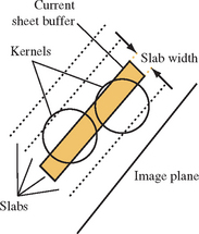
If the object itself should be transparent, it must be rendered along with the data-slice polygons a slice at a time. The object is chopped into slabs using application-defined clipping planes. The slab thickness corresponds to the spacing between volume data slices. Each slab of object corresponds to one of the data slices. Each slice of the object is rendered and blended with its corresponding data-slice polygon, as the polygons are rendered back to front.
Transfer Functions
Different alpha values in volumetric data often correspond to different materials in the volume being rendered. To help analyze the volume data, a nonlinear transfer function can be applied to the texels, highlighting particular classes of volume data. This transfer function can be applied through one of OpenGL’s look-up tables. Fragment programs and dependent texture reads allow complex transfer functions to be implemented. For the fixed-function pipeline, the SGI_texture_color_table extension applies a look-up table to texels values during texturing, after the texel value is filtered.
Since filtering adjusts the texel component values, a more accurate method is to apply the look-up table to the texel values before the textures are filtered. If the EXT_color_table table extension is available, a color table in the pixel path can be used to process the texel values while the texture is loaded. If look-up tables aren’t available, the processing can be done to the volume data by the application, before loading the texture. With the increasing availability of good fragment program support, it is practical to implement a transfer function as a postfiltering step within a fragment program.
If the paletted texture extension (EXT_paletted_texture) is available and the 3D texture can be stored simply as color table indices, it is possible to rapidly change the resulting texel component values by changing the color table.
Volume-cutting Planes
Additional surfaces can be created on the volume with application-defined clipping planes. A clipping plane can be used to cut through the volume, exposing a new surface. This technique can help expose the volume’s internal structure. The rendering technique is the same, with the addition of one or more clipping planes defined while rendering and blending the data-slice polygons.
Shading the Volume
In addition to visualizing the voxel data, the data can be lighted and shaded. Since there are no explicit surfaces in the data, lighting is computed per volume texel.
The direct approach is to compute the shading at each voxel within the OpenGL pipeline, ideally with a fragment program. The volumetric data can be processed to find the gradient at each voxel. Then the dot product between the gradient vector, now used as a normal, and the light is computed. The volumetric density data is transformed to intensity at each point in the data. Specular intensity can be computed in a similar way, and combined so that each texel contains the total light intensity at every sample point in the volume. This processed data can then be visualized in the manner described previously.
If fragment programs are not supported, the volume gradient vectors can be computed as a preprocessing step or interactively, as an extension of the texture bump-mapping technique described in Section 15.10. Each data-slice polygon is treated as a surface polygon to be bump-mapped. Since the texture data must be shifted and subtracted, and then blended with the shaded polygon to generate the lighted slice before blending, the process of generating lighted slices must be performed separately from the blending of slices to create the volume image.
Warped Volumes
The data volume can be warped by nonlinearly shifting the texture coordinates of the data slices. For more warping control, tessellate the slices to provide more sample points to perturb the texture coordinate values. Among other things, very high-quality atmospheric effects, such as smoke, can be produced with this technique.
20.5.10 Splatting
Splatting (Westover, 1990) takes a somewhat different approach to the signal reconstruction and integration steps of the ray-casting algorithm. Ray casting computes the reconstructed signal value at a new sample point by convolving a filter with neighboring voxel samples. Splatting computes the contribution of a voxel sample to the neighboring pixels and distributes these values, accumulating the results of all of the splat distributions. The resulting accumulation consists of a series of overlapping splats, as shown in Figure 20.15.

Splatting is referred to as a forward projection algorithm since it projects voxels directly onto pixels. Ray casting and texture slicing are backward projection algorithms, calculating the mapping of voxels onto a pixel by projecting the image pixels along the viewing rays into the volume. For sparse volumes, splatting affords a significant optimization opportunity since it need only consider nonempty voxels. Voxels can be sorted by classified value as a preprocessing step, so that only relevant voxels are processed during rendering. In contrast, the texture-slicing methods always process all of the voxels.
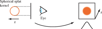
The contribution from a voxel is computed by integrating the filter kernel along the viewing ray, as shown in Figure 20.16. A typical kernel might be a 3D Gaussian distribution centered at the voxel center. The width of the kernel is typically several (5 to 11) pixels wide. The projection of the kernel onto the image plane is referred to as the footprint of the kernel. For an orthographic projection, the footprint of the convolution filter is fixed and can be stored in a table. To render an image, slices of voxels are stepped through, scaling the filter kernel by the sample value and accumulating the result. For an orthographic projection with no scaling, the integrated kernel table can be used directly. For projections that scale the volume, the footprint is scaled proportionately and the table is recalculated using the scaling information. For perspective projections, the footprint size varies with the distance from the viewer and multiple footprint tables are required.
The simplest splatting algorithm sorts all of the voxels along the viewing direction and renders the voxels one at a time from the back of the volume to the front, compositing each into the framebuffer. This can be implemented using the OpenGL pipeline by creating a table of projected kernels and storing them as 2D texture maps. Each voxel is rendered by selecting the appropriate texture map and drawing a polygon with the correct screen-space footprint size at the image-space voxel position. The polygon color is set to the color (or intensity) and opacity corresponding to the classified voxel value and the polygon color is modulated by the texture image.
This algorithm is very fast. It introduces some errors into the final image, however, since it composites the entire 3D kernel surrounding the voxel at once. Two voxels that are adjacent (parallel to the image plane) have overlapping 3D kernels. Whichever voxel is rendered second will be composited over pixels shared with the voxel rendered first. This results in bleeding artifacts where material from behind appears in front. Ideally the voxels contributions should be subdivided along the z axis into a series of thin sheets and the contributions from each sheet composited back to front so that the contributions to each pixel are integrated in the correct order.
An improvement on the algorithm introduces a sheet buffer that is used to correct some of the integration order errors. In one form of the algorithm, the sheet buffer is aligned to the volume face that is most parallel to the image plane and the sheet is stepped from the back of the volume to the front, one slice at a time. At each position the set of voxels in that slice is composited into the sheet buffer. After the slice is processed, the sheet buffer is composited into the image buffer, retaining the front-to-back ordering. This algorithm is similar to the texture slice algorithm using 2D textures.
Aligning the sheet buffer with one of the volume faces simplifies the computations, but introduces popping artifacts as the volume is rotated and the sheet buffer switches from one face to another. The sheet buffer algorithm uses the OpenGL pipeline in much the same way as the simple back-to-front splat algorithm. An additional color buffer is needed to act as the image buffer, while the normal rendering buffer serves as the sheet buffer. The second color buffer can be the front buffer, an off-screen buffer, or a texture map.
In this algorithm, the sheet buffer is aligned with the volume face most parallel with the image plane. A slab is constructed that is Δs units thick, parallel to the sheet buffer. The slab is stepped from the back of the volume to the front. At each slab location, all voxels with 3D kernel footprints intersecting the slab are added to the sheet buffer by clipping the kernel to the slab and compositing the result into the sheet buffer. Each completed sheet buffer is composited into the main image buffer, maintaining the front-to-back order.
A variation on the sheet buffer technique referred to as an image-aligned sheet buffer (Mueller, 1998) more closely approaches front to back integration and eliminates the color popping artifacts in the regular sheet buffer algorithm. The modified version aligns the sheet buffer with the image plane, rather than the volume face most parallel to the image plane. The regular sheet buffer algorithm steps through the voxels one row at a time, whereas the image-aligned version creates an image-aligned slab volume, Δs units thick along the viewing axis, and steps that from back to front through the volume. At each position, the set of voxels that intersects this slab volume are composited into the sheet buffer. After each slab is processed, the sheet buffer is composited into the image buffer. Figure 20.17 shows the relationship between the slab volume and the voxel kernels.
The image-aligned sheet buffer differs from the previous two variations in that the slab volume intersects a portion of the kernel. This means that multiple kernel integrals are computed, one for each different kernel-slab intersection combination. The number of preintegrated kernel sections depends on the radial extent of the kernel, R, and the slab width Δs. A typical application might use a kernel 3 to 4 units wide and a slab width of 1. A second difference with this algorithm is that voxels are processed more than once, since a slab is narrower than the kernel extent.
The image-aligned algorithm uses the OpenGL pipeline in the identical manner as for the other algorithms. The only difference is that additional 2D texture maps are needed to store the preintegrated kernel sections and the number of compositing operations increases.
20.5.11 Creating Volume Data
Both the texture slicing and splatting methods can be intermixed with polygonal data. Sometimes it is useful to convert polygonal objects to volumetric data, however, so that they can be rendered using the same techniques. The OpenGL pipeline can be used to dice polygonal data into a series of slices using either a pair of clipping planes or a 1D texture map to define the slice. The algorithm repeatedly draws the entire object using an orthographic projection, creating a new slice in the framebuffer each time. To produce a single value for each voxel, the object’s luminance or opacity is rendered with no vertex lighting or texture mapping. The framebuffer slice data are either copied to texture images or transferred to the host memory after each drawing operation until the entire volume is complete.
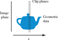
One way to define a slice for rasterization is to use the near and far clip planes. The planes are set to bound the desired slice and are spaced dz units apart as shown in Figure 20.18. For example, a modeling transformation might be defined to map the eye z coordinates for the geometry to the range [2.0, 127.0], and the near and far clip planes positioned 1 unit apart at the positions (1.0, 2.0), (2.0, 3.0), …, (128, 129) to produce 128 slices. The content of each slice is the geometry that is defined in the range [near, near + dz]. The exact sample location is dependent on the polygon data and is not a true point sample from the center of the voxel. The x and y coordinates are at the voxel center, whereas the z coordinate satisfies the plane equation of the polygon.
The number of fragments accumulated in each pixel value is dependent on the number of polygons that intersect the pixel center. If depth buffering is enabled, only a single fragment is accumulated, dependent on the depth function. To accumulate multiple fragments, a weighting function is required. If a bound on the number of overlapping polygons is known, the stencil buffer can be used, in conjunction with multiple rendering passes to control which fragment is stored in the framebuffer, creating a superslice. As each superslice is transferred to the host it can be accumulated with the other superslices to compute the final set of slice values.
Polygons edge-on to the image plane have no area, and make no sample contribution, which can cause part of an object to be missed. This problem can be mitigated by repeating the slicing algorithm with the volume rotated so that the volume is sliced along each of the three major axes. The results from all three volumes are merged. Since the algorithm approximates point sampling the object, it can introduce aliasing artifacts. To reduce the artifacts and further improve the quality of the sample data, the volume can be supersampled by increasing the object’s projected screen area and proportionately increasing the number of z slices. The final sample data is generated off-line from the supersampled data using a higher-order reconstruction filter.
The clip plane slicing algorithm can be replaced with an alternate texture clipping technique. The clipping texture is a 1D alpha texture with a single opaque texel value and zero elsewhere. The texture width is equal to the number of slices in the target volume. To render a volume slice, the object’s z vertex coordinate is normalized relative to the z extent of the volume and mapped to the s texture coordinate. As each slice is rendered, the s coordinate is translated to position the opaque texel at the next slice position. If the volume contains v slices, the s coordinate is advanced by 1/v for each slice. Using nearest (point) sampling for the texture filter, a single value is selected from the texture map and used as the fragment color. Since this variation also uses polygon rasterization to produce the sample values, the z coordinate of the sample is determined by the plane equation of the polygon passing through the volume. However, since the sample value is determined by the texture map, using a higher-resolution texture maps multiple texels to a voxel. By placing the opaque texel at the center of the voxel, fragments that do not pass close enough to the center will map to zero-valued texels rather than an opaque texel, improving sampling accuracy.
20.6 Vector Field Visualization
Visualizing vector fields is a difficult problem. Whereas scalar fields have a scalar value at each sample point, vector fields have an n-component vector (usually two or three components). Vector fields occur in applications such as computational fluid dynamics and typically represent the flow of a gas or liquid. Visualization of the field provides a way to better observe and understand the flow patterns.
Vector field visualization techniques can be grouped into three general classes: icon based, particle and stream line based, and texture based. Virtually all of these techniques can be used with both 2- and 3-dimensional vector fields, ![]() and
and ![]() .
.
20.6.1 Icons
Icon-based or hedgehog techniques render a 3D geometric object (cone, arrow, and so on) at each sample point with the geometry aligned with the vector direction (tangent to the field) at that point. Other attributes, such as object size or color, can be used to encode a scalar quantity such as the vector magnitude at each sample point. Arrow plots can be efficiently implemented using a single instance of a geometric model to describe the arrow aligned to a canonical up vector U. At each sample point, a modeling transformation is created that aligns the up vector with the data set vector, V. This transformation is a rotation through the angle U · V about the axis U × V. Storage and time can be minimized by precomputing the angle and cross product and storing these values with the sample positions.
Glyphs using more complex shape and color cues, called vector field probes, can be used to display additional properties such as torsion and curvature (de Leeuw, 1993). In general, icons or glyphs are restricted to a coarse spatial resolution to avoid overlap and clutter. Often it is useful to restrict the number of glyphs, using them only in regions of interest. To avoid unnecessary distraction from placement patterns, the glyphs should not be placed on a regular grid. Instead, they should be displaced from the sample position by a small random amount. To further reduce clutter, glyphs display can be constrained to particular 3D regions. Brushing (painting) techniques can be used to provide interactive control over which glyphs are displayed, allowing the viewer to paint and erase regions of glyphs from the display. The painting techniques can use variations on the selection techniques described in Section 16.1 to determine icons that intersect a given screen area.
20.6.2 Particle Tracing
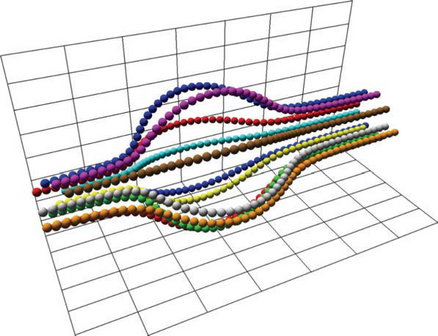
Particle tracing techniques trace the path of massless particles through a vector velocity field. The particles are displayed as small spheres or point-shaped geometry, for example, 2D triangles or 3D cones. Portions of the field are seeded with particles and paths are traced through the field following the vector field samples (see Figure 20.19). The positions of the particles along their respective paths are animated over time to convey a sense of flow through the field.
Particle paths are computed using numerical integration. For example, using Euler’s method the new position, pi+1, for a particle is computed from the current position, pi as pi+1 = pi + vi Δt. The vector, Vi, is an estimate of the vector at the point pi. It is computed by interpolating the vectors at the vertices of the area or volume cell containing pi. For a 2-dimensional field, the four vectors at the vertices of the area cell are bilinearly interpolated. For a 3-dimensional field, the 8 vectors at the vertices of the volume cell are trilinearly interpolated. This simple approximation can introduce substantial error. More accurate integration using Runge-Kutta (R-K) methods (Lambert, 1991) are a better choice and can be incorporated with only a small increase in complexity. For example, a fourth-order R-K method is computed as
where ![]() is the vector computed at intermediate position,
is the vector computed at intermediate position, ![]() , and
, and ![]() .
.
For small number of particles, the particle positions can be recomputed each frame. For large numbers of particles it may be necessary to precompute the particle positions. If the particle positions can be computed interactively, the application allows the user to interactively place new particles in the system and follow the flow. Various glyphs can be used as the particles. The most common are spheres and arrows. Arrows are oriented in the direction of the field vector at the particle location. Additional information can be encoded in the particles using other visual cues. The magnitude of the vector is reflected in the speed of the particle motion, but can be reinforced by mapping the magnitude to the particle color.
20.6.3 Stream Lines
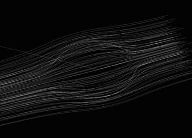
A variation on particle tracing techniques is to record the particle paths as they are traced out and display each path as a stream line using lines or tube-shaped geometry. Each stream line is the list of positions computed at each time step for a single particle. Rendering the set of points as a connected line strip is the most efficient method, but using solid geometry such as tubes or cuboids allows additional information to be incorporated in the shape. A variation of stream lines called ribbons, uses geometry with a varying cross section or rotation (twist) to encode other local characteristics of the field: divergence or convergence modulates the width, and curl angular velocity rotates the geometry.
A ribbon results from integrating a line segment, rather than a point, through the velocity field. Ribbons can be drawn as quadrilateral (or triangle) strips where the strip vertices coincide with the end points of the line segment at each time step. For small step sizes, this can result in a large number of polygons in each ribbon. Storing the computed vertices in a vertex array and drawing them as connected primitives maximizes the drawing performance. Ribbons can be lighted, smooth shaded, and depth buffered to improve the 3D perception. However, for dense or large data sets, the number of ribbons to be rendered each frame may create a prohibitive processing load on the OpenGL pipeline.
20.6.4 Illuminated Stream Lines
When visualizing 3-dimensional fields, illumination and shading provide additional visual cues, particularly for dense collections of stream lines. One type of geometry that can be used is tube-shaped geometry constructed from segments of cylinders following the path. In order to capture accurate shading information, the radius of the cylinders needs to be finely tessellated, resulting in a large polygon load when displaying a large number of stream lines.
Another possibility is to use line primitives since they can be rendered very efficiently and allow very large numbers of stream lines to be drawn. A disadvantage is that lines are rendered as flat geometry with a single normal at each end point, so they result in much lower shading accuracy compared to using tessellated cylinders. In (Stalling, 1997), an algorithm is described to approximate cylinder-like lighting using texture mapping (see Figure 20.20). This algorithm uses the anisotropic lighting method described in Section 15.9.3.2
The main idea behind the algorithm is to choose a normal vector that lies in the same plane as that formed by the tangent vector T and light vector L. The diffuse and specular lighting contributions are then expressed in terms of the line’s tangent vector and the light vector rather than a normal vector. A single 2D texture map contains the ambient contribution, the 1D cosine function used for the diffuse contribution, and a second 2D view-dependent function used to compute the specular contribution.
The single material reflectance is sent as the line color (much like color material) and is modulated by the texture map. The illuminated lines can also be rendered using transparency techniques. This is useful for dense collections of stream lines. The opacity value is sent with the line color and the lines must be sorted from back to front to be rendered correctly, as described in Section 11.8.
20.6.5 Line Integral Convolution
Line integral convolution (see Figure 20.21) is a texture-based technique for visualizing vector fields and has the advantage of being able to visualize large and detailed vector fields in a reasonable display area.
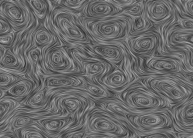
Line integral convolution involves selectively blurring a reference image as a function of the vector field to be displayed. The reference image can be anything, but to make the results clearer, it is usually a spatially uncorrelated image (e.g., a noise image). The resulting image appears stretched and squished along the directions of the distorting vector field stream lines, visualizing the flow with a minimum of display resolution. Vortices, sources, sinks, and other discontinuities are clearly shown in the resulting image, and the viewer can get an immediate grasp of the flow field’s “big picture.”
The algorithm starts with a vector field, sampled as a discrete grid of normalized vectors. A nonuniform and spatially uncorrelated image is needed so that correlations applied to it will be more obvious. This technique visualizes the direction of the flow field, not its velocity. This is why the vector values at each grid point are normalized.
The processed image can be calculated directly using a special convolution technique. A representative set of vector values on the vector grid is chosen. Special convolution kernels are created shaped like the local stream line at that vector. This is done by tracing the local field flow forward and backward some application-defined distance. The resulting curve is used as a convolution kernel to convolve the underlying image. This process is repeated over the entire image using a sampling of the vectors in the vector field.
Mathematically, for each location p in the input vector field a parametric curve P(p, s) is generated that passes through the location and follows the vector field for some distance in either direction. To create an output pixel F′(p), a weighted sum of the values of the input image F along the curve is computed. The weighting function is k(x). Thus, the continuous form of the equation is
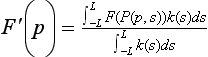
To discretize the equation, use values P0..l along the curve P(p, s):
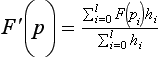
The accuracy with which the processed image represents the vector field depends on how accurately the line convolution kernels follow the flow-field stream lines. Since the convolution kernels are only discretely sampling a continuous flow field, they are inaccurate in general. Areas of flow that are changing slowly will be represented well, but rapidly changing regions of the flow field (such as the center of vortices and other singularities) will be incorrectly described or missed altogether.
There are various ways of optimizing the sampling intervals to minimize this problem, with different trade-offs between computation time and resulting accuracy. The numerical analysis topics involved are described in detail in (Cabral, 1993; Ma, 1997). For our purposes, we’ll use the simplest but least accurate method: a fixed spatial sampling interval.
Rather than generating a series of custom convolution kernels and applying them to an image, a texture mapping approach can be used. This variant has the advantage that it’s reasonably easy to implement and runs quickly, especially on systems with good texturing and accumulation buffer support, since it is parallelizing the convolution operations.
The concept is simple: a surface, tessellated into a mesh, is textured with an image to be processed. Each vertex on the surface has a texture coordinate associated with it. Instead of convolving the image with a series of stream-line convolution kernels, the texture coordinates at each vertex are shifted parallel to the flow-field vector, local to that vertex. This process, called advection, is done repeatedly in a series of displacements parallel to the flow vectors, with the resulting series of distorted images combined using the accumulation buffer.
The texture coordinates at each grid location are displaced parallel to the local field vector in a fixed series of steps. The displacement is done both parallel and antiparallel to the field vector at the vertex. The amount of displacement for each step and the number of steps determines the accuracy and appearance of the line integral convolution. The application generally sets a global value describing the length of the displacement range for all texture coordinates on the surface. The number of displacements along that length is computed per vertex, as a function of the local field’s curl (see Figure 20.22).
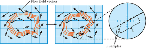
The following assumptions simplify the line integral convolution procedure.
1. The supplied flow-field vector grid matches the tessellated textured surface. There is a one-to-one correspondence between vector and vertex.
These assumptions allow the vector, associated with each vertex on the tessellated surface, to be used when computing texture displacements. Displacements can also be calculated by parameterizing the vector and computing evenly spaced texture coordinate locations displaced along the vector direction, both forward and backward. Given these assumptions, the procedure becomes:
1. Update the texture coordinates at each vertex on the surface.
2. Render the surface using the noise texture and the displaced texture coordinates.
3. Accumulate the resulting image in the accumulation buffer, scaling by 1/n.
4. Repeat the steps above n times and then return the accumulated image.
5. Perform histogram equalization or image scaling to maximize contrast.
Since the texture coordinates are repeatedly updated, using vertex arrays to represent the textured surface provides several benefits. It simplifies the representation of the texture coordinates (they can be kept in a 2D array), and it potentially increases rendering performance (glDrawElements has an index array that eliminates the need to send shared texture and vertex coordinates multiple times) and it reduces function call overhead.
Scaling each accumulation uniformly is not optimal. The displacement of the texture coordinates is most accurate close to the grid vector, so each image contribution should be scaled as an inverse function of distance from the vector. The farther the displacement from the original flow field vector the more potential error in the advection, and the smaller the accumulation scale factor should be. More sophisticated algorithms can be implemented that adjust scale based on a computed, rather than assumed, accuracy. Any scaling algorithm should take into account the maximum and minimum possible color values after accumulating to avoid pixel color overflow or underflow.
In many implementations, the performance of this algorithm will be limited by the speed of the convolution operation. For some applications, a blend operation can be substituted with a loss of resolution accuracy. The scaling operation can be provided by changing the intensity of the base polygon. Care must be taken to avoid overflow and underflow of the blended color values.
There are methods to enhance the resulting flow field to counteract the blurring tendency from the random noise texels being blended. One simple method is to scale and bias the image to maximize its contrast using glCopyPixels with the contrast stretching method described in Section 12.4.1. An alternative is to perform a histogram equalization using the method described in Section 12.4.2.
The approach described here to generate line integral convolution images is very simplistic. More sophisticated algorithms decouple the surface tessellation from the flow field grid, and more finely subdivide the tessellation surface where there are rapidly changing flows to properly sample them. This subdivision algorithm should be backed with a rigorous sampling approach so that the results can be trusted within given accuracy bounds. A subdivision algorithm must also recognize and handle various types of flow discontinuities.
This technique can be readily extended into three dimensions, using 3D textures (Interrante, 1997). Volume visualization techniques, described in Section 20.5.8, can be used to visualize the resulting 3D line integral convolution image.
20.7 Tensor Field Visualization
Tensors further extend vector-valued data samples to k-dimensional arrays at each sample point. Tensor fields frequently occur in engineering and physical science computations. For example, rank 2 (second-order) tensors are used to describe velocity gradients, stress, and strain. Tensor fields present a difficult visualization problem since it is difficult to map even a second order tensor onto a set of visual cues. A simple second order tensor might consist of a 3 × 3 array of scalar values defined over a 3D domain. It is difficult to visualize the data directly, so such fields are often visualized using vector or scalar techniques.
One frequently occurring class of tensor fields, symmetric tensor fields, has special properties that simplify the visualization problem. In particular, 3-dimensional fields of second-order tensors can be thought of as three orthogonal vector fields. Each tensor value can be reduced to a set of three real-valued vectors defined by the real-valued eigenvalues (λ) and unit eigenvectors (e) of the tensor value
The vectors are ordered such that λ(1) ≥ λ(2) ≥ λ(3) and v(1) is called the major eigenvector, v(2) the medium eigenvector, and v(3) the minor eigenvector. Visualization techniques strive to visualize these three vectors in meaningful ways.
The simplest method is to map each tensor to a 3D glyph, such as an ellipsoid (Haber, 1990) or rectangular prism. The major axis of the ellipsoid aligns with the major eigenvector, and the two remaining axes with the medium and minor eigenvectors. The magnitudes of the vectors can be used to scale the glyph, and colors can be used to indicate compression or strain (negative and positive eigenvalues). Tensor glyphs can be efficiently rendered using the method described in Section Section 20.6.1. If eigenvalue magnitudes are used to scale the glyph geometry, the transformed surface normal vectors will require normalization to compute correct lighting. The simplest way to accomplish renormalization is to enable automatic normalization, using GL_NORMALIZE.
20.7.1 Hyperstreamlines
Using glyphs to visualize the eigenvectors suffers from the same drawbacks found with using glyphs to visualize vector fields: rapid crowding and their discrete nature provides little information regarding the continuity of the field. To solve these problems, vector field visualization uses advection techniques to trace stream lines through the vector field. An analogous idea can be applied to symmetric tensor fields by tracing tensor field lines tangent to one of the three vectors at every point (Dickinson, 1989).
This method is virtually identical to tracing a stream line through a vector field, with the difference being that one of the three vectors is selected. The same methods used for rendering stream lines can be used to render tensor field lines.
The tensor field line approach only displays one of the vectors at each point. Replacing the stream line with tubular geometry with an elliptic cross section allows all three vectors to be represented continuously along the field line. Each tube, termed a hyperstreamline, follows one of the eigenvectors, while the two remaining vectors modulate the major and minor axis length of the elliptical cross section (Delmarcelle, 1993). Usually the tube is color coded according to the magnitude of the longitudinal vector. More generally, an arbitrary geometric primitive can be swept along the vector field trajectory while modulating its size using the other two vectors. Using a cross as the profile shape allows encoding of both the magnitude and direction of the transverse eigenvectors. The result, called a helix, may appear as a spiral as the transverse vectors change direction along the length of the helix.
Rendering hyperstreamlines interactively requires efficient construction of the model geometry. The trajectory is traced out using the advection techniques described in Section 20.6.2, but with some additional complications. Two eigenvalues may become equal at some point along the path. Assuming that the longitudinal trajectory is smooth, abrupt changes in the longitudinal direction can be used to signal that additional searching is required to locate a degeneracy and terminate the hyperstreamline. Similarly, the derivatives of the transverse eigenvalues can be used to determine when to search for points where these eigenvalues are zero and add extra vertices to display the singularity (Delmarcelle, 1993).
The hyperstreamline is constructed by tiling the perimeter of the tube or helix with a ring of polygons that are decomposed into a single triangle strip, (as shown in Figure 20.23). For an elliptical tube, the vertices in a unit circle can be stored in a look-up table and rotated to match the orientation of the longitudinal vector. The vertices and normal vectors are stored in a vertex array or display list for efficient transfer to the rendering pipeline. Since the stream lines are closed surfaces, they can be rendered with backface culling to further improve the performance.
Hyperstreamlines are effective in describing the tensor field along one dimensional paths. They can be extended to handle nonsymmetric tensors (Delmarcelle, 1993) and further extended to hyperstreamsurfaces (Jeremic, 2002) similar to the way stream lines are extended to stream surfaces. However, hyperstreamlines are subject to the same problem seen in other iconic and geometry-based visualization techniques: the overall visualization is sensitive to the seed points for the stream lines. The density of hyperstreamlines must be carefully controlled to maintain an intelligible visualization. Beyond hyperstreamline and hyperstreamsurfaces, other techniques have been proposed that display more of the field values simultaneously using hue and anisotropic reflection to encode tensor values (Kindlmann, 1999).
20.8 Summary
The number of visualization techniques continues to grow along with advances in hardware accelerator processing power and support for additional shading techniques using multitexture, vertex programs, fragment programs, and multipass rendering. Simultaneously, the size of scientific and engineering data sets continues to grow and will remain a challenge to visualization for some time to come.