Screen Angles and Screen Clash
As we have already seen (in Chapter 1), if you want to print a photograph using black ink, you used to have to break it up into dots by bouncing the image through a screen and on to film. Alternatively, you can use software like Adobe Photoshop together with digital cameras and/or scanners to capture the image, and then the imagesetter (the machine that outputs plates or film from your files) rasterizes the result, i.e. turns all the pixel information into halftone dots. Whichever method you use, screen or software, the end result is an illusion of an image that is actually made up of a grid of dots arranged in a grid of lines at 90° to each other.
This is why at a print shop they do not talk about dots so much as about the lines of dots that together make up a screen of dots. It is not a 150-dot halftone; it is a 150 “line screen” halftone. Different press technologies and papers can handle only certain densities of screen, so the decision as to which one you use is important. But more of that later.
Printing the first color is no problem. But what happens when you want to print an image in more than one color? That means you are planning to print two screens of dots, one on top of the other. The results can be quite a surprise:
Color 1, black (fig. 2.6).
Color 2, cyan (fig. 2.7).
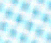
Now let us look at them together: fig. 2.8. This unfortunate result is called a moiré pattern. It is caused when two screens are laid down at close to the same angle and clash. Every few lines, the dots collide. However, printers discovered that if the second screen is turned until the rows of dots are 30° away from the first, the problem goes away (fig. 2.9).
So, color 1 can appear with a screen angle of 0° and 90°—i.e. the rows of dots are arranged on a grid of horizontal and vertical lines. Color 2 is turned 30° away from it. Color 3 has to be turned 30° away from both of them. So far, this is what you have (fig. 2.10).
Given that the colors need to be separated by 30° spaces, where can you put color number 4? There is simply nowhere for it to go. If you rotate it another 30°, you are back to where you started—on 0° and 90°. Fortunately, the answer lies in the nature of the colors themselves.
Consider the way we see colors. Obviously enough, we see black as the darkest and yellow as the lightest, while cyan and magenta fall somewhere in between. When any one of them is printed as a fine screen (around 150 lines to the inch), the dots are so small that we cannot see them even if we hold the sheet only 10–12in (250–300mm) away from us. Yellow is even harder to distinguish. It is so invisible to us that we have not even noticed it causing a moiré pattern in every four-color print we have ever seen. And yet that is exactly what it does. Yellow can slide in between any two of the other colors, only 15° away from both of them. It always causes a moiré, and we never, ever, see it. But this is not the case with any of the other colors.

2.6 Color 1, black.
2.7 Color 2, cyan.

2.8 A moiré pattern.

2.9 The two colors together but at non-conflicting screen angles.

2.10 Three of the CMYK components separated by 30° increments.
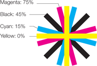
2.11 The four CMYK components shown at the correct screen angles for printing.

2.12 All four CMYK colors, each printed as a screen at the correct angle.
Printers take things even further. As well as there being a range of relative visibility in the colors themselves, there are more- and less-visible screen angles. Not surprisingly, the most visible orientations—the ones that we will see more easily than any of the others—are 0° and 90°. When you think about it, it makes perfect sense. Our world is filled with vertical and horizontal objects, so we are especially used to noticing those angles.
Yellow, the least visible color, goes in at 0° (or 90°), the most visible angle.
Black, the most visible color, goes in at 45°, the least visible angle.
Magenta and cyan are placed 30° either side of black, one at 15° and the other at 75°—and it does not matter which of them goes where (fig. 2.11).
Remember, all of this is simply intended to maintain the illusion. That is all you need to do.
When these print as a screen of dots, and each color is set at the correct angle, there is no visible moiré pattern at all (fig. 2.12). And that is the secret of the four-color process.