Creating and Using a Rich Black
In the page-layout programs, black is usually set to overprint everything. That makes sense, because black is intended to be opaque and is never trying to create a third color when it overlaps another. Pantone colors are also intended to be opaque although in practice they are not. However, cyan, magenta, or yellow are intended to be transparent and thus create additional color blends between them when one lands on top of another. Printing other elements within a large, solid-black background can be fraught with problems. For a start, in order to get a nice solid black, the printer cannot stint on the ink flow. Also, as it is most likely printing onto white paper, there has got to be enough ink, evenly spread, if it is going to look even and dense and not patchy. However, if there is a little bit too much ink, set-off might easily occur and ruin the job. This is where the ink on one sheet transfers to the—as yet—unprinted side of the sheet that lands on top of it in the pile after they have both gone through the press. Both of these results are definitely to be avoided.
To complicate matters further, if you have an image in the middle of the solid black area, then you are creating different ink requirements across your page. This might mean visible streaks unless the coverage is heavy enough to blot them out.
The example shown in fig. 9.4 shows the sort of thing that might happen. (The arrow indicates the direction of travel through the press.) On either side of the small four-color image on the front cover of the piece (the upper right quarter of the sheet) there is a 100% requirement for black ink, but above and below the area occupied by the image it is closer to 80%. It is therefore quite likely that there will be a visible difference between the black solid in this area and the black solid on either side. The same is true of the lines of type and the small magenta squares, although to a much lesser degree.
The printer is left in a difficult position: either increase the ink flow and risk set-off, or leave the ink flow at a safer, lower level and maybe end up with visible streaks. A good way to avoid this problem is by creating a color called a “four-color black” or “rich black” using whichever of the major drawing, image-adjustment, or page-layout programs you are using to create the front cover. A “rich black” is a color made up of 100% solid black combined with a supporting tint underneath it. This gives the black the extra density it needs without increasing the flow of ink to a possibly dangerous level.
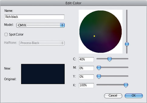
For a “rich black” I usually use a 40% tint of cyan plus 100% black (fig. 9.5). For a four-color black, I use a combination of a 30% tint of cyan, magenta, and yellow together with a 100% black (fig. 9.6). The three colors combine at (almost) equal densities to produce a neutral gray, and the printed result is an even, dense black with no visible pinholes. (There might actually be pinholes, but if there is a roughly 30% tint of gray underneath them, they are almost impossible to spot.) This means less stoppage time on the press, faster turnaround on the job, less quality control further down the production line, and, best of all, the potential problems of set-off or a streaky print are avoided. If you create your own rich black, make sure you do not overload the maximum ink density, which has already been discussed (see previous page).
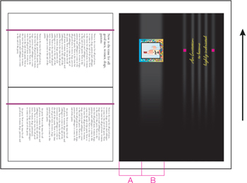
9.4 There is a different requirement for black ink between sections A and B, which could result in streaking if not enough ink is applied, or set-off if too much is applied.

9.5 The New Color Swatch window showing CMYK values for a “rich black”…

9.6 …and also the values for a four-color black.
Some designers prefer to create a more dense black by adding only a 40% cyan, with no yellow or magenta. This makes a good solid black that has a somewhat cool appearance. On the other hand, adding only a 40% magenta—with no cyan or yellow—adds the appearance of red highlights. The effect is quite subtle, but as the addition of another tint enables the printer to lower the density of the black, the color underneath can influence the overall appearance.
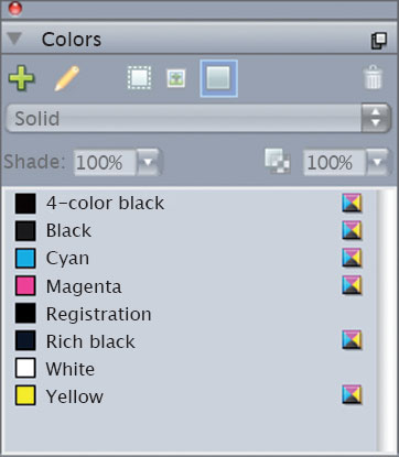
The best way to make these useful colors available to you is to add them to InDesign or Quark when you have no documents open. Then, any changes you make become program, rather than document, defaults. That means that once added, they will be there for any future documents you create. Of course, you will still need to add them where needed to documents that were created previously. To do this in InDesign, open the Swatches window. The default red, green, and blue swatches are really of no use as they are simply the CMYK versions of the RGB colors (fig. 9.7). If you needed a blue, for example, you would mix the blue you wanted rather than just using the one provided. So, delete these three (select them, then click on the Trash can at the foot of the window). Then, create the swatches for a four-color black and a rich black, as already described. Your new Swatches window will look like this (fig. 9.8).

9.7 The default Swatches window in InDesign.
9.8 (Bottom) The InDesign Swatches window after adding the rich and four-color black swatches.

9.9 The Edit > Colors window in Quark.
9.10 (Bottom) The default Colors window in Quark.
In Quark the process is similar, but you would choose Edit > Colors to create the new swatches (fig. 9.9). Incidentally, Quark included true RGB red, green, and blue swatches as a default for many years before deciding that as they were downright dangerous in a project that would be printed, they should go (fig. 9.10). Click on the New button to open the Edit Color window in which the new swatches can be created. After creating the swatch for a rich black (fig. 9.11), click OK to return to the Colors window, where you can again click on New to create the four-color black swatch (fig. 9.12). When you have finished and return again to the Colors window, click Save to add them to the Colors window (fig. 9.13).
9.11 The Edit Color window showing values for a rich black…

9.12 …and for a four-color black.
9.13 The Quark Colors window, after adding the rich and four-color black swatches.