
Photoshop Color Settings
You might wonder why Photoshop color settings are included here rather than before the chapters dealing with grayscale and color calibration. The reason is simple. Many people will use the information presented in these chapters and find that they get along much better than they did before, but they still will not want to mess around with the color-management zone in Photoshop or InDesign, which is a much more daunting prospect. It is an area that very few people understand, and if you do not understand it then you cannot really use it effectively. Most people would rather just leave it alone and trust that the Photoshop defaults will not get them into too much trouble. Unfortunately, you cannot rely on this being the case, and so having at least an overview of what this area can do for you is worthwhile, especially if it leads you toward making informed adjustments to your color settings.
In the following explanation, a “CMYK color space” is the full range of colors that can be generated using all the possible combinations and tints of a particular set of CMYK pigments, while an “RGB color space” holds all the RGB color combinations.
Certain conventions about color have been developed by a group called the International Color Consortium (ICC). Generally, graphics programs such as Photoshop use these conventions to determine their own color-management workflow. These are called color-management systems (CMS). The idea is to give consistency to your images wherever they are displayed throughout the entire work process—all the way from your screen, right up to a finished website, and even to the pages rolling off the press. Otherwise, particularly because there are many different CMYK “spaces” out there among print shops (caused by using different inks, for example), the results are unpredictable.
Similarly, while all monitors and scanners display and capture images using RGB, not all monitors and scanners share the same RGB space—aside from which, most monitors are weak in terms of green and cyan display. So there are many variables, and making use of the Photoshop color settings is a way of overcoming the difficulties in consistency that might otherwise arise.
A CMS setting applies a color profile to an image, which tags it with a description of how the colors included within it map to a particular color space. If you do not choose a profile, your image is untagged, and instead picks up Photoshop’s current working space profile as a default CMS. This then determines how your computer will display and edit the colors. If you choose a profile, it will be applied when, for example, you change the color mode of an image from RGB to CMYK. You can also choose whether or not to apply your resident settings to an image that is tagged with a different profile, as it is being opened.
6.5 The Bridge icon on the Photoshop menu bar.
If you already have an image open on screen, changing the profile settings will affect only the on-screen appearance. Actually tagging an image with the resident profile can only take place during the process of being opened, and the tag is then saved when you save the image.
As the settings have stabilized over the last few versions of Photoshop, I have not included notes for versions earlier than the current CS model. Regarding these, it does not make any difference whether you have a Mac or a PC.
To enter the CMS settings area, open Adobe Bridge. This can be done by clicking on the Bridge icon on the menu bar in Illustrator, InDesign, or Photoshop (fig. 6.5). The reason for doing this in Bridge is that tags can be put into place for all three programs at the same time, in a synchronized way.
In Bridge, choose Edit > Creative Suite Color Settings. When the Suite Color Settings window opens, it will probably show that the current, and default, CMS is North America General Purpose 2. That is great if you live in the US and send your work out to be printed on coated paper on a web press. For the rest of us, it is not so good. Instead, scroll up the list and choose Europe Prepress 3 instead (fig. 6.6). Click the Apply button to close the window and return to Photoshop.
 |
If you reopen the window, its top area will show that your settings are now synchronized across the suite for consistent color. If the settings are changed in any one of the applications, this area will say that the color settings are unsynchronized. |
If you are on a Mac, choose Photoshop > Color Settings. On a PC, choose Edit > Color Settings. In both cases, the Color Settings window will now show that Europe Prepress 3 is in place (fig. 6.7), and the CMYK working space will have changed to Coated FOGRA39. (Previously, it would have read US Web Coated (SWOP) v2.)
So, why would that have been a problem? The answer lies in a formidable area for the graphic designer: dot gain. In Chapter 4, this has been discussed in terms of controlling the size of the highlight and shadow dots, but here we are dealing with the main problem: how do we control what happens to the mid-point in the image tone, i.e. the 50% dot? This is important, because if we can control it, we thereby control the overall appearance of the entire image—with the exception of the highlight and shadow dots, which we have already dealt with. The amount by which the 50% value changes (and it is always an increase in density) during the printing process is the actual dot gain amount that is compensated for by the CMS you put into place in the Color Settings window. And the bad news is that on a web press, dot gain is roughly twice that of a sheet-fed press: 20% instead of 10%. If you are not sure how this will affect your work, read on.
A 50% dot going through a web press, unchanged, comes out at roughly a 70% dot. This would mean the mid-tones are dark and muddy, and the printed picture looks awful.
If a CMS profile for a web press is left in place, the 50% dot is curved down to a 30% dot (but without changing how the image looks on screen) so that during the printing process the dot gain turns it back into a 50% dot, and the picture looks great.
However, if you are printing on a sheet-fed press but using a CMS that compensates for a web press, the 50% dot is curved down to a 30% dot but only picks up 10% dot gain on the press… thus printing as a 40% dot, in which case the mid-tones look washed out and pale.
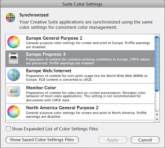
6.6 The Suite Color Settings window, with Europe Prepress 3 selected.

6.7 The Color Settings window in Photoshop, showing the settings for Europe Prepress 3.
See the problem? Most graphic designers do not even know about this, let alone dare to change it. As a friend of mine commented, “the CMS area is a classic example of putting the tools of genius into the hands of idiots: anyone can change a CMS, but very few people know how to do it.”
So, most of us send our work to the printer with the wrong profile in place. The printer is left with two poor choices: peel away the digital tag and try to fix it on the press, or just try to fix it on the press. Neither is the best way forward.
The key to putting the correct CMS profile in place is to talk to your printers. They should be able to tell you which CMS to choose for the best results in their shop, on their presses. If you change something without talking to them, you run the risk of having them assume that the default US web profile is part of your workflow, and adjust the ink flow accordingly. However, as this is not the case, they will probably waste a lot of paper.
If you know exactly what the dot gain is going to be, you can adjust the settings quite a lot further in Photoshop, and slightly further in Illustrator and InDesign. For instance, in all three programs, if you are printing on uncoated paper, open the Color Settings window, click on the drop-down list for CMYK, and choose Uncoated FOGRA39 (fig. 6.8). The top section of the window will tell you that your settings are now unsynchronized, but they are unsynchronized in a good way. You can also set the dot gain values for gray and spot colors here, which is especially useful if you have been able to use the dot-gain test strip discussed in Chapter 4.
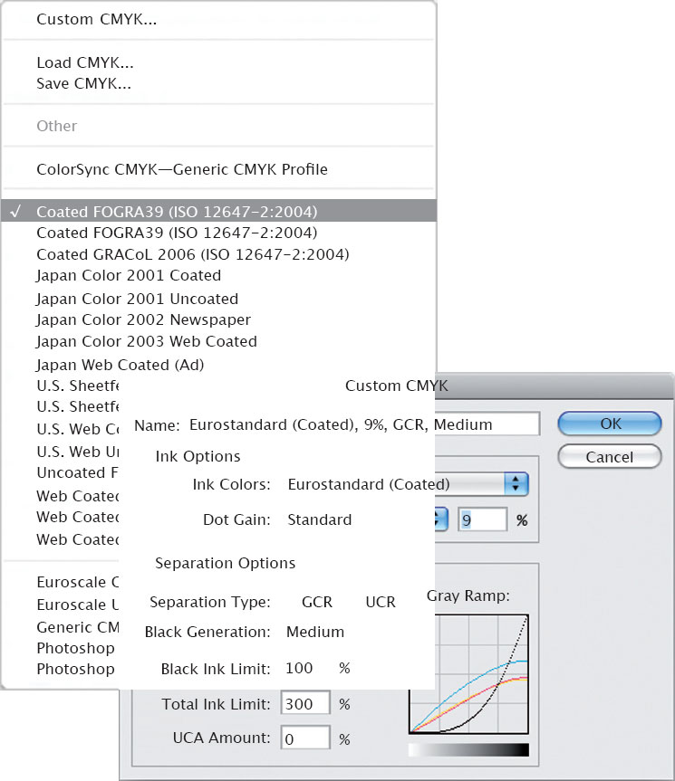
If you want to customize the settings in Photoshop even further, click on the CMYK drop-down list and choose Custom at the top. This opens the Custom CMYK window (fig. 6.9), where “SWOP (Coated)” will probably still appear at the top. To change it, click on the Ink Colors field and choose either Eurostandard (Coated) or Eurostandard (Uncoated), depending on the stock on which you will be printing. Here, the dot gain level can be set to a specific percentage rather than the 10% increments of the previous window. In the lower section, set the Separation Type to GCR, the Black Ink Limit to 100%, the Total Ink Limit to 300%, and the UCA Amount to 0%. Leave Black Generation set to medium.
Back in the Color Settings window, I usually leave the CMS policies to convert images to the working space in all three areas, but then check all the Ask boxes. This means that whenever you open an image to which another profile—or even no profile at all—has been attached, Photoshop will convert them to your chosen working profiles. By checking the three Profile boxes, you ensure that you get another chance to change your mind before any such conversion occurs, even when you are pasting areas between images with mismatched profiles.
6.8 The drop-down list showing CMYK alternatives in the Photoshop Color Settings window.
6.9 The Custom CMYK window.
If you cannot see the Conversion Options in the Color Settings window, click on More Options. Choose Adobe (ACE) as the engine, and either Relative Colormetric or Perceptual as the intent. The Adobe ACE engine is best for RGB to CMYK conversion, while the Intent compresses the RGB space into the target space while trying to retain the balance of the original. Adobe recommends using Relative Colormetric, whereas I usually use Perceptual. Have a look at the descriptions for both, and then choose whichever one you think best. They are both very good!
When you are happy that everything is correct for your current job, click on Save and give your custom settings a name and a description. The description will then appear in the box at the foot of the window whenever that setting is chosen.
You can also find your freshly saved setting, with its description, as a new CMS option in the Suite Color Settings window (“Edit > Creative Suite Color Settings”) in Adobe Bridge. By selecting it there, it is applied to the entire Adobe suite as well as being an option available when making a high-resolution PDF from InDesign. You can thus create and save all kinds of CMS profiles, which can be applied to any work you do in the future.
Even though I believe that using the above information will help to improve the quality of image output, if you have any serious doubts then do not feel that everything will turn to garbage if you simply leave things as they are. You do not have to panic: It is okay to go slowly. If you are reasonably happy with your printed results, then it is not really broken and therefore might not need fixing. Do not feel that you have to change any of your settings, yet. Talk to your printer, who may be able to help you decide; if not, you could also try a technical support call to Adobe. The chances are you will still feel unsure, because this is stuff you are unlikely to have heard much about, even if you have just completed a three-year graphics degree course. If you would like to try making some basic changes but also want to tread carefully, then, if you live in the UK, simply pick one of the European defaults for your CMYK setting and do not change anything else. Similarly, if you live in the US, pick a coated or uncoated option for either sheet-fed or web and leave it at that. The sky will not fall on your head, and you will soon have added to your experience to the point that you will probably feel confident about going a little further.