Good Image Formats
Here we take a look at the different kinds of images commonly available to a graphic designer with a view to figuring out which ones are okay to use and which ones are best to ignore. We will start with the good ones.
As far as offset printing is concerned, there are only three image formats that you should consider using in a page layout: TIFF files, various kinds of EPS files, and PSD files. And that is all. Forget JPEG (almost always, anyway—JPEG images can sometimes be used, but they fall into a “special case” category, hence the inclusion of “...and others!” in the chapter title). If you plan on using JPEGs, please read that section carefully as they are not generally a print-friendly format (unless you are using your desktop inkjet machine, or something similar). You should also forget GIF, PNG, and BMP. That is not to say that the image cannot be one of those formats at some point, but just that they are not the formats to send to print.
You can also use PDF files, but as they can contain entire layouts rather than being single images they are also a special case—again, see below.
TIFF (tagged image file format)
TIFF (shortened to “TIF” on a PC) files can be simple bitmaps (two-color images in which each pixel can be just one of the colors), grayscale images, RGB, or CMYK. The important thing about them is that each pixel is allowed to be anything it wants to be within the given range of the image and the applied color profile. As uncompressed images, they tend to be quite large; a full-bleed A4 CMYK TIFF at 300dpi can be anything between 30 and 40MB. In Photoshop there is a lossless (i.e. no loss of quality) compression option for TIFF files called LZW (Lemple-Zif-Welch). While it saves on disk space it can sometimes cause problems for the printer, so try to avoid using TIFF files in a page layout that have the compression option still attached. Open them and resave, turning the LZW button off during the process (fig. 7.1). I avoid this option in general because several times now I have saved something as TIFF using LZW, only to end up with a corrupted image that cannot be opened at all.
Although it is possible to save a multilayer image in TIFF format, I almost always save multilayered files in Photoshop format (PSD), and only “flattened” (i.e. single-layer) images as TIFF files. An exception to this is when I place text on top of an image in Photoshop. In that case, keeping editable text on its own layer preserves it as vector information. This means that when the result is placed into a page layout, the text will be able to print out at the maximum resolution of a PostScript printer rather than being held to the same resolution as the image. This is particularly useful when the text involved is small. However, if it is above 40pt I usually flatten the text layer into the background, as at that size the appearance will still be very good even though the text is now made up of pixels rather than vector information.
Otherwise, TIFF files are generally simple. They do not even need a PostScript printer to output them. The data just gets processed, one pixel at a time, until the whole thing is done. I cannot remember ever having a problem with a simple TIFF. Problems are always caused by something else.

7.1 The Tif Options window, showing the compression methods available.
EPS (encapsulated PostScript)
While EPS files can be useful, I do not agree with people who tell me that EPS is the preferred image format for everything. They have their uses, but they also have some disadvantages, especially for Quark users.
EPS files can be one of two basic kinds: vector or bitmap. Bitmapped EPS files are like TIFFs in that they are resolution-dependent, i.e. they have a fixed resolution based on the number of pixels there are to the inch. The amount of detail they can display is limited to the detail captured during their creation, whether it was by scanner, digital camera, or Photoshop. Increasing the resolution later merely spreads the original data over more pixels. This might smooth the pixelated edges somewhat, but it does not add any detail beyond what was there to begin with.
However, if you have drawn an object in Adobe Illustrator and saved it as an EPS file, or drawn the same thing in CorelDRAW and exported it as an Adobe Illustrator or EPS file, then it is a vector image and not a bitmap. This means it is not resolution-dependent and can instead be infinitely scaled to any size. Even if the image was drawn on a tiny section of the page, it can be enlarged to fit on the side of a bus—and it would look as sharp and clean as if you had zoomed in to view the original. Better still, both these formats support a transparent background, so you can import them into a page layout and place them on top of an existing background with no problem.
EPS files of this kind are also quite small—and it can be a bit of a shock to discover that the logo that you have created and that will soon be screenprinted, nine feet (three meters) tall, onto the side of a supermarket motortruck is only 18kb.
Other things you should know about EPS files
There are, as I mentioned, some disadvantages with EPS files.
Generally, a true EPS image can only be seen when it is printed. What you see in Quark or InDesign is actually the “preview,” or “image header.” This is a low(er)-resolution TIFF, created as the EPS file is being saved (fig. 7.2). This lies on top of the PostScript code so that you can at least see where the image has been placed, and roughly how it looks. I say “roughly,” because the maximum depth for an image header is usually 8-bit, so it can only show you 256 colors—much like a GIF. This means that what you have to look at while you are working has a quality level that is less than superb, especially in Quark, where it will look grainy and/or low-resolution. InDesign does rather better, and its display is just about indistinguishable from a TIFF. The true, high-quality image beneath it only appears when it is ripped (“raster image processed”—when the vector information of the EPS file is turned into halftone dots) with a PostScript printer.
Personally, I prefer to work with high-resolution images on screen no matter what program I am working in. It just helps the creative flow. If I am constantly having to deal with lower image quality on screen while I am trying to design something, things tend not to flow as well as they otherwise might.

7.2 The EPS Options window, which determines the preview image in a layout.
Vector images
Illustrator files can generally be copied and pasted straight into InDesign as editable vector objects. Indeed, as the Pen tool in InDesign is exactly the same as it is in Illustrator, the imported object does not appear in the Links window as InDesign considers it to be a “native” object. It can therefore be edited further on the InDesign page. More complex objects may need to be saved in “.ai” (Adobe Illustrator) format and placed in the same way as other images. In that case, additional editing in InDesign will not be possible.
There is no need to add clipping paths to files saved in .ai format. It is much easier simply to open them in Illustrator (or import them into CorelDRAW), remove any unwanted background, and resave them in the same format. Vector images saved in encapsulated PostScript (.EPS) format, however, might pose some problems. Even though you can import them into Illustrator or CorelDRAW, you cannot do anything with them in either program other than resize them on the page. In this case, there is no alternative but to open them in Photoshop in order to deal with unwanted background areas. Doing so immediately makes them resolution-dependent, which unfortunately negates their main advantage, i.e. infinite scalability. In fact, when you try to open an EPS image, Photoshop will immediately ask for the size and resolution at which you want it to be opened. When you enter your requirements and click OK, the EPS information gets rasterized into pixels at the resolution you have specified. If your vector image contains fine outlines that are made up of color tints, these will get rasterized into dots, too, which will probably make them look fuzzy.
Clipping paths
A clipping path is a vector outline drawn on an image that acts as a mask. When the image is placed into a page layout, only the parts of it enclosed by the outline can appear.
Clipping paths are usually created either in Photoshop or in the page-layout program being used for final document assembly. If a clipping path has too many nodes in it (i.e. points that anchor the path into a particular shape), the PostScript code involved can overload the printer to the point where it can no longer print. But for me the main disadvantage is that vector paths ignore pixels and cut right across them, creating an edge that is not anti-aliased and can therefore look as if it were cut out with scissors and pasted into place.
Anti-aliasing is a slight falling off of tone around the edge of an element that gives it a slightly soft edge and enables it to blend in visually with the rest of the image much more than would otherwise be possible. Photoshop typically applies it as a default when you copy and paste selections. It is also applied to items such as menu text on your computer screen, thus allowing it to have a smooth appearance despite being part of a comparatively low-resolution display.
The easiest place to create a clipping path is in Photoshop, as a selection made here can be transformed into a path. This can save a lot of time, as it is usually much faster to create a selection of the desired area than it is to draw a path around it. The path can then be saved as a clipping path.

7.3 The original image prior to the generation of the vector path.

7.4 For accurate selections on difficult backgrounds I usually use a combination of the Magic Wand and Freehand Lasso tools.
Fig. 7.3 shows a dancing figure against a fantasy background. To place the figure, without the background, on a page in InDesign you would perform the following operations.
Using a combination of the Magic Wand tool and the Freehand Lasso tool, create a selection shape around the figure (fig. 7.4). To turn the selection into a path, you now have two choices.
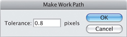
First, click on the Options button at the top right of the Paths window (fig. 7.5) in Photoshop and select Make Work Path. Doing this gives you the chance to enter a tolerance factor. The tightest tolerance available is 0.5 pixels; this will create a path that will be the closest possible to your original selection, but will probably contain hundreds of anchor points holding it into shape. An entry of 0.8 will make it much smoother, though still reasonably close to your selection shape. Progressively larger values smooth the resulting path ever further, right up to a value of 10, when it will be very loose indeed.
Second, if you click on the “Make work path from selection” button at the foot of the Paths window, Photoshop will remember the same tolerance factor chosen the last time a work path was created and apply that without giving you further options.
Either way, a work path is created in the Paths window (fig. 7.6), and the selection is converted into a vector path (fig. 7.7). This will be the basis of the clipping path.
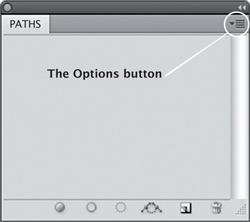
7.5 The Options button in the Paths window. The Make Work Path window, where you can set a Tolerance (an accuracy factor) for the path it then generates, based on your selection.
7.6 The new work path, in the Paths window.
7.7 The work path replaces the selection on the image.
 |
Each point at which the path suddenly changes direction involves a node that anchors it in place, so if you choose 0.5 as your tolerance factor you could be creating an object that is too complex to print. A setting of 0.8 or 1.0 smoothes things out without losing the overall shape of your selection, and this is usually a better choice. However, it is a good idea to zoom in and check it, in case you decide it needs further editing. |
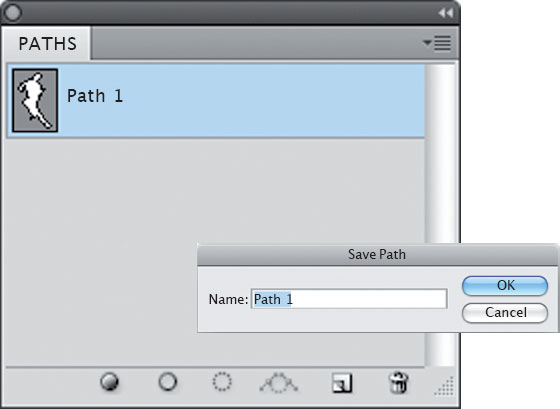
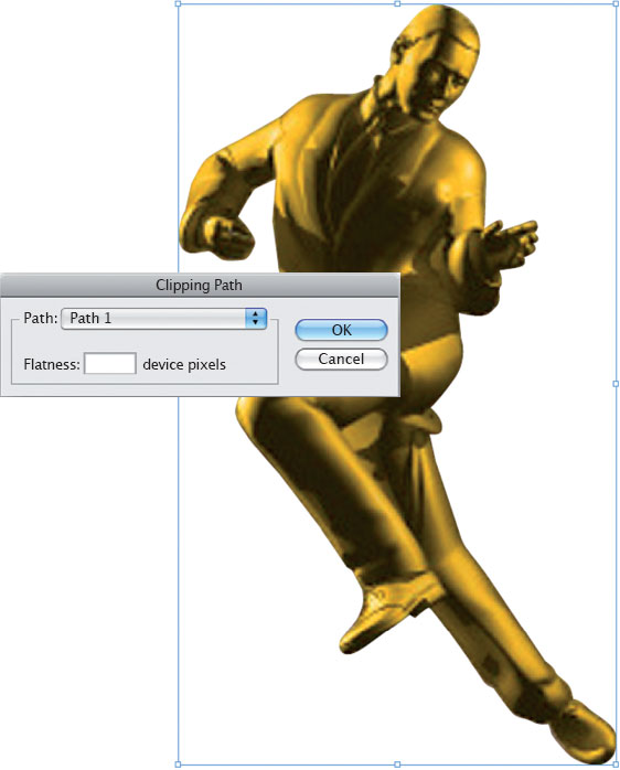
Click on the Options button again and choose Save Path (fig. 7.8). You will be offered the names of “Path 1,” “Path 2,” and so on, but you can call them whatever you want. Doing this changes the path name in the Paths window (fig. 7.9). Having saved the path, click on the Options button again and choose Clipping Path, which until now has been grayed-out. You will be asked to choose which path to apply the property to (fig. 7.10). If your image has several paths drawn on it, you can select from the list. Leave the “Flatness: device pixels” window blank, as then the entire image will print to the highest possible resolution of the target printer.
Save the image and place it into a page layout to see the result (fig. 7.11).
Clipping paths work in several file formats, including EPS, TIFF, and PSD (see below).
7.8 The work path should then be saved as a named path, to which “clipping” attributes can be applied.
7.9 The work path has now been saved as “Path 1.”
7.10 Select which path to apply the clipping property to.
7.11 The final result shown in an InDesign layout.
Duotones, DCS, and PDF files
There are three other kinds of EPS files that deserve a special mention: Duotones, which are two-color images, typically made up of black plus a Pantone color (Pantone colors are discussed in Chapter 10); DCS (desktop color separation) files; and PDF files.
Duotones
Duotones, alas, tend to be calibrated poorly or not at all, resulting in a muddy appearance in the mid-tones. This usually happens because both the color channels in the image have been left with the same spread of emphasis.
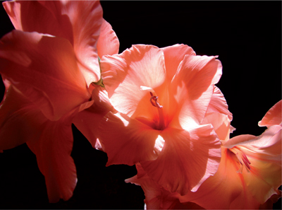
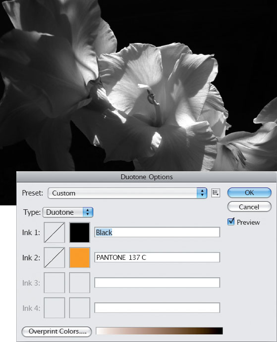
To convert an image into a duotone it must first be rendered as grayscale. In the example shown in fig. 7.12, I used Images > Adjustments > Black & White to make the conversion (fig. 7.13). Then I chose Images > Mode > Duotone.
In the Duotone Options window (fig. 7.14), click on the drop-down arrow next to the Type field and choose Duotone. You can also create one-, three-, and four-color images using a custom palette.
As the first color in a duotone is typically black, that color will already be chosen—although of course you can change this by clicking on the chip. To choose the second color, click in the white square directly below the black color chip. This opens the Color Libraries window (fig. 7.15), in which you can select the type of library by clicking on the drop-down list (fig. 7.16) in the top left corner. If, as is likely, you choose the Pantone Solid Coated library and you know which color you want, just type the appropriate number and it will be selected. Otherwise, you can choose from the list.
7.12 The original image, prior to duotone conversion.
7.13 The color image is first converted to grayscale.
7.14 The Duotone Options window, where you can create images containing between one and four colors, all of which can be other than CMYK.

7.15 The Color Libraries window, which includes the Pantone Solid Coated library and many more.
7.16 (Inset) The libraries list shows collections of non-CMYK colors used around the world, including the Pantone series, commonly used in the USA and

7.17 In a new duotone, the second color is usually too strong at first.
7.18 (Inset) The Duotone Curve window acts in a very similar way to the Curves window.

7.19 The end result is much more subtle.
It is extremely likely that the image will appear quite dark and heavy in the second color (fig. 7.17). However, if you “bend” the mid-tone region of the lighter color to make it somewhat brighter, this problem can be avoided. This is very much like making an adjustment using Curves. Click on the square with the diagonal line crossing it, directly to the left of your Pantone color chip, to open the Duotone Curve window (fig. 7.18). To lighten the second color, pull the curve into the shape shown. The image will update when you release the mouse button, and the result should be a much more subtle image (fig. 7.19). If needed, the black channel can also be adjusted using the same method.
Images in duotone format should be saved either as a Photoshop EPS or PSD file. The EPS format, in this case a two-channel image, requires that you choose a preview image type. For more details, see the EPS section, above. If it is saved in PSD format the preview is not needed.
Duotones containing spot (Pantone) colors that have been placed into a page layout are included as part of the composite when a PDF document is created. If you are in doubt as to whether the spot colors actually made it into the file, open it in Adobe Acrobat Pro. Choose Advanced > Print Production > Output Preview, where you should see any Pantone colors used listed beneath the process colors. Alternatively, place the resulting PDF file into a new Quark or InDesign document, which immediately adds the required Pantone colors to the color swatches.
If you want to use a duotone as part of a CMYK print run, do not leave it in its two-color EPS format or you will be adding the Pantone to the job as a fifth color—and therefore also adding a lot of additional expense. Instead, convert the duotone image into CMYK format, and save it as a TIFF.
DCS (desktop color separations)
Desktop color separations are another form of the EPS file format. There are two versions: DCS1 and DCS2.
DCS1 images are made up of five separate files: the four individual elements of the color separation plus a preview composite. I do not use DCS1 files at all. Instead, I convert any such files into TIFF (or occasionally EPS) format and use that instead.
DCS2 format supports spot channel colors in addition to the four-color separation and preview, and can be saved either in a multi-file format or as a single composite image.
If you have to add a spot (Pantone) color to a CMYK image, DCS2 used to be the only format that could do it. However, it is now also possible to use either a PSD or Photoshop PDF file instead, neither of which restricts the resulting view to a 256-color preview in the page layout. For more on the use of Pantone colors and the DCS2 format, see “Typical scenario 3” in Chapter 10.
PDF (portable document format)
Anything saved as a PDF file can be placed into InDesign or QuarkXPress. After all, a PDF file is an image captured in a PostScript format, and therefore very similar to EPS and DCS files. And, just like EPS and DCS files, there is usually nothing very useful that you can do to edit it once it has been created and saved. If the file from which it was generated contained mistakes, you usually get everything, warts and all, back from the printer—it is unlikely that they will check it very thoroughly. This means that a PDF file can end up containing RGB colors, seriously compressed images, no trapping, and sometimes the fonts will have been embedded and sometimes not.
A spot-color image can be saved as a Photoshop PDF file as well as in DCS2 or PSD formats. When placed into the page layout in InDesign, for example, the spot color itself will not usually be visible even though the relevant color is immediately added to the Swatches window. However, when the layout is itself exported as a PDF, the spot color can be seen as an overlaid addition by choosing Advanced > Print Production > Output Preview.
Better news is that PDF files, just like other EPS files, can contain both vector and bitmapped images. This makes them very versatile and useful, especially if you want to send your printer a high-resolution file that needs nothing else done to it prior to film or plate output. See Chapter 12 for more information about creating PDF files.
You can open a single-page PDF file, or one page of a multi-page PDF file, in Photoshop. However, if you do this, it is opened as an EPS file: also, the whole thing will be converted into a bitmap, including all the text and vector information. Multiple pages of a PDF document can be placed into an InDesign file where vector information will be retained, and it can even be re-exported as a second PDF.
PSD files
Typically, a PSD file is a multilayer format used to generate the appearance of the final image, whether it is for print or Web use. Layers are created, objects placed on them, and various operations performed to produce the desired composite image made up from all the visible layers. When ready, it can be saved in this multilayered format as a PSD (for archiving and possible future use) and also flattened into a single layer prior to saving as a TIFF, JPEG, or whatever.
It is also possible to place high-resolution CMYK PSD files into page layouts and turn layers on or off to produce the desired appearance. So, if one of the layers contains an image that has an elliptical feathered edge 20 pixels wide on an otherwise transparent background, it can be used as the placed image if the other layers are switched off. This is a huge step forward for the designer, as previously this kind of appearance required the building of a larger composite image, incorporating both the feathered layer and the background elements over which it was placed. Only then could the whole thing be imported into the page layout. Any additional adjustment of any of the elements would require deleting it from the page layout, reopening it in Photoshop, making the changes, saving it again, and reimporting it.
In the example, the background layer in the original image (fig. 7.20) was converted into a “normal” layer by double-clicking on it and then on OK, as doing this allows the generation of transparent areas. Then a rectangular selection was made (fig. 7.21). This was given a feathered edge in Photoshop, using the Refine Edge window (fig. 7.22).
7.20 The original file.

7.21 A rectangular selection is made.
In InDesign, PSD file layers can either be selected as the image is placed, or subsequently. To enable selection of layers when placed, the Show Import Options box should be checked in the window that opens after choosing File > Place. This opens the Image Import Options window, where layers can be turned on and off to generate the correct preview. If the file has already been placed, select it and then choose Object > Object Layer Options (fig. 7.23), which also allows you to switch layers on and off. The file can then be placed into a page layout (fig. 7.24).
For me, PSD files now come under the category of “best of the whole lot” in terms of printability. Not only can you work with the various layers in the page layout, you can also save duotones, clipping paths, and even spot-color channels in this format. In the case of duotones and spot channels, as soon as the image is placed into a page layout the relevant Pantone colors appear in the Swatches window. Clipping path images show exactly as they would as an EPS file, except that you will not be looking at a 256-color preview: a PSD file allows you to see the actual image.
|
When saving a duotone in PSD format it is still necessary to adjust the strength of the Pantone color or it is likely to be too strong. See the calibration notes in the Duotone section, above. |

7.22 The selection is given a feathered edge using the Refine Edge window.

7.23 The Object Layer Options window in InDesign, in which you can turn layers in a PSD file on and off to generate a specific appearance.
7.24 The final result, placed into an InDesign layout.