Color Opposites
Taking a quick look at how color photography works is a good way to gain a better understanding of the differences between RGB and CMYK.
If we take a picture, the colors coming in through the lens are made up of light, not pigment. So, the input information (light) is RGB format rather than CMYK. However, when using film, light hits the film and causes the chemical emulsions on its surface to react. Those chemicals result in colors that are much closer to the pigments used in CMYK than to those found in RGB. When the film is developed (print film, not slides), the end result is a color negative of the image that came in through the lens.
If we examine a film negative we will see that when we take a picture of something magenta, the resulting image on the film negative is green. If we photograph something orange, the resulting image is blue. If the tone was light, the resulting image on the film is dark. Every part of the image on the film is the opposite of what we actually photographed.
Then, to get a positive print, an exposure is made through the image onto photographic print paper. White light is projected through the film and becomes tinted by all the colors in the negative image. If it goes through a green area, the light that travels through to the photographic paper beneath it has picked up a green tint, which then develops to give us the opposite—a magenta area. And so on. The end result is usually a very convincing picture of whatever we were pointing the camera at when we took the shot.
So, even in a camera, the colors created by light and those created by pigments act as opposites. By using their understanding of this fundamental difference, photographers and printers have been able to develop some incredibly sophisticated methods to achieve the exact results they want.
The same kind of understanding can be used by a designer to obtain the desired results in print.
Early developers of the CMYK system had to work with the opposites of RGB because pigments of red, green, and blue are a hopelessly inadequate palette by themselves. It is impossible to mix them to create anything close to the range of colors required to print a photographic image. But their opposites work very well.
Cyan is as close as we can get, in pigment form, to the opposite of the red in RGB. Magenta is as close as we can get to the opposite of RGB green. Yellow is closest to the opposite of RGB blue. But none of them are exact opposites.
If you wanted to create white with CMYK, you would simply leave them all out. If you wanted to do the same thing using RGB, you would include them all at 100%. In that example, RGB and CMYK act as exact opposites of each other. But what happens when we try to create black?
It seems obvious, at least for the CMYK part of the equation: do not bother with the C, M, or Y, but use plenty of K.
The thing is, if the two systems were exact opposites, we would be able to get black using just C, M, and Y. But we cannot, and that is why black had to be added as a fourth color—because you simply cannot create it with C, M, and Y.
So, by their natures, the two systems are exact opposites when it comes to creating white, but they are not exact opposites when it comes to creating black. That is what I mean when I say they are “almost exact” opposites. To sum up:
Question: How do we get black using RGB?
Answer: We turn off all of the colors (in other words, we turn off the lights).
Question: How do we get black using C, M, and Y?
Answer: It is not possible. The combination of the three, even at full strength, is not dark enough to be convincing. That is why we have to include black.
Actually, it is debatable whether we can even get black with black. When I was at art college, a friend announced that his forthcoming masterpiece was to be a huge canvas painted black. The result, far from being a laughing matter, was quite a shock. The canvas was indeed painted black—but had first been divided into big squares, and each square then filled with a different “black” medium. Oil paint, water paint, poster paint, ink... all the usual “black” pigments were there—but also boot polish, stove paint, soot, and even a black plastic sheet.
Looking at the finished work, all the “blacks” appeared to have a particular color tint. The black plastic was obviously blue; the soot, in comparison, looked slightly red. And so on. This was a major revelation for me: color is relative, and you cannot see black when you still have the lights on. (Even with the lights off you would not really see black. Your eyes will not let you, only flickerings here and there.)
To take another example, try looking at something that is black. The only reason you can see it is because it is reflecting light into your eyes. That is the basis of your visual image. And if it is reflecting light, if you can see definition and shading, then you cannot be seeing something that is perfectly black—because true black could only appear in the total absence of light. It is an absence of reflection, definition, and shading. In other words, black is a very profound state of “lights off.”
When it comes to printing, you have to use something as close to true black as possible because, as previously mentioned, you cannot create anything really close to it with just cyan, magenta, and yellow. The pigment used is usually carbon, which makes black the cheapest of all the ink colors. And of course, while it is not really black, that is what we all call it. While its inclusion is essential, a typical four-color separation will contain less black than it will of the other three colors. Black tends to be found around clearly defined edges—it is what helps define them—and of course you will find it in the deep shadows. But there probably will not be very much of it anywhere else. On the other hand, cyan, magenta, and yellow will usually be present at higher densities throughout the entire tonal range of the image.
Aside from the need for it in images, black is obviously useful for other things as well—type, for example.
Now that we have some idea how the two systems compare, let us try to create yellow with both of them. Incidentally, in the formula shown in fig. 3.1, the “K” is in parentheses because it is only included to enable the CMYK range to extend to “black” and dark colors close to it. As yellow is the lightest color in the range, K will not be needed at all.
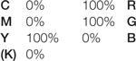
3.1 How to mix yellow using RGB and CMYK colors. This shows the opposing nature of the two color systems.
I mentioned earlier that (CMYK) cyan and (RGB) red are more or less opposites, as are (CMYK) magenta and (RGB) green, as are (CMYK) yellow and (RGB) blue.
Handily enough, the combination of (RGB) red and (RGB) green is also the opposite of (RGB) blue. Similarly, the combination of (CMYK) cyan and (CMYK) magenta is the opposite of (CMYK) yellow. So, in order to get yellow out of C, M, and Y, we turn on Y, but we also have to make sure that we turn off C and M. In RGB, the opposite system, we turn on R and G, and we also have to turn off B.
Try playing around with this in the Color Picker window in Photoshop. Click on the foreground color to open the window, and in the RGB area enter a value of 255 for R and G, and 0 for B. The result is yellow. Then try entering 255 for R and B and the result is magenta. And entering 255 for G and B gives you cyan. So the RGB system contains C, M, and Y as secondary combinations of its three primaries. Then try the same using the C, M, and Y of the CMYK area. A combination of 100% cyan and magenta will give you as close to RGB blue as you can get using pigments. It looks like a dark purple. If you enter 100% for magenta and yellow, you will get the pigment version of RGB red. It is red, but nowhere near as bright or saturated as RGB red. Last, try 100% of yellow and cyan. The result is the CMYK version of RGB green—a long way from RGB green, but again as close as CMYK can get. So the CMYK system also contains versions of the RGB colors as secondary combinations of its primaries, although they are fairly dull and drab when compared to the RGB versions. This means it is very tempting to use something bright, saturated, and RGB when we create colors on screen.
So, it is the differences between RGB and CMYK that are most important, because they are what cause the problems. The combination of 100% cyan and 100% magenta might look completely different and less interesting than pure RGB blue, which we are therefore tempted to pick instead, but it is as close as CMYK can get. Most designers do not really take that seriously enough, so they merrily send RGB colors off to the printer. The result, of course, is a total disaster.