A Practical Example of Grayscale Calibration
Open the image you want to calibrate in Adobe Photoshop (fig. 4.2 shows my example).
The first thing to do is to open the Levels window (Image > Adjustments > Levels) in order to make a basic adjustment to the tonal range so that it extends from black to white (see fig. 4.3).
The Input histogram, in the center of the window, shows the “pixel pile”—i.e. which shades of gray are present in the image, and the relative quantity of each one. Think of it as being made up of 256 vertical columns, one for each shade, beginning with black on the far left and ending with white on the far right, and that each column is filled proportionally according to the number of pixels there are of that particular color.
A gap at one or both ends indicates that the tonal range doesn’t extend right out to black or white, so the first thing to do for most images is to stretch the entire pixel pile out so that it does.
To reset the black point, drag the small arrow situated on the left-hand end of the histogram so that it just touches the pixel pile on the left-hand end. Histograms often end in small tails that indicate that there are just a few pixels of those shades present. Keeping them may be a good idea, or not. The only way to tell is to zoom in on some of the darkest or lightest areas and keep an eye on what happens when you move the arrow back and forth across the tail. If it doesn’t make much difference, it is probably okay to cut the tail off, just where the pile begins to pick up. Then do the same with the white point arrow to the right of the histogram, as shown in fig. 4.4. Cutting the tail off here means deleting subtle data in the highlights of the image. Sometimes you will want to keep these in place, but usually they are not very important.

4.2 In this example, the degree of contrast is quite flat and the tonal range stops short of either black or white. This picture clearly needs some help.
4.3 The Levels window shows a relative representation of the data in an image. In this case, it indicates that there is nothing present darker than roughly 87% gray, or lighter than 25%.
You will probably have noticed that I have made no mention, so far, of any adjustment involving the middle arrow. That is because, in almost every case, it should only be moved after the black and white points have been set. Then, if the mid-tones look too dark, move the arrow slightly to the left. This puts more of the pixel pile to its right, i.e. on the lighter side of the range. To darken the mid-tones, move it to the right. Rather than moving it in tiny increments, I usually give it a good heave one way or the other—thus overdoing the adjustment—then bring it slowly back toward the center. Doing this is far more likely to result in a better adjustment. The image now looks as shown in fig. 4.5.
Click OK and then reopen the Levels window. The pile will now extend right across the histogram area, but there will probably be vertical gray lines through it. These are shades that don’t exist in the image: we began this process with a finite number, and we still have a finite number, which have been redistributed, causing gaps. Fortunately, the gaps are evenly spaced throughout the pixel pile, so it is not a problem. Most grayscale images still appear convincing even when made from as few as 75 shades. For example, fig. 4.20 shows two apparently identical sections of the image. One of them shows the same number of shades as the original image, distributed evenly between 5% and 95%. Next to it is a copy in which the number of shades of gray has been restricted to 75—also distributed evenly between 5% and 95%. Can you tell which one is the restricted sample?
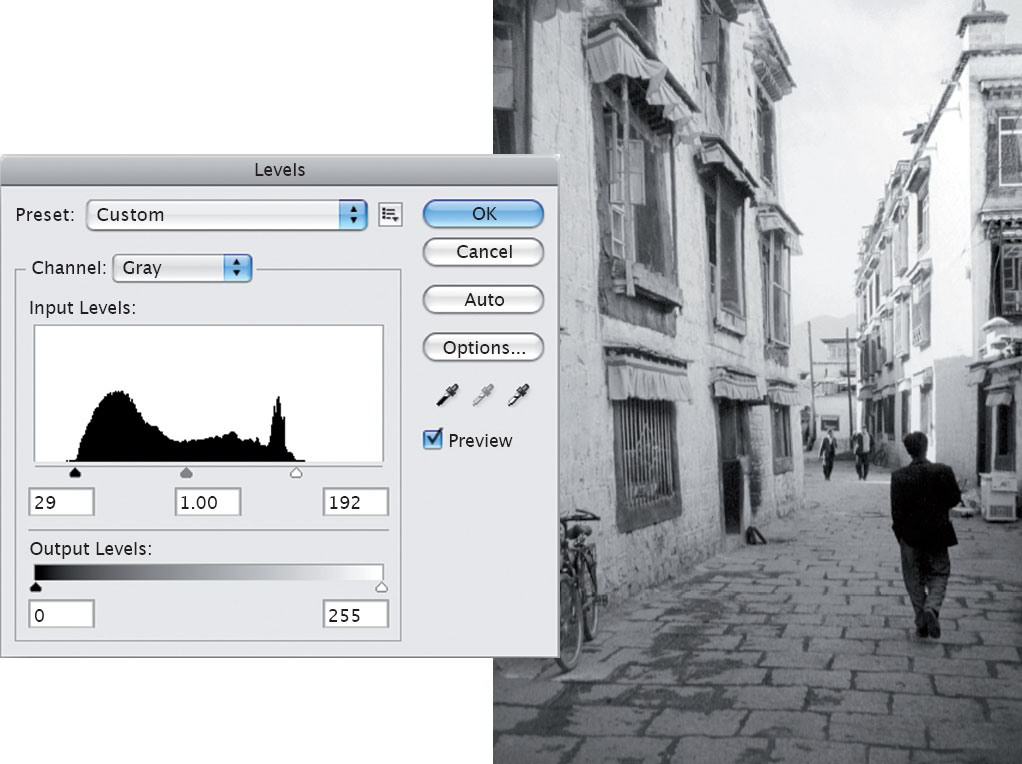
4.4 The Levels window showing how to reposition the black and white points.
4.5 This adjustment spreads the tone in the image from black to white.
Now close the Levels window again. As it is just about impossible to accurately identify the darkest and lightest parts of an image, we need to use Photoshop to help us do so. Before starting this process, open the Info window (fig. 4.6) and check to make sure that it is showing grayscale information (“K” values) in the top left quarter. If not, click on the Options button, select Palette Options, and set the first color readout to Actual Color. Then, open the Threshold window by choosing Image > Adjustments > Threshold (fig. 4.7). The image will immediately change, becoming black and white (fig. 4.8).
The same histogram shape appears, but with only one adjustment arrow. The mid-point position of the arrow (the threshold) indicates that all the areas in the image showing as black are to the left of the arrow and therefore darker than a 50% gray, whereas areas showing in white are to the right of the arrow and therefore lighter than 50%. The default position of the arrow when you open the Threshold window is at 128, which is the mid-point of a 256-shade grayscale image.
Move the arrow toward the left-hand end of the pixel pile (fig. 4.9). Gradually, the black areas in the image shrink (fig. 4.10). The farther you move the arrow, the fewer areas are left that are darker than the threshold level. When you are close to the left-hand end of the pixel pile, only the very darkest areas in the image are left showing.
Take a good look—so that you can remember where they are—and then click Cancel.
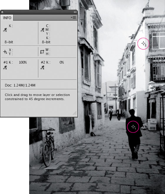
Choose the Color Sampler tool, which is the second tool down in the Eyedropper tool flyout (fig. 4.11). Clicking on the image with this tool places up to four markers. These appear in the Info window, telling you the exact percentage of gray of the pixel directly beneath each one. Better still, as you make adjustments to the image, they will give you live “before” and “after” information, showing you how the percentages are changing. The idea is to place one marker on the darkest pixel you can find, and another on the lightest, and then adjust the image until both are showing the percentages that you want.
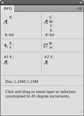
4.6 The Info window, showing “K” values in the top left quarter.
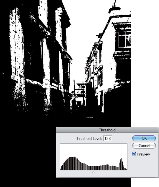
4.7 The Threshold window at its default position of 128.
4.8 The resulting change in the appearance of the image. Anything lighter than 50% gray shows as white, while darker values show as black.
Now you know roughly where to place your first marker, zoom in and move the cursor around in that area, and, as you do so, watch the numbers change in the “K” area of the Info window. Find the darkest pixel you can, and then click on it. You will see the area for marker 1 appear in the Info window, showing the exact shade of gray clicked on.
Incidentally, markers can be dragged to new positions, or deleted by holding down the Alt key and clicking on them. Once I have accurately positioned them, I usually leave them in place in case I need to calibrate the image for a different process in the future. They do not interfere with printing and can only be seen when the image is open in Photoshop.
Then repeat the process, but move the Threshold arrow to the right (fig. 4.12). This time, the last areas left visible indicate the lightest pixels in the image (fig. 4.13). As before, click Cancel and place a second marker on the lightest pixel you can find. Both markers should now be visible (fig. 4.14), and the Info window should now look something like fig. 4.15.
Now for the actual calibration. In order to create a 5% “gap” at either end of the scale, we need to pull the information in the image farther out toward solid black and white, to leave the darkest point set at 95% and the brightest at 5%.

4.9 The Threshold arrow is pulled to the left of the pixel pile.
4.10 Only the darkest areas of the image are still able to appear.

4.11 The Color Sampler tool.
If you had not made the initial Levels adjustment, the pixel pile might stop short of either end of the scale. In this case, the adjustment can be made simply by pulling the black and/or white arrows (situated just below the histogram, at either end) in toward the pixel pile.
However, if you have made the kind of adjustment described previously the information will extend out to both ends of the scale. Also, by having done so, you will have created slightly greater contrast between each pair of shades, and this should make it easier to find and click on the darkest/lightest pixels. In order to make the necessary adjustment, you should drag the arrows situated at either end of the Output Levels arrow (that is, the area under the histogram filled with a graduated gray tint) until the Info window tells you that the correct percentage of adjustment has been made at both ends of the scale. These arrows can be used to “squash” the entire histogram from one or both ends without cutting off any of the pixel information. Alternatively, you could make the adjustment using the numerical Output Levels boxes. The histogram represents 256 shades of gray; therefore, a 1% change equals 2.56 shades. A 5% change would be 12.8 shades, but as we can adjust only in whole numbers, the closest we can get is 13. Therefore you would change the 0 to 13 and the 255 to 242. In this example, the Info and Levels window now look as shown in figs 4.16 and 4.17.

4.12 The Threshold arrow is pulled to the right of the pixel pile.
4.13 Only the lightest areas of the image are still able to appear.
4.14 The image, showing both markers in place.
4.15 The Info window showing “before” and “after” marker information prior to any calibration adjustment.
If you click OK to accept these changes, the calibration of the image—at least as far as the highlights and shadows are concerned—is complete. The Levels window will now show a gap representing 5% at both ends of the histogram (fig. 4.18), and the image will print as shown in fig. 4.19.
And that is basically it.
The white gaps now showing between the vertical black lines in the Levels histogram are just that: shades that are not represented in your image. Unless these gaps are wide, it is very unlikely to be a problem, as we can get away with far fewer shades of gray than you might think, and still be convincing. For example, fig. 4.20 shows two apparently identical sections of the image. One of them shows the same number of shades as the original image, distributed evenly between 5% and 95%. Next to it is a copy in which the number of shades of gray has been restricted to 75—also distributed evenly between 5% and 95%. Can you tell which one is which?
Remember—each image is different and you should not make the same blind adjustment to everything. An image may, for example, include specular highlights such as reflections on a chrome bumper, or lights in a night scene. These should be completely white, and will not look right if you have filled them with a 5% highlight dot. Similarly, a photograph of a foggy scene is unlikely to contain very dense shadow tones. These will look much too dark if you pull them back out to a value of 95% black.

4.16 and 4.17 The Info window updates as changes are made to the black and white point arrows in the Output Levels field. In this example, the new shadow value is 95% and the new highlight value is 5%. 4.18 (Bottom) The new spread of tone values in the calibrated image. The vertical white gaps represent shades of gray that are no longer present.

4.19 The final image after calibration.
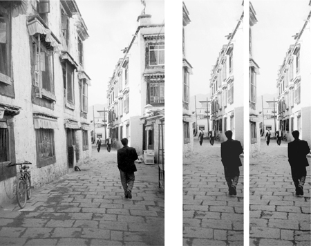
4.20 The one on the far right has 75 shades.

4.21 and 4.22 The result of an adjustment like this would be to burn out shades of gray at both ends of the spectrum.
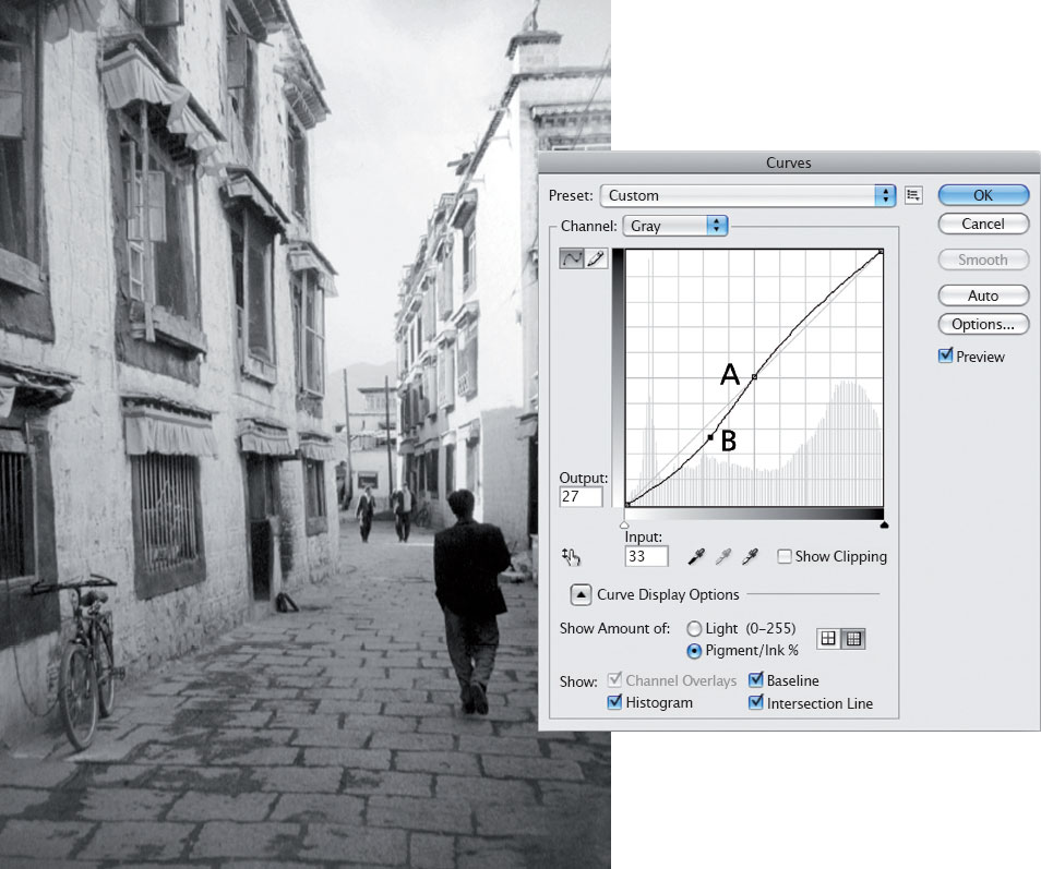
4.23 The Curves window can be used to increase contrast in an image without losing any of the original shades of gray.
4.24 Contrast added to the image using the Curves window.