Trapping into a Rich Black
9.15 Due to misregistration, the other colors present in the rich black can be seen around the edges of the white lettering.

9.16 The result when the cyan, magenta, and yellow all hold a “spread” image of the type, which has been expanded (hence “spread”) so that its shape is pushed away from the edges of the type shown in the black plate. This is known as a “hold-back” setting.
The greatest difficulty arising from the use of a rich black is in trapping with other elements. As an example, imagine a brochure that has a solid black cover with a line of white type running across it. If a rich black is used, there will be a registration problem around the edge of the white type. It will probably have a thin cyan line visible along one edge, and perhaps magenta visible along another, and a faint hint of yellow on yet another.
Fig. 9.15 shows a scenario that is very common. However, there are ways of getting around this situation. For users of Quark, Illustrator, and CorelDRAW, the solution is one that printers do not like and will try to dissuade you from using. Try not to be put off. I have used the following method more times than I can remember, and it has never yet failed. The idea is to send the printer two copies of the final file. From file 1, tell the printer to only run the black film (or plate if using CTP). The second version is an exact copy of the first with one exception: a white outline has been added to the type, thereby forcing all four colors away from it. Tell the printer to run only the cyan, magenta, and yellow films (or plates) from this file.
As long as the printer does not run the black film (or plate) on Monday and then wait until the following Friday to run the other three colors—which could mean that the images on the two sets will not match perfectly because of various environmental differences—then the chances of their not fitting are no more than when running all the separations from a single file. However, that is unlikely to prevent your printer from predicting dire consequences. It is quite likely that they will not have been asked to do this before, and one thing printers really dislike is a nasty surprise coming off the end of the press, especially if they might be held liable. Nevertheless, if you manage to persuade them to go ahead, the results will probably be one of the nicest things they ever printed. As a result, your standing with them will probably rise to such a point that you will get the red-carpet treatment from them from that time forth.
 |
You can still use a digital proof when using this method, because you can run it from the first of the two files. Even though it is not exactly the configuration that will run on the press, none of the color values will be any different. |
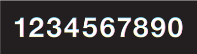
The method described above has been used to create fig. 9.16, which is a CMYK image using a rich black in which “1234567890” has had a white outline added in the magenta, cyan, and yellow components.
In Illustrator and CorelDRAW, this is quite easy to do. In Quark, it is rather more difficult because you cannot add white outlines to type until it has been converted into a graphic image. To do this, highlight the text with the Text Content tool, or select it with the Item tool, and then choose Item > Convert Text to Box > Convert Entire Box. Then use the Colors window to apply white as the outline color, and specify the outline width using Item > Frame. The second and third copies of the file are then sent to the printer, the second file being used to generate only the black and the third to generate the C, M, and Y.
Because the black is reasonably opaque, no one will notice that right around the edge of the type there is an area that is not quite as dense as the rest of the background. For one thing, it is a very thin area. For another, there is a high degree of visible contrast. The eye will be slightly dazzled by the brightness of the type against the dark background, and so it will not see the tiny “trap” area.
For users of InDesign, the news regarding rich black is very good. InDesign contains a trapping engine that allows the user to specify the width of a “hold-back” setting, or to simply use the default as is. This keeps the supporting screens of the other colors away from the edges of reversed or light elements, so that they retain their sharpness in the final print. In other words, it traps a rich black perfectly.