The Pantone Formula Guides

10.1 The Pantone Formula Guide books, on coated and uncoated stock.
Most designers who have sent their work to print shops have, at one time or another, run across Pantone colors. These are colors that printers can mix using the formula written under each sample in the swatch book (fig. 10.1).
While the formula is designed to give the same result every time, there are inevitably slight variations between one mix and another. Therefore, if you plan on using the same color repeatedly over time and want a high degree of consistency throughout, you may want to talk to the printer about mixing up a large batch and storing it for you for future use. You will save on mixing charges, and consistency will be improved, especially if you request that density readings are taken and matched to approved samples each time the color is run.
The Pantone range can be mixed from a range of several “standard” colors that come straight out of a can. These include not only the four process colors but also colors such as Pantone Green, Pantone Purple, Pantone Orange, Rubine Red, and Reflex Blue. Therefore, the range of colors it is possible to mix goes way beyond a range limited to combinations of just C, M, Y, and K.
Thus, when you are trying to match a Pantone color using CMYK inks, you are likely to run into the same problem as when starting with an RGB color: You cannot do it.
Pantone colors are, however, ideal for two-color work and duotones. As I mentioned before, if you do not have a swatch book yourself—and they are quite expensive—your local print shop probably will. As well as making them available for client use, they probably upgrade them from time to time, and if so they might be persuaded to sell (or give) you the old ones. Despite dire warnings from the manufacturers, it takes several years for the colors to fade even slightly, especially if you keep them in a dark drawer somewhere. Just to be sure, check any older books you are planning on using against a new one.
Most of the difficulties I have run into concerning the use of Pantone colors fall within one of the following three scenarios.
Typical scenario 1
Problem: The clients use a particular Pantone color for their logo. Now they want a four-color brochure/ad/newsletter, but they do not want to go to the additional expense of running a fifth color. So, the Pantone shade has to be converted to CMYK. Of course, when it does not convert accurately, it is your fault.
Solution: Educate your clients beforehand. Explain to them that the limitations of CMYK mean there is no easy way around this problem. Either they have to accept the change in color, or they have to pay for the additional Pantone print run. It is their choice.
Typical scenario 2
Problem: The clients understand the problems associated with converting a Pantone color to CMYK, and have decided to go for the fifth color on the print run. How can you give them an accurate proof that shows them their Pantone color?
Solution: Two choices.
First, you can run a reasonably pleasing digital proof or a Cromalin in which the Pantone color defaults to the closest CMYK equivalent, and then reassure the clients that on the actual print run the printer will use the actual Pantone shade. If the job is a sure thing, you could also ask the printer to mix the color for you (alternatively, if you want to be sure that the color is accurate, ask them to buy it, premixed) and do a dab test on a paper sample that can be shown to the clients for approval. You should only have to go through this once or twice before they trust you for all their future work.
The second choice is to use wet proofs. These are the most accurate kind of proof you can get as they are run on a real printing press using the same plates that your printer will use to run the job. They can even be printed on the same kind of paper you are going to print on, and they can use real Pantone ink mixes. However, you should bear in mind that wet proofs are also the most costly kind of proof available.
Typical scenario 3
Problem: The clients have decided to go for the fifth color on the print run. But, they want the Pantone area to overlap a CMYK image.
Solution: There are two subcategories for this one.
If the Pantone color is a solid, not a tint, things are fairly straightforward. There will not be a moiré problem because there are no additional screens involved, so the only thing to consider is the relative opacity of the inks and whether they should therefore be printed in a particular order.
Pantone colors are intended to be opaque rather than transparent, but they are not truly opaque. If you print them over the top of a CMYK image, those inks will still show through, though not as clearly as if the Pantone color had been printed underneath them.
If the Pantone ink needs to appear to be completely opaque across a CMYK image, then the shape of the Pantone image has to be knocked out of the other channels. But first,a fifth channel has to be added to the other four that can hold the Pantone information.
To create this, open the image in Photoshop (fig. 10.2). Then choose Window > Channels to open the Channels window. Click on the Options button at the top right of the window and select New Spot Channel (fig. 10.3). Do not worry about giving the new spot channel a name, as Photoshop will do that automatically when you pick the color you want. In the Ink Characteristics section, click on the colored square (where it says Color, as in fig. 10.4) to open the Color Picker window, then click on Color Libraries to open the window in which you can specify a Pantone color. You can simply type in the number if you do not want to scroll through the whole list. In this case I chose Pantone 199, a shade of red (fig. 10.5). When you have selected the color, click on OK to return to the Spot Channel window. The new channel appears, with the correct channel name (fig. 10.6).

10.2 The original image prior to the addition of a spot color.
10.3 Creating a new spot channel in the Channels window.
Incidentally, the Solidity percentage you can specify in the Spot Channel window is most useful when set to zero, as it will allow the rest of the CMYK image to show through. If you set it to 100%—i.e. completely opaque—you might believe that your Pantone color will completely obscure the image beneath it. Not so. It is a setting that only affects the visual appearance on screen.
You will notice that while you have a single channel active, the foreground and background colors revert to shades of gray; this is also the case with your new spot channel.
Now you can paint, or copy and paste, the image that you want to print as a Pantone color into the spot color channel. When you make the composite channel at the top of the channels “pile” active again, you will see the result. (Of course, what you will actually be looking at is an RGB representation of a CMYK image with an RGB representation of a Pantone color overlaying it!)

10.4 The New Spot Channel window in which a specific color, from a specific library, is chosen for the new channel.
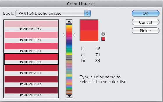
10.5 Type the color number on the keyboard and it is selected in the Color Libraries window.
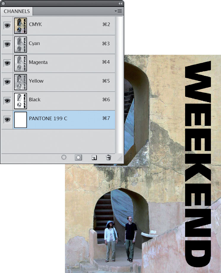
10.6 The new spot channel in the Channels window.
10.7 The type is added to the image, on a second layer.
First generate the image you want. In this example, I have used the word “Weekend” in bold type on a new layer (fig. 10.7); its shape can be selected by clicking on the thumbnail image in the type layer while holding down the Control or Apple key.
Then make the Pantone channel active by clicking on it (which makes the selection of the type apply to that channel); set black as the foreground color (Note: if you wanted to use a tint rather than a solid color you would choose that percentage of gray instead); and choose Alt + Backspace to fill that shape, on the Pantone channel, with solid color. In the channel, the shape of the type appears in solid black (fig. 10.8), but as that channel controls a Pantone color, it appears in the image as solid red 199 (fig. 10.9).
If you want to avoid having the CMYK areas print underneath the solid Pantone color, you will need to create a selection of the spot-channel image and knock it out of the other four channels in a way that allows the Pantone color to trap into the others. To do this, and while you still have the shape active as a selection, choose Select > Modify > Contract and enter a value of 1 pixel. Then choose the other channels one by one and delete the information within the selected area. This ensures a small trap between the CMYK and the Pantone colors (fig. 10.10).
If the Pantone color is a tint, not a solid, then further complications arise. This is because there are no more available screen angles for another color. As we have seen (see Chapter 2), there are not actually enough screen angles for the CMYK colors, and they only work together without producing a visible moiré pattern because of the unusual visual properties of yellow (you can see its color, but you cannot see its shape).

10.8 With the new spot channel selected in the Channels window, a selection of the type is filled with black.
10.9 Filling the text area with black means, on the spot channel, that it is filled with solid Pantone color.

10.10 After knocking out the image below the text, the Pantone color appears as both solid and opaque.
The solution here is again to generate a selection based on the spot channel (and again reduce that selection by 1 pixel to create a trap) and then knock it out of either the cyan, magenta, or black channels. Then you can tell the printer to run the Pantone tint at the same screen angle as the color you have knocked out. The reason you cannot do this in the yellow channel is, of course, because printing your Pantone color at the yellow screen angle will produce a visible moiré. Only colors like process yellow are able to produce moiré patterns that we cannot actually see.
Regardless of whether the Pantone color is a solid or a tint, you will need to save the result as either a DCS2 (desktop color separation 2) image, or a PSD file. In the first case, as DCS2 is actually an EPS format, you will be prompted to choose the image header type. For the best screen image, choose an 8-bits-per-pixel TIFF preview (which will be made up of 256 colors) and DCS with Color Composite (72 pixels/inch). PC users should save with the ASCII option, Mac users with Binary (fig. 10.11). However, if you choose to save the result as a PSD, you won’t need to do anything further.
Then, when you import the result into InDesign or Quark, you will see a color image that includes the Pantone channel, and the Pantone color (which will have automatically been added to the Swatches window) will be able to carry through to the PDF and generate a separate plate (or film) in addition to those required for the CMYK components.
 |
If you are sending files to your printer in PDF format, the whole file, including any DCS2 and PSD images in the layout, can be checked in Adobe Acrobat by clicking on Advanced > Print Production > Output Preview. In the top part of that window the four CMYK colors are listed, below which are additional Pantone colors (fig. 10.12). Each can be unchecked to remove that color from the preview, allowing you to check that, for example, the black type really is black rather than a combination of C, M, Y, and K. |
Incidentally, when asking a printer for a price on a job that uses one of the Pantone standard colors (the ones that come straight out of the can), remember to mention that there should not be any mixing charge added for the Pantone color. It always helps to let printers know that you know what you are talking about.

10.11 The DCS2 Format window in which the characteristics of the preview image are set.

10.12 The Output Preview window in Acrobat showing the four CMYK colors plus the Pantone.