 Time for action – aligning field editors with a grid
by Dr. Alex Blewitt
Eclipse Plug-in Development Beginner's Guide - Second Edition
Time for action – aligning field editors with a grid
by Dr. Alex Blewitt
Eclipse Plug-in Development Beginner's Guide - Second Edition
- Eclipse Plug-in Development Beginner's Guide Second Edition
- Table of Contents
- Eclipse Plug-in Development Beginner's Guide Second Edition
- Credits
- Foreword
- About the Author
- Acknowledgments
- About the Reviewers
- www.PacktPub.com
- Preface
- 1. Creating Your First Plug-in
- Getting started
- Time for action – setting up the Eclipse environment
- Time for action – creating a plug-in
- Time for action – launching Eclipse from within Eclipse
- Debugging a plug-in
- Time for action – debugging a plug-in
- Time for action – updating code in the debugger
- Time for action – setting up step filtering
- Time for action – breaking at method entry and exit
- Time for action – setting a conditional breakpoint
- Time for action – catching exceptions
- Time for action – inspecting and watching variables
- Summary
- 2. Creating Views with SWT
- Creating views and widgets
- Time for action – creating a view
- Time for action – drawing a custom view
- Time for action – drawing a seconds hand
- Time for action – animating the second hand
- Time for action – running on the UI thread
- Time for action – creating a reusable widget
- Time for action – using layouts
- Managing resources
- Time for action – getting colorful
- Time for action – finding the leak
- Time for action – plugging the leak
- Interacting with the user
- Time for action – getting in focus
- Time for action – responding to input
- Using other SWT widgets
- Time for action – adding items to the tray
- Time for action – responding to the user
- Time for action – modal and other effects
- Time for action – groups and tab folders
- Summary
- 3. Creating JFace Viewers
- Why JFace?
- Creating TreeViewers
- Time for action – creating a tree viewer
- Time for action – using Images in JFace
- Time for action – styling label providers
- Sorting and filtering
- Time for action – sorting items in a viewer
- Time for action – filtering items in a viewer
- Interaction
- Time for action – adding a double-click listener
- Tabular data
- Time for action – viewing time zones in tables
- Selection
- Time for action – propagating selection
- Time for action – responding to selection changes
- Summary
- 4. Interacting with the User
- Creating menus, commands, and handlers
- Time for action – installing the E4 tools
- Time for action – creating commands and handlers
- Time for action – binding commands to keys
- Time for action – changing contexts
- Time for action – enabling and disabling menus items
- Time for action – contributing commands to pop-up menus
- Jobs and progress
- Time for action – running operations in the background
- Time for action – reporting progress
- Time for action – dealing with cancellation
- Time for action – using subtasks and sub-progress monitors
- Time for action – using null progress monitors and sub monitors
- Time for action – setting job properties
- Reporting errors
- Time for action – showing errors
- Summary
- 5. Working with Preferences
- Eclipse Preferences
- Time for action – persisting a value
- Time for action – injecting preferences
- Time for action – injecting individual preferences
- Time for action – responding to preference changes
- Preference pages
- Time for action – creating a preference page
- Time for action – creating warning and error messages
- Time for action: choosing from a list
- Time for action – aligning field editors with a grid
- Time for action – placing the preferences page
- Time for action: using other field editors
- Time for action – searching for preferences
- Summary
- 6. Working with Resources
- Using the workspace and resources
- Time for action – creating an editor
- Time for action – writing the markup parser
- Time for action – building the builder
- Time for action – iterating through resources
- Time for action – creating resources
- Time for action – implementing incremental builds
- Time for action: handling deletion
- Using natures
- Time for action – creating a nature
- Using markers
- Time for action – error markers if file is empty
- Time for action – registering a marker type
- Summary
- 7. Creating Eclipse 4 Applications
- Time for action – installing E4 tooling
- Time for action – creating an E4 application
- Time for action – creating a part
- Using services and contexts
- Time for action – adding logging
- Time for action – getting the window
- Time for action – obtaining the selection
- Time for action – dealing with events
- Time for action – calculating values on demand
- Time for action – interacting with the UI
- Using commands, handlers, and menu items
- Time for action – wiring a menu to a command with a handler
- Time for action: passing command parameters
- Time for action – creating a direct menu and keybindings
- Time for action – creating a pop-up menu and a view menu
- Creating custom injectable classes
- Time for action – creating a simple service
- Time for action – injecting subtypes
- Summary
- 8. Migrating to Eclipse 4.x
- Why Eclipse 4.x?
- Time for action – creating a migration component
- Time for action – updating to e4view
- Time for action – upgrading the actions
- Time for action – creating toolbars
- Time for action – adding the view menu
- Time for action – adding the pop-up
- Migrating to Eclipse 4.x patterns
- Time for action – creating a model fragment
- Time for action – migrating the commands and handlers
- Time for action – creating the view menu
- Time for action – defining the pop-up view in the fragment
- Summary
- 9. Styling Eclipse 4 Applications
- Styling Eclipse with CSS
- Time for action – styling the UI with CSS
- Time for action – using custom CSS classes
- Using the Eclipse spies
- Time for action – using the CSS Spy
- Time for action – integrating the spy into a product
- Styling a custom widget
- Time for action – adding the clock
- Time for action – using a CSS property
- Time for action – going to the dark side
- Time for action – adding themes
- Time for action – switching between themes
- Summary
- 10. Creating Features, Update Sites, Applications, and Products
- Grouping plug-ins with features
- Time for action – creating a feature
- Time for action – exporting a feature
- Time for action – installing a feature
- Time for action – categorizing the update site
- Time for action – depending on other features
- Time for action – branding features
- Building applications and products
- Time for action – creating a headless application
- Time for action – creating a product
- Target platforms
- Time for action – creating a target definition
- Time for action – switching to a specific version
- Summary
- 11. Automated Testing of Plug-ins
- Using JUnit for automated testing
- Time for action – adding dependencies to the target platform
- Time for action – writing a simple JUnit 4 test case
- Time for action – writing a plug-in test
- Using SWTBot for user interface testing
- Time for action – writing an SWTBot test
- Time for action – working with menus
- Working with SWTBot
- Time for action – hiding the welcome screen
- Time for action – avoiding SWTBot runtime errors
- Working with views
- Time for action: showing views
- Time for action – interrogating views
- Interacting with the UI
- Time for action – getting values from the UI
- Time for action – waiting for a condition
- Summary
- 12. Automated Builds with Tycho
- Using Maven to build Eclipse plug-ins with Tycho
- Time for action – installing Maven
- Time for action – building with Tycho
- Building features and update sites with Tycho
- Time for action – creating a parent project
- Time for action – building a feature
- Time for action – building an update site
- Time for action – building a product
- Time for action – using the target platform
- Testing and releasing
- Time for action – running automated tests
- Time for action – changing the version numbers
- Signing update sites
- Time for action – creating a self-signed certificate
- Time for action – signing the plug-ins
- Time for action – serving an update site
- Summary
- 13. Contributing to Eclipse
- Open source contributions
- Time for action – installing the sources
- Time for action – debugging the platform
- Time for action – modifying the platform
- Time for action – checking out from EGit and Git
- Time for action – configuring the SWT project
- Contributing to Eclipse
- Time for action – creating an account at Eclipse
- Time for action – creating a bug
- Time for action – setting up a Gerrit profile
- Time for action – committing and pushing a patch
- Summary
- A. Using OSGi Services to Dynamically Wire Applications
- B. Pop Quiz Answers
- Chapter 1 – Creating Your First Plug-in
- Chapter 2 – Creating Views with SWT
- Chapter 3 – Creating JFace Viewers
- Chapter 4 – Interacting with the User
- Chapter 5 – Storing Preferences and Settings
- Chapter 6 – Working with Resources
- Chapter 7 – Creating Eclipse 4 Applications
- Chapter 8 – Migrating to Eclipse 4.x
- Chapter 9 – Styling Eclipse 4 Applications
- Chapter 10 – Creating Features, Update Sites, Applications, and Products
- Chapter 11 – Automated Testing of Plug-ins
- Chapter 12 – Automated Builds with Tycho
- Index
The preference values weren't lined up as might be expected. This is because the default preference field editor uses a FLAT style of rendering, which simply lays out the fields similar to a vertical RowLayout.
- Change it to be a more natural look by specifying a
GRIDstyle of rendering:public ClockPreferencePage() { super(GRID); } - Now, when the preference page is displayed, it will look more natural:
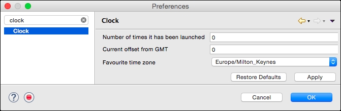
The default FLAT style does not render well. It was added in 2007 before the popularity of the grid layout increased and typically needs to be overridden to provide a decent user interface experience. Switching to GRID does this, by working out the label length and field lengths and setting up the split accordingly. Furthermore, the view is resizable, with the fields taking up additional stretch space.
If the layout needs further customization or the widget set needs to be extended, then it is possible to create a plain subclass of PreferencePage and create the contents by overriding the createContents method, applying any changes in the performOk or performApply methods.
-
No Comment