Since the first recipe of the chapter, we've been working with vector data; of course, GeoServer is also there to serve raster data. Moreover, while you may think that raster data doesn't need a style, this is only true for a small set of them. Most people think of raster data as aerial imagery, where the surface of the Earth is represented with true colors. In fact, this paradigm has been greatly enforced by the huge popularity web mapping applications have gained in the last decade.
However, there is a great variety of different raster data containing data about any parameter a sensor can measure, from elevation to temperature to satellite radar scenes and so on. Visualization of all this data makes more sense when you classify them and choose a set of colors. You will apply this technique to elevation data in this recipe.
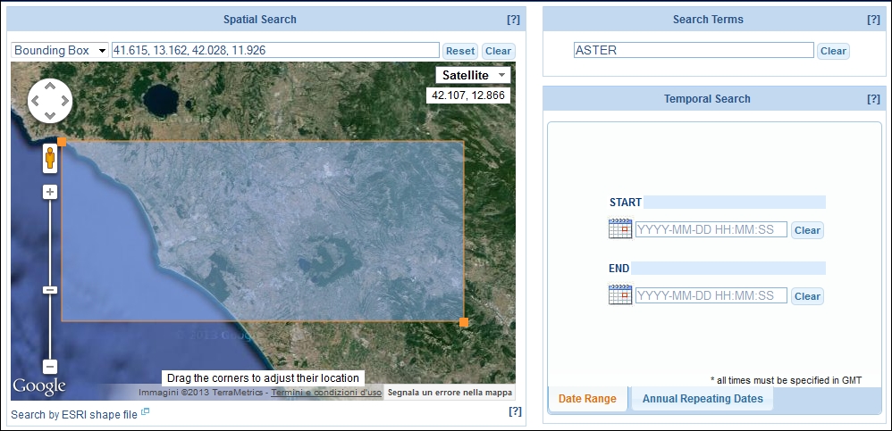
For this recipe, we need a Digital Elevation Model (DEM). As usual, we will use freely available open source data. Go to https://lpdaac.usgs.gov/products/aster_products_table/astgtm, the main page for an archive of high resolution DEMs provided by United States Geological Survey (USGS). Here, you will find a lot of data. For this recipe, you will need just a small portion of the data, which is provided to you with the code bundle of this book. At http://reverb.echo.nasa.gov/reverb, you will find an interactive map where the area was selected and downloaded. After signing in, you can search for data in other areas and experiment yourself with GeoServer, as shown in the following screenshot:
- Open the CSS Style section in the GeoServer web interface. Then, select the link Choose a different layer. From the list of layers, select the DEM file you loaded previously.
- Select the link Create a new style. In the form, select the NaturalEarth workspace and insert
Demas the style name. - Replace the code in the textbox with the following snippet:
* { raster-channels: auto; raster-color-map: color-map-entry(#2E9A58, 9) color-map-entry(#AAFF7F, 180) color-map-entry(#FDFF7F, 350) color-map-entry(#FFAA00, 500) color-map-entry(#F47221, 600) color-map-entry(#C83737, 1100) color-map-entry(#D7F4F4, 1300) } - Press the Submit button and switch to the map preview. Your map should look like the following screenshot:
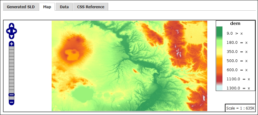
The CSS code in this recipe is fairly simple. In the first line, you find the * selector as the classification that will apply to all the data. To display raster data, the key property raster-channels is used. The following lines select the band we want to be represented. The value auto lets GeoServer select the appropriate band.
In this case, we're working with a raster with just one band, so GeoServer has an easy job of finding the proper one to represent. In scientific datasets, some rasters may contain tens of bands, so you need to manually select which ones you want to represent in the map. This is shown in the following lines of code:
* {
       raster-channels: auto;
Then, you use the color-map element to create a color ramp to render the data. To build it, you enter several color-map-entry elements—each one with two values. The first one is the color, defined as a hexadecimal value or by well-known color names, and the second element represents the value of your data to which the color applies. GeoServer automatically creates a continuous ramp among two different entries in the ramp. The code is as follows:
       raster-color-map:
               color-map-entry(#2E9A58, 9)
               color-map-entry(#AAFF7F, 180)
               color-map-entry(#FDFF7F, 350)
               color-map-entry(#FFAA00, 500)
               color-map-entry(#F47221, 600)
               color-map-entry(#C83737, 1100)
               color-map-entry(#D7F4F4, 1300)
     }
Tip
There are several resources that will help you select nice color ramps. One popular resource is http://colorbrewer2.org/, which was created by Cynthia Brewer of Penn State University. You may use it with the example data or also upload your data. Then, select the number of classes you need and the color ramp.
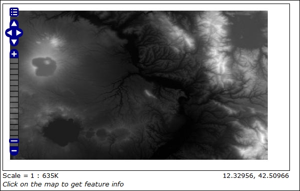
There is also a third optional value that you can set. It's the transparency value, which is by default equal to 1, that is, totally opaque. The result, shown in the previous screenshot, is quite nice. Compare it with the default representation of the data when you don't set any style, as shown in the following screenshot: