Creating Views
Creating views for your lists and libraries is a critical activity that allows you to present the right information to your users in a format and grouping that is meaningful to their purpose. Views are very flexible tools that allow you to explicitly define the selection, sorting, and presentation of items.
Selecting the view type
Each view creates a new page by which the list data is viewed. There are four view types that you can choose from and each is detailed below. Once you have selected a view type for your view, you cannot change the view type setting for that view although you can put a standard view or Gantt view into datasheet mode for quick editing.
Standard view: The standard view is a web page list view that displays the columns selected in the sort order and groupings as defined for the view.
Calendar view: The calendar view type displays list items in a day, week, or month calendar view.
Datasheet view: The datasheet view type creates a view in an Excel-like grid for bulk editing of data. Users must be using Office 2003 or later to take advantage of the datasheet editing features like the ability to drag and fill a value down a column. Standard and Gantt view types can be put in datasheet mode once created but only the datasheet view type will open in that mode.
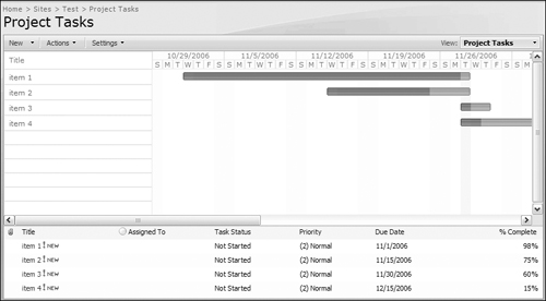
Gantt view: The Gantt style view is intended to display list items over time. When you define a Gantt view, you need to specify a title (e.g. task name), and the start date and due date columns so that the view can be created using those parameters. The issue list, project task list, and task list have those columns already defined so they are excellent candidates to support a Gantt view but this view style can also be applied to any custom list columns that you can designate as title, start date, and due date columns. The Gantt view of a list is shown in Figure 4.11.
If you choose to create a view based on an existing view instead of picking a view type, the view type of the view you are copying will be used.
Configuring view settings
After you have selected the view type, you configure the view settings to select the item set that you want and to present that item set in a view that is sorted and styled to meet the goals of the view.
Public or Private View: You can create a public view that is visible to all users of the list or a private view that will only show up as an option in your view choices. This selection can only be made at the time of the view creation and cannot be modified after the view has been created.
Audience: If you configure the view to be a public view, you can select whether or not you would like the view to be the default view for the list. If the view is the default view, users will open this view of the list if they select the list without navigating directly to a fully qualified view name.
Visible Columns: The selected columns in the visible columns section will be displayed in the view. You can also modify the position each visible column will have counting from the left side. If you are using a column for a criterion to filter by or group by, you can optimize page utilization by not selecting them as a visible column.
The visible column selection presents several versions of the primary column (name for a document type and title or first text field for a list) so that you can select the columns that will link to the document or item and edit the document and item. The columns that note (linked to document) or (icon linked to document) will allow users to click on them to open the document or item. The columns that note (linked to document with edit menu) will present the edit menu when the users clicks on the document. And finally, the edit column (linked to edit item) will open the document properties or item in edit mode.
Sort Order: The sort section allows you to choose which columns dictate which items are presented first. If you choose more than one column to sort on, the second column will sort items that have the same first sort column value.
Filter Options: The filter section allows you to enter the criteria so that only items that match your filter criteria are displayed in a view. This allows you to create views for subsets of items that are particular to an audience or purpose.
You can use more than one filter criteria (up to ten) to select the exact subset of list items that you want. For example, you may want to select all items that have the category column equal to bug and the assigned to column equal to the current user.
The filter fields accept two variables. The first is [Me] to filter a field by the current user and the second is [Today] to filter by the current date. You can use the [Today] variable in an equation so that it returns everything created in the past week by setting the filter to show items when the “created” column is greater than [Today]-7 as shown in Figure 4.12.
If you have more than one filter criteria, you must select whether the filters are “AND” so that they are cumulative so that items have to meet all filters or “OR” so that items have to meet only one of the filter criterion. You can mix “AND” and “OR” criteria so that the filter will pull all items that match the AND filters and pull all items that map the OR filter. For example, you can create a view that shows all issues that are assigned to me and are due in the past two weeks OR items that are high priority. In that case, the filter will return items that are high priority that are not assigned to me or due in the past two weeks.
Issue lists have a default filter set for the column “Current” equal to “YES” so that only the most recent version of an issue will appear.
Group By: The group by view allows you to define the columns by which your items will be grouped. If you select a sub-group, the items will be nested under the primary group according to sub-group as shown in Figure 4.13. Multi-choice columns are not available to be used for grouping.
The group by field allows you to configure whether grouping will be showed as expanded and collapsed. This setting applies to all groupings so if you select that groupings will be collapsed, the group, and sub-groups will be collapsed.
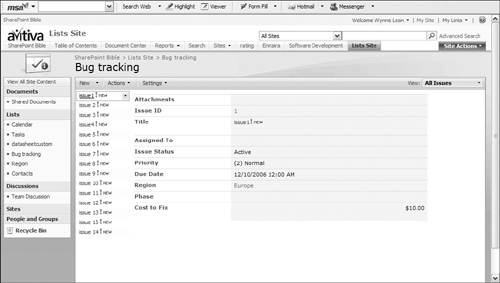
Totals: You can configure totals for any of your visible columns. If the column is a text-based column (text, choice, or person/group), you can configure the total as a count of that column as shown in the count of issue ID in Figure 4.13. If you have a number based column (either number or currency), you can perform statistical operations on that column, as shown in Figure 4.14. Date columns allow you to show counts, average (in datasheet view only), maximum or minimum totals.
Style: The style setting allows you to pick a style that will delineate the items. The style choices are:
Basic Table: Each item in a separate row in a table with a dividing border.
Newsletter: This style presents the content in a multi-line format similar to a news article with a separator line between each item as shown in Figure 4.15.
Newsletter, no lines: The newsletter no lines style presents the content in a multi-line format similar to a news article with no separator line between each item.
Shaded: The shaded view shows items in a single line and shades every other row.
Boxed (lists only): The boxed style shows items in two columns with a box surrounding each item.
Boxed, no labels (lists only): The boxed style, no labels shows items in two columns with a box surrounding each item but does not include the column labels for the items.
Document Details (document libraries only): The document details style is a two column view that shows each document item (including folders) in a box as shown.
Preview Pane: The preview pane style creates a two column view in which all the task item titles are listed in the left-hand column and the titles are linked to the item. In the right column or preview pane, the columns for the view are listed and when you hover over an item in the left column, the values for that item are displayed in the right pane as shown in Figure 4.16.
Default: The default style shows each item on its own line with all the columns selected for the view displayed from left to right.
Folders: Select whether or not you would like to show items inside folders in the “Folder or Flat:” field. This allows you to select whether you want the view to retain your folder structure and only show the qualified items when a users clicks into a folder or whether you want to use the view to show all items regardless of the folder they are stored in.
Item Limit: Specify how many items will be displayed in the “Number of items to display” field. Additionally, specify if the items will be displayed in batches of that specified size or limited to the number of items you have specified so that the view only returns the specified number of documents sorted according to the view and no more.
Mobile: Specify if you would like to make the view available for mobile view and whether it is the default mobile view or not. This section also provides the Web addresses for both this mobile view and the currently configured default mobile view.


Selecting and modifying views
Views are presented in a drop-down list in the right-hand corner of the list. From this view selector, you can select both public and private views, modify the current view and create a new view.