There are more interesting ways to visualize Twitter data than we could possibly cover in this short chapter, but that won’t stop us from working through a couple of exercises with some of the more obvious approaches that provide a good foundation. In particular, we’ll look at loading tweet entities into tag clouds and visualizing “connections” among users with graphs.
Tag clouds are among the most obvious choices for visualizing the extracted entities from tweets. There are a number of interesting tag cloud widgets that you can find on the Web to do all of the hard work, and they all take the same input—essentially, a frequency distribution like the ones we’ve been computing throughout this chapter. But why visualize data with an ordinary tag cloud when you could use a highly customizable Flash-based rotating tag cloud? There just so happens to be a quite popular open source rotating tag cloud called WP-Cumulus that puts on a nice show. All that’s needed to put it to work is to produce the simple input format that it expects and feed that input format to a template containing the standard HTML boilerplate.
Example 5-17 is a trivial adaptation of Example 5-4 that illustrates a routine emitting a simple JSON structure (a list of [term, URL, frequency] tuples) that can be fed into an HTML template for WP-Cumulus. We’ll pass in empty strings for the URL portion of those tuples, but you could use your imagination and hyperlink to a simple web service that displays a list of tweets containing the entities. (Recall that Example 5-7 provides just about everything you’d need to wire this up by using couchdb-lucene to perform a full-text search on tweets stored in CouchDB.) Another option might be to write a web service and link to a URL that provides any tweet containing the specified entity.
Example 5-17. Generating the data for an interactive tag cloud using WP-Cumulus (the_tweet__tweet_tagcloud_code.py)
# -*- coding: utf-8 -*-

import os
import sys
import webbrowser
import json
from cgi import escape
from math import log
import couchdb
from couchdb.design import ViewDefinition

DB = sys.argv[1]
MIN_FREQUENCY = int(sys.argv[2])

HTML_TEMPLATE = '../web_code/wp_cumulus/tagcloud_template.html'
MIN_FONT_SIZE = 3
MAX_FONT_SIZE = 20

server = couchdb.Server('http://localhost:5984')
db = server[DB]

# Map entities in tweets to the docs that they appear in


def entityCountMapper(doc):
    if not doc.get('entities'):
        import twitter_text

        def getEntities(tweet):

            # Now extract various entities from it and build up a familiar structure

            extractor = twitter_text.Extractor(tweet['text'])

            # Note that the production Twitter API contains a few additional fields in
            # the entities hash that would require additional API calls to resolve

            entities = {}
            entities['user_mentions'] = []
            for um in extractor.extract_mentioned_screen_names_with_indices():
                entities['user_mentions'].append(um)

            entities['hashtags'] = []
            for ht in extractor.extract_hashtags_with_indices():

                # massage field name to match production twitter api

                ht['text'] = ht['hashtag']
                del ht['hashtag']
                entities['hashtags'].append(ht)

            entities['urls'] = []
            for url in extractor.extract_urls_with_indices():
                entities['urls'].append(url)

            return entities

        doc['entities'] = getEntities(doc)

    if doc['entities'].get('user_mentions'):
        for user_mention in doc['entities']['user_mentions']:
            yield ('@' + user_mention['screen_name'].lower(), [doc['_id'], doc['id']])
    if doc['entities'].get('hashtags'):
        for hashtag in doc['entities']['hashtags']:
            yield ('#' + hashtag['text'], [doc['_id'], doc['id']])


def summingReducer(keys, values, rereduce):
    if rereduce:
        return sum(values)
    else:
        return len(values)


view = ViewDefinition('index', 'entity_count_by_doc', entityCountMapper,
                      reduce_fun=summingReducer, language='python')
view.sync(db)

entities_freqs = [(row.key, row.value) for row in
                  db.view('index/entity_count_by_doc', group=True)]

# Create output for the WP-Cumulus tag cloud and sort terms by freq along the way

raw_output = sorted([[escape(term), '', freq] for (term, freq) in entities_freqs
                    if freq > MIN_FREQUENCY], key=lambda x: x[2])

# Implementation adapted from
# http://help.com/post/383276-anyone-knows-the-formula-for-font-s

min_freq = raw_output[0][2]
max_freq = raw_output[-1][2]


def weightTermByFreq(f):
    return (f - min_freq) * (MAX_FONT_SIZE - MIN_FONT_SIZE) / (max_freq
            - min_freq) + MIN_FONT_SIZE


weighted_output = [[i[0], i[1], weightTermByFreq(i[2])] for i in raw_output]

# Substitute the JSON data structure into the template

html_page = open(HTML_TEMPLATE).read() %
                 (json.dumps(weighted_output),)

if not os.path.isdir('out'):
    os.mkdir('out')

f = open(os.path.join('out', os.path.basename(HTML_TEMPLATE)), 'w')
f.write(html_page)
f.close()

print 'Tagcloud stored in: %s' % f.name

# Open up the web page in your browser

webbrowser.open("file://" + os.path.join(os.getcwd(), 'out',
        os.path.basename(HTML_TEMPLATE)))
The most notable portion of the listing is the incorporation of the following formula that weights the tags in the cloud:
This formula weights term frequencies such that they are linearly
squashed between MIN_FONT_SIZE and
MAX_FONT_SIZE by taking into account the frequency for the
term in question along with the maximum and minimum frequency values for
the data. There are many variations that could be applied to this
formula, and the incorporation of logarithms isn’t all that uncommon.
Kevin Hoffman’s paper, “In
Search of the Perfect Tag Cloud”, provides a nice overview of
various design decisions involved in crafting tag clouds and is a useful
starting point if you’re interested in taking a deeper dive into tag
cloud design.
The tagcloud_template.html file that’s
referenced in Example 5-17 is
fairly uninteresting and is available
with this book’s source code on GitHub; it is nothing more than
a simple adaptation from the stock example that comes with the tag
cloud’s source code. Some script tags in the head of the page take care
of all of the heavy lifting, and all you have to do is feed some data
into a makeshift template, which simply uses string substitution to
replace the %s placeholder.
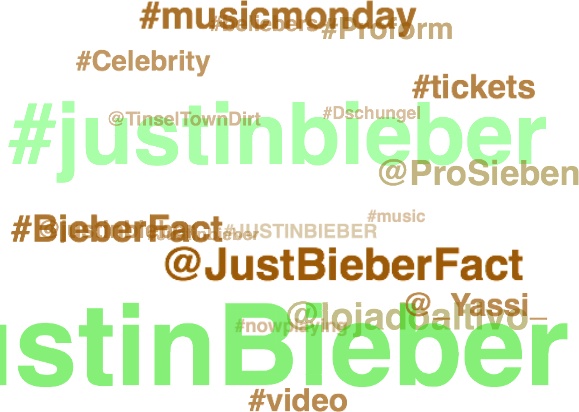
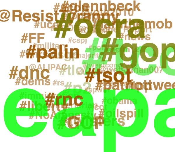
Figures 5-6 and 5-7 display tag clouds for tweet entities with a frequency greater than 30 that co-occur with #JustinBieber and #TeaParty. The most obvious difference between them is how crowded the #TeaParty tag cloud is compared to the #JustinBieber cloud. The gisting of other topics associated with the query terms is also readily apparent. We already knew this from Figure 5-5, but a tag cloud conveys a similar gist and provides useful interactive capabilities to boot. Of course, there’s also nothing stopping you from creating interactive Ajax Charts with tools such as Google Chart Tools.
We briefly compared #JustinBieber and #TeaParty queries earlier in this chapter, and this section takes that analysis a step further by introducing a couple of visualizations from a slightly different angle. Let’s take a stab at visualizing the community structures of #TeaParty and #JustinBieber Twitterers by taking the search results we’ve previously collected, computing friendships among the tweet authors and other entities (such as @mentions and #hashtags) appearing in those tweets, and visualizing those connections. In addition to yielding extra insights into our example, these techniques also provide useful starting points for other situations in which you have an interesting juxtaposition in mind. The code listing for this workflow won’t be shown here because it’s easily created by recycling code you’ve already seen earlier in this chapter and in previous chapters. The high-level steps involved include:
Computing the set of screen names for the unique tweet authors and user mentions associated with the
search-teapartyandsearch-justinbieberCouchDB databasesHarvesting the friend IDs for the screen names with Twitter’s
/friends/idsresourceResolving screen names for the friend IDs with Twitter’s
/users/lookupresource (recall that there’s not a direct way to look up screen names for friends; ID values must be collected and then resolved)Constructing a
networkx.Graphby walking over the friendships and creating an edge between two nodes where a friendship exists in either directionAnalyzing and visualizing the graphs
The result of the script
is a pickled graph file that you can open up in the interpreter and poke
around at, as illustrated in the interpreter session in Example 5-18. Because the script is essentially just bits and
pieces of recycled logic from earlier examples, it’s not included here
in the text, but is available
online. The analysis is generated from running the script on
approximately 3,000 tweets for each of the #JustinBieber and #TeaParty
searches. The output from calls to nx.degree, which returns
the degree[36] of each node in the graph, is omitted and rendered
visually as a simple column chart in Figure 5-8.
Example 5-18. Using the interpreter to perform ad-hoc graph analysis
>>>import networkx as nx>>>teaparty = nx.read_gpickle("out/search-teaparty.gpickle")>>>justinbieber = nx.read_gpickle("out/search-justinbieber.gpickle")>>>teaparty.number_of_nodes(), teaparty.number_of_edges()(2262, 129812) >>>nx.density(teaparty)0.050763513558431887 >>>sorted(nx.degree(teaparty)... output omitted ... >>>justinbieber.number_of_nodes(), justinbieber.number_of_edges()(1130, 1911) >>>nx.density(justinbieber)>>>0.0029958378077553165>>>sorted(nx.degree(teaparty))... output omitted ...
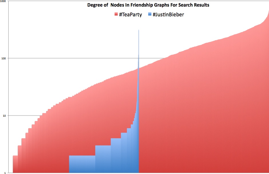
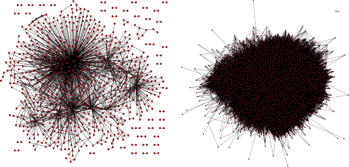
Without any visual representation at all, the results from the interpreter session are very telling. In fact, it’s critical to be able to reason about these kinds of numbers without seeing a visualization because, more often than not, you simply won’t be able to easily visualize complex graphs without a large time investment. The short story is that the density and the ratio of nodes to edges (users to friendships among them) in the #TeaParty graph vastly outstrip those for the #JustinBieber graph. However, that observation in and of itself may not be the most surprising thing. The surprising thing is the incredibly high connectedness of the nodes in the #TeaParty graph. Granted, #TeaParty is clearly an intense political movement with a relatively small following, whereas #JustinBieber is a much less concentrated entertainment topic with international appeal. Still, the overall distribution and shape of the curve for the #TeaParty results provide an intuitive and tangible view of just how well connected the #TeaParty folks really are. A 2D visual representation of the graph doesn’t provide too much additional information, but the suspense is probably killing you by now, so without further ado—Figure 5-9.
Recall that *nix users can write out a Graphviz output with
nx.drawing.write_dot, but Windows users may need to
manually generate the DOT language output. See Examples 1-12 and
2-4. For large undirected graphs, you’ll
find Graphviz’s SFDP (scalable
force directed placement) engine invaluable. Sample usage for
how you might invoke it from a command line to produce a useful layout
for a dense graph follows:
$sfdp -Tpng -Oteaparty -Nfixedsize=true -Nlabel='' -Nstyle=filled -Nfillcolor=red -Nheight=0.1 -Nwidth=0.1 -Nshape=circle -Gratio=fill -Goutputorder=edgesfirst -Gratio=fill -Gsize='10!' -Goverlap=prism teaparty.dot