This section lays down some templates and introduces some good starting points for analyzing and visualizing Facebook data. If you’ve been following along, you now have the basic tools you need to get at anything the platform can provide. The types of exercises we’ll explore in this section include:
Visualizing all the mutual friendships in your social network
Visualizing the mutual friendships within specific groups and for arbitrary criteria, such as gender
Building a simple data-driven game that challenges you to identify friends based on where they live now and their hometowns
The list of possibilities goes on and on, and with the necessary boilerplate intact, you’ll have no trouble customizing the scripts we’ll write to solve a variety of other problems.
This section works through the process of fetching friendship information from your Facebook account and visualizing it in interesting and useful ways, with an angle toward using the JavaScript InfoVis Toolkit (JIT). The JIT offers some great example templates that can easily be customized to whip up an interactive visualization.
An RGraph[58] is a network visualization that organizes the display by laying out nodes in concentric circles, starting from the center. RGraphs are available in many visualization toolkits, including the JIT. It’s worth taking a moment to explore the JIT’s RGraph examples to familiarize yourself with the vast possibilities it offers.
Note
Protovis’ Node-Link tree, that was introduced in Hierarchical and k-Means Clustering, is essentially the same core visualization, but the JIT is also worth having on hand and provides more interactive out-of-the-box examples that you might find easier to pick up and run with. Having options is not a bad thing.
As you well know by this point in the book, most of the effort
involved in connecting the dots between fetching raw Facebook data and
visualizing it is the munging that’s necessary to get it into a format
that’s consumable by the visualization. One of the data formats
accepted by the RGraph and other JIT graph visualizations is a
predictable JSON structure that consists of a list of objects, each of
which represents a node and its adjacencies. Example 9-12 conveys the general concept
so that you have an idea of our end goal. This structure shows that
“Matthew” is connected to three other nodes identified by ID values as
defined by adjacencies. The data field
provides additional information about “Matthew” and, in this case,
conveys a human-readable label about his three connections along with
what appears to be a normalized popularity score.
Example 9-12. Sample input that can be consumed by the JIT’s RGraph visualization
[
   {
        "adjacencies": [
            "2",
            "3",
            "4",
            ...
        ],
        "data": {
            "connections": "Mark<br>Luke<br>John",
            "normalized_popularity": 0.0079575596817,
            "sex" : "male"
        },
        "id": "1",
        "name": "Matthew"
    },
    ...
    ]
Let’s compute the mutual friendships that exist within your network of friends and visualize this data as an RGraph. In other words, we’ll be computing all the friendships that exist within your friend network, which should give us a good idea of who is popular in your network as well as who isn’t so very well connected. There’s potential value in knowing both of these things. At an abstract level, we just need to run a few FQL queries to gather the data: one to calculate the IDs of your friends, another to connect your friends in the graph, and a final query to grab any pertinent details we’d like to lace into the graph, such as names, birthdays, etc. The following queries convey the idea:
- Get friend IDs
q = "select target_id from connection where source_id = me() and target_type = 'user'" my_friends = [str(t['target_id']) for t in fql.query(q)]- Calculate mutual friendships
q = "select uid1, uid2 from friend where uid1 in (%s) and uid2 in (%s)" % (",".join(my_friends), ",".join(my_friends),) mutual_friendships = fql(q)- Grab additional details to decorate the graph
q = "select uid, first_name, last_name, sex from user where uid in (%s)" %
        (",".join(my_friends),)
names = dict([(unicode(u["uid"]), u["first_name"] + " " +
              u["last_name"][0] + ".") for u in fql(q)])
That’s the gist, but there is one not-so-well-documented detail that you may discover: if you pass even a modest number of ID values into the second step when computing the mutual friendships, you’ll find that you get back arbitrarily truncated results. This isn’t completely unwarranted, given that you are asking the Facebook platform to execute what’s logically an O(n2) operation on your behalf (a nested loop that compares all your friends to one another), but the fact that you get back any data at all instead of receiving an error message kindly suggesting that you pass in less data might catch you off guard.
Warning
Just like everything else in the world, the Facebook platform isn’t perfect. Give credit where credit is due, and file bug reports as needed.
Fortunately, there’s a fix for this situation: just batch in the data through several queries and aggregate it all. In code, that might look something like this:
mutual_friendships = []
N = 50
for i in range(len(my_friends)/N +1):
    q = "select uid1, uid2 from friend where uid1 in (%s) and uid2 in (%s)" %
        (",".join(my_friends), ",".join(my_friends[i*N:(i+1)*N]),)
    mutual_friendships += fql(query=q)
Beyond that potential snag, the rest of the logic involved in producing the expected output for the RGraph visualization is pretty straightforward and follows the pattern just discussed. Example 9-13 demonstrates a working example that puts it all together and produces additional JavaScript output that can be used for other analysis.
Example 9-13. Harvesting and munging friends data for the JIT’s RGraph visualization (facebook__get_friends_rgraph.py)
# -*- coding: utf-8 -*-

import os
import sys
import json
import webbrowser
import shutil
from facebook__fql_query import FQL
from facebook__login import login

HTML_TEMPLATE = '../web_code/jit/rgraph/rgraph.html'
OUT = os.path.basename(HTML_TEMPLATE)

try:
    ACCESS_TOKEN = open('out/facebook.access_token').read()
except IOError, e:
    try:

        # If you pass in the access token from the Facebook app as a command line
        # parameter, be sure to wrap it in single quotes so that the shell
        # doesn't interpret any characters in it. You may also need to escape
        # the # character

        ACCESS_TOKEN = sys.argv[1]
    except IndexError, e:
        print >> sys.stderr,
            "Could not either find access token in 'facebook.access_token' or parse args."
        ACCESS_TOKEN = login()

fql = FQL(ACCESS_TOKEN)

# get friend ids

q =
    'select target_id from connection where source_id = me() and target_type ='user''
my_friends = [str(t['target_id']) for t in fql.query(q)]

# now get friendships among your friends. note that this api appears to return
# arbitrarily truncated results if you pass in more than a couple hundred friends
# into each part of the query, so we perform (num friends)/N queries and aggregate
# the results to try and get complete results
# Warning: this can result in a several API calls and a lot of data returned that
# you'll have to process

mutual_friendships = []
N = 50
for i in range(len(my_friends) / N + 1):
    q = 'select uid1, uid2 from friend where uid1 in (%s) and uid2 in (%s)'
        % (','.join(my_friends), ','.join(my_friends[i * N:(i + 1) * N]))
    mutual_friendships += fql.query(q)

# get details about your friends, such as first and last name, and create an accessible map
# note that not every id will necessarily information so be prepared to handle those cases
# later

q = 'select uid, first_name, last_name, sex from user where uid in (%s)'
    % (','.join(my_friends), )
results = fql.query(q)
names = dict([(unicode(u['uid']), u['first_name'] + ' ' + u['last_name'][0] + '.'
             ) for u in results])

sexes = dict([(unicode(u['uid']), u['sex']) for u in results])

# consolidate a map of connection info about your friends.

friendships = {}
for f in mutual_friendships:
    (uid1, uid2) = (unicode(f['uid1']), unicode(f['uid2']))
    try:
        name1 = names[uid1]
    except KeyError, e:
        name1 = 'Unknown'
    try:
        name2 = names[uid2]
    except KeyError, e:
        name2 = 'Unknown'

    if friendships.has_key(uid1):
        if uid2 not in friendships[uid1]['friends']:
            friendships[uid1]['friends'].append(uid2)
    else:
        friendships[uid1] = {'name': name1, 'sex': sexes.get(uid1, ''),
                             'friends': [uid2]}

    if friendships.has_key(uid2):
        if uid1 not in friendships[uid2]['friends']:
            friendships[uid2]['friends'].append(uid1)
    else:
        friendships[uid2] = {'name': name2, 'sex': sexes.get(uid2, ''),
                             'friends': [uid1]}

# Emit JIT output for consumption by the visualization

jit_output = []
for fid in friendships:
    friendship = friendships[fid]
    adjacencies = friendship['friends']

    connections = '<br>'.join([names.get(a, 'Unknown') for a in adjacencies])
    normalized_popularity = 1.0 * len(adjacencies) / len(friendships)
    sex = friendship['sex']
    jit_output.append({
        'id': fid,
        'name': friendship['name'],
        'data': {'connections': connections, 'normalized_popularity'
                 : normalized_popularity, 'sex': sex},
        'adjacencies': adjacencies,
        })

# Wrap the output in variable declaration and store into
# a file named facebook.rgraph.js for consumption by rgraph.html

if not os.path.isdir('out'):
    os.mkdir('out')

# HTML_TEMPLATE references some dependencies that we need to
# copy into out/

shutil.rmtree('out/jit', ignore_errors=True)

shutil.copytree('../web_code/jit',
                'out/jit')

html = open(HTML_TEMPLATE).read() % (json.dumps(jit_output),)
f = open(os.path.join(os.getcwd(), 'out', 'jit', 'rgraph', OUT), 'w')
f.write(html)
f.close()

print >> sys.stderr, 'Data file written to: %s' % f.name

# Write out another file that's standard JSON for additional analysis
# and potential use later (by facebook_sunburst.py, for example)

json_f = open(os.path.join('out', 'facebook.friends.json'), 'w')
json_f.write(json.dumps(jit_output, indent=4))
json_f.close()

print 'Data file written to: %s' % json_f.name

# Open up the web page in your browser

webbrowser.open('file://' + f.name)
Warning
If you have a very large friends network, you may need to filter the friends you visualize by a meaningful criterion that makes the results more manageable. See Example 9-16 for an example of filtering by group by interactively prompting the user for input.
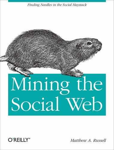
If all goes according to plan, you’ll have an interactive visualization of your entire social network on hand. Figure 9-5 illustrates what this might look like for a very large social network. The next section introduces some techniques for paring down the output to something more manageable.
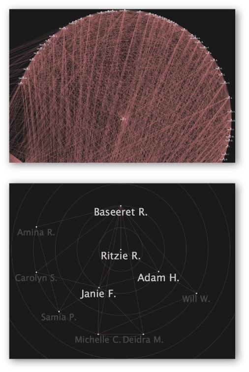
Figure 9-5. A sample RGraph computed with Facebook data for a fairly large network of 500+ people, per Example 9-13 (top), and a much smaller RGraph of mutual friends who are members of a particular group, as computed by Example 9-16 later in this chapter (bottom)
A Sunburst visualization is a space-filling visualization for rendering hierarchical structures such as trees. It gets its name from its resemblance to sunburst images, such as the one on the flag of the Imperial Japanese Army, as shown in Figure 9-6. The JIT’s Sunburst implementation is as powerful as it is beautiful. Like the RGraph, it consumes a simple graph-like JSON structure and exposes handy event handlers. But while a Sunburst visualization consumes essentially the same data structure as an RGraph, its layout yields additional insight almost immediately. You can easily see the relative degrees of intermediate nodes in the tree based upon how much area is taken up by each layer in the Sunburst. For example, it’s not difficult to adapt the JIT’s example implementation to render a useful interactive visualization of even a quite large social network, along with what relative share of the population fits a given criterion, such as gender. In fact, that’s exactly what is depicted in Figure 9-6. It shows that about two-thirds of the members of this social network are female, with each of those members appearing adjacent to that portion of the sector.
Example 9-14 demonstrates how to take
the sample output from Example 9-13
and transform it such that it can be consumed by a JIT Sunburst that
segments your social network by gender. Note that the
$angularWidth parameter is a relative measure of the
angle used by each level of the tree, and is used by the script to
scale the sector. The
area that each friend consumes is scaled according to their popularity
and provides an intuitive visual indicator. Friends who have privacy
settings in place to prevent API access to gender information will
have gender values of an empty string and are simply ignored.[59] The interactive version of the visualization also
displays a tool tip that shows a person’s mutual friends whenever you
hover over a slice, as shown in Figure 9-6, so that
you can narrow in on people and get more specific.
Example 9-14. Harvesting and munging data for the JIT’s Sunburst visualization (facebook__sunburst.py)
# -*- coding: utf-8 -*-

import os
import sys
import json
import webbrowser
import shutil
from copy import deepcopy

HTML_TEMPLATE = '../web_code/jit/sunburst/sunburst.html'
OUT = os.path.basename(HTML_TEMPLATE)

# Reuses out/facebook.friends.json written out by
# facebook__get_friends_rgraph.py
DATA = sys.argv[1]
data = json.loads(open(DATA).read())

# Define colors to be used in the visualization
# for aesthetics

colors = ['#FF0000', '#00FF00', '#0000FF']

# The primary output to collect input

jit_output = {
    'id': 'friends',
    'name': 'friends',
    'data': {'$type': 'none'},
    'children': [],
    }

# A convenience template

template = {
    'id': 'friends',
    'name': 'friends',
    'data': {'connections': '', '$angularWidth': 1, '$color': ''},
    'children': [],
    }

i = 0
for g in ['male', 'female']:

    # Create a gender object

    go = deepcopy(template)
    go['id'] += '/' + g
    go['name'] += '/' + g
    go['data']['$color'] = colors[i]

    # Find friends by each gender

    friends_by_gender = [f for f in data if f['data']['sex'] == g]
    for f in friends_by_gender:

        # Load friends into the gender object

        fo = deepcopy(template)
        fo['id'] = f['id']
        fo['name'] = f['name']
        fo['data']['$color'] = colors[i % 3]
        fo['data']['$angularWidth'] = len(f['adjacencies'])  # Rank by global popularity
        fo['data']['connections'] = f['data']['connections']  # For the tooltip

        go['children'].append(fo)

    jit_output['children'].append(go)
    i += 1

# Emit the output expected by the JIT Sunburst

if not os.path.isdir('out'):
    os.mkdir('out')

# HTML_TEMPLATE references some dependencies that we need to
# copy into out/

shutil.rmtree('out/jit', ignore_errors=True)

shutil.copytree('../web_code/jit',
                'out/jit')


html = open(HTML_TEMPLATE).read() % (json.dumps(jit_output),)
f = open(os.path.join(os.getcwd(), 'out', 'jit', 'sunburst', OUT), 'w')
f.write(html)
f.close()

print 'Data file written to: %s' % f.name

# Open up the web page in your browser

webbrowser.open('file://' + f.name)
Although the sample implementation only groups friends by gender and popularity, you could produce a consumable JSON object that’s representative of a tree with multiple levels, where each level corresponds to a different criterion. For example, you could visualize first by gender, and then by relationship status to get an intuitive feel for how those two variables correlate in your social network.
Although you might be envisioning yourself creating lots of sexy visualizations with great visual appeal in the browser, it’a far more likely that you’ll want to visualize data the old-fashioned way: in a spreadsheet. Assuming you saved the JSON output that powered the RGraph in the previous section into a local file, you could very easily crunch the numbers and produce a simple CSV format that you can load into a spreadsheet to quickly get the gist of what the distribution of your friendships looks like—i.e., a histogram showing the popularity of each of the friends in your social network. Example 9-15 demonstrates how to quickly transform the data into a readily consumable CSV format.
Example 9-15. Exporting data so that it can easily be loaded into a spreadsheet for analysis (facebook__popularity_spreadsheet.py)
# -*- coding: utf-8 -*-

import os
import sys
import json
import operator

# Reuses out/facebook.friends.json written out by
# facebook__get_friends_rgraph.py
DATA = open(sys.argv[1]).read()
data = json.loads(DATA)

popularity_data = [(f['name'], len(f['adjacencies'])) for f in data]
popularity_data = sorted(popularity_data, key=operator.itemgetter(1))

csv_data = []
for d in popularity_data:
    csv_data.append('%s	%s' % (d[0], d[1]))

if not os.path.isdir('out'):
    os.mkdir('out')

filename = os.path.join('out', 'facebook.spreadsheet.csv')
f = open(filename, 'w')
f.write('
'.join(csv_data))
f.close()

print 'Data file written to: %s' % filename
Visualizing the data as a histogram yields interesting results because it provides a quick image of how connected people are in the network. For example, if the network were perfectly connected, the distribution would be flat. In Figure 9-7, you can see that the second most popular person in the network has around half as many connections as the most popular person in the network, and the rest of the relationships in the network roughly follow a Zipf-like distribution[60] with a long tail that very closely fits to a logarithmic trendline.
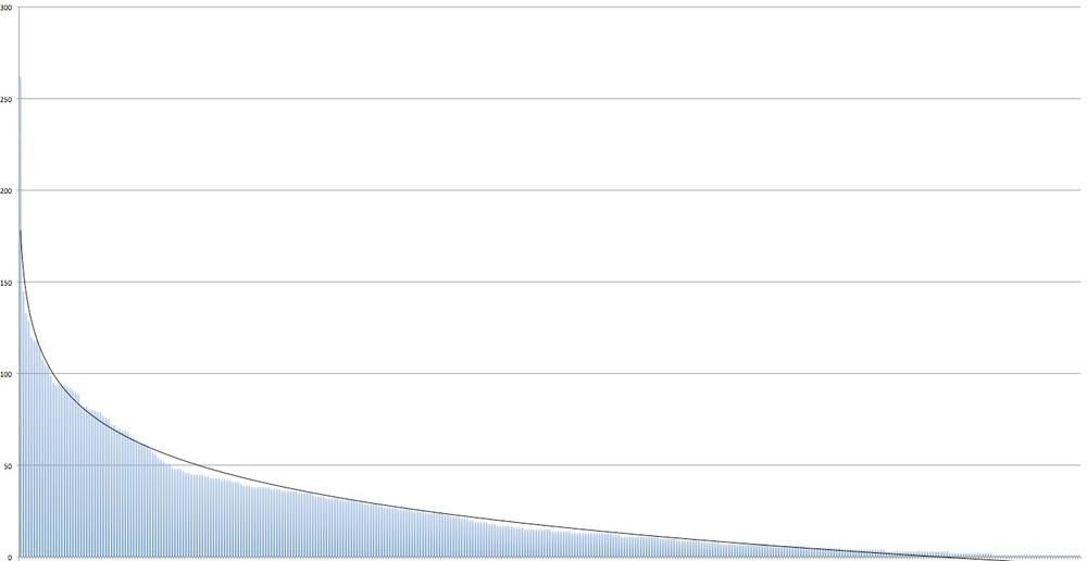
Figure 9-7. Sample distribution of popularity in a Facebook friends network with a logarithmic trendline (names omitted to protect the innocent)
A logarithmic distribution isn’t all that unexpected for a fairly large and diverse social network. It’s inevitable that there will be a few highly connected individuals, with the majority of folks having relatively few connections with one another compared to the most popular individuals. In line with the Pareto principle, or the 80-20 rule, in this instance, we might say that “20% of the people have 80% of the friends.”
The sample implementation provided in Example 9-13 attempts to visualize all the
mutual friendships in your social network. If you are running it in a
modern browser with good support for the canvas element,
the JIT holds up surprisingly well for even huge graphs. A click handler
is included in the sample implementation: it displays the selected
node’s connections and a normalized popularity score (calculated as the
number of connections divided by the total number of connections in your
network) below the graph. Viewing your entire friend network is surely
interesting, but sooner rather than later you’ll want to filter your
friends by some meaningful criteria and analyze smaller
graphs.
There are lots of great filtering options available if your
objective is to build out a nice user interface around a small web app,
but we’ll take the simplest possible approach and filter the JSON output
produced from Example 9-13 according
to a specifiable group criterion. Groups are the most logical starting
point, and Example 9-16
demonstrates how to implement this additional functionality. An
advantage of filtering the output from your global friendship network is
that you’ll retain the complete "connections" data for the
rest of the network, so you’ll still be able to keep track of what other
friends a person is connected to even if those friends aren’t in the
group. Keep in mind that the possibilities for additional group analysis
are vast: you could analyze whether your male friends are more connected
than your female friends, perform clique analysis as described in Clique Detection and Analysis, or any number of other
possibilities.
Example 9-16. Harvesting and munging data to visualize mutual friends with a particular group (facebook__filter_rgraph_output_by_group.py)
# -*- coding: utf-8 -*-

import os
import sys
import json
import facebook
import webbrowser
import shutil
from facebook__fql_query import FQL
from facebook__login import login

HTML_TEMPLATE = '../web_code/jit/rgraph/rgraph.html'
OUT = os.path.basename(HTML_TEMPLATE)

# Reuses out/facebook.friends.json written out by
# facebook__get_friends_rgraph.py

DATA = sys.argv[1]
rgraph = json.loads(open(DATA).read())

try:
    ACCESS_TOKEN = open('out/facebook.access_token').read()
except IOError, e:
    try:

        # If you pass in the access token from the Facebook app as a command line
        # parameter, be sure to wrap it in single quotes so that the shell
        # doesn't interpret any characters in it. You may also need to escape
        # the # character.

        ACCESS_TOKEN = sys.argv[2]
    except IndexError, e:
        print >> sys.stderr,
            "Could not either find access token in 'facebook.access_token' or parse args."
        ACCESS_TOKEN = login()

gapi = facebook.GraphAPI(ACCESS_TOKEN)

groups = gapi.get_connections('me', 'groups')

# Display groups and prompt the user

for i in range(len(groups['data'])):
    print '%s) %s' % (i, groups['data'][i]['name'])

choice = int(raw_input('Pick a group, any group: '))
gid = groups['data'][choice]['id']

# Find the friends in the group

fql = FQL(ACCESS_TOKEN)
q =
    """select uid from group_member where gid = %s and uid in
(select target_id from connection where source_id = me() and target_type = 'user')
"""
    % (gid, )

uids = [u['uid'] for u in fql.query(q)]

# Filter the previously generated output for these ids

filtered_rgraph = [n for n in rgraph if n['id'] in uids]

# Trim down adjancency lists for anyone not appearing in the graph.
# Note that the full connection data displayed as HTML markup
# in "connections" is still preserved for the global graph.

for n in filtered_rgraph:
    n['adjacencies'] = [a for a in n['adjacencies'] if a in uids]

if not os.path.isdir('out'):
    os.mkdir('out')

# HTML_TEMPLATE references some dependencies that we need to
# copy into out/

shutil.rmtree('out/jit', ignore_errors=True)

shutil.copytree('../web_code/jit',
                'out/jit')

html = open(HTML_TEMPLATE).read() % (json.dumps(filtered_rgraph),)
f = open(os.path.join(os.getcwd(), 'out', 'jit', 'rgraph', OUT), 'w')
f.write(html)
f.close()

print 'Data file written to: %s' % f.name

# Open up the web page in your browser

webbrowser.open('file://' + f.name)
A sample graph for a group who attended the same elementary school is illustrated in Figure 9-5.
It would no doubt be interesting to compare the connectedness of different types of groups, identify which friends participate in the most groups to which you also belong, etc. But don’t spend all of your time in one place; the possibilities are vast.
Note
If you’re using a modern browser that supports the latest and
greatest canvas element, you may be able to adapt the
following JavaScript code to save your graph as an image:
//grab the canvas element
var canvas = document.getElementById("infovis-canvas");
//now prompt a file download
window.location = canvas.toDataURL("image/png"); There are a number of interesting variables that you could correlate for analysis, but everyone loves a good game every once in a while. This section lays the foundation for a simple game you can play to see how well you know your friends, by grouping them such that their hometowns and current locations are juxtaposed. We’ll be reusing the tree widget from Intelligent clustering enables compelling user experiences as part of this exercise, and most of the effort will be put into the grunt work required to transform data from an FQL query into a suitable format. Because the grunt work is mostly uninteresting cruft, we’ll save some trees by displaying only the FQL query and the final format. As always, the full source is available online at http://github.com/ptwobrussell/Mining-the-Social-Web/blob/master/python_code/linkedin__get_friends_current_locations_and_hometowns.py.
The FQL query we’ll run to get the names, current locations, and hometowns is simple and should look fairly familiar to previous FQL queries:
q = """select name, current_location, hometown_location from user where uid in
       (select target_id from connection where source_id = me())"""
results = fql(query=q)
Example 9-17 shows the final format that feeds the tree widget once you’ve invested the sweat equity in massaging it into the proper format, and Example 9-18 shows the Python code to generate it.
Example 9-17. Target JSON that needs to be produced for consumption by the Dojo tree widget
{
    "items": [
        {
            "name": " Alabama (2)",
            "children": [
                {
                    "state": " Alabama",
                    "children": [
                        {
                            "state": " Tennessee",
                            "name": "Nashville, Tennessee (1)",
                            "children": [
                                {
                                    "name": "Joe B."
                                }
                            ]
                        }
                    ],
                    "name": "Prattville, Alabama (1)",
                    "num_from_hometown": 1
                }
            ]
        },         {
            "name": " Alberta (1)",
            "children": [
                {
                    "state": " Alberta",
                    "children": [
                        {
                            "state": " Alberta",
                            "name": "Edmonton, Alberta (1)",
                            "children": [
                                {
                                    "name": "Gina F."
                                }
                            ]
                        }
                    ],
                    "name": "Edmonton, Alberta (1)",
                    "num_from_hometown": 1
                }
            ]
        },
        ...
    ],
    "label": "name"
    }
The final widget ends up looking like Figure 9-8, a hierarchical display that groups your friends first by where they are currently located and then by their hometowns. In Figure 9-8, Jess C. is currently living in Tuscaloosa, AL but grew up in Princeton, WV. Although we’re correlating two harmless variables here, this exercise helps you quickly determine where most of your friends are located and gain insight into who has migrated from his hometown and who has stayed put. It’s not hard to imagine deviations that are more interesting or faceted displays that introduce additional variables, such as college attended, professional affiliation, or marital status.
A simple FQL query is all that it took to fetch the essential data, but there’s a little work involved in rolling up data items to populate the hierarchical tree widget. The source code for the tree widget itself is identical to that in Intelligent clustering enables compelling user experiences, and all that’s necessary in order to visualize the data is to capture it into a file and point the tree widget to it. A fun improvement to the user experience might be integrating Google Maps with the widget so that you can quickly bring up locations you’re unfamiliar with on a map. Adding age and gender information into this display could also be interesting if you want to dig deeper or take another approach to clustering. Emitting some KML in a fashion similar to that described in Geographically Clustering Your Network and visualizing it in Google Earth might be another possibility worth considering, depending on your objective.

Example 9-18. Harvesting data and computing the target JSON as displayed in Example 9-17 (facebook__get_friends_current_locations_and_hometowns.py)
import sys
import json
import facebook
from facebook__fql_query import FQL
from facebook__login import login

try:
    ACCESS_TOKEN = open("facebook.access_token").read()
except IOError, e:
    try:
        # If you pass in the access token from the Facebook app as a command-line
        # parameter, be sure to wrap it in single quotes so that the shell
        # doesn't interpret any characters in it. You may also need to escape
        # the # character.
        ACCESS_TOKEN = sys.argv[1]
    except IndexError, e:
        print >> sys.stderr, "Could not either find access token" +
            in 'facebook.access_token' or parse args. Logging in..."
        ACCESS_TOKEN = login()


# Process the results of the following FQL query to create JSON output suitable for
# consumption by a simple hierarchical tree widget:

fql = FQL(ACCESS_TOKEN)

q =
    """select name, current_location, hometown_location from user where uid in
       (select target_id from connection where source_id = me() and target_type =
           'user')"""
results = fql.query(q)

# First, read over the raw FQL query and create two hierarchical maps that group
# people by where they live now and by their hometowns. We'll simply tabulate
# frequencies, but you could easily grab additional data in the FQL query and use it
# for many creative situations.

current_by_hometown = {}
for r in results:
    if r['current_location'] != None:
        current_location = r['current_location']['city'] + ', '
            + r['current_location']['state']
    else:
        current_location = 'Unknown'

    if r['hometown_location'] != None:
        hometown_location = r['hometown_location']['city'] + ', '
            + r['hometown_location']['state']
    else:
        hometown_location = 'Unknown'

    if current_by_hometown.has_key(hometown_location):
        if current_by_hometown[hometown_location].has_key(current_location):
            current_by_hometown[hometown_location][current_location] +=
                [r['name']]
        else:
            current_by_hometown[hometown_location][current_location] =
                [r['name']]
    else:
        current_by_hometown[hometown_location] = {}
        current_by_hometown[hometown_location][current_location] =
            [r['name']]

# There are a lot of different ways you could slice and dice the data now that
# it's in a reasonable data structure. Let's create a hierarchical
# structure that lends itself to being displayed as a tree.

items = []
for hometown in current_by_hometown:
    num_from_hometown = sum([len(current_by_hometown[hometown][current])
                            for current in current_by_hometown[hometown]])
    name = '%s (%s)' % (hometown, num_from_hometown)
    try:
        hometown_state = hometown.split(',')[1]
    except IndexError:
        hometown_state = hometown
    item = {'name': name, 'state': hometown_state,
            'num_from_hometown': num_from_hometown}

    item['children'] = []
    for current in current_by_hometown[hometown]:
        try:
            current_state = current.split(',')[1]
        except IndexError:
            current_state = current

        item['children'].append({'name': '%s (%s)' % (current,
                                len(current_by_hometown[hometown][current])),
                                'state': current_state, 'children'
                                : [{'name': f[:f.find(' ') + 2] + '.'}
                                for f in
                                current_by_hometown[hometown][current]]})

        # Sort items alphabetically by state. Further roll-up by state could
        # be done here if desired.

    item['children'] = sorted(item['children'], key=lambda i: i['state'])
    items.append(item)

# Optionally, roll up outer-level items by state to create a better user experience
# in the display. Alternatively, you could just pass the current value of items in
# the final statement that creates the JSON output for smaller data sets.

items = sorted(items, key=lambda i: i['state'])
all_items_by_state = []
grouped_items = []
current_state = items[0]['state']
num_from_state = items[0]['num_from_hometown']
for item in items:
    if item['state'] == current_state:
        num_from_state += item['num_from_hometown']
        grouped_items.append(item)
    else:
        all_items_by_state.append({'name': '%s (%s)' % (current_state,
                num_from_state), 'children': grouped_items})
        current_state = item['state']
        num_from_state = item['num_from_hometown']
        grouped_items = [item]
all_items_by_state.append({'name': '%s (%s)' % (current_state,
                          num_from_state), 'children': grouped_items})

# Finally, emit output suitable for consumption by a hierarchical tree widget

print json.dumps({'items': all_items_by_state, 'label': 'name'},
indent=4)As with any other source of unstructured data, analyzing the language used on your wall or in your news feed can be an interesting proposition. There are a number of tag cloud widgets that you can find on the Web, and they all take the same input—essentially, a frequency distribution. But why visualize data with an ordinary tag cloud when you could use a customizable and interactive tag cloud? Recall that there just so happens to be a quite popular open source rotating tag cloud called WP-Cumulus that puts on quite a nice show.[61] All that’s needed to put it to work is to produce the simple input format that it expects, and feed that input format into a template with the standard HTML boilerplate in it. For brevity, the boilerplate won’t be repeated here. See http://github.com/ptwobrussell/Mining-the-Social-Web/blob/master/web_code/dojo/facebook.current_locations_and_hometowns.html.
Example 9-19 presents some minimal logic
to grab several pages of news data and compute a simple JSON structure
that’s a list of [term, URL, frequency] tuples that can be
fed into an HTML template. We’ll pass in empty strings for the URL
portion of those tuples, but with a little extra work, you could
introduce additional logic that maintains a map of which terms appeared
in which posts so that the terms in the tag cloud could point back to
source data. Note that since we’re fetching multiple pages of data from
the Graph API in this example, we’ve simply opted to interface directly
with the API endpoint for your Facebook
wall.
Example 9-19. Harvesting and munging data for visualization as a WP-Cumulus tag cloud (facebook__tag_cloud.py)
# -*- coding: utf-8 -*-

import os
import sys
import urllib2
import json
import webbrowser
import nltk
from cgi import escape
from facebook__login import login

try:
    ACCESS_TOKEN = open('out/facebook.access_token').read()
except IOError, e:
    try:

        # If you pass in the access token from the Facebook app as a command line
        # parameter, be sure to wrap it in single quotes so that the shell doesn't
        # interpret any characters in it. You may also need to escape the # character

        ACCESS_TOKEN = sys.argv[1]
    except IndexError, e:
        print >> sys.stderr,
            "Could not find local access token or parse args. Logging in..."
        ACCESS_TOKEN = login()

BASE_URL = 'https://graph.facebook.com/me/home?access_token='
HTML_TEMPLATE = '../web_code/wp_cumulus/tagcloud_template.html'
OUT_FILE = 'out/facebook.tag_cloud.html'
NUM_PAGES = 5
MIN_FREQUENCY = 3
MIN_FONT_SIZE = 3
MAX_FONT_SIZE = 20

# Loop through the pages of connection data and build up messages

url = BASE_URL + ACCESS_TOKEN
messages = []
current_page = 0
while current_page < NUM_PAGES:
    data = json.loads(urllib2.urlopen(url).read())
    messages += [d['message'] for d in data['data'] if d.get('message')]
    current_page += 1
    url = data['paging']['next']

# Compute frequency distribution for the terms

fdist = nltk.FreqDist([term for m in messages for term in m.split()])

# Customize a list of stop words as needed

stop_words = nltk.corpus.stopwords.words('english')
stop_words += ['&', '.', '?', '!']

# Create output for the WP-Cumulus tag cloud and sort terms by freq along the way

raw_output = sorted([[escape(term), '', freq] for (term, freq) in fdist.items()
                    if freq > MIN_FREQUENCY and term not in stop_words],
                    key=lambda x: x[2])

# Implementation adapted from
# http://help.com/post/383276-anyone-knows-the-formula-for-font-s

min_freq = raw_output[0][2]
max_freq = raw_output[-1][2]


def weightTermByFreq(f):
    return (f - min_freq) * (MAX_FONT_SIZE - MIN_FONT_SIZE) / (max_freq
            - min_freq) + MIN_FONT_SIZE


weighted_output = [[i[0], i[1], weightTermByFreq(i[2])] for i in raw_output]

# Substitute the JSON data structure into the template

html_page = open(HTML_TEMPLATE).read() % (json.dumps(weighted_output), )

f = open(OUT_FILE, 'w')
f.write(html_page)
f.close()

print 'Date file written to: %s' % f.name

# Open up the web page in your browser

webbrowser.open('file://' + os.path.join(os.getcwd(), OUT_FILE))
Figure 9-9 shows some sample results. The data for this tag cloud was collected during a Boise State versus Virginia Tech football game. Not surprisingly, the most common word in news feeds is “I”. All in all, that’s not a lot of effort to produce a quick visualization of what people are talking about on your wall, and you could easily extend it to get the gist of any other source of textual data. If you want to pursue automatic construction of a tag cloud with interesting content, however, you might want to consider incorporating some of the more advanced filtering and NLP techniques introduced earlier in the book. This way, you’re specifically targeting terms that are likely to be entities as opposed to performing simple frequency analysis. Recall that Chapter 8 provided a fairly succinct overview of how you might go about accomplishing such an objective.
[58] Also commonly called radial graphs, radial trees, radial maps, and many other things that don’t necessarily include the term “radial” or “radius.”
[59] Also commonly called “pie piece.”
[60] This concept was introduced in Data Hacking with NLTK.
[61] It was introduced in Visualizing Tweets with Tricked-Out Tag Clouds.