CHAPTER 9
Volatility Slope
There is a long history in the equity markets of implied volatility increasing as the markets fall and, to a lesser degree, of implied volatility falling as the markets climb.
As bad news begins to be reflected in stock prices, the future volatility of those stock prices tends to increase because stock prices and stock market volatility are negatively correlated—they tend to go in opposite directions. We first discussed the need for investors to be compensated for additional volatility (which is really risk) in Part One. Conversely, when good news begins to be reflected in stock prices the future volatility of those stock prices tends to decrease. Unfortunately, future volatility doesn’t decrease as fast, or by as much as, it increases. This mismatch is often referred to as volatility asymmetry—volatility, both realized and implied, moves in the opposite direction of the underlying market, and it goes up a lot faster than it goes down.
THE CORRELATION BETWEEN MARKET PRICES AND IMPLIED VOLATILITY
This negative correlation is most evident in index options and less so (sometimes much less so) in options on individual equities, but how big can this negative correlation between market direction and volatility be over time? A little blip in the price of the S&P 500 shouldn’t have much of an effect on implied volatility, should it? We’ll focus on implied volatility because it’s the real cost of the options we want to trade, and because changes in implied volatility tend to be followed by changes in realized volatility.
A little blip in prices of the S&P 500 can indeed have an astonishingly large impact on implied volatility on the S&P 500. From day to day the relationship is obvious, and it’s clear over even shorter timeframes as well.
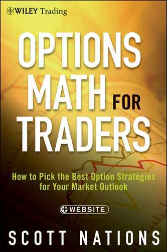
Let’s look at Table 9.1 and see how the Volatility Index (VIX), the Chicago Board Options Exchange (CBOE) measure of S&P 500 implied volatility, changes based on that day’s change in the price of the S&P 500. We can break the daily changes in the S&P down into several “buckets,” each 1 percent wide. We can then determine the days that showed that change in the S&P and note the change in the VIX for those days. The result is the average daily change in the VIX for each bucket of outcomes for the S&P.
Table 9.1 Changes in VIX by Changes in S&P 500
| Day’s Change in S&P 500 | Average Daily Change |
| Price Fell in the Range of: | in VIX for Those Days |
| −10% to −9% | +25.61% |
| −9% to −8% | +29.21% |
| −8% to −7% | +11.11% |
| −7% to −6% | +24.32% |
| −6% to −5% | +13.18% |
| −5% to −4% | +19.17% |
| −4% to −3% | +16.16% |
| −3% to −2% | +10.47% |
| −2% to −1% | +7.05% |
| −1% to Unchanged | +1.83% |
| Unchanged to +1% | −1.99% |
| +1% to +2% | −4.98% |
| +2% to +3% | −6.88% |
| +3% to +4% | −8.62% |
| +4% to +5% | −12.89% |
| +5% to +6% | −9.99% |
| +6% to +7% | −10.44% |
| +7% to +8% | −5.80% |
The change in a day’s S&P 500 price is clearly related to the change in implied volatility, as measured by the VIX, for that day. On days when the S&P rallied, even slightly, the VIX tended to fall. On days the S&P was down, implied volatility was generally higher. On days the S&P was down substantially, the VIX was up substantially. As any drop in the S&P 500 intensifies, the increase in implied volatility intensifies as well. Figure 9.1 shows a graph of this phenomenon.
FIGURE 9.1 Changes in Stock Price Drive Changes in Implied Volatility
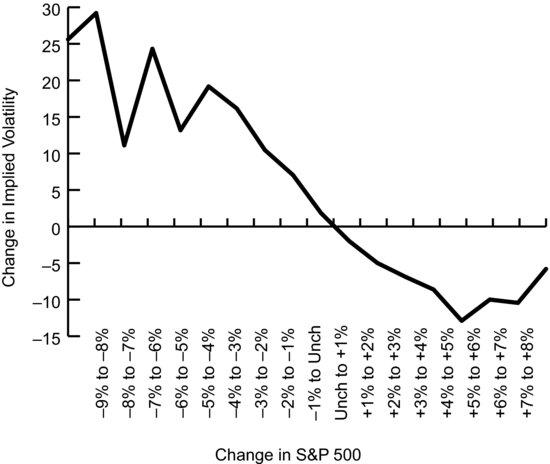
While this demonstrates the relationship for each day, it’s also clear that the relationship exists over a much shorter timeframe, which is even more perplexing. We’d think that a tiny one-minute move in the S&P wouldn’t impact the implied volatility that S&P option traders around the world are willing to pay, yet it does. Figure 9.2, which graphs one-minute changes in the S&P over the course of one trading day, and the resulting change in implied volatility for the buckets of S&P change, tracks this phenomenon.
FIGURE 9.2 Very Short-Term Changes in Stock Price Drive Changes in Implied Volatility
The Volatility Slope
The path that implied volatility takes as the price of the underlying asset changes is called the volatility slope.
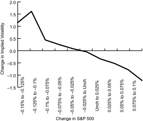
Imagine that the entire volatility skew chart, like the one we saw in Figure 9.1, moves up and down with changes in the underlying market with the volatility skew curve always touching the volatility slope at the at-the-money strike price. The result is that the shape of the skew curve doesn’t necessarily change (in reality it will probably change somewhat, due to the passage of time if nothing else), but rather the entire curve essentially slides along the slope, intersecting it at the at-the-money strike, moving higher as the market falls and sliding lower as the market rallies. That would look something like Figure 9.3.
FIGURE 9.3 Volatility Slope

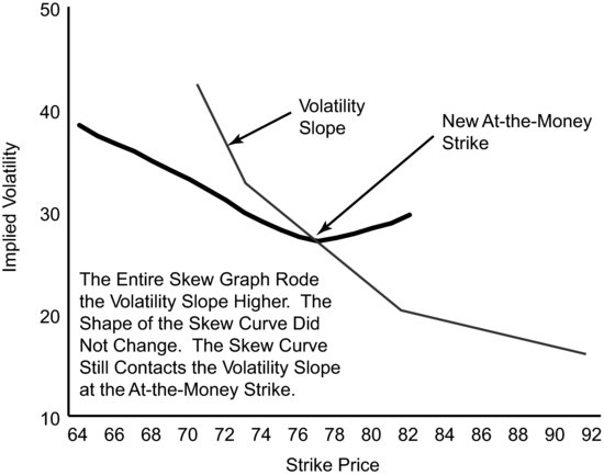
How would the skew curve ride the volatility slope, and what would that look like? Figure 9.4 shows the skew and the volatility slope after the Russell 2000 ETF (IWM) has fallen, and after skew has moved along the volatility slope.
FIGURE 9.4 Volatility Slope after the Market Moves
THE VOLATILITY SLOPE, THE WHY
Why does implied volatility follow the volatility slope, even over tiny changes in the price of the underlying asset? There are three theories. The first two are based on a company’s fundamental value. Thus, these two should be longer-term and lagging effects. As such, these two can’t account for the entire effect because they’re longer-term and lagging, and we’ve seen that equity indexes ride the volatility slope for periods as short as one minute.
The three theories are:
It’s not important for us to understand why volatility changes with changes in the underlying, but it does, and in Part Three we’ll learn how to take advantage of the phenomenon. However, the more we know about it, the better we’ll understand it, and the greater the number of situations in which we’ll recognize its usefulness.
Volatility slope isn’t the only phenomenon driven by investors’ and traders’ tendency to extrapolate current conditions, meaning they project current market and volatility changes into future changes. This is why a trader or investor is willing to pay up for a put option after a big down move—even though the damage has already been done.
THE ASYMMETRY
The fact that implied volatility remained high following the market crash in October 1987, the collapse of Long Term Capital Management in 1998, and the events of September 11, 2001—yet never got very high in the market run up during the technology bubble of 1999–2000—demonstrates that the volatility slope is more impactful when the market is headed lower and volatility is headed higher than when the market is headed higher and volatility is headed lower.
Since this volatility slope works more in one direction than in the other direction, it’s referred to as asymmetrical. Some investors refer to the entire phenomenon as volatility asymmetry, but we’ll stick with volatility slope since it also conveys the direction that implied volatility is likely to take, and not just the relative degree of the change.
The result of volatility slope on option traders is that for put selling strategies, correctly deducing that the market will head lower is doubly useful. In waiting until after the move downward traders will find that the put or put spread they want to sell will be more valuable for two reasons. The first is due to its sensitivity to changes in the price of the underlying price (this sensitivity is the delta of an option we discussed in Part One), and the second is due to the fact that implied volatility, and hence option prices, will be higher due to volatility slope.
VOLATILITY SLOPE AND SKEW ARE RELATED
It’s no surprise that the volatility skew and volatility slope in Figure 9.3 have similar shapes; volatility slope and volatility skew are related. Some traders prefer to think of volatility changes due to price changes in the underlying as simply moving along the volatility skew graph.
The two points of view generate similar outcomes—volatility increases when the market falls and decreases when the market rallies. That said, ignoring volatility slope by making skew do both jobs is a little like using a hatchet to perform surgery. It might get the job done, but it’s not very precise.
Skew doesn’t always look like it looks in Figure 9.3, which shows option skew and a volatility slope for IWM options. As we saw in Chapter 6, skew looks very different for those assets that tend to jump rather than fall in the case of unexpected events or news. Those assets include commodities such as gold and crude oil but also include stocks that are takeover targets like Yahoo!, which we also discussed in Chapter 6. For those assets the volatility slope will likely curve upward as we move to the right from at-the-money much more sharply than our chart of IWM shows. For those assets the volatility slope will also look similar to skew.

- Implied volatility increases as market prices for the underlying decrease, and implied volatility decreases as market prices for the underlying increase.
- The degree by which implied volatility changes is asymmetrical. It goes up more when the market falls than it falls when the market rallies.
- This negative correlation applies over even very short time frames.
- Volatility slope, our name for the path of this negative correlation, is much more applicable to equity indexes than individual equities.
- There are several theories about why the volatility slope exists, but behavioral factors are likely to have the most impact.
- Volatility slope and volatility skew are related.
- Volatility slope can be used by traders and is particularly important in strategies that use out-of-the-money put options.