
C H A P T E R 3
CSS Primer
Cascading Style Sheets (CSS) are closely associated with HTML and are the means by which you control the presentation of HTML elements. CSS has a special significance for jQuery for two reasons. The first is that you can use CSS selectors (which I describe in this chapter) to tell jQuery how to find elements in an HTML document. The second reason is that one of the most common tasks that jQuery is used for is to change the CSS styles that are applied to elements.
There are more than 130 CSS properties, each of which controls an aspect of an element's presentation. As with the HTML elements, there are too many CSS properties for me to be able to describe them in this book. Instead, I have focused on how CSS works and how you apply styles to elements. If you want detailed coverage of CSS, then I suggest another of my books: The Definitive Guide to HTML5, which is also published by Apress.
Getting Started with CSS
When the browser displays an element on the screen, it uses a set of properties, known as CSS properties, to work out how the element should be presented. Listing 3-1 shows a simple HTML document.
Listing 3-1. A Simple HTML Document
<!DOCTYPE html>

<html>

<head>

   <title>Example</title>

</head>

<body>

    <h1>New Delivery Service</h1>

    <h2>Color and Beauty to Your Door</h2>

    <h2>(with special introductory offer)</h2>

    <p>We are pleased to announce that you are starting a home delivery service for

    your flower needs. You will deliver within a 20 mile radius of the store

    for free and $1/mile thereafter.</p>

</body>

</html>
You can see how a browser displays the document in Figure 3-1.
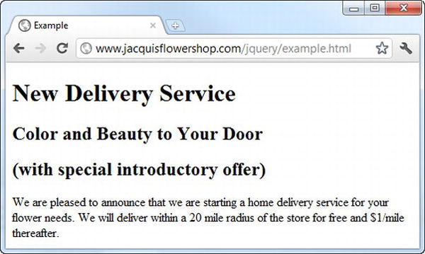
Figure 3-1 Displaying a simple document in the browser
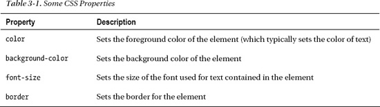
There are a lot of CSS properties—too many to cover in detail in this book—but you can learn a lot about how CSS works by looking at just a small number of properties, as described in Table 3-1.
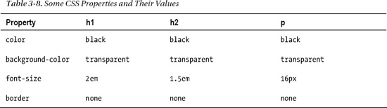
I haven't defined any values for these properties, but the browser has still managed to display the content, and, as the figure shows, each of the content elements has been presented in a slightly different way. The browser has to work with something if you haven't provided values for the properties, so each element has a style convention. That is, the browser has a set of default values that it uses for CSS properties when you don't supply a value. Although the HTML specification defines the style conventions for elements, browsers are free to vary them, and there are minor differences in how elements are displayed by default. Table 3-2 shows the default values that are used by Google Chrome.
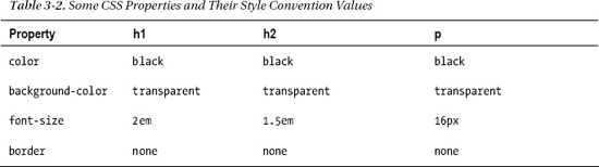
You can see from the table that all three types of element have the same values for the color, background-color, and border properties and that it is only the font-size property that changes. Later in the chapter, I'll describe the units that are used for these property values and explain why the font-size property is expressed in em units for the h1 and h2 elements but in px units for the p element. For the moment, though, we are going to focus on setting values for properties without worrying about the units in which those values are expressed.
Setting an Inline Value
The most direct way to set values for CSS properties is to apply the style attribute to the element whose presentation you want to change. Listing 3-2 shows how this is done.
Listing 3-2. Using the style Attribute to Set a CSS Property on an Element
<!DOCTYPE html>

<html>

<head>

    <title>Example</title>

</head>

<body>

    <h1>New Delivery Service</h1>

    <h2 style="background-color: grey; color: white">Color and Beauty to Your Door</h2>

    <h2>(with special introductory offer)</h2>

    <p>We are pleased to announce that we are starting a home delivery service for

    your flower needs. We will deliver within a 20 mile radius of the store

    for free and $1/mile thereafter.</p>

</body>

</html>
In this example, I have used style declarations to specify values for two of the CSS properties. You can see the anatomy of the attribute value in Figure 3-2.
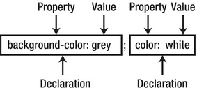
Figure 3-2 The anatomy of a style attribute value
Each style declaration specifies the name of a property you want to change and the value that you want to use, separated by a colon (:). You can put multiple declarations together using a semicolon character (;). In this example, I set the value of the background-color to grey and the value of the color property to white. These values are specified in the style attribute of the h2 element and will affect only that element (other elements in the document remain unaffected, even if they are also h2 elements). You can see the effect that these new property values have in the presentation of the first h2 element in Figure 3-3.
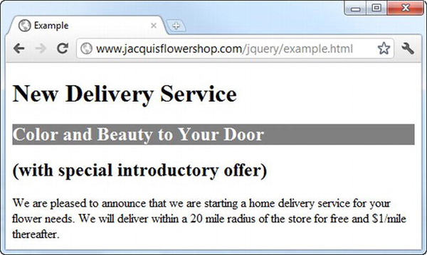
Figure 3-3 The effect of changing CSS values in the style attribute of the h2 element
Defining an Embedded Style
Using the style attribute is easy, but it applies to only a single element. You could use simple style declarations for every element that you wanted to change, but it becomes difficult to manage and error-prone very quickly, especially if you need to make revisions later. A more powerful technique is to use the style element (rather than the style attribute) to define an embedded style and direct the browser to apply it with a selector. Listing 3-3 shows an embedded style.
Listing 3-3. Defining an Embedded Style
<!DOCTYPE html>

<html>

<head>

    <title>Example</title>

    <style>

        h2 { background-color: grey; color: white;}

    </style>

</head>

<body>

    <h1>New Delivery Service</h1>

    <h2>Color and Beauty to Your Door</h2>

    <h2>(with special introductory offer)</h2>

    <p>We are pleased to announce that we are starting a home delivery service for

    your flower needs. We will deliver within a 20 mile radius of the store

    for free and $1/mile thereafter.</p>

</body>

</html>
We still use declarations in an embedded style, but they are enclosed in braces (the { and } characters) and are preceded by a selector. You can see the anatomy of an embedded style in Figure 3-4.
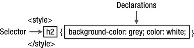
Figure 3-4 The anatomy of an embedded style
 Tip I have placed the
 style element within the head element, but I could have equally put it inside the body element. I prefer using the head element for styles because I like the idea of separating the content from the metadata.
CSS selectors are very important in jQuery, since they are the basis by which you select elements in the DOM in order to perform operations on them. The selector I used in the example is h2, which means that the style declarations contained in the braces should be applied to every h2 element in the document. You can see the effect this has on the h2 elements in Figure 3-5.
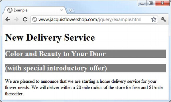
Figure 3-5 The effect of an embedded style
You can use a style element to contain more than one embedded style. Listing 3-4 shows the flower shop document that you first saw in Chapter 2, which has a more complex set of styles.
Listing 3-4. A More Complex Set of Styles in an HTML Document
<!DOCTYPE html>

<html>

<head>

    <title>Example</title>

    <script src="jquery-1.7.js" type="text/javascript"></script>

    <style>

        h1 {

            min-width: 700px; border: thick double black; margin-left: auto;

            margin-right: auto; text-align: center; font-size: x-large; padding: .5em;

            color: darkgreen; background-image: url("border.png");

            background-size: contain; margin-top: 0;

        }

        .dtable {display: table;}

        .drow {display: table-row;}

        .dcell {display: table-cell; padding: 10px;}

        .dcell > * {vertical-align: middle}

        input {width: 2em; text-align: right; border: thin solid black; padding: 2px;}

        label {width: 5em;  padding-left: .5em;display: inline-block;}

        #buttonDiv {text-align: center;}

        #oblock {display: block; margin-left: auto;

            margin-right: auto; min-width: 700px;}

    </style>

</head>

<body>
<h1>Jacqui's Flower Shop</h1>
<form method="post">
<div id="oblock">
<div class="dtable">
<div class="drow">
<div class="dcell">
<img src="astor.png"/><label for="astor">Astor:</label>
<input name="astor" value="0" required>
</div>
<div class="dcell">
<img src="daffodil.png"/><label for="daffodil">Daffodil:</label>
<input name="daffodil" value="0" required >
</div>
<div class="dcell">
<img src="rose.png"/><label for="rose">Rose:</label>
<input name="rose" value="0" required>
</div>
</div>
<div class="drow">
<div class="dcell">
<img src="peony.png"/><label for="peony">Peony:</label>
<input name="peony" value="0" required>
</div>
<div class="dcell">
<img src="primula.png"/><label for="primula">Primula:</label>
<input name="primula" value="0" required>
</div>
<div class="dcell">
<img src="snowdrop.png"/><label for="snowdrop">Snowdrop:</label>
<input name="snowdrop" value="0" required>
</div>
</div>
</div>
</div>
<div id="buttonDiv"><button type="submit">Place Order</button></div>
</form>
</body>
</html>
The style element in this example contains several embedded styles, and some of them, especially the one with the h1 selector, define values for many properties.
Defining an External Style Sheet
Rather than define the same set of styles in each of your HTML documents, you can create a separate style sheet. This is an independent file, conventionally with the .css file extension, into which you put your styles. Listing 3-5 shows the contents of the file styles.css, into which I have placed the styles from the flower shop document.
Listing 3-5. The styles.css File
h1 {
min-width: 700px; border: thick double black; margin-left: auto;
margin-right: auto; text-align: center; font-size: x-large; padding: .5em;
color: darkgreen; background-image: url("border.png");
background-size: contain; margin-top: 0;
}
.dtable {display: table;}
.drow {display: table-row;}
.dcell {display: table-cell; padding: 10px;}
.dcell > * {vertical-align: middle}
input {width: 2em; text-align: right; border: thin solid black; padding: 2px;}
label {width: 5em; padding-left: .5em;display: inline-block;}
#buttonDiv {text-align: center;}
#oblock {display: block; margin-left: auto; margin-right: auto; min-width: 700px;}
You don't need to use a style element in a style sheet. You just define the selector and declarations directly. You can then use the link element to bring the styles into your document, as shown in Listing 3-6.
Listing 3-6. Importing an External Style Sheet
<!DOCTYPE html>
<html>
<head>
<title>Example</title>
<script src="jquery-1.7.js" type="text/javascript"></script>
<link rel="stylesheet" type="text/css" href="styles.css"/>
</head>
<body>
    <h1>Jacqui's Flower Shop</h1>

    <form method="post">

        <div id="oblock">

            <div class="dtable">

                <div class="drow">

                    <div class="dcell">

                        <img src="astor.png"/><label for="astor">Astor:</label>

                        <input name="astor" value="0" required>

                    </div>

                    <div class="dcell">

                        <img src="daffodil.png"/><label for="daffodil">Daffodil:</label>

                        <input name="daffodil" value="0" required >

                    </div>

                    <div class="dcell">

                        <img src="rose.png"/><label for="rose">Rose:</label>

                        <input name="rose" value="0" required>

                    </div>

                </div>

                <div class="drow">

                    <div class="dcell">

                        <img src="peony.png"/><label for="peony">Peony:</label>

                        <input name="peony" value="0" required>

                    </div>

                    <div class="dcell">

                        <img src="primula.png"/><label for="primula">Primula:</label>

                        <input name="primula" value="0" required>

                    </div>

                    <div class="dcell">

                        <img src="snowdrop.png"/><label for="snowdrop">Snowdrop:</label>

                        <input name="snowdrop" value="0" required>

                    </div>

                </div>

            </div>

        </div>

        <div id="buttonDiv"><button type="submit">Place Order</button></div>

    </form>

</body>

</html>
You can link to as many style sheets as you need, one per link element. The order in which you import style sheets is important if you define two styles with the same selector. The one that is loaded last will be the one that is applied.
Understanding CSS Selectors
Notice that the selectors in the flower shop style sheet have differing natures. Some are element names (such as h1 and input), others start with a period (such as .dtable and .row), and yet others start with a pound (#butonDiv and #oblock). If you are particularly observant, you will notice that one of the selectors has multiple components: .dcell > *. Each CSS selector selects elements in the document, and the different kinds of selector tell the browser to look for elements in different ways. In this section, I'll describe the different kinds of selector that are defined by CSS. You start with the core selectors, which are summarized in Table 3-3.
These selectors are the most widely used (they cover almost all of the styles I defined in the example document, for instance).
Selecting by Attribute
Although the basic selectors work on the id and class attributes (which I described in Chapter 2), there are also selectors available that let you work with any attribute. These are described in Table 3-4.
Listing 3-7 shows a simple document with an embedded style whose selector is based on attributes.
Listing 3-7. Using the Attribute Selectors
<!DOCTYPE html>

<html>

<head>

    <title>Example</title>

    <style>

        [lang] { background-color: grey; color: white;}

        [lang="es"] {font-size: 14px;}

    </style>

</head>

<body>

    <h1 lang="en">New Delivery Service</h1>

    <h2 lang="en">Color and Beauty to Your Door</h2>
<h2 lang="es">(Color y belleza a tu puerta)</h2>
<p>We are pleased to announce that we are starting a home delivery service for
your flower needs. We will deliver within a 20 mile radius of the store
for free and $1/mile thereafter.</p>
</body>
</html>
The first selector matches any element that has the lang attribute, and the second selector matches any element whose lang attribute value is es. You can see the effect of these styles in Figure 3-6.
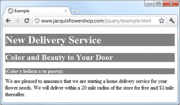
Figure 3-6 Applying styles using attribute selectors
Note There is something important to note in this figure. Look at how the h2 element has been affected by both of the embedded styles. The first style is applied to all elements with a lang attribute. The second style is applied to all elements that have a lang attribute whose value is es. The second h2 element in the document meets both of those criteria, and so the values for the background-color, color, and font-size properties are all changed. I'll explain more about how this works in the “Understanding Style Cascading” section later in this chapter.
Selecting by Relationship
In Chapter 2, I explained that elements (and the object that represents them in the DOM) have a hierarchy that gives rise to different kinds of relationship. There are CSS selectors that allow you to select elements based on those relationships, as described in Table 3-5.
I used one of these selectors in the flower shop example document, like this:
.dcell > * {vertical-align: middle}
This selector matches all of the elements that are children of elements that belong to the dcell class, and the declaration sets the vertical-align property to the value middle. Listing 3-8 shows some of the other relationship selectors being used.
Listing 3-8. Using the Relationship Selectors
xs<!DOCTYPE html>
<html>
<head>
<title>Example</title>
<style>
h1 ~ [lang] { background-color: grey; color: white;}
h1 + [lang] {font-size: 12px;}
</style>
</head>
<body>
<h1 lang="en">New Delivery Service</h1>
<h2 lang="en">Color and Beauty to Your Door</h2>
    <h2 lang="es">(Color y belleza a tu puerta)</h2>

    <p>We are pleased to announce that we are starting a home delivery service for

    your flower needs. We will deliver within a 20 mile radius of the store

    for free and $1/mile thereafter.</p>

</body>

</html>
I have used both of the sibling selectors in this example. The first selector, the one that uses the tilde (~) character, matches any element that has a lang attribute and that is defined after and is a sibling to an h1 element. In the example document, this means that both the h2 elements are selected (since they have the attribute and are siblings to and are defined after the h1s element). The second selector, the one that uses the plus character, is similar but matches only the immediate sibling of an h1 element. This means that only the first of the h2 element is selected. You can see the effect in Figure 3-7.
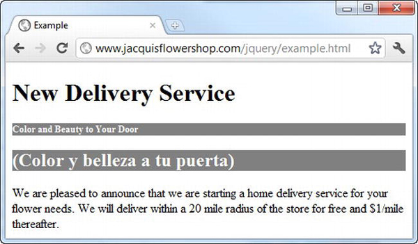
Figure 3-7 Using the sibling relationship selectors
Selecting Using the Pseudo-element and Pseudo-class Selectors
CSS supports a set of pseudo-element and pseudo-class selectors. These provide convenient functionality that doesn't correspond directly to elements or class membership in the document. These selectors are described in Table 3-6.
Listing 3-9 shows the use of some pseudo-selectors.
Listing 3-9. Using Pseudo-selectors
<!DOCTYPE html>

<html>

<head>

    <title>Example</title>

    <style>

        :nth-of-type(2) { background-color: grey; color: white;}

        p:first-letter {font-size: 40px;}

    </style>

</head>

<body>

    <h1 lang="en">New Delivery Service</h1>

    <h2 lang="en">Color and Beauty to Your Door</h2>

    <h2 lang="es">(Color y belleza a tu puerta)</h2>

    <p>We are pleased to announce that we are starting a home delivery service for

    your flower needs. We will deliver within a 20 mile radius of the store

    for free and $1/mile thereafter.</p>

</body>

</html>
You can use the pseudo-selectors on their own or as a modifier to another selector. I have shown both approaches in the example. The first selector matches any element that is the second element of its type defined by its parent. The second selector matches the first letter of any p elements. You can see the application of these styles in Figure 3-8.
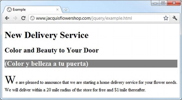
Figure 3-8 Using pseudo-selectors to apply styles
Unions and the Negation Selectors
You can get a lot of additional flexibility by arranging selectors together. Specifically, you can create unions by combining selections and inverting a selection through negation. Both of these approaches are described in Table 3-7.
Listing 3-10 shows how you can create unions and negations.
Listing 3-10. Using Selector Unions and Negation
<!DOCTYPE html>

<html>

<head>

    <title>Example</title>

    <style>

        h1, h2 { background-color: grey; color: white;}

        :not(html):not(body):not(:first-child) {border: medium double black;}

    </style>

</head>

<body>

    <h1 lang="en">New Delivery Service</h1>

    <h2 lang="en">Color and Beauty to Your Door</h2>

    <p>We are pleased to announce that we are starting a home delivery service for

    your flower needs. We will deliver within a 20 mile radius of the store

    for free and $1/mile thereafter.</p>

</body>

</html>
The first selector in this example is the union of the h1 and h2 selectors. As you might imagine, this matches all h1 and h2 elements in the document. The second selector is a little more esoteric. I wanted to demonstrate how you could use pseudo-selectors as modifiers to other pseudo-selectors, including negation:
:not(html):not(body):not(:first-child) {border: medium double black;}
This selector matches any element that is not an html element, that is not a body element, and that is not the first child of its parent. You can see how the styles in this example are applied in Figure 3-9.
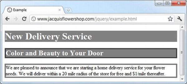
Figure 3-9 Creating selector unions and negations
Understanding Style Cascading
The key to understanding style sheets is to understand how they cascade and inherit. There can be multiple sources for CSS properties, and cascading and inheritance are the means by which the browser determines which values should be used when it displays an element. You have seen three different ways you can define styles (inline, embedded, and from an external style sheet), but you need to know about two other sources of styles: browser styles and user styles.
The browser styles (more properly known as the user agent styles) are the style conventions that a browser applies to an element if no other style has been specified. You saw an example of style conventions being used at the start of this chapter.
In addition, most browsers allow users to define their own style sheets. The styles that these style sheets contain are called user styles. This isn't a widely used feature, but those users who do define their own style sheets often attach great importance in being able to do so, not least because it provides a way of making pages more accessible.
Each browser has its own mechanism for user styles. Google Chrome on Windows, for example, creates a file in the user's profile directory called DefaultUser StyleSheetsCustom.css. Any styles added to this file are applied to any site that the user visits, subject to the cascading rules that I describe in the following section.
Understanding How Styles Cascade
Now that you have seen all of the sources of styles that a browser has to consider, you can look at the order in which the browser will look for a property value when it comes to display an element. The order is very specific:
- Inline styles (styles that are defined using the
styleattribute on an element) - Embedded styles (styles that are defined in a
styleelement) - External styles (styles that are imported using the
linkelement) - User styles (styles that have been defined by the user)
- Browser styles (the style conventions applied by the browser)
Imagine that the browser needs to display a p element. One of the things it needs to know is what color the text should be displayed in. To answer this question, it will need to find a value for the CSS color property. First, it will check to see whether the element it is trying to display has an inline style that defines a value for color, like this:
<p style="color: red">We are pleased to announce that we are starting a home delivery

    service for your flower needs. We will deliver within a 20 mile radius of the store

    for free and $1/mile thereafter.</p>
If there is no inline style, then the browser will look for a style element that contains a style that applies to the element, like this:
<style>

    p {color: red};

</style>
If there is no such style element, the browser looks at the style sheets that have been loaded via the link element, and so on, until either the browser finds a value for the color property, and that means using the value defined in the default browser styles if no other value is available.
Tip The first three sources of properties (inline styles, embedded styles, and style sheets) are collectively referred to as the author styles. The styles defined in the user style sheet are known as the user styles, and the styles defined by the browser are known as the browser styles.
Tweaking the Order with Important Styles
You can override the normal cascade order by marking your property values as important, as shown in Listing 3-11.
Listing 3-11. Marking Style Properties as Important
<!DOCTYPE html>

<html>

<head>

    <title>Example</title>

<style>

    p {color: black !important};

</style>

</head>

<body>

    <h1 lang="en">New Delivery Service</h1>

    <h2 lang="en">Color and Beauty to Your Door</h2>

    <p style="color: red">We are pleased to announce that we are starting a home delivery

    service for your flower needs. We will deliver within a 20 mile radius of the store
for free and $1/mile thereafter.</p>
</body>
</html>
You mark individual values as important by appending !important to the declaration. The browser gives preference to important styles, irrespective of where they are defined. You can see the effect of property importance in Figure 3-10, where the embedded value for the color property overrides the inline value (this may be a little hard to make out on the printed page, but all of the text is black).
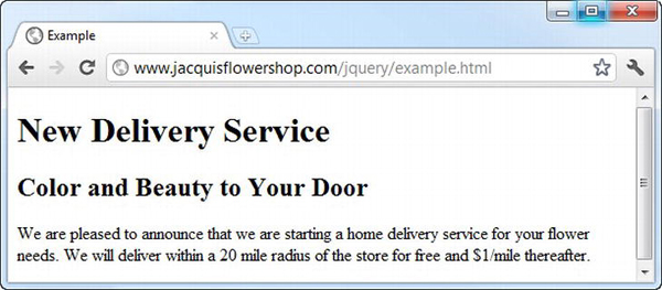
Figure 3-10 Important property values overriding inline property values
Tip The only thing that will take precedence over an important value that you define is an important value defined in the user style sheet. For regular values, the author styles are used before the user styles, but this is reversed when dealing with important values.
Tie-Breaking with Specificity and Order Assessments
You enter a tie-break situation if there are two styles that can applied to an element defined at the same cascade level and they both contain values for the CSS property that the browser is looking for. To decide which value to use, the browser assesses the specificity of each style and selects the one that is most specific. The browser determines the specificity of a style by counting three different characteristics:
- The number of
idvalues in the style's selector - The number of other attributes and pseudo-classes in the selector
- The number of element names and pseudo-elements in the selector
The browser combines the values from each assessment and applies the property value from the style that is most specific. You can see a very simple example of specificity in Listing 3-12.
Listing 3-12. Specificity in Styles
<!DOCTYPE html>
<html>
<head>
<title>Example</title>
<style>
p {background-color: grey; color: white;}
p.details {color:red;}
</style>
</head>
<body>
<h1 lang="en">New Delivery Service</h1>
<h2 lang="en">Color and Beauty to Your Door</h2>
<p class="details">We are pleased to announce that we are starting a home delivery
service for your flower needs. We will deliver within a 20 mile radius of the store
    for free and $1/mile thereafter.</p>

</body>

</html>
When assessing specificity, you create a number in the form a-b-c, where each letter is the total from one of the three characteristics that are counted. This is not a three-digit number. A style is more specific if it's a value is the greatest. Only if the a values are equal does the browser compare b values. The style with the greater b value is more specific in this case. Only if both a and b values are the same does the browser consider the c value. This means that a specificity score of 1-0-0 is more specific than 0-5-5.
In this case, the selector p.details includes a class attribute, which means that the specificity of the style is 0-1-1 (0 id values + 1 other attributes + 1 element names). The other selector has a specificity of 0-0-1 (it contains no id values or other attributes and one element name).
When rendering a p element, the browser will look for a value for the color property. If the p element is a member of the details class, then the style with the p.details selector will be the most specific, and the value of red will be used. For all other p elements, the value white will be used. You can see how the browser selects and applies values for this example in Figure 3-11.
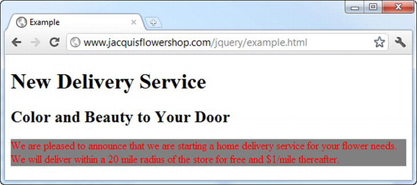
Figure 3-11. Applying values from styles based on specificity
When there are values defined in styles with the same specificity, then the browser selects the value it uses based on the order in which the values are defined. The one that is defined last is the one that will be used. Listing 3-13 shows a document that contains two equally specific styles.
Listing 3-13. Styles That Are Equally Specific
<!DOCTYPE html>

<html>

<head>

    <title>Example</title>

    <style>

        p.details {color:red;}

        p.information {color: blue;}

    </style>

</head>

<body>

    <h1 lang="en">New Delivery Service</h1>

    <h2 lang="en">Color and Beauty to Your Door</h2>

    <p class="details information">We are pleased to announce that we are starting a home

    Delivery service for your flower needs. We will deliver within a 20 mile radius of

    the store for free and $1/mile thereafter.</p>

</body>

</html>
Both styles defined in the style element have the same specificity score, and both apply to the p element. When the browser displays the p element in the page, it will select the blue property for the color property since that is the value defined in the latter style. You can see this in Figure 3-12.
Figure 3-12 Selecting property values based on the order in which styles are defined
Tip These specificity rules are applied only to styles that are defined at the same cascade level. This means that a property defined in a style attribute will always take precedence over a style defined in a style element, for example.
Understanding CSS Units
Earlier in the chapter, I showed you the values that the browser uses by default for some CSS properties. These are the style convention for some of the elements in the examples, and I have duplicated this information in Table 3-8.
CSS defines a broad range of different unit types, and in the sections that follow I'll show you some of the more commonly used ones, including those that I will use in this book.
Working with CSS Colors
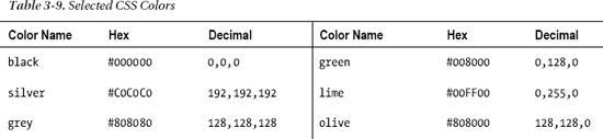
Colors used by a lot of the CSS properties, including the color and background-color properties I have been using in the examples in this chapter. The simplest way to specify a color is to use a predefined color name or to use a decimal or hexadecimal value for each of the red, green, and blue components. Decimal values are separated by a comma, and hex values are usually prefixed with #, such as #ffffff, which represents white. You can see some of the predefined names for colors and their decimal and hex equivalents in Table 3-9.
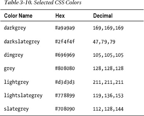
These are known as the basic color names. CSS also defines the extended colors. There are too many to detail here, but you can find a complete list at www.w3.org/TR/css3-color. In addition to the basic colors, a lot of slight variations are available. As an example, Table 3-10 shows the extended set of gray shades that can be used.
Specifying More Complex Colors
Color names and simple hex values aren't the only way you can specify colors. A number of functions allow you to select a color. Table 3-11 describes each of the functions available.
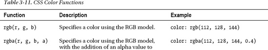
You can use the rgba function to specify a color with transparency, but if you want a completely transparent element, then you can use the special color value transparent.
Understanding CSS Lengths
Many CSS properties require you to specify a length, such as the font-size property, which is used to specify the size of font used to render an element's content. When you specify a length, you concatenate the number of units and the unit identifier together, without any spaces or other characters between them. For example, a value of 20pt for the font-size property means 20 of the units represented by the pt identifier (which are points, explained in a moment). CSS defines two kinds of length unit: those that are absolute and those that are relative to another property. I'll explain both in the sections that follow.
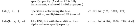
Working with Absolute Lengths
Absolute units are real-world measurements. CSS supports five types of absolute unit, which are described in Table 3-12.
You can mix and match units in a style and also mix absolute and relative units. Absolute units can be useful if you have some prior knowledge of how the content will be rendered, such as when designing for print. I find that I don't use the absolute units that much in my CSS styles. I find the relative units more flexible and easier to maintain, and I rarely create content that has to correspond to real-world measurements.
Tip You might be wondering where pixels are in the table of absolute units. In fact, CSS tries to make pixels a relative unit of measurement, although, sadly, the specification makes a very botched attempt at doing so. You can learn more in the “Working with Pixels” section.
Working with Relative Lengths
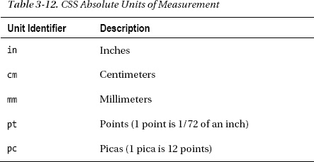
Relative lengths are more complex to specify and implement than absolute units and require tight and concise language to define their meaning unambiguously. A relative unit is measured in terms of some other unit. Unfortunately, the language in the CSS specifications isn't precise enough (a problem that has plagued CSS for years). This means CSS defines a wide range of interesting and useful relative measurements, but you can't use some of them because they don't have widespread or consistent browser support. Table 3-13 shows the relative units that CSS defines and that can be relied on in mainstream browsers.
When you use a relative unit, you are effectively specifying a multiple of another measurement. Listing 3-14 gives an example that sets a property relative to the font-size.
Listing 3-14. Using a Relative Unit
<!DOCTYPE html>

<html>

<head>

    <title>Example</title>

    <style>

        p.details {

            font-size: 15pt;

            height: 3em;

            border: thin solid black;

        }

    </style>

</head>
<body>
<h1 lang="en">New Delivery Service</h1>
<h2 lang="en">Color and Beauty to Your Door</h2>
<p class="details information">We are pleased to announce that we are starting a home
delivery service for your flower needs. We will deliver within a 20 mile radius of
the store for free and $1/mile thereafter.</p>
</body>
</html>
In this example, I have specified the value of the height property (which sets the height of an element) to be 3em, which means that p elements should be rendered so that the height of the element on the screen is three times the font-size. You can see how the browser displays these elements in Figure 3-13. I added a border (using the border property) so you can see the size of the element more readily.
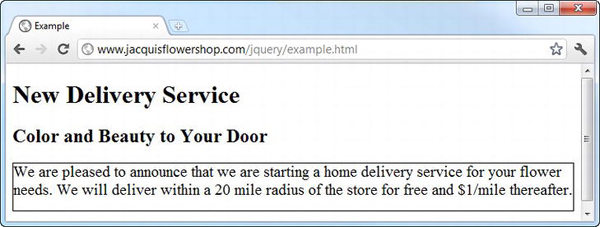
Figure 3-13 The effect of using relative measurements
Working with Pixels
Pixels in CSS are not what you might expect. The usual meaning of the term pixel refers to the smallest addressable unit on a display: one picture element. CSS tries to do something different and defines a pixel as follows:
The reference pixel is the visual angle of one pixel on a device with a pixel density of 96dpi and a distance from the reader of an arm's length.
This is the kind of vague definition that plagues CSS. I don't want to rant, but specifications that are dependent on the length of a user's arm are problematic. Fortunately, the mainstream browsers ignore the difference between pixels as defined by CSS and pixels in the display and treat 1 pixel to be 1/96th of an inch. (This is the standard Windows pixel density; browsers on platforms with displays that have a different pixel density usually implement a translation so that 1 pixel is still roughly 1/96th of an inch.)
Tip Although it isn't much use, you can read the full definition of a CSS pixel at www.w3.org/TR/CSS21/syndata.html#length-units.
The net effect of this is that although CSS pixels are intended to be a relative unit of measure, they are treated as an absolute unit by browsers. Listing 3-15 demonstrates specifying pixels in a CSS style.
Listing 3-15. Using Pixel Units in a Style
<!DOCTYPE html>
<html>
<head>
<title>Example</title>
<style>
p.details {
font-size: 20px;
width: 400px;
border: thin solid black;
}
</style>
</head>
<body>

    <h1 lang="en">New Delivery Service</h1>

    <h2 lang="en">Color and Beauty to Your Door</h2>

    <p class="details information">We are pleased to announce that we are starting a home

    delivery service for your flower needs. We will deliver within a 20 mile radius of

    the store for free and $1/mile thereafter.</p>

</body>

</html>
In this example, I have expressed both the font-size and width properties in pixels (the width property is the complement to the height property and sets the width of an element). You can see how the browser applies this style in Figure 3-14.
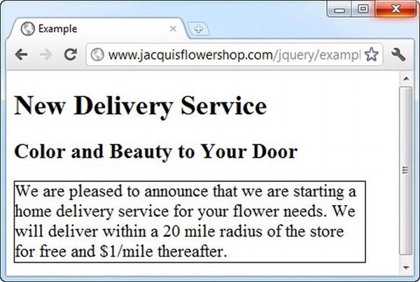
Figure 3-14 Specifying units in pixels
Tip Although I often use pixels as units in CSS, it tends to be a matter of habit. I find em units more flexible. This is because I have to alter the size of the font only when I need to make a change, and the rest of the style works seamlessly. It is important to remember that while CSS pixels were intended to be relative units, they are absolute units in practice and can be inflexible as a consequence.
Working with Percentages
You can express a unit of measurement as a percentage of another property value. You do this using the % (percent) unit, as demonstrated in Listing 3-16.
Listing 3-16. Expressing Units as a Percentage of Another Property Value
<!DOCTYPE html>

<html>

<head>

    <title>Example</title>

    <style>

        p.details {

            font-size: 200%;

            width: 50%;

            border: thin solid black;

        }

    </style>

</head>

<body>

    <h1 lang="en">New Delivery Service</h1>

    <h2 lang="en">Color and Beauty to Your Door</h2>

    <p class="details information">We are pleased to announce that we are starting a home

    delivery service for your flower needs. We will deliver within a 20 mile radius of

    the store for free and $1/mile thereafter.</p>

</body>

</html>
There are two complications in using percentages as units. The first is that not all properties can be expressed in this way, and the second is that each property that can be expressed as a percentage individually defines which other property the percentage refers to. For example, the font-size property uses the inherited font-size value from the parent element, and the width property uses the width of the containing element.
Using Shorthand Properties and Custom Values
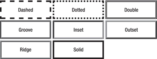
Not all properties are set using units and colors. Some have special values that are unique to the kind of behavior they control. A good example of this is the border property, which I used in some of the examples to draw a border around elements. You set the border property using three values, like this:
border: thin solid black;
The first value is the thickness of the border, the second value is the style of the border, and the final value is the color of the border. Table 3-14 shows the values you can use to specify the thickness of the border.
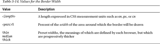
Table 3-15 shows the values you can use for the style of the border.
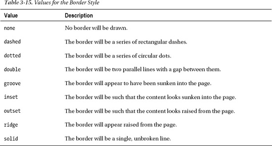
By combining values from these tables with a color, you can achieve a wide range of border effects. You can see the range of styles displayed in the browser in Figure 3-15.
The border property is also a good example of a shorthand property. These properties allow you to set the value of several related properties in a single declaration. This means a border such as the one shown earlier is equivalent to the 12 declarations shown in Listing 3-17.
Listing 3-17. The Individual Border Properties
border-top-color: black;

border-top-style: solid;

border-top-width: thin;

border-bottom-color: black;

border-bottom-style: solid;

border-bottom-width: thin;

border-left-color: black;

border-left-style: solid;

border-left-width: thin;

border-right-color: black;

border-right-style: solid;

border-right-width: thin;
CSS allows you to dig into the details and set individual properties for fine control or to use the shorthand properties when all of the related values are the same.
Summary
In this chapter, I gave you a brief overview of CSS, showing you how to set properties using the style attribute, how to use the style element (including the wide range of selectors that are available), and how the browsers use cascading and specificity to work out which property values should be applied to elements when they are displayed. I finished with a tour of the CSS units, custom values, and shorthand properties. You can express values for properties in a number of different ways, which adds flexibility (and a little confusion) to CSS styles.