
C H A P T E R 30
Using jQuery Mobile Forms
Small screens present unique difficulties when presenting a form on a mobile device. There is little enough screen real estate available to start with, and you need to give the user form elements that are easy to manipulate by touch without creating a page that requires endless scrolling to complete. In this chapter, I show you how jQuery Mobile enhances form elements so that they are consistent with other widgets and can be readily used on a touch screen.
jQuery Mobile does a lot of work automatically when the page is loaded. Many form elements are enhanced without your intervention, and Ajax is automatically used when the form is submitted so that jQuery Mobile can smoothly transition to the results returned by the server.
There are, however, some useful configuration options available. One element in particular (the select element) requires special attention. You can choose between different widgets to present the element to the user, and you can neatly sidestep some issues with the native implementation of select elements.
The jQuery Mobile support for forms is pretty good, but it isn't perfect. In particular, there are some minor layout issues, which means that elements laid out adjacent to one another can have different widths. These are annoying problems, but they do little to undermine the general utility of jQuery Mobile and, given the excitement about jQuery Mobile, I expect these issues to be resolved in a future release.
More broadly, I recommend careful thought when you are creating forms for mobile devices. By their nature, forms are intended to gather input from users, but this can be a tedious process on a small device, especially when it comes to typing. In addition, most mobile devices don't display scrollbars when the user isn't actively scrolling through a page. This means that the user isn't always aware there are form elements just off the immediate display. To create the best possible experience for users, you need to follow some basic guidelines:
- Require as little typing as you can. Where possible, use alternative widgets that allow the user to make simple touch selections, such as check boxes or radio buttons. This can reduce the range of inputs that the user can make, but it might have the effect of increasing the number of users who are willing to complete the form.
- Use navigation between pages to display sections of a form. This gives users a clear indication of their progress through the form and doesn't require them to speculatively scroll to see if they are missing anything.
- Eliminate any form elements that are not required. Mobile forms should be as streamlined as possible, and that can mean accepting less data from mobile users than you get from desktop users.
Table 30-1 provides the summary for this chapter.
Understanding Automatically Created Form Elements
jQuery Mobile automatically creates widgets for form elements when the page is processed, just as it creates button widgets automatically (which I described in Chapter 29). Listing 30-1 shows a jQuery Mobile page that contains a form element and some form-related child elements.
Listing 30-1. A simple form in a jQuery Mobile page
<!DOCTYPE html>

<html>

<head>

    <title>Example</title>

    <meta name="viewport" content="width=device-width, initial-scale=1">

    <link rel="stylesheet" href="jquery.mobile-1.0.css" type="text/css" />

    <script type="text/javascript" src="jquery-1.6.4.js"></script>

    <script type="text/javascript" src="jquery.mobile-1.0.js"></script>

    <style type="text/css">

        #buttonContainer {text-align: center}

    </style>

</head>

<body>

    <div id="page1" data-role="page" data-theme="b">

        <div data-role="header">

           <h1>Jacqui's Shop</h1>

        </div>

        <form method="get">

            <div data-role="fieldcontain">

                <label for="name">Name: </label>

                <input id="name">

            </div>

            <div data-role="fieldcontain">

                <label for="address">Address: </label>

                <textarea id="address"></textarea>

            </div>

            <div id="buttonContainer">

                <input type="submit" data-inline="true" value="Submit"/>

            </div>

        </form>

    </div>

</body>

</html>
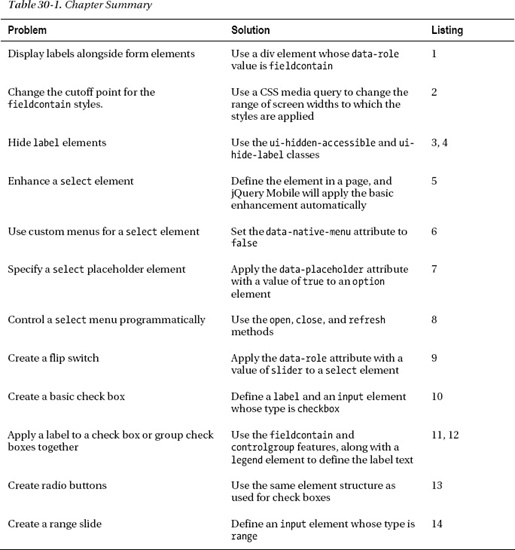
This is a very simple form, but it lets me set the scene for how jQuery Mobile handles forms overall. There are two form elements: a text input and a textarea, each of which is paired with a label element. You can see the result in Figure 30-1.
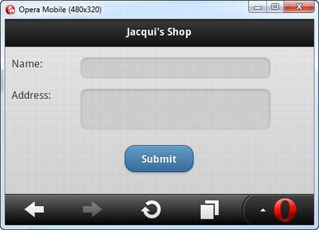
Figure 30-1. A simple form displayed by jQuery Mobile
 Tip jQuery Mobile will automatically submit the form when an
 input element whose type is submit is included within a form element. The form will be submitted using Ajax by default, but this behavior can be disabled by applying the data-ajax attribute with a value of false to the form element.
Working with Form Labels
In the last example, each form element and its label are wrapped in a div element. I set the data-role of the div element to be fieldcontain, which tells jQuery Mobile that I want the label and the form element displayed in a single line, and you can see the effect in Figure 30-1.
The styles that jQuery Mobile applies to align the label and the form element are used only when the screen is at least 450 pixels wide. Below that width value, the label and the form element are displayed on separate rows, as illustrated by Figure 30-2.
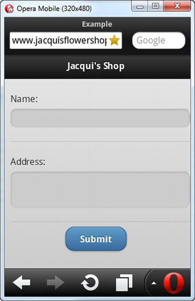
Figure 30-2. Displaying a form in portrait orientation
Changing the fieldcontain Cutoff Point
I don't like the 450-pixel cutoff point. It is arbitrary and doesn't take into account the wide range of mobile device screen sizes and resolutions.
You can easily extend the reach of the fieldcontain feature by applying the underlying CSS classes directly to your document and, optionally, use CSS media queries specifying your own rules for when they are applied. Listing 30-2 shows the relevant styles and applies a cutoff point of 100 pixels.
Listing 30-2. Changing the cutoff point for the fieldcontain classes
<!DOCTYPE html>

<html>

<head>

    <title>Example</title>

    <meta name="viewport" content="width=device-width, initial-scale=1">

    <link rel="stylesheet" href="jquery.mobile-1.0.css" type="text/css" />

    <script type="text/javascript" src="jquery-1.6.4.js"></script>

    <script type="text/javascript" src="jquery.mobile-1.0.js"></script>

    <style type="text/css">

            #buttonContainer {text-align: center}
            @media all and (min-width: 100px){

                .ui-field-contain label.ui-input-text  { vertical-align: top;

                    display: inline-block;  width: 20%;  margin: 0 2% 0 0 }

                .ui-field-contain input.ui-input-text,

                .ui-field-contain textarea.ui-input-text,

                .ui-field-contain .ui-input-search { width: 60%; display: inline-block;}

                .ui-field-contain .ui-input-search { width: 50%; }

                .ui-hide-label input.ui-input-text,

                .ui-hide-label textarea.ui-input-text,

                .ui-hide-label .ui-input-search { padding: .4em; width: 97%; }

                .ui-input-search input.ui-input-text { width: 98%;}

            }

    </style>

</head>

<body>

    <div id="page1" data-role="page" data-theme="b">

        <div data-role="header">

           <h1>Jacqui's Shop</h1>

        </div>

        <form method="get">

            <div data-role="fieldcontain">

                <label for="name">Name: </label>

                <input id="name">

            </div>

            <div data-role="fieldcontain">

                <label for="address">Address: </label>

                <textarea id="address"></textarea>

            </div>

            <div id="buttonContainer">

                <input type="submit" data-inline="true" value="Submit"/>

            </div>

        </form>

    </div>

</body>

</html>
jQuery Mobile has already applied the classes to the elements in response to the fieldcontainer role, which makes it easy for us to change the limit or tweak the CSS.
While I think the 450-pixel limit is arbitrary, I agree that there is a point at which displaying the labels alongside the form elements makes it hard to for the user to activate a form element with a finger and impossible to see all of the contents. Although I have shown a 100-pixel limit in the example, you should test carefully with your target devices and make sure that your application remains usable at the limit you set. Figure 30-3 shows the effect of reducing the limit to below the 320-pixel width of my emulator window.
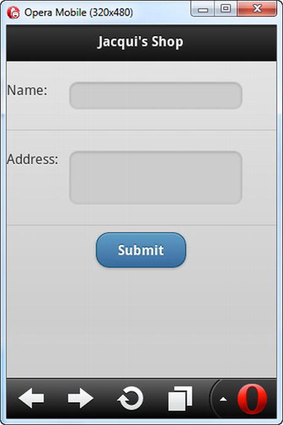
Figure 30-3. Displaying labels alongside form elements on a narrow screen
Hiding Labels
A popular approach is to hide labels when the device is in portrait mode and show them in landscape mode. I am not especially keen on this idea because the labels often provide important context to the user. That said, you can still provide some helpful hints using the HTML5 placeholder attribute.
jQuery Mobile provides a CSS class that hides labels in a way that keeps them available for screen readers and other assistive technologies. It does this by leaving the label in the document, but moving it out of site. To hide an individual label, you apply the ui-hidden-class to the label element. To hide all of the labels in a container element, you can apply the ui-hide-label class to the parent element. Listing 30-3 shows the user both attributes along with the placeholder attributes to give the user some idea what the form elements are for.
Listing 30-3. Hiding labels for form elements
<!DOCTYPE html>

<html>

<head>

    <title>Example</title>

    <meta name="viewport" content="width=device-width, initial-scale=1">

    <link rel="stylesheet" href="jquery.mobile-1.0.css" type="text/css" />
    <script type="text/javascript" src="jquery-1.6.4.js"></script>

    <script type="text/javascript" src="jquery.mobile-1.0.js"></script>

    <style type="text/css">

            #buttonContainer {text-align: center}

    </style>

</head>

<body>

    <div id="page1" data-role="page" data-theme="b">

        <div data-role="header">

           <h1>Jacqui's Shop</h1>

        </div>

        <form method="get">


            <label for="name" class="ui-hidden-accessible">Name: </label>

            <input id="name" placeholder="Your Name">


            <div data-role="fieldcontain" class="ui-hide-label">

                <label for="address">Address: </label>

                <textarea id="address" placeholder="Your Address"></textarea>

            </div>

            <div id="buttonContainer">

                <input type="submit" data-inline="true" value="Submit"/>

            </div>

        </form>

    </div>

</body>

</html>
Tip Notice that I removed the fieldcontain parent element from the first label and form element. If you apply the ui-hidden-accessible class to a label element that is inside a fieldcontain element, the labels isn't visible but the space for it is still preserved in the layout, which limits the size of the form element and offsets it to the right.
You can see the effect of these changes in Figure 30-4.
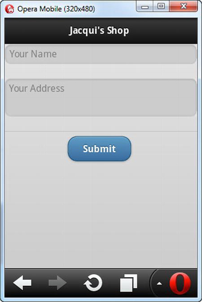
Figure 30-4. Hiding form labels
Hiding the labels is a compromise, and it usually doesn't make sense to hide labels when the device is in landscape mode. You can respond to the orientationchange event (which I described in Chapter 26) and selectively add and remove the ui-hide-label class, as shown in Listing 30-4. (You need to use fieldcontrol div elements in this situation to keep the label in line with the form control in landscape mode.
Listing 30-4. Hiding labels selectively
<!DOCTYPE html>

<html>

<head>

    <title>Example</title>

    <meta name="viewport" content="width=device-width, initial-scale=1">

    <link rel="stylesheet" href="jquery.mobile-1.0.css" type="text/css" />

    <script type="text/javascript" src="jquery-1.6.4.js"></script>

    <script type="text/javascript">

        $(document).bind("pageinit", function() {

            $(window).bind("orientationchange", function(ev) {

                processOrientation(ev.orientation)

            })
            processOrientation(jQuery.event.special.orientationchange.orientation())


            function processOrientation(orientation) {

                var elems = $('div[data-role=fieldcontain]'),

                if (orientation == "portrait") {

                    elems.addClass("ui-hide-label")

                } else {

                    elems.removeClass("ui-hide-label")


            }

        })

    </script>

    <script type="text/javascript" src="jquery.mobile-1.0.js"></script>

    <style type="text/css">

        #buttonContainer {text-align: center}

    </style>

</head>

<body>

    <div id="page1" data-role="page" data-theme="b">

        <div data-role="header">

           <h1>Jacqui's Shop</h1>

        </div>

        <form method="get">

            <div data-role="fieldcontain" class="ui-hide-label">

                <label for="name">Name: </label>

                <input id="name" placeholder="Your Name">

            </div>

            <div data-role="fieldcontain" class="ui-hide-label">

                <label for="address">Address: </label>

                <textarea id="address" placeholder="Your Address"></textarea>

            </div>

            <div id="buttonContainer">

                <input type="submit" data-inline="true" value="Submit"/>

            </div>

        </form>

    </div>

</body>

</html>
The labels are hidden in the portrait mode and displayed in the landscape mode, as Figure 30-5 shows.
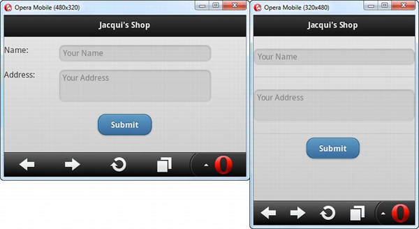
Figure 30-5. Selectively hiding form element labels
Using Select Elements
jQuery Mobile provides you with two ways to deal with select elements. The first is to present the element as a button with a down icon, which is the approach that will be used automatically when jQuery Mobile is processing the page and finds a select. Listing 30-5 contains a select element.
Listing 30-5. A page containing a select element
<!DOCTYPE html>

<html>

<head>

    <title>Example</title>

    <meta name="viewport" content="width=device-width, initial-scale=1">

    <link rel="stylesheet" href="jquery.mobile-1.0.css" type="text/css" />

    <script type="text/javascript" src="jquery-1.6.4.js"></script>

    <script type="text/javascript" src="jquery.mobile-1.0.js"></script>

    <style type="text/css">

        #buttonContainer {text-align: center}

    </style>

</head>

<body>

    <div id="page1" data-role="page" data-theme="b">

        <div data-role="header">

           <h1>Jacqui's Shop</h1>

        </div>

        <form method="get">

            <div data-role="fieldcontain">
                <label for="name">Name: </label>

                <input id="name" placeholder="Your Name">

            </div>

            <div data-role="fieldcontain">

                <label for="speed"><span>Speed: </span></label>

                <select id="speed" name="speed">

                    <option value="vfast">Very Fast</option>

                    <option value="fast">Fast</option>

                    <option value="normal" selected>Normal</option>

                    <option value="slow">Slow</option>

                </select>

            </div>

            <div id="buttonContainer">

                <input type="submit" data-inline="true" value="Submit"/>

            </div>

        </form>

    </div>

</body>

</html>
You can see how jQuery Mobile enhances select elements in Figure 30-6. I switched to the Windows Phone 7 emulator for this section because the Opera Emulator doesn't display styled select elements properly.
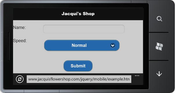
Figure 30-6. A select element that has been enhanced by jQuery Mobile
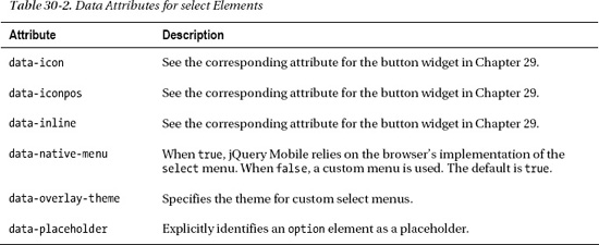
jQuery Mobile defines some data attributes that can be used to tailor the appearance and behavior of select elements. These attributes are summarized in Table 30-2, and I explain the use of the most important ones in the sections that follow.
Tip Because jQuery Mobile uses button widgets to represent select elements, you can group elements together using the same techniques I described in Chapter 29, with the controlgroup value for the data-role attribute.
Using Custom Selection Menus
Most mobile browsers provide a touch-enabled approach to displaying the options in a select element. For example, the Windows Phone 7 browser switches to a new screen that lists the options in a way that makes them easy to select with a finger (as shown in Figure 30-7), while other mobile browsers display a simple popup menu in which the items are displayed large enough to select by touch.
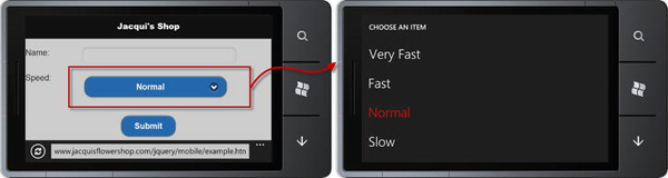
Figure 30-7. A mobile browser dealing with a select element
You can override the native behavior of the browser and have jQuery Mobile create a popup menu that is suitable for touch selection. You do this by applying the data-native-menu attribute to the select element with a value of false, as shown by Listing 30-6.
Listing 30-6. Disabling native select menus
...

<div data-role="fieldcontain">

    <label for="speed"><span>Speed: </span></label>

    <select id="speed" name="speed" data-native-menu=false>

        <option value="vfast">Very Fast</option>

        <option value="fast">Fast</option>

        <option value="normal" selected>Normal</option>

        <option value="slow">Slow</option>

    </select>

</div>

...
This feature is useful for mobile browsers that don't handle native select elements properly (such as Opera Mobile) and when you want to create an application that has a consistent appearance on both desktop and mobile browsers. When you set the data-native-menu attribute to false, jQuery Mobile removes the select element from the document and replaces it with a button widget that displays a custom menu when it is clicked, as shown in Figure 30-8.
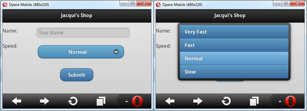
Figure 30-8. Using jQuery Mobile custom menus for a select element
Tip jQuery Mobile uses swatch A for custom select menus by default. You can change this by specifying a different swatch as the value for the data-overlay-theme attribute.
Specifying Placeholder Elements
You can use an option element as the placeholder for a select element by setting the value of the data-placeholder attribute to true. Placeholders are shown when the select element is initially displayed but isn't present in the list of options that the user chooses from. Listing 30-7 shows the use of the data-placeholder attribute.
Listing 30-7. Using the data-placeholder attribute
...

<div data-role="fieldcontain">

    <label for="speed"><span>Speed: </span></label>

    <select id="speed" name="speed" data-native-menu=false>

        <option data-placeholder=true value="placeholder">Select a Speed</option>

        <option value="vfast">Very Fast</option>

        <option value="fast">Fast</option>

        <option value="normal">Normal</option>

        <option value="slow">Slow</option>

    </select>

</div>

...
You can see the effect in Figure 30-9. I generally like to use placeholders with select menus, but this is an especially useful technique for giving the user context when hiding label elements in portrait layouts.
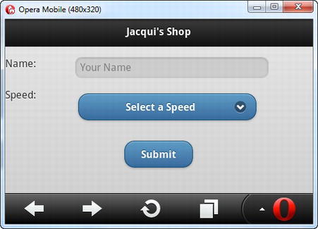
Figure 30-9. Specifying a placeholder element
Controlling Select Menus Programmatically
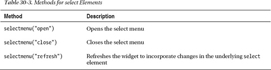
You can control the select widget menu programmatically using the methods described in Table 30-3. These methods follow the jQuery UI standard of passing a string to the widget method, which is selectmenu in this case.
Listing 30-8 shows how to use buttons to control the select menu.
Listing 30-8. Controlling the select menu programmatically
<!DOCTYPE html>

<html>

<head>

    <title>Example</title>

    <meta name="viewport" content="width=device-width, initial-scale=1">

    <link rel="stylesheet" href="jquery.mobile-1.0.css" type="text/css" />

    <script type="text/javascript" src="jquery-1.6.4.js"></script>

    <script type="text/javascript">

        $(document).bind("pageinit", function() {

            $('button').bind("tap", function() {

                if (this.id == "open") {

                    $('#speed').selectmenu("open")

                } else {

                    $('#speed').selectmenu("close")

                }

            })

        })

    </script>

    <script type="text/javascript" src="jquery.mobile-1.0.js"></script>

    <style type="text/css">

        #buttonContainer {text-align: center}

    </style>

</head>

<body>

    <div id="page1" data-role="page" data-theme="b">

        <div data-role="header">

           <h1>Jacqui's Shop</h1>

        </div>
        <form method="get">


            <div class="ui-grid-a">

                <div class="ui-block-a">

                    <button id="open">Open Menu</button>

                </div>

                <div class="ui-block-b">

                    <button id="close">Close Menu</button>

                </div>

            </div>


            <select id="speed" name="speed" data-native-menu=false>

                <option data-placeholder=true value="placeholder">Select a Speed</option>

                <option value="vfast">Very Fast</option>

                <option value="fast">Fast</option>

                <option value="normal">Normal</option>

                <option value="slow">Slow</option>

            </select>


            <div id="buttonContainer">

                <input type="submit" data-inline="true" value="Submit"/>

            </div>

        </form>

    </div>

</body>

</html>
Creating Flip Switches
If a select element contains only two option elements, you can elect to create a flip switch instead of a regular select widget. You create a flip switch by applying the data-role attribute to the select element with a value of slider, as shown in Listing 30-9.
Listing 30-9. Creating a flip switch
<!DOCTYPE html>

<html>

<head>

    <title>Example</title>

    <meta name="viewport" content="width=device-width, initial-scale=1">

    <link rel="stylesheet" href="jquery.mobile-1.0.css" type="text/css" />

    <script type="text/javascript" src="jquery-1.6.4.js"></script>

    <script type="text/javascript" src="jquery.mobile-1.0.js"></script>

    <style type="text/css">

        #buttonContainer {text-align: center}

    </style>

</head>

<body>

    <div id="page1" data-role="page" data-theme="b">

        <div data-role="header">
           <h1>Jacqui's Shop</h1>

        </div>

        <form method="get">


            <div data-role="fieldcontain">

                <label for="speed"><span>Speed: </span></label>

                <select id="speed" name="speed" data-role="slider">

                    <option value="fast">Fast</option>

                    <option value="slow">Slow</option>

                </select>

            </div>


            <div data-role="fieldcontain">

                <label for="size"><span>Size: </span></label>

                <select id="size" name="size" data-role="slider">

                    <option value="large">Large</option>

                    <option value="small" selected>Small</option>

                </select>

            </div>


            <div id="buttonContainer">

                <input type="submit" data-inline="true" value="Submit"/>

            </div>

        </form>

    </div>

</body>

</html>
There are two flip switches in this example. You can see how they are displayed in the browser in Figure 30-10. The user can change the setting either by tapping or clicking on the exposed value or by dragging the slider into position.
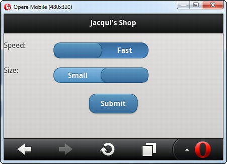
Figure 30-10. Using flip switches
Creating Check Boxes
You can configure the appearance of check boxes in a number of ways. The simplest way is to give jQuery Mobile just an input element whose type is check box, followed by a label element, as shown in Listing 30-10.
Listing 30-10. Creating simple check boxes
<!DOCTYPE html>

<html>

<head>

    <title>Example</title>

    <meta name="viewport" content="width=device-width, initial-scale=1">

    <link rel="stylesheet" href="jquery.mobile-1.0.css" type="text/css" />

    <script type="text/javascript" src="jquery-1.6.4.js"></script>

    <script type="text/javascript" src="jquery.mobile-1.0.js"></script>

    <style type="text/css">

        #buttonContainer {text-align: center}

    </style>

</head>

<body>

    <div id="page1" data-role="page" data-theme="b">

        <div data-role="header">

           <h1>Jacqui's Shop</h1>

        </div>

        <form method="get">

            <div data-role="fieldcontain">

                <label for="name">Name: </label>

                <input id="name" placeholder="Your Name">

            </div>


            <input type="checkbox" name="check" id="check"/>

            <label for="check">I agree</label>


            <div id="buttonContainer">

                <input type="submit" data-inline="true" value="Submit"/>

            </div>

        </form>

    </div>

</body>

</html>
You can see how this check box is presented in Figure 30-11. I have shown the checked and unchecked state of the check box in the figure.
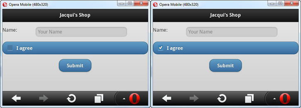
Figure 30-11. A simple jQuery Mobile check box
Applying a Label to a Check Box
By default, check boxes span the entire width of their parent element, which means, in this case, that the check box is the entire width of the screen. You need to use a particular element structure if you want to make the check box fit into the layout so that it matches the text input above it, as shown in Listing 30-11.
Listing 30-11. Changing the layout of a check box
<!DOCTYPE html>

<html>

<head>

    <title>Example</title>

    <meta name="viewport" content="width=device-width, initial-scale=1">

    <link rel="stylesheet" href="jquery.mobile-1.0.css" type="text/css" />

    <script type="text/javascript" src="jquery-1.6.4.js"></script>

    <script type="text/javascript" src="jquery.mobile-1.0.js"></script>

    <style type="text/css">

        #buttonContainer {text-align: center}

    </style>

</head>

<body>

    <div id="page1" data-role="page" data-theme="b">

        <div data-role="header">

           <h1>Jacqui's Shop</h1>

        </div>

        <form method="get">

            <div data-role="fieldcontain">

                <label for="name">Name: </label>

                <input id="name" placeholder="Your Name">
            </div>

            <div data-role="fieldcontain">

                <fieldset data-role="controlgroup">

                    <legend>Terms & Conditions:</legend>

                    <input type="checkbox" name="check" id="check"/>

                    <label for="check">I agree</label>

                </fieldset>

            </div>


            <div id="buttonContainer">

                <input type="submit" data-inline="true" value="Submit"/>

            </div>

        </form>

    </div>

</body>

</html>
The outer element should be familiar by now—a div element with the data-role attribute set to fieldcontain. The problem that jQuery Mobile faces is that there is already a label element associated with the input element, so you have to take an alternative path to give jQuery Mobile the information it needs. You do this by adding a fieldset element whose data-role is set to controlgroup and adding a legend element before the input, containing the text you want displayed. You can see the effect in Figure 30-12. The new layout isn't quite perfect, but it is a significant improvement.
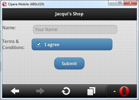
Figure 30-12. Changing the layout of a check box
Grouping Check Boxes
You can also use a fieldset element with a data-role of controlgroup to group multiple check boxes together. Listing 30-12 contains a demonstration.
Listing 30-12. Grouping check boxes together
<!DOCTYPE html>

<html>

<head>

    <title>Example</title>

    <meta name="viewport" content="width=device-width, initial-scale=1">

    <link rel="stylesheet" href="jquery.mobile-1.0.css" type="text/css" />

    <script type="text/javascript" src="jquery-1.6.4.js"></script>

    <script type="text/javascript" src="jquery.mobile-1.0.js"></script>

    <style type="text/css">

        #buttonContainer {text-align: center}

    </style>

</head>

<body>

    <div id="page1" data-role="page" data-theme="b">

        <div data-role="header">

           <h1>Jacqui's Shop</h1>

        </div>

        <form method="get">

            <div data-role="fieldcontain">

                <label for="name">Name: </label>

                <input id="name" placeholder="Your Name">

            </div>


            <div data-role="fieldcontain">

                <fieldset data-role="controlgroup">

                    <legend>Choose Your Flowers:</legend>

                    <input type="checkbox" name="roses" id="roses"/>

                    <label for="roses">Roses</label>

                    <input type="checkbox" name="orchids" id="orchids"/>

                    <label for="orchids">Orchids</label>

                    <input type="checkbox" name="astors" id="astors"/>

                    <label for="astors">Astors</label>

                </fieldset>

            </div>


            <div data-role="fieldcontain">

                <fieldset data-role="controlgroup" data-type="horizontal">

                    <legend>Font:</legend>

                    <input type="checkbox" name="bold" id="bold"/>

                    <label for="bold"><b>b</b></label>

                    <input type="checkbox" name="italic" id="italic"/>

                    <label for="italic"><em>i</em></label>

                    <input type="checkbox" name="underline" id="underline"/>

                    <label for="underline"><u>u</u></label>

                </fieldset>

            </div>


            <div id="buttonContainer">
                <input type="submit" data-inline="true" value="Submit"/>

            </div>

        </form>

    </div>

</body>

</html>
There are two groups of check boxes in this example. The first set is laid out vertically, which is the default orientation. jQuery Mobile changes the style of the widgets so that there is no space between the individual input elements and only the outer corners of the block are rounded. For the second set, I set the data-type attribute to horizontal, which changes the direction of the layout and causes jQuery Mobile to hide the check box, creating a set of buttons that can be toggled on and off. You can see the result in Figure 30-13.
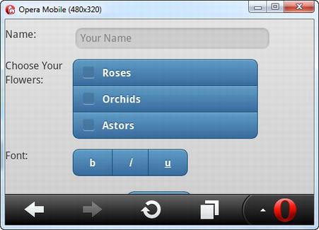
Figure 30-13. Grouping check boxes
Creating Radio Buttons
You format radio buttons in much the same way as you format check boxes. Listing 30-13 contains an example.
Listing 30-13. Creating a group of radio buttons
<!DOCTYPE html>

<html>

<head>

    <title>Example</title>

    <meta name="viewport" content="width=device-width, initial-scale=1">

    <link rel="stylesheet" href="jquery.mobile-1.0.css" type="text/css" />

    <script type="text/javascript" src="jquery-1.6.4.js"></script>

    <script type="text/javascript" src="jquery.mobile-1.0.js"></script>
    <style type="text/css">

        #buttonContainer {text-align: center}

    </style>

</head>

<body>

    <div id="page1" data-role="page" data-theme="b">

        <div data-role="header">

           <h1>Jacqui's Shop</h1>

        </div>

        <form method="get">

            <div data-role="fieldcontain">

                <label for="name">Name: </label>

                <input id="name" placeholder="Your Name">

            </div>


            <div data-role="fieldcontain">

                <fieldset data-role="controlgroup">

                    <legend>Choose Your Flowers:</legend>

                    <input type="radio" name="flowers" id="roses"/>

                    <label for="roses">Roses</label>

                    <input type="radio" name="flowers" id="orchids"/>

                    <label for="orchids">Orchids</label>

                    <input type="radio" name="flowers" id="astors"/>

                    <label for="astors">Astors</label>

                </fieldset>

            </div>


            <div data-role="fieldcontain">

                <fieldset data-role="controlgroup" data-type="horizontal">

                    <legend>Choose Your Flowers:</legend>

                    <input type="radio" name="flowers" id="roses"/>

                    <label for="roses">Roses</label>

                    <input type="radio" name="flowers" id="orchids"/>

                    <label for="orchids">Orchids</label>

                    <input type="radio" name="flowers" id="astors"/>

                    <label for="astors">Astors</label>

                </fieldset>

            </div>


            <div id="buttonContainer">

                <input type="submit" data-inline="true" value="Submit"/>

            </div>

        </form>

    </div>

</body>

</html>
Once again, I created horizontal and vertical groups, and you can see how they are displayed in the browser in Figure 30-14.
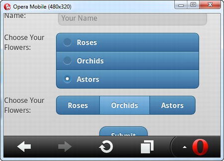
Figure 30-14. Creating groups of radio buttons
Using Range Sliders
When jQuery Mobile encounters an input element whose type is range, it creates a range slider. Listing 30-14 shows the use of this element in a page.
Listing 30-14. Using a range slider
<!DOCTYPE html>

<html>

<head>

    <title>Example</title>

    <meta name="viewport" content="width=device-width, initial-scale=1">

    <link rel="stylesheet" href="jquery.mobile-1.0.css" type="text/css" />

    <script type="text/javascript" src="jquery-1.6.4.js"></script>

    <script type="text/javascript" src="jquery.mobile-1.0.js"></script>

    <style type="text/css">

        #buttonContainer {text-align: center}

    </style>

</head>

<body>

    <div id="page1" data-role="page" data-theme="b">

        <div data-role="header">

           <h1>Jacqui's Shop</h1>

        </div>

        <form method="get">


            <div data-role="fieldcontain">

                <label for="name">Name: </label>

                <input id="name" placeholder="Your Name">

            </div>
            <div data-role="fieldcontain">

                <label for="quant"><span>Quantity: </span></label>

                <input id="quant" type="range" value="5" min="1" max="10" />

            </div>


            <div id="buttonContainer">

                <input type="submit" data-inline="true" value="Submit"/>

            </div>

        </form>

    </div>

</body>

</html>
You can see the way that jQuery Mobile enhances this element in Figure 30-15.
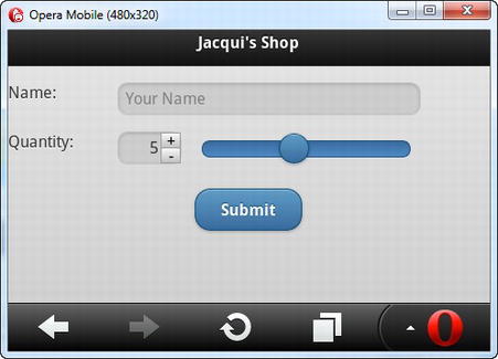
Figure 30-15. Using a range slider
Summary
In this chapter, I showed how jQuery Mobile enhances form elements to make them consistent with the broader touch-enabled style. You don't have to take any special action to submit a form, which is done automatically using Ajax so that jQuery Mobile can smoothly manage the transition to the page returned by the server. You can rely on jQuery Mobile to automatically enhance form elements, but there are some good reasons to apply some additional elements and data-role attributes, especially when it comes to dealing with select elements. Overall, the way that jQuery Mobile handles forms is reasonably slick and elegant, although there are some minor formatting issues in the way that elements are sized on screen.