
C H A P T E R 31
jQuery Mobile Lists
In this chapter, I describe the jQuery Mobile list widget. Lists are an important tool in building mobile web applications, and they often provide simple and obvious navigation around the different functional areas of a web application. The beauty of lists is that they are compact, even when the individual list items are large enough to be selected by touch. They are also extremely well understood by users. Simply placing an arrow icon at the right edge of a list item (which jQuery Mobile does by default) makes it clear to most users that selecting the item will cause some kind of selection or navigation to occur. Table 31-1 provides the summary for this chapter.
Getting Started with Lists
There are a number of ways you can set up a list using jQuery Mobile. To get started, Listing 31-1 shows a basic list that links to jQuery Mobile pages inside the same document. Each page describes a different flower, and the list provides the user with a mechanism to navigate to these pages.
Listing 31-1. A basic list
<!DOCTYPE html>

<html>

<head>

    <title>Example</title>

    <meta name="viewport" content="width=device-width, initial-scale=1">

    <link rel="stylesheet" href="jquery.mobile-1.0.css" type="text/css" />

    <script type="text/javascript" src="jquery-1.6.4.js"></script>

    <script type="text/javascript" src="jquery.mobile-1.0.js"></script>

    <style type="text/css">

        .lcontainer {float: left; text-align: center; padding-top: 10px}

        .productData {float: right; padding: 10px; width: 60%}

    </style>

</head>

<body>

    <div id="page1" data-role="page" data-theme="b">

        <div data-role="header">

           <h1>Jacqui's Shop</h1>

        </div>


        <ul data-role="listview">

            <li><a href="#roses">Roses</a></li>

            <li><a href="#orchids">Orchids</a></li>

            <li><a href="#astors">Astors</a></li>

        </ul>

    </div>


  <div id="roses" data-role="page" data-theme="b">

        <div data-role="header">

           <h1>Roses</h1>

        </div>

        <div>

            <div class="lcontainer">

                <img src="rose.png">

                <div><a href="#" data-rel="back" data-role="button"
data-inline=true data-direction="reverse">Back</a>
</div>
</div>
<div class="productData">
A rose is a woody perennial within the family Rosaceae.
They form a group of erect shrubs, and climbing or trailing plants.
<div><b>Price: $4.99</b></div>
</div>
</div>
</div>
<div id="orchids" data-role="page" data-theme="b">
<div data-role="header">
<h1>Orchids</h1>
</div>
<div>
<div class="lcontainer">
<img src="orchid.png">
<div><a href="#" data-rel="back" data-role="button"
data-inline=true data-direction="reverse">Back</a>
</div>
</div>
<div class="productData">
The orchid family is a diverse and widespread family in the order
Asparagales. It is one of the largest families of flowering plants.
<div><b>Price: $10.99</b></div>
</div>
</div>
</div>
<div id="astors" data-role="page" data-theme="b">
<div data-role="header">
<h1>Astors</h1>
</div>
<div>
<div class="lcontainer">
<img src="astor.png">
<div><a href="#" data-rel="back" data-role="button"
data-inline=true data-direction="reverse">Back</a>
</div>
</div>
<div class="productData">
The name Astor comes from the Ancient Greek word meaning "star",
referring to the shape of the flower head.
<div><b>Price: $2.99</b></div>
</div>
</div>
</div>
</body>
</html>
Most of this document is given over to the pages that describe the flowers. The actual list is just a few elements, as follows:
<ul data-role="listview">
<li><a href="#roses">Roses</a></li>
<li><a href="#orchids">Orchids</a></li>
<li><a href="#astors">Astors</a></li>
</ul>
 Tip I used the
 ul element in this example, but jQuery Mobile treats numbered lists (created with the ol element) in just the same way.
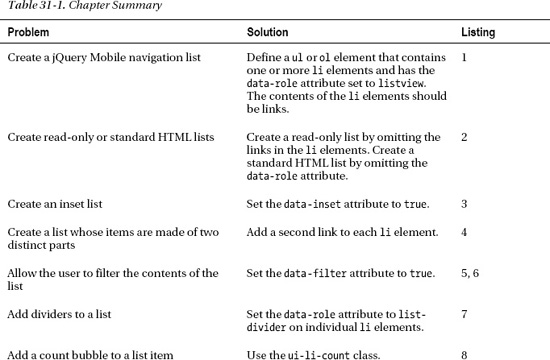
This is a standard HTML unnumbered list, expressed using the ul element, that contains three li elements. To create the jQuery Mobile list widget, I set the data-role attribute on the ul element to listview. The basic use for a list widget is to provide navigation and to this end, the content of each li element is an a element that links to one of the other pages in the document. You can see how the list is displayed in the browser in Figure 31-1.
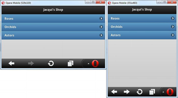
Figure 31-1 A simple jQuery Mobile list widget
Clicking or tapping the individual list items takes the user to the appropriate page. You can see one of these pages in Figure 31-2. I added a link-based button to each page that takes the user back to the list, using the standard transition (but in reverse).
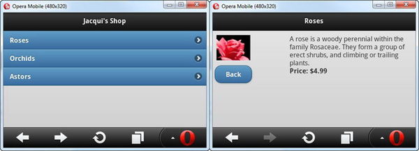
Figure 31-2 Using the list to navigate to another page
Formatting Lists
jQuery Mobile defines a number of data attributes you can use to format lists. These attributes are described in Table 31-2.
Creating Vanilla List Items
I showed list items that contained a elements in the last example because this is the most common use for the list widget. If you omit the links, you create a plain list, also known as a read-only list. If you omit the data-role attribute from the ul or ol element, jQuery Mobile doesn’t create a widget at all, and you get a standard HTML list. Listing 31-2 shows both techniques.
Listing 31-2. Creating read-only and unformatted lists
...
<div id="page1" data-role="page" data-theme="b">
<div data-role="header">
<h1>Jacqui's Shop</h1>
</div>
<ul>
<li><a href="#roses">Roses</a></li>
<li><a href="#orchids">Orchids</a></li>
<li><a href="#astors">Astors</a></li>
</ul>
<ul data-role="listview" data-theme="e">
<li>Roses</li>
<li>Orchids</li>
<li>Astors</li>
</ul>
</div>
...
The first list is the run-of-the-mill HTML list. I included it here because even though I have not created a jQuery Mobile widget, the user can still use these links to navigate to other pages. This is the basic navigation approach I introduced in Chapter 27.
The second list is read-only. When you create a read-only list, jQuery Mobile applies the default content styles from the current swatch, which makes it hard to differentiate between the list and other content in the page. To make the list easier to see, I applied the data-theme attribute to the ul element, which applies a swatch to all of the list items. You can see both lists in Figure 31-3.
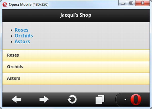
Figure 31-3 A raw HTML list and a read-only list
I recommend being cautious when you consider using read-only lists, especially if you have used other lists to help the user navigate through your application. There isn’t enough difference in the appearance of a read-only list, and my user test usually shows the user trying to tap the read-only lists, causing confusion and frustration.
Creating Inset Lists
The default layout for lists is to fill the width of the container element and to have square corners, which doesn’t match the style of other jQuery Mobile widgets. To make the style consistent, you can create an inset list, which has rounded corners and can be used in elements that do not touch the edges of the screen. You create an inset list by applying the data-inset attribute with a value of true to the ul or ol element, as shown in Listing 31-3.
Listing 31-3. Creating an inset list
...
<div id="page1" data-role="page" data-theme="b">
<div data-role="header">
<h1>Jacqui's Shop</h1>
</div>
<div id="container" style="padding: 20px">
<ul data-role="listview" data-inset=true>
<li><a href="#roses">Roses</a></li>
<li><a href="#orchids">Orchids</a></li>
<li><a href="#astors">Astors</a></li>
</ul>
</div>
</div>
...
In this example, I placed the ul element inside a div element. I used the CSS padding setting to inset the list from the edge of the parent element, and I used the data-inset attribute to change the style of the list. You can see the result in Figure 31-4.
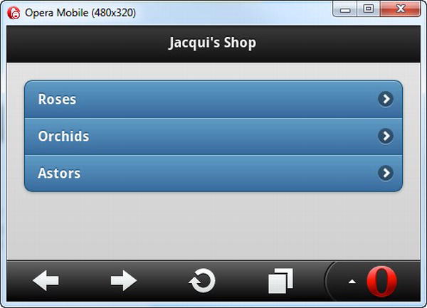
Figure 31-4 Creating an inset list
Creating Split Lists
Split lists are useful when there are two actions that can be performed for each item in the list. The list item is split into two sections, and clicking or tapping on each part of the item leads to a different action. Listing 31-4 shows a split list that allows users to get information about a flower or simply add it to their shopping basket.
Listing 31-4. Using a split list
<!DOCTYPE html>
<html>
<head>
<title>Example</title>
<meta name="viewport" content="width=device-width, initial-scale=1">
<link rel="stylesheet" href="jquery.mobile-1.0.css" type="text/css" />
<script type="text/javascript" src="jquery-1.6.4.js"></script>
<script type="text/javascript" src="jquery.mobile-1.0.js"></script>
<style type="text/css">
.lcontainer {float: left; text-align: center; padding-top: 10px}
.productData {float: right; padding: 10px; width: 60%}
.cWrapper {text-align: center; margin: 20px}
</style>
</head>
<body>
<div id="page1" data-role="page" data-theme="b">
<div data-role="header"> <h1>Jacqui's Shop</h1>
</div>
<div id="container" style="padding: 20px">
<ul data-role="listview" data-inset=true>
<li><a href="#basket" class="buy" id="rose">Roses</a>
<a href="#roses">Roses</a></li>
<li><a href="#basket" class="buy" id="orchid">Orchids</a>
<a href="#orchids">Orchids</a> </li>
<li><a href="#basket" class="buy" id="astor">Astors</a>
<a href="#astors">Astors</a> </li>
</ul>
</div>
</div>
<div id="basket" data-role="page" data-theme="b">
<div data-role="header">
<h1>Jacqui's Shop</h1>
</div>
<div class="cWrapper">
Basket will go here
</div>
<div class="cWrapper">
<a href="#" data-rel="back" data-role="button" data-inline=true
data-direction="reverse">Back</a>
</div>
</div>
<div id="roses" data-role="page" data-theme="b">
<div data-role="header">
<h1>Roses</h1>
</div> <div>
<div class="lcontainer">
<img src="rose.png">
<div><a href="#" data-rel="back" data-role="button"
                       data-inline=true data-direction="reverse">Back</a>

                </div>

            </div>

            <div class="productData">

                A rose is a woody perennial within the family Rosaceae.

                They form a group of erect shrubs, and climbing or trailing plants.

                <div><b>Price: $4.99</b></div>

            </div>

        </div>

    </div>


   <div id="orchids" data-role="page" data-theme="b">

        <div data-role="header">

           <h1>Orchids</h1>

        </div>

        <div>

            <div class="lcontainer">

                <img src="orchid.png">

                <div><a href="#" data-rel="back" data-role="button"

                       data-inline=true data-direction="reverse">Back</a>

                </div>

            </div>

            <div class="productData">

                The orchid family is a diverse and widespread family in the order

                Asparagales. It is one of the largest families of flowering plants.

                <div><b>Price: $10.99</b></div>

            </div>

        </div>

    </div>


   <div id="astors" data-role="page" data-theme="b">

        <div data-role="header">

           <h1>Astors</h1>

        </div>

        <div>

            <div class="lcontainer">

                <img src="astor.png">

                <div><a href="#" data-rel="back" data-role="button"

                       data-inline=true data-direction="reverse">Back</a>

                </div>

            </div>

            <div class="productData">

                The name Astor comes from the Ancient Greek word meaning "star",

                referring to the shape of the flower head.

                <div><b>Price: $2.99</b></div>

            </div>

        </div>

    </div>

</body>

</html>
Creating the split list is easy. You just add a second a element to the li elements. I highlighted the split list in the example. jQuery Mobile splits each list item in two and inserts a vertical divider between the parts. Clicking or tapping the left part of the item navigates to the target of the first a element, and clicking or tapping on the right part navigates to the second a element. You can see how the list items are presented in Figure 31-5.
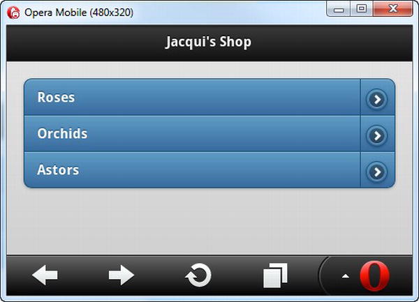
Figure 31-5 Creating split lists
In this example, I set all of the left parts of the list items to point to a new page I added to the document called basket. I’ll come back to this example in Chapter 32 and expand on it to put a simple shopping basket in place. For this example, the basket page is simply a placeholder.
Tip jQuery Mobile uses the arrow icon for the split button by default. You can change this by applying the data-split-icon attribute to the ul or ol element, specifying the name of the icon you want. Chapter 29 contains a list of the available icons.
Filtering Lists
jQuery Mobile provides a mechanism for filtering the content of lists. You enable list filtering by applying the data-filter attribute with a value of true to the ul or ol element, as shown in Listing 31-5.
Listing 31-5. Using list filtering
<!DOCTYPE html>
<html>
<head>
<title>Example</title>
<meta name="viewport" content="width=device-width, initial-scale=1">
<link rel="stylesheet" href="jquery.mobile-1.0.css" type="text/css" />
<script type="text/javascript" src="jquery-1.6.4.js"></script> <script type="text/javascript" src="jquery.mobile-1.0.js"></script>
<style type="text/css">
.lcontainer {float: left; text-align: center; padding-top: 10px}
.productData {float: right; padding: 10px; width: 60%}
</style>
</head>
<body>
<div id="page1" data-role="page" data-theme="b">
<div data-role="header">
<h1>Jacqui's Shop</h1>
</div>
<div data-role="content">
<ul data-role="listview" data-inset=true data-filter=true>
<li><a href="#roses">Roses</a></li>
<li><a href="#orchids">Orchids</a></li>
<li><a href="#astors">Astors</a></li>
</ul>
</div>
</div>
<div id="roses" data-role="page" data-theme="b">
<div data-role="header">
<h1>Roses</h1>
</div>
        <div>

            <div class="lcontainer">

                <img src="rose.png">

                <div><a href="#" data-rel="back" data-role="button"

                       data-inline=true data-direction="reverse">Back</a>

                </div>

            </div>

            <div class="productData">

                A rose is a woody perennial within the family Rosaceae.

                They form a group of erect shrubs, and climbing or trailing plants.

                <div><b>Price: $4.99</b></div>

            </div>

        </div>

    </div>


   <div id="orchids" data-role="page" data-theme="b">

        <div data-role="header">

           <h1>Orchids</h1>

        </div>

        <div>

            <div class="lcontainer">

                <img src="orchid.png">

                <div><a href="#" data-rel="back" data-role="button"

                       data-inline=true data-direction="reverse">Back</a>

                </div>

            </div>

            <div class="productData">

                The orchid family is a diverse and widespread family in the order

                Asparagales. It is one of the largest families of flowering plants.

                <div><b>Price: $10.99</b></div>

            </div>

        </div>

    </div>


   <div id="astors" data-role="page" data-theme="b">

        <div data-role="header">

           <h1>Astors</h1>

        </div>

        <div>

            <div class="lcontainer">

                <img src="astor.png">

                <div><a href="#" data-rel="back" data-role="button"

                       data-inline=true data-direction="reverse">Back</a>

                </div>

            </div>

            <div class="productData">

                The name Astor comes from the Ancient Greek word meaning "star",

                referring to the shape of the flower head.

                <div><b>Price: $2.99</b></div>

            </div>

        </div>

    </div>

</body>

</html>
As you can see in Figure 31-6, jQuery Mobile adds a search bar above the list. When the user enters characters into the search bar, jQuery Mobile removes all of the items from the list that don’t contain that sequence of characters.
Caution jQuery Mobile doesn’t preserve item numbering when filtering a numbered list.
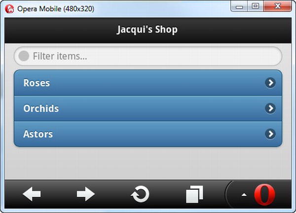
Figure 31-6 Enabling list filtering
Tip Although you can usually omit the content element in a jQuery Mobile page with no ill-effect, this is not the case when using the list filtering feature. Without such an element, the search box size and position are not handled properly.
The ability to filter lists is a great feature, but it isn’t always useful on small touch screens. To support character input, most mobile devices show a pop-up touch keyboard when the user activates a text input element such as the search bar. On small devices, the keyboard can occupy so much of the screen that the user can’t easily see the results of her filter, as Figure 31-7 shows. This does not mean you should not support list filtering, but it is important to provide other navigation mechanisms if you are targeting devices with small screens.
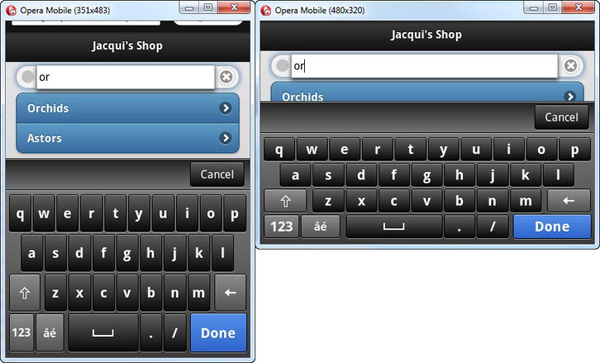
Figure 31-7 The touch keyboard obscuring a filtered list
Using a Custom Filtering Function
The default filter matches any list item that contains the set of characters the user has entered. These are matched anywhere in the list item text and are case insensitive. You can provide a custom filter function by using a jQuery UI-style method, as shown in Listing 31-6.
Listing 31-6. Using a custom list filter function
...

<script type="text/javascript">

    $(document).bind("pageinit", function() {

        $('ul').listview("option", "filterCallback", function(listItem, filter) {

            var pattern = new RegExp("^" + filter, "i");

            return !pattern.test(listItem)

        })

    })

</script>

...
The jQuery Mobile list widget is called listview, and you set the custom function by calling the option method and using the function as the value for the filterCallback setting. The arguments to the function are the text from a list item and the filter that the user has entered. The function is called once for each item in the list, and if you return true, the item for which the function has been called is hidden. In this example, I use a regular expression to restrict matches to list items that begin with the filter text. You can see the result in Figure 31-8, where typing the letter R into the filter box matches only the Roses item.
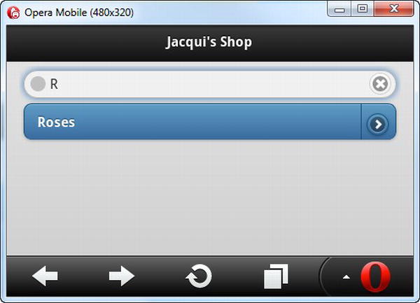
Figure 31-8 Using a custom filter
Formatting List Items
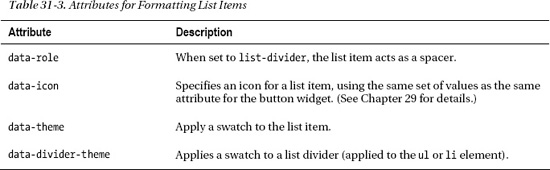
jQuery Mobile defines a number of data attributes you can use to format list items. These attributes are described in Table 31-3.
I demonstrate three of these attributes in Listing 31-7. The most interesting is the use of the data-role attribute and its list-divider value, which creates a static entry in the list that doesn’t act as a navigation aid. This is a useful mechanism for adding structure to a list to provide the user with context for the list’s content. In the example, I added some additional flowers to the list, sorted the entries alphabetically, and added list dividers for each letter of the alphabet representing the first letter of each entry.
Listing 31-7. Using list dividers
...

<div id="page1" data-role="page" data-theme="b">

    <div data-role="header">

       <h1>Jacqui's Shop</h1>

    </div>


    <div data-role="content">

        <ul data-role="listview" data-inset=true data-theme="c"

            data-divider-theme="b">


            <li data-role="list-divider">A</li>

            <li><a href="#astors">Astors</a></li>

            <li data-role="list-divider">C</li>

            <li><a href="document2.html">Carnations</a></li>

            <li data-role="list-divider">D</li>

            <li><a href="document2.html">Daffodils</a></li>

            <li data-role="list-divider">L</li>

            <li><a href="document2.html">Lilies</a></li>

            <li data-role="list-divider">O</li>

            <li><a href="#orchids">Orchids</a></li>

            <li data-role="list-divider">P</li>

            <li><a href="document2.html">Peonies</a></li>

            <li><a href="document2.html">Primulas</a></li>

            <li data-role="list-divider">R</li>

            <li><a href="#roses">Roses</a></li>

            <li data-role="list-divider">S</li>

            <li><a href="document2.html">Snowdrops</a></li>

        </ul>

    </div>

</div>

...
You can see the effect that the dividers create in Figure 31-9. I used the data-theme attribute to set the swatch for the entire list and the data-divider-theme attribute to specify a different swatch just for the dividers.
Tip You can apply the data-theme attribute directly to individual list items if you want a different appearance for just one element.
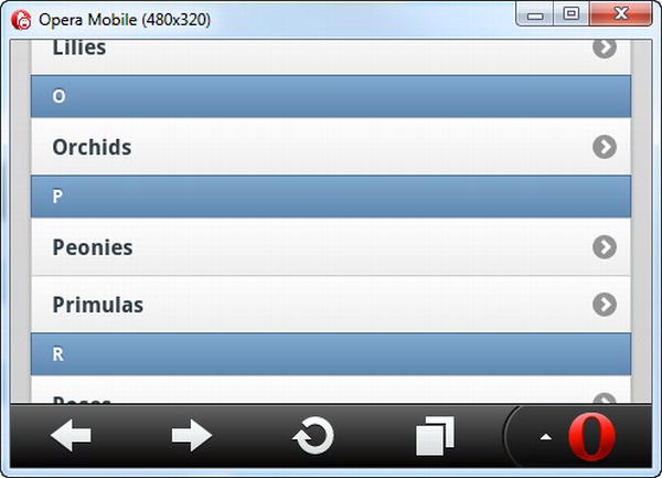
Figure 31-9 Adding dividers to a list
Using Convention-Based Formatting
Some styling options are handled by convention rather than configuration. You already saw an example of this when you looked at split lists. If you add a second a element to the content of an li element, jQuery Mobile automatically creates a split list item. You don’t have to apply a data attribute to create this effect—it just happens. In this section, I show you three different conventions you can use to format list items: count bubbles, text emphasis, and asides.
Adding Count Bubbles
You can add a small numeric indicator to a list item. These are called count bubbles, and they can be useful when list items represent a category of some sort and you want to provide information about how many are available. For example, if your list items represent email folders, you can use count bubbles to indicate how many messages are in each folder. You might also use count bubbles to show how many items are in stock in an e-commerce application.
Although this effect is typically used to present numeric values, you can display any information you like. The meaning of the value needs to be self-evident, because you don’t have room to provide an explanation to the user—just the value.
You create a count bubble by adding an additional child element to the contents of an li element. This child element must contain the value and be assigned to the ui-li-count class. You can see examples of count bubbles defined in Listing 31-8, including one that uses a non-numeric value.
Listing 31-8. Adding count bubbles to list items
...

<div id="page1" data-role="page" data-theme="b">

    <div data-role="header">

       <h1>Jacqui's Shop</h1>

    </div>


    <div data-role="content">

      <ul data-role="listview" data-inset=true data-filter=true>

          <li><a href="#roses">Roses<div class="ui-li-count">23</div></a></li>

          <li><div class="ui-li-count">7</div><a href="#orchids">Orchids</a></li>

          <li><a href="#astors">Astors</a><div class="ui-li-count">Pink</div></li>

      </ul>

    </div>


</div>

...
Notice that you can position the child element anywhere within the li element. It doesn’t have to be the last element (although this is a common convention). You can see how the count bubbles are displayed in Figure 31-10.
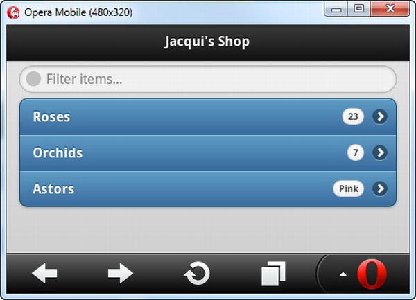
Figure 31-10 Using counter bubbles
Adding Text Emphasis
jQuery Mobile will apply different levels of emphasis when you use content that is wrapped in a header element (the h1 through h6 elements) instead of a p element (indicating a paragraph). This allows you to create a list item that contains a headline and some supporting details text, as shown in Listing 31-9.
Listing 31-9. Adding text emphasis
...

<div id="page1" data-role="page" data-theme="b">

    <div data-role="header">

       <h1>Jacqui's Shop</h1>

    </div>


    <div data-role="content">

      <ul data-role="listview" data-inset=true data-filter=true>

          <li>

            <a href="#roses"><h1>Roses</h1>

                <p>A rose is a woody perennial within the family Rosaceae.</p>

                <div class="ui-li-count">$4.99</div></a>

          </li>

          <li><div class="ui-li-count">7</div><a href="#orchids">Orchids</a></li>

          <li><a href="#astors">Astors</a><div class="ui-li-count">Pink</div></li>

      </ul>

    </div>

</div>

...
In this example, I used the h1 element to denote the name of the product and the p element to denote the detailed information. I included a count bubble, indicating the price of the item. (Prices are ideally suited to count bubbles because the currency symbol provides immediate meaning to the numeric value.) You can see the effect in Figure 31-11.
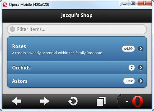
Figure 31-11 Using text emphasis in a list item
Adding an Aside
An aside is an alternative to using count bubbles. To create an aside, you add a child to the li element that contains the information you want to display and that is assigned to the ui-li-aside class. You can see the use of an aside in Listing 31-10.
Listing 31-10. Creating an aside in a list item
...

<div id="page1" data-role="page" data-theme="b">

    <div data-role="header">

       <h1>Jacqui's Shop</h1>

    </div>


    <div data-role="content">

      <ul data-role="listview" data-inset=true data-filter=true>

          <li>

            <a href="#roses">

                <h1>Roses</h1>

                <p>A rose is a woody perennial within the family Rosaceae.</p>

                <p class="ui-li-aside">(Pink) <strong>$4.99</strong></p>

            </a></li>

          <li><div class="ui-li-count">7</div><a href="#orchids">Orchids</a></li>

          <li><a href="#astors">Astors</a><div class="ui-li-count">Pink</div></li>

      </ul>

    </div>

</div>

...
You can see the style with which an aside is displayed for the Roses item in Figure 31-12.
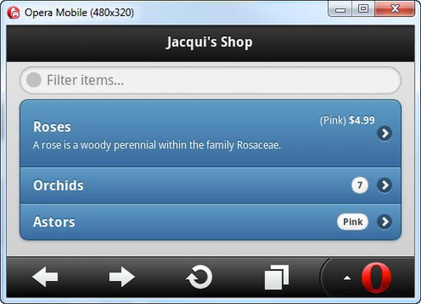
Figure 31-12 Using an aside
Summary
In this chapter, I described the jQuery Mobile list widget, which can be an essential navigation tool for mobile web applications. I showed you the different kinds of lists you can create, the different styles of list you can present to the user, and the configurations and conventions you can use to manage the content of individual list items.