C H A P T E R 34
The jQuery UI Effects & CSS Framework
In this chapter, I describe two utility features that jQuery UI provides. The first is a set of enhancements to existing jQuery methods so that you can animate colors, changes in element visibility, and the application of CSS classes. The other feature is a set of CSS classes that allow you to apply a jQuery UI theme to the rest of your HTML documents to create a consistent look across all of your web applications. Table 34-1 provides the summary for this chapter.
Using the jQuery UI Effects
jQuery UI extends some core jQuery methods so that you can animate different transitions for an element. This ranges from color changes to the application of CSS classes. These can be valuable additions to a web application when used carefully, and to supplement these features, jQuery UI also defines some additional animation effects.
Animating Colors
jQuery UI extends the jQuery animate method, which I described in Chapter 10, to add support for animating colors. You can animate one of several CSS properties that define an element's colors. Table 34-2 describes the CSS properties that the animate method supports.
To animate colors, you pass a map object as the argument to the animate method, detailing the properties you want animated and the target values. Listing 34-1 contains an example.
Listing 34-1. Animating colors
<!DOCTYPE html>

<html>

<head>

    <title>Example</title>

    <script src="jquery-1.7.js" type="text/javascript"></script>

    <script src="jquery-ui-1.8.16.custom.js" type="text/javascript"></script>

    <link rel="stylesheet" type="text/css" href="styles.css"/>

    <link rel="stylesheet" type="text/css" href="jquery-ui-1.8.16.custom.css"/>

    <style type="text/css">

        #animTarget {

            background-color: white;

            color: black;

            border: medium solid black;

            width: 200px; height: 50px;

            text-align: center;
            font-size: 25px;

            line-height: 50px;

            display: block;

            margin-bottom: 10px;

        }

    </style>

    <script type="text/javascript">

        $(document).ready(function() {

            $('button').click(function() {

                $('#animTarget').animate({

                    backgroundColor: "black",

                    color: "white"

                })

            })

        });

    </script>

</head>

<body>

    <h1>Jacqui's Flower Shop</h1>


    <div id=animTarget>

        Hello!

    </div>


    <button>Animate Color</button>

</body>

</html>
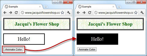
I style the div element in this document so that it has an initial background color of white and a color of black. When the button in the document is clicked, I call the animate method, specifying that these properties be changed to black and white, respectively. The transition from one color to another is done gradually, and both properties are animated simultaneously. You can see the effect in Figure 34-1.
 Tip Notice that I use the standard CSS property names in the
 style element—background-color, for example. When specifying the same property in the map object, I switched to using camel case—backgroundColor. This allows me to specify the CSS property as a JavaScript object property without having to enclose the term in quotes.
In this example, I specified the colors I wanted using the CSS color shorthand values, black and white. There are shorthand values for a wide range of colors, but the animate method also accepts hexadecimal colors (#FFFFFF, for example) and RGB function colors, such as rgb(255, 255, 255).
Tip Aside from the support for the color properties, you use the animate method just as I described in Chapter 10.
Animating Classes
jQuery UI provides a convenient way of animating sets of CSS properties using classes. Rather than specify each property, you simply define your properties and values in a class and tell jQuery UI to add the class to one or more elements. jQuery UI will animate the transition from one state to another. Listing 34-2 provides a demonstration.
Listing 34-2. Animating using classes
<!DOCTYPE html>

<html>

<head>

    <title>Example</title>

    <script src="jquery-1.7.js" type="text/javascript"></script>

    <script src="jquery-ui-1.8.16.custom.js" type="text/javascript"></script>

    <link rel="stylesheet" type="text/css" href="styles.css"/>

    <link rel="stylesheet" type="text/css" href="jquery-ui-1.8.16.custom.css"/>

    <style type="text/css">

        .elemClass {

            background-color: white;

            color: black;

            border: medium solid black;
            width: 200px; height: 50px;

            text-align: center;

            font-size: 25px;

            line-height: 50px;

            display: block;

            margin-bottom: 10px;

        }

        .myClass {

            font-size: 40px; background-color: black; color: white;

        }

    </style>

    <script type="text/javascript">

        $(document).ready(function() {


            $('button').click(function() {

                if (this.id == "add") {

                    $('#animTarget').addClass("myClass", "fast")

                } else {

                    $('#animTarget').removeClass("myClass", "fast")

                }

            })

        });

    </script>

</head>

<body>

    <h1>Jacqui's Flower Shop</h1>


    <div id=animTarget class="elemClass">

        Hello!

    </div>


    <button id="add">Add Class</button>

    <button id="remove">Remove Class</button>

</body>

</html>
Once again, jQuery UI extends an existing jQuery method to add functionality. In this case, the addClass and removeClass methods have been enhanced. I described the standard versions of these methods in Chapter 8. The jQuery UI versions do exactly the same thing, but you specify a duration as the second argument to the method and jQuery UI animates the transition from one class to the other.
In this example, I defined a class called myClass, and there are buttons in the document that add and remove this class using the duration shorthand of fast. You can see the effect in Figure 34-2.
Tip The standard CSS style cascading rules apply, which means that the properties in a class will be applied only if the class is the most specific for the target element or elements. In the previous example, I styled the initial state of the element by id, but in this example I use a class so that my modifications have effect. See Chapter 3 for details of CSS style cascading.
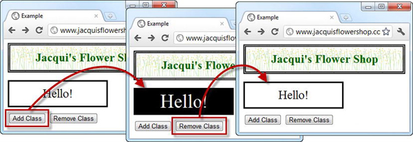
Figure 34-2 Animating elements using classes
Tip jQuery UI also enhances the toggleClass method. This works in the same way as the standard toggleClass method I described in Chapter 8, but it takes a duration argument and animates the transition, just as in the addClass and removeClass example just shown.
Switching Classes
In addition to enhancing some of the standard methods, jQuery UI also defines the switchClass method, which removes one class and adds another, animating the transition from one state to the other. Listing 34-3 contains a demonstration.
Listing 34-3. Using the switchClass method
<!DOCTYPE html>

<html>

<head>

    <title>Example</title>

    <script src="jquery-1.7.js" type="text/javascript"></script>

    <script src="jquery-ui-1.8.16.custom.js" type="text/javascript"></script>

    <link rel="stylesheet" type="text/css" href="styles.css"/>

    <link rel="stylesheet" type="text/css" href="jquery-ui-1.8.16.custom.css"/>

    <style type="text/css">

        .elemClass {

            border: medium solid black;

            width: 200px; height: 50px;

            text-align: center;

            line-height: 50px;

            display: block;

            margin-bottom: 10px;

        }
        .classOne {

            font-size: 25px; background-color: white; color: black;

        }

        .classTwo {

            font-size: 40px; background-color: black; color: white;

        }

    </style>

    <script type="text/javascript">

        $(document).ready(function() {


            $('button').click(function() {

                $('#animTarget').switchClass("classOne", "classTwo", "fast")

            })

        });

    </script>

</head>

<body>

    <h1>Jacqui's Flower Shop</h1>


    <div id=animTarget class="elemClass classOne">

        Hello!

    </div>

    <button>Switch Class</button>

</body>

</html>
The arguments to the switchClass method are the class that should be removed, the class that should be added, and the duration for the animation. In the example, my two classes define the same properties, but this need not be the case.
Using the jQuery UI Animations
jQuery UI includes a number of animation effects you can apply to elements, much as you did with the core jQuery effects in Chapter 10. My recommendation is to use these effects sparingly. Animations applied carefully can be a genuine enhancement to the user experience, but all too often, they become a source of annoyance and frustration to the user. There are many different animation effects available, including blind, bounce, clip, drop, explode, fade, fold, highlight, puff, pulsate, scale, shake, size, and slide.
Note In this chapter, I show you how to apply these effects, but I do not get into the details of each individual effect. There is a good summary of the effects and the settings that can be applied to some of them at http://docs.jquery.com/UI/Effects.
Using Effects to Show and Hide Elements
jQuery UI enhances the jQuery UI show, hide, and toggle methods so that you can apply animation effects. I described the original versions of these methods in Chapter 10. To use the enhanced jQuery UI versions of these methods, you simply provide additional arguments specifying the effect you want to use and the duration over which it should be applied. Listing 34-4 shows the use of these enhanced methods.
Listing 34-4. Using the enhanced show, hide, and toggle methods
<!DOCTYPE html>

<html>

<head>

    <title>Example</title>

    <script src="jquery-1.7.js" type="text/javascript"></script>

    <script src="jquery-ui-1.8.16.custom.js" type="text/javascript"></script>

    <link rel="stylesheet" type="text/css" href="styles.css"/>

    <link rel="stylesheet" type="text/css" href="jquery-ui-1.8.16.custom.css"/>

    <style type="text/css">

        .elemClass {

            font-size: 25px; background-color: white; color: black;

            border: medium solid black; width: 200px; height: 50px;

            text-align: center; line-height: 50px; display: block; margin-bottom: 10px;

        }

    </style>

    <script type="text/javascript">

        $(document).ready(function() {


            $('button').click(function() {

                switch (this.id) {

                    case "show":

                        $('#animTarget').show("fold", "fast");

                        break;

                    case "hide":

                        $('#animTarget').hide("fold", "fast");

                        break;

                    case "toggle":

                        $('#animTarget').toggle("fold", "fast");

                        break;

                }

            })

        });

    </script>

</head>

<body>

    <h1>Jacqui's Flower Shop</h1>


    <button id="hide">Hide</button>

    <button id="show">Show</button>

    <button id="toggle">Toggle</button>
    <div id=animTarget class="elemClass">

        Hello!

    </div>

</body>

</html>
There are three buttons in this example, and clicking them leads to the show, hide, or toggle method being called. For all three buttons, I specified that the fold animation should be applied, using the fast duration. These methods work just like their core jQuery counterparts, except that the transition is animated.
Applying Standalone Effects
jQuery UI defines the effect method, which allows you to apply an animation to an element without having to show or hide it. When used with the right animation, this can be a useful way of drawing the user's attention to an element in the document. Listing 34-5 contains an example.
Listing 34-5. Using the effect method
<!DOCTYPE html>

<html>

<head>

    <title>Example</title>

    <script src="jquery-1.7.js" type="text/javascript"></script>

    <script src="jquery-ui-1.8.16.custom.js" type="text/javascript"></script>

    <link rel="stylesheet" type="text/css" href="styles.css"/>

    <link rel="stylesheet" type="text/css" href="jquery-ui-1.8.16.custom.css"/>

    <style type="text/css">

        .elemClass {

            font-size: 25px; background-color: white; color: black;

            border: medium solid black; width: 200px; height: 50px;

            text-align: center; line-height: 50px; display: block; margin-bottom: 10px;

        }

    </style>

    <script type="text/javascript">

        $(document).ready(function() {


            $('button').click(function() {

                $('#animTarget').effect("pulsate", "fast")

            })

        });

    </script>

</head>

<body>

    <h1>Jacqui's Flower Shop</h1>


    <div id=animTarget class="elemClass">

        Hello!

    </div>

    <button>Effect</button>
</body>

</html>
When the button in this example is clicked, the effect is applied in situ, without any permanent changes to visibility. In this case, I used the pulsate effect, which causes the element to pulse on and off.
Using the jQuery UI CSS Framework
jQuery UI manages the appearance of widgets by applying a set of classes to elements that apply some complex CSS styles. Some of these classes are exposed to programmers so that elements that are not part of widgets can be styled in a consistent manner. I used some of these classes in the examples in Part IV of this book.
Using the Widget Container Classes
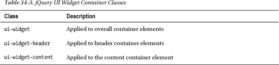
The three most basic classes in the CSS framework apply the core styles that are used on widgets. These classes are described in Table 34-3.
These classes are applied to container elements—that is, elements that contain all of the header and content elements (or, in the case of ui-widget, the outermost element you are working with). Listing 34-6 shows how you can apply these classes.
Listing 34-6. Using the jQuery UI widget container classes
<!DOCTYPE html>

<html>

<head>

    <title>Example</title>

    <script src="jquery-1.7.js" type="text/javascript"></script>

    <script src="jquery-ui-1.8.16.custom.js" type="text/javascript"></script>

    <link rel="stylesheet" type="text/css" href="styles.css"/>

    <link rel="stylesheet" type="text/css" href="jquery-ui-1.8.16.custom.css"/>

    <style type="text/css">

        body > div {float: left; margin: 10px}

    </style>

</head>

<body>

    <h1>Jacqui's Flower Shop</h1>


    <div>
        <div>

            Flowers

        </div>

        <div>

            <div class="dcell">

                <img src="peony.png"/><label for="peony">Peony:</label>

                <input name="peony" value="0" />

            </div>

        </div>

    </div>


    <div class="ui-widget">

        <div class="ui-widget-header">

            Flowers

        </div>

        <div class="ui-widget-content">

            <div class="dcell">

                <img src="peony.png"/><label for="peony">Peony:</label>

                <input name="peony" value="0" />

            </div>

        </div>

    </div>

</body>

</html>
There are two sets of elements in this example, one of which I applied the container classes to. You can see the effect in Figure 34-3.
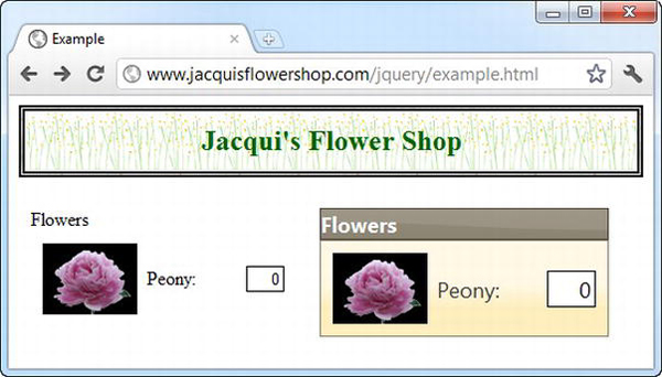
Figure 34-3 Applying the jQuery UI widget container classes
Applying Rounded Corners
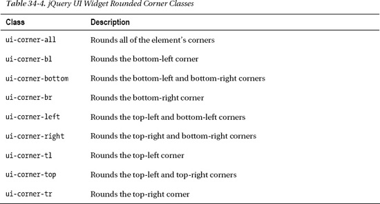
The next set of CSS framework classes lets you apply rounded corners to your widget-like elements. Table 34-4 describes the classes in this category.
These classes take effect only when an element has a background or margin, which means that you can apply them to the ui-widget-header and ui-widget-content classes, as shown in Listing 34-7.
Listing 34-7. Using the rounded corner classes
<!DOCTYPE html>

<html>

<head>

    <title>Example</title>

    <script src="jquery-1.7.js" type="text/javascript"></script>

    <script src="jquery-ui-1.8.16.custom.js" type="text/javascript"></script>

    <link rel="stylesheet" type="text/css" href="styles.css"/>

    <link rel="stylesheet" type="text/css" href="jquery-ui-1.8.16.custom.css"/>

    <style type="text/css">

        body > div {float: left; margin: 10px}

    </style>

</head>

<body>

    <h1>Jacqui's Flower Shop</h1>


    <div>

        <div>
            Flowers

        </div>

        <div>

            <div class="dcell">

                <img src="peony.png"/><label for="peony">Peony:</label>

                <input name="peony" value="0" />

            </div>

        </div>

    </div>


    <div class="ui-widget">

        <div class="ui-widget-header ui-corner-top" style="padding-left: 5px">

            Flowers

        </div>

        <div class="ui-widget-content ui-corner-bottom">

            <div class="dcell">

                <img src="peony.png"/><label for="peony">Peony:</label>

                <input name="peony" value="0" />

            </div>

        </div>

    </div>

</body>

</html>
To create an overall effect, I rounded the top corners of the header element and the bottom corners of the content element. You can see the result in Figure 34-4. Notice that I added a little padding to the header element. The rounded corners are applied within the element's content box, which can require some additional space to avoid clipping content.

Figure 34-4 Applying rounded corners to elements
Using the Interaction State Classes
You can also apply CSS framework classes to show different interaction states, which allows you to create elements that respond to user interaction in the same way that jQuery UI widgets do. Table 34-5 describes the classes available.
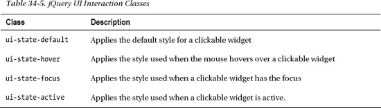
Listing 34-8 applies these four classes. Notice that I applied padding to an inner span element in each case. The interaction state classes define padding values, and the easiest way to create spacing between the container element and the content is to target an inner element.
Listing 34-8. Applying the interaction state classes
<!DOCTYPE html>

<html>

<head>

    <title>Example</title>

    <script src="jquery-1.7.js" type="text/javascript"></script>

    <script src="jquery-ui-1.8.16.custom.js" type="text/javascript"></script>

    <link rel="stylesheet" type="text/css" href="styles.css"/>

    <link rel="stylesheet" type="text/css" href="jquery-ui-1.8.16.custom.css"/>

    <style type="text/css">

        body > div {float: left; margin: 10px}

        span {padding: 10px; display: block}

    </style>

</head>

<body>

    <h1>Jacqui's Flower Shop</h1>


    <div class="ui-widget ui-state-default ui-corner-all">

        <span>Default</span>

    </div>

    <div class="ui-widget ui-state-hover ui-corner-all">

        <span>Hover</span>

    </div>

    <div class="ui-widget ui-state-focus ui-corner-all">

        <span>Focus</span>

    </div>

    <div class="ui-widget ui-state-active ui-corner-all">
        <span>Active</span>

    </div>

</body>

</html>
You can see the effect of each class in Figure 34-5. Some of these states are very similar in the jQuery UI theme that I am using, but you can use ThemeRoller (described in Chapter 17) to create a theme when increased state emphasis is required.
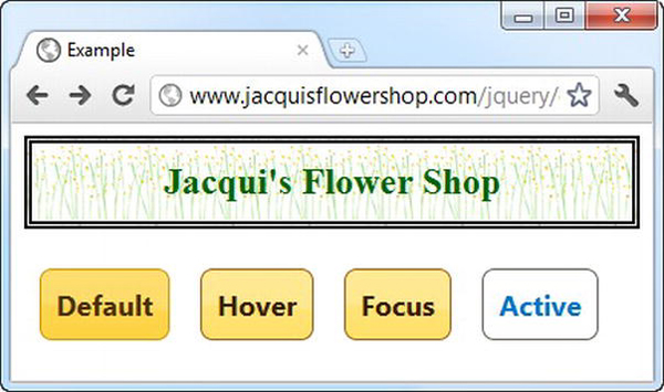
Figure 34-5 The effect of the interaction state classes
Using the Cue Classes
Some CSS framework classes allow you to provide the user with cues about the state of elements in the document. These classes are described in Table 34-6.
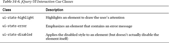
Listing 34-9 shows the use of the highlight and disabled cues.
Listing 34-9. Using the jQuery UI highlight class
<!DOCTYPE html>

<html>

<head>

    <title>Example</title>

    <script src="jquery-1.7.js" type="text/javascript"></script>
    <script src="jquery-ui-1.8.16.custom.js" type="text/javascript"></script>

    <link rel="stylesheet" type="text/css" href="styles.css"/>

    <link rel="stylesheet" type="text/css" href="jquery-ui-1.8.16.custom.css"/>

    <style type="text/css">

        body > div {float: left; margin: 10px}

        span {padding: 10px; display: block}

    </style>

</head>

<body>

    <h1>Jacqui's Flower Shop</h1>

    <div class="ui-widget">

        <div class="ui-widget-header ui-corner-top" style="padding-left: 5px">

            Flowers

        </div>

        <div class="ui-widget-content ui-corner-bottom">

            <div class="dcell">

                <img src="peony.png"/><label for="peony">Peony:</label>

                <input name="peony" value="0" />

            </div>

        </div>

    </div>


    <div class="ui-widget ui-state-highlight ui-corner-all">

        <div class="ui-widget-header ui-corner-top" style="padding-left: 5px">

            Flowers

        </div>

        <div class="ui-widget-content ui-corner-bottom">

            <div class="dcell">

                <img src="peony.png"/><label for="peony">Peony:</label>

                <input name="peony" value="0" />

            </div>

        </div>

    </div>


    <div class="ui-widget ui-state-disabled">

        <div class="ui-widget-header ui-corner-top" style="padding-left: 5px">

            Flowers

        </div>

        <div class="ui-widget-content ui-corner-bottom">

            <div class="dcell">

                <img src="peony.png"/><label for="peony">Peony:</label>

                <input name="peony" value="0" />

            </div>

        </div>

    </div>


</body>

</html>
You can see the effect of the classes in Figure 34-6. Notice that I also applied the ui-corner-all style when using the ui-state-highlight class. This class applies a border, which will be shown with square corners by default. If the child elements have rounded corners, you need to round the corners of the highlighted element as well.
Figure 34-6 Applying the highlight cue class
Listing 34-10 shows the use of the error cue.
Listing 34-10. Using the error cue
<!DOCTYPE html>

<html>

<head>

    <title>Example</title>

    <script src="jquery-1.7.js" type="text/javascript"></script>

    <script src="jquery-ui-1.8.16.custom.js" type="text/javascript"></script>

    <link rel="stylesheet" type="text/css" href="styles.css"/>

    <link rel="stylesheet" type="text/css" href="jquery-ui-1.8.16.custom.css"/>

    <style type="text/css">

        body > div {float: left; margin: 10px; padding: 20px}

    </style>

</head>

<body>

    <h1>Jacqui's Flower Shop</h1>


    <div class="ui-state-error">

        Oops! Something went wrong.

    </div>

</body>

</html>
You can see the effect in Figure 34-7.
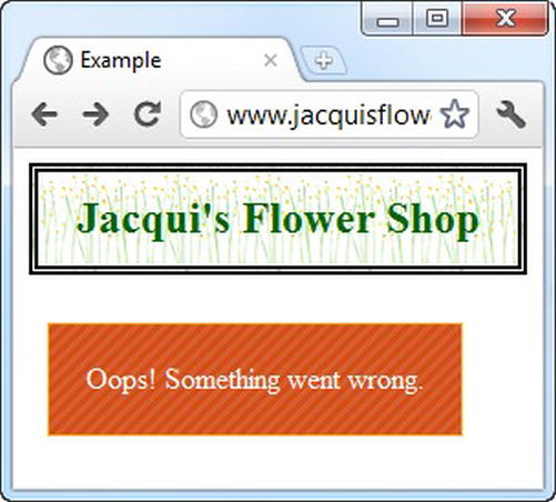
Figure 34-7 Using the error cue class
Summary
In this chapter, I described the enhancements that jQuery UI provides for animating transitions for color, visibility, and CSS classes. These are useful features, but they must be used with caution to avoid bombarding the user with distracting and annoying effects. I also described the principle classes of the jQuery UI CSs framework, which allows you to style elements in a way that is consistent with jQuery UI widgets, allowing you to extend the appearance of your jQuery UI theme to the rest of your HTML documents.