C H A P T E R 18
Using the Button, Progress Bar, and Slider Widgets
Now that you have configured, downloaded, and installed jQuery UI, you can start to look at the widgets it contains. These are the major functional blocks of jQuery UI, and although there are other features (such as effects, which I describe in Chapter 34), it is the widgets that jQuery UI is known for.
In this chapter, I describe the three simplest widgets: the button, progress bar, and sliders. All widgets have some common characteristics: settings, methods, and events. Mastering one widget provides a solid foundation for working with all of them, so I spend some time at the start of this chapter providing some overall context.
It is hard to tie all of the widgets into the flower shop example, so you will find that many of the examples in this part of the book are small, self-contained HTML documents that demonstrate a single widget. You’ll return to the flower shop example in Chapter 25 when you refactor it to include jQuery UI. Table 18-1 provides the summary for this chapter.
Using the jQuery UI Button
The first widget you will look at provides a good introduction into the world of jQuery UI. The button widget is relatively simple but has a transformational effect on HTML documents. The button widget applies the jQuery UI theme to button and a elements. This means that the size, shape, font, and color of the element is transformed to match the theme you selected when you created your custom jQuery UI theme. Applying jQuery UI widgets is very simple, as Listing 18-1 shows.
Listing 18-1. A Simple HTML Document
<!DOCTYPE html>

<html>

<head>

    <title>Example</title>

    <script src="jquery-1.7.js" type="text/javascript"></script>

    <script src="jquery.tmpl.js" type="text/javascript"></script>

    <script src="jquery-ui-1.8.16.custom.js" type="text/javascript"></script>

    <link rel="stylesheet" type="text/css" href="styles.css"/>

    <link rel="stylesheet" type="text/css" href="jquery-ui-1.8.16.custom.css"/>

    <script type="text/javascript">

        $(document).ready(function() {

            $.ajax("mydata.json",{

                    success: function(data) {

                        var template = $('#flowerTmpl'),

                        template.tmpl(data.slice(0, 3)).appendTo("#row1");

                        template.tmpl(data.slice(3)).appendTo("#row2");

                    }

                });


            $('button').button();

        });

    </script>

    <script id="flowerTmpl" type="text/x-jquery-tmpl">

        <div class="dcell">

            <img src="${product}.png"/>

            <label for="${product}">${name}:</label>

            <input name="${product}" data-price="${price}" data-stock="${stocklevel}"

                value="0" required />

        </div>

    </script>

</head>

<body>

    <h1>Jacqui's Flower Shop</h1>

    <form method="post" action="http://node.jacquisflowershop.com/order">

        <div id="oblock">

            <div class="dtable">

                <div id="row1" class="drow">

                </div>

                <div id="row2"class="drow">

                </div>

            </div>

        </div>

        <div id="buttonDiv"><button type="submit">Place Order</button></div>

    </form>

</body>

</html>
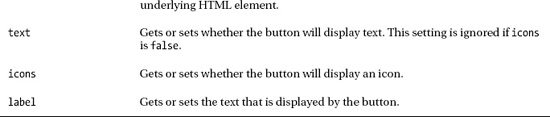
To apply the button widget, you use jQuery to select the elements you want to transform and call the button method. jQuery UI takes care of the rest. You can see the effect in Figure 18-1. Notice that you apply the button method to a jQuery selection object. The integration between jQuery and jQuery UI is very close, and it means that using jQuery UI is generally a natural extension of using the core jQuery techniques that I showed you in the earlier parts of this book.
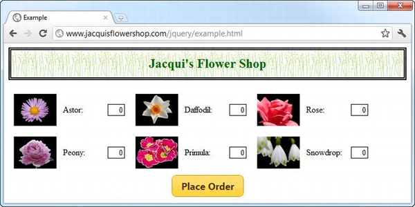
Figure 18-1. Applying the Button widget
Like all of the jQuery UI widgets, the button shown in the figure is a series of CSS styles applied to the existing HTML element. The button method transforms the element from this:
<button type="submit">Place Order</button>
to this:
<button type="submit" class="ui-button ui-widget ui-state-default ui-corner-all

    ui-button-text-only" role="button" aria-disabled="false">

        <span class="ui-button-text">Place Your Order</span>

</button>
This is a nice approach because it lets you work normally with the HTML element without having to worry about whether you are applying jQuery UI widgets to them.
Configuring the Button
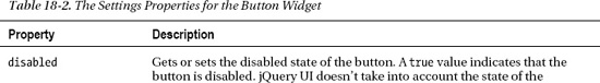
The jQuery UI button widget can be configured via settings properties, allowing you to apply some control over the way that the button is created. These properties are described in Table 18-2.
You can apply these settings in two ways. The first is using a map object when you call the button methods, as highlighted in Listing 18-2.
Listing 18-2. Configuring the Button Widget Using a Map Object
...

<script type="text/javascript">

    $(document).ready(function() {


        $.ajax("mydata.json", {

                success: function(data, status) {

                    var template = $('#flowerTmpl'),

                    template.tmpl(data.slice(0, 3)).appendTo("#row1");

                    template.tmpl(data.slice(3)).appendTo("#row2");

                }

            });


        $('button').button({

            label: "Place Your Order",

            disabled: true

        });


        $('button').button("option", "disabled", false);

    });

</script>

...
I have set the text that the button displays with the label setting and used the disabled setting to disable the button. This is the approach to use when defining the initial configuration for a widget and follows the style you saw most recently for configuring Ajax requests.
Listing 18-2 also shows the technique you use to define a new value for a setting property after the widget has been created, which is as follows:
$('button').button("option", "disabled", false);
You call the button method again, but with three arguments. The first argument is option, the second argument is the setting you want to change, and the third argument is the new value for the setting. This statement example sets false as the value for the disabled setting, undoing the value I passed in via the map object when I created the widget.
You can combine these techniques so that you call the button method with a first argument of option and a map object as the second argument. This allows you to apply multiple settings in one go, as shown in Listing 18-3.
Listing 18-3. Using the option Argument with a Map Object
...

<script type="text/javascript">

    $(document).ready(function() {


        $.ajax("mydata.json", {

                success: function(data, status) {

                    var template = $('#flowerTmpl'),

                    template.tmpl(data.slice(0, 3)).appendTo("#row1");

                    template.tmpl(data.slice(3)).appendTo("#row2");

                }

            });


        $('button').button()


        $('button').button("option", {

            label: "Place Your Order",

            disabled: false

        });


        console.log("Enabled? " + $('button').button("option", "disabled"));

    });

</script>

...
You use the same slightly ugly syntax to read the value of a setting. In this case, you call the button method with two arguments. The first is option, and the second is the setting whose value you want to get, as this statement shows:
console.log("Enabled? " + $('button').button("option", "disabled"));
This statement reads the value of the disabled setting and writes it to the console, producing the following output for this example:
Enabled? false
Using jQuery UI Icons in Buttons
The jQuery UI themes include a range of icons that you can use for any purpose, including displaying them in buttons. Listing 18-4 shows the use of icons in a jQuery UI button.
Listing 18-4. Displaying an Icon in a Button
...

$('button').button({

    icons: {

        primary: "ui-icon-star",

        secondary: "ui-icon-circle-arrow-e"

    }

});

...
You use the icons setting to specify which icons will be displayed. The button widget has two positions for icons. The primary icon is displayed to the left of the text, and the secondary icon is displayed to the right of the text. As the listing demonstrates, you use an object that has primary and secondary properties to specify the icons you want. You can omit either property to display just a single icon. The icons themselves are quite small, as you can see in Figure 18-2.
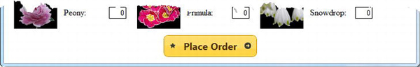
Figure 18-2. Displaying icons in a button
You specify icons using classes that are defined in the jQuery UI CSS file. There are 173 different icons available, which is too many to list in this chapter. The easiest way to figure out the name of the icon you want is to go to http://jqueryui.com, select the Themes page, and scroll to the bottom of the page. You will see all of the icons listed in a grid, and moving the mouse button over each icon reveals the class name to use for the icon, as shown in Figure 18-3.
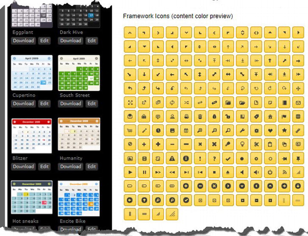
Figure 18-3. The jQuery UI icon grid
 Tip The name that pops up on the web page has a leading period that must be omitted to be used with the icons setting. So, for example, if you hover the mouse over the first icon in the grid,
 .ui-icon-caret-1-n will pop up. To use this icon with a button, set the primary or secondary property to ui-icon-caret-1-n.
Using a Custom Image
I don’t find the jQuery UI icons all that useful; they are usually too small for my needs. You can use a couple of techniques to display a different image in a jQuery UI button. The first is to insert an img element inside the button element to which you intend to apply jQuery UI. The jQuery UI button is very good at respecting the content of the underlying button element, and as long as you use an image with a transparent background, you don’t have to worry about making the image match the theme. Listing 18-5 gives a simple demonstration.
Listing 18-5. Using a Custom Image with a jQuery UI Button
...

$('button')

    .text("")

    .append("<img src=rightarrows.png width=100 height=30 />")

    .button();

...
You can use the text setting to stop the jQuery UI button from displaying the content of the underlying button element only if the icons setting is true. If I don’t want text and I don’t want to use a jQuery UI icon, then I can use the jQuery text method to set the content to an empty string. I then use the append method to insert an img element and call the button method to create a jQuery UI button. You can see the result in Figure 18-4.
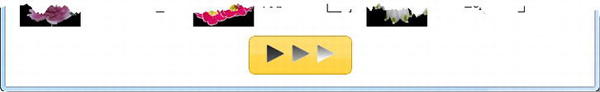
Figure 18-4. Showing a custom image in a button
Using the Button Methods
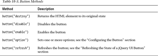
The jQuery UI widgets also define methods, which you can use to control the widget once it has been created. These are not true methods because you have to pass specific arguments to the button method, just as you did to change the value of settings earlier in the chapter. I am going to refer to them as methods, since that is the jQuery UI terminology. Table 18-3 shows the different methods you can use and the effect each has.
Removing the Widget
The destroy method removes the jQuery UI widget from the HTML element, returning it to its original state. Listing 18-6 shows an example.
Listing 18-6. Using the destroy Method
...

<script type="text/javascript">

    $(document).ready(function() {


        $.ajax("mydata.json", {

                success: function(data, status) {

                    var template = $('#flowerTmpl'),

                    template.tmpl(data.slice(0, 3)).appendTo("#row1");

                    template.tmpl(data.slice(3)).appendTo("#row2");

                }

            });


        $('button').button().click(function(e) {

            $('button').button("destroy");

            e.preventDefault();

        })

    });

</script>

...
In this example, I have used the click method to register a handler function for the button. Notice that you do this just as you did in Chapter 9 and that you don’t have to make any special accommodation for the jQuery UI additions. I call the destroy method in the function, meaning that clicking the button causes it to disable itself. You can see the effect in Figure 18-5.
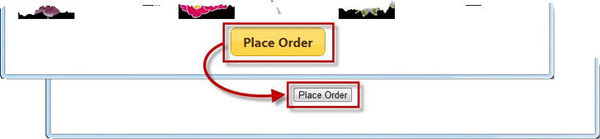
Figure 18-5. Destroying the jQuery UI button widget
Enabling and Disabling the Button
The enable and disable methods let you change the status of the jQuery UI button, as shown in Listing 18-7.
Listing 18-7. Enabling and Disabling a Button
...

<script type="text/javascript">

    $(document).ready(function() {


        $.ajax("mydata.json", {

                success: function(data, status) {

                    var template = $('#flowerTmpl'),

                    template.tmpl(data.slice(0, 3)).appendTo("#row1");

                    template.tmpl(data.slice(3)).appendTo("#row2");

                }

            });


        $('<span>Enabled:<span><input type=checkbox checked />').prependTo('#buttonDiv'),

        $(':checkbox').change(function(e) {

            $('button').button(

                $(':checked').length == 1 ? "enable" : "disable"

            )

        });


        $('button').button();

    });

</script>

...
In this script I have inserted a check box into the document and used the change method to register a function that will be called when the box is checked or unchecked. I call the enable and disable methods to change the state of the button to match the check box. You can see the effect in Figure 18-6.
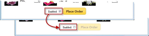
Figure 18-6. Enabling and disabling a jQuery UI button
Refreshing the State of a jQuery UI Button
The refresh method updates the state of the jQuery UI button to reflect any changes in the underlying HTML element. This can be useful for reflecting programmatic changes, like the ones shown in Listing 18-8.
Listing 18-8. Refreshing the jQuery UI Button
...

<script type="text/javascript">

    $(document).ready(function() {


        $.ajax("mydata.json", {

                success: function(data, status) {

                    var template = $('#flowerTmpl'),

                    template.tmpl(data.slice(0, 3)).appendTo("#row1");

                    template.tmpl(data.slice(3)).appendTo("#row2");

                }

            });


        $('<span>Enabled:<span><input type=checkbox checked />').prependTo('#buttonDiv'),

        $(':checkbox').change(function(e) {

            var buttons = $('button'),

            if ($(':checked').length == 1) {

                buttons.removeAttr("disabled");

            } else {

                buttons.attr("disabled", "disabled");

            }

            buttons.button("refresh");

        });


        $('button').button();

    });

</script>

...
In this example, I use the check box to trigger adding and removing the disabled attribute from the HTML button element. This change isn’t automatically detected by jQuery UI, so I call the refresh method to bring everything back in sync.
Using the Button Event
The jQuery UI widgets define events that you can use in addition to those of the underlying element. The button widget defines a single event called create, which is triggered when you create a jQuery UI button. As with the methods, you deal with events by using predefined arguments passed to the jQuery UI method, which is button in this case. Listing 18-9 shows how you can use the create event.
Listing 18-9. Using the jQuery UI Button create Event
...

<script type="text/javascript">

    $(document).ready(function() {

        $('button').button({

            create: function(e) {

                $(e.target).click(function(ev) {

                    ev.preventDefault();

                    alert("Button was pressed");

                })

            }

        });

    });

</script>

...
In this example, I use the create event to set up a function to respond to the click event on the button. I don’t find the create event very useful and generally find that anything that can be done in response to this event can be done in a way that is more in keeping with the broader jQuery approach.
Creating Different Types of Button
The button method is sensitive to the kind of element it is applied to. The basic behavior, a regular button, is created when you call the button method on button elements, on a elements, or on input elements whose types are set to submit, reset, or button. Listing 18-10 shows all of these elements being transformed into jQuery UI buttons.
Listing 18-10. Creating Standard Buttons
<!DOCTYPE html>

<html>

<head>

    <title>Example</title>

    <script src="jquery-1.7.js" type="text/javascript"></script>

    <script src="jquery-ui-1.8.16.custom.js" type="text/javascript"></script>

    <link rel="stylesheet" type="text/css" href="jquery-ui-1.8.16.custom.css"/>

    <script type="text/javascript">

        $(document).ready(function() {


            $('.jqButton').click(function(e) {

               e.preventDefault();

               $(this).button();

            });

        });

    </script>

</head>

<body>

    <form>

        <input class="jqButton" type="submit" id="inputSubmit" value="Submit">

        <input class="jqButton" type="reset" id="inputReset" value="Reset">

        <input class="jqButton" type="button" id="inputButton" value="Input Button">

        <button class="jqButton">Button Element</button>

        <a class="jqButton" href="http://apress.com">A Element</a>

    </form>

</body>

</html>
In this simple document, I have defined one of each of the elements I described. I have used the click method so that each element is transformed into a jQuery UI button when it is clicked. You can see the transformation in Figure 18-7.
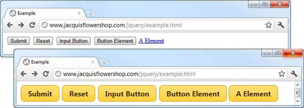
Figure 18-7. Creating standard jQuery UI buttons
Creating a Toggle Button
If you call the button method on an input element whose type is set to checkbox, then you get a toggle button. A toggle button is switched on or off when you click it, following the checked and unchecked states of the underlying element. Listing 18-11 provides a demonstration.
Listing 18-11. Applying jQuery UI to a Check Box
<!DOCTYPE html>

<html>

<head>

    <title>Example</title>

    <script src="jquery-1.7.js" type="text/javascript"></script>

    <script src="jquery-ui-1.8.16.custom.js" type="text/javascript"></script>

    <link rel="stylesheet" type="text/css" href="jquery-ui-1.8.16.custom.css"/>

    <script type="text/javascript">

        $(document).ready(function() {

            $('.jqButton').button();

        });

    </script>

</head>

<body>

    <form>

        <input class="jqButton" type="checkbox" id="toggle">

        <label for="toggle">Toggle Me</label>

    </form>

</body>

</html>
To create a jQuery UI button from a check box, you must have an input element and a matching label element, as shown in the listing. jQuery UI creates a button that has the same appearance as a basic button but that toggles its state when clicked. You can see the effect in Figure 18-8.
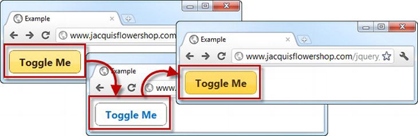
Figure 18-8. Creating a toggle button from a check box
Remember that jQuery UI doesn’t change the underlying element, so the check box is still treated the same way by the browser when included in forms. The change of state is reflected using the checked attribute, just as it would be without jQuery UI.
Creating a Button Set
You can use the buttonset method to create jQuery UI buttons from radio button elements, as shown in Listing 18-12.
Listing 18-12. Creating a Button Set
<!DOCTYPE html>

<html>

<head>

    <title>Example</title>

    <script src="jquery-1.7.js" type="text/javascript"></script>

    <script src="jquery-ui-1.8.16.custom.js" type="text/javascript"></script>

    <link rel="stylesheet" type="text/css" href="jquery-ui-1.8.16.custom.css"/>

    <script type="text/javascript">

        $(document).ready(function() {

            $('#radioDiv').buttonset();

        });

    </script>

</head>

<body>

    <form>

        <div id="radioDiv">

            <input type="radio" name="flower" id="rose" checked />

                <label for="rose">Rose</label>

            <input type="radio" name="flower" id="lily"/><label for="lily">Lily</label>

            <input type="radio" name="flower" id="iris"/><label for="iris">Iris</label>

        </div>

    </form>

</body>

</html>
Notice that I have selected the div element that contains the radio buttons in order to call the buttonset method. You don’t call the button method on the individual input elements. You can see the effect of the buttonset method in Figure 18-9.
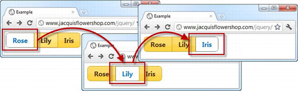
Figure 18-9. Creating a button set
As with regular radio buttons, at most one of the buttons can be selected, allowing you to provide the user with a fixed set of choices in a way that is visually consistent with other jQuery UI buttons. Notice that jQuery UI emphases the relationship between the buttons in a set by applying different styling to the edges where buttons meet. This is shown more clearly in Figure 18-10.
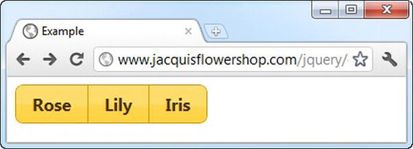
Figure 18-10. The jQuery UI styling for button sets
Creating Button Sets from Regular Buttons
You can use the buttonset method on any element that can be used with the regular button method. This has the effect of applying the style of a set of radio buttons but not the behavior so that each button works individually. Listing 18-13 shows this use of the buttonset method.
Listing 18-13. Creating a Button Set from Regular Buttons
<!DOCTYPE html>

<html>

<head>

    <title>Example</title>

    <script src="jquery-1.7.js" type="text/javascript"></script>

    <script src="jquery-ui-1.8.16.custom.js" type="text/javascript"></script>

    <link rel="stylesheet" type="text/css" href="jquery-ui-1.8.16.custom.css"/>

    <script type="text/javascript">

        $(document).ready(function() {

            $('#radioDiv').buttonset();

        });

    </script>

</head>

<body>

    <form>

        <div id="radioDiv">

            <input type="submit" value="Submit"/>

            <input type="reset" value="Reset"/>

            <input type="button" value="Press Me"/>

            <a href="http://apress.com">Visit Apress</a>

        </div>

    </form>

</body>

</html>
Any suitable element in the div container will be transformed into a button, and the adjoining edges will be styled just as with the radio button, as you can see in Figure 18-11.
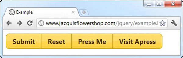
Figure 18-11. Creating a button set from regular buttons
Tip Be careful when using this technique. It can be confusing to the user, especially if you are using radio buttons elsewhere in the same document or web application.
Using the jQuery UI Progress Bar
Now that you’ve used the button to understand the basic structure of a jQuery UI widget, you can begin to look at the other widgets that jQuery UI supports, starting with the progress bar.
The progress bar allows you to show the user progress in completing a task. The progress bar is designed only to show determinate tasks, where you can give the user an accurate indication of how far you are through the task as a percentage. The alternative is an indeterminate task, where you don’t have visibility of what’s happening and you just need to tell the user to wait (I showed you a simple indeterminate progress indicator in Chapter 16 when I used an animated image).
SHOWING USEFUL PROGRESS INFORMATION
Creating the Progress Bar
You create a progress bar by calling selecting a div element and calling the progressbar method, as shown in Listing 18-14.
Listing 18-14. Creating a Progress Bar
<!DOCTYPE html>

<html>

<head>

    <title>Example</title>

    <script src="jquery-1.7.js" type="text/javascript"></script>

    <script src="jquery-ui-1.8.16.custom.js" type="text/javascript"></script>

    <link rel="stylesheet" type="text/css" href="jquery-ui-1.8.16.custom.css"/>

    <script type="text/javascript">

        $(document).ready(function() {

            $('#progressDiv').progressbar({

                value: 21

            });

        });

    </script>

</head>

<body>

    <div id="progressDiv"></div>

</body>

</html>
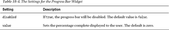
In this example, the document contains a div element with an id of progressDiv. To create a progress bar, you must use an empty div element. If there are any contents, they affect the layout of the widget. I select the progressDiv element and call the progressbar method, passing in a map object to provide the initial configuration. The progress bar supports two settings, which are described in Table 18-4.
In the example, I specified an initial value of 21 percent, and you can see the effect in Figure 18-12.
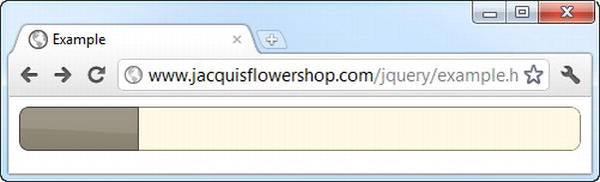
Figure 18-12. Creating a progress bar
Using the Progress Bar Methods
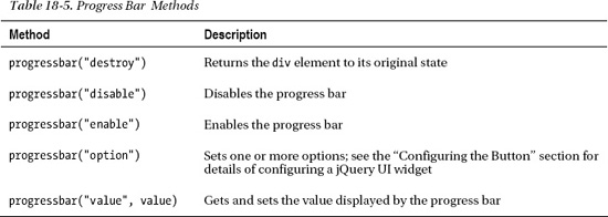
The progress bar widget defines a number of methods, which are in the same style as for the button. In other words, you call the progressbar method, and the first argument specifies the method you want. Table 18-5 describes the available methods.
Most of these methods work in the same way as for the button widget, so I am not going to demonstrate them again. The exception is the value method, which lets you get and set the value that is displayed by the progress bar. Listing 18-15 demonstrates the use of this method.
Listing 18-15. Using the Progress Bar Value Method
<!DOCTYPE html>

<html>

<head>

    <title>Example</title>

    <script src="jquery-1.7.js" type="text/javascript"></script>

    <script src="jquery-ui-1.8.16.custom.js" type="text/javascript"></script>

    <link rel="stylesheet" type="text/css" href="jquery-ui-1.8.16.custom.css"/>

    <script type="text/javascript">

        $(document).ready(function() {


            $('#progressDiv').progressbar({

                value: 21

            });


            $('button').click(function(e) {

                var divElem = $('#progressDiv'),

                var currentProgress = divElem.progressbar("value");

                    divElem.progressbar("value",

                        this.id == "decr" ? currentProgress - 10 :

                                                currentProgress + 10)

            })

        });

    </script>

</head>

<body>

    <div id="progressDiv"></div>

    <button id="decr">Decrease</button>

    <button id="incr">Increase</button>

</body>

</html>
I have added a pair of button elements in this example that I used to increase or decrease the value displayed by the progress bar. Each press of a button changes the value by 10 percent, and you can see the effect in Figure 18-13.
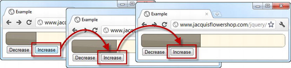
Figure 18-13. Using the value method to change the progress displayed
Tip The value method will return a number between 0 and 100 even if you have set the value to a greater or smaller number. This means you can rely on the progress bar to check the magnitude of the values you specify rather than having to do it yourself.
Animating the Progress Bar
The appearance of the progress bar is pretty basic, although it is consistent with the rest of the jQuery UI theme. When you create a progress bar, jQuery UI adds a div element to the document and adds a number of classes to the new div and the one you used for the progressbar method. The HTML that is generated looks like this:
<div id="progressDiv" class="ui-progressbar ui-widget ui-widget-content ui-corner-all"

     role="progressbar" aria-valuemin="0" aria-valuemax="100" aria-valuenow="10">

     <div class="ui-progressbar-value ui-widget-header ui-corner-left"

         style="width: 10%; ">

     </div>

</div>
The ui-progressbar-value class affects the element that jQuery UI has added to display the progress value, and the ui-progressbar class affects the outer div element that you started with. You can take advantage of these classes to create a progress bar that uses an animated GIF image for the progress value, as shown in Listing 18-16.
Listing 18-16. Using an Animated GIF Image with a Progress Bar
<!DOCTYPE html>

<html>

<head>

    <title>Example</title>

    <script src="jquery-1.7.js" type="text/javascript"></script>

    <script src="jquery-ui-1.8.16.custom.js" type="text/javascript"></script>

    <link rel="stylesheet" type="text/css" href="jquery-ui-1.8.16.custom.css"/>

    <style type="text/css">

        .ui-progressbar-value {

            background-image: url(progress-animation.gif);

        }

        .ui-progressbar {

            height: 22px

        }

    </style>

    <script type="text/javascript">

        $(document).ready(function() {

            $('#progressDiv').progressbar({

                value: 75

            });

        });

    </script>

</head>

<body>

    <div id="progressDiv"></div>

</body>

</html>
You can use the background-image CSS property to specify the image that will be used by the inner div element. In this case, I have specified an image called progress-animation.gif, which is a simple animated GIF image from the jQuery UI web site. It is difficult to show the effect of an animated GIF in a screenshot, but Figure 18-14 shows a single frame of the animation.
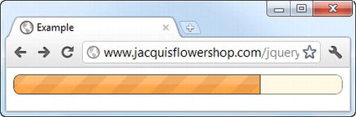
Figure 18-14. Using an animated image for a progress bar
There are a couple of points to note when using an image like this. The first is that you are responsible for selecting an image that matches the rest of the theme. jQuery UI doesn’t manipulate the image in any way. The second is that you have to pay attention to the height of the image. By default, a jQuery UI progress bar is 2em high, which can cause problems with smaller images. To address this, you can set the height property for the ui-progressbar class to match the image you are using. In the example, my image is 22 pixels high. If you don’t manage the height, you can end up with a border above and below the image, as shown in Figure 18-15.
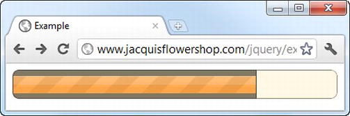
Figure 18-15. An image that is less than 2em high
Using the Progress Bar Events
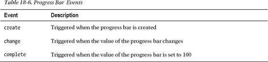
The jQuery UI progress bar widget defines three events, as described in Table 18-6.
Listing 18-17 shows the events in use.
Listing 18-17. Using the Progress Bar Events
<!DOCTYPE html>

<html>

<head>

    <title>Example</title>

    <script src="jquery-1.7.js" type="text/javascript"></script>

    <script src="jquery-ui-1.8.16.custom.js" type="text/javascript"></script>

    <link rel="stylesheet" type="text/css" href="jquery-ui-1.8.16.custom.css"/>

    <style type="text/css">

        .ui-progressbar-value {

            background-image: url(progress-animation.gif);

        }

        .ui-progressbar {

            height: 22px

        }

    </style>

    <script type="text/javascript">

        $(document).ready(function() {


            $('button').button();


            $('#progressDiv').progressbar({

                value: 75,

                create: function(e) {

                    $('#progVal').text($('#progressDiv').progressbar("value"));

                },

                complete: function(e) {

                    $('#incr').button("disable")

                },

                change: function(e) {

                    if ($(this).progressbar("value") < 100) {

                        $('#incr').button("enable")

                    }

                    $('#progVal').text($('#progressDiv').progressbar("value"));

                }

            });


            $('button').click(function(e) {

                var divElem = $('#progressDiv'),

                var currentProgress = divElem.progressbar("value");

                    divElem.progressbar("value",

                        this.id == "decr" ? currentProgress - 10 :

                                                currentProgress + 10)

            })

        });

    </script>

</head>

<body>

    <div id="progressDiv"></div>

    <button id="decr">Decrease</button>

    <button id="incr">Increase</button>

    Progress: <span id="progVal"></span>%

</body>

</html>
In this example, I have added a span element that I use to display the numeric progress value. I use the create event to set the initial value.
Tip Notice that I have used the same map object for the settings and events of the progress bar. This isn’t required, but it does allow you to completely create and configure a widget in a single method call.
I use the complete event to disable the Increase button when the progress reaches 100% and the change event to ensure that the button is enabled for other values. I also use this event to update the contents of the span element. You can see the effect in Figure 18-16.
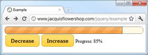
Figure 18-16. Responding to the progress bar events
Tip There are a couple of things to remember when using the events. First, the complete event fires every time the value is set to 100 or greater. This means the event can fire multiple times if you repeatedly set the value to 100, for example. Second, both the change and complete events are triggered for values of 100 or more, so you have to be able to deal with both when you complete the progress update.
Using the jQuery UI Slider
The slider widget creates sliders out of elements in the HTML document. You create sliders using the slider method, as shown in Listing 18-18. Sliders are useful when you want the user to select a value in a given range.
Listing 18-18. Creating a Slider
<!DOCTYPE html>

<html>

<head>

    <title>Example</title>

    <script src="jquery-1.7.js" type="text/javascript"></script>

    <script src="jquery-ui-1.8.16.custom.js" type="text/javascript"></script>

    <link rel="stylesheet" type="text/css" href="jquery-ui-1.8.16.custom.css"/>

    <script type="text/javascript">

        $(document).ready(function() {


            $('#slider').slider();


        });

    </script>

</head>

<body>

    <div id="slider"></div>

</body>

</html>
The slider is themed consistently with the other jQuery UI widgets and allows the user to use the mouse or arrow keys to move the slider handle up and down the scale. You can see how the basic slider appears in Figure 18-17.
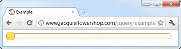
Figure 18-17. A basic jQuery UI slider
Configuring the Slider
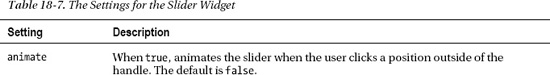
A with all jQuery UI widgets, the slider widget defines a number of settings that you can use to configure the appearance and behavior of sliders. These settings are described in Table 18-7. In the sections that follow, I show you how to use these settings to configure the widget.
Tip The min and max values are exclusive, meaning that if you set a min value of 0 and a max value of 100, the user can select values between 1 and 99.
Changing the Slider Orientation
By default, sliders are horizontal, but you can use the orientation setting to create vertical sliders as well. Listing 18-19 provides a simple demonstration.
Listing 18-19. Using the orientation Setting
<!DOCTYPE html>

<html>

<head>

    <title>Example</title>

    <script src="jquery-1.7.js" type="text/javascript"></script>

    <script src="jquery-ui-1.8.16.custom.js" type="text/javascript"></script>

    <link rel="stylesheet" type="text/css" href="jquery-ui-1.8.16.custom.css"/>

    <style type="text/css">

        #hslider, #vslider { margin: 10px}

    </style>

    <script type="text/javascript">

        $(document).ready(function() {


            $('#hslider').slider({

                value: 35

            });


            $('#vslider').slider({

                orientation: "vertical",

                value: 35

            })


        });

    </script>

</head>

<body>

    <div id="hslider"></div>

    <div id="vslider"></div>

</body>

</html>
In this example, I have created two sliders, one of which has the orientation setting of vertical. I have also added a style element so that I can apply a margin to the slider elements to keep them apart. You control the size and position of sliders (and any jQuery UI widget) by styling the underlying element (which is why div elements work best; they can be readily manipulated with CSS). You can see the sliders in Figure 18-18. Notice that I used the value setting to set the initial position of the handle.
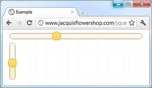
Figure 18-18. Creating vertical and horizontal sliders
Although I am keeping the options and methods separate, I could have written the previous example differently to make better use of the underlying jQuery functionality, as shown in Listing 18-20.
Listing 18-20. Making Better Use of jQuery
<!DOCTYPE html>

<html>

<head>

    <title>Example</title>

    <script src="jquery-1.7.js" type="text/javascript"></script>

    <script src="jquery-ui-1.8.16.custom.js" type="text/javascript"></script>

    <link rel="stylesheet" type="text/css" href="jquery-ui-1.8.16.custom.css"/>

    <style type="text/css">

        #hslider, #vslider { margin: 10px}

    </style>

    <script type="text/javascript">

        $(document).ready(function() {

            $('#hslider, #vslider').slider({

                value: 35,

                orientation: "vertical"

            }).filter('#hslider').slider('option', 'orientation', 'horizontal'),

        });

    </script>

</head>

<body>

    <div id="hslider"></div>

    <div id="vslider"></div>

</body>

</html>
It is a minor point, but I don’t want you to forget that jQuery UI is built on and tightly integrated with jQuery, and you can use all of the selections and manipulations you saw earlier in the book.
Tip Notice that I set the initial orientation to vertical and then changed it to horizontal. As I write this, there is a minor bug with the slider where changing the orientation to vertical after the slider has been created causes the handle to be misaligned.
Animating the Slider
The animate setting enables smooth handle movement when the user clicks the slider at the point they want the handle to move to (as opposed to moving the slider itself). You can enable the default animation by setting animate to true, set a speed for the animation by using fast or slow, or specify the number of milliseconds that the animation should last for. Listing 18-21 shows the use of the animate setting.
Listing 18-21. Using the animate Setting
<!DOCTYPE html>

<html>

<head>

    <title>Example</title>

    <script src="jquery-1.7.js" type="text/javascript"></script>

    <script src="jquery-ui-1.8.16.custom.js" type="text/javascript"></script>

    <link rel="stylesheet" type="text/css" href="jquery-ui-1.8.16.custom.css"/>

    <style type="text/css">

        #slider {margin: 10px}

    </style>

    <script type="text/javascript">

        $(document).ready(function() {

            $('#slider').slider({

                animate: "fast"

            });

        });

    </script>

</head>

<body>

    <div id="slider"></div>

</body>

</html>
In this example, I have set the animate setting to fast. It is hard to show animations in a screenshot, but Figure 18-19 shows what the animate setting does.
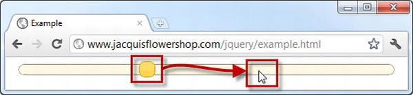
Figure 18-19. Animating the movement of the handle
This screenshot shows the slider just before I clicked the mouse button. If I had not enabled animations, then the handle would just snap instantly to the location I clicked, immediately setting the new value for the slider. But since I have enabled animations, the slider will gracefully move to its new position in a less jarring way. However, like any effect or animation, you don’t want to over-egg the effect, which is why I have selected the fast option. This is an example that you need to play with to see the full result. I recommend downloading the source code that accompanies this book if you don’t want to type in the code and HTML. It is freely available from Apress.com and contains all of the examples in this book.
Creating a Range Slider
A range slider has two handles and lets the user specify a range. For example, you might want to let the user express the price range they are willing to pay for products so that you can filter anything else out. Listing 18-22 demonstrates creating a range slider.
Listing 18-22. Creating a Range Slider
<!DOCTYPE html>

<html>

<head>

    <title>Example</title>

    <script src="jquery-1.7.js" type="text/javascript"></script>

    <script src="jquery-ui-1.8.16.custom.js" type="text/javascript"></script>

    <link rel="stylesheet" type="text/css" href="jquery-ui-1.8.16.custom.css"/>

    <style type="text/css">

        #slider { margin: 10px}

    </style>

    <script type="text/javascript">

        $(document).ready(function() {


            $('#slider').slider({

                values: [35, 65],

                range: true,

                create: displaySliderValues,

                slide: displaySliderValues

            })


            function displaySliderValues() {

                $('#lower').text($('#slider').slider("values", 0));

                $('#upper').text($('#slider').slider("values", 1));

            }

        });

    </script>

</head>

<body>

    <div id="slider"></div>

    <div>Lower Value: <span id="lower">

        </span> Upper Value: <span id="upper"></span></div>

</body>

</html>
To create a range slider, you must set the range setting to true and set the value setting to an array that contains the initial lower and upper bounds of the range. (When using a regular slider, you use the value setting, and when using a range slider, you use the values setting.) In this example, I have set the bounds to 35 and 65. You can see the effect in Figure 18-20.
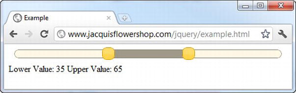
Figure 18-20. Creating a range slider
I have added a handler function for the create and slide events. I’ll get to the events supported by the slider later in this chapter, but I wanted to demonstrate how you obtain the position of the handles in a range slider. You do this through the values method, specifying the index of the slider you are interested in, like this:
$('#slider').slider("values", 0);
The index is zero-based, so the previous fragment gets the value for the handle that represents the lower bound of the range. I have used the events to set the contents of two span elements.
Using the Slider Methods
The slider defines the same set of basic methods that all jQuery UI widgets define, plus a couple that let you set either a single value or the range of values to be shown. The methods are described in Table 18-8.
Listing 18-23 shows how you can use the value and values methods to control a slider programmatically.
Listing 18-23. Controlling Sliders Programmatically
<!DOCTYPE html>

<html>

<head>

    <title>Example</title>

    <script src="jquery-1.7.js" type="text/javascript"></script>

    <script src="jquery-ui-1.8.16.custom.js" type="text/javascript"></script>

    <link rel="stylesheet" type="text/css" href="jquery-ui-1.8.16.custom.css"/>

    <style type="text/css">

        #slider, #rangeslider, *.inputDiv { margin: 10px}

        label {width: 80px; display: inline-block; margin: 4px}

    </style>

    <script type="text/javascript">

        $(document).ready(function() {


            $('#slider').slider({

               value: 50,

               create: function() {

                    $('#slideVal').val($('#slider').slider("value"));

               }

            });


            $('#rangeslider').slider({

                values: [35, 65],

                range: true,

                create: function() {

                    $('#rangeMin').val($('#rangeslider').slider("values", 0));

                    $('#rangeMax').val($('#rangeslider').slider("values", 1));

                }

            })


            $('input').change(function(e) {

                switch (this.id) {

                    case "rangeMin":

                    case "rangeMax":

                        var index = (this.id == "rangeMax") ? 1 : 0;

                        $('#rangeslider').slider("values", index, $(this).val())

                        break;

                    case "slideVal":

                        $('#slider').slider("value", $(this).val())

                        break;

                }

            })

        });

    </script>

</head>

<body>

    <div id="rangeslider"></div>

    <div class="inputDiv">

        <label for="rangeMin">Range Min: </label><input id="rangeMin" />

        <label for="rangeMax">Range Max: </label><input id="rangeMax" />

    </div>

    <div id="slider"></div>

    <div class="inputDiv">

        <label for="slideVal">Slide Val: </label><input id="slideVal" />

    </div>

</body>

</html>
This document contains two sliders. There are also three input elements that allow the values for the handles to be specified without moving the handles themselves. You can see the layout of the document in Figure 18-21.
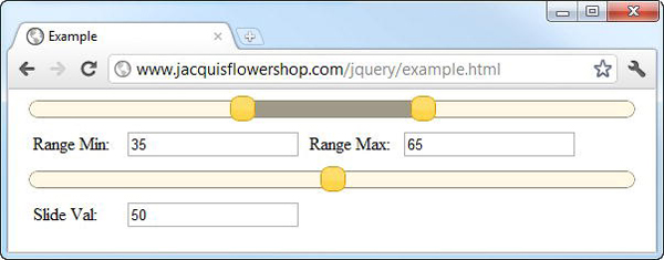
Figure 18-21. Controlling sliders programmatically
I have used jQuery to select the input elements in order to apply the change method so that my function is executed whenever the value of one of the input elements is changed. I then switch on the id attribute of the changed element and use the value or values methods to set the position of the handles. The relationship is one-way, meaning that moving the handles doesn’t update the input elements. I’ll show you how to do this in the next section when you turn to the events supported by the slider.
Using Slider Events
Table 18-9 shows the events that the slider supports. The best feature of these events is the support for both change and stop, which allows you to differentiate between new values created by the user moving the handle and values that you set programmatically.
Listing 18-24 shows the use of slider events to create a bidirectional relationship between the sliders and the input elements from the example in the previous section. This allows you to tie together programmatic support and user interaction to manage the sliders.
Listing 18-24. Using Slider Events to Create a Bidirectional Relationship Between Sliders and Inputs
<!DOCTYPE html>

<html>

<head>

    <title>Example</title>

    <script src="jquery-1.7.js" type="text/javascript"></script>

    <script src="jquery-ui-1.8.16.custom.js" type="text/javascript"></script>

    <link rel="stylesheet" type="text/css" href="jquery-ui-1.8.16.custom.css"/>

    <style type="text/css">

        #rangeslider, *.inputDiv { margin: 10px}

        label {width: 80px; display: inline-block; margin: 4px}

    </style>

    <script type="text/javascript">

        $(document).ready(function() {


            $('#rangeslider').slider({

                values: [35, 65],

                range: true,

                create: setInputsFromSlider,

                slide: setInputsFromSlider,

                stop: setInputsFromSlider

            })


            function setInputsFromSlider() {

                $('#rangeMin').val($('#rangeslider').slider("values", 0));

                $('#rangeMax').val($('#rangeslider').slider("values", 1));

            }


            $('input').change(function(e) {

                var index = (this.id == "rangeMax") ? 1 : 0;

                $('#rangeslider').slider("values", index, $(this).val())

            })

        });

    </script>

</head>

<body>

    <div id="rangeslider"></div>

    <div class="inputDiv">

        <label for="rangeMin">Range Min: </label><input id="rangeMin" />

        <label for="rangeMax">Range Max: </label><input id="rangeMax" />

    </div>

</body>

</html>
I removed one of the sliders to simplify the example. I already had all the code I needed because I set the values of the input elements in response to the create event. To enable this to work with the other events, I extracted the statements into a new function and used it to handle the create, slide, and stop events. Now the slider handles are moved when new values are entered into the input elements, and the values in the input elements are updated when the slider is moved. You can see how the document appears in Figure 18-22, but this is an example that requires interaction to see the full effect.
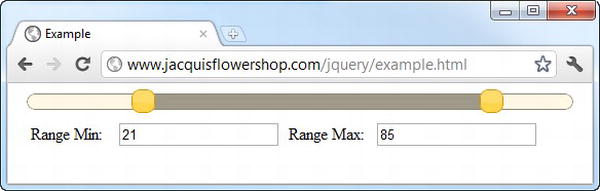
Figure 18-22. Responding to slider events
Summary
In this chapter, I introduced you to the first three jQuery UI widgets: the button, the progress bar, and the slider. Each widget follows the same basic structure. There is a single method that creates and configures the widget as well as letting you supply functions that will respond to its events. Some methods and events are common to each widget, but there are unique additions as well that expose the special functionality that some widgets offer. Now that I have gotten the basics out of the way, I’ll show you some more flexible and complex widgets in the chapters that follow.