Chapter 2
Icon Placement and Organization
In This Chapter
- Optimizing placement for productivity
- Pegging the edges
- Thinking through folders
- Giving each home screen a purpose
- Generating a workflow
Thinking about the setup involved in tailoring your iPhone specifically for you is worth the effort. Once you have things just so from an initialization standpoint, it’s time to ponder the overall look and feel of iOS. Remember: this is your phone, a highly personal extension of you. After whisking through the first handful of setup panes, you’ll be abruptly dropped onto the home screen. Where do you go from there? Here. This chapter explains how to best tweak the iOS home screen for productivity, how to best arrange your Dock, and how to position icons that I’m sure you’ll end up using the most. The fact is, it doesn’t take a great deal of time to get your icons and apps situated in a manner that’s ideal, and it’ll save you precious time and frustration in the future. When you first get an iPhone, there’s not a whole lot on there. But soon, if you lack a proper attack plan, you’ll be overwhelmed with the sheer quantity of apps and information on board. Thankfully, there’s a method to controlling the madness, and I discuss shortcuts and suggestions for creating a sorting system that works best for you.
Optimizing Placement for Productivity
Ever wondered why people tend to place things in easy-to-reach spots whenever possible? Because it makes perfect sense. If you let it, the iPhone’s home screen will eventually become an out-of-control slew of panes that simply arrange icons in the order in which they were downloaded.
The iPhone has been around since 2007, and by and large, the visual styling of iOS (formerly known as iPhone OS) has not drastically changed. Users who are choosing now to jump on the iPhone bandwagon for the first time certainly have a lot to grow familiar with. But even for iOS veterans, the explosive growth of the App Store has made organization a continual challenge. When your app collection grows on a weekly or even daily basis, you won’t want to completely rewrite rules for placement. Rather, it’s wiser to construct a scheme for organizing that scales and applies even when new apps join the fray. (And with the amount of innovation happening in the App Store, join the fray they will!)
Placing Highly Used Icons in Easy-to-Reach Spots
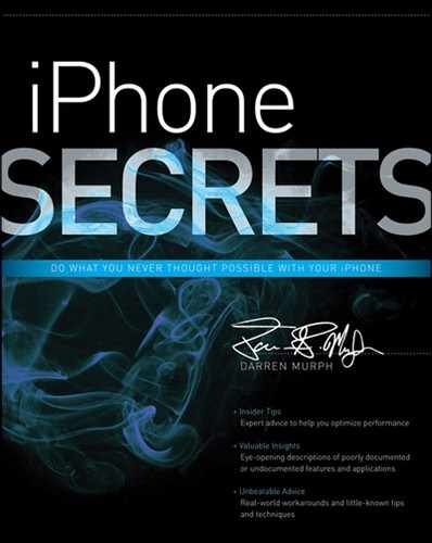
It might sound obvious, but it’s worth clarifying. The iPhone, due to its shape, tends to place your thumbs in the lower right and left hand corners. Predictably, those are the two hottest spots on the entire screen, and they’re absolutely the easiest and most convenient to access. The iPhone Dock has room for a grand total of four icons (it’s filled up in Figure 2-1, showing two fewer than the maximum of six possible on the iPad), but don’t be fooled. You can actually stuff many dozens of apps into that lower bar without ever reaching for a jailbreak.
Figure 2-1: Choosing which four get the Dock spot is tough.
iOS 5 and 6 contain a feature called Folders, which is Apple’s simplistic, albeit entirely satisfactory solution to now having well over 650,000 apps in the App Store. I dive deeper into folders in a bit, but suffice it to say, I’m a big fan of using ‘em for the sake of organization. Unfortunately, you can’t choose a folder color, lock a given folder, or change the font of a folder title without jailbreaking your device. These customization options are hugely requested, though, so I’m holding out hope that we’ll see them in future iOS builds.
The Dock as a whole is without question the most important locale for apps. It’s the only row of apps that retains its position regardless of what pane you’re on, and taking it one step further, the apps on the far left and far right of the Dock should be the ones you use the most. Remember that whole “close to your thumbs” thing? Yeah. If you’re looking for a little advice on which apps you’re likely to use the most, here goes.
- Phone
- Contacts
- Safari
- Messages
- App Store
- Music
- Photos
- Settings
- Maps
- Game Center
- Passbook
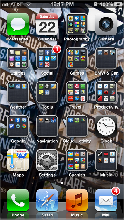
My personal recommendation is to make Mail and Safari the bookends, unless you have a stellar reason to do otherwise. From there, I’d create a folder (as seen in Figure 2-2) to house relatively similar apps that would normally be overflow—apps that would’ve been numbers 7, 8, 9, and 10 if the Dock were longer.
Figure 2-2: Folders… they do an iPhone good.
An ideal Dock, in my mind, consists of two of your most commonly used applications (Mail and Safari for me) and two folders of overflow. You can cram up to 16 apps in each folder with the iPhone 5 (though prior iPhones are limited to 12 per folder), but nine per folder is optimal. Why? Because you’ll see miniaturized icons of the first nine apps in any folder, which—surprisingly enough—are large enough to make out what they are should you encounter a brain fart while trying to remember which apps are in which folder.
Pegging the Edges
The corners are undoubtedly the place to nail your favorite apps. The bottom corners are the easiest to reach, while the top two aren’t lacking on the tantalization scale, either. But sadly, some estranged law in some scientific field I’m not qualified to opine on has asserted that only four corners be applied to each rectangle, and I know good and well you’ll need hasty access to more than four apps or folders.
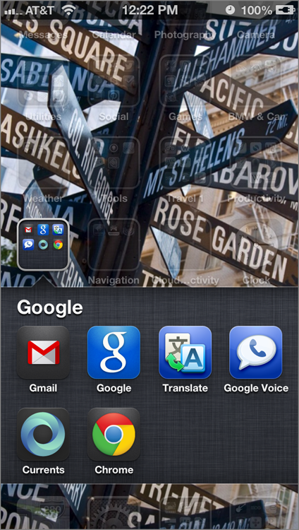
Just as surrounding yourself with good company is a wise move in life, it’s also wise to surround your moderately used applications with your favorites. That’s right, it’s time to head to the edges. The outskirts of the app grid are naturally easiest to access (see Figure 2-3) without having to relocate your hands or fingers, and conversely, the central region of each home screen is where I leave my most infrequently used programs.
Figure 2-3: Sorry, Newsstand—it’s tough to get a seat on the edge!
Picking a uniform modus operandi and sticking with it is crucial in allowing the iPhone to become just an extension of your brain. If you know precisely where the apps that you need most given your current situation will be, it is far easier to locate them. Even if the apps or folders themselves change with the season, the placement is of the utmost importance.
Thinking Through Folders
Folders are perhaps the most wonderful introduction to iOS from an organizational standpoint, although they’re often overlooked in the frenzy of slapping as many mouth-watering applications as possible onto the iPhone upon the initial unwrapping. I’m not blaming the masses—grabbing hold of an iPhone for the first time is indeed a thrilling experience—but if you’re calm, cool, and collected enough to be perusing these pages, you’re probably thoughtful enough to add a bit of order to your iPhone.
As mentioned previously, you can shove up to 16 apps into a single folder with the iPhone 5 (or 12 in prior iPhones), and you can name each one anything you desire. I recommend stopping at nine per folder in order to see each and every app thumbnail within each folder, but those with highly trained memories can feel free to go overboard.
- Apple Apps
- Cloud Storage
- Navigation
- Foreign Languages
- Travel
- Streaming Video
- Streaming Music
- Online Radio
- Web Browsers
- Word Processors
- Social Networking
- Camera Apps
- Video Apps
- Video Calling
- VoIP
- Magazines
- Analytics
- To-Do
Giving Each Home Screen a Purpose
The first home screen—the one that loads up after the Slide To Unlock screen is slid aside—is clearly the most significant. Communication, productivity, and your favorite content/game applications should reside here, but what about the other 10 panes? The iPhone and iOS 5/6 provide 11 total panes to work with, and if you’re genuinely able to fill them all up, you’ve most certainly accomplished something.
The wild thing is that some of you might come close. If you’re the type who tends to leave no stone unturned—and thus, no pane left blank—the aforementioned categorization methods may need a bit of tweaking. Start off by keeping your first home screen reserved for your most commonly used apps and folders. The first screen should always be home to the popular crowd. The good news is that science has yet to prove that apps have feelings, so those relegated to subsequent panes aren’t apt to delete themselves in an act of rebellion.
If you’re wondering about customization on the home screen, it’s as simple to change as visiting Settings Wallpaper. You can assign different images for your Lock Screen as well as your home panes, but you can’t assign a different image for each individual home pane. For best results, ensure that you select an image with a resolution higher than the display of your iPhone, or better yet, crop it ahead of time in a photo editing program like Preview, Lightroom, or Photoshop. From there, you can just e-mail it to yourself, long-press to Open in Safari, and then save it to your Camera Roll. Once it’s there, you can easily select it for wallpaper or home pane use.
Apple doesn’t allow each page to be labeled. You can call your folders anything you want, but there’s no naming panes. What I suggest, however, is giving each overflow pane a theme. It’s certainly not as obvious as a label, but until Apple adds that function, this is about as close as you can get.
Looking for an example? Let’s say you’re a huge news junkie, and you’ve downloaded just about every possible news application hosted on the App Store. Creating News 1, News 2, and News 3 is clearly not specific enough, so you can theme an entire pane for news apps instead. I’d create folders for Sports, Politics, Technology, Science, Travel, and whatever other niche you’re into, and for apps that encompass all aspects of news, you can pop those into a General folder. Just like that, you’ve assigned an entire pane to host news apps—no confusion about what lives where.
As for deleting apps? If you’d prefer, you can delete from within iTunes and then sync with your iPhone. If you’re on the go, you can just long-press an app, wait for it to start jiggling, and mash that X in the top-left that appears. If you’d like to protect your precious apps from being deleted, simply visit Settings General Restrictions, and flip that Deleting Apps toggle. While you’re in there, you can also restrict the ability to install new apps, use FaceTime, open your Mail, and a host of other things. It’s a great way to put some boundaries on what can and can’t be done with your phone—particularly if it’s routinely in the hands of a child.
Examples of themes that tend to flesh out well:
- News
- Sports
- Audio Streaming
- Video Streaming
- Communications
- Productivity
- Business
- For the Kids
- Games
- Sharing/Storage
It’d be swell if Apple included a way to lock all panes except for that one dedicated to kids, but at least you can go ahead and arrange one specifically for their eyes. In iOS 6, a new Guided Access feature allows you to disable the Home button and disable touch in specific areas of the screen, but it’s largely only useful to keep kids in a single app that you’ve already loaded.
Generating a Workflow
At long last, it’s the culminating of all the work you’ve put into the art or organizing. Once you’ve populated your Dock just so, arranged your most commonly used apps along the edges of the first home screen, and organized your home panes by easy-to-recognize themes, it’s time to focus on a workflow.
The most challenging thing about using an iPhone once you pick it up is finding what you’re after, particularly if you’re keen on keeping dozens upon dozens of applications on your device. I take a closer look at Push Notifications in future chapters, but I’ll mention for the sake of organization that they are completely valuable tools when properly set up and minded.
A great number of applications have been updated to support the more useful, less invasive push system first unveiled with iOS 5, and honed in iOS 6. In prior versions of the operating system, push notifications simply popped up in the center of the iPhone’s display, regardless of what app you were currently engrossed in. Taking a note from Google’s Android, Apple decided it prudent to shift notifications to their own pull-down bar at the top of the display (shown in Figure 2-4), where they’ll collect and sit until you manually go and sift through.
Figure 2-4: Have a look at iOS 6’s drop-down notification window.
I suggest enabling push notifications for any app that you use daily. Things like Facebook, breaking news apps, e-mail, and perhaps your favorite podcast can send you push notifications whenever a new message, alert, or issue awaits. With a reliable push system, you’re presented with only the important changes upon reentering the iPhone universe, giving you a head start on which apps to check in on first. Those that haven’t sent you a notification are probably less urgent to reload.
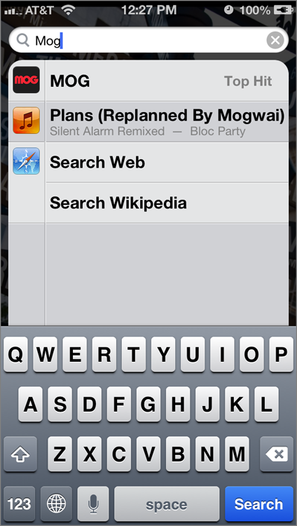
For times when sifting through pages or folders just seems too burdensome, there’s always a way out. At the initial home screen—the one that automatically presents itself just after the lock screen—just swipe toward the right one time, and up pops a simple search bar. That’s called Universal Search (shown in Figure 2-5).
Figure 2-5: Universal Search—just type, and it’ll start finding.
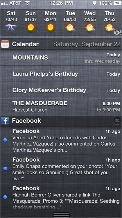
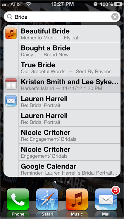
That search bar is remarkably powerful. And it fields results incredibly quick. What’s most useful about the Universal Search function is that it actually digs into applications when it searches. In other words, searching for “Facebook” not only pulls up a shortcut to the Facebook app, but also any e-mail messages within the Mail app that relate to Facebook (see Figure 2-6). It’s also capable of searching within Contacts, Music, third-party apps, and Calendar. New to iOS 6, Spotlight now tells you which folder a certain app is in, which is most useful when you have two identically named apps that serve different functions in varying folders.
Figure 2-6: It’s not just for finding apps…
Best of all, there are two shortcuts that appear for every search: Search Web and Search Wikipedia. Even if you can’t find what you’re looking for, one of those can probably help. I actually recommend using the Universal Search bar as a shortcut to Google search something. No need to actually launch Safari and search; just whisk over to the Universal Search bar, peck your query in, and select the Search Web option.
While we’re on the topic, let's dive into a few settings that'll increase your efficiency. Apple provides a way to add your own keyboard shortcuts by visiting Settings General Keyboard Shortcuts. Add as many of these as you like for frequently used phrases, and since they're automatically synced over iCloud, anything you input on your iPhone will also transfer to your iPad (assuming you own one). Just be sure to visit Settings iCloud Documents & Data and flip that to On.
Just above the Shortcuts feature is a Keyboards icon that adds other keyboards. You can add various languages—only useful if you're multi-lingual, of course—but the real kicker is Emoji. iOS 6 has added a ton of new icons here, enabling frequent iMessage users to have a bit of fun with graphical characters.
When you're typing, you can also hold down (almost) any letter to get a pop-up menu of alternative characters—pretty useful for properly typing words with foreign origins. If you're in the mood to ruin someone's day, you can activate Caps Lock by simply double-tapping the Shift key. Thankfully for those trying to expand their vocabulary, iOS enables users to long-press on any word in an e-mail or document and witness a Define pop-up; tap that, and you'll instantly be educated on the word's definition. Here are a few more of my favorite timesaving tips when generating a workflow:
- If you're tired of targeted advertising, head to Settings General About Advertising and flip Limit Ad Tracking to On.
- For heavy Safari users, head to Settings Safari and flip Private Browsing to On.
- While browsing an article in Safari, click the Reader icon in the Address Bar to view a stripped-down version that's far easier on the eyes.
- In just about every app—Safari and Twitter included—a gentle tap at the top of the app or page will automatically scroll to the very top.
- Near universally, iOS 6 supports pull to refresh, which allows you to press and slide downward (in a Twitter stream, for example) in order to have that stream refreshed.
- To save an image from the web or an e-mail to your Camera Roll, just long-press on it and select Save Image.
- To activate an LED flash for any incoming alerts, head to Settings General Accessibility and flip LED Flash For Alerts to On.
- If you're having trouble viewing icons or text, visit the Accessibility menu in Settings and flip Zoom and/or Large Text to On.
- Taking another step, the VoiceOver feature in the Accessibility menu will read aloud screen icons and actions, and you'll find plenty of tweakable options within.
- Try out AssistiveTouch in the Accessibility menu to add hot corners to your screen for easier navigation.
- To quickly turn VoiceOver, AssistiveTouch, Invert Colors or Zoom on and off, visit Accessibility and activate Triple-click Home; tapping your Home button three times will trigger it.
- In the pull-down Notification Center, swiping across the Weather icon will bring up a multi-day forecast, while tapping on it opens up the Weather app.
- If you're annoyed by those constant keyboard clicks, visit Settings Sounds and flip Keyboard Clicks to Off.
- With iOS 6, you can now simply pick a song from your Music library to be associated with any alarm in the Clock app (edit any alarm, then look in Sounds).
- Newer iPhones and iPads with iOS 6 will now find a Late Night option in Music EQ settings—sweet dreams!
- If you're being bombarded with random messages, visit Settings Notifications Messages and choose My Contacts Only under Show iMessage Alerts From.
- In iOS 6, visit Settings Notifications Do Not Disturb to establish the hours when you want your alerts silenced; if you still want all calls to come through, just select Allow Calls From Everyone.
- To add or remove items from your pull-down Notification Center, visit Settings Notifications. To prevent clutter, only add the ones you'll actually use.
- New in iOS 6, there's an entire Privacy portal in Settings Privacy. Turn as much of that stuff off as needed until you're comfortable.
- Passbook is still a blossoming app; open it to visit the App Store and see what apps currently support it. For now, airline boarding passes and digital gift cards are the highlights.
- In iOS 6, you can send a message back to someone if they're trying to ring you while you're on another call. To edit the messages, visit Settings Phone Reply With Message.
Summary
Just as important as setting your iPhone up right is the art of organizing the applications that make it what it is. It’s vital to think about the kind of layout you’d prefer, choosing a methodology for arranging folders and giving themes to each home screen. I suggest keeping your most highly used apps in the Dock, even if that means tossing a folder or two down there. Yeah, folders can fit into the Dock, too!
The iPhone’s edges are the easiest to reach, so keeping your most commonly used programs around those is advisable. You’ll also be more apt to maintain your sanity if you take full advantage of folders, but placing only nine apps in each ensures that you can view all of the app thumbnails. In general, Apple’s folder name suggestions are just too vague for serious cataloging; they are, however, useful for thinking of themes for home panes.
The easiest way to dig through information that builds up on the iPhone is the Universal Search function, which not only pulls up app names, but information tucked within Mail, Contacts, and more.
Finally, I reviewed some of my favorite timesaving settings that help to generate a smooth workflow. I recommend diving into Settings and making the tweaks that make sense for you.