3 Exploring the Lightroom Workspace
Lesson overview
Whether you prefer to use menu commands and keyboard shortcuts or buttons and sliders, whether you use one monitor or two, you can set up the Lightroom Classic CC workspace to suit the way you work. Customize each module to always have your favorite tools and controls at hand, arranged as you like them. In this lesson you’ll explore the Library module and a variety of view modes, tools, and techniques for reviewing your images and navigating your catalog. In the process, you’ll become familiar with the interface elements and skills that are common to all the workspace modules. You’ll learn how to:
Adjust the workspace layout, use the Navigator panel and the Filmstrip, and work with a second display.
Work with the different image preview and screen modes.
Use keyboard shortcuts.
Compare, flag, and delete photos.
Assemble groups of images using the Quick Collection.

This lesson will take 1 to 2 hours to complete. Please log in to your account on peachpit.com to download the files for this lesson, or go to the “Getting Started” section at the beginning of this book and follow the instructions under “Accessing the lesson files and Web Edition.” Store the files on your computer in a convenient location. Your Account page is also where you’ll find any updates to the lessons or to the lesson files. Look on the Lesson & Update Files tab to access the most current content.
Make working with Lightroom Classic CC even more pleasurable, and ultimately more productive, by personalizing the workspace so that you always have your favorite tools and controls at hand. Here we are simulating how a picture will look in a sample magazine layout, which we cover in this chapter.
Getting started
Before you begin, make sure you’ve set up the LRClassicCIB folder for your lesson files and created the LRClassicCIB Catalog file to manage them, as described in “Accessing the lesson files and Web Edition” and “Creating a catalog file for working with this book” in the “Getting Started” section at the start of this book.
 Note
Note
This lesson assumes that you already have a basic working familiarity with the Lightroom Classic CC workspace. If you need more background information, refer to Lightroom Classic CC Help, or review the previous lessons.
If you haven’t already done so, download the lesson03 folder from your Account page at www.peachpit.com to the LRClassicCIBLessons folder, as detailed in “Accessing the lesson files and Web Edition” in the “Getting Started” section.
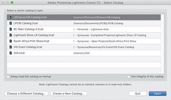
Start Lightroom Classic CC.
In the Select Catalog dialog box, make sure the file LRClassicCIB Catalog.lrcat is selected under Select A Recent Catalog To Open, and then click Open.
Lightroom Classic CC will open in the screen mode and workspace module that were active when you last quit. If necessary, switch to the Library module by clicking Library in the Module Picker at the top of the workspace.

 Tip
Tip
If you can’t see the Module Picker, choose Window > Panels > Show Module Picker, or press the F5 key. If you’re working on macOS, you may need to press the fn key together with the F5 key, or change the function key behavior in the system preferences.
Importing images into the library
The first step is to import the images for this lesson into the Lightroom library.
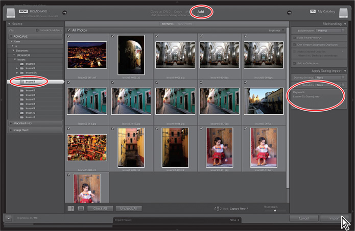
In the Library module, click the Import button below the left panel group.

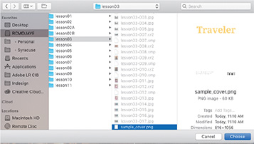
Under Source at the left of the expanded Import dialog box, locate and select your LRClassicCIBLessonslesson03 folder. Ensure that all 16 photos in the lesson03 folder are selected for import (deselect the sample_cover.png file).
In the import options above the thumbnail previews, select Add so that the imported photos will be added to your catalog without being moved or copied. Under File Handling at the right of the expanded Import dialog box, choose Minimal from the Build Previews menu and leave the Don’t Import Suspected Duplicates option unselected. Under Apply During Import, choose None from both the Develop Settings menu and the Metadata menu and type Lesson 03, Guanajuato in the Keywords text box. Make sure that your import is set up as shown in the illustration below, and then click Import.
Tip
The first time you enter any of the Lightroom Classic CC modules, you’ll see tips that will help you get started by identifying the components of the workspace and stepping you through the workflow. Dismiss the tips by clicking the Close button. To reactivate the tips for any module, choose [Module name] Tips from the Help menu.
The 16 images are imported and now appear in both the Library module’s Grid view and the Filmstrip across the bottom of the Lightroom Classic CC workspace.
Viewing and managing your images
The Library module is where every Lightroom Classic CC workflow begins, whether you’re importing new images or finding a photo that’s already in your catalog. The Library module offers a variety of viewing modes and an array of tools and controls to help you evaluate, sort, and group your photos. During import, you applied common keywords to the selection of images as a whole; now, even as you review your newly imported photos for the first time, you can begin to add more structure to your catalog, flagging picks and rejects and assigning ratings, tags, and labels.
Lightroom’s search and filter features will enable you to leverage the metadata that you attach to your photos; you can search and sort the images in your library by any attribute or association, and then create collections to group them, making it easy to retrieve exactly the photos you want, no matter how big your catalog.
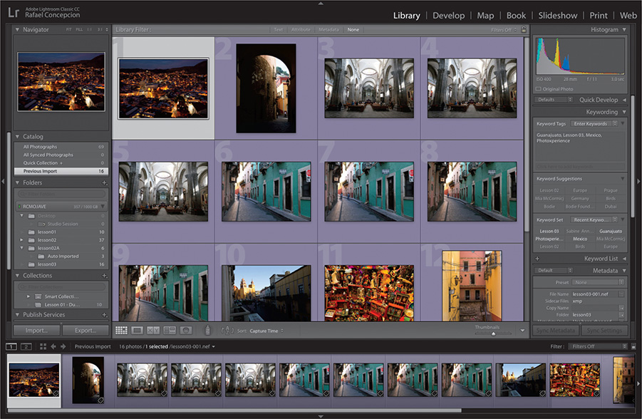
In the Library module’s left panel group, you’ll find panels where you can access and manage the folders and collections containing your photos. The right panel group presents controls for adjusting your images and working with keywords and metadata. Above the work area is the Filter bar, where you can set up a custom search. The Toolbar below the work area provides easy access to your choice of tools and controls, and the Filmstrip presents the images in the selected source folder or collection, no matter which view is active in the work area.
Adjusting the workspace layout
You can customize the layout of the flexible Lightroom Classic CC workspace to suit the way you prefer to work on any task in your workflow, freeing-up screen space as you need it and keeping your favorite controls at your fingertips. In the next five exercises, you’ll learn how to modify the workspace on the fly and use the various screen display modes: skills that are applicable to any of the Lightroom modules.
Resizing panels
When you need more space to work, you can quickly change the width of the side panel groups and the height of the Filmstrip panel by simply dragging, or you can hide any of these elements.
Move the pointer over the right edge of the left panel group; the cursor changes to a horizontal double arrow. Drag to the right and release the mouse button when the panel group has reached its maximum width.

The central work area contracts to accommodate the expanded panel. This could be useful if you have a set of collections that has a long name and you want to see it.
Click Develop in the Module Picker to switch to the Develop module. You’ll notice that the left panel group returns to the width it was when you last used the Develop module.
Lightroom Classic CC remembers your customized workspace layout for each module independently, so that the workspace is automatically rearranged to suit the way you like to work for each stage of your workflow as you move between modules.
Press the G key to switch back to Grid view in the Library module.
In the Library module, drag the right edge of the left panel group to return the group to its minimum width.
Move the pointer over the top edge of the Filmstrip panel; the cursor changes to a double-arrow. Drag the top edge of the Filmstrip down as far as it will go.
The work area expands to fill the available space. This arrangement keeps the Filmstrip visible while increasing the space available for the Grid view when you’re selecting photos, or for reviewing images in Loupe, Compare, and Survey views.

Note
You can’t change the size of the top panel, but you can hide or reveal it just like the side panel groups and the Filmstrip. You’ll learn about showing and hiding panels in the next exercise.
Switch to the Develop module. The Filmstrip remains unchanged as you move between modules. Whichever module you switch to, the Filmstrip will remain at its current height until you resize it.
Move the pointer over the top edge of the Filmstrip panel and it changes to a vertical double-arrow cursor. Double-click the top edge of the Filmstrip to reset the panel to its previous height, then switch back to the Library module.
Drag the top border of the Filmstrip to its maximum height. The thumbnails in the Filmstrip are enlarged and, if necessary, a scroll bar appears along the bottom of the Filmstrip. Scroll to view all the thumbnails, then double-click the top edge of the Filmstrip with the vertical double-arrow cursor to reset the panel to its previous height.
Note
For the side panel groups, double-clicking the border will produce a different result. This is discussed in the next section, “Showing and hiding panels or panel groups.”
Showing and hiding panels or panel groups
By adjusting the size of the side panel groups and the Filmstrip, you can allocate more space for the controls you access most frequently and reduce the prominence of features you use less often. Once you’ve set up the workspace as you like it, you can maximize your working view as needed by temporarily hiding any, or all, of the surrounding panels.
To hide the left panel group, click the Show/Hide Panel Group arrow icon in the left margin of the window. The panel group disappears and the arrow icon is reversed to face right.
Click the reversed Show/Hide Panel Group arrow to reinstate the left panel group.

Tip
You don’t need to be accurate clicking the Show/Hide Panel Group arrows. In fact, you can click anywhere in the outer margins of the workspace to hide and show panels.
You can use the arrows in the top, right, and bottom margins of the workspace to show and hide the top panel, the right panel group, and the Filmstrip.
Deselect the menu option Window > Panels > Show Left Module Panels or press the F7 key to hide the left panel group. To show the group again, press F7 or choose Window > Panels > Show Left Module Panels. Deselect the menu option Window > Panels > Show Right Module Panels or press the F8 key to hide the right panel group. To show the group again, press F8 or choose Window > Panels > Show Right Module Panels.
Deselect the menu option Window > Panels > Show Module Picker or press the F5 key to hide the top panel. To show it again, press F5 or choose Window > Panels > Show Module Picker. To hide the Filmstrip, press the F6 key or deselect the menu option Window > Panels > Show Filmstrip. To show it again, press F6 or choose Window > Panels > Show Filmstrip.
To hide or show both side panel groups at once, press the Tab key or choose Window > Panels > Toggle Side Panels. To hide or show the top panel and the Filmstrip as well as the side panel groups, press Shift+Tab, or choose Window > Panels > Toggle All Panels.
Tip
On macOS, some function keys are assigned to specific operating system functions by default. If pressing a function key in Lightroom Classic CC does not work as expected, either press the fn key (not available on all keyboard layouts) together with the respective function key, or change the keyboard behavior in the system preferences.
Lightroom Classic CC offers options that make the workspace even more flexible and convenient by showing and hiding panels or panel groups automatically in response to your movements with the pointer, so that information, tools, and controls will appear only when you need them.
Right-click the Show/Hide Panel Group arrow in the left margin of the workspace. Choose Auto Hide & Show from the menu.
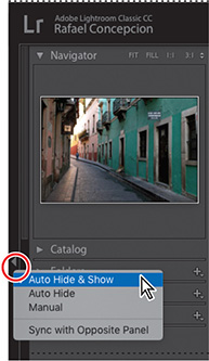
Hide the left panel group by clicking the Show/Hide Panel Group arrow, then move the pointer over the arrow in the left margin of the workspace. The left panels automatically slide into view, partially covering the work area. You can click to select catalogs, folders, and collections; the left panel group will remain visible as long as the pointer remains over it. Move the pointer outside the left panel group and it will disappear again. To show or hide the left panels independently of the current settings, press the F7 key.
Right-click the Show/Hide Panel Group arrow in the left margin of the workspace window and choose Auto Hide from the menu. Now the panel group disappears when you are done with it and does not reappear when you move the pointer into the workspace margin. To show the left panel group again, click in the workspace margin or press the F7 key.
To turn off automatic show and hide for this panel, right-click the Show/Hide Panel Group arrow in the left margin of the workspace and choose Manual from the context menu.
To reset the left panel group to its default behavior, choose Auto Hide & Show in the menu. If either of the left or right panel groups is still hidden, press the F7 key or the F8 key, respectively, to show it again.
Lightroom remembers your panel layout for each module independently, including your choice of show and hide options. The options you choose for the Filmstrip and the top panel, however, remain unchanged as you move between modules.
Expanding and collapsing panels
Up to this point in our lesson, we’ve dealt with the left and right panels only as groups. Now you’ll learn to work with the individual panels within the groups.
If you are not already in the Library module, switch to it now. Create more space to work with the side panel groups by hiding both the top panel and the Filmstrip. (See step 4 in the previous exercise.)
In the Library module, the left panel group contains the Navigator, Catalog, Folders, Collections, and Publish Services panels. Each panel within a group can be expanded to show its content or collapsed so that only the panel header is visible. A triangle next to the panel name indicates whether a panel is expanded or collapsed.
Tip
You don’t need to be accurate when you click the triangle. Clicking anywhere in the panel header will do, as long as you don’t click any other control that might be located there, such as the plus sign (+) in the header of the Collections panel.
To expand a collapsed panel, click the triangle beside its name; the triangle turns downward and the panel expands to show its content. Click the triangle again to collapse the panel.

Folders within a panel—such as the Smart Collections folder in the Collections panel—can also be expanded and collapsed by clicking the triangle next to the folder name.
Open the Window > Panels menu; panels that are currently expanded and fully visible in the panel group show a check mark in front of their names. Choose any panel from that menu and toggle its display status.
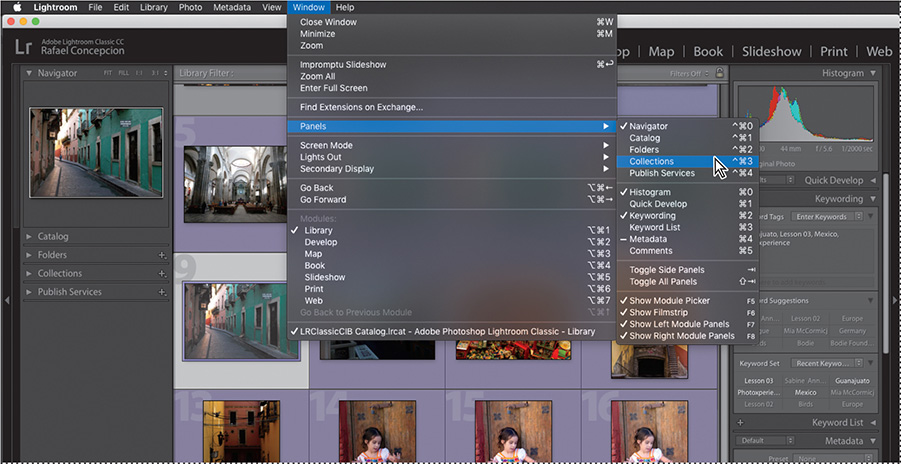
In the Window > Panels menu, look at the keyboard shortcuts for expanding and collapsing the individual panels.
For the panels in the left group, the keyboard shortcuts begin with Control+
Command/Shift+Ctrl followed by a number. The panels are numbered from the top down, so you press Control+Command+0/Shift+Ctrl+0 for the Navigator panel, Control+Command+1/Shift+Ctrl+1 for the Catalog panel, and so on.
For the panels in the right group, the keyboard shortcuts begin with Command/Ctrl followed by a number. Press Command+0/Ctrl+0 to collapse the Histogram panel. Press the same keyboard shortcut again to expand it. These keyboard shortcuts may be assigned to different panels in another module, but this shouldn’t be too confusing if you remember that, whatever module you’re in, the panels are always numbered from the top of the group, starting at 0.
Using keyboard shortcuts is a great way to streamline your workflow, so it’s worthwhile to note the shortcuts listed beside the menu commands you use.
Press Command+/ (macOS) or Ctrl+/ (Windows) to see a list of all the keyboard shortcuts for the currently active module. When you’re done, click anywhere on the list to dismiss it.
With one click, you can expand or collapse all panels other than the topmost in each group, or have all the panels other than the top panel in the group and the one you’re working with close automatically. The top panel in each group has a special role and is not affected by these commands.
To collapse all panels in either of the side groups, right-click the header of any panel other than the top panel in the group, and then choose Collapse All from the menu. If the top panel is already expanded, it will stay open.
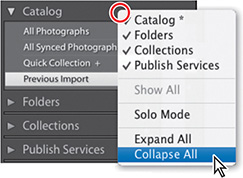
To expand all the panels in either group, right-click the header of any panel—other than the top panel in each group—and choose Expand All from the menu. Once again, the top panel remains unaffected.
To collapse all the panels in a group other than the one you’re working with, right-click the header of any panel—other than the top panel in the group—and choose Solo mode from the menu. Only one panel will remain expanded. The triangles beside the panel names change from solid to dotted when Solo mode is activated. Click the header of a collapsed panel to expand it. The previously expanded panel collapses automatically.
Tip
Option-click/Alt-click the header of any panel to quickly activate or disable the Solo mode.
Hiding and showing panels
If you use some panels in a group less often than others, you can hide them from view to create more space to expand the panels you use most frequently.
To show or hide an individual panel, choose it from the same menu. Panels that are currently visible have check marks in front of their names.
To show all of the panels that are currently hidden in either of the side panel groups, right-click the header of any panel other than the top panel in the group and choose Show All from the menu.

You can’t access the panel group menu by right-clicking the header of the Navigator or Histogram panel; if you’ve hidden all of the panels other than the topmost in either side group, you can make the panel you want visible again by choosing its name from the Window > Panels submenu.
Toggling screen modes
Whichever of the Lightroom Classic CC modules you’re working in, you can choose between several screen modes to suit the way you prefer to work. In the default mode, the workspace appears inside an application window that you can resize and position on your screen. If you prefer, you can expand the workspace to fill the screen, either with or without the menu bar, or switch to a full-screen preview to see the photo you’re working on without any distracting workspace elements.
Choose Window > Screen Mode > Normal to ensure you’re in the default mode.
In Normal screen mode, the Lightroom Classic CC workspace appears inside an application window. You can resize and reposition the application window just as you are used to doing with other applications.
Move the pointer over any edge or corner of the application window. When the pointer changes to a horizontal, vertical, or diagonal double-arrow, drag to reduce the size of the application window.
On macOS, click the green Zoom button at the left of the title bar; on Windows, click the Maximize button, located at the upper right of the window.
The application window expands to fill the entire screen, although the title bar remains visible. While the window is maximized, it’s no longer possible to resize it as you did in step 2, or reposition it by dragging the title bar.
Click the Restore Down button/green Zoom button to restore the window to the size you established in step 2.
Choose Window > Screen Mode > Full Screen, and the workspace fills the entire screen. The menu bar is hidden, as is the Dock on macOS or the Task Bar on Windows. Move the pointer to the top edge of the screen to see the menu bar. Choose Window > Screen Mode > Full Screen And Hide Panels. Alternatively, use the keyboard shortcut Shift+Command+F/Shift+Ctrl+F.
The Full Screen And Hide Panels mode is a good choice to quickly maximize the space available for the main work area, whether you’re working with the thumbnail grid or a single image in the Loupe view. You can still access any of the hidden panels when needed—using either keyboard shortcuts or your mouse, as we discussed earlier—without changing the view.
Press Shift+F repeatedly, or choose Window > Screen Mode > Next Screen Mode, to cycle through the working modes. As you switch between the screen modes, you’ll notice that the panels around the work area remain hidden. To reveal all panels, press Shift+Tab. Press T to show or hide the Toolbar.
Press the F key to see a full-screen preview of the selected image at the highest magnification possible, without the distraction of workspace elements; then, press Option+Command+F/Alt+Ctrl+F to return to Normal screen mode.
Switching views
In each Lightroom Classic CC module, you have a different choice of working views to suit the various phases of your workflow. You can switch between viewing modes as you work by choosing from the View menu, using the keyboard shortcuts listed there, or clicking a view mode button at the left of the Toolbar below the work area.
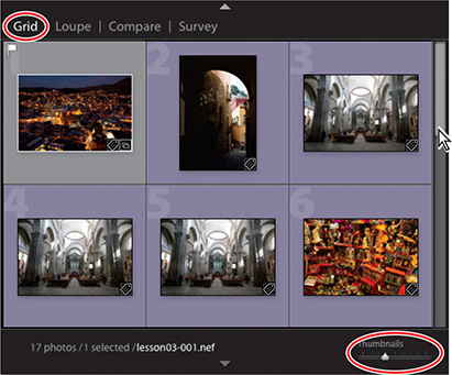
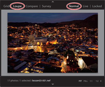
In the Library, you can move between several viewing modes. Press the G key or click the Grid view button in the Toolbar to see thumbnails of your images while you search, apply flags, ratings, and labels, or create collections. Use the keyboard shortcut E or click the Loupe view button to inspect a single photo at a range of magnifications. Press C or click the Compare view button to see two images side by side. Click the Survey view button in the Toolbar or use the keyboard shortcut N to evaluate several images at once. The Toolbar displays a different set of controls for each view mode. For the purposes of this lesson, we’ll ignore the fifth view button in the Toolbar, which is used in the process of tagging faces in your photos; you’ll learn about using the People view in Lesson 4.
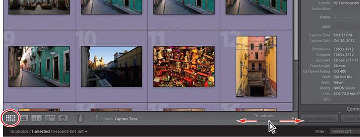
If you’re not already in the Grid view, click the Grid view button. Adjust the size of the thumbnails to your liking by dragging the Thumbnails slider.
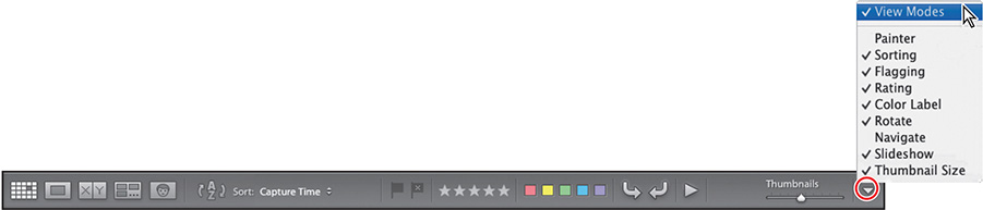
Click the triangle at the right end of the Toolbar and ensure that View Modes is activated in the menu. If you’re working on a small screen, you can disable any of the other options except Thumbnail Size for this lesson.
Note
The order of the tools and controls from top to bottom in the menu corresponds to their order from left to right in the Toolbar.
Tools and controls that are currently visible in the Toolbar have a check mark beside their names in the menu.
Review the section “Setting Grid and Loupe view options”—at the end of Lesson 2—and specify which items of information you would like to see displayed with each photo in the Grid view image cells.
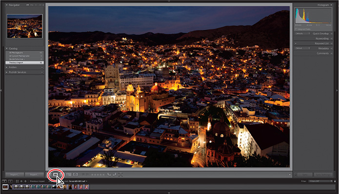
Working in Loupe view
The Loupe view displays a single photo at a wide range of zoom levels. In the Develop module, where high magnification enables fine editing, the Loupe view is the default; in the Library module, you’ll use it while evaluating and sorting your images. You can use the Navigator panel to set the level of magnification, and also to find your way around a zoomed image that’s mostly out of frame. As with the Loupe view, you’ll find the Navigator panel in both the Library and Develop modules.
In the Grid view or the Filmstrip, select a photo, and then click the Loupe view button in the Toolbar or press the E key. Alternatively, simply double-click the thumbnail in the Grid view or the Filmstrip.
Tip
In the Library View Options dialog box, activate Show Info Overlay if you wish to display text details overlaid on your image in the Loupe view. By default, the Loupe view info overlay is disabled.
If necessary, expand the Navigator panel at the top of the left panel group. The zoom controls in the upper-right corner of the Navigator panel enable you to switch quickly between preset magnification levels. You can choose from Fit, Fill, 1:1, or 2:1, or choose another option from a menu of 10 zoom ratios.
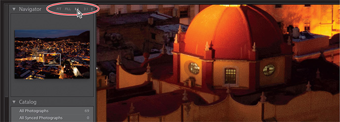
You can toggle between zoom levels by choosing View > Toggle Zoom View, by pressing Z on your keyboard, or simply by clicking the photo in the work area. To better understand what happens when you use the Toggle Zoom View command (or click the enlarged image), you should be aware that the magnification controls are organized into two groups: Fit and Fill make up one group, while the numerical zoom ratio settings are in the other. The Toggle Zoom View command toggles the Loupe view between whichever magnification levels were last used in each group.
Click Fit in the zoom controls in the upper-right corner of the Navigator panel. Now click the 1:1 control. Choose View > Toggle Zoom View, or press Z. The zoom setting reverts to Fit. Press the Z key; the zoom setting reverts to 1:1.
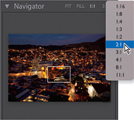
Click Fill in the zoom controls, and then choose 2:1 from the menu at the far right of the Navigator panel header.
Click the image in the Loupe view. The zoom setting reverts to Fill. The difference between zooming this way and using the Toggle Zoom View command is that the zoomed view will now be centered on the area you clicked. Press Z to zoom to 2:1.
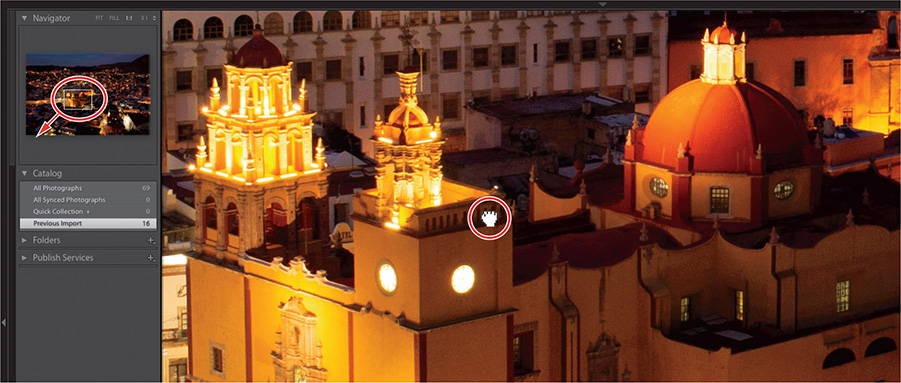
When you’re working at such a high level of magnification, the Navigator helps you move around in the image quickly and easily.
Click anywhere in the Navigator preview and the zoomed view will be centered on that point. While the view is magnified, the white rectangle overlaid on the Navigator preview indicates the area currently displayed in the Loupe view. Drag the rectangle to pan the zoomed view, then watch the rectangle move as you drag the image in the Loupe view.
Using keystrokes to navigate an image can be helpful when inspecting the entire image in close detail. Press the Home key (fn+Left Arrow on a macOS laptop) to move the zoom rectangle to the upper left of the image, then press the Page Down key (fn+Down Arrow) to scroll through the magnified image one section at a time. When you reach the bottom of the photo, the zoom rectangle jumps to the top of the next column. To start in the lower-right corner of the image, press the End key (fn+Right Arrow), then use the Page Up key (fn+Up Arrow).
Show the Filmstrip, then select another photo with the same orientation and click in the Navigator preview to move the zoom rectangle to a different part of the image. Return to the previous image, and the zoom rectangle returns to its previous position for that photo. Choose View > Lock Zoom Position, and then repeat the first part of this step; the position of the zoom rectangle is now synchronized. This can be useful when comparing detail across similar photos.
Choose View > Lock Zoom Position again to disable it, and then click Fit in the header of the Navigator panel.
The zoom controls and the Navigator panel work the same way for the Loupe view in both the Library and Develop modules.
Using the Loupe view overlays
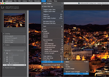
When you’re working in Loupe view in the Library or Develop modules, or during a tethered capture session, you can choose to show configurable overlays that can be useful for setting up a layout, aligning elements, or making transformations.
Select any image in the Filmstrip. Choose View > Loupe Overlay > Grid and then choose View > Loupe Overlay > Guides. To hide both the grid and guides, choose Show in the same submenu; choose it again to show them.

The Layout Image option for the Loupe overlay can be useful when you’re choosing a photo—or shooting one in tethered capture mode—that is intended for use in a printed layout, a web page design, or as a title screen for a slide show. You can create a layout sketch in PNG format, with a transparent background, and then choose the Layout Image option.
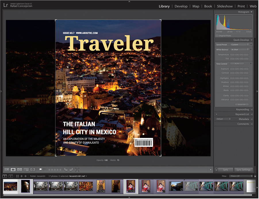
Let’s say, for example, we want to review a series of images and simulate what they would look like on a magazine cover.
Choose View > Loupe Overlay > Choose Layout Image.
Navigate to the lesson03 folder and select the sample_cover.png that I designed. This image is set as a transparent PNG file, so you should be able to see the layout as an overlay on the picture.
Hold down the Command/Ctrl key to bring up overlay controls, allowing you to reposition the layout image, change the opacity of the layout or matting (the area around the layout), and use a vertical and horizontal guide to align the text with the image. Choose View > Loupe Overlay > Show to hide it.

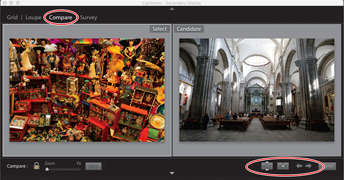
Comparing photos
As the name suggests, the Compare view is ideal for examining and evaluating images side by side.
Press F5 and F7, or click the white arrows at the top and left edges of the work-
space, to hide the Module Picker and the left panels. In the Filmstrip, select any pair of similar photos: then, click the Compare View button in the Toolbar.
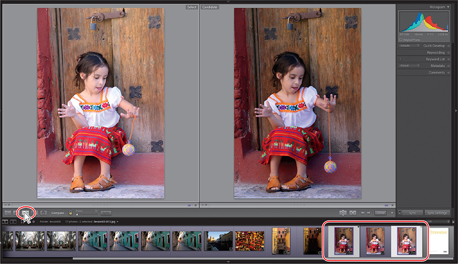
The first image that you selected becomes the Select image, which is displayed in the left pane of Compare view; the image displayed in the right pane is called the Candidate. In the Filmstrip, the Select image is marked with a white diamond icon in the upper-right corner of the image cell, whereas the Candidate image is indicated by a black diamond.
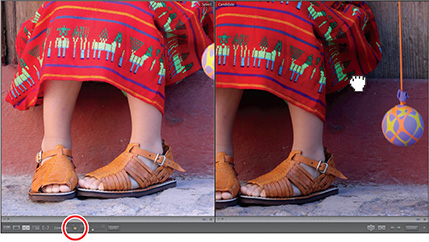
To use the Compare view to make a choice from a group of more than two photos, select your favored choice first to place it as the Select image, and then add other photos to the selection by Command-clicking/Ctrl-clicking them (for non-contiguous photos) or Shift-clicking the last one (for contiguous photos). Click the Select Previous Photo and Select Next Photo buttons (the left and right arrows) in the Toolbar or press the left and right arrow keys on your keyboard to move between the Select and Candidate photos. Should you decide that the current Candidate is better than the Select image, you can reverse their positions by clicking the Swap button in the Toolbar.
To compare fine detail in the images, zoom in by dragging the Zoom slider in the Toolbar. You’ll notice that the images zoom together. Drag either of the images in the Compare view and they move in unison. The closed lock icon to the left of the Zoom slider indicates that the view focus of the two images is locked.
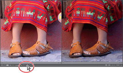
In some situations, this may prove to be inconvenient; for instance, with photos of the same subject shot at different zoom levels, or differently composed.
To pan the Select and Candidate images independently, click the Link Focus (lock) icon to unlink them, then drag either image to pan the view.
A thin white line surrounds whichever photo in the Compare view is currently the active image (the image that will be affected by the Zoom slider or the controls in the right panel group).
Click the photo on the right to make it active, and then alter the zoom ratio.
Press Shift+Tab twice to show all panels. Click the lock icon to relink the views, and then choose Fit from the zoom picker at the top of the Navigator.
Change the active image—the image to which your edits will be applied—by clicking the photo on the left, and then expand the Quick Develop panel. In the Tone Control section, experiment with a few of the adjustment buttons to improve the image. Here we clicked the right double arrow button for Contrast, Shadows, and Whites, and the left double arrow for Highlights, to get to the result on the left, but see what you get by experimenting with it.

Using the controls in the Quick Develop panel while you’re working in Compare view can help you choose between images. Applying a develop preset or making Quick Develop adjustments can help you assess how an image will look once it’s edited and adjusted. You can then either undo your Quick Develop operations and move to the Develop module to edit the image with greater precision, or use the modifications you’ve already made as a starting point.
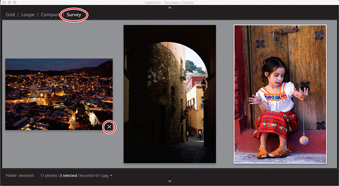
Using Survey view to narrow a selection
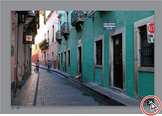
The last of the four viewing modes in the Library module, the Survey View lets you see multiple images together on one screen, and then refine your selection by dropping one photo after another from the view.
Make sure the Previous Import folder is selected as the image source in the Catalog panel. In the Filmstrip, select five architectural or cityscape shots. Click the Survey view button (the fourth from the left) in the Toolbar, or press the N key. Press F5 and F7, or click the arrows at the top and left edges of the workspace, to hide the Module Picker and left panels.

Navigate between the images by pressing the arrow keys on your keyboard or click the Select Previous Photo (left arrow) and Select Next Photo (right arrow)buttons in the Toolbar. The active image is surrounded by a thin white border.
Position the pointer over the image you like least; then, click the Deselect Photo (X) icon in the lower-right corner of the thumbnail to drop this photo from the Survey view selection.
Tip
If you have eliminated a photo accidentally, choose Edit > Undo Deselect Photo to return it to the selection, or simply Command-click/Ctrl-click its thumbnail in the Filmstrip. You can easily add a new photo to the selection in the Survey view in the same way.
As you eliminate candidates, the remaining photos are progressively resized and shuffled to fill the space available in the work area.
Dropping a photo from the Survey view doesn’t delete it from its folder or remove it from the catalog; the dropped image is still visible in the Filmstrip—it has simply been deselected. You can see that the images that are still displayed in the Survey view are also the only ones that remain selected in the Filmstrip.

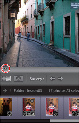
Continue to eliminate photos from the Survey view. For the purposes of this exercise, deselect all but one favorite. Keep the last image selected in the Survey view for the next exercise.
Flagging and deleting images
Now that you’ve narrowed down a selection of images to one favorite in the Survey view, you can mark your choice with a flag.
Flagging images as either picks or rejects as you review them is an effective way to quickly sort your work; flag status is one of the criteria by which you can filter your photo library. You can also quickly remove images flagged as rejects from your catalog using a menu command or keyboard shortcut.
A white flag denotes a pick, a black one with an x marks a reject, and a neutral gray flag indicates that an image has not been flagged.
Tip
Press the P key on your keyboard to flag a selected image as a pick, the X key to flag it as a reject, or the U key to remove any flags.
Still in the Survey view, move the pointer over the remaining photo to see the flag icons just below the lower-left corner. The grayed icons indicate that the image is not yet flagged. Click the flag on the left. The flag turns white, which marks this image as a pick. In the Filmstrip, you can see that the thumbnail now displays a white flag in the upper-left corner of the image cell.

Select a different image in the Filmstrip, and then press the X key. The black reject flag icon appears at the lower-left corner of the image in the Survey view and at the upper left of the image cell in the Filmstrip. The thumbnail of the rejected image is dimmed in the Filmstrip.
Choose Photo > Delete Rejected Photos or press Command+Delete/Ctrl+Backspace. Then, click Remove to remove the rejected photo from your catalog without also deleting the master file from your hard disk.
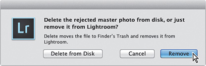
Having been removed from the Lightroom library catalog file, the rejected image is no longer visible in the Filmstrip.
Press the G key or click the Grid view icon in the Toolbar to see all the remaining images as thumbnails in the Grid view.
Grouping images in the Quick Collection
A collection is a convenient way to keep a group of photos together in your catalog, even when the image files are actually located in different folders on your hard disk. You can create a new collection for a particular presentation or use collections to group your images by category or any other association. Your collections are always available from the Collections panel, where you can access them quickly.
The Quick Collection is a temporary holding collection: a convenient place to group images as you review and sort your new imports, or while you assemble a selection of photos drawn from different folders in your catalog.
In the Grid view or the Filmstrip, you can add images to the Quick Collection with a single click, and remove them just as easily. Your images will stay in the Quick Collection until you clear it or convert it to a more permanent collection listed in the Collections panel. You can access the Quick Collection from the Catalog panel so that you can return to work with the same selection of images at any time.
Moving images into or out of the Quick Collection
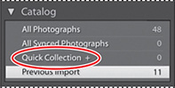
Expand the Catalog panel in the left panel group, if necessary, to see the listing for the Quick Collection.
In the Grid view or the Filmstrip, select the images lesson03_001, lesson03_003, lesson03_009, and lesson03_011.
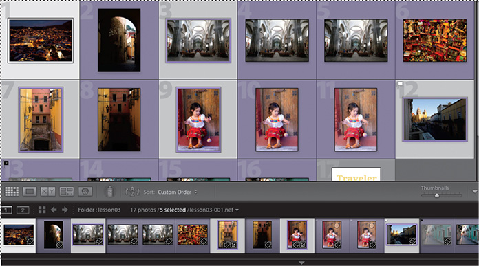
To add the selected photos to the Quick Collection, press the B key or choose Photo > Add To Quick Collection.
In the Catalog panel, the image count beside the Quick Collection indicates that it now contains four images. If you have activated the Show Quick Collection Markers option in the Library View Options dialog box, each of the four images is marked with a gray dot in the upper-right corner of its thumbnail in the Grid view. The same markers are also shown in the Filmstrip, unless the thumbnail size is too small.
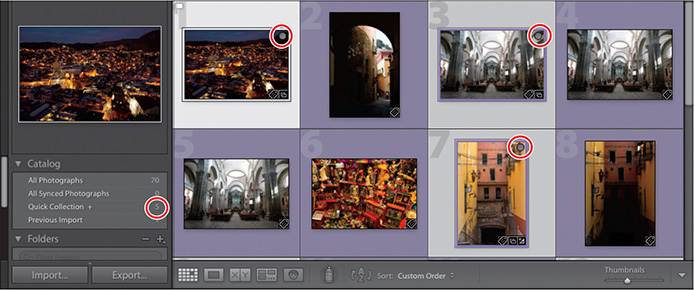
You can remove all of the selected photos from the Quick Collection by simply clicking the marker on one of the thumbnails or by pressing the B key.
For this exercise, you’ll remove only the second image, lesson03-003, from the Quick Collection. First, deselect the other three images, then with only the lesson03-003 image selected, press the B key. The image count for your Quick Collection has been reduced to three.
Tip
If you don’t see the Quick Collection marker when you move your pointer over a thumbnail, make sure that Show Extras is activated in the View > Grid View Style menu. Choose View > View Options and activate Quick Collection Markers under Cell Icons in the Library View Options dialog box.
Converting and clearing the Quick Collection
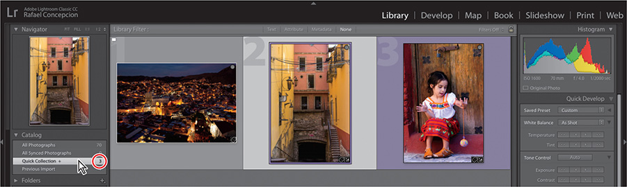
Select the Quick Collection in the Catalog panel. The Grid view now displays only three images. Until you clear the Quick Collection, you can easily return to this group of images to review your selection.
Now that you’ve refined your selection, you can move your grouped images to a more permanent collection.
Choose File > Save Quick Collection.
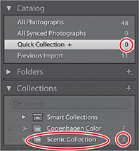
In the Save Quick Collection dialog box, type Scenic Collection in the Collection Name box. Select the Clear Quick Collection After Saving option, and then click Save.

In the Catalog panel, you can see that the Quick Collection has been cleared; it now has an image count of 0. If necessary, expand the Collections panel so that you can see the listing for your new collection, which displays an image count of 3.
In the Folders panel, click the lesson03 folder. The grid view once more shows all the lesson images, including those in your new collection.
Designating a target collection
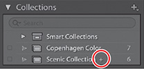
By default, the Quick Collection is designated as the target collection; this status is indicated by the plus sign (+) that follows the Quick Collection’s name in the Catalog panel. The target collection is the collection to which a selected image is added when you press the B key or click the circular marker in the upper-right corner of the thumbnail, as you did in the previous exercise.
You can designate a collection of your own as the target collection so that you can use the same convenient techniques to add and remove photos quickly and easily.
Right-click the entry for your new Scenic Collection in the Collections panel, and then choose Set As Target Collection from the menu. The name of your collection is now followed by a plus sign (+).
Select the Previous Import folder in the Catalog panel, then Command-click/Ctrl-click to select lesson03-002 through lesson03-008 in the Grid view.
Make sure the Collections panel is open, and then watch as you press the B key on your keyboard; the image count for the Scenic Collection increases as the selected images are added.
Press Command+Z/Ctrl+Z to undo the addition of those images. Right-click the Quick Collection in the Catalog panel and choose Set As Target Collection. The Quick Collection once again displays the plus sign (+).
Working with the Filmstrip
No matter which module or view you’re working in, the Filmstrip across the bottom of the Lightroom Classic CC workspace provides constant access to the images in your selected folder or collection.
As with the Grid view, you can quickly navigate through the images in the Filmstrip using the arrow keys on your keyboard. If there are more images than will fit in the visible Filmstrip, you can either use the scroll bar below the thumbnails, drag the Filmstrip by the top edge of the thumbnail frame, click the arrows at either end of the Filmstrip, or click the shaded thumbnails at either end to access photos that are currently out of view.
Across the top of the Filmstrip, Lightroom Classic CC provides a convenient set of controls to help streamline your workflow.
At the far left, you’ll find buttons for working with two displays, with pop-up menus that enable you to set the viewing mode for each display independently.
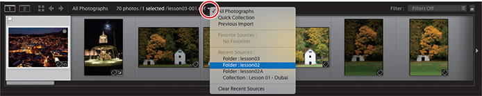
To the right of these buttons is the Grid view button, and arrow buttons for navigating between the different folders and collections you’ve recently been viewing.

Next is the Filmstrip Source Indicator, where you can see at a glance which folder or collection you’re viewing, how many photos it contains, how many images are currently selected, and the name of the active image or the photo that is currently under your pointer in the Filmstrip. Click the Source Indicator to see a menu listing all the image sources that you’ve accessed recently.
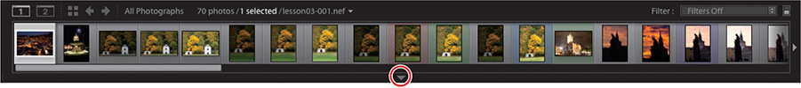
Hiding the Filmstrip and adjusting its size
You can show and hide the Filmstrip and adjust its size, as you can with the side panel groups, to make more screen space available for the image you’re working on.
Click the triangle in the lower border of the workspace window or press F6 to hide and show the Filmstrip. Right-click the triangle to set the automatic show and hide options.
Position the pointer over the top edge of the Filmstrip; the cursor becomes a double arrow. Drag the top edge of the Filmstrip up or down to enlarge or reduce the thumbnails. The narrower you make the Filmstrip, the more thumbnails it can display.
Using filters in the Filmstrip
As you’ll see, when you only have a few photos in a folder, it’s not difficult to see all the images at once in the Filmstrip. However, when you’re working with a folder containing many images, it can be inconvenient to scroll the Filmstrip looking for the photos you want to work with.
You can use the Filmstrip filters to narrow down the images displayed in the Filmstrip to only those that share a specified flag status, rating, color label, or any combination of these attributes.
In the Filmstrip, you can see that one of the images in the lesson03 folder displays the white Pick flag that you assigned in a previous exercise. If you don’t see the flag, right-click anywhere in the Filmstrip image cells and choose View Options > Show Ratings And Picks. Take a look at the other options available in the Filmstrip menu. Many of the commands apply to the image or images currently selected; others affect the Filmstrip itself.
From the Filter menu at the upper right of the Filmstrip, choose Flagged. Only the image with the white flag is displayed in the Filmstrip.
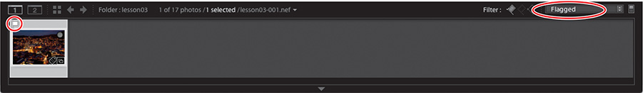
The white flag icon is now highlighted among the Filter controls in the top bar of the Filmstrip. Click the word Filter at the left of the flag icons to see the attribute filter options displayed as buttons in the Filmstrip header.
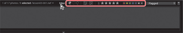
You can activate or disable any of the filters you saw in the Filter menu by clicking the respective Filter buttons. You can set up a combination of filters and save it as a custom preset by choosing Save Current Settings As New Preset from the menu.
Click the white flag button to deactivate the active filter or choose Filters Off from the menu to disable all filters. The Filmstrip once more displays all the images in the folder. Click the word Filter again to hide the filter buttons.
You’ll learn more about using filters in Lesson 4, “Managing Your Photo Library.”
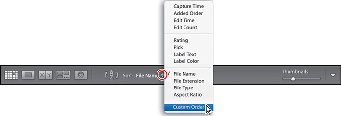
Changing the sorting order of the thumbnails
Use the Sort Direction icon and the Sort menu in the Toolbar to change the display order of the thumbnail images in the Grid view and the Filmstrip.
If the sorting controls are not currently visible in the Toolbar, choose Sorting from the tools menu at the right of the Toolbar.
Choose Pick from the Sort menu.
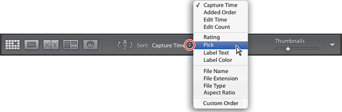
The thumbnails are rearranged in both the Grid view and the Filmstrip to display the image with the white Pick flag first.
Click the Sort Direction control to reverse the sorting direction of the thumbnails. The image with the white Pick flag now appears last in the order.
When you’ve grouped images in a collection, you can manually rearrange their order however you wish. This can be particularly useful when you’re creating a presentation such as a slideshow or web gallery, or putting together a print layout, as the images will be placed in the template according to their sort order.
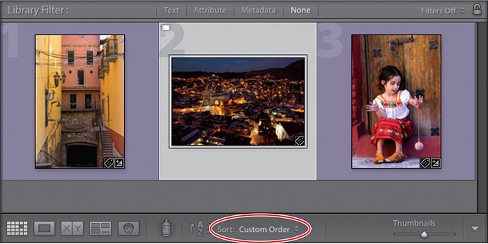
Expand the Collections panel and click the Scenic Collection that you created earlier in this lesson. Choose File Name from the Sort Criteria menu.

In the Filmstrip, drag the first image to the right and release the mouse button when you see a black insertion bar appear after the second thumbnail.
Tip
You can also change the order of the photos in a collection by dragging the thumbnail images in the Grid view.
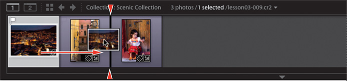
The image snaps to its new location in both the Filmstrip and the Grid view. The new sorting order is also apparent in the Toolbar; your manual sorting order has been saved and is now listed as Custom Order in the Sort menu.
Choose File Name from the Sort menu, then return to your manual sorting by choosing Custom Order.
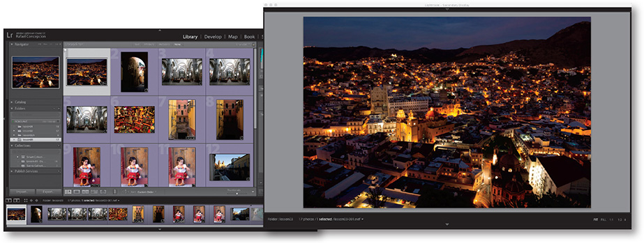
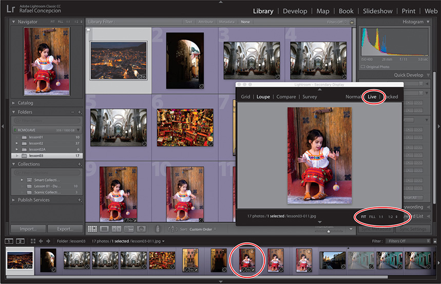
Using a secondary display
Click the lesson03 folder in the Folders panel so we have more images to work with. If you have a second monitor connected to your computer, you can use it to display an additional view that is independent of the module and view mode currently active on your main monitor. You can choose to have the secondary view displayed in its own window that can be resized and repositioned, or have it fill your second screen. Use the view picker at the top of the secondary display to switch between Grid, Loupe, Compare, Survey, and Slideshow views.
If you have only one monitor connected to your computer, you can open the additional display in a floating window that you can resize and reposition as you work.
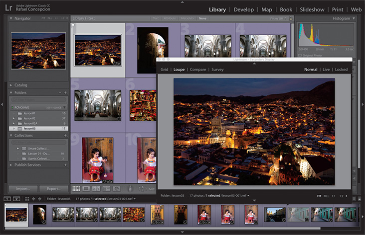
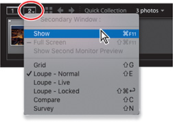
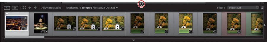
To open a separate window—whether you’re using one or two monitors—click the Second Window button (it looks like a monitor with a 2 in it), located at the upper left of the Filmstrip.
In the top panel of the secondary display, click Grid or press Shift+G.
Use the Thumbnails slider in the lower-right corner of the secondary display to change the size of the thumbnail images. Use the scroll bar on the right side, if necessary, to scroll to the end of the Grid view.
Tip
You can use keyboard shortcuts to change the view in the secondary display—Shift+G for Grid, Shift+E for Loupe, Shift+C for Compare, and Shift+N for Survey. If the second window is not already open, you can use these keyboard shortcuts to quickly open it in the desired viewing mode.
Although it’s possible for the secondary display to show a different enlarged photo from the main window, the Grid view in the secondary display always shows the same images as the Grid view and the Filmstrip in the main window.
The Source Indicator and menu at the left of the secondary display’s lower panel work the same way they do in the Filmstrip, and the top and bottom panels can be hidden and shown, just as they can in the main window.
Click to select any thumbnail in the secondary display’s grid, and then click Loupe in the view picker at the left of the top panel. Check the picker at the right of the top panel to make sure that Normal mode is active.
When the secondary display is in Normal mode, the Loupe view displays the active image from the Grid view and the Filmstrip in the main display.
Note
If your secondary display is open in a window rather than on a second screen, you may need to change the focus for any keyboard input by clicking inside the main window or on its title bar.
Use the left and right arrow keys on your keyboard to select either the previous or next photo in the series. The new selection becomes the active image and the secondary display is updated accordingly.
Click Live in the mode picker at the right of the secondary display’s top panel.
In Live mode, the secondary display shows the image that is currently under your pointer in the main window—whether that image is a thumbnail in the Filmstrip or the Grid view, or enlarged in the Loupe, Compare, or Survey view.
You can set a different zoom level for the secondary display by choosing from the picker at the lower right of the secondary window.
Select an image in the Filmstrip, then switch the secondary window to Locked mode by clicking Locked in the mode picker at the right of the top panel. The current image will now remain fixed in the secondary display until you return to Normal or Live mode—regardless of the image displayed in the main window.
Change the zoom level for the secondary display by choosing from the picker at the right of the lower panel: click Fit, Fill, or 1:1, or choose a zoom ratio from the menu at the far right.
Drag the zoomed image to reposition it in the secondary window, and then click the image to return to the previous zoom level.
(Optional) Right-click the image to choose a different background color or texture from the menu. These settings will apply to the secondary display independently of the options chosen for the main window.
Select Compare in the view picker at the left of the secondary window’s top panel. In the main window, select two or more images in the Grid view or in the Filmstrip.
As in the main window, the image on the left of Compare view is the Select image; the image on the right is the Candidate. To change the Candidate photo, make sure the Candidate pane is active, and then click the Select Previous Photo or the Select Next Photo button. If you have more than two images selected, only images from the selection are considered as candidates. To replace the Select image with the current Candidate, click the Make Select button.
In the main window, select three or more images, and then click Survey in the top panel of the second window. Use the Survey view to compare more than two images at once. To remove an image from the Survey view, move the pointer over the unwanted image and click the Deselect Photo button that appears in the lower-right corner of the image.
Choose Show in the Window > Secondary Display menu to deselect it, or click the Close button to close the secondary display.
Review questions
1 Name the four working views in the Library module, and explain how they’re used.
2 What is the Navigator?
3 How do you use the Quick Collection?
4 What is the target collection?
Review answers
1 Press the G key or click the Grid view button in the Toolbar to see thumbnails of your images while you search, apply flags, ratings, and labels, or create collections. Use the keyboard shortcut E or click the Loupe view button to inspect a single photo at a range of magnifications. Press C or click the Compare view button to see two images side by side. Click the Survey view button in the Toolbar or use the keyboard shortcut N to evaluate several images at once or refine a selection.
2 The Navigator is an interactive full-image preview that helps you move around easily within a zoomed image in Loupe view. Click or drag in the Navigator preview to reposition the view while a white rectangle indicates the portion of the magnified image that is currently visible in the workspace. The Navigator panel also contains controls for setting the zoom levels for the Loupe view. Click the image in Loupe view to switch between the last two zoom levels set in the Navigator panel.
3 To create a Quick Collection, select one or more images and then press the B key or choose Photo > Add To Quick Collection. The Quick Collection is a temporary holding area; you can continue to add—or remove—images until you are ready to save the grouping as a more permanent collection. You’ll find the Quick Collection listed in the Catalog panel.
4 The target collection is the collection to which a selected image will be added when you press the B key or click the circular marker in the upper-right corner of the thumbnail. By default, the Quick Collection is designated as the target collection; this status is indicated by the plus sign (+) that follows the Quick Collection’s name in the Catalog panel. You can designate a collection of your own as the target collection so that you can use the same convenient techniques to add and remove photos quickly.