5 Developing Basics
Lesson overview
Lightroom delivers an extensive suite of powerful, yet easy-to-use, developing tools to help you make the most of your photos with a minimum of effort, whether they’re incorrectly exposed, shot at an angle, poorly composed, or even spoiled by extraneous objects.
This lesson introduces you to a range of basic editing options in the Develop module, from automatic adjustments and develop presets to cropping, straightening, and finishing tools. Along the way, you’ll pick up a little background knowledge in digital imaging as you become familiar with some basic techniques. You’ll learn how to:
Crop your images for the best effect.
Use the histogram and properly set your white balance.
Perform basic edits in the Develop module.
Apply artistic color profiles to your images.
Effectively use sharpening and noise reduction.
Create versions of images using virtual copies and snapshots.
Create compelling black-and-white images.

This lesson will take 2 to 2-1/2 hours to complete. Please log in to your account on peachpit.com to download the files for this lesson, or go to the “Getting Started” section at the beginning of this book and follow the instructions under “Accessing the lesson files and Web Edition.” Store the files on your computer in a convenient location. Your Account page is also where you’ll find any updates to the lessons or to the lesson files. Look on the Lesson & Update Files tab to access the most current content.
Now that you’ve imported your photos and organized your catalog, you can jump right in and begin editing them with a range of options from one-click automatic adjustments to specialized retouching tools. You can experiment with any of these, secure in the knowledge that, thanks to Lightroom’s non-destructive editing, the modifications you make while you’re learning won’t alter your master files.
Getting started
Before you begin, make sure you’ve set up the LRClassicCIB folder for your lesson files and created the LRClassicCIB Catalog file to manage them, as described in “Accessing the lesson files and Web Edition” and “Creating a catalog file for working with this book” in the “Getting Started” section at the start of this book.
![]() Note
Note
This lesson assumes that you already have a basic working familiarity with the Lightroom Classic CC workspace. If you need more background information, refer to Lightroom Classic CC Help, or review the previous lessons.
If you haven’t already done so, download the lesson05 folder from your Account page at www.peachpit.com to the LRClassicCIBLessons folder, as detailed in “Accessing the lesson files and Web Edition” in the “Getting Started” section.
Start Lightroom Classic CC.
In the Select Catalog dialog box, make sure the file LRClassicCIB Catalog.lrcat is selected under Select A Recent Catalog To Open, and then click Open.
Lightroom Classic CC will open in the screen mode and workspace module that were active when you last quit. If necessary, switch to the Library module by clicking Library in the Module Picker at the top of the workspace.
![]() Tip
Tip
If you can’t see the Module Picker, choose Window > Panels >
Show Module Picker, or press the F5 key. If you’re working on macOS, you may need to press the fn key together with the F5 key, or change the function key behavior in the system preferences.

Importing images into the library
The first step is to import the images for this lesson into the Lightroom library.
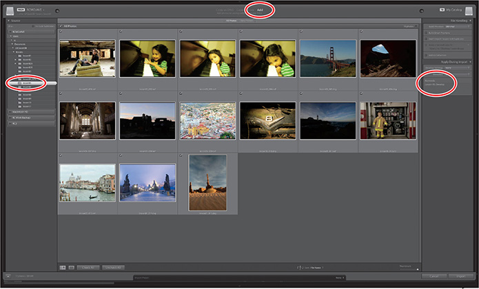
In the Library module, click the Import button below the left panel group.
If the Import dialog box appears in compact mode, click the Show More Options button at the lower left of the dialog box to see all the options in the expanded Import dialog box.

Under Source at the left of the expanded Import dialog box, locate and select your LRClassicCIBLessonslesson05 folder. Ensure that all 15 images in the lesson05 folder are selected (checked) for import.
In the import options above the thumbnail previews, select Add so that the imported photos will be added to your catalog without being moved or copied. Under File Handling at the right of the expanded Import dialog box, choose Minimal from the Build Previews menu and leave the Don’t Import Suspected Duplicates option unselected. Under Apply During Import, choose None from both the Develop Settings menu and the Metadata menu and type Lesson 05, Develop in the Keywords text box. Make sure that your import is set up as shown in the illustration below, and then click Import.
![]() Tip
Tip
The first time you enter any of the Lightroom Classic CC modules, you’ll see tips that will help you get started by identifying the components of the workspace and stepping you through the workflow. Dismiss the tips by clicking the Close button. To reactivate the tips for any module, choose [Module name] Tips from the Help menu.
The 15 images are imported and now appear in both the Library module’s Grid view and the Filmstrip across the bottom of the Lightroom workspace.
The Develop module
Although the Library module’s Quick Develop panel offers access to many basic image editing options, you’ll work in the Develop module to make more detailed adjustments and modifications to your photos. The Develop module is a comprehensive editing environment, presenting all the tools you’ll need to correct and enhance your images in a single workspace. The controls are simple enough for a beginner to use, and yet have the depth and power required by the advanced user.
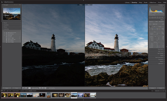
The Develop module offers three viewing modes: the Loupe view, where you can focus on a single image; the Reference view, where you can compare your image to a reference image; and the Before/After view, which has several layout options that make it easy to compare the original and edited versions of a photo. The Toolbar across the bottom of the work area presents buttons for switching between the views and a slightly different suite of controls for each viewing mode.
The tools and controls in the Develop module’s right panel group are arranged from top to bottom in the order in which they would ordinarily be used, a layout that guides you intuitively through the editing workflow.
The left panel group contains the Navigator panel, which can be collapsed but not hidden, and any combination of the Presets, Snapshots, History, and Collections panels, which can be shown or hidden to suit the way you prefer to work.
At the top of the left panel group, the Navigator panel helps you find your way around a zoomed image, lets you preview the effects of developing presets before you apply them, and lets you review past stages in an image’s developing history. At the right of the Navigator’s header is a zoom picker for setting the magnification level in the working views.

At the top of the right panel group is the Histogram panel. Immediately below the histogram is an array of tools for cropping, removing image flaws, applying local adjustments through graduated or radial masks, and painting develop settings directly onto an image selectively. Clicking any of these tools expands a tool options panel with controls and settings for that tool.
Below these editing tools is the Basic panel, your starting point for color correction and tonal adjustments. In many cases, this may be the only panel you need to achieve the result you want. The remaining panels offer specialized tools for various image enhancement tasks.
For example, you can use the Tone Curve panel to fine-tune the distribution of the tonal range and increase midtone contrast. Use the controls in the Detail panel to sharpen an image and reduce noise.
It’s not intended that you use every tool on every photo. In many circumstances, you may make only a few slight adjustments to an image; however, when you wish to polish a special photo—or if you need to work with shots captured at less than ideal camera settings—the Develop module gives you all the control you need.
Reorganize the Develop module
The 2019 release of Lightroom Classic CC provides a new feature in the Develop module. Right-click any panel’s header on the right, and you’ll see a new option at the top of the menu. Choose Customize Develop Panel, and you’re presented with a dialog box where you can drag to rearrange the order of the panels on the right. The checkboxes toggle each panel’s visibility. Clicking the Save button will prompt you to restart Lightroom. After the restart, your panels will be organized as you set them, showing only the ones you need in the order you prefer.
To get back to the original arrangement, go back into the Customize Develop Panel area, click Default Order at the bottom, then click Save and restart Lightroom.

Creating a collection from a previous import
Now that we are familiar with how to create collections inside of Lightroom, it’s a good idea to get into a workflow habit of making collections for images that we will be working on in Lightroom CC.
After importing images into the Library, all of the images reside in the Previous Import group in the Catalog panel. Press Command+A/Ctrl+A to select all of the images in the group.
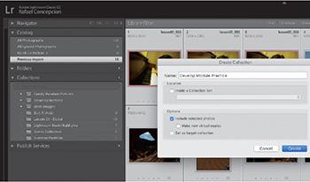
Click the plus sign (+) button at the upper right of the Collections panel and make a collection called Develop Module Practice, making sure the Include Selected Photos option is selected.
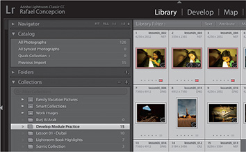
The images are automatically added to the Develop Module Practice collection. From here, you can drag to reorganize them to your liking, or choose File Name from the Sort menu in the Toolbar at the bottom of the work area to see them in order by filename.

![]() Note
Note
If you do not see the Toolbar at the bottom of the panel, press the letter T to show it.
Now that we have ourselves organized, let’s start tackling the Develop module by working on some of the most popular tools from the top down.
Cropping and rotating images
The Crop Overlay tool makes it simple to improve your composition, crop away unwanted edge detail, and even straighten your image.
Select the raw image of the model in the yellow chair in the Grid view or Filmstrip and press the D key to switch to the Develop module.
Hide the left panel group to enlarge the work area; you’ll find keyboard shortcuts for showing and hiding any or all of the panels listed beside the commands in the Window > Panels menu. If you’re not already in the Loupe view, press the D key or click the Loupe view button in the Toolbar. If you don’t see the Toolbar, press the T key.
Click the Crop Overlay tool button just below the Histogram panel, or press the R key. A crop overlay rectangle appears on the image in the Loupe view and an options panel for the Crop Overlay tool opens above the Basic panel.
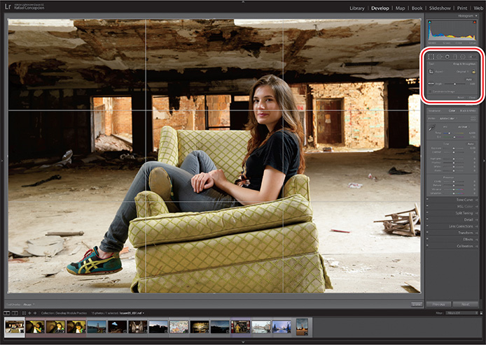
Drag the top corners inward and the area outside of the crop overlay will darken, giving you a better idea what the crop will look like. Drag the image to reposition the crop. Move your pointer outside the corners of the overlay, and it turns into a curved double-headed arrow, allowing you to drag clockwise or counterclockwise to rotate the image.
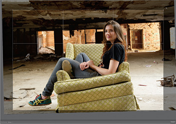
The crop overlay includes a set of compositional aids you can use to make better crop adjustments to your images. The default overlay is the Rule Of Thirds, shown above. Press the O key to cycle between the overlays. The Golden Spiral overlay is shown in the illustration at the right.

![]() Note
Note
If you press Shift+O, you can change the orientation of the overlays.
Changing crop overlays
These crop overlays are meant to be guidelines or suggestions for aligning and cropping your image. In the example to the right, I am using the Rule Of Thirds overlay. This is one of the most common photographic principles: any image that puts the subject at one of the intersecting points on a Rule Of Thirds grid is more compositionally interesting. By using the Rule Of Thirds grid, I can crop to ensure my friend Kena’s face is at that top right intersecting point, making the picture more interesting.
![]() Note
Note
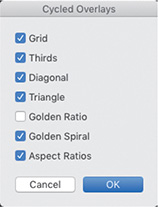
The following crop overlays are available in Lightroom Classic CC: Grid, Rule Of Thirds, Diagonal, Triangle, Golden Ratio, Golden Spiral, and Aspect Ratios.
You may not need all of the guides that are available, however. Here’s how you we can limit the amount you see.
Choose Tools > Crop Guide Overlay > Choose Overlays To Cycle. In the resulting dialog box, you can deselect any of the guides that you do not find necessary. Click OK, and the next time you use the Crop Guide Overlays menu, you will only see the ones that you have selected.
Using the Straighten tool
In the Crop Overlay tool’s options panel is the Straighten tool. Its icon looks like a level, and you use it to adjust your images if they are askew.
![]() Note
Note
Whether you use the Straighten tool or rotate the photo manually, Lightroom will automatically trim the angled edges of the rotated photo when you commit the crop by clicking the Crop Overlay tool or double-clicking the image in the Loupe view. Lightroom will find the largest crop possible with the specified aspect ratio. Changing or unlocking the aspect ratio can minimize the amount of the photo that will be trimmed away.
Click the tool in the panel and your pointer turns into a crosshair and a level.

Move over the picture and drag along something that should be horizontally level or Shift-drag along something that should be vertically straight. In this case, I am using the floor behind Kena. Drag a line that runs along your straight edge, and the picture will straighten itself along that guide.
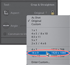
Cropping to specific dimensions
Photographers often want to lock their picture’s crop to the specific ratio it was shot at (in this example, the aspect ratio of a DSLR sensor, 3:2). There are times, however, when you may want to change your cropping ratio, perhaps creating a square crop for Instagram, a wider Facebook cover post, or a 16:9 wide shot.
With the Crop Overlay tool active, click to the right of Aspect, and you’ll see a menu of commonly used photo sizes, such as 1x1 (square crop), 4x5 (great for making 8x10 images), and 16x9. For this example, choose the 16x9 crop to give the image a little more of a cinematic feel. The crop overlay automatically resizes, and now is constrained by the 16x9 crop.
Seeing your crop better
One last piece of advice: when you are making a crop, make sure that you get rid of the Lightroom interface while you are making judgements on the crop. The best way to do this is to press Shift-Tab on the keyboard. This will hide the panels, Module Picker, and Filmstrip, giving you the most real estate for the picture.
![]() Tip
Tip
Thanks to non-destructive editing, you can return at any time and adjust your crop—or the angle of the photo—by simply reactivating the Crop Overlay tool. The crop becomes “live” —the trimmed portions of the image become visible once more and you can rotate the photo or resize and reposition the cropping rectangle as you wish.
Once the panels are hidden, press the letter L twice. The first press of the L key will switch Lightroom to Lights Dim mode, dimming the interface by 80%. The second time you press the L key turns the lights off entirely (Lights Out mode). This gets rid of all of the distractions around the edges, and lets you focus on only the elements you want in the picture as you move the crop around.
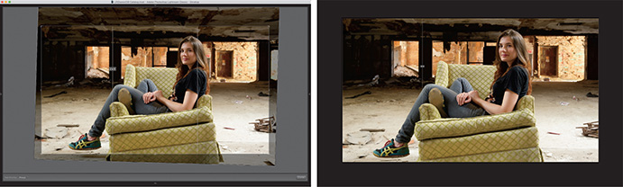
Press Return/Enter to complete your crop, then press the letter L to turn the lights back on, and press Shift-Tab to bring back the panels.
What are camera profiles?
When shooting in JPEG mode, the camera applies color, contrast, and sharpening to your image files. Switching to shooting in raw, your camera captures all of the raw data at the point of capture, but builds a small JPEG preview as well. This JPEG preview—with all of the color, contrast, and sharpening—is what you see in the LCD on the back of the camera.
When you import this image into Lightroom, Lightroom initially shows you that JPEG preview as a thumbnail. Behind the scenes, it starts to render the raw data into pixels you can view and work with onscreen (a process known as demosaicing). To do this, Lightroom looks at the image’s metadata—white balance and everything buried in your camera’s color menu—and interprets it as best it can.
Because Lightroom can’t interpret some proprietary camera settings, the preview almost never looks like the JPEG that you saw on the back of your camera. This is why your thumbnails shift in color shortly after (or during) the import process.
This shift frustrated many photographers before Lightroom’s developers added camera profiles (presets that attempt to mimic the settings included in a camera’s JPEGs). While not 100 percent accurate, they let you get closer to what you saw on the back of your camera. They used to be located in the Camera Calibration panel.
As more photographers started using them, some created profiles for artistic effects. Adobe realized that users wanted to add profiles first—for both color fidelity and artistic expression—and moved them to the top of the Basic panel.
The new profiles in Lightroom
The April 2018 release of Lightroom Classic CC greatly expanded how photographers use camera profiles in their workflow by creating three categories to explore:
Adobe Raw profiles: These profiles are not camera-dependent and aim to give users of any camera a more unified look and feel for their images.
Camera Matching profiles: These profiles mimic the profiles built in to your camera, and vary by camera manufacturer.
Creative profiles: These profiles are built for artistic expression and leverage Lightroom’s ability to include 3D LUTs for even more coloring effects.
![]() Note
Note
Color lookup tables (LUTs) are tables that remap or transform color in an image. Originally used in the video space to attempt to make footage from different video sources look similar, LUTs gained popularity as Photoshop users began using them to colorize their images as an effect. These effects sometimes are known as cinematic color grading.
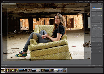
Now that we know what these tools can do, let’s spend some time exploring how to use them to make our work really stand out: Select the first image in the Develop Module Practice collection (when sorted by File Name in the Grid view’s Sort menu), and press the D key to make sure you are in the Develop module. To make it easier for you to see the changes we are making, close the left-side panels and the Filmstrip by clicking the gray triangles in the middle of each side.
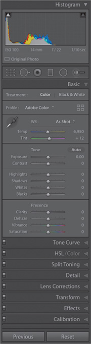
At the top of the Basic panel (directly below Treatment) is the Profile area. On the left is the Profile pop-up menu, a quick way to access some of the Adobe Raw profiles that mimic your camera settings (these appear only when working on a raw file). You also can add your favorite profiles from the Profile Browser to this menu for easier access.

On the right is the Profile Browser icon (it looks like four squares), where you can access a variety of profiles, including the Adobe Raw Profiles. Josh Haftel, principal product manager for Adobe, wrote a blog post explaining the new color profiles:
“Adobe Monochrome has been carefully tuned to be a great starting point for any black and white photograph, resulting in better tonal separation and contrast than photos that started off in Adobe Standard and were converted into black and white.
Adobe Portrait is optimized for all skin tones, providing more control and better reproduction of skin tones. With less contrast and saturation applied to skin tones throughout the photo, you get more control and precision for critical portraiture.
Adobe Landscape, as the name implies, was designed for landscape photos, with more vibrant skies and foliage tones.
Adobe Neutral provides a starting point with a very low amount of contrast, useful for photos where you want the most control or that have very difficult tonal ranges.
Adobe Vivid provides a punchy, saturated starting point.”
While I believe that Adobe has done a great job with the Adobe Raw profiles, many photographers will want to go directly to the Camera Matching profiles, the profiles that are specific to your camera make and are based on the ones you can choose on your camera. To do this, click the Profile Browser icon.
Using the Profile Browser
The new Profile Browser gives you access to all the profiles Adobe created. We already discussed the Adobe Raw profiles at the top of the Profile Browser. The Camera Matching profiles include any profiles that are specific to your camera make, so the number of profiles available will vary by camera type.

At the bottom of the Profile Browser are the creative profiles, separated by category: Artistic, B&W, Modern, and Vintage. If you expand any of them, you’ll see a series of thumbnails showing what each profile will look like on your photo.
I encourage you to experiment with all of the profiles. While the Camera Matching profiles might offer you a one-click solution to get closer to what you saw on the back of your camera, the creative profiles might spark a new interpretation of your image. My other favorite part? The creative profiles have an Amount slider, allowing you to dial in the effect to your liking. Once you choose a profile and an Amount setting, click the Close button at the upper right of the browser to return to the Basic panel.
The profiles that have been created also include black-and-white presets that can really enhance and serve as a great starting point for creating compelling black-and-white images. We’ll talk about how to create your own black-and-white images later on in the lesson.
For the purposes of this image, select the Vintage06 preset and click the Close button.
The end result is a grungier look with more compressed midtones.
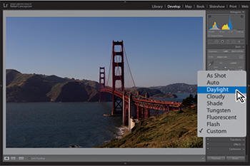
Setting your picture’s white balance
White balance refers to the color of light in a photo. Different kinds of light—fluorescent or tungsten bulbs, overcast skies, and so on—create different color casts in your photo. White balance adjustment is done by adjusting the temperature and tint to bring the color back to what you intended. Click the lesson05_005 file, then click As Shot next to WB near the top of the Basic panel and experiment with the different white balance choices in the menu.
![]() Note
Note
On raw images, you can use the WB menu to access white balance presets, although it’s usually quicker to set it manually using the White Balance Selector. Your camera’s white balance is baked into JPEGs, so this menu has far fewer options for them.
If you shoot in a raw format, you have more choices in the menu—the ones you typically find in your camera (they’re not available with a JPEG). Choose the one that most closely matches the lighting you shot in. You can also make your own adjustments with the Temp and Tint sliders.

If you don’t like the results, in the Basic panel, click the White Balance Selector (it looks like an eyedropper) or press W on your keyboard. Move your cursor over your image, and click an area that should be neutral in color, such as a light or medium gray (you can use the Loupe that appears to help you find a neutral color).

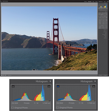
In this example of a picture that I took of the Golden Gate Bridge in San Francisco, I want to get rid of the yellow tinge that the original picture had. Once I get the white balance closer to what I want, I can go in and adjust the tint of the picture to get it where I really want it. The White Balance Selector tool doesn’t have to be a one-step solution, but it can certainly shave some time off the process.
About white balance
In order to correctly display the full range of color informa-tion recorded in an image file, it’s critical to balance the distri-bution of color in the photo—that is, to correct the photo’s white balance.
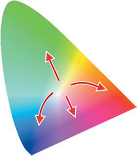
This is achieved by shifting the image’s white point, the neutral point around which the colors in the image are distributed on the two axes of temperature (blue to red, visualized in the illustration at the right as a curved axis) and tint (green to magenta).
An image’s white point reflects the lighting conditions in which the photo was captured. Different types of artificial lighting have different white points; they produce light that is dominated by one color or deficient in another. Weather conditions also have an effect on the white balance.
The higher the red component in the lighting, the warmer the colors in the photo will appear; the higher the blue component, the cooler the image, so movement along this axis defines the photo’s color temperature, while the term tint refers to shifts in the direction of green or magenta.
The sensors in a digital camera record the amount of red, green, and blue light that is reflected from an object. Under pure white lighting, an object that is a color-neutral gray, black, or white reflects all color components of the light source equally.
If the light source is not pure white but has a predominant green component for example (typical of fluorescent lighting), a higher amount of green will be reflected. Unless the composition of the light source is known—and the white balance or white point is corrected accordingly—even objects that should appear color-neutral will have a green color cast.
When shooting in auto white balance mode, your camera attempts to estimate the composition of the light source from the color information measured by the sensors. Although modern cameras are doing better at automatically analyzing lighting and setting the white balance to meet conditions, the technology is not infallible; it’s preferable—if your camera supports it—to use your camera to measure the white point of the light source before shooting. This is usually done by photographing a white or neutral, light gray object in the same lighting conditions as the intended subject.
Together with the color information collected by the camera sensors, raw images also contain “As Shot” white balance information, a record of the white point determined automatically by the camera at the moment of capture. Lightroom can use this information to correctly interpret the recorded color data for a given light source. The recorded white point information is used as a calibration point in reference to which the colors in the image will be shifted to correct the white balance.
You can use the White Balance Selector tool, located in the upper- left corner of the Basic panel, to correct the white balance in your photo. Click to sample an area in your photo that you know should appear onscreen as a light neutral gray; Lightroom will use the sampled information to determine the point around which the image can be calibrated and set the image’s white balance accordingly.
As you move the White Balance Selector tool across the image, you will see a magnified view of the pixels under the eyedropper cursor and RGB values for the central target pixel. To avoid too radical a color shift, try to click a pixel where the red, green, and blue values are as close as possible. Do not use white or a very light color (such as a spectral highlight) as the neutral target; in a very bright pixel, one or more of the color components might already have been clipped.
Color temperature is defined with reference to a concept known as black-body radiation theory. When heated, a black-body will first start glowing red, then orange, yellow, white, and finally blue-white. A color’s temperature is the temperature—in kelvin (K)—to which a black-body must be heated to emit that particular color. Zero K corresponds to −273.15°C or −459.67°F and an increment of one unit kelvin is equivalent to an increment of one degree Celsius.
What we generally refer to as a warm color (with a higher red component) actually has a lower color temperature (in kelvin) than what we would call a cool color (with a higher blue component). The color temperature of a visually warm scene lit by candlelight is about 1500 K. In bright daylight you would measure around 5500 K and light from an overcast sky results in a color temperature in the photo of about 6000 to 7000 K.
The Temperature slider adjusts the color temperature (in kelvin) of the designated white point, from low at the left side of the range to high on the right side. Moving the Temp slider to the left reduces the color temperature of the white point. In consequence, the colors in the image are interpreted as having a higher color temperature relative to the adjusted white point and are shifted toward blue. The colors displayed in the track of the Temp slider control indicate the effect a change in that direction will have on the image. Moving the slider to the left will increase the blue in the image, moving the slider to the right will make the image look more yellow and red.
The Tint slider works in the same way. For example, to remove a green cast in an image, you would move the Tint slider to the right, away from the green displayed inside the slider control. This increases the green component in the white point so the colors in the image are interpreted as less green relative to the adjusted white point.

Adjusting the Temp and Tint sliders corresponds to shifting the white point within the color gamut.
Setting exposure and contrast
Exposure is determined by how much light your camera’s sensor captures and is measured in f-stops (indicating how much light your camera’s lens lets in). In fact, the slider simulates stops on a camera: a setting of +1.00 is like exposing one stop over the metered exposure in-camera. In Lightroom, the Exposure slider affects midtone brightness (in portraits, that’s skin tones). Drag to the right to increase brightness, or drag to the left to decrease brightness (you can see this in the slider itself—white is to the right and black is to the left).
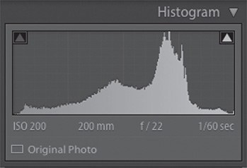
Keep the lesson05_005 image open, and move the Exposure slider to the right to +1.0. Immediately, the image gets brighter.

If you move your pointer over the middle of the histogram at the top of the right-side panels, the area affected by the Exposure slider is highlighted in light gray and the word Exposure appears below the lower-left corner of the histogram.
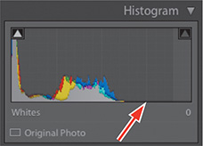
Before the change, the range of information lived on the left side of the histogram (shown above left). With the exposure adjustment, all of that has moved to the right (shown above right).
Contrast adjusts the difference in brightness between the darkest and lightest tones in your picture. When you drag this slider to the right (increasing contrast), you “stretch out” the histogram’s data, creating darker blacks and brighter whites. It’s like parting (or joining) the middle of the histogram.
![]() Tip
Tip
To have Lightroom perform an auto adjustment for a single slider, no matter where it appears in the adjustment panels, Shift-double-click it. This is especially helpful in setting contrast—if, say, you opt to set exposure and contrast manually rather than using the Auto button—because contrast can be tough to get right (you can easily mess up your highlights and shadows)
If you drag this slider to the left (decreasing contrast), you scrunch the histogram’s data inward, shortening the distance between the darkest (pure black) and lightest (pure white) endpoints, making the photo’s tones look flat or muddy.
Experiment with adjusting the contrast of the image and see the results. In this image, I moved the Contrast slider to +44, which makes the picture stand out a bit more.
Press the Y key for a side-by-side comparison between the before and after of the image. This will give you a great idea of just how far you have taken the file. This is more indicative of what it was like that morning.

Adjusting shadows and highlights
The Highlights and Shadows sliders let you recover details in areas that may be clipped. Clipping occurs when areas in the picture are too dark or too light. If an area is too dark (sometimes referred to as blocked), there is not enough data in the shadows to show detail—it’s too black, too muddy, and no good. If there is an area that is clipped in the highlights (sometimes referred to as blown out), it is so bright that there is no detail in it. Printing this part of a picture would show areas where no ink would hit the page!
![]() Tip
Tip
You can turn clipping warnings on and off by pressing J on your keyboard.
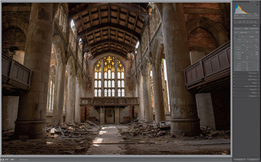
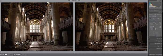
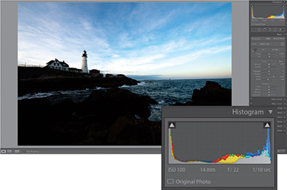
As a general rule, you want both your shadows and highlights to have as much detail as possible without affecting the rest of the image. I made this picture of an abandoned church in Gary, Indiana, by underexposing it to keep from blowing out the highlights, but I still lost some detail in the windows. Let’s see if Shadows and Highlights can help us here.
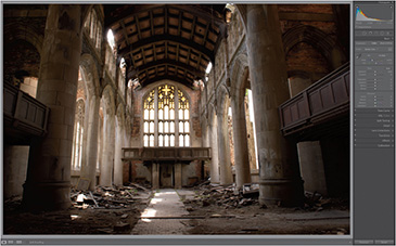
Open lesson05_007 in the Develop module and move your pointer over the shadows clipping warning at the upper left of the histogram, which turns the clipped shadows in your image blue. Move it over the clipping warning in the upper right, and it shows you the blown-out highlights in red.

Drag the Shadows slider to the right to see how much information you get back in the sides of the image—those areas were extremely dark. The shadows (or highlights, in the next step) are no longer clipping when you see the blue (for shadows) or red (for highlights) disappear or the clipping warnings in the histogram turn gray again.
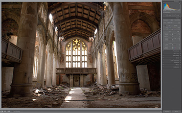
The areas by the windows are so overexposed that all the detail is lost. Drag the slider to –100, and you can see how much information is recovered in the area. Unfortunately, it looks like we hit a limit at –100. If you want to try to bring back more of those highlights, you’d have to consider underexposing the image a little further.
While there are plenty of times when Lightroom will require you to make some elaborate modifications to your images, I cannot stress how many times I’ve relied on these four sliders to do a lot of my heavy lifting. Most of the time, it’s all I need.
You will, however, run into people who believe that the best way to develop pictures is to start with the Whites and Blacks sliders. Let’s open up lesson05_011 (a picture I took in Portland, Maine) and go through how to develop your images this way.
Adjusting whites and blacks
If we understand that a histogram is a representation of pixel data across a range of tones in a picture, then it’s a good idea for us to establish what those limits are within that range.

The whites and blacks are the brightest and the darkest parts of the picture. Setting their values sets the “limits” of your tonal range. In many (but not all) pictures, making sure that all of your pixel information is within those white and black limits can yield great photos.
I look at it this way: Imagine seeing a bunch of kids playing in only half of a yard. The key to happiness is to spread the kids all around the yard. The problem with blacks and whites in images is that it can be difficult to see exactly where they are.
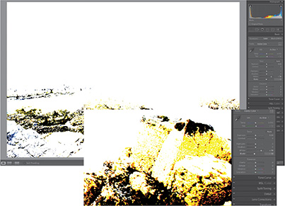
Hold down the Option/Alt key and click the Whites slider, and the image turns completely black. As you drag the Whites slider to the right, you’ll see some color changes. What you’re looking for is the first area that turns white. White tells you that portion of the picture is clipping, so that is the brightest you can make the whites without losing information. If other colors appear before you see white, Lightroom is letting you know that they are predominantly bright in the image.
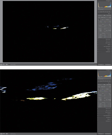
Looking at the original image, it feels like it has a film of color over it. This is known as a color cast. The yellows that appear when we do this clipping trick suggest there is a bit of bright yellow in the picture, but I am okay with that. You may see other colors as you drag, but what you’re looking for is white.
What is a histogram?
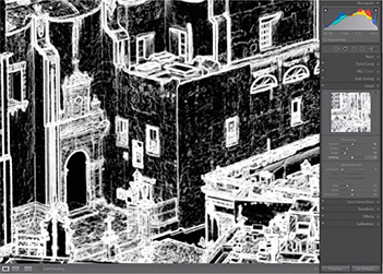
When you start looking at your images in Lightroom, you may get into (occasionally heated) discussions about the histograms of your photos. In photography, you may hear that you need to keep the histogram “as a curve” or, worse, hear about the “perfect” histogram (supposedly the one illustrated at the right). It’s essential for you to understand what it is that you are looking at when you look at a histogram, but it’s even more important for you to understand that this tool is intended to be just that—a tool, not a goal.
This is extremely oversimplified, but think of a histogram as kind of a chart. On the left side of the histogram are pixels of 0% luminance. On the right are pixels of 100% luminance. The white area is showing you color values from 0 to 255, each of them from darkest to lightest.
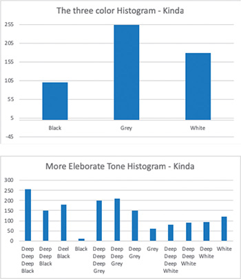
Imagine if you only had three luminance values in your picture. Your histogram would (kind of) look like the top chart here (and would probably not be from the camera you want to buy in 2019).
Now, imagine if your histogram only had 12 tones. A sample readout of these 12 luminance values might look like the bottom chart here. It’s starting to get a little crowded in that bar chart.

The histogram is just a whole mess of bars in a bar chart. There are so many of those bars that they are literally butting up to one another. But the concept is still the same. Going from left to right are the luminance values (the X axis), and from top to bottom is how bright each luminance value is (the Y axis), from 0 to 255.
When you see color in a histogram, think of the same bar chart, but with a new bar chart for each color behind that original chart. Each color chart (say, for blue) measures the amount of that color’s (blue’s) pixels, from super-dark (blue) on the left to super-bright (blue) on the right.
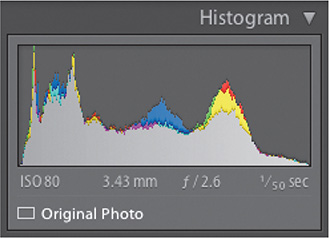
It’s the same for yellow, and the same for red. All they are is bar charts, informing you how much data you have in the picture. The more important question is: what were you aiming to get?
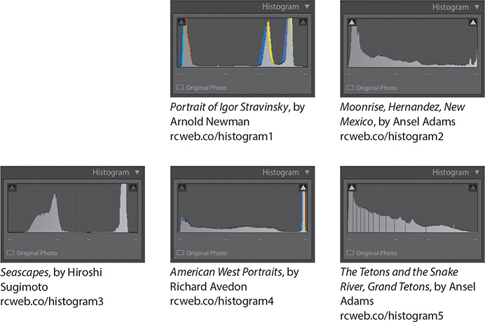
I used to believe that we were all in search of the perfect bell curve in a histogram until a conversation that I had with famed portrait photographer Gregory Heisler at Syracuse University. Professor Heisler explained that intention would prove to be infinitely more important than what the readout of the histogram said.
In our conversation, he offered a series of pictures that he often uses as a foundation for the “Histogram Hall of Fame.” These histograms would often be rejected as problematic, until you realize that the photographer intended them to be this way. They were made like this for a reason.
Because of copyright law, I can’t show you what the original images look like, but I’ll leave you with a test. Here, we have the histograms of five pictures. Take a look at those pictures online, and compare them with the histograms below (the URLs should take you right to them).
What you should watch out for when using the histogram is whether you are clipping a portion of tone, and how best to remedy that. You’ll learn how to do that in this lesson.
![]() Tip
Tip
Hold down the Shift key and double-click the Whites or Blacks slider, and Lightroom makes the change automatically.
Once you’re done with the whites, Option-click/Alt-click the Blacks slider and drag it to the left. This time, the image turns white, and what you’re looking for is the first spot of black. This tells you how far you can drag the Blacks slider. If you see other colors, they are predominantly dark.
Notice the change in the histogram compared to the original. All of the pixel information is distributed across the entire image, but that actually made the image look worse, not better. Let’s apply a Contrast setting of –100, a Highlights setting of –96, and a Shadows setting of +36, and you’ll see the picture come back to life.

This leads us to a question: does this mean that the “Whites and Blacks first” method is preferable to working with Exposure and Contrast? Not necessarily. You could have achieved a similar result by starting with Exposure and Contrast, and adjusting Shadows and Highlights to your liking. In learning how to develop pictures, it’s important that you understand how the technology works, but that you allow yourself the opportunity to find your own way of getting to the solution you find the best.
Clarity, vibrance, and saturation
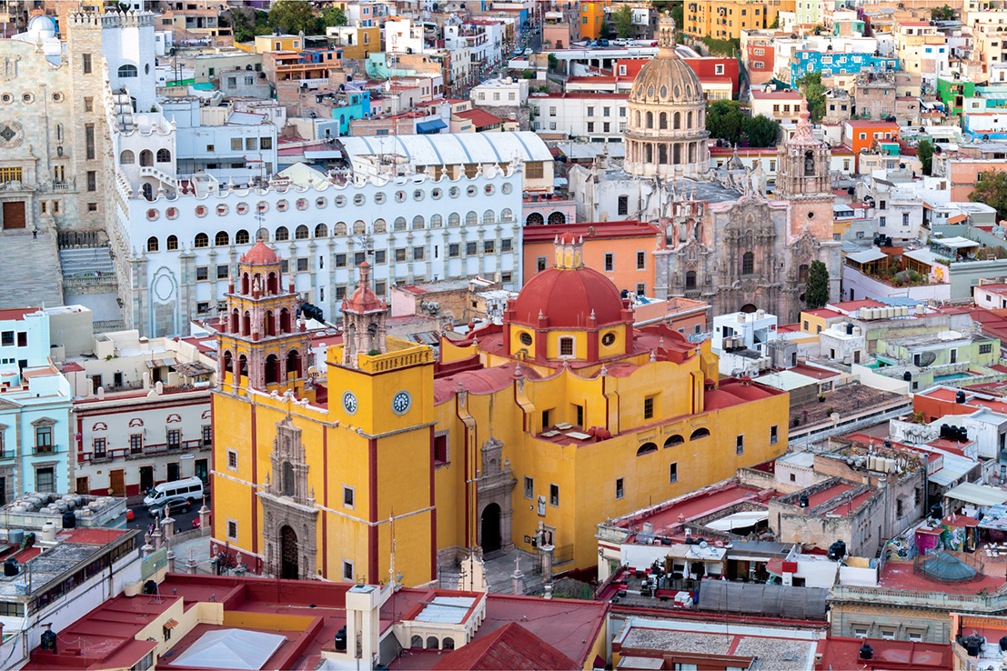
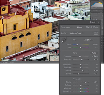
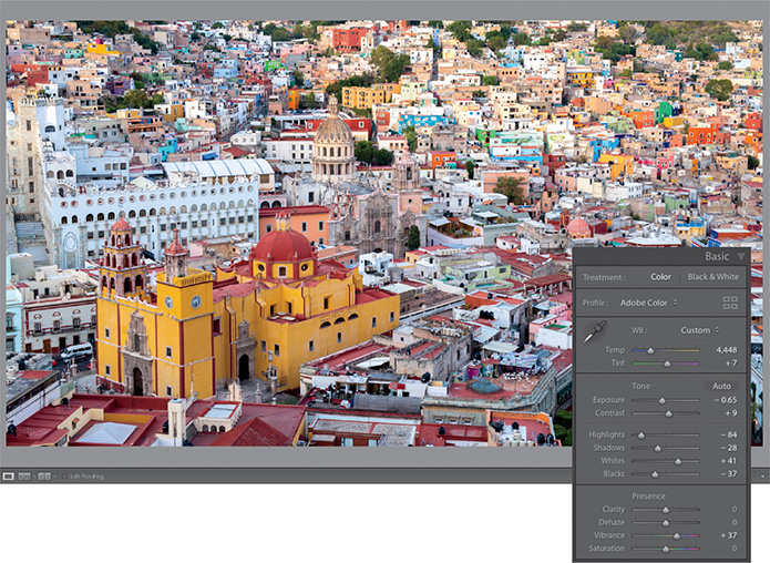
Once you’ve dialed in your picture’s tonality, you can move on to making some of the final Basic panel adjustments to the shot. Clarity, vibrance, and saturation round out the basic editing of a picture. To do this, let’s work on a picture I made in the city of Guanajuato, Mexico.
To start, open the lesson05_009 image and make some basic adjustments to it. On this image, I set the Exposure to –0.65, the Contrast to +15, Whites to +29, and Blacks to –37.
Setting the picture’s general exposure adds contrast in the shadows and highlights, and affects the whites and blacks. The one part that doesn’t get a lot of attention is the midtones, and sometimes, adding a little punch in the midtones is very helpful.

Set the Clarity slider to +71.
The Clarity slider controls midtone contrast. It’s great for adding a bit of a gritty element to your pictures—things like metals, textures, brick walls, and hair all can do with a little bit of a clarity boost.
Keep in mind, though, when you’re using the Clarity slider, that out-of-focus areas in a picture generally don’t look good with clarity applied to them. It also doesn’t do well with softer elements in a picture, so use it sparingly, or use the effect attached to an adjustment brush. We’ll cover that in the next lesson.
The Saturation and Vibrance sliders both deal with the application of color to a picture, but they work a little differently.
Experiment by dragging the Saturation slider far to the right. This intensifies all of the colors in your image evenly, as shown in the illustration to the right.
Saturation doesn’t take into account whether a color is overrepresented already. It’s an easy way to make a picture look too colorful and unrealistic in Lightroom.
Vibrance should really be called “smart Saturation.” Drag the Vibrance slider to the right, and any underrepresented colors are intensified more. Any colors that are overrepresented are not adjusted as much. If there are any skin tones in the picture, Vibrance tries not to affect them at all.
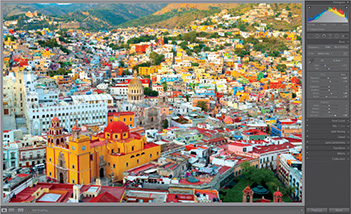
Let’s brighten the image a little: set the Contrast to +9, Highlights to –84, Shadows to –28, and Whites to +41. Then bring the Saturation back down to 0, and drag the Vibrance slider to +37.
As a general rule, I’ll usually start by making any color adjustments I need as Vibrance adjustments, and then move on to Saturation only if necessary.
Now that we have color and tone taken care of, we need to finish the picture by adding a little detail to it.
Adding detail to your images
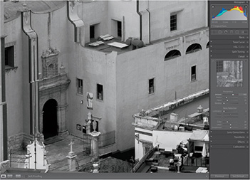
When you shoot in JPEG mode, the camera adds color, contrast, and sharpening to the final image. Photographers are quick to make the tonal adjustments we just discussed, but many skip sharpening their images. By default, Lightroom adds a small amount of detail to raw files, but it is never really enough for input sharpening.
In the Detail panel, there is a Sharpening area with four sliders: Amount, Radius, Detail, and Masking. Above those sliders is a 100% preview of the picture (click the black triangle at the upper right of the panel to show/hide it). This preview doesn’t give you a good idea how much sharpening is being applied.
Click the larger image in the center preview area once to zoom in to 100%. Drag around the picture to find an area where you can better see the sharpening you’re applying, so you can make better sharpening decisions.

The Amount slider is pretty straightforward: it dictates how much sharpening you want to apply to the picture. Let’s drag it to 102. Hold down the Option/Alt key as you drag to see a black-and-white preview, which may help you see the sharpening better.
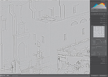
The Radius slider lets you change how far from the center of the pixel you want to apply that sharpening. It’s hard to see this by just dragging the Radius slider, so here’s a trick.
Hold down the Option/Alt key as you drag the slider. Drag it to the left, and your image turns gray; drag it to the right, and you start seeing more edge information. The visible edge information is the area that is sharpened. Anything that’s gray won’t be sharpened. Let’s drag it to 2.6 here.
Once you have the Radius set, move on to the Detail slider. The Detail slider brings out more texture or detail in a picture as you drag it to the right. However, if you move it too far, or all the way to the right, it will start introducing a little bit of noise. You’ll want to watch out for that.
Drag the detail slider to +13.
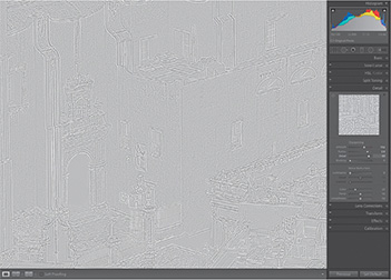
If you want to limit how that sharpening is applied, use the Masking slider. It creates a black-and-white mask, where the black areas won’t be sharpened and the white areas will be sharpened, confining your sharpening to only the edges.
Hold down the Option/Alt key and drag the Masking slider to the right to determine where you want that sharpening to occur. As soon as you release the Option/Alt key, you’ll see a much sharper picture without the noise you might get from sharpening everything evenly. Let’s move the masking to +50, as shown in the illustration at left.
To see a before/after of your sharpening, click the power switch at the far left of the Detail panel’s header to turn the sharpening off. Click it again to turn the sharpening back on, and now you can see whether you’ve added enough.
Once you’re done with sharpening, go ahead and tackle noise. Noise in a picture appears for one of two reasons: you used a camera with a really high ISO setting (you shot in low light) or you added a lot of sharpening to your photo. In this example, we’re using a picture taken at 12,800 ISO, so it’s pretty high.
The Noise Reduction area has two different types of noise you can affect. The first of these is luminance noise, which is that grainy look. Drag the Luminance slider to the right, and the noise starts disappearing. You’ll use this slider for 90% of the noise you want to remove.
If you feel you have lost too much detail after dragging the Luminance slider, grab the Detail slider below it and drag it to the right. If you want to add contrast back after these adjustments, drag that slider to the right a bit. Increasing the Detail and the Contrast reduces some of the effect of the luminance noise reduction because they tend to counterbalance each other, so be careful.
Drag the Luminance Noise Reduction slider to 15, the Detail slider to 50, and the Contrast slider to 0. Click the Detail panel’s power switch to turn your adjustments off and back on to see your results.

Color, Detail, and Smoothness are used when you see noise that comes in different colors: red, green, or blue dots (this problem is prevalent with some cameras and tends to appear in shadows). To get rid of that kind of noise, drag the Color slider to the right until those dots are desaturated, then add a bit of detail back in and balance it with a little smoothness.
Noise reduction brings back some smoothness to a file with a high ISO, but it’s also something you have to do if you excessively sharpen a picture. The more you sharpen a picture, the more noise gets introduced, especially if you use the Detail slider. So every time you go into the Detail panel’s sharpening section and create a lot of sharpening, add a little bit of noise reduction to counterbalance the effect.
Lens corrections and transformations
All lenses exhibit some trademark problem: distortion, dark edges (vignetting), or the appearance of chromatic abberations (colored pixels that appear along the edges of objects). To correct these problems, we have the Lens Corrections and Transform panels.

Select lesson05_012, and expand the Lens Corrections panel. In the panel’s Profile tab, select Enable Profile Corrections and Lightroom reads the image’s embedded EXIF data to determine what make and model of lens you used. It then chooses a built-in profile and automatically adjusts the picture, often yielding a better-looking file. If it can’t find your lens, choose the closest one from the Make and Model menus.
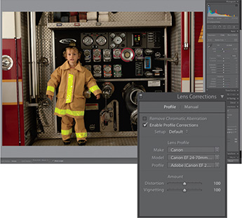
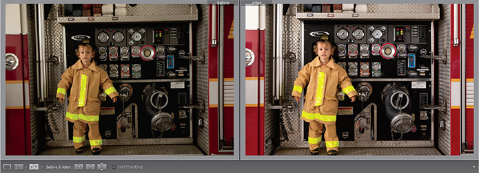
There are times, however, when the problem with your image has little to do with your lens and more to do with your position when you made the picture. In this photo, I was so excited that my little friend was getting to hang out for the first time with real firefighters that I didn’t pay attention to my camera’s relation to the side of the truck. The result was lines that are crooked from a rotation standpoint and also from a perspective point of view. This is where the Transform panel can help.
The buttons in the Upright area of the Transform panel tilt and skew your image in an attempt to fix it. You have the following four options to choose from.
Auto: Balances level, vertical, and horizontal perspective corrections, and keeps the aspect ratio as much as possible.

Level: Perspective corrections are weighted toward horizontal details.
Vertical: Perspective corrections are weighted toward vertical details and level corrections.
Full: Combination of full Level, Vertical, and Auto perspective corrections.
Click each of the transformation options to see if any of the results help what you are trying to do.
If none of the options fully solves your problem, try the Guided option to really move things along. Guided transformation allows you to draw up to four lines on the picture, tracing the edges of areas that should be straight. As you draw the lines, the image adjusts itself to what it believes is a straight picture.
Input, creative, and output sharpening
When you import a raw photo, Lightroom automatically applies a little sharpening to your photo so you can see the details it contains. This sharpening is attempting to mimic the sharpening that your camera would normally apply to an image if it were shot as a JPEG, and is commonly referred to as input sharpening. In my opinion, this level of sharpening is never enough as input sharpening, which means that you have to take it into your own hands at the start of the import process. What we cover in this book would be considered input sharpening, and is only a start.
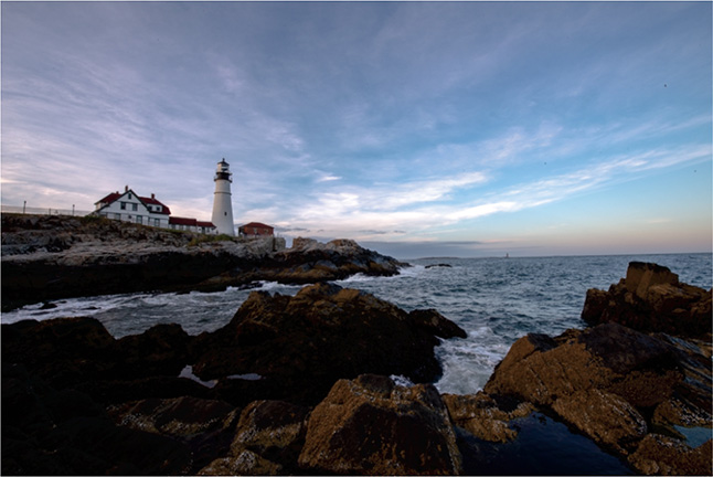
As you work on your image, you may decide that you want to sharpen more in some areas and not as much in others. In the picture above, I would probably want to apply a little more sharpening on the rocks in the foreground of this picture to add emphasis. I would not apply as much sharpening to the lighthouse. When it comes to the sky, I would not apply any sharpening at all. I’d probably want to apply some noise reduction, though.
This additional sharpening is commonly known as creative sharpening—sharpening you perform to highlight a specific thing in a picture.
When you’re completely finished adjusting the photo, you can add more sharpening according to how you’ll output it, which is cleverly referred to as output sharpening. For example, a photo that’s destined to become a canvas gallery wrap needs more sharpening than one you’ll print on glossy or metallic stock, or one that you will use online only.
How much to sharpen these images, when to sharpen them, and what process to use in doing so in Photoshop could be the subject of an entirely new book. I believe Jeff Schewe is one of the masters in this space, and his The Digital Print (from Peachpit Press) is a book that will take you through this entire process, from start to finish.
Click the Guided Upright tool and draw two horizontal lines along the metallic edges of the firetruck and one vertical line along the left side of the truck, following the edges outlined by the arrows on the illustration at right.

Once the transformation is complete, use the Transform sliders to make any final tweaks. This image ended up with a lot of white background in the bottom corners that needed to be cropped. You can also select the Constrain Crop option to have Lightroom automatically remove the white areas. The final image is smaller than the original one, but it certainly is straighter.
Finally, add some adjustments using the Basic panel, and the transformation is quite noticeable.
Using virtual copies for variations
Lightroom does a great job of keeping your library organized by keeping the number of duplicate images down to zero. One image can be referenced in multiple collections, and making a change in the file in one collection automatically cascades that change to the file in all other collections.
What if you want a copy of the file to try out a different look without changing the original? This is where another powerful feature comes in handy: the virtual copy.
Press the letter G to go to the Grid view, and select the lesson05_009 image.
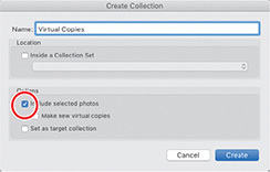
Click the plus sign (+) button at the right of the Collections panel’s header and make a new collection called Virtual Copies. Make sure you include the selected photo.
Right-click the image and select Create Virtual Copy from the menu.
Make an additional virtual copy so you have a total of three files in your collection.

![]() Note
Note
You can create virtual copies by pressing Command + ‘ (apostrophe)/Ctrl+’ on the keyboard.
These new files are virtual copies of the original image. You can make changes to each of the copies in the Develop module and they will be treated as separate images with separate changes.
While they look like separate images—full copies not tied to the original image—they actually refer to the same physical copy of the image. That’s the virtual part.

You can create multiple virtual copies of a photo to try out different edits without taking up much additional space on your hard drive. You can make better judgements about which edits you prefer by having these virtual copies side by side.
Highlight all three images and press the letter N on your keyboard to enter Survey mode to compare your changes. When finished, press the G key to get back to Grid view.

Using snapshots for variations
To save different edits to a photo without making separate copies of the image for comparison, snapshots are a great option.
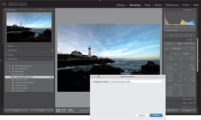
Edit the image to a point you want to save, and then click the plus sign (+) button at the right of the Snapshots panel’s header. A dialog box will appear with the date and time that you are creating the snapshot in the Snapshot Name text box. You can either keep that date and time or rename the snapshot and click Create.

Continue editing your picture and when you are ready to save another change, click the plus sign (+) button again to save a new snapshot. This is a great way to save variations and keep tabs on your progress, although I prefer the side-by-side nature of working with virtual copies.

Review questions
1 What does the Navigator panel do?
2 What is the meaning of the term white balance?
3 How can you straighten a crooked photo?
4 How do you get Lightroom to perform an automatic adjustment for a setting in the Basic panel?
5 How do you get Lightroom to perform an automatic lens correction?
Review answers
1 The Navigator panel helps you find your way around a zoomed image, lets you preview Develop module presets before applying them, and lets you view past stages in an image’s developing history.
2 An image’s white balance reflects the light source when the picture was taken. Different types of artificial lighting and weather conditions can produce light that is dominated by one color or deficient in another, resulting in images with a color cast.
3 You can straighten a tilted image by dragging to rotate the cropping rectangle or using the Straighten tool, which lets you mark a horizontal or vertical element in a tilted photo as a reference around which Lightroom then straightens the image.
4 Shift-double-clicking any slider in the Basic panel will cause Lightroom to automatically adjust that setting.
5 In the Profile tab of the Lens Corrections panel, select the Enable Profile Corrections option. If Lightroom cannot locate your lens make and model, select the closest match using the Lens Profile menus.