
Global wind data is also a map service provided by the ArcGIS livefeeds, providing global-level wind data at various locations. Our objective is to incorporate a gauge widget that changes its gauge reading based on the wind location being hovered upon. The wind data has been appropriately symbolized by default.
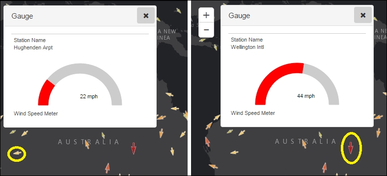
The following screenshot shows a gauge widget based on our global wind data. The arrows in the map are wind feature locations, the direction of the arrow represents the direction of the wind, and the color and size of the arrow represents the speed of the wind. The gauge reading in the two instances represents the feature being hovered upon (which is highlighted by a thick yellow circle).
The URL for the wind data has been provided in one of our earlier snippets and has been added to the layerDict array:
var activeHurricaneURL = "http://livefeeds.arcgis.com/arcgis/rest/services/LiveFeeds/Hurricane_Active/MapServer";
Since this URL has been added to the layerDict array already, we can go ahead and create a feature layer representing the wind data from its title "Wind Data":
var windFeatureLayer = array.filter(layerDict, function (item) {
          return item.title == "Wind Data";
        })[0].layer;
Let's now add a gauge widget that can harness the data from this layer. The gauge is provided by an Esri dijit (dojo widget) named esri/dijit/Gauge. The gauge constructor is very simple. It accepts a GaugeParameter object and the container dom ID.
The GaugeParameter object needs to be constructed by us. Keep the following in mind before creating the GaugeParameter object:
- The
layerproperty accepts the reference to the feature layer it represents. - The
dataFieldproperty indicates which field shall be used to get the gauge reading. - The
dataFormatproperty accepts two values—valueorpercent. When percent is chosen, the maximum value of the gauge is automatically calculated and the gauge reading is shown as a percentage of the maximum value. When thedataFormatvalue is chosen asvalue, the actual value of the feature being hovered upon is shown as the gauge reading. - The
dataLabelFieldproperty can be used to represent the station name or any other ancillary property about the feature being hovered upon, which can identify the feature. This shall be clubbed with thetitleproperty, which represents what thedataLabelFieldproperty represents. - The
colorproperty lets us set the color of the gauge reading. - If
valueis chosen as thedataFormatvalue, we need to provide a value for themaxDataValueproperty as well.
The following code is the one we used to create the wind gauge widget you saw in the previous screenshot:
var windGaugeParams = {
          caption: "Wind Speed Meter",
          dataFormat: "value",
          dataField: 'WIND_SPEED',
          dataLabelField: "STATION_NAME",
          layer: windFeatureLayer,
          color: "#F00",
          maxDataValue: 80,
          title: 'Station Name',
          unitLabel: " mph"
        };
var windGauge = new Gauge(windGaugeParams, "gauge");
windGauge.startup();